Imagine slicing a perfectly baked pie, each piece a different flavor, all parts of a delicious whole. That’s what pie charts do with data. They carve out portions of information and serve them up in a colorful, easy-to-digest visual feast.
Chances are, whether it’s budget allocations or survey results, you’ve encountered these circular marvels of data visualization. But why should you care, right? Well, in a world buzzing with numbers and stats, pie charts cut through the noise, turning complex data slices into comprehensible insights. Isn’t that something?
By the end of this read, you’ll be a pie chart wizard. You’ll learn how to craft these charting tools into compelling narratives that stick.
Table of Contents
- What Is A Pie Chart?
- Pie Chart Example
- When To Use A Pie Chart
- How To Read A Pie Chart
- Types Of Pie Charts
- How To Make A Pie Chart In WordPress
- How To Make A Pie Chart In Excel
- How To Make A Pie Chart In Google Sheets
What Is A Pie Chart?
A pie chart is a circular statistical graphic that divides a circle into slices to illustrate numerical proportions. Each slice represents a category’s contribution to the whole, typically displayed as a percentage or fraction of the total.
Pie Chart Example
Chart created with wpDataTables
When To Use A Pie Chart
The pie chart’s your go-to when you want to show how individual pieces measure up to the whole.
You’ve got a few categories? You’re in pie chart territory. Say you’re breaking down how time’s spent on a project, illustrating different slices for each task. If these tasks make up the entire project time, you’ve got yourself a pie chart situation. It’s about showing the relationship, like how much of the pie goes to meetings versus actual work.
Now, when you have a lot of categories or the differences between slices are kinda subtle, maybe think twice. Too many slivers of pie, and nobody knows what they’re looking at anymore.
So, use a pie chart when:
- You have a small number of categories.
- The focus is on relative proportions.
- You want to emphasize data as parts of a whole.
Just remember the golden slice: Pie charts are best served simple, with clarity as the main ingredient.
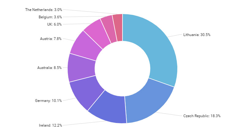
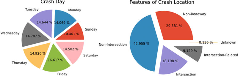
How To Read A Pie Chart
Chart created with wpDataTables
Picture this: a pie chart’s like a wheel, each wedge a different flavor of info.
First stuff first, check out the title. It hooks you up with what you’re eyeing – a chart about, say, favorite ice cream flavors. Without it, you’re a lost cookie in a creamery.
Now, on to the legend – it’s your flavor guide, matching colors on the pie to what they stand for. Cherry red for cherry, chocolate brown for, well, chocolate; you get the drift.
Here comes the main act, those tasty wedges. Bigger slice, bigger deal. It’s all about proportions here.
- Size up the slices: Eyeball which piece dominates – is it mint choco chip towering over the others?
- Colors and labels: They’re there for a reason. Match ’em up – which hue speaks for which stats?
- Savvy up on specifics: Some pie charts get fancy, throwing in numbers or percentages on the slices.
And hey, some charts like showboating with exploded segments to highlight the Big Kahuna.
Now, let’s not leave yet. Glance for any fine print or sources – gotta make sure you’re biting into fresh data pie, not last week’s leftovers.
Types Of Pie Charts
Standard Pie Chart
Chart created with wpDataTables
This is the most basic form, where different segments of a circle represent different categories. The size of each segment is proportional to the quantity it represents.
Doughnut Chart
Similar to a standard pie chart but with a hole in the middle, giving it a doughnut shape. It’s useful for comparing parts of a whole and can sometimes include multiple series of data.
Exploded Pie Chart
In this type, some or all of the slices are separated from the main pie. This is useful for emphasizing certain segments.
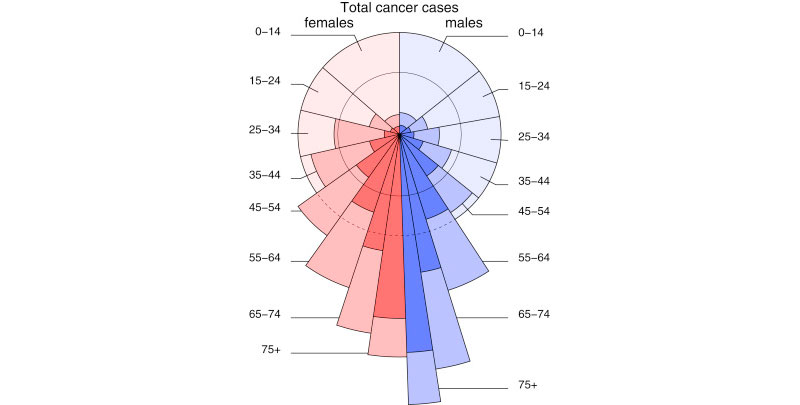
Polar Area Diagram (Coxcomb Chart)
Resembles a pie chart, but each segment has an equal angle, and the radius varies according to the value being represented. It’s useful for displaying cyclic data.
3D Pie Chart
Chart created with wpDataTables
A pie chart with a three-dimensional aspect. While visually appealing, it can sometimes distort data representation.
Pie of Pie or Bar of Pie Chart
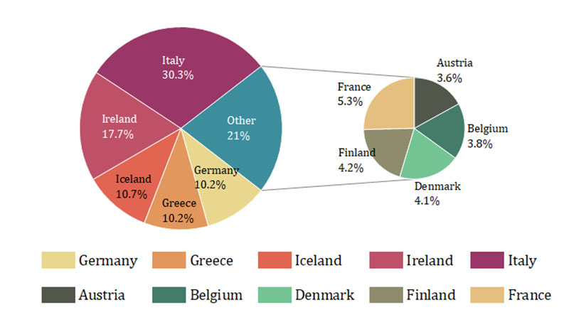
This involves a second pie or bar chart emerging from a slice of the main pie chart. It’s used to highlight and give more detail to smaller slices.
Spie Chart
This is a variant of the pie chart with an additional variable represented by the radius of each slice.
Multi-level Pie Chart
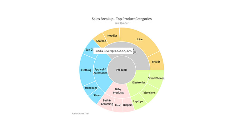
A pie chart with multiple levels or concentric circles, each representing a different hierarchy or grouping of data.
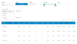
How To Make A Pie Chart In WordPress
To create a pie chart in WordPress using wpDataTables, follow these steps:
- Open the Chart Creation Wizard in your WordPress admin panel by navigating to wpDataTables -> Create a Chart.
- Choose a chart name and select a rendering engine (Google Charts, Highcharts, Chart.js, or ApexCharts).
- Pick a chart type from the list provided by the selected rendering engine.
- Define the data source by selecting a wpDataTable.
- Specify the data range for the chart, selecting columns and rows from the table.
- Customize the chart’s appearance and settings, including dimensions, colors, and other format options.
- Save the chart, which will generate a shortcode.
- Use the shortcode to insert the pie chart into your WordPress post or page.
How To Make A Pie Chart In Excel
To create a pie chart in Excel, follow these steps:
- Prepare the source data for the pie chart in a single column or row.
- Insert a pie chart by selecting your data, going to the ‘Insert’ tab, and choosing your desired pie chart type.
- Customize the chart by selecting various chart styles and options for formatting, labeling, and rotating the pie chart.
How To Make A Pie Chart In Google Sheets
To create a pie chart in Google Sheets, follow these six steps:
- Open Google Sheets and input your data, ensuring it’s organized with clear labels for each category and their corresponding values.
- Highlight the data you want to include in the pie chart.
- Go to the ‘Insert’ menu and select ‘Chart’.
- Set up your pie chart by choosing the ‘Pie Chart’ option in the Chart Editor.
- Customize your pie chart using the Chart Editor, where you can edit chart elements, modify colors, add titles, adjust the legend, and more.
- Finalize and insert the pie chart into your Google Sheets document by clicking the ‘Insert’ button in the Chart Editor.
FAQ About Pie Charts
What’s the main point of a pie chart?
It’s all about visual impact! A pie chart takes your stats and gives them life with a vivid display. Think of it as a snapshot capturing the essence of your data set, perfect for showing off those percentage breakdowns and category comparisons that might snooze-fest in a spreadsheet.
How accurately can you interpret a pie chart?
Gazing at a pie chart, it’s like each slice whispers its story to you. All hunky-dory, right? Almost. Pie charts are ace for getting the gist of things, but when it comes to the nitty-gritty, they leave room for guesswork. You want hard figures? Best pair it with precise data labels or a chart legend.
Can I compare different sets of data with a pie chart?
Let’s get this straight – pie charts are great solo artists, singing the highs and lows of a single data series. Mash up multiple data sets in one pie chart, though, and you’ve got a recipe for confusion. Stick to one chart per set for clarity that hits the spot.
Are 3D pie charts better than 2D ones?
3D pie charts are the flashy cousins of the classic 2D, bringing an extra oomph to your presentation visuals. But here’s the catch: they can skew your view, distorting data proportions like a funhouse mirror. So, for accurate data representation, keep it real with 2D.
When is it inappropriate to use a pie chart?
Overcrowd your pie, and it’s goodbye readability! Save these circular champs for the times when your category comparison is short and sweet.
How many categories can you show in a pie chart?
A pie chart’s like a cozy dinner party – you want to keep your guest list exclusive to preserve the vibe. Aim for around five to seven categories max. Too many guests, and the party – I mean, your chart – becomes a chaotic mess no one enjoys.
What are some alternatives to pie charts?
Feeling adventurous? Swap out the pie for its cousins – how about a bar chart for crisp category comparison, or a stacked bar for part-to-whole relationships with a twist? And let’s not forget the doughnut chart – it’s basically a pie chart that decided to rock a trendy central void.
How do you choose the right colors for a pie chart?
Oh, the power of colors! For your pie chart to be the belle of the ball, play with contrasting hues that pop while being considerate to those with color vision deficiencies. Pro tip: Keep your color-coded segments intuitive – like green for “go” and red for “stop”.
Can pie charts be misleading?
Tricky, tricky pie charts, they can be sneaky little things. With their round faces and colorful slices, they can exaggerate or undersell differences if they’re not crafted with care. Choose them wisely, and always double-check that proportions match the real story.
What’s the optimal way to order the slices in a pie chart?
Arrange your pie slices by size – it’s not just tidier; it helps the eye follow the data flow. Start with the chunkiest slice at 12 o’clock and work your way down. This visual storytelling makes your data warmer, friendlier, and instantly more relatable.
Conclusion
Visual analytics like this? They’re not just about pretty colors and shapes. They’re data heroes, transforming statistical data into something that anyone can nibble on and digest.
Remember, it’s not about tossing in a pie chart for the eye candy factor. It’s about using them when they’re the perfect fit – showcasing comparisons, percentage representations, or market share visualizations. And yeah, sometimes it’s smarter to pass on the pie and reach for another data presentation software or tool that better suits your fancy data feast.
Whether it’s in a boardroom or a classroom, armed with a click and a drag, you can now make data do the tango in a circular graph, and who wouldn’t want that? Just keep it simple, savvy, and always, always on point.