Looking for inspiring comparison table examples to improve your own? Whether you’re showcasing product differences, pricing plans, or feature comparisons, a well-structured table makes information easy to digest.
In this guide, we’ll explore real-world examples of high-converting comparison tables, including interactive and dynamic designs.
Table of Contents
The Purpose of the Comparison Table
A comparison table isn’t just a list – it’s a conversion tool. It quickly highlights key differences, helping users make informed decisions without sifting through paragraphs of text. When you compare products, services, pricing plans, or features, a well-structured table eliminates confusion and keeps users engaged.
- Faster decision-making: Users can scan and compare options instantly.
- Higher conversions: Clear, structured comparisons reduce hesitation and drive action.
- Better user experience: Organized data keeps visitors engaged and lowers bounce rates.
- Ideal for affiliate marketing: Guides readers toward the best choice, increasing clicks and commissions.
- Enhances credibility: A professional, well-designed table builds trust with your audience.
Next, we’ll explore real-world use cases of comparison table examples and what makes them effective.
Comparison Table Examples: Most Important Use Cases
Comparison tables serve a wide range of industries and purposes, making them a versatile tool for presenting information in a structured and engaging way.
Product comparison tables
A product comparison table helps users evaluate different products side by side based on key specifications, features, and benefits. These tables are widely used in eCommerce, tech reviews, and affiliate marketing to simplify complex buying decisions.
Example: An electronics retailer creates a table comparing three laptops (MacBook Pro, Dell XPS, and HP Spectre) based on price, processor, battery life, and screen resolution. Users can quickly see which model best fits their needs.
Why it works:
- Provides a direct, side-by-side feature comparison.
- Highlights the best value option with visual markers.
- Helps users make a purchase decision faster.
Pricing comparison tables
Pricing tables are crucial for SaaS businesses, online services, and membership sites. They display different pricing plans and features, making it easy for users to choose the right option.
Example: A SaaS company offers Basic, Pro, and Enterprise subscription plans. The comparison table outlines the features included in each plan, such as storage limits, customer support levels, and API access.
Why it works:
- Clearly differentiates features between plans.
- Uses visual cues (such as checkmarks or color highlights) to emphasize the best choice.
- Encourages upgrades by showing additional benefits in higher-tier plans.
Feature comparison tables
When products or services have overlapping features but key differences, a feature comparison table helps users understand what sets them apart.
Example: A blog compares three WordPress table plugins (wpDataTables vs. Competitor A vs. Competitor B), listing their pricing, ease of use, integrations, and customization options.
Why it works:
- Makes it easy to identify strengths and weaknesses.
- Helps users choose the best tool for their specific needs.
- Drives conversions by demonstrating why one option stands out.
Service comparison tables
For freelancers, agencies, and consultants, service comparison tables clarify what each package includes, helping potential clients choose the best fit.
Example: A digital marketing agency offers three service packages (Starter, Growth, and Premium) with different levels of SEO, content marketing, and ad management. The table outlines the services included in each package.
Why it works:
- Reduces confusion about what’s included at each pricing level.
- Helps potential clients see the value of higher-tier services.
- Simplifies the decision-making process for customers.
Technical specification tables
Industries that deal with complex technical data – such as automotive, IT, and industrial equipment – use technical specification tables to present detailed performance metrics in a digestible format. In this way, a vehicle valuation platform could use this format to help users sell a damaged car by comparing salvage offers with technical specifications such as engine condition or chassis integrity.
Example:
Why it works:
- Helps technical buyers find key specifications quickly.
- Provides a structured, no-fluff way to compare performance data.
- Useful for B2B sales where precise details matter.
Affiliate marketing & review tables
Affiliate marketers and bloggers use comparison tables to showcase recommended products in a way that encourages clicks and conversions.
Example: A tech blogger creates a “Best Laptops for Video Editing” table comparing five different models, highlighting performance, price, and best overall value. The table includes affiliate links to buy each product.
Why it works:
- Engages users by simplifying complex buying decisions.
- Increases affiliate commissions by guiding readers toward the best choice.
- Enhances credibility by providing a well-researched comparison.
Interactive comparison tables (Built with wpDataTables)
Unlike static tables, interactive comparison tables allow users to sort, filter, and customize data. These are particularly useful for large datasets where users want to refine their search.
Example: A financial website allows users to compare credit cards based on annual fees, rewards, and interest rates. Users can filter the table by categories like “Best for Travel” or “Lowest APR.”
Why it works:
- Gives users control over what data they see.
- Enhances engagement with sorting and filtering features.
- Makes large datasets easier to navigate.
Best Comparison Table Examples With Analysis
Not all comparison tables are created equal. Some simply list data, while others are designed to engage users, drive conversions, and simplify decision-making. In this section, we’ll showcase real-world comparison table examples that effectively present information and influence user choices.
Each example includes:
- A short description of its purpose and industry use case.
- Why it works, breaking down key design and usability factors.
- A screenshot or embedded table to illustrate its effectiveness.
Whether you’re creating product comparisons, pricing tables, or feature-based evaluations, these examples will give you the inspiration and insights you need to build tables that convert.
Product comparison table example
| Preview |
 |
 |
 |
| Model | Huawei P40 Pro | Samsung Galaxy S20 Ultra | Xiaomi Mi 10 |
| Price | $804 | $599 | $365 |
| Rating | |||
| Specifications | |||
| Price/Quality Score |
9.4Price/Quality Score |
9.7Price/Quality Score |
9.9Price/Quality Score |
| Design score | 8.7Design | 9.2Design | 9.0Design |
| Performance score | 8.4Performance | 8.6Performance | 8.6Performance |
| Camera score | 9.5Camera | 9.1Camera | 8.8Camera |
| Battery score | 7.0Battery | 8.4Battery | 7.7Battery |
| User reviews | |||
| User score |
9.9 19 reviews |
7.8 24 reviews |
9.1 48 reviews |
| Screen | |||
| Inches | 6.58" | 6.9" | 6.67" |
| Resolution | FHD+ | WQHD+ | FHD+ |
| Usable surface | 92% useful | 90% useful | 89% useful |
| Aspect Ratio | 20:9 | 20:9 | 19.5:9 |
| Structure | |||
| Dimensions |
72.6 mm 158.2 mm 9.0 mm |
76.0 mm 166.9 mm 8.8 mm |
74.8 mm 162.6 mm 9.0 mm |
| Weight | 209 g | 222 g | 208 g |
| Performance | |||
| Micro | Kirin 990 Octa-Core | Exynos 990 Octa-Core | SnapD. 865 Octa-Core |
| RAM | 8 GB RAM | 12 GB RAM | 8 GB RAM |
| Storage | 256 GB | 128 GB | 256 GB |
| SD Slot |
|
|
|
| Battery | 4200 mAh | 5000 mAh | 4780 mAh |
| Main Camera | 52 Mpx | 108 Mpx | 108 Mpx |
| Selfie Camera | SELF 32 Mpx | SELF 40 Mpx | SELF 20 Mpx |
| OS | Android 10 Q | Android 11 Red Velvet Cake | Android 10 Q |
| More info |
 |
|
|
This product comparison table example provides a side-by-side breakdown of three smartphones: Huawei P40 Pro, Samsung Galaxy S20 Ultra, and Xiaomi Mi 10. It presents key details such as pricing, specifications, performance ratings, and user reviews to help potential buyers make an informed decision.
Why it works
- Clear and structured layout: The table organizes information into categories like price, performance, battery, and user scores, making it easy to scan.
- Scoring system for quick evaluation: Instead of just listing specs, it includes design, performance, and camera scores, helping users compare quality beyond raw specifications.
- Balanced use of data & visual cues: Ratings and numerical scores provide quick takeaways, while additional specifications give deeper insights for informed buyers.
- Usability & purchase intent: The inclusion of user reviews and a “More Info” section encourages further exploration, potentially leading to conversions.
This type of comparison table is perfect for tech blogs, affiliate marketing sites, and eCommerce stores, as it enhances user experience while driving sales.
Product comparison table example #2


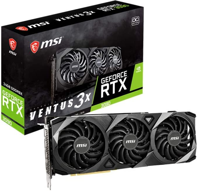
This graphics card comparison table presents three high-end GPUs—GeForce RTX 3080 Ti, Radeon RX 6900 XT, and GeForce RTX 3090—allowing users to evaluate specifications, performance metrics, and pricing side by side. This type of table is particularly useful for gamers, PC builders, and tech enthusiasts looking for the best GPU based on their budget and performance needs.
Why it works
- Essential specs at a glance: The table highlights critical details such as core clock speed, memory size, and memory clock speed, helping users quickly compare performance factors.
- PCIe 4.0 compatibility and API support: Users can see that all three models support DirectX 12.0 and OpenGL 4.6, ensuring compatibility with modern games and applications.
- Power consumption consideration: Including max TDP (thermal design power) helps buyers understand energy efficiency, an important factor for gaming and workstation setups.
- Action-oriented design: Each product features a “Buy on Amazon” link, directing users to purchase options, making this table ideal for affiliate marketing and driving conversions.
This type of Amazon product comparison table is commonly used on tech blogs, review websites, and eCommerce platforms to help consumers make data-driven purchasing decisions.
Pricing comparison table examples
Pricing table
STARTER
1 Webiste / YEAR
|
FREELANCE
10 Webistes / YEAR
|
PROFESSIONAL
1000 Webistes / YEAR
|
Feature-based pricing table that breaks down different plans (e.g., Starter, Freelance, Professional) by listing included features. Each plan scales up in functionality, helping users choose based on their needs.
Benefits:
- Clearly highlights differences between pricing tiers.
- Helps users quickly identify which plan offers the best value.
- Encourages upgrades by showcasing premium features in higher-tier plans.
Compares a free version of a product against paid plans. The free option is great for user acquisition, while premium plans offer enhanced functionality.
Benefits:
- Converts free users into paying customers by showing feature limitations.
- Appeals to different buyer personas (casual users vs. professionals).
- Helps justify pricing by contrasting free vs. paid benefits.
Common for SaaS platforms, this table presents pricing based on a monthly or annual subscription model, often with “Get Started” or “Contact Us” call-to-action buttons.
Benefits:
- Highlights flexible pricing for individuals and teams.
- Reinforces value by emphasizing user productivity and scalability.
- Encourages immediate sign-ups with action-oriented CTAs.
STARTER
1 Webiste / YEAR
|
FREELANCE
10 Webistes / YEAR
|
PROFESSIONAL
1000 Webistes / YEAR
|
DEVELOPER
unlimited / YEAR
|
Designed for developers or agencies, this table often includes an “Unlimited” or high-volume tier, making it ideal for businesses needing extensive access.
Benefits:
- Appeals to enterprise clients by offering unlimited usage.
- Shows clear value for agencies managing multiple websites.
- Positions higher-tier plans as cost-effective for bulk usage.
Examples of a feature comparison table
|
PRODUCT 1 Free |
PRODUCT 2 $99 |
PRODUCT 3 $59 |
| FEATURE | FEATURE | FEATURE |
| FEATURE | FEATURE | FEATURE |
| FEATURE | FEATURE | FEATURE |
This feature comparison table allows users to compare three product versions – Product 1 (Free), Product 2 ($99), and Product 3 ($59) – based on their features. Each product is associated with specific functionalities, enabling users to easily evaluate which option fits their needs.
Why it works
- Concise comparison: By using a simple grid layout, users can quickly understand what features come with each product version.
- Effective for multiple versions: It highlights differences across free and paid tiers, helping users decide which version offers the best value based on their requirements.
- Call to action: The “Buy now!” buttons make it clear and easy for users to take the next step, converting interest into sales.
- Adaptable: This layout can be used for a variety of products, from software to digital services, making it versatile.
This table is ideal for offering clear feature breakdowns across different product versions, allowing potential customers to make a decision based on the features they need rather than just price.
This feature comparison table breaks down a SaaS product into different subscription tiers, ranging from a free plan to premium plans with advanced features. It helps users compare essential tools, such as productivity features and data operations, in a simple and easy-to-digest format.
Why it works
- Clear tier differentiation: The table clearly shows which features are included in each pricing tier, making it easy for users to understand what they get at each price point.
- Focus on key features: It highlights the most relevant features for users, such as grid and kanban views, personal tiles, team views, and priority support, ensuring users know exactly what benefits they’ll receive with each plan.
- Scalable for teams: The tiers are designed to accommodate individual users up to enterprise teams, with progressively more features and support.
- Direct call to action: Each plan includes a “Get Started” button or “Contact us” for custom pricing, guiding users towards taking the next step.
- Custom pricing option: For high-value users or enterprise-level customers, a custom pricing tier is available, catering to large-scale needs.
This table is particularly useful for SaaS platforms offering multiple pricing models where users need to compare core features across plans. It allows potential customers to easily choose the plan that best fits their business size and functional requirements.
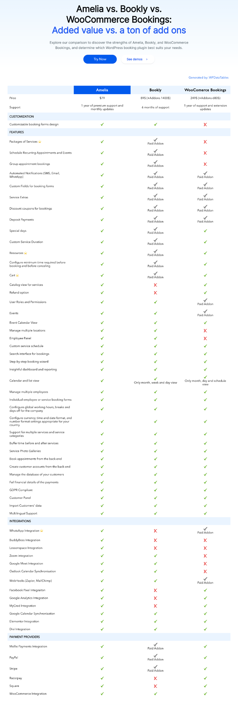
This feature comparison table compares three popular booking systems – Amelia, Bookly, and WooCommerce Bookings – based on various key attributes such as pricing, support, features, integrations, and addons. With clear checkmarks and crosses, users can quickly assess the differences and similarities between each platform to determine which best suits their needs.
Why it works
- Visual clarity: The use of ticks and crosses next to each feature allows for an immediate visual understanding of what each platform offers. This makes it easy to spot the strengths and limitations of each solution.
- Comprehensive comparison: It compares all essential factors, such as pricing, support, and integrations, while also distinguishing between features included in the base plans and those available as paid addons.
- Support for decision making: This table gives users a clear overview of which features are essential to their business, making it easier to choose the right booking plugin based on specific needs.
- Feature vs. addon breakdown: By marking paid addons clearly, the table sets clear expectations about what’s included and what will incur additional costs, preventing surprise charges for users.
- Tailored for booking solutions: This type of table works especially well for platforms like booking and appointment plugins, where comparing core functionality and scalability options is key to the decision-making process.
Create Stunning Comparison Tables with wpDataTables
Comparison tables are an invaluable tool for showcasing your products, services, or features in a clear, digestible format. As you’ve seen through the examples, these tables provide a fast, visual way for users to compare key data, helping them make well-informed decisions.
With WordPress table plugin, you can create dynamic, responsive, and beautifully designed comparison tables with ease. Here’s why wpDataTables is the go-to solution for building comparison tables that work for your specific needs:
- Fully customizable: Design tables that align with your brand and layout. Add or remove columns, rows, and features as needed.
- Interactive elements: Make your tables more engaging by allowing users to sort, filter, and search the content.
- Fast & responsive: wpDataTables optimizes your tables to load quickly, even with large data sets, ensuring a seamless user experience.
- Powerful data integration: Easily import data from Excel, Google Sheets, or MySQL, and turn them into beautiful comparison tables with just a few clicks.
- Mobile-friendly: Your tables will look great on any device, automatically adjusting to ensure a perfect viewing experience.
All the tables you’ve seen in this blog were built using wpDataTables, showcasing the plugin’s versatility and ease of use. Whether you’re comparing pricing, features, plans, or any other key data, wpDataTables makes it simple to create tables that not only look great but also enhance your user experience.
So, if you’re ready to improve your website and provide your visitors with crystal-clear comparisons, wpDataTables is the tool you need. Start creating your own beautiful comparison tables today – your users will thank you for it!