

wpDataTables includes 5 major chart engines:
Even though there are a lot of chart types in the aforementioned chart libraries, they need to be programmatically added by our developers, so not all chart types you see on chart engines’ websites are included in wpDataTables. You can always suggest one of the missing chart types be developed for wpDataTables by clicking on this link.
The list of available chart types for each engine can be seen in the tabs below. You can click on each image or each chart name to open a new page where you can see a live example of that chart type in our documentation.


From plugin version 5.3, horizontal bar chart is available as option in chart wizard.
By default chart engine’s behavior, column chart cannot be inverted, so X axis becomes Y axis and vice versa. That’s where wpDataCharts Callbacks come in again. Every chart exposes several options that customize its look and feel. Charts usually support custom options appropriate to that visualization. You can use it for adding options that are available in Charts.js API.
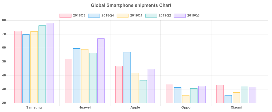
In this example, we look at Global Smartphone Shipments (in millions of units) since Q3 2018, until Q3 2019. Initially, the chart would come up like this:
To make the chart display the bars horizontally, you need to enter the following callback in HTML format above the chart’s shortcode, like this:
<script type="text/javascript">
jQuery(window).on('load',function(){
    if( typeof wpDataChartsCallbacks == 'undefined' ){ wpDataChartsCallbacks = {}; }
    wpDataChartsCallbacks[95] = function(obj) {
        obj.options.type = 'bar';
        obj.options.options.indexAxis = 'y';
    };
});
</script>
For a chart that has this many bars, it’s recommended to change the default chart’s height in the creation wizard. So with the height set to 800px, and the callback seen above applied, the chart finally looks like this:
Percentage is being automatically added to Google Pie charts tooltips, and there is no built-in option to remove it. However, you can use wpDataChart callbacks to tweak this. Charts usually support custom options appropriate to that visualization. You can use it for adding options that are available in Google Api. In this callback in method wpDataChartsCallbacks 83 is the ID of the chart we want to remove the percentage from the tooltips.
<script type="text/javascript">
jQuery(window).on('load',function(){
if( typeof wpDataChartsCallbacks == 'undefined' ){ wpDataChartsCallbacks = {}; }
wpDataChartsCallbacks[96] = function(obj){
obj.options.tooltip = {
text: 'value'
}
obj.options.pieSliceText = "none"
}
});
</script>
Hover over the slices in the chart to see the change.
If you add a prefix or a suffix to values in the table, they won’t be carried over to the chart. This is the default behavior of the chart engine, but you can use wpdatachart callbacks to get them to display. Every chart exposes several options that customize its look and feel. Charts usually support custom options appropriate to that visualization. You can use it for adding options that are available in Highcharts API.
In this example we will show you how to use Highcharts.setOptions to add these labels on a chart which has two Y axes.
<script type="text/javascript">
jQuery(window).on('load',function(){
    if( typeof wpDataChartsCallbacks == 'undefined' ){ wpDataChartsCallbacks = {}; }
    wpDataChartsCallbacks[94] = function(obj){
        obj.options.yAxis[0] = {
           labels: {
             format: '$ {value}'
           }
        }
        obj.options.yAxis[1] = {
           opposite: true,
           labels: {
             format: '{value} %'
           }
        }
    }
});
</script>
Highcharts do not inherit the number format you set up in wpDataTables, and there are no built-in options to change the number format in the chart, but you can use wpdatachart callbacks. Every chart exposes several options that customize its look and feel. Charts usually support custom options appropriate to that visualization. You can use it for adding options that are available in Highcharts API.
In this example we will show you how to use Highcharts.setOptions to change the decimal separator from point ( . ) to a comma ( , ). In the callback, you can see how to change the number of decimal places after the separator ( , ) from default 2 to 3. We use the method wpDataChartsCallbacks where 93 is the id of the chart for which we want to apply these settings.
<script type="text/javascript">
jQuery(window).on('load',function(){
    Highcharts.setOptions({
        lang: {
            decimalPoint: ','
        }
    });
    if( typeof wpDataChartsCallbacks == 'undefined' ){ wpDataChartsCallbacks = {}; }
    wpDataChartsCallbacks[93] = function(obj){
        obj.options.tooltip = {
            pointFormat: "Distance: {point.y:.3f} km"
        };
    };
});
</script>