HTML tables are a go-to tool for displaying structured data, but by default, they’re static. If you’re working with large datasets or need to keep your layout clean, having an HTML table with collapsible rows can make a huge difference in readability and user experience.
Showing all rows at once isn’t always practical. A collapsible table row lets users expand and collapse sections of a table without reloading the page.
We’ll show you:
- How to toggle visibility of table rows
- When to use CSS vs JavaScript
- How to structure your HTML for collapsible rows
- How to build an HTML expandable table that works on all devices
Table of Contents
What is a collapsible HTML table?
A collapsible HTML table is a table that lets users expand or hide specific rows without affecting the rest of the content. Think of it like a drop-down menu inside a table; a row click revelas or hides more information nested beneath it.
This feature is especially userful when:
- You want to show summary rows by default and hide details unless needed
- You’re working with nested data like order items, FAQs, or changelogs
- You’re optimizing a layout for smaller screens
In a table with collapsible rows, the parent row acts as a toggle. When clicked, it reveals child rows—similar to how an accordion component works. Depending on your needs, this can be achieved using:
- Pure HTML and CSS (for basic toggling using <details> and <summary> or CSS tricks)
- JavaScript (for more complex or styled interactions)
- Frameworks like Bootstrap or Tailwind (to speed up development)
These tables are sometimes called:
- Expandable HTML tables
- Collapsible table rows
- HTML expandable tables
- HTML tables with toggle rows
They all refer to the same concept: hiding and revealing table content on interaction.
How to build a table with collapsible rows?
We’ve singled out 3 best methods to create a table with expandable rows:
Method 1: Collapsible table using HTML and CSS
If you want to keep things simple and lightweight, you can create a collapsible table row using only HTML and CSS. This approach works best for static content and quick UI enhancements without relying on JavaScript.
HTML5 introduced the <details> and <summary> elements, and they’re a game-changer for toggling visibility. Although they aren’t designed specifically for tables, you can still use them creatively to reveal additional content inside a cell.
Here’s a quick example:
<table border="1" width="100%">

  <thead>

    <tr>

      <th>Order ID</th>

      <th>Customer</th>

      <th>Details</th>

    </tr>

  </thead>

  <tbody>

    <tr>

      <td>#1023</td>

      <td>Jane Doe</td>

      <td>

        <details>

          <summary>View</summary>

          <ul>

            <li>Item: Red T-Shirt</li>

            <li>Qty: 2</li>

            <li>Total: $40</li>

          </ul>

        </details>

      </td>

    </tr>

  </tbody>

</table>
Why does this work so well?
- It’s semantic and accessible. Screen readers can interpret it correctly, making it more inclusive than hiding elements with display toggles.
- No JavaScript required, which improves performance and makes maintenance easier.
- It’s easy to style with CSS to match your site’s design.
Here’s a simple CSS snippet to enhance the toggle visuals:
details summary {

  cursor: pointer;

  font-weight: bold;

}

details summary::after {

  content: " ▼";

}

details[open] summary::after {

  content: " ▲";

}
This gives a visual indicator for users to know whether the section is expanded or collapsed.
However, there are still some limitations such as:
- You can’t collapse or hide entire <tr> rows with pure CSS. This technique only works within <td> cells.
- Layout control is limited, especially in complex or nested tables.
- Styling <details> inside a table can be tricky in designs that require precise alignment or customization.
Which makes this method to create a table with collapsible rows a good choice for:
- Displaying order or product details inline
- Expanding extra info like customer notes or specifications
- Any scenario where simplicity and speed matter more than advanced interactivity
Method 2: Expand and collapse table rows with JS
When you need more flexibility – like hiding or showing entire <tr> elements, animating the transition, or managing large datasets – JS is your best friend. With just a bit of scripting, you can build a clean and interactive HTML table with expandable rows.
JS offers numerous benefits, and some of them are:
- You can collapse or expand the entire <tr> elements
- Fully customizable styling and icons
- Can be combined with data attributes for better scalability
- Works well with pagination, sorting and AJAX content
But here is an example of how you can implement it to collapse rows in the table:
<table border="1" width="100%" id="ordersTable">

  <tr class="parent">

    <td colspan="3" onclick="toggleRow(this)">Order #1023 – Jane Doe</td>

  </tr>

  <tr class="child" style="display: none;">

    <td colspan="3">

      <ul>

        <li>Item: Red T-Shirt</li>

        <li>Qty: 2</li>

        <li>Total: $40</li>

      </ul>

    </td>

  </tr>

</table>

<script>

function toggleRow(row) {

  const next = row.parentElement.nextElementSibling;

  if (next && next.classList.contains("child")) {

    next.style.display = (next.style.display === "none") ? "table-row" : "none";

  }

}

</script>
However, be mindful when using JS. When you overdo it, it can slow down your performance. There are also some issues that can arise if you don’t do it correctly, so:
- Always make sure that toggled rows have the same number of <td> cells to avoid layout issues
- Add ARIA attributes or roles if you want accessibility compliance
- Watch for browser quirks – older browsers may render transitions differently
But if you’re building a complex admin dashboard or an interactive report, JS method gives you a complete control over how the rows in your table behave.
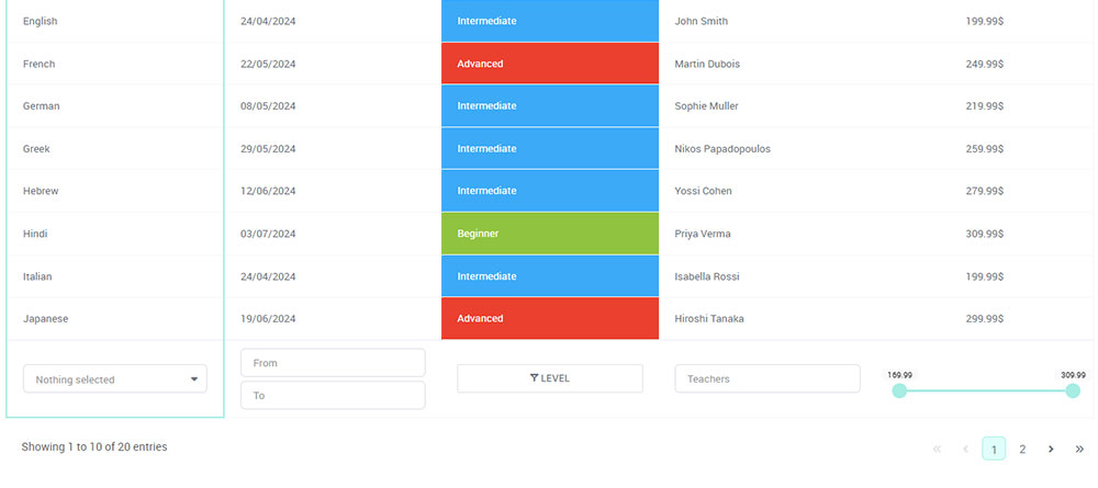
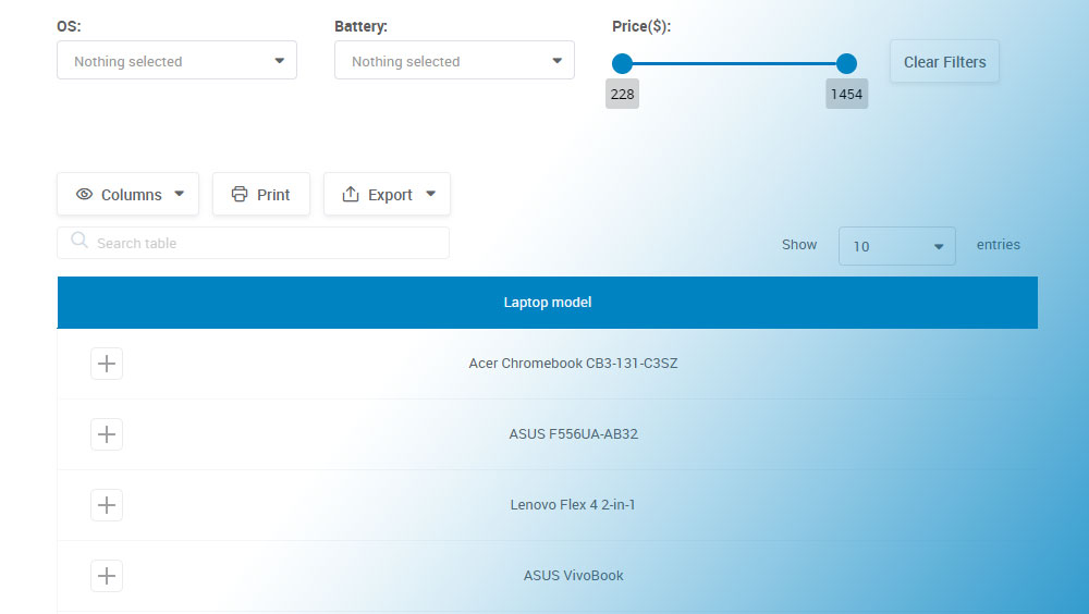
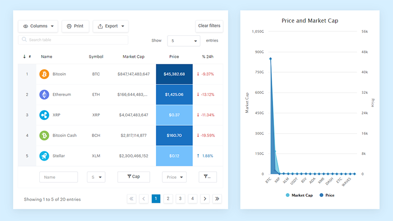
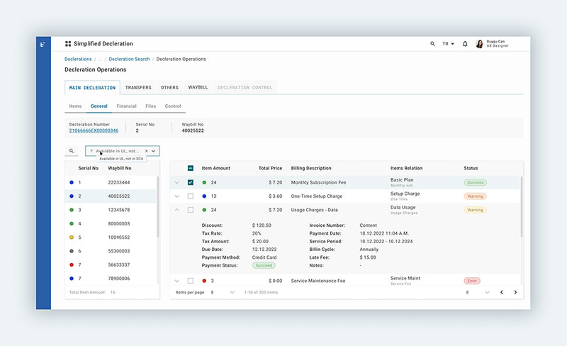
Method 3: Using wpDataTables for collapsible rows
If you’re working inside WordPress and want a collapsible table solution, you don’t need to write even a line of code because wpDataTables does it all for you.
wpDataTables is a table plugin that creates interactive, expandable rows out of the box.
This plugin is ideal for users who want:
- A visual interface to create tables from Excel, CSV, Google Sheets, or SQL
Responsive HTML tables with collapsible (expandable) rows - Advanced features like filters, conditional formatting, and pagination
- Seamless integration with Elementor, Gutenberg, or WPBakery
Expandable rows in wpDataTables are implemented through features like:
- Master-detail views (also known as nested tables)
- Row grouping, which lets you group data under a clickable header
- Custom toggle icons or text to expand/collapse rows
- AJAX loading for child rows, improving performance for large datasets
- Column-level control over what appears in the expanded section
This functionality is perfect when you want users to click a row and see additional information without cluttering the main view.
Why use wpDataTables for collapsible rows?
- No coding required-great for beginners and non-technical users
- Full control over HTML styling for expanded rows
- Built to handle large datasets, thanks to server-side processing
- Fully responsive and optimized for themes like Astra, Kadence, and Hello Elementor
If you’re using WordPress and want to save time while delivering a slick, user-friendly data table, wpDataTables makes implementing expandable rows incredibly easy. You get professional-level functionality with none of the usual development headaches.
And it’s really easy to do something like this:
- You provide the table data
- Configure and customize it
- Publish it in a post or page
And it’s not just pretty, but also practical. You can make large tables with up to millions of rows, or you can use advanced filters and search, or you can go wild and make it editable.
“Yeah, but I just like Excel too much and there’s nothing like that on websites”. Yeah, there is. You can use conditional formatting like in Excel or Google Sheets.
Common use cases for collapsible tables
Now that you know how to build collapsible rows, let’s talk about where they actually shine in real-world projects. This UI pattern isn’t just decorative—it’s incredibly useful for organizing complex data without overwhelming your users. Here are some common and practical use cases:
Product listings with specifications
Selling products with multiple options or technical specs? Use expandable rows to in your product tables to show essential info upfront and let users click to reveal more—like materials, dimensions, or compatibility.


Order history tables
Perfect for dashboards or admin panels. Show a summary of each order (ID, customer name, total), and let users expand rows to see itemized purchases, shipping details, or tracking links.
Schedules or calendars
In time-based tables like weekly planners, project timelines, or class schedules, collapsible rows can reveal additional info like time slots, notes, or who’s responsible for each task.
FAQs or knowledge bases
If you’re organizing help content in a table (like category, title, and summary), collapsible rows let users expand a question to view the full answer – great for compact yet searchable layouts.
Financial reports and invoices
Display totals at a glance, and use collapsible rows to drill down into the breakdown: line items, taxes, fees, or discounts. It’s clean, professional, and easy to audit.
Dashboard designs
Let’s paint a picture—dashboards are the command centers of the digital realm, giving users the steering wheel to their data-driven vehicle.
They’re packed with knobs and dials, each representing slices of vital statistics.
Collapsible rows are the unsung heroes here, preventing the data-overload breakdown. Dashboard designers love these nifty tools as they help them keep the cockpit neat.
Users can prioritize which metrics to monitor closely while tucking away those less urgent, only pulling them out when needed. It’s about furnishing users with the art of choice.
Data reporting interfaces
Now, think about the folks who eat, sleep, and breathe numbers—analysts, managers, and the data-curious.
They’re not just looking at the figures; they’re diving deep, looking for patterns and stories.
For data reporting interfaces, collapsible rows are akin to an expert storyteller—they know when to build suspense and when to deliver the punchline.
Complex reports become streamlined narratives, with each row unfolding a new chapter of insights. Data becomes friendlier, almost whispering its secrets as you expand those rows at your discretion.
Collapsible Table by Muhammad Awais Iqbal (@cybentizen)
on CodePen.
Code is poetry, where classes are the verses that command behavior. Assigning a class to a table row is like whispering to it, teaching it new tricks.
Giving a class name, say .collapsible, is like a secret handshake between the row and the styling rules that’ll come into play later.
In this tangle of HTML tags, sprinkle the rows you want to toggle with a dab of distinctiveness.
It’s all about using classes to earmark the rows set for the grand act of appearing and disappearing. These classes are the handlers, lying in wait for the cue to tuck away data or unveil it grandly as users interact with your creation.
Advanced techniques and best practices for collapsible rows tables
Improving accessibility
Think of the internet as a bustling metropolis, and every user deserves a VIP tour, accessibility being the guiding principle.
Web pages aren’t just for sight. They sing, they speak, they indicate with a tap of the key. Enter ARIA attributes, the unsung heroes making web content more welcoming, like braille on street signs or ramps beside stairs.
With ARIA attributes applied to tables, those collapsible rows turn into well-marked paths for screen readers.
They’re signs, whispers, and nudges making tables talk in ways beyond the visual. Just a dash of aria-expanded or aria-controls, and a hidden world is revealed to the eyes of the software, guiding users through the maze of data with the ease of a local showing around their neighborhood.
Keyboard navigation
Ever tried threading a needle in the dark? That’s using a website without the convenience of a mouse or touch.
It’s all about the keyboard, the trusty companion for many, an essential interface. Now, adding keyboard navigation is like turning on the lights, welcoming users into the fold as they tap their way through content.
It’s about mapping the keys to actions, capturing the essence of user intent with each press, making the journey through the table with collapsible rows an intuitive dance of fingers on keys.
It’s setting the stage, inviting users to play their part in a performance where the keyboard is the wand and the website, the spellbook of content waiting to be unveiled.
Optimizing for performance
Reducing repaints and reflows
Behind the scenes, browsers are the tireless stagehands of the web, painting and composing the spectacle of sites. Yet, heavy scripts can bog them down, like a painter splashing over the same spot.
Optimizing performance is akin to choreographing the brush strokes, ensuring each swipe of paint, each layout calculation is deliberate, not wasteful.
Tackling repaints and reflows is a balancing act, finding just the right moment to animate or alter elements.
Consideration is key—minimize the changes, streamline the path from code to visual, and watch as the performance takes a leap from good to great, rendering the escapade of collapsible rows swiftly, without the browser catching its breath.
Lazy loading for expanded rows
Now, think of a long road trip. You wouldn’t pack everything you own, would you?
That’s lazy loading; it’s about taking what you need, leaving the rest until later. Apply this to tables, and you’re only loading the data as it’s needed, each row expanding not from weight but when called upon.
Lazy loading for expanded rows means the table remains nimble.
It conserves resources, serves content on a silver platter, but only when the user asks. Reduced load times, smooth experiences, and a pat on the back for efficiency – that’s the lazy loading philosophy at its best.
Enhancing user interaction
Visual cues for expandability
First impressions count. A quiet whisper can be lost in a storm, while a gentle nudge can guide the way.
Visual cues are these nudges, the soft spotlights on a stage, hinting where the action lies. It’s about indicators; subtle signs that beckon towards the collapsible rows, suggesting interaction without saying a word.
A small arrow, a shift in color, a hint of shadow—these are the visual whispers that tell a hand where to click, a finger where to tap.
They transform the unknown into an invitation, banishing hesitation.
Animations and transitions
Life’s a play, and every act flows into the next. Animations and transitions on a webpage imitate that seamless movement.
No jarring jumps, no abrupt appearances – it’s all about the flow, the graceful entrance and exit of content as if choreographed by an unseen director.
Applying animations and transitions to the table’s accordion-like behavior breathes life into its rows.
They don’t just show and hide; they perform, a visual ballet synced with user interaction, coupled with the thrill of discovery. It’s a sight to behold, as each row unveils or conceals its treasures with poise—a dance of pixels that delights the senses and invites continuous exploration.
FAQ about tables with collapsible rows
How to make collapsible rows in HTML?
You can use the <details> and <summary> elements inside a table cell to create collapsible content without JavaScript, or use JavaScript to toggle visibility of additional rows.
How to collapse rows in a table?
To collapse rows, hide specific <tr> elements with CSS (display: none) and use JavaScript or <details> toggles to control when they appear.
How to add expand and collapse in HTML table?
Wrap extra content in a <details> tag inside a cell for simple toggling, or use JavaScript to show/hide entire rows based on user interaction (like clicking an icon or button).
How do I reduce the space between rows in a table in HTML?
Use CSS to set border-spacing: 0; on the <table> and adjust padding or line-height on <td> elements to reduce row spacing.
What are the best practices for designing tables with collapsible rows?
To ensure user engagement, employ visual cues signaling interactivity. Lean on CSS for responsive layouts, keeping your tables legible on all devices. Accessibility is key—use ARIA labels for screen readers, ensuring equitable access. Strive for performance—optimize with lazy loading, ensuring swiftness in expanding and collapsing.
Is JavaScript necessary for implementing collapsible table rows?
Though not mandatory, JavaScript’s flair in DOM manipulation brings collapsible rows to life. It enables custom interactivity, going beyond static HTML. For those less code-savvy, jQuery offers shorthand methods, while CSS alone can handle basic toggle functionality with the pseudo-class :checked.
Can collapsible rows be nested within other rows?
Absolutely, nested data thrives with collapsibility, revealing layers upon interaction. When structuring HTML, embed a child table within a parent row, applying similar classes for consistency. JavaScript facilitates nested functionality, toggling visibility of child rows independent of their parent counterparts, maintaining a clean, hierarchical flow of information.
How do I ensure my collapsible tables are mobile-responsive?
Mobile-first approach is vital. Use fluid grid layouts, responsive CSS frameworks like Bootstrap, and media queries to ensure tables adapt to smaller screens. Consider touch interactions—make toggle elements finger-friendly, using larger tap targets. Always test on various devices for true responsiveness.
How do I handle accessibility in tables with collapsible rows?
Prioritize screen readers and keyboard navigation in your design. ARIA attributes, such as aria-expanded and role=”button”, clarify the function and state of collapsible elements.
Ensure keyboard users can navigate rows using tabindex, and provide clear focus styles, fostering inclusivity in your table’s design.
Can I use CSS alone to create a table with collapsible rows?
You can, indeed. Employ the :target or :checked pseudo-classes combined with the display property to show and hide table rows. While this approach suits simpler applications, using JavaScript offers additional control and interaction, catering to more complex requirements with ease and agility.