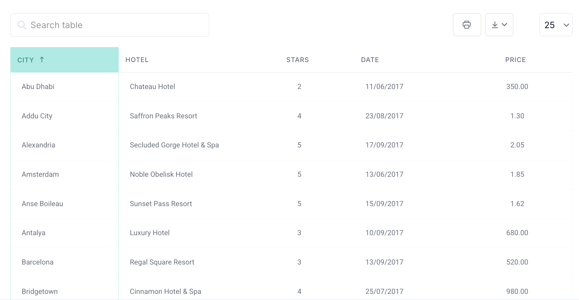
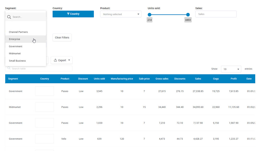
Data Visualization Challenges And Mistakes To Avoid

Data can be messy, and turning it into something that makes sense (and looks good) is an art form. Enter the maze of data visualization challenges.

Why should you care? Well, first off, I live and breathe web design and data visualization. And trust me, even the pros sometimes scratch their heads when it comes to representing complex data effectively. If they can trip up, so can you.

In this article:

  • You’ll learn about the big no-nos in the data viz world,
  • Get the scoop on common pitfalls,
  • And of course, tricks to make your data sing (not literally, but you get it).

The Best Data Visualization Blogs You Should Follow

Blink twice, and you’re hit with an ocean of data. But let’s be real, no one’s got time for boring spreadsheets. Enter: data visualization blogs.

Ever been on Instagram and wondered why some photos just pop? It’s because we humans are visual creatures. The same goes for understanding raw data. We need a lil’ sprinkle of design magic to make sense of all those numbers.

But where do you go to get that magic?

How to Choose the Right Chart Type for Your Data

Imagine your data wearing the wrong outfit. Yeah, that’s a weird image, right? But stick with me.

Data, like us, needs the right style to shine. We wouldn’t rock up to a beach party in a tux, just as our figures shouldn’t strut in a pie chart when a bar graph fits better. So, how to choose the right chart for your data?

You see, web design taught me something invaluable. Just as design decisions impact user experience, chart choices directly influence data interpretation.

Miss that? Data could be misunderstood or, worse, ignored.

By the time we’re done here, you’ll know:

  • The essence of different chart types
  • When and why to use them
  • The common pitfalls to avoid

Let’s make your data not just heard, but understood. Ready to pick the perfect ensemble for your numbers?

Impressive Data Storytelling Examples You Must Check Out

You know when you’re scrolling through Instagram, and you come across this super cool infographic, and it just clicks? That’s the power of data storytelling. At its heart, it’s about taking numbers and stats and turning them into a tale that resonates with everyone – yeah, even folks who hated math in school.

The Financial Charts And Graphs That You Can Create

Let’s dive deep into the colorful world of financial charts and graphs. You know, those cool visuals that might seem like mysterious hieroglyphics to some, but are like blockbuster movie trailers to the financially savvy. Yep, we’re unraveling the enigma.

Now, before you think, “Charts? Snooze…” — hold up!

Ever imagined diving into a pool of money, Scrooge McDuck style? Well, understanding these visuals is kinda like getting the map to the treasure.

Ever been to a concert? That crescendo in your favorite song? Charts and graphs have their own rhythm, peaks, and drops. It’s like music for your money.