Imagine setting a table where every seat offers a feast of information, and everyone finds exactly what they’re looking for, without stretching or straining.
That’s the essence of creating accessible tables—crafting a spot where details are served up ready for all to digest, making the web a more inclusive space.
In a digital landscape that should uphold equality, access to information can still resemble an obstacle course for some. Tackling this, I’m determined to turn the tide.
By diving into this article, you’ll unravel the intricate web of making tables accessible—a skill vital as a heartbeat in our interconnected world.
You’ll learn the ins and outs of effective HTML structuring, discover advanced techniques with ARIA, and even master the secrets behind crafting data relationships that speak clearly to all users.
With fresh insights into validation tools and a checklist for compliance, this journey will equip you with the know-how to bridge the gap in digital accessibility—one table at a time.
Fundamentals of Accessible Data Tables
See the Pen
Accessible Responsive Table Example by Kyle Luke (@lukekyl)
on CodePen.
Proper Use of HTML Tags
Imagine a world where every diner at a vast table easily reaches the central dish. That’s the aim of accessible tables—every user, regardless of ability, finds what they need without strain.
The world of the web isn’t much different; users navigate data tables seeking information as smoothly as possible.
The Importance of <th> and <td> Elements
It starts with the basics; the framework of our table stands on <th> (table header) and <td> (table data) elements. The <th> element is the signpost; it guides users like road signs do drivers, indicating whether the incoming data is a street name or a traffic law. It makes clarity a priority, providing a label for each column or row—a necessity for assistive technologies that read aloud to visually impaired visitors.
Switching to the <td> element, these are the bricks of content in the structure we’re building.
They hold the piece of data, the individual facts, if you will, directly tied to the headers above. Together, <th> and <td> work in concert—without each other, our diners are reaching in the dark for that elusive central dish.
Utilizing the <caption> Element for Descriptions
Consider the humble caption, an often-overlooked gem. By employing the <caption> element, a succinct but powerful description sits atop our data table, setting the scene.
It whispers a brief prelude to the story within the data, hinting at what the table contains. This orchestration helps not just those using screen readers, but all users, framing the data that follows.
Identification and Role of Headers
Behold the archways, elegant and functional: headers. Correctly identifying these allows those who cannot see the table to still perceive its structure through screen readers or alternative means.
Defining Row and Column Headers
Row and column headers are akin to a librarian sorting books by category and subcategory—intuitive and orderly.
Row headers categorize horizontally, often representing a unique identifier like a name or date.
Column headers categorize vertically, commonly representing attributes belonging to each identifier—like the chapters of a book detailing a story in sequences.
Application of the Scope Attribute
And then we dance—the graceful move of the ‘scope’ attribute pairs each data with its lead dancer, the header. Assigning a scope of ‘row’ or ‘col’ is like a choreographer’s decision, ensuring that the movements tell a clear story.
This attribute specifies the context, making every interaction meaningful. It’s not just about accessibility; it’s about making sense of the data, weaving a tapestry that all can appreciate.
Enhancing Accessibility with Advanced Features
See the Pen
HTML table advanced features and accessibility by Germán Freixinós (@germanfrelo)
on CodePen.
The Role of Table Structure
Tables are like puzzles. Some are straightforward, easy, and perfect for quick glances.
Others? They’re the 1000-piece nightmares that sprawl across the floor on a rainy Sunday. But whether you keep it simple or complex, there’s room for everyone to understand.
Simple vs. Complex Tables
Let’s chat about the easy ones first. Simple tables have columns and rows we all know and love. They’re akin to a straightforward list – think of your shopping list on a sticky note, where you’ve got items down the side and maybe brands or prices along the top. Nothing to it, right? Accessibility comes naturally, as assistive technologies read them like a book, left to right, top to bottom.
Now, take a breath.
Complex tables are another beast. They have headers that span multiple rows or columns, maybe sub-headers nestled within like a matryoshka doll. You need a strategy to keep it all from turning into a jumbled mess in a screen reader’s mind.
Strategies for Managing Complex Data Structures
So, strategy – it’s all about breaking down the data, making it digestible. Think about slicing that 1000-piece puzzle into chunks.
You structure complex tables with care, using headers that speak clearly about what they relate to and avoiding a muddled mess where a screen reader doesn’t know what’s a header and what’s data.
Separate complex datasets into smaller chunks when needed, and make sure all the connections are clearly marked, almost like a map that shows you where to go from the header to the related data point.
Utilizing ARIA for Layout Tables
ARIA stands for Accessible Rich Internet Applications. It’s a fancy way of making things on the web easier for everyone to use, especially if they’ve got assistive technology in their corner.
When and How to Use role=”presentation”
Layout tables are like the stages for content; they don’t hold data but control the layout. ARIA has a trick up its sleeve here – the role=”presentation“.
This tells assistive devices, “Hey, don’t worry about me, there’s nothing to see here,” effectively turning the table’s visibility off for screen readers without disrupting the visual layout for sighted users.
Ensuring Correct Reading Order for Content
It’s not magic, but it feels like it when it goes right. Ensuring the correct reading order for content in tables is like a director staging a play.
Everyone, every element, every part must enter and exit at just the right time. Sometimes, without ARIA, assistive technology reads the script out of order – chaos ensues.
With the proper use of ARIA roles and properties, the story unfolds as it should, in a straight, understandable line. All the readers in the audience follow your tale with bated breath, never missing the plot.
Design and Implementation Practices
Keeping Tables Simple and Structured
Life’s complicated enough, right? When I build tables on a web page, I do everyone a favor by keeping them simple.
It’s like drawing with crayons instead of trying to paint a masterpiece on the first go. Clear, clean lines – no one gets lost.
Avoiding Merged Cells and Multi-layer Headers
Ever tried reading a book where the chapters were out of order? That’s what it’s like navigating a table with merged cells and headers that try to be a layer cake.
Things get messy, and not in a fun way. So, every time I make a table, I think: no fancy footwork. Stick to the basics. Rows and columns that line up nice and neat, like bees in a hive. It’s better for everyone, especially for folks using screen readers who are trying to make sense of the data.
Splitting Complex Datasets into Multiple Tables
Stick with me here. Sometimes you’ve got a bunch of information that’s about as easy to understand as a foreign film without subtitles.
When that happens, I don’t force it into one ginormous table. I break it up like a TV series, bite-sized pieces that make you want to hit “Next Episode.”
Each table serves up just part of the story, so you don’t get bogged down in a swamp of details. This way, everyone – and I mean everyone – can grab the info they need without getting a headache.
Alt Text and Summaries for Tables
Because tables speak, but sometimes they mumble. Alt text and summaries? They’re the translators. It’s all about getting the message across.
Writing Effective Descriptions
Alt text is like that friend who always knows what to say. For each table, I craft a little nugget of description, something punchy that says, “Here’s what you’re about to dive into.” It’s not the whole story, but it gives you just enough to latch onto.
Just like when you’re pitching a tent, stakes to hold the ground; alt text grounds the user, keeps them from floating away in a sea of data.
Use Cases for Summary Attribute in Complex Tables
Now, picture this: a table’s so complex, it feels like you’re in a maze. That’s where the summary attribute steps in, like a reliable guidebook.
It doesn’t just label the maze; it walks you through it. When there’s a lot going on, the summary is the whisper in your ear, giving you the play-by-play so you can follow along without tripping up.
Accessibility Techniques for Screen Reader Users
Making Data Relatable to Headers
See the Pen
Responsive accessible table by Fenwick (@Fenwick17)
on CodePen.
Every time I lay out a table on a web page, I imagine a story. The headers? They’re our main characters, and every piece of data is part of their tale.
They’ve got to be connected, or the story doesn’t make sense. What use is a tale if you can’t follow who’s who and what’s what?
Techniques for Associating Data Cells with Headers
Okay, so how do we make this work? It’s about building relationships—between data and their headers.
A header says, “I’m the boss of this row,” and every cell under it belongs to that family. I use scope attributes to say whether a header is for a row or a column.
Want to go deeper?
I wire up ids for headers and match them with headers attributes in data cells. This is like assigning everyone in our story a name tag at a party. A screen reader can then introduce each guest properly, no awkward pauses or mix-ups.
Benefits of Using the id and headers Attributes
If you think of the web as a massive cocktail party for data, ids and headers are the perfect mingling tools.
They let data cells pick out their headers from the crowd and stick with them.
This means someone listening to the page can understand the layout, turning the data into a cohesive narrative, not just a jumble of numbers and phrases. It’s all about keeping the conversation fluid and making sense of the buzzing room.
Navigation and Interaction
Now let’s talk about getting around. A well-thought-out web page doesn’t just drop you in the deep end; it offers a diving board—or better yet, a ladder to ease in.
Strategies to Allow Users to Skip Tables
When someone’s using a screen reader, they might not want to hear the whole table read out.
Just like flipping through channels, sometimes you’re not in the mood for a documentary. I craft the option to skip tables entirely because freedom is about choice, right?
By placing invisible but clickable links before a table starts, someone can skip ahead, avoiding the table if they’ve already got what they need.
Ensuring Information is Conveyed in Navigation Mode
Picture this: you’re strolling through a garden. You want to enjoy the flowers, not get a botany lecture on each one.
That’s the logic I apply to tables. I ensure that when someone’s just passing through—using navigation mode—they get the gist, not the entire botanical name.
It’s about giving context, a brief whiff of the roses, while saving the full experience for those who want to stop and sniff each flower. Clear, succinct, and optional—that’s my motto for table information on the move.
Addressing Common Accessibility Issues
Fixing Inaccessible Data Tables
Ever come across a table on a webpage that’s about as clear as mud? That’s when I roll up my sleeves and plunge into an accessibility makeover, turning that mud into crystal clear waters.
Identifying and Rectifying Missing Headers and Captions
First things first, I play detective – hunting for those elusive headers and captions that sometimes go AWOL. Headers are the VIPs of data tables; they’re key to introducing what the table is about. No headers? It’s like a party with no host.
Then there’s the nifty <caption> element – consider it the headline of our data story, giving everyone a heads-up on what’s about to unfold. Missing these essentials is like forgetting your lines on stage. So, I find them, or I create them, making the silent speak.
Correcting Improper Use of Layout Tables
Remember when layout tables were the rage? Well, times have changed, my friend. When I spot them, it’s like finding bell-bottom jeans in a modern boutique – they’re out of place, and honestly, they complicate things. Screen readers can choke on them, making a neat reading experience into a mouthful of confusion.
So, out they go. I swap them for CSS tricks that have the same visual dazzle but none of the accessibility clutter. Clean, sleek, and forward-thinking – that’s the way to layout land.
Practical Examples and Code Snippets
Theory is all well and good, but nothing beats seeing things in action—like watching a cooking show with real sizzling and smells wafting out of the screen.
Real-world Examples of Accessible Table Coding
I dig right into the trenches, pulling out some battle-tested examples. The goal?
Show how it’s done, not just tell. I witness everyday warriors coding like champs, making accessible tables that sing harmony with screen readers, and sing it loud.
Think of HTML filled with scope, caption, and aria-label attributes. It’s those little markings that make all the difference, creating a symphony of clarity and order.
Step-by-Step Guide to Enhancing Table Accessibility
Let’s break it down—dismantle the overwhelming into actionable chunks. Going step-by-step is my jam. Kind of like those painting by numbers; you start with wide sweeps, then get down to the nitty-gritty detail.
Each line of code, each tag, I treat them like precious gems, setting them just right to catch the light of accessibility. The result? A path laid out in stones that anyone can follow, where each step makes the next clearer, ushering you right to the door of understanding with no wrong turns.
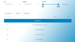
Your beautiful data deserves to be online
wpDataTables can make it that way. There’s a good reason why it’s the #1 WordPress plugin for creating responsive tables and charts.

And it’s really easy to do something like this:
- You provide the table data
- Configure and customize it
- Publish it in a post or page
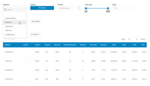
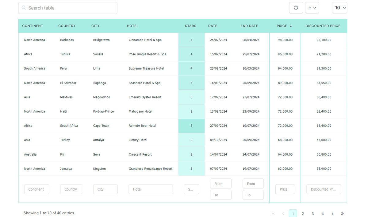
And it’s not just pretty, but also practical. You can make large tables with up to millions of rows, or you can use advanced filters and search, or you can go wild and make it editable.
“Yeah, but I just like Excel too much and there’s nothing like that on websites”. Yeah, there is. You can use conditional formatting like in Excel or Google Sheets.
Did I tell you you can create charts too with your data? And that’s only a small part. There are lots of other features for you.
Best Practices for Creating Accessible Tables
Checklist for Accessibility Compliance
Here’s a checklist for making sure your tables don’t leave anyone lost in the woods.
Essential Elements for Accessible Tables
Imagine you’re packing for a hike. You wouldn’t head out without the essentials, right? Same goes for building tables. There’s gear you need:
- Headers that know their role, marked up with
<th>tags. - Captions that give a bird’s-eye view of what the table is all about.
- Scope attributes to clarify the lay of the land, signaling if cells answer to a column or a row.
- ARIA roles and properties, when the terrain gets complex, for that extra layer of direction.
It’s less about ticking boxes, more about packing smart. Only bring what guides you to beautiful views.
Common Pitfalls and How to Avoid Them
Now, it’s easy to trip over roots on the path – pitfalls await. Some common stumblers?
Forgetting that a table needs to make sense even without those fancy visuals. Remember screen readers? They can’t interpret merged cells or decorative images that don’t say a word.
Another misstep is too much complexity – if it looks like a spreadsheet that’s swallowed another spreadsheet, you’ve gone too far.
Keep it as simple as possible, breaking larger data sets into smaller, digestible chunks. It’s the difference between a walk in the park and an obstacle course.
FAQ On Accessible Tables
What Are Accessible Tables?
Accessible tables ensure everyone can interact with data on a webpage, regardless of ability. They follow guidelines and standards to provide a barrier-free environment, particularly for users with disabilities.
Why Are Accessible Tables Important?
They’re like keys to knowledge vaults. Without them, some users face walls instead of doors, barring access to vital information needed for education, work, and everyday life.
How Do You Make a Table Accessible?
You sprinkle some HTML tag magic, toss in clear headers, a dollop of ARIA for complex structures, and ensure a proper relationship between headers and data cells. It’s a careful balance of coding and testing.
What Is ARIA?
ARIA, or Accessible Rich Internet Applications, acts as an interpreter. It fills the communication gaps between web content and user and bridges conversations with assistive technologies.
Can Tables Be Both Accessible and Visually Complex?
Yes, with a touch of elegance and a lot of thought, tables can be eye-catching and fully accessible. Complex doesn’t mean inaccessible, it just needs a clear path for all users.
What Are the Common Pitfalls in Making Accessible Tables?
The usual suspects include ignoring headers, merging cells without plan, and forgetting alternative text and summaries that guide screen reader users through data’s narrative.
How Do Screen Readers Interpret Tables?
With headers as their compass and ARIA landmarks in sight, screen readers narrate the tale of data in order, giving life to rows, columns, and all they encase.
What Tools Can Help Validate Table Accessibility?
Software that scans line-by-line, online validators that emulate screen readers, and guidelines like WCAG are the trusty sidekicks here, dissecting tables for proper accessibility form.
How Does Responsive Design Affect Table Accessibility?
Responsive design can transform a table’s accessibility on various devices. It’s essential to adapt tables so they’re as seamless on a phone as on a widescreen, without losing their accessible spark.
Where Can I Learn More About Creating Accessible Tables?
The digital world is brimming with resources—from the W3C’s treasure trove to community forums where web artisans share their blueprints and creative zeal.
Conclusion
In the tapestry of the web, accessible tables stand out as vibrant threads, integral to weaving an inclusive digital fabric. We’ve journeyed through the nuances of structuring, labeling, and enhancing tables to ensure they speak volumes to all users.
- We’ve decoded the significance of semantic HTML.
- Dissected how ARIA roles act as beacons.
- Dove into making data structures comprehensible.
Our aim? To craft an online spread where information is not just presented, but shared with clarity and intent. It’s not merely about ticking compliance boxes; it’s about embracing universal design and enriching the user experience.
As we wrap up, remember that the commitment to accessibility echoes the principles of good design – intuitive, practical, and egalitarian. Let the information on your tables flow as freely as conversation, inviting every visitor to partake with ease. That’s the essence of true accessibility, the core of digital hospitality.