Imagine sculpting the skeleton of a digital creature, its bones crafted from code, invisible yet intrinsic to its form. The HTML table headers are akin to the spine in this creature—a series of undervalued lines that give structure and meaning to the cascade of data they preside over.
Here lies the secret architecture of the web, the subtle art that elevates clarity over chaos.
Within these paragraphs, embark on a journey through the lattice of HTML5 table elements.
Unlock the potential of tags and traverse the realms of CSS styling for tables, where the aesthetic meets accessibility. A mastery of these header cells, intertwined with the ARIA labels and Schema.org semantics, does more than organize information; it champions a user’s seamless navigation through oceans of data.
Discover, woven into the narrative, the JavaScript threads that animate static cells into dynamic emissaries of interactivity.
The adventure promises enlightenment on wielding table powers responsibly—from responsiveness to cross-browser compatibility. A golden thread of knowledge awaits, ready to enhance your digital tapestry.
Table of Contents
Understanding Table Headers
The Basic Structure of Table Headers
See the Pen
HTML Table & CSS Table by Ahmad Awais ⚡️ (@ahmadawais)
on CodePen.
The <th> Element
In the realm of tabular data, a cornerstone of clarity is the unassuming <th> element. Picture a grid, a crisscrossing lattice of potential information.
Each intersection, a cell brimming with data—this is where <th> comes in, capably donning the hat of a director, orchestrating the flow of data with a mere gesture.
Attributes like scope add another layer, an unspoken whisper that deftly suggests logical relationships, binding cells in an intricate dance of context and relevance.
Attributes of the <th> Element
Now, imagine the attributes as invisible strings, deftly pulling at the corners of our cells, shaping them to our whims.
‘Colspan’ leaps forth, a dynamic entity stretching headers across the horizon of columns with ease.
‘Rowspan’ follows suit, drawing headers up and down the rows in a vertical embrace. The stage is set for the data to follow.
The Role of the <thead> Element
Grouping Header Rows
Delve into the <thead> and you’ll find a treasure trove of semantic structuring.
It’s an enclave within the larger table, a specific domain where like-minded headers reside, a sort of council of elders for the table that sets the stage for what’s to come.
Interaction with <tbody> and <tfoot>
The beauty of <thead> is in its alliance with <tbody> and <tfoot>.
Together, they forge an alliance, a tripod on which the stability of the HTML table rests.
The body flows with the bulk of data, while the foot waits patiently to conclude or summarize, an understated yet pivotal endnote.
Detailed Attributes of Table Headers
Global Attributes in Table Headers
scope Attribute
Cast your gaze upon the ‘scope’—a global attribute akin to a beacon, casting light on the path of associations between headers and the rest of the table cells.
It’s a lighthouse guiding screen readers through the murky waters, defining whether our headers mark a path along vertical columns or horizontal rows.
colspan and rowspan Attributes
And then there’s ‘colspan’ and ‘rowspan’, quintessential when tables morph from humble grids to a tapestry of nested data.
Complexity bows to their tune, allowing headers to span over rows and columns, building bridges over cells, uniting segregated data under a singular banner.
Deprecated Attributes and Modern Alternatives
Alignment Attributes (align, valign)
Once upon the web, attributes like ‘align‘ and ‘valign‘ dictated the flow of text, positioning data with an authoritarian flair.
Yet, as the times shift, these inline tyrants retreat, giving way to the democratic nature of CSS, where stylesheets reign supreme.
Style Attributes (bgcolor, width, height)
The HTML stage has evolved beyond attributes of style—like ‘bgcolor’, ‘width’, and ‘height’.
Now, CSS scripts whisper the spells to color, shape, and resize, draping tables with adaptable styles that dance fluidly across myriad devices with the grace of a seasoned ballet performer.
As the tapestry of table design unfolds, one marvels at the intricate dance of HTML and CSS.
Far from mere structural elements, they are the warp and weft that give form to the web’s pliable expanse.
Each <th> a star in the constellation of data, guiding the eye with sovereign precision. And the story goes on, the next chapter always lying just a cell away.
Styling Table Headers
CSS Techniques for Table Header Design
Text Alignment and Font Styling
See the Pen
MODERN TABLE CSS (FLAT DESIGN) from Comment Redirect Team by Vikas Chauhan (@vikasChauhan)
on CodePen.
Imagine stepping into a vast hall of data: rows stretch out like-pinstriped carpets, columns stand tall like pillars of knowledge.
At the head, the table headers look down upon the cells, guardians of context. But they don’t just stand guard; they must also invite, entice, and inform.
It’s here that CSS weaves its magic, an artist lifting the veil of blandness to reveal character.
Text alignment swings from centered grace to left-aligned candor with the ease of a style declaration.
Font styling?
A dash of font-weight: bold; and headers assert their presence. The addition of font-family adds a voice, be it the scholarly tone of Times New Roman or the modern spark of Arial.
Sizes ebb and flow with font-size, guiding the gaze from title to detail, as effortlessly as a river shapes its banks.
Background Color and Borders
The table sheathes its otherwise invisible might in colors and hues, brandished on the headers like banners on a fortress.
A quick background-color: #f2f2f2; and a new realm awakens, draped in a palette that sets the stage, be it ethereal light or a brooding abyss.
Borders? The guardians need their armor.
A border-bottom: 2px solid black; and they are ready for any onslaught of data that dares challenge their authority.
Yet it is not mere power, for with border-radius, they can choose to approach with a diplomat’s grace, their corners curved into a welcoming smile.
Responsive Design Considerations
Adapting Table Headers for Different Devices
See the Pen
Responsive Table by Trevor Nestman (@FluidOfInsanity)
on CodePen.
The world is a mosaic of screens: wide, narrow, tall, small. The tapestry of tables must fit them all, tables headers included.
They adapt, a fluid dance to the rhythm of @media queries, bending and flexing to fit from the expanse of a desktop to the confines of a smartphone.
It’s a chameleon act, fiddly, yet vital. Width becomes a percentage game, width: 25%; somehow fitting everything and nothing at the same time.
Yet, it’s the combination of min-width and max-width that spells the true game-changer, an elastic boundary that ensures dignity across devices.
Techniques for Scrollable and Fixed Headers
See the Pen
Fixed table header by Nikhil Krishnan (@nikhil8krishnan)
on CodePen.
The table goes on and on, and yet the headers must remain, a lighthouse for eyes lost in a sea of data.
Enter position: sticky; top: 0;, a spell that binds the headers to the top, unwavering even as the storm of scrolling rages below.
The scrollable narrative unfurls beneath, a never-ending story of data and cells, while the headers stand firm.
The trick is balance—ensuring the headers aren’t chains that bind but beacons that guide. With overflow: auto; encapsulated in a div, the table breathes, a living entity, as manageable as it’s vast.
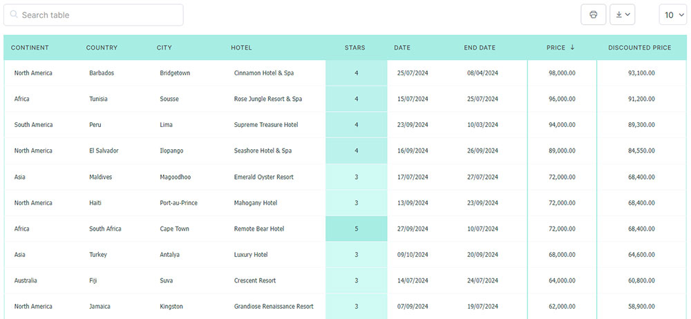
Your beautiful data deserves to be online
wpDataTables can make it that way. There’s a good reason why it’s the #1 WordPress plugin for creating responsive tables and charts.
And it’s really easy to do something like this:
- You provide the table data
- Configure and customize it
- Publish it in a post or page
And it’s not just pretty, but also practical. You can make large tables with up to millions of rows, or you can use advanced filters and search, or you can go wild and make it editable.
“Yeah, but I just like Excel too much and there’s nothing like that on websites”. Yeah, there is. You can use conditional formatting like in Excel or Google Sheets.
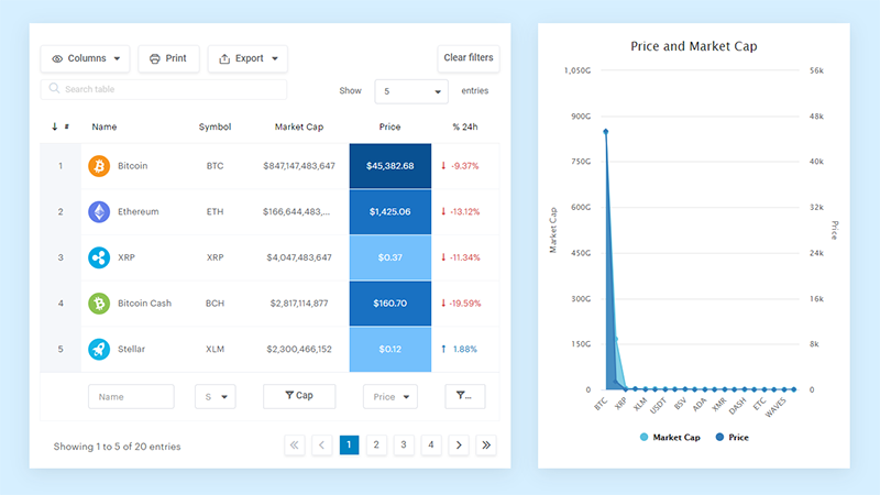
Did I tell you you can create charts too with your data? And that’s only a small part. There are lots of other features for you.
Implementing Vertical and Horizontal Headers
Vertical Table Headers
Defining Vertical Headers Using <th>
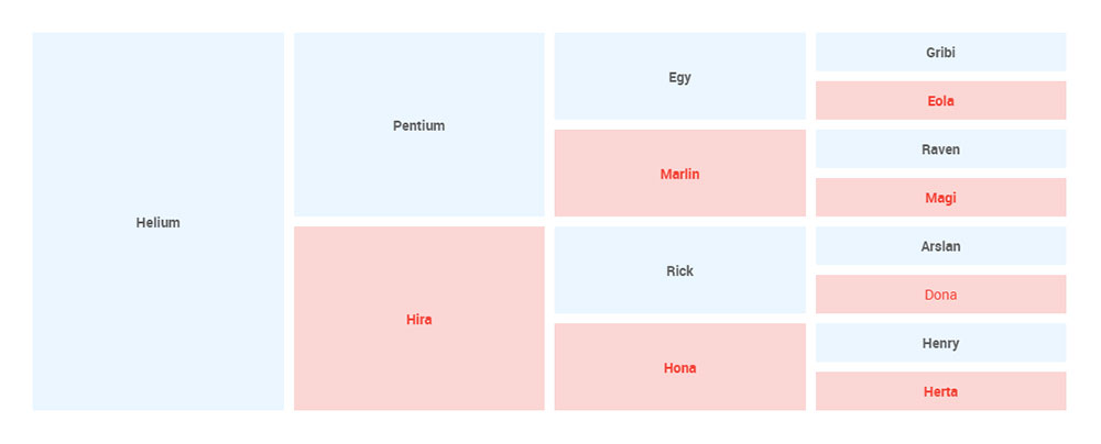
Once upon a spreadsheet, it was all about columns and rows, lines crossing at right angles creating perfect squares.
Yet, something was amiss—the headers, they yearned for more than just the horizontal realm. Enter vertical headers, a twist in the tale, where <th> elements defy gravity, standing tall along the Y-axis.
Styling these guardians of columns introduces an elegant confusion; it’s the upside-down world, where headers align next to cells, peers in the data symphony.
A sprinkle of CSS transform properties, perhaps a rotate(-90deg) or a vertical-align: bottom; and they fall in line, an honor guard for the data they introduce.
Styling Vertical Headers
Crafting vertical headers isn’t merely about taking the humble route. It’s about making them stand out in the crowd, yet not overshadowing the data they herald.
A tinge of background-color, a border that defines boundaries yet doesn’t stifle—subtle choices that speak volumes. It’s like choosing the right necktie for a tailored suit; it should complement, not compel.
Horizontal Table Headers
Utilization of colspan for Grouping Columns
Eyes meander across the table, a tableau of information laid out in a buffet of data. And there, like an organ pianist with fingers spread wide, the colspan attribute conducts a symphony, uniting columns under a single banner.
The <th> elements stretch, reaching across to embrace their cell-kind with open arms. Grouping, it seems, isn’t just for mammals.
Enhancing Readability with Horizontal Headers
In the horizontal scape, readability is king. Here, HTML table headers are not just identifiers; they are guides, a constellation of landmarks for those navigating the intricate topology of tables.
It’s a designer’s task to ensure these headers are more than just pointers; they should resonate as mnemonics, blazing forth in font weight and contrast.
Think of a marquee, letters bold and bright, drawing spectators with promises of stories untold. Headers, too, summon users with the potential of the knowledge beneath. With clean lines, optimal padding, and sharp contrasts, headers stand as beacons, ensuring every passerby not only sees but understands the silent tales the cells have to convey.
Advanced Table Header Strategies
Creating Headers for Multiple Columns and Rows
Use of colspan and rowspan for Complex Tables
Picture a table with layers, as if each row and column tells its own story. Here, single headers aren’t enough; they need to stretch and span, cover more territory, become multi-cellular behemoths. The colspan and rowspan attributes are the secret sauce. They’re like architectural columns supporting a bridge, connecting diverse pieces of data across a multidimensional space.
Within this intricate web, the role of headers expands. No longer just a simple signpost, they orchestrate a complex ballet of data alignment and association. This dance, when choreographed correctly, lends the table not just structure but a narrative, turning chaos into a well-told tale.
Example Scenarios and Implementations
Dive into a scenario where multidimensional data resembles a tightly packed metro map, each line a distinct pathway, each station a data point. A header spanning multiple columns becomes the central station, a point through which multiple pathways converge. Likewise, a header covering rows becomes a timeline, guiding viewers along a vertical journey through time or categories.
The implementation of such headers can be akin to placing a keystone in an arch. Precision is key—the correct usage of colspan and rowspan forms a gateway through which information flows seamlessly. Get it wrong, and the bridge crumbles, leaving users stranded in a maze of data.
Integrating Table Headers with Captions
The <caption> Element
See the Pen
HTML5 table caption by David Fox (@foxbeefly)
on CodePen.
There’s something about a caption that adds context to a table, much like a title gracing the cover of a novel.
Enter the <caption> element, the unsung hero, adding a layer of context atop a sea of cells. It’s not just about what the data is; it’s also about why it matters.
Positioned typically at the top, but also adaptable to reside at the foot, the caption serves a mantra of the table’s intent, whispered before the chorus of data sings.
It’s a handshake before a conversation, a nod before a performance, setting expectations with quiet confidence.
Positioning and Styling Captions
To truly integrate captions is to play with their position and attire—CSS at the ready.
With a flourish, captions can be centered, emboldened, or italicized, draped in the visual language that speaks to the thematic heart of the data they precede.
Positioning is key. To place a caption is to anchor it in a sea of information. It may hover above, a watchful guardian; or it may rest below, a thoughtful conclusion.
Styling is the magic that transforms this otherwise utilitarian element into a thread that ties the narrative together. It’s not just about crowning a table with text; it’s about crowning it with purpose.
FAQ on HTML Table Headers
What exactly are HTML table headers?
Table headers are the elements in an HTML table, significant landmarks that guide the user through a matrix of data much like signposts. Essential for accessibility, these column headers grant context in an otherwise labyrinthine dataset, making them not just decorative but functional compasses.
How do I create a header for my HTML table?
Crafting a header involves wrapping content within the <th> tag at the start of a row. Precision here sows the seeds for structured data; sprinkle CSS styling to flavor appearance, ensuring the visuals align with the context, thereby setting the stage for a robust HTML harvest.
What attributes can I use with HTML table headers?
Table headers mingle with attributes like scope, which clarifies their reign over rows or columns. Attributes like rowspan and colspan can merge cells, transforming tags into masters of their domain, expanding their embrace horizontally or vertically for a clearer hierarchy in the web page’s syntax.
Why are HTML table headers important for SEO?
SEO treasures clarity—HTML table headers sculpt a silhouette of understanding for search engines, aiding them in digesting page content. Enriched with semantic tags from HTML5 and aligned with Schema.org, headers enhance your content’s findability, feeding it into the machinery of Search making it more digestible for the algorithms.
Can I use inline CSS with HTML table headers?
Absolutely, inline CSS can dress up headers for the gala, but beware. Embedding style within the HTML can be a siren’s call, tempting yet entangling for future upkeep. External CSS styling for tables is a prudent ally, modular and maintainable—an oracle of best practices in a fast-evolving digital expanse.
How do I make table headers responsive?
Enlist CSS and its media queries as your allies; they transform static elements into a fluid dance across different screens. Responsive tables adapt with elegance, ensuring your headers never lose their poise. They are a ballet of pixels, reorienting to accommodate every change in the stage of display dimensions.
How can I ensure accessibility with table headers?
Accessibility is our silent vow to inclusivity. Embolden your header cells with scope and ARIA labels, guiding those who navigate by touch or sound. Accessible HTML tables transcend the visual, speaking in hushed tones to screen readers, thus unfurling a scroll of comprehension to all.
What is the difference between <th> and <td>?
While the <th> tag is crowned, <td> serves as loyal subjects. In the court of HTML, denotes headers, the heralds of the table, proclaiming what’s to come. <td>, the table data cells, humbly present the content itself, the flesh to ‘s skeletal framework.
How do I align table headers to the center or left?
Alignment is but a wand’s flick away; CSS styling commands cells to huddle center or align left with the mere whisper of text-align. This enforces order within the header cells, positioning each title with purpose, painting alignment across the canvas, dictated by the very code that flows beneath.
How can I improve the visual design of my table headers?
Breathe life into your styles with CSS—armor them with colors, borders, and padding. Intertwine responsive design and user experience elements to ensure a feast not just for the eyes but also for usability. A well-designed header is not just a portal of information but a tapestry woven from the threads of functionality and art.
Conclusion
In this digital tapestry where data reigns supreme, HTML table headers have emerged as pillars of structure.
They stand guardians over rows and columns, allowing visitors to navigate the sweeping lands of information with ease. The journey through the <th> tag’s realm reveals its power—headers are not mere waypoints but the very cartographers of understanding.
Embrace the whispers of CSS to dress them in finery, and heed the teachings of accessibility, bestowing passage to all sojourners of the web.
Revel in the knowledge that the proper use of these markers resonates beyond the visual, sending silent signals to search engines, amplifying your presence in the great digital library.
And so, with a blend of responsive design and user experience delicacies, you now hold the quintessence of HTML table headers—keys to crafting not just tables, but experiences.
Treasure this alchemy of code and intent: may your data forever be a beacon of clarity in the vast expanse of the Internet.