Imagine a world where complex health data transforms into crystal-clear visuals, delivering insights with the blink of an eye.
In the realm of healthcare, the power of data visualization isn’t just about pretty charts and graphs; it’s a crucial tool for improving patient outcomes, understanding epidemiological trends, and enhancing operational efficiencies.
As we dive into the sea of healthcare data visualization examples, you’ll grasp not only the how but also the why behind these sophisticated tools.
Throughout this exploration, you’ll learn to appreciate the nuances of translating raw data—be it from electronic health records or population health management systems—into actionable insights.
We’ll delve into analytics software and interactive dashboards designed specifically for healthcare environments, and uncover how these visual tools support decision-making from clinical to policy levels.
By the end of this article, you’ll come away with a deeper knowledge of the best practices in visualizing healthcare data and how it can be a game-changer in medical practices globally.
This isn’t just an overview; it’s your gateway to truly understanding the significance and implementation of health data visualization.
Healthcare Data Visualization Examples
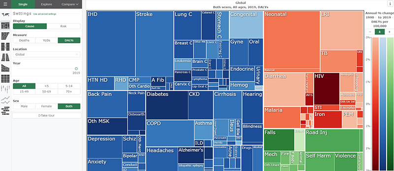
GBD Compare
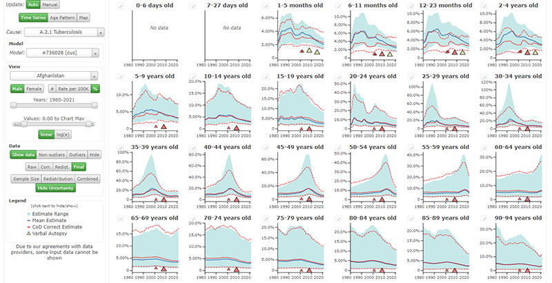
Causes of Death (COD) Visualization
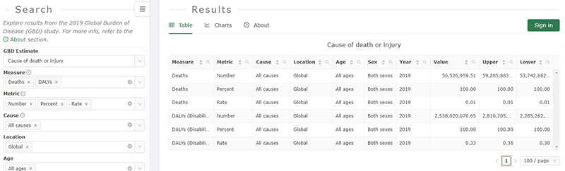
GBD Results
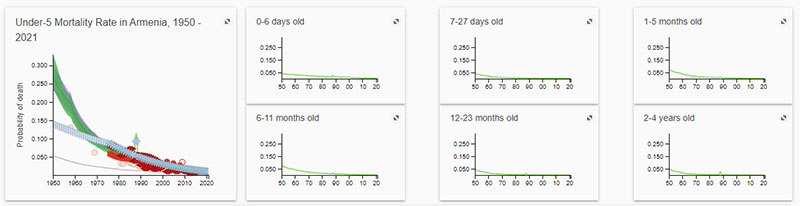
Mortality Visualization
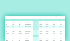
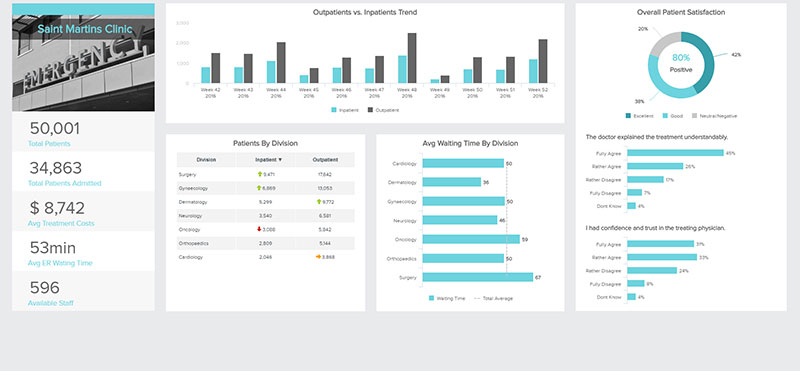
Healthcare dashboard from Datapine
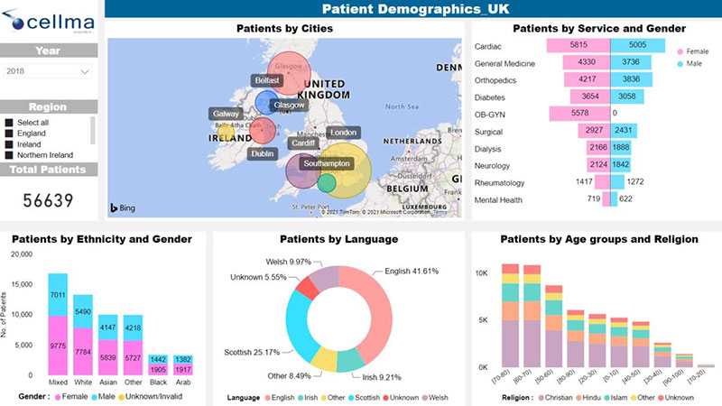
Cellma’s iDashboards
Your beautiful data deserves to be online
wpDataTables can make it that way. There’s a good reason why it’s the #1 WordPress plugin for creating responsive tables and charts.

And it’s really easy to do something like this:
- You provide the table data
- Configure and customize it
- Publish it in a post or page
And it’s not just pretty, but also practical. You can make large tables with up to millions of rows, or you can use advanced filters and search, or you can go wild and make it editable.
“Yeah, but I just like Excel too much and there’s nothing like that on websites”. Yeah, there is. You can use conditional formatting like in Excel or Google Sheets.
Did I tell you you can create charts too with your data? And that’s only a small part. There are lots of other features for you.
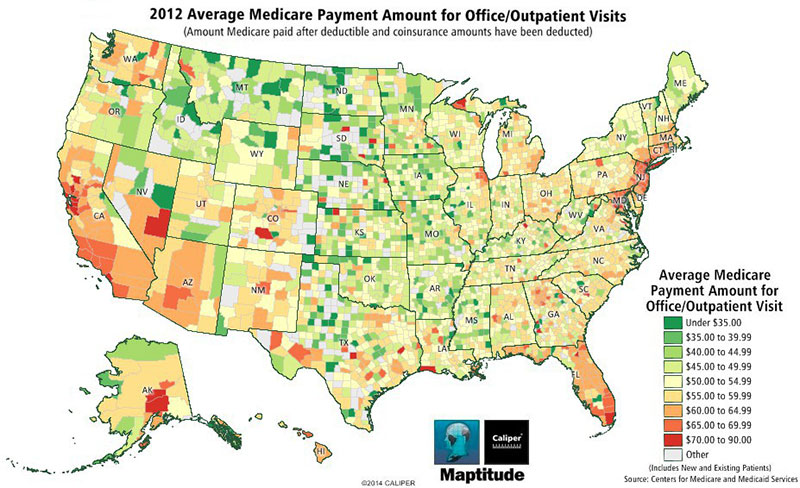
Average Medicare Payment for Office Visits
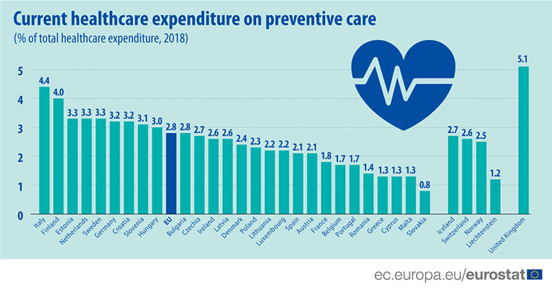
3% of healthcare expenditure spent on preventive care
The state of healthcare
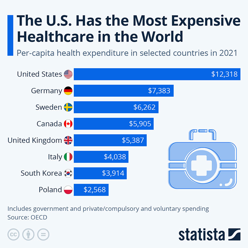
The U.S. Has the Most Expensive Healthcare in the World
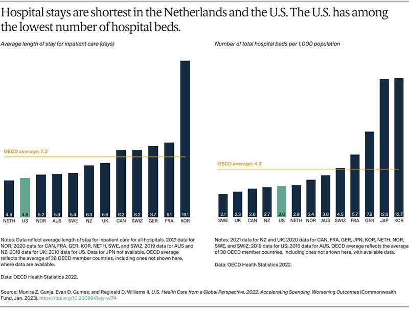
Hospital stays
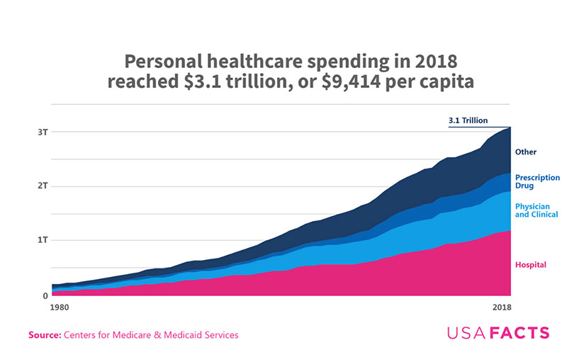
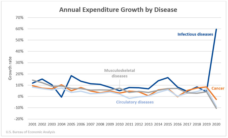
Annual expenditure analysis
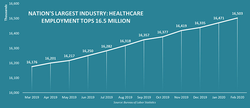
Healthcare Workforce Data
FAQ On Healthcare Data Visualization
What is healthcare data visualization?
Data visualization in healthcare transforms complex patient datasets and clinical statistics into visual formats that are easier to understand and actionable.
These visuals help in rapid decision-making and trend analysis, benefiting patient outcomes and operational efficiency.
Why is visualization important in healthcare?
Visualization plays a pivotal role by presenting data in ways that are quickly interpretable, aiding in clinical decisions, policy formulation, and resource management. It highlights patterns, trends, and anomalies, making it essential for proactive healthcare management.
What tools are used for healthcare data visualization?
Healthcare professionals often use specialized analytics software, such as Tableau, Microsoft Power BI, and Qlik.
These tools support creating interactive healthcare dashboards and detailed medical charts interpretation that explain complex data through accessible visual interpretations.
Can data visualization improve patient care?
Absolutely. By enabling the swift interpretation of complex datasets, visualization tools allow healthcare providers to more quickly understand and act on patient data, thus improving the responsiveness and personalization of patient care.
What are common examples of data visualization in healthcare?
Common examples include patient treatment progress trackers, epidemic outbreak maps, hospital performance metrics, and operational dashboards that help manage staffing and resources.
How is patient data protected in visualization processes?
Patient data protection is critical. Tools that create healthcare visualizations comply with regulations like HIPAA in the U.S., ensuring data is anonymized and encrypted to secure patient privacy and data integrity.
How can visualization influence healthcare policy?
By clearly showing trends and outcomes, data visuals can inform policy decisions, highlighting areas needing attention or adjustment—such as public health strategies or allocation of healthcare resources.
What is the future of data visualization in healthcare?
The future points toward more advanced integrations of AI and machine learning, helping to predict trends and outcomes more efficiently.
This integration will lead to even more dynamic predictive analytics in healthcare, enhancing preemptive care and resource allocation.
How does data visualization handle real-time data?
Healthcare informatics graphics are particularly adept at incorporating real-time data, updating visualizations dynamically to reflect changes immediately. This is crucial for monitoring patient vitals and hospital resource levels in real-time, ensuring timely interventions.
Are there training programs for healthcare data visualization?
Yes, numerous professional development courses and certifications focus on data visualization specifically in the healthcare sector.
These programs teach how to use clinical data visualization tools effectively and interpret complex health data for practical applications.
Conclusion
Exploring healthcare data visualization examples has unraveled the substantial impact of effective visual storytelling in medicine. From enhancing patient care to streamlining hospital operations, the tangible benefits are undeniable.
- We’ve seen how interactive healthcare dashboards foster quicker decision-making.
- We’ve recognized the vital role of clinical data visualization tools in comprehending complex patient data.
- The rise of predictive analytics in healthcare highlighted throughout this discourse underlines a future where data is not just seen but strategically anticipated.
The journey through various visualizations has reaffirmed the essential merger between data science and healthcare efficacy. As we continue to advance technologically, the promise of even more nuanced and sophisticated visualization techniques is evident. Such progress ensures that healthcare professionals are equipped not just with data, but with knowledge that is clear, actionable, and visually impactful. The evolution and implementation of these visual tools will undoubtedly continue to revolutionize patient care methodologies, healthcare policy planning, and overall medical practices.