
Imagine a world where complex data narrates vivid stories through simple visuals. That’s the transformative power of data visualization techniques, crafting clarity from chaos and making insights accessible to everyone.
Whether you’re a business leader, marketer, or data enthusiast, mastering these techniques is crucial in today’s data-driven landscape.
This article delves into the art and science of visual data representation. You’ll learn about various tools and approaches—from dynamic dashboards to interactive graphs—that cater to both novice users and seasoned analysts.
We’ll explore basic and advanced methods to effectively communicate data, enhancing user engagement and decision-making processes.
Gear up to uncover how to turn rows of data into compelling visual narratives, enhancing your analytical capabilities and making your presentations not just seen, but understood.
Table of Contents
Types of Data Visualization Techniques
Basic Visualization Techniques
Diving into the basics—they’re far from plain, matter of fact, they’re foundational! Starting off, let’s chat about the classic Charts and Graphs.
Whether it’s a bar chart showing monthly expenses, a smooth line graph tracing a website’s traffic over the year, or a colorful pie chart breaking down your favorite app’s demographic spread, these tools are essential staples in visualization.
They tell stories, compact and crisp, providing snapshots that capture the essence of data at a mere glance.
Moving onto Tables and Infographics. Tables are that reliable friend, straightforward and organized, turning confusing data into approachable columns and rows.
Infographics? They’re the fun ones, marrying data and design to educate and intrigue.
Through clever artwork and strategic layouts, they transform raw stats into engaging stories.
Let’s not forget Geospatial Visualizations. Maps aren’t just for finding treasure or your way to the nearest coffee shop; they’re potent tools that plot data in a geographic context.
Watching population growth explode in vibrant heat maps or tracking delivery routes in dynamic displays, these visualizations connect data to the physical world, making complex geographic relationships incredibly palpable.
Advanced Visualization Techniques
Now, let’s gear up for the advanced squad, where complexity meets creativity.
The Heat Maps and Tree Maps are perfect for spotting patterns and density in data. Imagine diving into website analytics with a heat map—brighter colors where users linger most.
Tree Maps, on the other hand, use nested rectangles to show hierarchical data that could represent business divisions or product categories proportionally, according to specified metrics like revenue or market share.
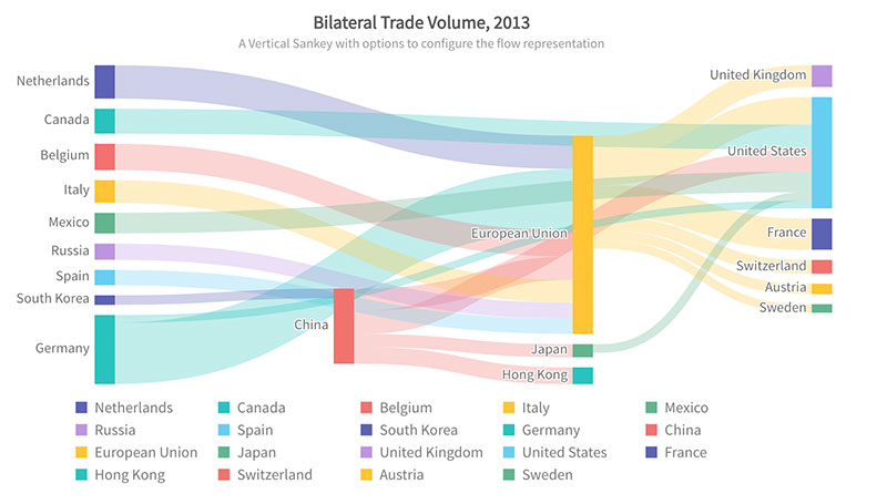
Network Diagrams and Flow Charts pave the way for understanding interactions and processes.
Whether it’s illustrating the intricate network of a telecom giant or outlining a customer’s journey through a marketing funnel, these diagrams untangle the complex web of nodes and connections.
Lastly, the fascinating world of Multidimensional and Real-time Visualizations.
Here, the data dances and evolves right before your eyes, adjusting dynamically as new data flows in.
Handling multiple dimensions unfathomable in static images, these visualizations allow us to monitor stock markets, weather forecasts, or even heart rates in real-time, offering insights that are not just current but also multidimensional.
Analysis through Visualization
Univariate, Bivariate, and Multivariate Analysis
In the realm of deep-diving into data, the approach taken can wildly vary depending on the dimensionality of the analysis.
When painting the portrait of Univariate Analysis, imagine focusing solely on one variable.
It’s like staring at a single star in the vast cosmos – direct and straightforward. With this, histograms or bar charts fit snugly, as they splendidly showcase frequency distributions or variations within a sole factor.
Shift the spotlight to Bivariate Analysis, and suddenly, there’s a dance between two variables under the limelight.
Think scatter plots or line graphs, capturing the rhythm and relationship of pairings, like age versus income. These visualizations make it possible to pinpoint correlations or discern trends that help predict behaviors or outcomes.
Now, the plot thickens with Multivariate Analysis. Here, multiple variables intermingle, providing a 3D view of data interactions, a kaleidoscope of insights.
Tools for this could range from bubble charts—where the size of the bubble adds another data dimension—to parallel coordinates, which allow the eyes to follow multiple axes of data threads simultaneously.
Choosing the Right Visualization
Choosing the right tools is more art than science sometimes—it ties back directly to the nature of the data and what story needs telling.
When paving the path for data visualization techniques, the complexity of data, as well as the audience’s familiarity with types of visual portrayals, stand as critical determinants.
Visual literacy varies widely across audiences; thus, the trick lies in matching complexity with clarity.
A financial analyst might love detailed candlestick charts in a business intelligence dashboard, but that same chart could baffle a marketing team.
For categorical data, pie charts deliver quick insights, while interconnected data could shine in network diagrams, revealing the depth of relationships through visual interpretation.
Factors like the immediacy of the needed information and the potential for real-time data feed also sculpt the decision landscape.
Real-time data streams clamor for dynamic visualizations like rolling line charts or continually updating heat maps.
Selecting visual tools is somewhat akin to picking the right spices for a meal—the choice can elevate an experience, making data not just visible but deliciously understandable.
Detailed Exploration of Popular Visualization Tools
Tools for General Users
When diving into the colorful world of data visualization, user-friendly interfaces are like the welcoming committee.
Platforms like wpDataTables, Tableau, and Power BI stand out as beacons for those less versed in code, offering a smooth entry into the visual storytelling realm.
wpDataTables excels in simplifying the process of working with tables and charts within WordPress.
This plugin transforms complex data into responsive, editable tables and charts with ease, making it ideal for users who prefer to stay within the WordPress environment.
Its strengths include quick data rendering from various sources, such as Excel, CSV, JSON, and SQL databases.
With wpDataTables, you can create dynamic and interactive data presentations without ever leaving your website, catering to both technical and non-technical users alike.
Tableau shines with its intuitive drag-and-drop interface, which lets you shuffle data elements effortlessly into stunning visuals.
Whether you’re crafting intricate dashboards or simple pie charts, it flexes to fit the narrative you need to weave, all while being robust enough to handle large datasets without a hiccup.
Switch gears to Power BI, which harmonizes beautifully with the Microsoft ecosystem, enhancing its allure for those entrenched in tools like Excel or SQL Server.
Its strengths lie in the deep dives it facilitates, turning data queries into rich, interactive reports that are not just informative but actionable.
Each tool brings to the table distinct features: Tableau’s ability to connect to virtually any data source versus Power BI’s seamless integration with other Microsoft products. The choice often boils down to your existing workflow and the specific demands of the data you’re dealing with.
Tools for Developers and Data Scientists
For those who code and those who thrive on highly customized, intricate visual setups, there are tools designed just for you. Enter the domains of FusionCharts, Sisense, and Plotly, where flexibility meets complexity.
FusionCharts comes packed with an arsenal of charts, maps, and widgets, all primed for integration into software applications.
It’s a robust library that doesn’t shy away from heavy customization, supporting a multitude of languages and data formats for a tailored fit into any developer’s project.
Sisense offers a slightly different flavor—one where data mashups and blending reign supreme, supporting data scientists in making heterogeneous data homogenous.
Its ability to provide insights via machine learning models embeds a layer of intelligence into the visualization process, turning raw data into smart, business-driven results.
Lastly, Plotly stands out with its exquisite rendering of interactive graphs. Whether you’re coding in Python, R, or another stack, it translates complex statistical computations into visually digestible graphs that are web-ready.
From predictive analytics models to real-time dashboards, Plotly ensures that the visual communication of data remains both sophisticated and accessible.
For developers and data scientists, these tools are more than just means to an end—they enable a fusion of code, creativity, and customization, providing expansive capabilities for integrating comprehensive and interactive visual elements into a diversity of applications.
Practical Application of Visualization Techniques
Industry-Specific Applications
Across various fields, the strategic deployment of data visualization breathes life into raw figures, turning them into actionable insights.
Let’s delve into how different sectors harness these tools to enhance decision-making and operational efficiencies.
In healthcare, visual tools are integral in tracking patient metrics and managing hospital resources effectively, especially when using small practice EMR systems to streamline workflows.
Imagine a hospital dashboard showcasing real-time bed availability, operation schedules, or patient vitals. Such visuals help in quick decision-making, significantly impacting patient care quality.
Switching to the realm of finance, where numbers aren’t just numbers—they’re critical data points that can predict market trends and guide investment decisions.
Financial institutions leverage complex visual interpretations like candlestick charts, risk heat maps, or asset distribution tree maps. These tools help unravel the intricate threads of financial markets, providing clarity amidst chaos.
Then there’s retail, a sector that thrives on trend analysis and consumer behavior tracking.
Through heatmap analytics of store layouts or visualizations of sales data by region, retailers can strategically place products and design marketing campaigns that resonate with diverse consumer bases.
This targeted approach not only boosts sales but also enhances customer satisfaction and loyalty.
Effective Dashboard Design
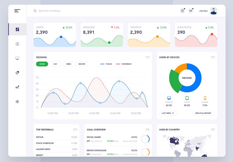
Moving onto dashboards—a centerpiece in the tableau of data visualization techniques. Crafting a functional and aesthetically pleasing dashboard is less about stuffing data and more about presenting it meaningfully.
Principles of dashboard layout and design start with simplicity.
A clean, uncluttered layout with a logical flow of information not only pleases the eye but also makes data consumption more intuitive. Employing grids and sections to categorize related data points helps maintain structure and balance.
When it comes to usability and efficiency, personalization takes the front seat.
Tailoring dashboards to user roles and needs ensures that they deliver relevant information swiftly.
Moreover, implementing interactive elements like filters or drill-down capabilities empowers users, providing them a tool that’s not just informative but also interactive.
Tips for maximizing effectiveness include consistent visual language and color usage, which aids in quick data assessment and reduces cognitive load.
Responsiveness of design ensures that dashboards are equally functional on a desktop or a mobile device, vital for on-the-go decision-makers.
Visualization Techniques and Data Interpretation
Techniques for Enhancing Data Comprehension
Navigating through data can sometimes feel like trying to read a map without a compass unless the visuals come into play to guide you through.
The intrinsic power of colors, shapes, and layout taps into our cognitive framework, enhancing comprehension at a glance.
Choosing the right colors can highlight critical data points, create groupings, or signal warnings without a single word.
Similarly, shapes can encode information, with different geometries representing different categories or magnitudes, enhancing visual discrimination.
The layout orchestrates all these elements into a coherent narrative.
Think of it as directing a play—you place every actor precisely to ensure the story unfolds smoothly without losing the audience in details. Grids, alignment, and visual hierarchy direct the viewer’s attention to what’s essential, bolstering understanding at every glance.
However, the path has pitfalls. One such is over-complication.
An overdose of creativity or complex representations can lead to confusion rather than clarity. Another common slip-up is not considering the audience’s familiarity with specific graph types or visual indicators, which can alienate rather than educate.
Balancing intricacy and simplicity is fundamental to prevent these errors, ensuring visuals are intuitive and informative.
Interactivity in Visualizations
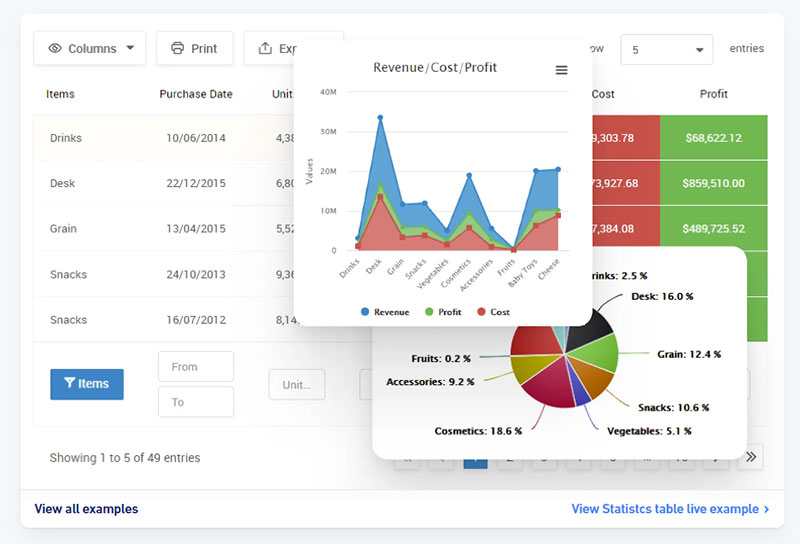
Chart created with wpDataTables
The dynamic nature of interactivity within visualizations acts as a bridge between static data and the viewer’s curiosity, offering them control over what they see and how they understand it.
By integrating interactive elements like sliders, hover effects, or clickable legends, visual tools become exploratory spaces rather than mere reports. These features invite viewers to dig deeper, filter, and correlate, turning passive observation into an active investigation.
Consider a stock market dashboard that lets users adjust the time frame, or a geographical map where clicking on a region displays specifics about sales and demographics.
Each interaction unveils more layers, enriching the user’s understanding and engagement with the data.
Interactive visualizations hence not only make information consumption more accessible but also significantly more engaging, increasing the time and depth of interaction with the data.
They allow users to tailor the information flow to fit their needs, providing personalized insights at will, which is invaluable in our fast-paced decision-driven environments.
Summarizing Complex Data with Visual Aids
Synthesizing Large Data Sets
Imagine being presented with an entire forest when all you need is a specific tree. That’s the challenge with large data sets.
Tools like clustering and dimension reduction are the machetes that help clear away the underbrush, revealing pathways through the data jungle.
Clustering groups data points with similar characteristics, making patterns identifiable at a glance.
This approach not only reduces complexity but highlights relationships and outliers within the data swamp. Next is dimension reduction, which streamlines data by removing less relevant information.
Techniques such as Principal Component Analysis (PCA) transform a multivariate dataset into fewer dimensions, preserving the essence while shedding excess weight.
These methods not only simplify the viewing but enhance comprehension by focusing on what truly matters, presenting a distilled version of the data that speaks clearly and effectively.
Visual Storytelling without Overwhelming the Viewer
The art of visual storytelling lies in finding that sweet spot between detail and digestibility. Excessive detail can drown the narrative, while too little can leave it adrift.
The key? Balancing detail and clarity. This is achieved by focusing on the core narrative and trimming the trivial, ensuring the viewer stays connected to the unfolding story without getting lost.
Using a visual hierarchy is crucial in guiding the viewer’s focus.
Elements like size, color, and placement can dictate the importance of information, guiding the viewer’s eye through the data landscape in a predetermined path. Such hierarchies are not just design choices but narrative decisions that help ensure even complex stories are received with ease.
Thus, visual summaries serve as more than just simplified representations—they are carefully crafted distillations of data that respect the viewer’s need for clarity while fulfilling their curiosity.
Your beautiful data deserves to be online
wpDataTables can make it that way. There’s a good reason why it’s the #1 WordPress plugin for creating responsive tables and charts.

And it’s really easy to do something like this:
- You provide the table data
- Configure and customize it
- Publish it in a post or page
And it’s not just pretty, but also practical. You can make large tables with up to millions of rows, or you can use advanced filters and search, or you can go wild and make it editable.
“Yeah, but I just like Excel too much and there’s nothing like that on websites”. Yeah, there is. You can use conditional formatting like in Excel or Google Sheets.
Did I tell you you can create charts too with your data? And that’s only a small part. There are lots of other features for you.
FAQ On Data Visualization Techniques
What is Data Visualization?
Data visualization is the technique of transforming data, often quantitative or statistical, into visual contexts like charts, graphs, and maps.
This practice helps to simplify complex information, making it more accessible and easier to understand for decision-making or storytelling purposes.
Why is Data Visualization Important?
It condenses large datasets into visual snapshots that enhance comprehension. Effective visualization aids in identifying trends, anomalies, and patterns faster than poring over spreadsheets or reports, allowing businesses and individuals to make informed decisions based on visualized data insights.
What Tools are Used for Data Visualization?
Common tools include Tableau, Power BI, and Google Charts for general users, while more tech-savvy individuals might use Python libraries like Matplotlib or Seaborn.
Each tool offers unique features catering to different needs, from simple pie charts to complex heat maps and interactive dashboards.
How Can I Choose the Right Visualization Type?
Choosing the right type depends on the data you have and the questions you want to answer. For instance, use line graphs for trends over time, bar charts for comparisons among categories, and scatter plots for examining relationships or distributions.
What Are the Best Practices for Creating Effective Visualizations?
Focus on clarity and simplicity. Avoid clutter and ensure your visuals are understandable at a glance by keeping design elements to a minimum.
Use color and text sparingly to emphasize key points, ensuring that each element serves a purpose in delivering the message or insight.
How Do Interactivity Enhance Data Visualization?
Interactivity allows users to engage deeply with the data, exploring different facets and drill down into specifics by clicking, hovering, or scrolling. This turns passive viewing into an active exploration, increasing retention and understanding, especially in complex datasets.
What are Common Pitfalls in Data Visualization?
Common pitfalls include overcomplicating visuals with too much information, using inappropriate chart types that can mislead or confuse the audience, and poor design choices like improper color schemes or unreadable text that detract from the data’s readability and effectiveness.
How Does Data Visualization Help in Business Decision Making?
It enables quick, informed decisions by presenting business metrics visually for easy consumption and interpretation. Trends, patterns, and outliers become apparent, helping leaders and teams to focus on what’s most important without getting lost in data minutiae.
How to Ensure Accessibility in Data Visualizations?
Ensure that your visualizations are accessible by using color-blind-friendly palettes, providing textual alternatives, and ensuring interactivity is navigable via keyboard for users with different abilities.
These practices help make sure that your visuals are inclusive and can be understood by a wider audience.
What Future Trends are Emerging in Data Visualization?
Expect advancements in AI and machine learning integration, offering more sophisticated analytical capabilities like predictive analytics visualized in real-time.
Increased customization and interactivity are likely, allowing users to create more personalized and dynamic visualizations that cater better to individual needs and contexts.
Conclusion
In wrapping up our exploration of data visualization techniques, it’s clear that the power to crystallize complex data into clear, impactful visuals is more than just an artistic endeavor—it’s a crucial strategy in today’s data-driven environment.
Harnessing tools like wpDataTables, Tableau, Power BI, and interactive dashboards transforms abstract numbers into understandable stories, making insights accessible to everyone, not just data scientists.
- From healthcare to finance, effective visual reporting influences decisions and strategies.
- Tools like heat maps, bar charts, and scatter plots are not just representations but navigational aids that drive businesses towards better outcomes.
Embrace these visuals, and you leverage the significant ability to communicate the hidden language of data, ensuring it speaks effectively to its audience.


