
Ever tried squeezing an elephant into a mini-fridge? Well, getting data tables to play nice on mobile feels a bit like that at times. Mobile-friendly tables aren’t just a good-to-have; they’re the heartbeat of modern web design.
In a world where folks are glued to their phones more than ever, presenting data that’s both sleek and functional on a tiny screen is a wild ride.
Think about it – countless businesses, creatives, and coffee-shop thinkers depend on crystal clear tables to get their point across. The challenge? Making these tables responsive, readable, and, yep, kinda sexy.
By sticking with me through this piece, you’ll dive into the ins, outs, and maybe a few loop-de-loops of crafting tables that not only fit your phone but also elevate the entire user experience.
Table of Contents
Unraveling the Challenges
Ah, so you’re keen on making your tables rock on mobile devices? Great, let’s dive deep into the puddle of challenges that might trip us up first.
Constraints of mobile screens
Mobile screens can be such divas, right? Always demanding attention.
Screen size and resolution challenges
Mobiles come in all sizes and shapes. Some are big and some, well, tiny. And each one wants to show your table.
But cramming all that info into such a small space? That’s the real brain teaser.
Touchscreen interaction nuances
Fingers are chunky. They’re not as precise as the cool mouse pointer. So, when designing mobile-friendly tables, you need to give some room for those chubby fingers to play.
Make buttons big enough, space out elements, and make sure there’s no accidental tap on something else when you’re trying to hit a different button.
Data presentation dilemmas
Here’s where things get a tad dramatic.
Balancing information density
You want to show everything, but remember, less can be more. Especially on mobile. It’s a balancing act.
One the one side, you’ve got loads of data. On the other, you have a screen that’s like, “Nope, not gonna fit.” So, tweak, adapt, and get creative!
Ensuring data legibility
Squinting is for spotting celebrities in the distance, not for reading tables. So, the info on your table?
It should pop. Be clear. Be bold. Yet, be simple. No one wants to feel like they’re decoding hieroglyphics.
Decoding the Mobile User’s Mindset
Alright, we’ve tackled the big techy challenges. Now, let’s get into the minds of our users. A bit like Sherlock, but cooler.
Patterns in mobile browsing behavior
People on mobiles are on-the-go. Quick peeks, shorter attention spans, and a lot of swiping and tapping.
They might be on a train, in a cafe, or, let’s be real, in the bathroom.
They want their info and they want it fast. Your mobile-friendly tables? They should dance to this rhythm.
User expectations from mobile data tables
Imagine going to a magic show and seeing no tricks. That’d be lame, right? Mobile users have their own set of magic they expect. They want clarity, speed, and simplicity.
All served on a neat, mobile-friendly table.
Striking the balance: Information vs. Simplicity
It’s like choosing between a double chocolate fudge cake and a salad. Both are great, but for different reasons. Information is the cake. It’s rich, heavy, and oh-so-good.
Simplicity is the crisp salad. Light and refreshing. Marry the two? You’ve got a winning combo. Your mobile-friendly tables should make users feel they’re having their cake and eating it too. In a salad bowl.
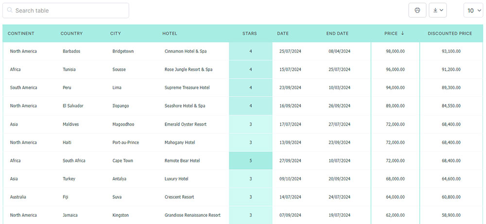
Your beautiful data deserves to be online
wpDataTables can make it that way. There’s a good reason why it’s the #1 WordPress plugin for creating responsive tables and charts.
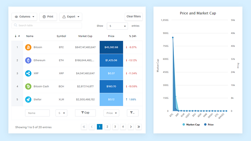
And it’s really easy to do something like this:
- You provide the table data
- Configure and customize it
- Publish it in a post or page
And it’s not just pretty, but also practical. You can make large tables with up to millions of rows, or you can use advanced filters and search, or you can go wild and make it editable.
“Yeah, but I just like Excel too much and there’s nothing like that on websites”. Yeah, there is. You can use conditional formatting like in Excel or Google Sheets.
Did I tell you you can create charts too with your data? And that’s only a small part. There are lots of other features for you.
Core Design Principles for Mobile Tables
Alright, let’s dive into the deep end. The core stuff, the backbone of making those tables look fab on mobile.
Data prioritization
Ah, the art of picking favorites! With mobile screens, it’s all about choosing what stands out and what takes a back seat.
Highlighting key information
Imagine you’re telling your bestie the juiciest piece of gossip. You don’t start with the weather, right? Dive straight into the good stuff.
Similarly, with mobile-friendly tables, push the most essential, can’t-miss data to the front. Let it shine!
Eliminating redundant data
Now, if you’re anything like me, you’ve got a closet full of stuff you never wear. Time for a clear-out! Think of your table in the same way. Strip out the fluff and leave only the showstoppers. It’s all about decluttering.
Adaptive design strategies
Flexibility is the name of the game. Whether it’s yoga or mobile-friendly tables, being able to bend without breaking is essential. Collaborating with UI UX companies can help ensure your design is both adaptable and user-friendly.
Responsiveness across devices
Phones are like snowflakes. No two are the same. Your table should look dashing, whether it’s on a tiny old-school mobile or the latest mega-screen gadget. It’s gotta adapt and fit in, no matter where it’s viewed.
Dynamic adaptability to content
Ever tried on an outfit, loved it, but then switched shoes and suddenly it’s all wrong? Yep, content can be that fussy.
Your mobile-friendly tables need to jive with the data they’re displaying, changing their groove based on the content.
Innovative Design Solutions
Here’s where we unleash our inner unicorns. Let’s get wild and think outside the box.
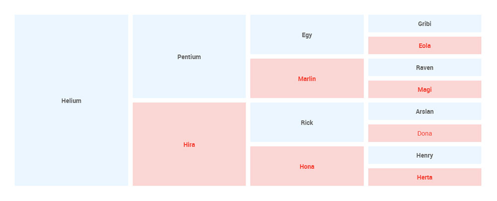
Collapsed and Stackable Tables
Alright, bear with me. Picture your table like a multi-layered sandwich. On a mobile screen, we might need to unstack that sandwich and lay it out flat so you can see all the yummy fillings. Makes sense?
Benefits of dense data presentation
Packing in the data, without making it feel cramped? It’s an art. With collapsed and stackable designs, you get to see everything you want without the mess.
It’s like fitting a week’s worth of outfits in a tiny suitcase. Magic, right?
Use cases and implementation
Okay, let’s talk real-life. Say you’re booking a flight. You wanna see the dates, prices, stops – all of it. But all neatly.
Stackable tables do just that, showing you everything, but without overwhelming your screen.
Movable Tables
Slide left. Slide right. It’s not a dance move; it’s how movable tables groove!
Catering to wide datasets
Think panoramic photos, but for data. Sometimes, you have loads of stuff to show, and scrolling vertically just won’t cut it. Enter movable tables. Slide through the data without missing a beat.
Enhancing user navigation
Ever been lost in a giant mall? Movable tables are like those “You Are Here” maps. They let you know where you are, help you find where you want to go, and make sure you enjoy the ride.
User-Centric Tables
We’re all unique. Snowflakes, remember? Your mobile-friendly tables should treat every user like the unique gem they are.
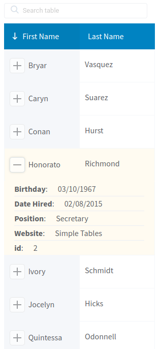
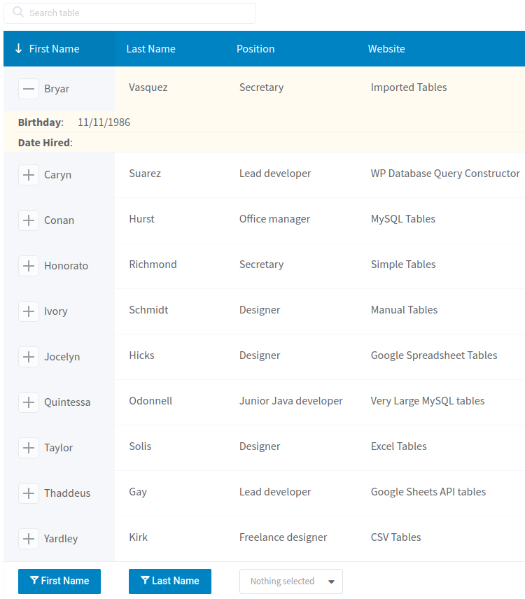
Personalized views and controls
Remember when mixtapes were a thing? Handpicked songs, just for you. Imagine if tables did that.
Showing you exactly what you wanna see, the way you wanna see it.
Dynamic content based on user preferences
It’s like walking into a room and the music switches to your favorite song. Your tables should vibe with the user.
If they’re all about numbers, show them the digits. If they’re visual, maybe some neat graphs. Tailored perfection!
Enhancing Visual and Interactive UX
Let’s paint a picture. No, really. Let’s visualize the ideal way mobile-friendly tables should appear and feel on our screens.
Typography considerations
Fonts, they’re like the mood ring of the web. They set the tone.
Font selection and size
So, I’ve got this buddy who wears outfits louder than a rock concert. Crazy patterns and all. But then another friend? All about minimal chic. Fonts are kinda the same.
Some scream at you, while others whisper. Depending on the vibe of your table, pick a font that matches. Too big and it feels shouty. Too small and it’s like trying to hear a whisper at that rock concert.
Ensuring readability and clarity
It’s all about that clear, crisp look. Like looking out on a sunny day after it rained. Your data should be legible, like reading the titles of your favorite songs on a playlist.
Visual cues and indicators
It’s a bit like breadcrumb trails or, you know, when your game character finds those shiny coins guiding the path?
Visual cues are the shiny coins of mobile-friendly tables.
Signposting for navigation
Getting lost on a website is no fun. Ever been on a wild goose chase trying to find that one elusive piece of info?
Yeah, no bueno. Visual signposts, like bold headers or icons, can be like your North Star. Keeping you on track and guiding you through the sea of data.
Icons, colors, and visual hierarchy
Picture a rainbow. All those colors, layered perfectly. Your table? It should be the same. Certain parts pop, while others blend.
Using colors wisely can set a hierarchy. As for icons? They’re the cherries on top, giving an extra oomph of clarity.
Interactive elements
Interactivity. It’s the difference between watching a movie and being in a video game. One is passive, the other? You’re in the driver’s seat.
Touch-friendly controls
Those clunky buttons that feel like trying to push a door that says pull? A total no-go. On mobile, everything should feel smooth. Like swiping through your fave pics.
Make controls big, tactile, and buttery smooth.
Feedback mechanisms for user actions
Ever shouted into a canyon and waited for the echo? That’s feedback. When someone interacts with your mobile-friendly tables, they wanna know the table “heard” them.
Maybe it’s a subtle color change, a tiny vibration, or a fun animation. Give that nod of acknowledgment.
FAQ On Mobile Friendly Tables
Why the fuss over mobile-friendly tables?
Seriously, why all the buzz about tables on mobile? Well, mobile isn’t the future. It’s the now.
With more than half the globe accessing info on their smartphones, your data needs to be snazzy and functional. If tables look wonky or are hard to navigate, you risk losing viewers faster than ice melts in the sun.
Aren’t all tables mobile-friendly by default?
You’d think, right? But nah. Most standard tables won’t auto-magically adjust to smaller screens.
They’re designed for bigger landscapes, like desktops. Going mobile-friendly means tweaking and tuning to ensure they look fabulous on phones.
What’s the biggest challenge with these tables?
Size matters! Mobile screens are tiny real estate. Making a table that’s clear, legible, and doesn’t require the ol’ pinch-zoom dance?
That’s the game. Plus, add in touchscreen navigation, and you’ve got yourself a jigsaw puzzle.
Can’t I just squish everything?
Tempting, huh? But squishing data only gets you squinty-eyed users. Mobile-friendly tables need more than just a resize.
Think rearranging, collapsing columns, or switching to a card layout. It’s a whole reimagining, not just a squeeze.
Do these tables work on all phones?
One word: Responsiveness. It’s what makes your table morph and adapt like a chameleon to different devices.
With proper design, your table should dance smoothly from iPhones to Androids and everything in-between.
What about tablets?
Oh, those limbo devices! Not quite a phone, not quite a computer. But fear not! A well-designed mobile-friendly table should look stellar on tablets too.
It’s all about fluid design, baby.
How do I make sure they’re user-friendly?
It’s a mix. Consider finger tap zones (nobody wants to accidentally click the wrong thing), legibility, and swift load times.
Remember, user experience is king. If it’s smooth as butter and clear as day, you’re golden.
Can I get creative with design?
Heck yes! It’s not just about functionality. Add a sprinkle of personality with icons, colors, and custom typography.
But remember, creativity should enhance clarity, not hinder it.
Are there tools to help me out?
You betcha! There are loads of plugins and frameworks out there ready to lend a hand. They can be a lifesaver, especially if coding isn’t your jam.
Dive into the ecosystem and find what fits your vibe.
How do I keep up with mobile table trends?
Ah, the world of design. Always shifting, always evolving. Stay in the loop with web design blogs, forums, and courses. Keep an eye on user behavior too. After all, they’re the ones swiping and tapping. Stay curious, and you’ll be ahead of the game.
Conclusion on mobile-friendly tables
There’s no dancing around it, mobile-friendly tables are the unsung heroes of the digital age.
They’ve transformed from being these clunky, static entities to dynamic dynamos, bridging the gap between complex data and smooth, on-the-go accessibility.
We’ve journeyed through their evolution, challenges, and the nitty-gritty of their design.
- Now? Every time you see data seamlessly blend into the confines of your mobile screen, give a little nod to these adaptable wonders.
- Keep in mind, the mobile landscape is ever-shifting, like sand dunes in a desert storm. So, staying updated, staying curious is the name of the game.