Creating an HTML table with a fixed header and scrollable body is a powerful technique that can dramatically enhance data presentation on a website.
This approach not only improves the user experience but also makes your web development projects look professional and function smoothly. Imagine effortlessly navigating through extensive tabular data without losing sight of crucial headers.
In today’s fast-paced digital landscape, mastering the art of embedded tables with scroll capabilities is non-negotiable. Whether you’re presenting complex datasets or simply organizing lists, a scrollable table body ensures data remains accessible and readable.
You’ll not only learn how to structure and style your tables using HTML and CSS but also grasp critical concepts such as responsive design and fixed positioning.
Basic Concepts and Terminology
HTML Table Structure
Tables are a foundational element in web development. They organize data neatly and logically.
When we dive into creating a table, it’s crucial to grasp the essential elements and attributes. Here’s what you need to know:
Elements: <table>, <thead>, <tbody>, <tfoot>, <tr>, <th>, <td>
<table>: This is the outer container, the framework.<thead>: Houses the table’s header row.<tbody>: Contains all the body rows, where the bulk of data resides.<tfoot>: Often overlooked, it holds footer rows for summarizing data.<tr>: Defines a row in the table, within either<thead>,<tbody>, or<tfoot>.<th>: A header cell—bold and centered by default.<td>: A standard cell containing data.
Attributes: colspan, rowspan, scope
Attributes breathe life into these elements, giving them flexibility and meaning.
colspan: Makes a cell span multiple columns.rowspan: Allows a cell to stretch across several rows.scope: Clarifies header-cell relationships for screen readers, enhancing accessibility. It can be set tocol,row,colgroup, orrowgroup.
CSS Properties for Table Styling
Moving beyond structure, CSS steps in to style our table, ensuring a slick and responsive design.
position: sticky
The sticky position allows elements to stick within their container relative to the user’s scroll position. For tables, this property is magical. Applying position: sticky to <th> elements keeps headers visible as you scroll through rows of data.
overflow
Overflow controls the scrolling behavior. By setting overflow: auto or overflow: scroll on the table’s wrapper, we can create scrollable sections, maintaining visibility of the header while the body scrolls.
border-collapse
This property merges adjacent cell borders into a single border, preventing double lines and creating a neater appearance. Setting border-collapse: collapse on your table results in a sleek, integrated look.
table-layout
Defines the algorithm used to lay out table cells, rows, and columns. The table-layout: fixed property, in particular, makes the rendering faster and more predictable by fixing the table’s width according to the first row.
JavaScript Enhancements
While CSS handles appearance, JavaScript kicks in for dynamic behavior. Here, we’ll focus on two essential enhancements.
window.onscroll Event
This event is a powerhouse for dynamic web interactions. For tables, particularly those with fixed headers, the window.onscroll event can add or remove classes based on the scroll position—providing more granular control over the header’s behavior.
Adding and Removing Classes Dynamically
By leveraging JavaScript, we can toggle classes dynamically on elements. For instance, as the user scrolls, we might add a “sticky-header” class to keep the table header fixed. This technique is especially useful for creating interactive, responsive web designs where CSS alone isn’t enough.
Approach 1: Using Pure CSS
HTML Structure
So, as we embark on our CSS-only journey, let’s first set the stage with our HTML structure. It all starts with a basic layout and a touch of preemptive styling for clarity.
Basic Table Layout
Imagine you’re laying down the bones of your table:
<table class="fixed-header">
  <thead>
    <tr>
      <th>Column 1</th>
      <th>Column 2</th>
      <th>Column 3</th>
    </tr>
  </thead>
  <tbody>
    <tr>
      <td>Row 1, Cell 1</td>
      <td>Row 1, Cell 2</td>
      <td>Row 1, Cell 3</td>
    </tr>
    <tr>
      <td>Row 2, Cell 1</td>
      <td>Row 2, Cell 2</td>
      <td>Row 2, Cell 3</td>
    </tr>
    <!-- More rows as needed -->
  </tbody>
</table>
A few <tr> and <td> tags, and voilà! You’ve got the basic layout. But wait, we’re not stopping here.
Adding Classes for Styling
The magic ingredient? Classes. Simple, yet effective:
<table class="fixed-header">
  <thead class="header">
  <!-- What's inside goes here -->
  </thead>
  <tbody class="scrollable">
  <!-- Rows and cells go here -->
  </tbody>
</table>
These classes (like fixed-header, header, scrollable) will help us target and style the specific sections. It’s like giving each part a unique role in a play.
CSS Styling
Now that the stage is set, let’s bring in the spotlight with some CSS styling. This is where your table starts dressing for the occasion.
Styling the Header
First off, the header. Bold and ready to stick:
.header th {
  background-color: #f4f4f4;
  font-weight: bold;
  padding: 10px;
}
Making the Header Sticky
Time for the real deal—the stickiness:
.fixed-header thead {
  position: sticky;
  top: 0;
  z-index: 1; /* Keep it on top of other rows */
}
This keeps the header in view as you scroll through the data. No ninja moves here, just simple CSS.
Enabling Scrollable Body
Let the body breathe with a scroll:
.scrollable {
  display: block;
  overflow-y: auto;
  max-height: 300px; /* Adjust based on your design needs */
}
Your table now starts to look like a sophisticated, responsive grid of data, fit for displaying everything from simple lists to complex datasets.
Example and Code Implementation
Okay, talk is cheap. Let’s see the whole shebang in action with a sample code snippet:
<!DOCTYPE html>
<html lang="en">
<head>
  <meta charset="UTF-8">
  <meta name="viewport" content="width=device-width, initial-scale=1.0">
  <style>
    table {
      width: 100%;
      border-collapse: collapse;
    }
    .header th {
      background-color: #f4f4f4;
      font-weight: bold;
      padding: 10px;
    }
    .fixed-header thead {
      position: sticky;
      top: 0;
      z-index: 1;
    }
    .scrollable {
      display: block;
      overflow-y: auto;
      max-height: 300px;
    }
  </style>
</head>
<body>
  <table class="fixed-header">
    <thead class="header">
      <tr>
        <th>Column 1</th>
        <th>Column 2</th>
        <th>Column 3</th>
      </tr>
    </thead>
    <tbody class="scrollable">
      <tr>
        <td>Row 1, Cell 1</td>
        <td>Row 1, Cell 2</td>
        <td>Row 1, Cell 3</td>
      </tr>
      <tr>
        <td>Row 2, Cell 1</td>
        <td>Row 2, Cell 2</td>
        <td>Row 2, Cell 3</td>
      </tr>
      <!-- More rows as needed -->
    </tbody>
  </table>
</body>
</html>
Explanation of Each Step
Every piece of the code has a role. Here’s the rundown:
- The
<head>section: Sets up basic styling. - The
tablestructure: Defines the framework. position: sticky;on the<thead>: Makes the header stay put while scrolling..scrollableclass: Enables scrolling in the body without affecting the header.
By understanding these elements, attributes, and styles, you not only master how to create an HTML table with a fixed header and scrollable body but also gain the power to handle larger data sets with ease, ensuring both responsive design and a killer user experience.
Approach 2: Using jQuery
HTML Structure
When the canvas is HTML, and the brush is jQuery, the synergy can make something as mundane as a table quite spectacular. Let’s dive into the nitty-gritty starting with our HTML structure.
Table Layout with ID and Class Selectors
Imagine your table as a concert stage, with IDs and classes acting as the spotlights, illuminating the key performers.
<table id="myTable" class="scrollable-table">
  <thead>
    <tr>
      <th>Header 1</th>
      <th>Header 2</th>
      <th>Header 3</th>
    </tr>
  </thead>
  <tbody>
    <tr>
      <td>Item 1</td>
      <td>Item 2</td>
      <td>Item 3</td>
    </tr>
    <tr>
      <td>Item 4</td>
      <td>Item 5</td>
      <td>Item 6</td>
    </tr>
    <!-- Add more rows as needed -->
  </tbody>
</table>
IDs like #myTable give you pinpoint precision, while classes like .scrollable-table allow you to paint with broader strokes across similar elements on your webpage.
jQuery for Header Fixation
Here is where things get twisty. The jQuery magic begins. First up, selecting the table header.
Selecting the Table Header
Select it like you mean it:
$(document).ready(function() {
  var $header = $('#myTable thead');
  // Rest of the jQuery code goes here
});
That $header variable holds a world of potential. It’s your magic wand, selecting the <thead> of #myTable.
Applying Sticky Position via jQuery
Next, sprinkle some sticky potion on it:
$(document).ready(function() {
  var $header = $('#myTable thead');
  $(window).on('scroll', function() {
    if ($(this).scrollTop() > $header.offset().top) {
      $header.addClass('sticky');
    } else {
      $header.removeClass('sticky');
    }
  });
});
Here, as the user scrolls, we track their vertical position and toggle the “sticky” class—a class we’ll define using CSS in a bit.
Example and Code Implementation
Theory without practice is just daydreaming. Let’s implement a complete example with all the bells and whistles.
Sample Code Snippet
Here’s the codebase, mingling HTML, CSS, and jQuery:
<!DOCTYPE html>
<html lang="en">
<head>
  <meta charset="UTF-8">
  <meta name="viewport" content="width=device-width, initial-scale=1.0">
  <style>
    .scrollable-table {
      width: 100%;
      border-collapse: collapse;
    }
    .scrollable-table thead th {
      background: #f0f0f0;
      padding: 10px;
    }
    .scrollable-table tbody td {
      padding: 10px;
    }
    .sticky {
      position: fixed;
      top: 0;
      background: #fff;
      z-index: 1000; /* Ensuring it stays on top */
    }
  </style>
</head>
<body>

<table id="myTable" class="scrollable-table">
  <thead>
    <tr>
      <th>Header 1</th>
      <th>Header 2</th>
      <th>Header 3</th>
    </tr>
  </thead>
  <tbody>
    <tr>
      <td>Item 1</td>
      <td>Item 2</td>
      <td>Item 3</td>
    </tr>
    <tr>
      <td>Item 4</td>
      <td>Item 5</td>
      <td>Item 6</td>
    </tr>
    <!-- Add more rows as needed -->
  </tbody>
</table>

<script src="https://code.jquery.com/jquery-3.6.0.min.js"></script>
<script>
  $(document).ready(function() {
    var $header = $('#myTable thead');

    $(window).on('scroll', function() {
      if ($(this).scrollTop() > $header.offset().top) {
        $header.addClass('sticky');
      } else {
        $header.removeClass('sticky');
      }
    });
  });
</script>

</body>
</html>
Sleek, right? Here’s a breakdown of our masterpiece:
Explanation of Each Step
- HTML Layout: The fundamental structure with IDs and classes, anchoring our scripts and styles.
- CSS Styling: Defines the aesthetic—creating scrollability, padding, and the sticky class.
- jQuery Magic: We start by waiting for the document to be ready. Then, we define the
$headervariable holding our table’s<thead>. Finally, we use the scroll event to toggle the “sticky” class based on the user’s scroll position.
This completes the narrative on how to use HTML, CSS, and jQuery in harmony, allowing you to create an HTML table with fixed header and scrollable body that doesn’t just display data, but does so with elegance and functionality.
Advanced Techniques
Enhancing Table Aesthetics
We want our tables not just functional, but eye-catching. Let’s dive into the art of enhancing table aesthetics. Think of it as dressing our table in its Sunday best.
Adding Borders
Borders can make or break a table’s visual appeal. Adding them is like drawing lines on a map—clarity at its finest.
table, th, td {
  border: 1px solid #ddd;
  border-collapse: collapse;
}
A dash of border-collapse smooths out any rough edges, making your table look seamless. It’s like turning a rough sketch into a polished blueprint.
Styling Table Rows and Columns
Alright, let’s add some flair to those rows and columns. Different strokes for different folks—and tables.
Apply alternating row colors for that chic zebra look:
tbody tr:nth-child(odd) {
  background-color: #f9f9f9;
}

tbody tr:nth-child(even) {
  background-color: #fff;
}
Bam! Instant sophistication. Borders in place, now alternating row colors give depth and style. Columns can sport their own personality too:
th, td {
  padding: 12px;
  text-align: left;
}
Padding adds breathing space. Alignment keeps things neat and tidy. Now your table is not just read, it’s admired.
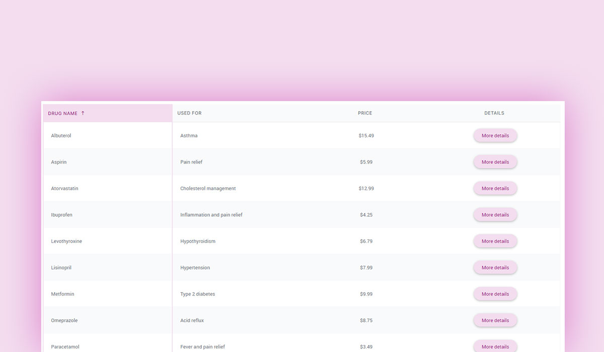
Your beautiful data deserves to be online
wpDataTables can make it that way. There’s a good reason why it’s the #1 WordPress plugin for creating responsive tables and charts.
And it’s really easy to do something like this:
- You provide the table data
- Configure and customize it
- Publish it in a post or page
And it’s not just pretty, but also practical. You can make large tables with up to millions of rows, or you can use advanced filters and search, or you can go wild and make it editable.
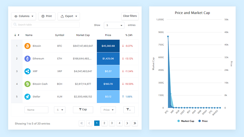
“Yeah, but I just like Excel too much and there’s nothing like that on websites”. Yeah, there is. You can use conditional formatting like in Excel or Google Sheets.
Did I tell you you can create charts too with your data? And that’s only a small part. There are lots of other features for you.
Handling Large Data Sets
When tables swell with data, things can get messy. Efficiency becomes the game’s name. Handling large data sets is like farming—efficient tools and methods make all the difference.
Efficient Data Loading Techniques
Instead of drowning users in data, serve it in digestible chunks. Lazy Loading to the rescue!
$(window).on('scroll', function() {
  if ($(window).scrollTop() + $(window).height() > $(document).height() - 100) {
    // Load more data here
  }
});
Here, JavaScript watches your scroll, loading more data as needed. It’s like the buffet that replenishes itself just as you’re getting another plate.
Pagination within Tables
Break it down further. Paging through data makes it manageable and less overwhelming.
<div class="pagination">
<a href="#">«</a>
<a href="#">1</a>
<a href="#">2</a>
<a href="#">3</a>
<a href="#">4</a>
<a href="#">»</a>
</div>
And the CSS:
.pagination a {
  color: black;
  padding: 8px 16px;
  text-decoration: none;
}

.pagination a.active {
  background-color: #4CAF50;
  color: white;
}

.pagination a:hover:not(.active) {
  background-color: #ddd;
}
Pagination divides your kingdom into provinces, each a manageable piece. Users navigate seamlessly, data loads efficiently, and performance issues fade away.
Responsive Table Design
Tables must flex and adapt. Today’s users are on desktops, tablets, and phones. Responsive design ensures your table looks dapper everywhere.
Making Tables Mobile-Friendly
A desktop-first table can become a mobile menace. Simplify and rearrange for smaller screens.
@media screen and (max-width: 600px) {
  table, thead, tbody, th, td, tr {
    display: block;
  }

  thead tr {
    display: none;
  }

  tr { margin-bottom: 15px; }

  td {
    text-align: right;
    position: relative;
    padding-left: 50%;
  }

  td:before {
    content: attr(data-label);
    position: absolute;
    left: 0;
    width: 50%;
    padding-left: 15px;
    font-weight: bold;
  }
}
Here, rows stack on small screens, and headers transform into labels, making navigation intuitive. It’s like transforming a grand banquet into a cozy café setting, without losing an ounce of functionality.
Using Media Queries for Different Screen Sizes
Media queries are the tailors of web design. They snip and stitch, making tables fit every device like a custom suit.
@media screen and (min-width: 601px) and (max-width: 1024px) {
  table {
    /* Tablet-specific styles */
  }
}

@media screen and (max-width: 600px) {
  table {
    /* Mobile-specific styles */
  }
}
Each screen size gets a bespoke style. No more squinting or endless scrolling. Just a beautifully adaptive table.
These advanced techniques elevate your table game. Whether it’s adding borders, handling massive data sets, or ensuring a responsive design, the journey to create an HTML table with fixed header and scrollable body is both an art and science.
Practical Examples
See the Pen
Fixed table header by parth goyal (@1508)
on CodePen.
See the Pen
Fixed Table Header by Oisin Conolly (@OACDesigns)
on CodePen.
See the Pen
Pure CSS Fixed Header Table by Kiana Greene (@yaykiana)
on CodePen.
See the Pen
Table Sticky Header by Robin Rendle (@robinrendle)
on CodePen.
See the Pen
CSS Sticky Table Header and Column by Mike Golus (@mikegolus)
on CodePen.
FAQ On Create An HTML Table With Fixed Header And Scrollable Body
How do I create a fixed header in an HTML table?
To create a fixed header, you’ll need to use CSS. Apply the position: sticky; property to the <thead> element and set it to top: 0;. This ensures the header sticks at the top of the window when scrolling. Make sure your table layout is designed accordingly.
What CSS properties are necessary for a scrollable body?
To make the table body scrollable, apply overflow-y: auto; to the container holding your table. Fix its height with height: [desired height];. This combination allows the body to scroll while the header remains fixed. Use the right CSS properties for seamless integration.
Can I use pure HTML to achieve this functionality?
No, pure HTML alone isn’t enough. You’ll need to rely on CSS for positioning and JavaScript if more dynamic behavior is required. HTML gives the structure, but CSS handles the visual behavior, ensuring your table’s header remains fixed.
Is JavaScript required to fix the table header?
Not necessarily. You can fix the header using CSS alone with the position: sticky; property. However, if you need additional functionality like handling dynamic content adjustments, JavaScript can be useful. It depends on your project’s requirements.
How do I ensure compatibility across different browsers?
Ensure you use cross-browser compatible CSS properties, and keep in mind browser prefixes like -webkit- for older browsers. Testing your implementation in multiple browsers (Chrome, Firefox, Safari) is crucial to guarantee a consistent look and feel.
What are common issues developers face when implementing this?
Common issues include mismatching column widths between the fixed header and scrollable body, misalignment, and responsiveness concerns. Properly setting the width of both header and body cells and ensuring they match is essential. Use consistent styles.
How can I maintain the table’s responsiveness?
To maintain responsiveness, use CSS media queries and relative units like percentages. Make sure the table adapts to different screen sizes by setting width: 100%; for the table and adjusting heights and widths accordingly. Responsive design principles are key.
Are there library options available for easier implementation?
Yes, libraries like DataTables or StickyTableHeaders offer pre-built solutions with fixed headers and scrollable bodies. These libraries save time and handle most of the complexity for you. They also provide additional features and customization options.
Can this be done without affecting table performance?
Yes, by carefully applying CSS properties and limiting the use of heavy JavaScript operations. Efficiently designed CSS ensures smooth scrolling and fixed headers without impacting performance. Avoid unnecessary DOM manipulation for better performance.
How do I avoid header and body misalignment?
To avoid misalignment, ensure that the widths of the columns in the HTML table‘s header (<thead>) and body (<tbody>) match precisely. Define explicit widths for columns using CSS to keep everything in sync. Consistency in CSS is your best friend here.
Conclusion
Crafting a solution to create an HTML table with fixed header and scrollable body is not just a useful skill; it’s a game-changer for data presentation. This method elevates user experience, making lengthy datasets navigable and easy to comprehend without losing context.
Throughout this guide, we delved into the nuances of HTML and CSS to achieve this. We’ve covered everything from leveraging the position: sticky; property to ensuring our tables remain adaptable with responsive design principles. Transforming plain HTML tables into dynamic, user-friendly data views requires a strategic blend of front-end technologies and an eye for detail.
By implementing these techniques, you now have the power to enhance your web projects significantly. Whether it’s a comprehensive data report or a simple list, this approach keeps crucial headers visible and content accessible.
Remember, the key to mastering this lies in fine-tuning both your CSS properties and table layout. With these tools at your disposal, you’re more than ready for any tabular challenge.