A table that looks perfect on desktop can turn completely unreadable on a phone. If you’ve ever gone looking for how to build responsive tables with CSS or WordPress, you’re in good company.
Mobile now drives 63.15% of all website visits worldwide (Statcounter, 2025). A data table with fixed column widths simply doesn’t survive that.
There are a handful of methods that actually work, from CSS overflow wrappers and block reflow techniques to WordPress plugins like Ninja Tables and TablePress, and the right one depends entirely on your situation. That’s what the rest of this gets into.
Table of Contents
What Is a Responsive Table?
It’s a data table that reshapes its layout to fit any device’s viewport width, without cutting off content or making people scroll the whole page sideways. The row-and-column relationship stays intact, but how that data appears gets restructured on smaller screens.
Standard HTML tables run on a fixed grid model controlled by display: table. That model doesn’t collapse the way block or flex elements do, so the columns hold their minimum content width no matter how small the screen gets.
Mobile now drives 63.15% of all website visits worldwide (Statcounter, 2025). A table that’s perfectly fine at 1200px wide can become unreadable at 375px.
For a table to count as responsive, it has to handle three things. The horizontal scroll has to stay inside a defined container rather than spilling onto the full page. The cells need to reflow vertically once the horizontal space runs out. And the column headers have to stay tied to their data even when the visual layout changes.
Which method you pick to get those behaviors comes down to how many columns the table has, whether the data is semantic, and whether you’re on the hook for accessibility compliance.
What Breaks Standard HTML Tables on Mobile?
Standard HTML tables fall apart on small screens because of a few technical constraints baked into the browser’s default table rendering.
The first is the fixed grid model. display: table tells the browser to size columns by their content, not the available space, so each column claims at least its min-content width, the minimum needed to show the longest unbreakable word or value in it.
The second is the lack of automatic collapse. Unlike display: block or display: flex, the table model has no built-in wrapping. When the total column width blows past the viewport, the table overflows instead of reorganizing.
The third is missing overflow rules. With no explicit overflow-x on a parent container, the table pushes past the page boundary and creates a horizontal scroll on the body itself, which shifts every element on the page, not just the table.
73.1% of web designers name lack of mobile optimization as the top reason visitors abandon a site (GoodFirms, 2025), and tables are among the worst offenders on content-heavy pages.
In practice this shows up as columns overflowing past the right edge of the screen, text getting truncated when cells are forced narrower than their content, and a loss of context when someone can’t see which header belongs to a cell that’s scrolled out of view.
What CSS Properties Control Table Responsiveness?
Before settling on a specific method, it helps to know which CSS properties each one leans on. A handful do most of the heavy lifting.
| Property | Applied to | What it does |
|---|---|---|
overflow-x: auto |
Wrapper div | Contains horizontal scroll inside the div, not the page |
display: block |
tbody tr td |
Breaks the table grid model, allows vertical stacking |
width: 100% |
table element | Fills the container width instead of auto-sizing to content |
white-space: nowrap |
td elements | Prevents cell text from wrapping and compressing column width |
box-sizing: border-box |
Global or td | Keeps padding inside the declared width, preventing overflow |
overflow-x: auto is the most reliable place to start. It only fires a scrollbar when the table exceeds the container width, and it leaves the surrounding page layout alone.
display: block on tbody, tr, and td is what makes column stacking possible. Strip away the table-cell relationship and those elements stack like normal block elements under a media query.
white-space: nowrap is the tricky one. It stops text wrapping inside cells, which keeps column widths predictable inside a scrollable container. But leave it active at mobile breakpoints and it can make a stacked-column layout look broken.
How Does the CSS Overflow Wrapper Method Work?
See the Pen
CSS Overflow Scroll On A Table – Interactive Viewport Demo by Bogdan Sandu (@bogdansandu)
on CodePen.
The overflow wrapper is the simplest responsive table technique going. It needs no changes to the HTML table markup and works in every modern browser with no polyfills.
How to Implement the Overflow Wrapper
You wrap the <table> in a <div> and put two CSS rules on that div:
.table-wrapper {
  overflow-x: auto;
  width: 100%;
}
The table keeps its full column structure at every screen size, and horizontal scrolling only kicks in when the table’s natural width outgrows the container.
For proper keyboard and screen reader support, CSS-Tricks and accessibility expert Adrian Roselli recommend adding role="region", aria-labelledby, and tabindex="0" to the wrapper div. That makes the scroll container focusable and labelled, which matters for keyboard-only users who need to scroll the table without a mouse.
The full accessible version looks like this:
<div role="region" aria-labelledby="table-caption" tabindex="0" class="table-wrapper">
  <table>
    <caption id="table-caption">Your Table Title</caption>
    ...
  </table>
</div>
When to Use It and When Not To
This one shines on tables with two to five columns where preserving the column relationships matters: comparison tables, pricing tables, and anything where the semantic HTML integrity has to stay intact.
Its limit shows up past eight columns, where you still get significant horizontal scrolling on mobile even with the wrapper. The method contains the scroll. It doesn’t get rid of it.
This is the only CSS responsive table method that keeps native <th> scope attributes and <caption> elements fully intact, which means it clears accessible table requirements without any ARIA additions at all.
How Does the CSS Block Reflow Method Work?
See the Pen
CSS Block Reflow – Responsive Table Demo by Bogdan Sandu (@bogdansandu)
on CodePen.
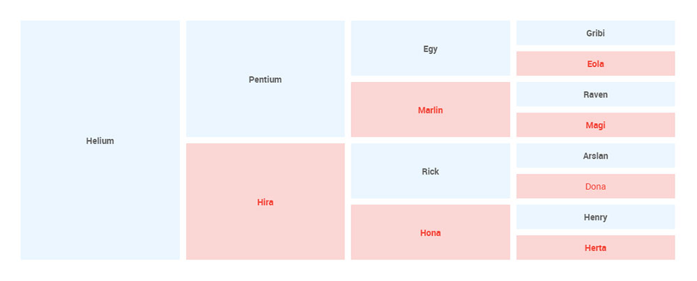
Block reflow turns table rows into stacked card-style blocks on mobile. Each row becomes its own section, and each cell shows up as a full-width “Label: Value” pair.
How to Add data-label Attributes to Table Cells
Because this method hides the <thead> on mobile, every <td> needs a data-label attribute mirroring its column header. Skip it and people on small screens see values with no idea what they refer to.
<td data-label="Product Name">Widget Pro</td>
<td data-label="Price">$29.99</td>
<td data-label="Stock">142 units</td>
This is a manual markup change, and on tables with a lot of rows it adds up. One thing worth flagging: CSS pseudo-elements built with content: attr(data-label) aren’t read by NVDA or VoiceOver on mobile (WebAIM, 2024), so that label is visual only. For real accessibility, put aria-label on each td instead.
CSS Code for the Block Reflow Method
The full implementation runs off a media query at 768px:
@media (max-width: 768px) {
  table, thead, tbody, th, td, tr {
    display: block;
  }

  thead tr {
    display: none;
  }

  td {
    position: relative;
    padding-left: 50%;
    border: none;
    border-bottom: 1px solid #eee;
  }

  td::before {
    content: attr(data-label);
    position: absolute;
    left: 0;
    width: 45%;
    font-weight: bold;
  }
}
Block reflow fits tables with four to seven columns where scrolling feels awkward and the data reads fine row by row. The cost is that it needs markup changes on every <td> and breaks native table semantics, so you’ll have to add ARIA roles to restore screen reader compatibility.
How Does the CSS Flexbox Method Work for Tables?
See the Pen
CSS Flexbox Responsive Table by Bogdan Sandu (@bogdansandu)
on CodePen.
The flexbox method swaps the native table display model for display: flex, which buys you precise control over how columns distribute and wrap at different breakpoints.
Core Flexbox Rules for Tables
On the row element, set display: flex and flex-wrap: wrap, so the row’s cells behave like flex children that wrap to the next line when space runs out. On each cell, assign a flex-basis percentage to control the column width. A three-column table might use flex-basis: 33.33% at desktop and flex-basis: 100% at mobile.
Inside the mobile media query:
@media (max-width: 600px) {
  tr {
    flex-direction: column;
  }

  td {
    width: 100%;
  }
}
Flexbox is quicker to prototype for simple two-to-four-column layouts than block reflow is (iPixel Creative, 2024). The catch is that display: flex on a <tr> breaks the browser’s native table semantics completely.
Accessibility Requirement for Flexbox Tables
Once display: flex replaces display: table, screen readers stop reading the structure as a table, so ARIA roles become mandatory. Add role="table" on the container, role="row" on each row, and role="columnheader" or role="cell" on each cell.
Without those roles, JAWS and NVDA (the two most-used desktop screen readers at 41% and 38% of users respectively, per WebAIM 2024) read the content as a generic list and lose all the row and column context.
So flexbox is the call for two-to-four-column tables where visual column control is the priority and the team can keep the added ARIA markup maintained.
How Does the CSS Grid Method Work for Tables?
See the Pen
Responsive SaaS Data Table With CSS Grid by Bogdan Sandu (@bogdansandu)
on CodePen.
CSS Grid swaps the table’s fixed column model for a fluid grid that reflows on its own, and in a lot of cases without explicit breakpoints at all.
The auto-fit and minmax() Approach
The most practical CSS Grid pattern for responsive tables pairs auto-fit with minmax() on the grid container:
.table-grid {
  display: grid;
  grid-template-columns: repeat(auto-fit, minmax(120px, 1fr));
  gap: 1px;
}
Columns reflow with no explicit media queries when the content hits the 120px minimum, and below that threshold the cells wrap to the next row automatically.
This works well for pricing table layouts and feature comparison grids, where the visual structure matters more than traditional row-and-column data relationships.
Where CSS Grid for Tables Falls Short
It breaks the semantics. Like the flexbox method, applying display: grid to a <table> strips its native table semantics, and screen readers lose the row and column context entirely without ARIA reconstruction.
There’s also the IE 11 issue. CSS Grid as implemented here doesn’t work in Internet Explorer 11, so if your analytics show IE 11 traffic above 1%, use the overflow wrapper method or serve a fallback.
See the Pen
Responsive Table – CSS Method Comparison by Bogdan Sandu (@bogdansandu)
on CodePen.
The U.S. Department of Justice published a rule in April 2024 requiring all state and local government web content to meet WCAG 2.1 Level AA. For public-sector tables, the overflow wrapper is the only method that clears that bar without extra ARIA work.
For teams building comparison grids or custom HTML table designs where the visual layout outranks semantic correctness, CSS Grid is a solid pick. Just pair it with the full ARIA role set and test with VoiceOver on iOS before you ship.
Which WordPress Plugin Creates Responsive Tables?
WordPress powers 43.2% of all websites globally (W3Techs, 2025), which means a large share of responsive table problems get solved with plugins rather than hand-written CSS.
Most table plugins treat responsiveness as an afterthought. One plugin that doesn’t is wpDataTables.
Why wpDataTables Is the Only Option Worth Considering
80,000+ active users. Over a million downloads. 10+ years on the market. That track record matters when you’re picking a plugin you’ll rely on for client work or live production sites.
Responsive design is built directly into wpDataTables. No extensions, no workarounds.
Tables adapt automatically to different screen sizes. The plugin handles the mobile layout at the plugin level, not through theme CSS, so the behavior stays consistent regardless of what theme you’re running.
What You Get Out of the Box
- Multiple responsive modes including stacked view, horizontal scroll, and column hiding at defined breakpoints
- Fixed headers and columns so users don’t lose context when scrolling through wide or tall datasets
- Server-side processing for tables with millions of rows, which keeps load times from becoming a problem
The data source flexibility is genuinely impressive. You can pull from Excel files, CSV, XML, JSON, PHP arrays, MySQL queries, and private Google Sheets. Changes in the connected source reflect in the table automatically. No re-publishing required.
That last part alone covers the main use case most people are searching for: a mobile-friendly table setup where the data stays fresh without manual intervention.
Beyond Just Responsive Tables
Honestly, responsive behavior is just the baseline. wpDataTables goes well past it.
Frontend and backend editing. Users can edit table data directly on the live page, inline or via popover windows. Or use the Excel-like editor in the admin if that’s more comfortable.
Conditional formatting. Set rules to highlight specific values automatically. Extremely useful for large datasets where you need to spot patterns quickly.
80+ chart types across 5 chart engines (Google Charts, ApexCharts, Highcharts, Chart.js, Highcharts Stock). Charts sync with table filters, so filtering the table updates the chart in real time.
WooCommerce integration. Build product tables where users can add items to cart directly from the table. That’s a different category of feature entirely.
Builder support covers Gutenberg, Elementor, WPBakery, Avada, and Divi. WCAG compatibility is included for accessibility. Tables can be exported to CSV, Excel, or PDF. You can also pre-filter tables through URL parameters.
Pricing
wpDataTables has a free lite version available. Premium licenses start at a reasonable price point, with up to 50% off during current promotions. There’s a 15-day money-back guarantee.
For a plugin that handles responsive tables, live data sync, front-end editing, charts, WooCommerce, and accessibility in a single install, it’s hard to argue against it.
How Does the Gutenberg Table Block Handle Responsiveness?
The core Gutenberg Table block doesn’t include responsive behavior out of the box, which catches a lot of developers off guard, since they assume block editor tables auto-adapt to mobile.
What actually happens depends entirely on the active theme.
What Themes Add to wp-block-table
Most well-maintained block themes, Twenty Twenty-Four, GeneratePress, Kadence among them, add overflow-x: auto to the .wp-block-table class in their stylesheets. That gives you the overflow wrapper behavior with no extra CSS from your end.
The themes that don’t add that rule output a bare <table> with no overflow containment, so the table overflows the content column on any screen narrower than the table’s natural width.
Check your own theme by building a test table with six or more columns and viewing it on a 375px-wide device. If the table pushes past the page edge, the theme isn’t handling it.
The Additional CSS Fix for Non-Responsive Themes
No plugin required. Go to Appearance > Customize > Additional CSS and add:
.wp-block-table {
  overflow-x: auto;
  display: block;
}
That targets every table inserted through the Gutenberg Table block, site-wide.
On Full Site Editing themes, the same rule goes into the theme.json file under styles.blocks["core/table"], which scopes it correctly without touching Additional CSS.
When to Switch to a Table Plugin Instead
The Gutenberg Table block has real limits. No sorting, no filtering, no pagination, no import from CSV or a spreadsheet.
If your table needs any of that, the block is the wrong tool. Switch to a dedicated WordPress table plugin with built-in responsive controls rather than patching the block with extra CSS and JavaScript.
How Do JavaScript Libraries Extend Responsive Table Options?
CSS-only methods stop being enough around six columns, or whenever people need to sort and filter the data. That’s the point where a JavaScript table library becomes the right tool.
DataTables.js Responsive Extension
DataTables.js is the most feature-complete option for complex data grids. Its Responsive extension gives you four ways to handle columns at small screen widths. Collapse hides the lower-priority columns and moves their data into expandable child rows.
Inline drops the hidden column data inline below the visible row content. Modal opens the hidden data in a popup on tap. And the column visibility toggle puts show/hide control in the user’s hands per column.
DataTables.js v2.0 introduced Web Workers support for moving sort and filter operations off the main thread, which directly cuts Interaction to Next Paint (INP) scores on tables running 1,000-plus rows.
Total page weight with the core library plus the Responsive extension comes to roughly 80-120KB minified. Load it asynchronously or it blocks rendering.
FooTable and Tablesaw for Lighter Implementations
FooTable (v3) hides the lower-priority columns at defined breakpoints and moves their data into expandable child rows. Minified, it runs at roughly 15-20KB, well under DataTables.
Tablesaw, maintained by Filament Group, offers four distinct responsive modes. Stack does full column-to-row stacking. Swipe gives you horizontal swipe navigation between columns. Toggle puts user-controlled column visibility checkboxes in place. And column toggle adds a persistent toggle panel above the table.
Both FooTable and Tablesaw hold onto native table semantics better than the CSS Flexbox and Grid methods do, since they manipulate visibility rather than replacing display: table.
SitePoint’s analysis of jQuery table plugins notes that JavaScript-based responsive solutions hand you more options than pure CSS, filtering, sorting, and pagination included, at the cost of added page weight and a JavaScript dependency.
What Accessibility Rules Apply to Responsive Tables?
Responsive tables create more accessibility problems than standard ones do. The methods that look great visually on a small screen frequently break the programmatic structure screen readers depend on.
WCAG 2.1 Requirements That Apply Directly
WebAIM’s 2024 Screen Reader User Survey found JAWS and NVDA nearly tied as the most-used desktop screen readers, at 41% and 38% respectively, with VoiceOver leading on mobile at 70.6%.
All three navigate tables the same way: they read the associated column or row header every time the user moves to a new cell. When CSS block reflow or Flexbox replaces display: table, that association breaks entirely.
Three WCAG criteria get hit directly by how you implement a responsive table. SC 1.3.1 requires the table structure to be programmatically determinable, not just visual. SC 1.4.10 requires content to reflow at 320 CSS pixels without horizontal scrolling, which catches overflow wrapper tables that carry too many columns. And SC 4.1.2 requires interactive elements like sort buttons and column toggles to have accessible names and roles.
Which Methods Require ARIA and Which Do Not
The U.S. DOJ published a final rule in April 2024 requiring state and local government web content to comply with WCAG 2.1 Level AA. For public-sector teams, the method choice isn’t optional.
The overflow wrapper needs no ARIA. The native <th scope>, <caption>, and table element hierarchy all stay intact.
Block reflow, Flexbox, and CSS Grid all need role="table", role="row", role="columnheader", and role="cell" to put the structure back for screen readers. And remember that CSS pseudo-content from content: attr(data-label) isn’t announced by NVDA or VoiceOver on iOS (WebAIM, 2024), so use aria-label directly on each <td> instead.
For a deeper look at building HTML table headers that play well with assistive technology, the markup decisions you make at the header level decide whether the whole table is navigable for screen reader users.
How Do Core Web Vitals Affect Responsive Table Performance?
Tables touch all three Core Web Vitals: CLS from layout shifts during render, LCP if the table is the page’s largest content block, and INP when sorting or filtering runs on the main thread.
CLS and Table Render Behavior
Comparison tables are especially prone to CLS because they hold multiple elements that load at different speeds, which causes visible layout jumps (White Label Coders, 2025).
Two CSS habits keep table-related CLS down. Set an explicit width on the table wrapper div so the browser reserves the space before the table renders. And avoid animating width, height, or margin on table containers, since those trigger layout recalculations (Vercel, 2024).
Google’s CLS threshold is a score below 0.1. As of February 2025, 80.43% of pages hit it (Web Almanac, 2025), and tables without reserved dimensions are a common reason the rest don’t.
INP and JavaScript Table Performance
Google replaced First Input Delay with Interaction to Next Paint as a Core Web Vital on March 12, 2024. INP measures the full response time of every interaction, not just the first one.
Sort and filter operations on large JavaScript-rendered tables are the main INP offender. DataTables.js v2.0 tackles this with Web Workers support, moving the sort logic off the main thread entirely.
On WordPress sites using table plugins, defer the non-critical table scripts. Loading DataTables.js or FooTable synchronously in <head> delays Largest Contentful Paint, so use the defer attribute or load scripts through wp_enqueue_script with $in_footer = true.
Google PageSpeed Insights flags render-blocking scripts and scores them against your INP threshold of 200ms for a passing rating.
How to Choose the Right Responsive Table Method?
The right method falls out of four things: your column count, whether you need sorting or filtering, your accessibility requirements, and whether you’re working inside WordPress or writing raw HTML and CSS.
| Situation | Recommended method | Reason |
|---|---|---|
| 2–4 columns, plain HTML | CSS overflow wrapper | Zero markup changes, full semantic integrity |
| 5–7 columns, no JS | CSS block reflow | Stacks cleanly, no library dependency |
| 6+ columns with sort / filter | DataTables.js v2.0 | Column priority, child rows, Web Workers |
| WordPress, no coding | wpDataTables | Built-in breakpoint controls, no CSS required |
| WCAG 2.1 AA required | CSS overflow wrapper only | Only method that keeps native table semantics |
For Gutenberg sites on default themes that lack overflow-x: auto in their stylesheet, adding that single rule via Additional CSS is the minimum viable fix before you reach for plugins or custom CSS methods.
Questions That Help Narrow It Down
Does the table data update frequently? If so, a plugin with Google Sheets sync like Ninja Tables, or a JavaScript library that takes JSON input like DataTables.js, saves you a pile of manual work compared to rebuilding static HTML tables every time the data shifts.
Do users need to interact with the table? Sorting, filtering, and table pagination all require JavaScript. CSS-only methods handle the layout but can’t touch behavior.
Is the site on WordPress? Start with the Gutenberg table block and test it on mobile. If the theme doesn’t handle responsiveness, add the Additional CSS fix. If the table needs sorting or more than six columns, jump to Ninja Tables or WP Table Builder before you start writing CSS.
Is accessibility compliance a hard requirement? Public sector, financial, and healthcare tables often fall under legal accessibility rules. The overflow wrapper is the only method that satisfies WCAG 1.3.1 with no extra ARIA reconstruction. For more on building well-structured HTML table designs that hold up across devices and assistive technologies, the markup foundation matters as much as the CSS approach.
FAQ on How To Create Responsive Tables
What is the simplest way to make an HTML table responsive?
Wrap your <table> in a <div> and apply overflow-x: auto to that div. No markup changes inside the table itself. This CSS overflow wrapper method works in all modern browsers and preserves full native table semantics.
Does the Gutenberg table block create responsive tables automatically?
No. The core WordPress block editor table block has no built-in responsive behavior. Whether your table adapts to mobile depends entirely on your active theme’s stylesheet targeting the .wp-block-table class.
Which WordPress plugin makes tables responsive without coding?
Ninja Tables and WP Table Builder both include built-in mobile breakpoint controls. Ninja Tables offers three responsive modes, stacked view, horizontal scroll, and column hiding, all configurable from the plugin admin panel.
Does the CSS block reflow method break table accessibility?
Yes. Setting display: block on table elements removes the native semantics, so screen readers like NVDA and JAWS lose row and column context. You need ARIA roles and aria-label attributes on each cell to restore accessibility.
Can I use CSS Grid to create a responsive table?
Yes. Use display: grid with grid-template-columns: repeat(auto-fit, minmax(120px, 1fr)). Columns reflow without explicit media queries. CSS Grid does break native table semantics, though, and needs ARIA reconstruction for screen reader compatibility.
How do I fix a WordPress table that overflows on mobile?
Go to Appearance > Customize > Additional CSS and add .wp-block-table { overflow-x: auto; display: block; }. That targets every Gutenberg table block site-wide. Full Site Editing themes handle it through theme.json instead.
What is the best responsive table method for WCAG compliance?
The CSS overflow wrapper is the only method that satisfies WCAG 2.1 Success Criterion 1.3.1 without extra ARIA work. Block reflow, Flexbox, and CSS Grid all break the programmatic table structure that assistive technology depends on.
Do JavaScript table libraries affect Core Web Vitals?
Yes. Loading DataTables.js or FooTable synchronously delays Largest Contentful Paint. Always use the defer attribute or load scripts in the footer. DataTables.js v2.0 reduces Interaction to Next Paint impact via Web Workers for sort operations.
How does TablePress handle responsive tables?
TablePress doesn’t include responsive behavior in its free version. You need the separate “TablePress Responsive Tables” extension by Tobias Battenberg, or an upgrade to TablePress Pro ($89/yr), which includes native responsive output without a secondary plugin.
When should I use a JavaScript library instead of CSS for responsive tables?
Switch to JavaScript when your table has six or more columns, or when people need to sort, filter, or paginate the data. CSS-only methods handle fluid layout but can’t add interactive behavior. DataTables.js and Tablesaw cover both responsiveness and interactivity.
Conclusion
This conclusion is for an article presenting the full range of methods for building responsive data tables, from pure CSS techniques to WordPress plugin solutions.
The right approach depends on your column count, interactivity needs, and accessibility requirements. No single method fits every situation.
For simple fluid table layout with no JavaScript dependency, the block reflow technique or overflow wrapper handles most cases cleanly. For WordPress sites, Ninja Tables and WP Table Builder remove the need to write any CSS at all.
When column visibility control, sorting, or pagination matter, DataTables.js and Tablesaw are worth the added page weight.
WCAG 2.1 compliance, Core Web Vitals scores, and viewport width breakpoints should all factor into whichever method you choose.