Visualizing large data sets can be daunting, but with wpDataTables, it becomes a seamless process. Whether you’re managing big data, or developing custom tables on WordPress, understanding how to leverage wpDataTables is crucial.
Handling vast amounts of data efficiently ensures that not only is our data mobile-friendly and responsive, but it also makes real-time updates and advanced filtering simple. This article will guide you through the essentials of using wpDataTables for visual data representation. By the end, you’ll be proficient in using this powerful data visualization plugin to enhance your WordPress site.
You’ll learn how to set up and customize charts and graphs, optimize data import and export features, and improve the user experience with dynamic data display techniques.
Explore how to transform your data into insightful visuals, leveraging the full potential of wpDataTables for superior data analysis and presentation.
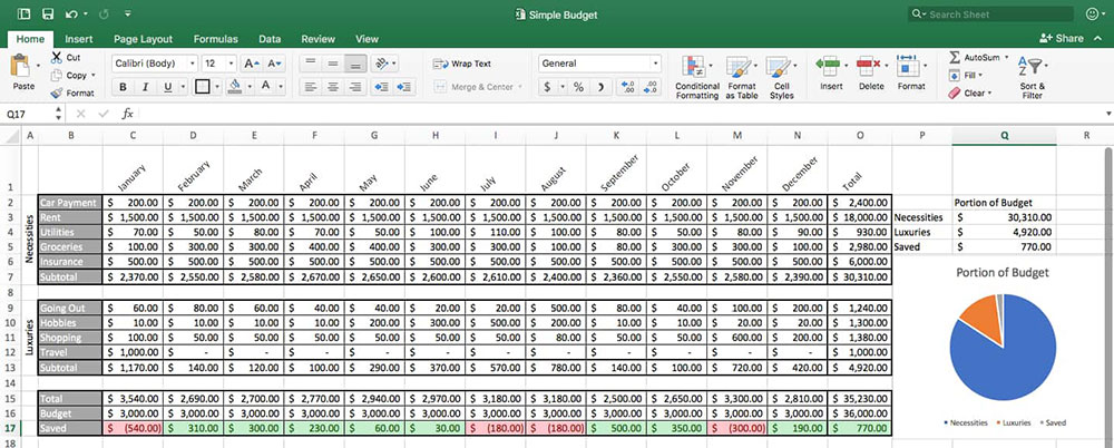
wpDataTables is the robust data visualization tool that you will love. You make all kinds of graphs and charts with it. It specializes in handling big data and turning it into presentations your audience will love.
This WordPress plugin handles all kinds of organized and hierarchical data formats, such as:
- CSV
- Excel
- Google Sheets
- JSON
- MySQL
- PostgreSQL
- XML
It has a built-in graph and chart editor for customizing your data representations. As a standard, it produces various charts, including:
- Area charts
- Bar charts
- Bubble charts
- Column charts
- Donut charts
- Gauge charts
- Line charts
- Pie charts
- Scatter charts
So, it is clear why wpDataTables is such an awesome tool. This article will show you how you can use it for visualizing large data sets in WordPress and publishing them on your website.
Table of Contents
Using wpDataTables for Visualizing Large Data Sets
Installing and Activating wpDataTables
The first step is obvious: to get started, you need to install the wpDataTables plugin. It is very easy to do by going to the WordPress plugin repository.
To do that, open WordPress and go to Add New under Plugins. Here you can search for wpDataTables. Then follow the instructions on the screen and finish the installation and activation.
Importing Data
Once installed, you can import your data into wpDataTables from various sources. Some of the choices for data import are:
- CSV
- Excel
- Google Sheets
- JSON
- MySQL queries
- Serialized PHP Array
- XML
You also still have the option of entering your data by hand into wpDataTables or linking the plugin to a live data source.
This feature is very useful because you can make tables that update automatically each time you load your page. You can also generate a custom query with the Graphical User Interface (GUI) tool.
How to Create a New Table From the Data
You can create a new table by going to wpDataTable and clicking Create a table. There you will see the option Create a table linked to an existing data source. Click that option and then click Next.
On the next screen, you will see different options for how you want to import your data. You don’t need to select any of them, but some of them might be handy.
Under Display, you can select the Responsive Collapsing option, which is very useful on devices with smaller screens. You can edit scrollbars, limit table width, and so on.
The Editing tab gives you more options for front-end editing. This includes printing, copying, and exporting quick links. The good thing is that you can preview your changes in real time. Each time you make a change, you need to click Save or Apply.
Using Large Data Sets? No Problemo. We Have Server-Side Processing
If you’re dealing with massive data sets and creating gigantic tables with loads of pages, wpDataTables is the WordPress plugin you need.
wpDataTables is a powerful and flexible plugin that can handle tons of data with ease. Seriously, I’m talking about thousands or even millions of rows!
- Tired of waiting for your massive tables to load?
- Fed up with sluggish sorting and filtering?
- Worried about your pages crashing due to heavy data?
No more! wpDataTables has got your back. It’s built with a fantastic feature called “Server-side processing.” This bad boy takes all the heavy lifting off your plate and delegates it to the MySQL server. What does that mean for you? It means:
- Faster page loading
- Smarter filtering and sorting
- No more crashing due to large data sets
Curious how it’s done? Check out this video:
Now, I know what you’re thinking: “Sounds too good to be true, right?” But let me tell you, it’s as real as it gets.
This feature is tailor-made for people like you who handle large data sets and want a smooth experience.
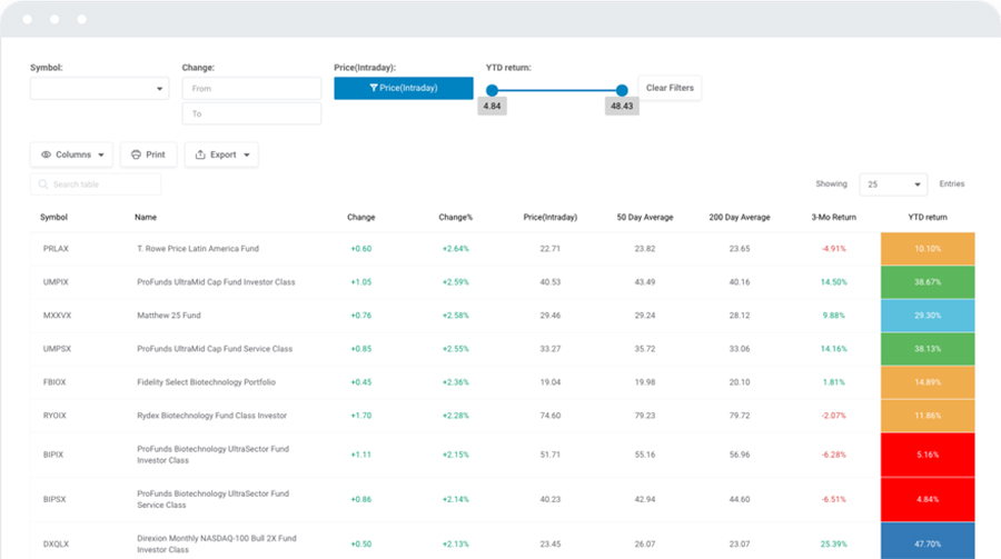
Choosing the Right Data Visualization
With your data imported, you can start thinking about data visualization. To do that, open the Chart Creation Wizard. You find the wizard after you open wpDataTables under Create a Chart.
First, you have to give your chart a name to find it again later. Then choose one of the four chart rendering engines:
Choosing the right data visualization is very important. Different categories of charts are more suited for different types of data.
First, think of the point you want to make with your data. That message must be clear and prominent. Five questions can help you determine what you want to do:
- If there are different data sets, what is the relation between them?
- Is there a need to highlight data distribution and identify outliers?
- Do you want to compare values? If so, do you want to compare different data points, or do you want to follow one point over time?
- Are there interesting trends within the data set?
- Is the data visualization step a part of the data analysis?
When you know the answer to those questions, you are ready to pick the right kind of chart for your project.
After editing your graph or chart you can click through to the next screen and copy the shortcode for the data visualization.
Now you are ready to paste the shortcode into the content of your website. Save it and check the front end to see what it looks like.
Inside wpDataTables there is a very special option. It allows you to keep your tables, even if you delete the plugin.
If you ever choose to delete the plugin, you will still find your tables in the database.
Create a Chart From a Table
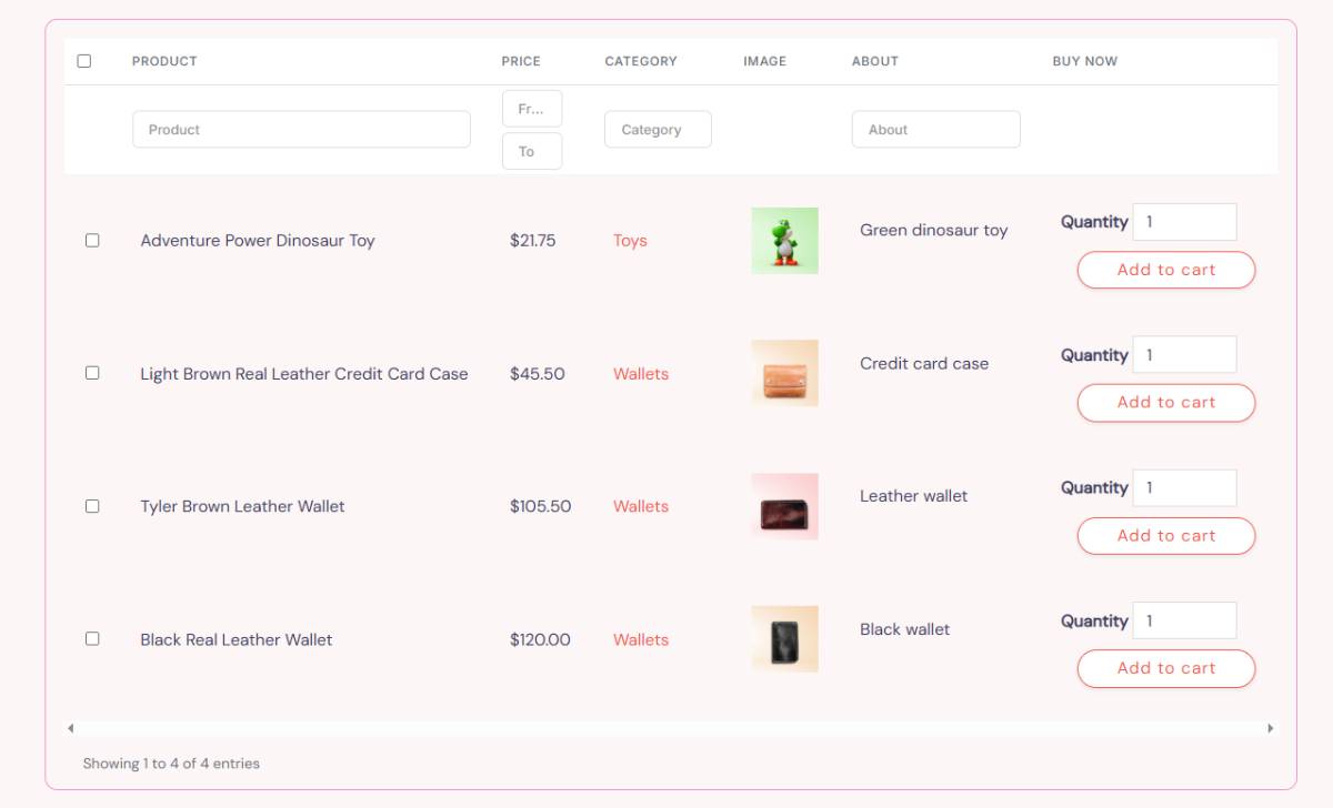
Let’s get a little deeper into creating data visualization with wpDataTables. The plugin lets you make some impressive and interactive graphs and charts from any kind of data source. You can use Excel files, CSV, MySQL, JSON, and more.
When your table is ready for processing, select Charts and then click on Add New.
Give the project a title and choose the rendering machine as described above. You can choose from Google Charts, Chart.js, or others. Each rendering engine has its characteristics, each with its pros and cons. You can play around and see which one is best for your project.
Also, each rendering engine will give you different categories of charts, such as bar, column, area, and line. There is a drop-down menu at the top where you can select the kind of data visualization you want.
Formatting and Previewing
Now, the plugin will allow you to format your chart or graph the way you want to. You can see your changes right away in a panel on the right-hand side of the screen.
You will notice that there are several formatting categories for each chart or graph element. The first set of options allows you to adjust the following things:
- Background colors
- Border color
- Border radius
- Border width
- Chart height
- Chart width
- Group chart
- Responsive width
Another formatting category is Series, where you can customize the data series. Under Axes, you will find all options related to the layout of the graph’s axes. You can customize the X and Y axes independent of each other.
The next category is Exporting. You can allow your website visitors to download your data visualization tools in different formats:
- CSV
- JPG
- PNG
- SVG
- XLS
The Toolbar category is only available for ApexCharts. This option lets you allow users to download the visualizing data in CSV, PNG, and SVG vector image formats.
When you are happy with the way your chart or graph looks, you can save it by clicking the Save Chart button. wpDataTables will save it in the WordPress database. At this point, it will also generate the shortcode for you.
Publish the Chart on Your Website or Blog Post
Older versions use the Classic WordPress editor. But you can also use it if you are working with WordPress 5+. For that, you’d need to download and install the Classic Editor Plugin.
In the Classic editor, you can paste the shortcode that wpDataTable generated for your chart. An example of a shortcode could be:
[ wpdatatable id=22 ]
To paste the code in the right way, follow these steps:
- Go to Posts
- Click Add New or Pages
- Select Add New
- Paste the shortcode into the content in the editor
- Update or publish your page or blog post
Another way to publish your table is by using the wpDataTables button in the editor. Click the button to select the chart you want to use and click Insert.
The Gutenberg Editor is another tool for managing your content. In fact, it allows you more options for your chart. You can choose which table you want and how to display it, and you can define variable placeholders and export file names.
There is an integration for wpDataTables in Divi Page Builder. With this page builder, you can insert charts and tables straight into the Divi user interface.
FAQ on Visualizing Large Data Sets With wpDataTables
What is wpDataTables?
wpDataTables is a powerful WordPress plugin designed for creating and managing data tables and charts. It offers intuitive and flexible options for visualizing large data sets. Perfect for handling big data and enabling interactive dashboards, it simplifies data representation on your site.
How can I import data into wpDataTables?
You can easily import data into wpDataTables using various formats like Excel, CSV, Google Sheets, and MySQL. These data import options enable you to upload and manage large datasets, providing responsive tables and customizable charts that fit seamlessly on your WordPress site.
Is wpDataTables mobile-friendly?
Yes, wpDataTables is designed to be mobile-friendly and responsive. It ensures that your data tables and charts look great on any device, so users can engage with your content whether they are on a smartphone, tablet, or desktop.
Can I use wpDataTables with other data visualization tools?
Absolutely, wpDataTables integrates well with other data visualization tools. You can use it alongside Google Charts, Highcharts, or Chart.js to enhance your data presentation tools. This flexibility helps in creating diverse and dynamic data displays for better data-driven decision-making.
How do I customize charts and tables in wpDataTables?
Customization is straightforward with wpDataTables. You can tweak chart types, colors, fonts, and more. Use the plugin’s user-friendly interface to create interactive data tables and graphs that match your site’s design and meet your specific data needs, ensuring effective data visualization.
Can I filter and sort data in wpDataTables?
Yes, wpDataTables offers advanced filtering and sorting options. This allows users to dynamically adjust their views based on specific criteria. With features like advanced filtering and searching, making sense of large datasets becomes more manageable and insightful.
How do I handle large datasets efficiently with wpDataTables?
wpDataTables is optimized for handling large datasets. It uses efficient data processing techniques and supports server-side processing for high-volume data. By effectively managing resources, it ensures performance optimization, allowing for smooth interaction with your data tables.
Can I display real-time data with wpDataTables?
Yes, you can display real-time data with wpDataTables. The plugin supports real-time updates, which is crucial for data-driven environments that require up-to-the-minute information. This is particularly useful for creating dynamic dashboards and live data feeds.
Is wpDataTables compatible with different WordPress themes?
wpDataTables is compatible with a wide range of WordPress themes. It seamlessly integrates, making your interactive data tables and charts look consistent with your site’s overall aesthetic. This ensures a cohesive user experience that aligns with your branding.
How do I export data from wpDataTables?
Exporting data is simple with wpDataTables. You can export your tables and charts into various formats like Excel, CSV, and PDF. These data export features ensure that you can share your data tables easily, maintaining consistency and accessibility for your audience.
Conclusion
Visualizing large data sets with wpDataTables provides a vital tool for data representation on WordPress sites. By leveraging this data visualization plugin, you can create interactive dashboards, customizable charts, and responsive tables that handle big data efficiently.
To recap:
- Importing data is seamless, with support for formats like Excel, CSV, and MySQL.
- Customization options allow for tailoring charts and tables to fit your design.
- Advanced features enable filtering, sorting, and real-time updates.
- Compatible with various data visualization tools and WordPress themes, ensuring a cohesive look and performance.
Using wpDataTables, you can transform your data analysis into visually engaging and practical insights, enhancing overall data-driven decision-making. Whether you’re managing high-volume data or need dynamic updates, this plugin ensures your data is presented effectively and efficiently.
If you liked this article about visualizing large data sets, you should check out this article about data visualization blogs.
There are also similar articles discussing scientific data visualization, data visualization challenges, data visualization for marketers, and data storytelling examples.
And let’s not forget about articles on data journalism examples, big data visualization, financial data visualization tools, and data visualization trends.