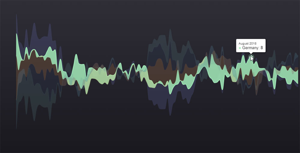
ApexCharts: Everything You Need To Know
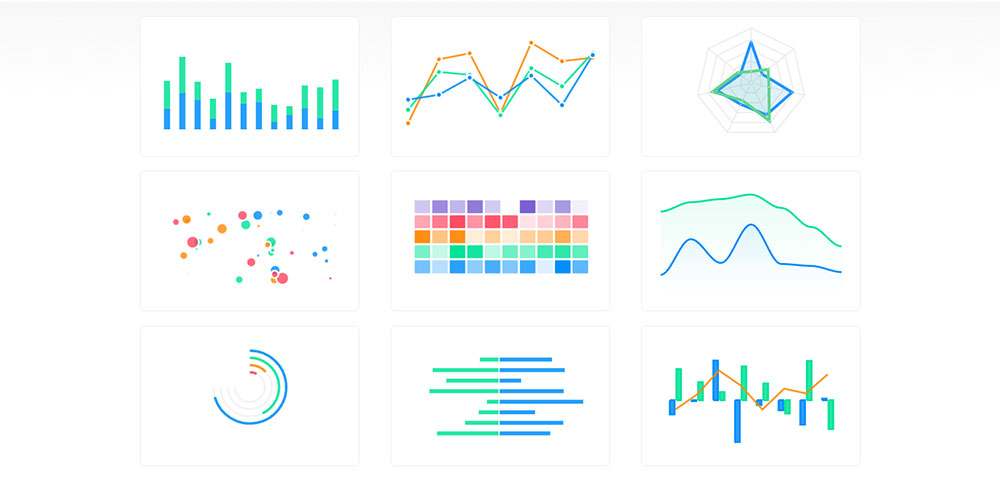
Visualizing data can be the difference between understanding your audience and missing the mark, and ApexCharts sits at the cutting edge of this transformation. When our digital lives are dictated by numbers and trends, having a powerful chart library becomes essential. ApexCharts.js, a…