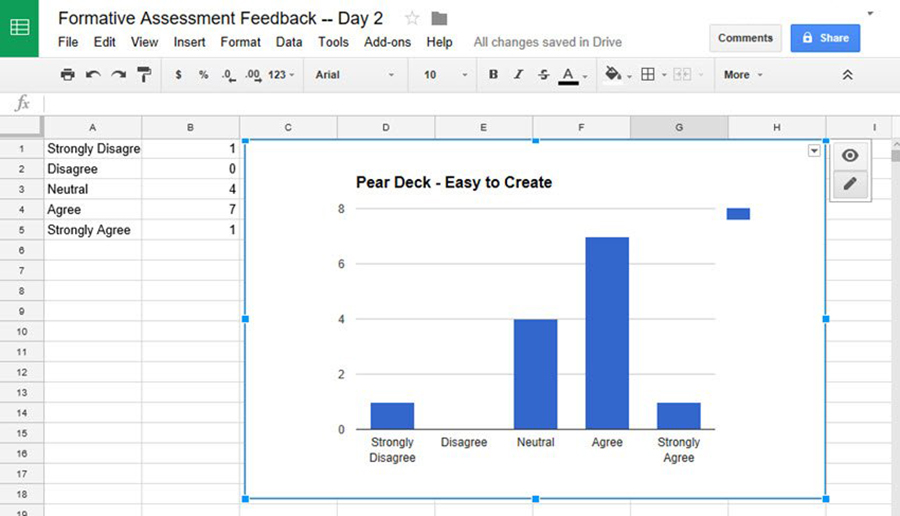
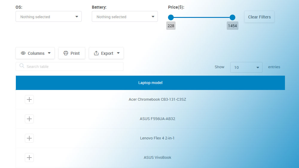
Table Pagination Guide with Examples
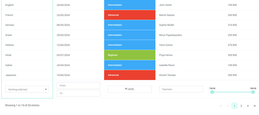
Ever felt frustrated trying to find something on a website, scrolling endlessly or clicking around without a clue where to go? That’s exactly the problem table pagination solves. It takes a big, messy chunk of data and breaks it into…