Diving into the world of data visualization, you often find yourself face-to-face with a pivotal crossroads: should you showcase your data using a line chart or an area chart?
Now, imagine possessing the acute finesse to not just choose effectively but to craft visuals that convey stories hidden within data, with the precision of a cartographer mapping new territories.
Understanding these chart types is more than picking a design; it’s about embracing the silent dialogue between data trends and the beholder.
As a web designer, I’ve seen my fair share of infographics lost in translation—beautiful, but mute—while others sing sonnets of insights, whispering the tales of rise and fall in the rhythms of business seasons or the pulse of social analytics.
In this dance of pixels and axes, I’ll be your choreographer. By the end of our journey, you will hold the key to unlocking when a line chart reveals its best or an area chart paints a more compelling narrative.
From the basics of graph comparison to the nuanced cadence of data interpretation, let’s orchestrate the visuals that resonate.
Table of contents
- Line Charts
- Area Charts
- Comparative Analysis
- Use Case Scenarios
- Best Practices and Design Strategies
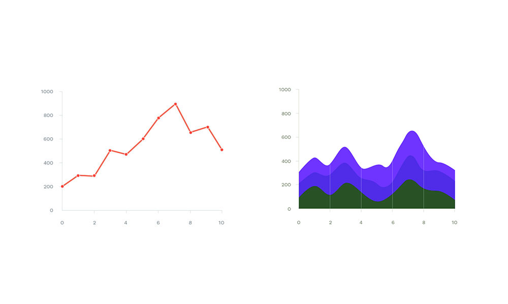
Line Charts
Chart created with wpDataTables
Dive straight into the heart of data visualization tools where the simplicity of line chart vs area chart becomes evident.
Picture this: you’re tracing a squiggly line with your finger on a graph. That’s the essence of a line chart. It’s lean on design but heavy on insight.
Structural Design and Interpretation
Imagine a heartbeat monitor, with peaks and valleys showing vital signs—this is akin to a line chart’s pulse.
Each pulse point represents a data point. Lines linking them are more than just scribbles; they’re stories of progression, regression, and everything in between.
Structural elegance lies in its simplicity. It’s the difference between reading a complex novel versus a poem—both tell stories, but one gets to the point with fewer words, like a line chart.
Interpretation is akin to reading the tea leaves of the chart. You glance at the trends, follow the line as it dances across the X and Y-axis, and narratives emerge. You witness not just data but a journey through time.
Best Practices for Data Points and Timelines
Now, think about a crowded street. How difficult is it to navigate through? The same goes for line charts with too many data series crammed in—it gets messy.
Best practice means keeping it clutter-free. Only invite essential data points to the party; others can wait offstage.
Considering timelines, they’re your silent narrators. Whether tracking web analytics or environmental data tracking, they must be paced just right—not to skip a beat, not to drag.
Data points should march neatly across, neither rushed with a mere blip of visibility nor plodding in oversized boots.
Advantages of Line Charts
Line chart vs area chart beckons us to explore the why behind the choice. Line charts are the unsung heroes in the showdown between clarity and complexity.
Clarity in Tracking Trends over Time
Ever watched the sun rise and set? That’s your visual for trend tracking. Line charts capture these celestial arcs of data over horizons of time.
Effective for Comparing Multiple Data Sets
Line charts shine in the lineup of graphical representation tools when the showdown of line chart vs area chart touches the comparison stage.
Imagine you’re a conductor of an orchestra. Each instrument (or data set) has its tune but together create harmony. Line charts are the maestro for such data symphonies.
Suitability for Both Short-Term and Long-Term Analysis
No matter the time frame, line charts adapt. They’re chameleons visualizing quick blinks or epochs in the eons of data tales.
It’s about framing the story—crisp snapshots or drawn-out sagas; line charts are your reliable narrators.
Limitations and Challenges
Even champions face hurdles. In the line chart vs area chart arena, line charts are not exempt from challenges.
Potential for Clutter with Too Many Data Series
Recall the crowded street metaphor? Cramping too many data points is like that.
The narrative loses clarity, and the line chart’s story becomes a cacophony of undecipherable whispers. It’s about inviting the right amount of guests to the party so everyone can breathe and converse without shouting.
Risk of Misinterpretation with Improper Scale or Axis Settings
Here’s the deal: scaling and axis are the building blocks; get these wrong, and your line chart might as well be a house of cards in a breeze.
Tweaking scales with finesse is pivotal. It’s the precision of striking the right chords in a melody. Too high or too low, and the music is lost; the same goes for scale settings. Calibration is critical.
The axis must be a well-aligned seesaw balancing data’s gravity with interpretative ease. Missteps here could twist your chart’s tale into knots.
Area Charts
Chart created with wpDataTables
Step into the world of area charts, where each pixel of shaded glory tells a tale more profound than its surface story.
It’s like a painter filling his canvas—not just with lines but with colors that seep deep, giving a sense that there’s more here than meets the eye.
Difference in Structure from Line Charts
If you’ve ever stacked layers of colored sand in a bottle, then you’ll get what area charts do.
They lay down a beat with a line and then drop the bass with shading underneath. It’s all about depth. That shading? It’s not for show—it highlights how much, how many, how heavy.
When it comes down to line chart vs area chart, think of it this way: if line charts are the pencil sketches, then area charts are the watercolors that bring a wash of meaning to the numbers.
Use of Shading to Emphasize Volume
Remember finger-painting as a kid, how the blobs of paint showed the vigor of your work?
Area charts use this vibe of shading to let data not just speak but shout its volume. It’s graphical powerlifting—with each shade pushing the visual narrative just a bit more.
Advantages of Area Charts
Chart created with wpDataTables
Dig deeper, and you find that line chart vs area chart isn’t just a contest of lines.
It’s about what those lines can build; it’s about landscapes.
Visual Impact of Cumulative Data Representation
Ever watched a sunrise and seen the sky light up, layer by layer? That’s the epic drama area charts bring.
They stack up data points like stairways to heaven, creating a visual terrain that says, “Here’s the whole story, and it’s beautiful.”
Ideal for Highlighting Part-to-Whole Relationships
Area charts sing a song of unity, blending individual notes into a melody.
They’re visual feasts, showing us that each part, no matter how small, contributes to the whole. Like ingredients in a stew, each adds flavor—some subtle, some strong—improving the end result.
Enhancing Comprehension of Large Data Set Variations
Imagine you’re lost at sea, staring at vast waters. The waves rise and fall, telling tales of the sea’s mood.
Area charts throw you a lifeline by summing up these waves of variation. They offer you a raft to see the ebb and flow of data in its massive, undulating form.
Limitations and Challenges
Every hero has a tragic flaw, and in the saga of line chart vs area chart, even area charts face their monsters.
Issue of Occlusion in Layered Data Series
Think about sitting in the back of a crowded theater. All those heads blocking your view?
That’s what happens when area charts layer up too much. Elements hide behind one another, and suddenly, you’re missing part of the show.
Difficulty in Interpreting Stacked Layers Accurately
Putting together a layered dessert looks great, but dig in, and you wonder, “What layer am I tasting now?”
Area charts can be that dessert when the layers blend and boundaries blur. The sweet spot lies in making each layer distinct, so every taste—every data slice—is there to savor, not to puzzle over.
Comparative Analysis
Trend Visualization
Watching trends in data is like observing ripples across a pond. You toss a pebble—that’s your event, your starting point—and watch the ripples, analyze their spread, their reach, their lifespan.
Line charts for precise trend tracking
The sharp, angular turns of a line chart make it a trustworthy trail tracker. It’s all about following breadcrumbs through the woods—or in this case, following points across a grid.
You want to see the exact spot where something spikes or dips? Line charts are your go-to, illuminating the path like streetlamps on a dark night.
Area charts for aggregate trend visualization
Now, think of a painter with a broad brush, swathing color over large sections. That’s an area chart in the face-off of line chart vs area chart.
It’s less about the pinpoint accuracy of the line chart’s beacon and more about the warm glow that adds context, filling in the space below the trend line to show the weight of what’s happening.
Volume and Cumulative Data
How area charts provide deeper insights into volume
Area charts give us the lay of the land, breathing dimension into flat figures. Think of the contours on a map, showing the rise and fall of terrain.
Area charts do that with data. They puff out their chests, showing off the fullness of volume, a territory lush with meaning.
Line charts’ inability to visually represent volume
Line charts, while graceful and targeted, miss out on the bravado of bulk. They give us the skeleton, the highwire route without the safety net.
They can’t show the swell, the bold buildup that shading under the lines can.
Data Set Comparison
We’re back to comparing colored sand layers to freestanding threads. Each data set in a line chart stands alone, marked by its hue.
They form neighbors, side by side, easy to decipher—no guesswork needed.
The clarity of line charts in multiple data set comparison
You could compare the clarity to a crystal goblet—look straight through it, and there it all is.
Nothing obscured in the line chart vs area chart debate. Multiple data sets in line charts are like distinct guitar strings in a chord—each with its own note, its own space, easy to pluck out of the mix.
Challenges with area charts in handling overlapping data series
Now picture an intricate tapestry. Beautiful, yes, but try to trace a single thread through its complex weave.
That’s the puzzle of area charts with overlap. It’s a dialog of many voices in the narrative of volume, with each layer’s tale at risk of being muffled under the pile.
Use Case Scenarios
When I lay out data in line chart vs area chart format, it’s like choosing the right shoes for the journey.
You wouldn’t hike a mountain in flip-flops, right? It’s all about finding the perfect fit for the story you’re telling with numbers.
Industry-Specific Applications
Every industry has its own rhythm, its own flavor. I tailor the charts I use to match the taste.
It’s like a chef who knows exactly which spices will bring out the savory in a stew or the sweet in a pie.
Financial Market Trends
The erratic heartbeat of the stock market is a tale best told in lines.
Watching the rise and fall of shares, the peaks and valleys of indices, I use line charts to track these journeys.
They’re like plot lines of a thriller, always keeping you on the edge of your seat.
Environmental Data Tracking
Then there’s the steady breath of the earth, the slow dance of climate shifts. Here, I often reach for area charts.
They fill in the bigger picture—the cumulative impact. It’s like watching the tide come in, covering the beach in a blanket of blue, bit by bit.
Web Analytics and User Behavior
And what about the digital footprints left behind by users clicking through sites?
Line charts are my breadcrumbs, leading me through the woods to conclude how and where people tread in the world of clicks and scrolls.
Choosing Between Line and Area Charts
Factors Influencing Chart Selection
What’s the tale? Who’s listening? What’s the scene? Each of these questions plays its part. Is it the quick snapshot for a busy exec or the in-depth report for the data analyst?
Assessing Audience and Context for Presentation
I think of my audience as guests at a dinner party. What will delight their palates?
I consider context like setting the table—formal china for the high-stakes meeting or casual plating for the laid-back brainstorm session. Every choice whispers part of the tale, from casual chitchat to momentous monologues.
Best Practices and Design Strategies
Setting out on the line chart vs area chart journey, you realize it’s more than a toss-up between two options.
It’s understanding that each has its secret sauce, and for those flavors to shine, you’ve got to cook them just right.
For Line Charts
Imagine you’re stringing lights for a party. Too few and your yard’s dark; too many and it’s a blinding glare.
Line charts are my strings of light—they’ve got to be strung up with the same balance in mind.
Optimizing the Number of Data Series
Think of a jam session where every instrument adds to the tune, but no one drowns out the others.
That’s my goal with line charts. Each series is a member of the band. Too many, and it’s noise. Just enough, and we’ve got symphony.
Choosing Appropriate Scales and Intervals
To measure out ingredients for that secret sauce, I need my measuring cups. Scales and intervals on a line chart are those cups.
If they’re off, you bet the sauce won’t taste right.
Enhancing Readability with Design Elements
And let’s not forget the garnish, the final flourish. That’s what design elements are when wrapping up a line chart.
A dash of color here, a swift label there—all to make sure when you glance at it, that dish of data is as easy on the eyes as it is insightful.
For Area Charts
Managing Occlusion through Transparency and Color Choices
Ever look through tinted glasses? Everything takes on a new shade. The same goes for area charts.
I play with transparency and colors like an artist with his palette—ensuring no detail is hidden, no message obscured.
Using Stacked Area Charts for Part-to-Whole Relationships
Piecing a mosaic, where the whole picture comes from tiny fragments—stacked area charts work on that principle.
Like a good storyteller, I make sure each piece adds to the narrative without overpowering it.
Avoiding Misrepresentation with Zero-Baseline Emphasis
Lastly, it’s about keeping it real, grounded. That zero line is our reference point, our horizon.
Without it firmly in place, my data story might just float away into the realm of fiction, and that’s a territory we tread lightly.
Your beautiful data deserves to be online
wpDataTables can make it that way. There’s a good reason why it’s the #1 WordPress plugin for creating responsive tables and charts.

And it’s really easy to do something like this:
- You provide the table data
- Configure and customize it
- Publish it in a post or page
And it’s not just pretty, but also practical. You can make large tables with up to millions of rows, or you can use advanced filters and search, or you can go wild and make it editable.
“Yeah, but I just like Excel too much and there’s nothing like that on websites”. Yeah, there is. You can use conditional formatting like in Excel or Google Sheets.
Did I tell you you can create charts too with your data? And that’s only a small part. There are lots of other features for you.
FAQ On Line Charts Vs Area Charts
When should I choose a line chart over an area chart?
Area charts are ace when you’re tracking cumulative values over time, letting the color beneath the line do the heavy lifting in showing volume.
Line charts, on the other hand, are your go-to for clarity when you’re following multiple data trends without the distraction of filled colors.
Can area charts represent multiple data sets effectively?
It’s a mixed bag. Area charts are not the best at handling multiple datasets; they tend to transform into a muddled sea of color. If you need to compare different datasets, line charts with distinct colors or dash styles usually provide a clearer picture.
What’s the most significant advantage of using a line chart?
Precision of the plot. Line charts spotlight fluctuations perfectly, especially when dealing with specific value points on the Y-axis. They’re like high-definition lenses for your time series data, making even the smallest variances stand out.
How does an area chart enhance data visualization?
Area charts excel at giving a quick read on the volume beneath the curve, illustrating more than just the trend— they highlight the weight of the data over time. It’s the difference you feel between the hollowness of a bubble and the solidity of a balloon.
What are the common pitfalls when designing a line chart?
Overloaded axes and clustering too many lines can create a spiderweb of confusion. The trick is in the simplicity—stick to fewer lines, and your message stays crisp. Also, watch out for non-standard scales that can mislead the viewer’s eye.
Can an area chart show negative values?
Imagine an area chart as a fluid thing—it can dip below that baseline into negative territory just fine. However, it might require a bit of mental gymnastics from your viewer to interpret the areas as negative spaces.
That’s where line charts can bring in a bit more precision and less cognitive load.
How does data granularity impact the choice between line and area charts?
The finer the data—like seconds ticking away—the more a line chart can shine, catching every flicker of change. Area charts are less about the rapid heartbeat and more about the steady pulse, taking a step back to show the sweep of data across broader strokes of time.
How can I decide between a stacked area chart and a standard area chart?
Find your focus— are you telling a story of the total, the grand sum of all parts? Stack ’em up. But if it’s the individual journey of each element through time that’s taking center stage, keep them separate and let each narrative breathe on its own.
Are line charts suitable for all types of data?
Line charts are versatile, but they crave continuous data—especially the time-sensitive type. They’re less adept with categorical data where bar charts might flex their muscles more effectively. It’s all about matching the rhythm of your data to the visual tune.
Can area charts handle large data sets efficiently?
An area chart can take on a big data set, but it’s like a heavy coat in a crowd—bound to brush up and overwhelm. For vast volumes of points, consider a line chart that’ll give each data point its own space to shine.
Conclusion
Unpacking the saga of line chart vs area chart has been no less than a deep dive into the ocean of data storytelling. The contours on a line chart serve a surgical purpose, dissecting time and value with laser precision. They’re the storyteller’s quill, tracing the ebbs and flows of datasets with a clear beginning and an end.
Meanwhile, area charts—those color-drenched canopies—paint a more holistic picture. They’re the backdrop against which the drama of cumulative values plays out, offering a sense of weight and significance to the narrative unfurling along the temporal axis. They don’t just tell the story; they set the scene.
In this world of visualization, remember:
- Brevity is the soul of wit. Keep charts clean.
- Context is king. Choose based on your story’s core.
- Legibility leads. Make it readable at a glance.
By now, paths are clear on when to harness the poised eloquence of a line chart or the anchored depth of an area chart. The choice hinges on the story you yearn to tell through your data’s dance.