Ever found yourself staring at a cluster of dots or a sneaky line creeping across a grid, wondering what secrets they’re whispering? Welcome to the crossroads of clarity and confusion: the realm of line charts and scatter plots.
Decoding these chart types is less about the ‘eureka’ and more about the ‘aha’ as you peel back layers of data visualization.
In this dive into the digital quest for crisp insights, we’ll unravel the tangled threads of graph comparison and trend analysis.
Charts and plots are not just tools; they’re storytelling canvases where each data point holds court with its own narrative.
By article’s end, the murky waters of when to use a line chart over a scatter plot—and vice versa—will clear. Expect to leave armed with the know-how to spiff up your next report or data spill with just the right graphical representation.
We’ll pivot through chart software, swivel around data interpretation, and land squarely in the sweet spot of chart selection criteria that makes sense—and makes your data sing.
Table of Contents
Understanding Line Charts
Chart created with wpDataTables
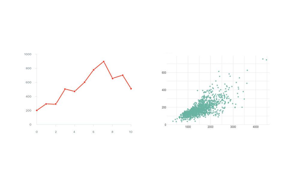
Diving straight into the essence of a line chart, it’s this beautiful, fluid representation of data that gives you a snapshot of change and progress over time.
Imagine drawing a series of dots on graph paper—each dot sitting comfortably on a coordinate that represents a moment in time and a value. Now, connect those dots with sleek lines, and voilà, you’ve got yourself a line chart.
When you’re examining the key features of line charts, think simplicity and clarity. These charts are stars at emphasizing the flow and rate of change between data points.
They plot data along the X-axis and Y-axis, giving you a visual dance of points connected by lines that reveal trends, dips, and rises in the most accessible way possible.
Appropriate Usage
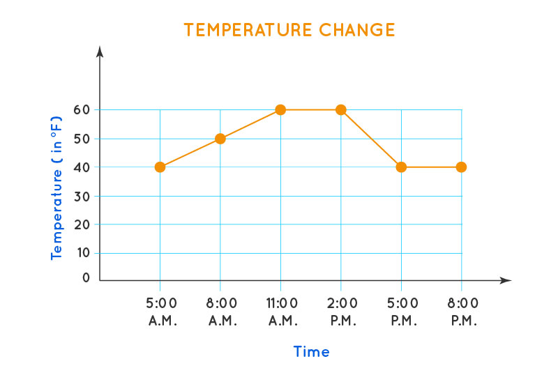
Talking about when to use this tool, line charts are your go-to when tracking changes over intervals of time.
Say, when you want to peek at how your favorite stock is doing or see the rise and fall of temperatures during a week.
These are examples of effective line chart applications—situations where changes unfold in a narrative, and you’re ready to follow along.
Advantages of Line Charts
Simple line chart created with wpDataTables
It can’t be overstated how epic line charts are when it comes to showcasing trends over time. They turn time series data into stories that anyone can easily follow.
Trends in weather patterns, stock market fluctuations, or even viewership ratings of your favorite show—it’s all a walk in the park for line charts.
Next up, simplicity and ease of interpretation. If you need to explain your data to someone who finds numbers and figures intimidating, line charts are your ally.
They take complex information, and compress it into visual bites that are digestible at a glance.
They transcend language and expertise, making them an invaluable visualization tool in data comparison and analysis.
Limitations and Considerations
However, it’s not all smooth sailing with line charts. There’s the potential for misinterpretation with non-continuous data.
If the data points represent categories rather than intervals, a line chart might accidentally imply a relationship or trend that doesn’t exist.
It’s like showing the most popular ice cream flavors over months with a line chart—it suggests a continuity that can mislead or confuse.
Lastly, large datasets can be a stumbling block too. A line chart vs scatter plot situation often arises when there’s a multitude of data points to consider.
If you try cramming all those onto a single line chart, you might end up with an unintelligible mess.
At some point, the lines overlap, the pure volume of data obfuscates clarity, and you’re left with a chart that’s more puzzling than enlightening. This is especially true in statistical graphics where the data sets represent very minute variances over an aggravating number of data series.
Understanding Scatter Plots
Chart created with wpDataTables
Let’s waltz into the world where data flirts with randomness and patterns emerge like constellations in the night sky – welcome to scatter plots.
Think of them not as random but as little crumbs that Hansel and Gretel left in the woods, waiting for someone to connect the dots.
Scatter plots explained, oh well, they are the party hosts for data points where each guest is an independent variable living its life on a numerical axis, free from the constraints of time-based chit-chat.
These guests mingle across the chart, showing us the raw, unfiltered interactions between different factors.
Key features of scatter plots are just as cool.
They give us the power to lay out data on a graph where our two variables, let’s call them ‘X’ and ‘Y’, can shake hands. The scatter plot’s mojo lies in its ability to highlight any relationship, or lack thereof, between them.
Appropriate Usage
Now, when do we whip out a scatter plot? When you’re itching to answer questions like, “Does sipping coffee affect productivity?” or “Does the number of hours spent studying affect test scores?” That’s when these plots shine.
They’re ideal when you’re detective-needy, hunting for correlations or patterns lurking within your dataset.
Examples showcasing scatter plot strengths pop up in various fields.
From health research that pairs lifestyle choices with wellness outcomes to marketing that compares ad spend with website traffic, scatter plots don’t shy away from complex stories.
Advantages of Scatter Plots
Chart created with wpDataTables
Scatter plots are ace detectives for sniffing out relationships and correlations between variables.
They don’t just show us the skinny, but also the meaty relationships that might not look obvious at first glance.
And when it comes to outliers, scatter plots hit a home run. Where else can you find the lone wolf data points straying from the pack, daring to be different?
These outliers aren’t just rebels without a cause; they’re the plot twists in your data narrative.
Limitations and Considerations
However, scatter plots have their kryptonite. Without trend lines, it’s like trying to read a book with the words scattered; finding a clear trend becomes an eye-squinting endeavor.
The plot thickens, deciphering the movements and rhythms, calling for an assist from statistical graphics like trend lines to clear the air.
And there’s no beating around the bush when it comes to another challenge: large, overplotted datasets.
When scatter plots get too crowded, it’s like a rush hour traffic jam — noisy, chaotic, unforgiving. Every data point starts to blur into the next, and what you hoped would be a clear visual story turns into a modern art piece open to interpretation.
Comparative Analysis: Line Chart vs Scatter Plot
Plotting Data
Imagine standing at a fork in the road: To one side, the line chart, a path well-trodden by those who watch time’s steady march.
To the other, the scatter plot, a playground for variables to express their mutual dance, free from the constraints of chronological order.
In the matchup of line chart vs scatter plot, axis considerations pick the winner. Say you have categorical data, like types of cookies sold at a bake sale; a bar chart might wave at you.
But a line chart? It craves numerical axes, longing to connect points across time like stars in a constellation.
Impact of data type on chart selection? Think of it as choosing the right shoes for the occasion.
Line charts slip on comfortably when the journey crosses time. Scatter plots, on the other hand, love to show off continuous numerical data without the tick-tock of a clock looming over.
Visualizing Trends and Relationships
Line charts are time’s storytellers, drawing out narratives of progress, decline, or cycles with a start and end.
They’re pros when you need to show how something grew or shrunk as the days, months, or years ticked by. Trends over time play out like melodies in these visual symphonies.
Scatter plots throw the party when it comes to illustrating variable correlations.
Think of them as social butterflies, revealing who gets along, who’s awkwardly avoiding each other, and who’s paired up. They expose the dynamics between different factors, delighting in the web of relationships spun across your graph.
Data Volume and Complexity
Handling of sparse vs dense datasets? It’s about knowing the crowd. A line chart navigates through sparse time sequences without breaking a sweat.
But when the data gets denser than a downtown rush hour? That’s where scatter plots can step in, managing the swarm with a bit more elbow room.
Visual clutter and its effects on chart readability can’t be brushed aside. It’s like inviting too many friends to a tiny apartment; it gets chaotic quickly.
When data overlaps rampantly, it could turn your insightful graph into a cryptic puzzle no one wants to solve. And when folks squint at your chart, it’s not the “ooh” of admiration but the “uh” of confusion.
Your beautiful data deserves to be online
wpDataTables can make it that way. There’s a good reason why it’s the #1 WordPress plugin for creating responsive tables and charts.

And it’s really easy to do something like this:
- You provide the table data
- Configure and customize it
- Publish it in a post or page
And it’s not just pretty, but also practical. You can make large tables with up to millions of rows, or you can use advanced filters and search, or you can go wild and make it editable.
“Yeah, but I just like Excel too much and there’s nothing like that on websites”. Yeah, there is. You can use conditional formatting like in Excel or Google Sheets.
Did I tell you you can create charts too with your data? And that’s only a small part. There are lots of other features for you.
FAQ On Line Chart Vs Scatter Plot
When should I use a line chart instead of a scatter plot?
A line chart shines when tracking changes over periods of time. Think of it like a storyteller for your time series data. Use it when you want to show how something has shifted or grown, say, your website traffic or sales figures, across different time points.
What’s a scatter plot best used for?
Scatter plots are the go-to for highlighting relationships between two different variables. They’re like detectives showing the correlation — or lack thereof. So, if you’re wondering how website visits affect sales, a scatter plot shows data points revealing any variable relationship.
Can a line chart show correlation between variables?
Not really. While a line chart can imply trends over time, such as increasing temperatures, it isn’t the tool for data comparison or depicting how two variables play together. Correlation is the scatter plot’s arena, where each dot partners up to dance a visual tango.
How do I decide which chart to use for my data?
The decision hinges on your data’s story. Line Chart for tales of change over time. Scatter Plot for exploring relational themes between your quantitative data. Ask yourself: Am I tracking progress or investigating a partnership?
What are the limitations of a line chart?
Line charts, though superb for trend analysis, don’t mesh well with lots of categories or with comparing more than a few data series. They prefer a simpler, less cluttered stage to communicate effectively. Too many lines can turn a chart into a spaghetti junction.
Are scatter plots difficult to interpret?
Not if you know what you’re hunting for. Scatter plots expect you to spot data clustering or outliers. They need a sharp eye to dissect statistical significance. With too many points, they can become a wild static, so keep your graph interpretation skills polished.
Can I show multiple data sets on a scatter plot?
Absolutely. With different colors or symbols, you can toss multiple data set parties onto one scatter plot canvas. It’s like mixing different friend groups — vibrant and telling, as long as you maintain a clear legend. It’s your chart design challenge.
How do trend lines work in these charts?
Trend lines, or best fit lines, surf across your data waves in scatter plots to summarize the journey between variables. Line charts already have a path drawn out, with points forming a linear walk. Think of trend lines as the “guide ropes” in your data campground.
What are the best practices for labeling these charts?
Always prioritize legibility. Use clear, concise labels; both chart types require precise axis labels. Titles? Make them snappy. Legends? Only if you’re hosting a data set comparison party. Your aim? No head-scratching confusion.
Can both charts be used for forecasting?
Yes, but with nuance. Line charts forecast by continuing trends, like extending a mountain path. Scatter plots forecast through extrapolation. If a trend line indicates an uptick, extend that line with caution — it’s a future whisper, not a shout.
Conclusion
Navigating the digital landscape of line chart vs scatter plot has taken us through a winding path of visual analytics and storytelling. Each chart type, a beacon of data visualization, serves its purpose like expertly chosen décor in a well-designed space.
To wrap up, consider the line chart the historian of the graph world, crafting tales of change across the temporal canvas. On the flip side, the scatter plot stands as the social network analyst, underlining the bonds and rifts between diverse data points.
Armed with this knowledge, forget about wandering in the graphing wilderness. Your newly-minted savvy lets you match chart to data like a curator pairs art with light — with purpose, precision, and a dash of style.
- Data interpretation? Conquered.
- Chart readability? Ensured.
- Visual analytics? Mastered.
At journey’s end, whether it’s the line chart’s steady march or the scatter plot’s vibrant scatter, both hold the power to transform raw numbers into insights with just the right amount of analytical sparkle.


