
Line charts are indispensable tools for visualizing data trends over time. Whether you’re analyzing sales metrics, financial forecasting, or historical data, a line chart provides clarity and precision.
In this article, we’ll explore the essentials of creating and utilizing line charts effectively. We’ll dive into solutions like wpDataTables, Excel, Google Sheets, and advanced tools like Tableau and D3.js to help you design dynamic, interactive charts.
You’ll learn to leverage terms like data analysis, market trends, and performance metrics to enhance the informational value of your charts.
By the end of this article, you’ll understand how to design custom line charts with tools like Matplotlib and Plotly, implement structured data for better search engine understanding, and integrate charts using HTML5, CSS, and various APIs.
This guide aims to equip you with the skills to make your data visually compelling and easily interpretable.
Table of Contents
- What Is A Line Chart?
- Line Chart Example
- When To Use A Line Chart
- How To Read A Line Chart
- Types Of Line Charts
- How To Make A Line Chart In WordPress
- How To Make A Line Chart In Excel
- How To Make A Line Chart In Google Sheets
Table of Contents
What Is A Line Chart?
A line chart is a type of data visualization that displays information as a series of data points called ‘markers’ connected by straight lines. It’s often used to track changes over intervals of time, making it ideal for showing trends like sales metrics, financial forecasting, or any form of trend analysis.
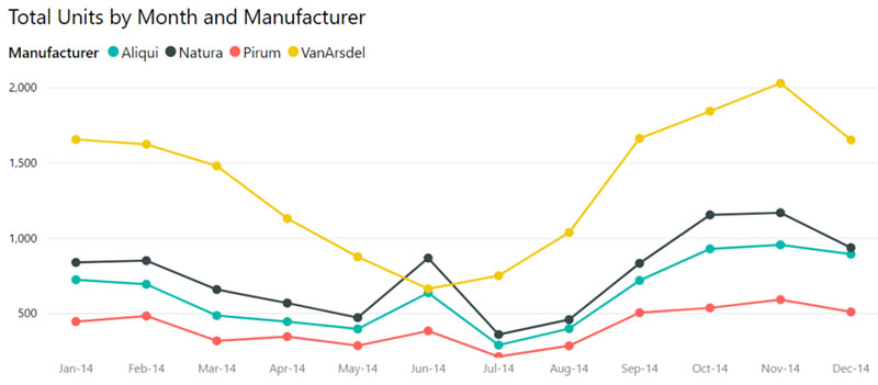
Line Chart Example
Chart created with wpDataTables
When To Use A Line Chart
Let’s cut to the chase—line charts, they’re your perfect pick when the story’s about change and progression.
- Tracking sales numbers over the quarters?
- Watching user engagement spike and dip?
- Eyeballing website traffic stats over the months?
That’s when a line chart shines. It turns the ebb and flow of those figures into something you can point at—clear, and no beating around the bush.
Say you’ve got this data set that’s unfurling over time. Plot that on a line chart.
Watch it do its dance—the rises, the falls, a bird’s-eye view of what’s hot and what’s not. People get it, fast; it’s visual, intuitive.
Whenever there’s a timeline involved, and you’re looking to illustrate a journey—whether that’s stock prices doing their rollercoaster thing or temperature readings telling their warming tales—a line chart steps up.
Pulls those abstract numbers into a visual story, a narrative that sticks, straight as an arrow.
How To Read A Line Chart
Step right up, let’s decode this line chart. You’re staring down the X-axis—that’s where the timeline hangs out, chronological and steady.
Tick tock, it goes from left to right, mapping out those moments in time.
Now, crane your neck up to the Y-axis. This is where the action’s at—those data points jump up and down, showing the highs and lows of whatever we’re tracking.
Could be dollar signs, website hits, maybe temperatures—whatever the numbers, they’re all plotted right there.
Eyes on the prize: the line itself. It’s like a trail through the wilderness of data.
A steady climb? Things are looking up.
A sharp descent? Buckle up, there’s turbulence ahead.
Watch for patterns, are they waving hello with peaks and troughs, or is it a flatline ride—steady as she goes?
That’s the line chart spilling the beans on the story behind the numbers.
Types Of Line Charts
Dive into the world of lines and charts, and you’ll find there’s more than one way to stitch data through time and space.
Take the classic simple line chart—a no-fuss, clear-cut way to showcase one data set’s journey over time. It’s the vanilla scoop that never goes out of style.
Simple line chart created with wpDataTables
Now, jazz it up—enter the multiple-line chart. It’s like a band jamming on stage, each line a different instrument, together creating this rich, layered tune of various data sets.
Multiple line chart created with wpDataTables
Got a ton of zigzagging between points? That might call for a segmented line chart. Each segment tells its own mini-tale, part of a greater saga.
Segmented line chart created with wpDataTables
Then there’s the area line chart—filling in everything under the line, painting a picture of quantity as well as quality. It’s not just the trajectory; it’s also the volume, nice and shaded.
Area line chart created with wpDataTables
Charts, lines, they’re the bread and butter for casting numbers into narratives. Each type tweaks the story, a different frame for a different effect. It’s form meeting function, with straight-up elegance.
How To Make A Line Chart In WordPress
To create a line chart in WordPress using wpDataTables, follow these steps:
- Access Chart Creation Wizard: In your WordPress admin panel, go to wpDataTables and select “Create a Chart”.
- Select Chart Type: Choose a render engine (e.g., Google Charts, Highcharts) and select the type of chart you want to create, such as a line chart.
- Define Data Source: Choose the wpDataTable that will provide data for your chart.
- Set Data Range: Specify the columns and rows from your table to be used in the chart. You can also configure the data range for rows and columns.
- Customize Formatting: Adjust chart formatting options like width, height, colors, and axis settings.
- Preview and Adjust: Review the chart in the preview section and make any necessary adjustments to the settings.
- Save and Get Shortcode: Once satisfied, save the chart to generate a shortcode.
- Insert Chart in Post/Page: Use the shortcode to insert the chart into your WordPress post or page.
How To Make A Line Chart In Excel
To make a line chart in Excel, follow these steps:
- Prepare Your Data: Your data should have at least two columns, with time intervals (or another independent variable) in the first column and dependent values in the others.
- Select Data: Click on a single cell within your data range or select the specific data you want to plot.
- Insert Line Chart: Go to the ‘Insert’ tab, click on ‘Insert Line or Area Chart‘, and choose your preferred line chart type.
- Customize Chart: You can further customize your chart by changing the title, legend, axis scale, gridlines, and other stylistic elements.
For multiple line graphs, ensure you have at least three columns of data. Each data series will be plotted individually.
How To Make A Line Chart In Google Sheets
To create a line chart in Google Sheets, you can follow these steps:
- Enter Data: Start by inputting your data into the spreadsheet.
- Highlight Data: Select the data you want to include in the graph.
- Insert Chart: Go to the top toolbar and click on “Insert Chart”.
- Choose Chart Type: Select the type of line chart you prefer, such as a regular line chart, smooth line chart, or combo line chart.
- Customize Chart: If needed, customize your chart using the available options.
FAQ About Line Charts
How do I create a line chart in Excel?
Open Excel and input your data into a worksheet. Highlight the data range, go to the ‘Insert’ tab, select ‘Line Chart’ from the charts group. Choose a specific line chart style. Your line graph will appear, showing your numeric data along the X-axis and Y-axis with labeled data points.
Why should I use a line chart?
Line charts are optimal for visualizing data over time. They reveal trends and patterns that might be missed in a table of numbers. Useful for business intelligence, market analysis, and statistical charts, they help in tracking performance metrics and historical data effectively.
What tools can I use to create line charts?
Several tools can help you create line charts, such as Google Sheets, Tableau, Highcharts, and D3.js. Programming languages like Python with libraries such as Matplotlib and Plotly are also excellent options. Each tool has unique features for making your visualization tools more interactive and dynamic.
Can I customize a line chart?
Yes, most tools allow extensive customization. You can adjust axis labels, change colors, add chart legends, and include markers for specific data points. Tools like Chart.js and Excel offer various formatting options to make your charts more informative and visually appealing.
What is the difference between a line chart and a graph?
While a line chart specifically refers to data points connected by lines to display trends over time, a graph is a broad term for any graphical representation of data, including bar charts, pie charts, and scatter plots. Line charts specifically excel in showing continuous data.
How do I interpret a line chart?
Interpreting a line chart involves looking at the trend lines to see increases, decreases, and fluctuations. Peaks and troughs indicate high and low values. Understanding these patterns helps in data interpretation for financial forecasting, market analysis, and monitoring key performance indicators (KPIs).
Can line charts show real-time data?
Yes, with tools like Google Data Studio and Power BI, you can create interactive dashboards that update in real-time. Real-time line charts are invaluable for monitoring live metrics, making them perfect for business intelligence and performance tracking.
What are some common mistakes to avoid?
Avoid cluttering your line chart with too many lines or points, which can make it confusing. Always label your axes and data points accurately. Ensure your data is correctly formatted and all trends are clearly visible to provide more precise data analysis.
How do I integrate line charts into a website?
To integrate line charts into a website, you can use JavaScript libraries such as D3.js, Chart.js, or Plotly. Embed charts using HTML5 and style them with CSS for a seamless experience. Using APIs, you can link real-time data directly to your charts.
Conclusion
Line charts offer a straightforward yet powerful way to visualize data trends and patterns. They are essential for tasks like tracking sales metrics, performing financial forecasting, or conducting market analysis. We’ve explored various tools, from Excel and Google Sheets to advanced options like Tableau and D3.js.
By using tools like wpDataTables, Matplotlib, Plotly, and Power BI, you can enhance your data visualization projects. Customization options, such as adjusting axis labels and integrating real-time data, make line charts versatile and practical for various applications.
Here’s a quick recap:
- Creating line charts: Various tools like Excel and Tableau.
- Customization: Labels, colors, and data points.
- Interpretation: Trends, peaks, and troughs.
- Integration: Use of JavaScript libraries and APIs for websites.
Mastering line charts will elevate your data analysis capabilities and deliver clearer, more insightful business intelligence.
If you liked this article about line charts, you should check out this article about bar charts.
There are also similar articles discussing pie charts, candlestick charts, bubble charts, and waterfall charts.
And let’s not forget about articles on stacked bar charts, area charts, column charts, and donut charts.


