Area charts offer a powerful way to visualize data trends over time. Their ability to show cumulative data and trends over periods makes them invaluable for business analytics, financial charts, and data visualization projects. In this article, you’ll learn how to make the most of area charts using tools like Microsoft Excel, Google Sheets, and Tableau.
You’ll discover practical tips for chart customization, explore essential aspects like chart axes, and understand the importance of color-coded charts in visual data representation. With insights into leading visualization software and charting techniques, you can enhance your data storytelling and make informed decisions.
By the end of this article, you will have a comprehensive understanding of area charts and their applications in different contexts—whether it’s time series analysis, dashboard visualization, or analytical charts. Let’s dive deep into the essentials of area charts, with sections covering types, tools, and best practices.
Feast your eyes on the following smorgasbord: the best charting tools to create your masterpiece, the lowdown on interactive charts, and nifty tricks for data trend analysis. Let’s raise the curtain on this show of shapes and statistics.
Table of Contents
What Is An Area Chart?
An area chart is a graphical representation that displays quantitative data. Similar to line charts, with the addition of shading between lines and the baseline, it vividly illustrates volume changes over time, making it perfect for highlighting trends and patterns in a dataset.
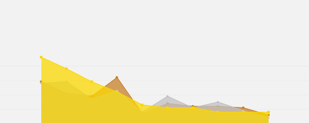
Area Chart Example
Chart created with wpDataTables
When To Use An Area Chart
You’ve got data that unfolds over time—numbers that rise and fall like the breath of the market. Area charts are your go-to when such a story needs the stage. They shine with time-series data, where the ebb and flow of information paint the picture.
When different categories stack up to a total? That’s when a stacked area chart steps in, each layer adding its own hue to the narrative.
Chasing simplicity? Single data sets seeking the spotlight get their due with a basic area chart—no clutter, just the essence of rise and fall, the visual heartbeat of your data.
Always remember: the aim is to illuminate trends, not to overwhelm. Visual analytics is a craft, and knowing when to use this tool—that’s the art.
How To Read An Area Chart
Chart created with wpDataTables
Reading an area chart?
Start with the x-axis, mapping time or categories. As eyes trail up, the y-axis greets you with values. Where the dance of lines and shaded regions unfolds, that’s the narrative.
Peaks whisper tales of highs—those success stories. The lows, they speak of challenges, valleys waiting for the climb.
Shades between lines? They’re more than just pretty; they’re volumes over time, a subtle yet bold statement of cumulative action.
Remember, legends are your Rosetta stone here. Without them, it’s just abstract art. But with those data points labeled?
Now, the story unfolds.
Types Of Area Charts
Chart created with wpDataTables
Navigating the world of area charts is like picking the perfect tool for the job—each with its unique flair.
There’s the classic area chart, a lone ranger, perfect for the straightforward tale of one data set against the tides of time.
Up the ante, and stacked area charts come into play—think of them as your layered cake of data, each slice a different category, their sum telling a collective story.
Don’t want the layers merged? Percent stacked area charts keep things proportional, every category’s contribution to the whole crystal clear, no matter how the total fluctuates.
Need clarity over overlaps? Streamgraph injects a touch of style and grace, tackling data that dances over and under one another—a ballet of statistics.
Each type, a different lens to view the sheer spectrum of data visualization. Choose wisely; make the unseen seen.
How To Make An Area Chart In WordPress
To create an area chart in WordPress using the wpDataTables plugin, follow these steps:
- Open Chart Creation Wizard:
- In your WordPress admin panel, go to wpDataTables -> Create a Chart.
- Define a chart name for identification and choose a render engine (Google Charts, Highcharts, Chart.js, or ApexCharts).
- Data Source Step:
- Select the table to be used as the data source for your chart using a simple select box.
- Data Range Step:
- Use the Column Range Picker to select table columns for the chart. You can reorder items in the list and add or remove columns.
- For Row Range Picker, choose individual rows or ranges. You can select cells directly or use checkboxes for rows and columns.
- Optionally, use the “Follow table filtering” checkbox if you want the chart to adapt to table filters.
- Formatting and Preview:
- Adjust basic chart options like width, height, background color, border properties, and more.
- Customize series options (label, color, type) and axes options (grid, labels, crosshair, direction).
- Set main title options, tooltip settings, and legend properties.
- Configure exporting options for users to download the chart in various formats.
- Use the live chart preview on the right side of the screen to see changes instantly.
- Save and Use the Chart:
- Once satisfied with the preview, click “Save chart” to save it in the WordPress database.
- A shortcode will be generated, which you can copy and use to insert the chart into a WordPress post or page.
This process allows you to create responsive and customizable area charts in WordPress, enhancing your website’s data presentation capabilities.
How To Make An Area Chart In Excel
To make an area chart in Excel, follow these steps:
- Set Up Your Data: Organize your data in a table format. The first column should contain labels (like years or categories), and the second column should contain corresponding values. For a stacked area chart, create additional columns for each sub-group.
- Creating the Area Chart:
- Highlight the data range you want to use for the chart.
- Go to
Insert>Charts, choose theLine Chartgroup, and then select the second 2-D Area chart option. - An area chart will be created based on your selected data. You can modify its properties by selecting the chart and using the Chart options in the toolbar.
- Modifying the Chart:
- You can add a title, change the legend, adjust axis font size, and more through the Chart options.
- To further customize, you can start with an empty area chart object (Insert > Charts > Area Chart) and then use
Chart Tools>Design>Select Datato input your data.
- Advanced Customization:
- For more advanced options and flexibility beyond Excel, you can explore other visualization tools like Displayr’s area chart maker.
This process allows you to create both standard and stacked area charts in Excel, providing a visual representation of your data with the area between the line and the x-axis colored to illustrate volume.
How To Make An Area Chart In Google Sheets
To create an area chart in Google Sheets, follow these steps:
- Format Your Data:
- First column: Data for the x-axis.
- Second column: Data for the y-axis.
- Additional columns (optional): For more areas in the chart.
- Use the first row for series labels.
- Create an Area Chart:
- Select the range of data you want to visualize.
- Click
Insert, then selectChart. - In the Chart editor sidebar, go to the
Setuptab and chooseArea chartfrom the Chart type dropdown.
- Customize the Chart:
- To add a title, go to the
Customizetab in the Chart editor, then clickChart axis & titles. - Select
Chart titlefrom the dropdown and type your title. - Modify the title font, size, and alignment as needed.
- To add a title, go to the
- Create a Stacked Area Chart:
- Follow similar steps as above, but select
Stacked area chartfrom the Chart type dropdown. - Ensure your data contains multiple columns for the breakdown of values.
- Follow similar steps as above, but select
- Create a 100% Stacked Area Chart:
- This is similar to a stacked area chart but emphasizes the differences in composition over time.
- Select
100% stacked area chartfrom the Chart type dropdown.
- Create Stepped Area Charts:
- These charts combine features of column and area charts.
- Choose from
Stepped area chart,Stacked stepped area chart, or100% stacked stepped area chartin the Chart type dropdown.
These steps allow you to create various types of area charts in Google Sheets, including simple, stacked, 100% stacked, and stepped area charts, each providing a unique way to visualize your data.
FAQ About Area Charts
How do I create an area chart in Excel?
To create an area chart in Microsoft Excel, first input your data into a spreadsheet. Select the data, then go to the “Insert” tab and choose “Area Chart.” You can customize it further with options for chart axes, legends, and color-coded areas.
What is the main difference between a line chart and an area chart?
The key difference between a line chart and an area chart is that the area chart fills the space below the line with color, enhancing visual data representation. This makes it easier to observe cumulative data and segment trends.
When should I use an area chart?
Use area charts when you need to display data trends over time, particularly for cumulative data. They are ideal for financial charts, business analytics, and whenever you need to visualize trends in data sets effectively.
How do I choose the right colors for my area chart?
Choosing the right colors for your area chart is crucial for clarity. Use contrasting colors for different data sets. Many visualization software like Tableau and Google Sheets offer predefined color palettes to help you maintain consistency and readability.
Can I make interactive area charts?
Yes, interactive area charts can be made using visualization tools like Tableau, Power BI, and Chart.js. These tools allow for dynamic charts, enabling users to hover over data points for detailed information, enhancing data storytelling and user engagement.
What are stacked area charts used for?
Stacked area charts display multiple data sets layered on top of each other. They are used for visualizing how different components contribute to the whole over time, making them suitable for business reporting and understanding complex data relationships.
How do I interpret an area chart?
Interpreting an area chart involves analyzing the height and color-coded areas below the lines. Look for trends, peaks, and valleys to understand data patterns. Interactive dashboards often provide additional details upon hovering over the area segments.
What tools can I use to create area charts?
Popular tools for creating area charts include Microsoft Excel, Google Sheets, Tableau, Power BI, and open-source libraries like D3.js and Chart.js. Each offers unique features for chart customization and data presentation.
What are the best practices for designing area charts?
Best practices involve clear labeling of chart axes, using contrasting colors, and avoiding excessive data overlays. Focus on chart customization to enhance readability. Utilize structured data and ensure your chart aligns with the intent of your data presentation for effective results.
Conclusion
Area charts are a powerful tool in data visualization, offering both simplicity and depth. They are ideal for revealing trends, visualizing cumulative data, and enhancing comparative analysis. By leveraging these charts in tools like Microsoft Excel, Tableau, or Google Sheets, you can turn raw data into insightful, intuitive graphical representations.
When designing area charts, be mindful of chart customization elements: clear chart axes, contrasting colors, and effective use of data overlays. This ensures your visualization is easy to understand and visually appealing. Whether you are working with business analytics, financial charts, or dashboard visualizations, mastery of area charts can significantly elevate your data presentation skills.
This article has shown you how to create, customize, and interpret area charts using various visualization tools and chart libraries. Applying these best practices will help you transform complex data sets into compelling visual stories, aiding in data-driven decision-making.
If you liked this article about area charts, you should check out this article about bar charts.
There are also similar articles discussing pie charts, candlestick charts, line charts, and bubble charts.
And let’s not forget about articles on waterfall charts, stacked bar charts, column charts, and donut charts.


