Imagine this: you’ve got a jigsaw puzzle of the stock market, a mess of pieces that somehow fit together to form a picture of where your investments might head.
That’s where the art of chart interpretation waltzes in, with two distinct dance partners: the line chart and the candlestick chart. While both aim to sync to the rhythm of the markets, each cuts through the cacophony of trading data with its own flair.
Here’s the deal. By the time you reach the final full stop of this deep-dive, you’ll have a tight grasp on these charting powerhouses.
You’ll suss out the essence of technical analysis, decode complex market trends, and sweep through price action with the finesse of a seasoned trader.
Chart Types, Financial Instruments, Trading Patterns—you name it. We’re dissecting them all. We’ll unravel the dense tapestry woven by OHLC and learn why Volume data isn’t just noisy background.
Knowledge is your currency; let’s make you rich. Buckle up; it’s not your average joyride through the elaborate network of financial charts.
Table of Contents
- Line Charts
- Candlestick Charts
- Comparative Analysis: Line Charts vs. Candlestick Charts
- Making an Informed Choice
Table of Contents
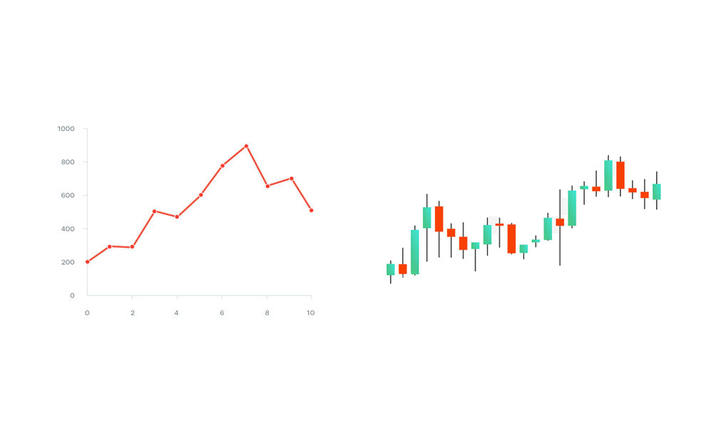
Line Charts
Chart created with wpDataTables
Diving into the world of charts, it feels almost like clearing up a foggy window and seeing the market’s soul laid out bare and simple.
The line chart—it’s straightforward, no nonsense, and to the point, like that old friend who never beats around the bush.
Characteristics of Line Charts
Definition and construction of a line chart
Imagine taking a pen and sketching a dot for the closing price of your favorite stock each day. Now, connect the dots.
Each line you draw from one dot to the next tells a story—the story of how that stock has moved over time.
It’s as simple as it gets: A breadcrumb trail capturing the essence of market movement, plain and unadorned.
Visual representation and readability
It’s the minimalist artwork of the financial world.
You look at a line chart, and it’s clear as day—a smooth curve swinging up and down, showing you at a glance which way the wind’s been blowing in the markets. No fuss or frills, just clarity served on a plate.
Advantages of Line Charts
Clarity in showing the overall trend
Line charts shine a light on the bigger picture.
They scream the overarching trend from the rooftops, making them ideal for seeing the forest for the trees—or in trader speak, spotting long-term trends without getting lost in the noise of daily price fluctuations.
Simplicity and ease of use for beginners
They’re the entry-level pick for anyone taking their first steps into the world of market analysis.
Intuitive? Check. Beginner-friendly? Absolutely. Line charts hold your hand through those early, daunting days of charting.
Limitations and Challenges
Lack of detailed price action information
Here’s the snag: line charts are a bit like that well-meaning friend who leaves out the juicy details.
You get the gist of the story, sure, but sometimes those missing specifics are exactly what you need. The chart whispers the closing price but keeps mum on the high drama of intra-day peaks and troughs.
Inadequacy for complex technical analysis
When traders fancy themselves as market detectives, searching for clues hidden in the charts, line charts fall short.
The simplicity that once was a virtue becomes a vice, as the lack of details—like price gaps and varied volume data—leaves these sleuths with half the story.
For the intricate dance of line chart vs candlestick, the subtleties of wicks and shadows paint a far richer picture than the solitary paths etched by line charts.
Candlestick Charts
Chart created with wpDataTables
Zoom in from the daily hum of the market and you’ll see it: a forest of candlestick charts, a favorite in the trader’s toolbox.
It’s not just a graph; it’s a rich narrative, telling tales of battles between bulls and bears, each candle a miniature drama of its own.
Anatomy of a Candlestick Chart
Understanding candlestick structure: body and wicks
Picture each candlestick as a little snapshot of time. The body is like the heart, showing where prices have opened and closed.
It’s thick with meaning—the wider it is, the more significant the shift. Now, the wicks, they’re the wisps of what was—the highest highs and lowest lows that tell you just how far prices stretched within that time frame.
Color coding and its significance
These candles come in two shades—usually red and green, like a stop-and-go light, teeming with intent.
Green is the market whispering, “We’re going up,” while red is a warning, “We’re heading down.” This color talk makes it easier to spot shifts in market mood, a swirl of sentiment at every turn.
Advantages of Candlestick Charts
Detailed price information (open, high, low, close)
The devil’s in the details, and candlestick charts are chock-full of them.
Each candle offers a quartet of precious intel—opening price, closing price, the peak of optimism, and the depth of despair. It’s the full monty, all you need to decipher the day’s doings.
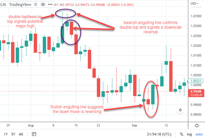
Identification of patterns and market sentiment
Candlesticks are like the market’s Morse code, patterns blinking signals for those in the know.
Hammer, doji, or engulfing—each formation is a clue, a piece of the puzzle that seasoned eyes can piece together to predict the market’s next move.
Challenges and Complexities
Learning curve for interpretation
Every skill worth its salt has a learning curve, and waxing wise with candlestick charts is no different.
Grasping this visual language takes patience—a bit like learning to read all over again, but this time the alphabet is made of candles.
Risk of misinterpreting patterns
Even the most eagle-eyed can trip up on candlestick charting.
Misread a pattern and you’ve got a recipe for a mishap. It’s the line chart vs candlestick conundrum; the former keeps it simple, while the latter demands a sharp eye and a sharper mind.
Dive deep into these contents and the story spins itself—a narrative thick with data, ready for a savvy mind to read between the lines (or, in this case, the wicks and bodies).
Decode the hues of red and green, and the market’s trends and turns lie bare before you, ripe for the picking.
Comparative Analysis: Line Charts vs. Candlestick Charts
Cracking open the door to the chart room reveals two distinct characters vying for attention: line chart vs candlestick.
Each one is telling the same story – the rocky road of stock prices – but in a different dialect. While one speaks in smooth arcs, the other talks in vibrant candlelight.
Visual Representation and User Friendliness
Comparison of visual aesthetics and ease of interpretation
Let’s paint a picture here. Line charts are like the clean, classic lines of a well-designed chair—uncomplicated, practical, giving you what you need at a glance.
But when it comes to the candlestick, it’s more like an intricate chandelier, each part with a purpose, every flicker of candlelight offering depth and shading.
Line charts boast that renowned ‘user-friendly’ badge. They’re accessible, free of the ornamentation that sometimes casts shadows in the halls of financial charts.
This makes them prime for the fresh eyes of market greenhorns.
In the line chart vs candlestick kerfuffle, the candlestick charts bring a storybook full of details to bedtime. For the vested viewer, those details are gold dust.
But for the newcomer? Perhaps an overwhelming novella, dense and daunting.
Audience suitability for each chart type
Dive into this cesspool of uncertainty, and the riddle begins to unravel. Harness the line chart for its uncomplicated truth, catered to those who swim in the shallow end of market analysis.
On the flipside, candlestick charts spread their arms wide open for the seasoned swimmers, the ones who’ll dive to the depths for richer insights.
Depth of Market Insights
Analyzing the depth of information provided by each chart
One chart whispers the close on the breeze, the other tells tales of highs and lows, opens and closes.
In the line chart vs candlestick narrative, the former is the abridged version, a digestible snippet, while the latter is the unrivaled tome of market moves.
A line chart is your trusty steed through the plains, steadfast and true, keeping you on course through thick and thin. Yet, it’s when the terrain demands more—more details, more secrets whispered in the wind—that the candlestick chart mounts up, a trusty chariot armed for battle with volatility.
Impact on short-term vs. long-term analysis
If the long-term is your stage, the line chart sits in the director’s chair, framing the panoramic view.
It’s in the nimble dance of short-term shifts, though, where the candlestick’s flickering light unveils the nuances that could be the pivot in your plot twist.
Application in Different Market Conditions
Adaptability to volatile vs. stable markets
The equanimity of line charts provides solace when markets hum a stable tune.
But havoc rages in the tumult of volatility, and here candlesticks whisper secrets, allowing you to hear through the cacophony.
Usefulness in predicting market trends and reversals
In the seesaw of trends and reversals, the blistering pace can blur the line between foresight and hindsight.
A line chart extends a steadying hand, but candlesticks jitterbug with signals, blooming like flowers that presage the change of season.
Making an Informed Choice
When it comes to winding through the maze of market analysis, every turn and corner presents a new challenge.
Treading this path means making friends with charts. Not just any charts, but the right kind for the journey. It’s about more than a casual stroll; it’s about making the informed choice in the great line chart vs candlestick debate.
Factors to Consider When Choosing a Chart Type
Personal trading or investment style
Think about it—every trader has their rhythm, their own style that makes their heart beat.
Some folks like to keep it simple, to see the bigger picture without getting bogged down in the nitty-gritty. They might tilt toward the line chart, the straightforward storyteller.
But then, there are those who crave the details, who want to see every breath the market takes. They’re more likely to buddy up with candlestick charts.
It’s all about picking the chart that fits like a glove, the one that speaks your language.
Specific analytical needs and goals
Dig deeper. What’s the treasure you’re hunting for in this vast ocean of data? Are you setting sail for a quick trade, or are you in it for the long haul?
The flashes of light from candlesticks could guide you through choppy short-term waters, while the steady beam from a line chart could shine the way if you’re charting a course over the horizon.
Blending Chart Types for Enhanced Analysis
Combining strengths of both charts in a complementary analysis strategy
Imagine having two puzzle pieces that by some stroke of magic, fit together to unveil the big picture.
That’s the harmony that can happen when you blend the strengths of line charts and candlesticks. You’ve got the line chart—a dose of clarity and simplicity.
Then there’s the candlestick—rich in detail and texture. Marry the two, and you’re staring at a full picture, each style filling in the blanks left by the other.
Practical examples of hybrid analysis approaches
Breathe life into that strait-laced line chart with splashes of candlestick insight for those moments when the market swings wildly, and you need a candle’s flame to light the way.
Or sharpen the complex candlestick patterns with the clean line of a simpler chart to stay on track of the trend.
It’s not so much about choosing one over the other but letting them dance together, a blend that could strike the right chord in your market melody.
FAQ On Line Chart Vs Candlestick
What’s the basic difference between line charts and candlestick charts?
Line charts are sleek, tracing closing prices in a continuous line. Candlestick charts show more – the full dance of prices within a period: opening, high, low, and closing, all in a single ‘candle.’ It’s about the detail, mate.
Why would someone pick a line chart over a candlestick chart?
Line charts are clean, no-fuss. They give you the gist, the trend, without drowning you in details. When your brain’s fried from over-analysis or you need a quick market pulse, that’s your go-to.
How do candlestick charts illuminate market psychology?
Each ‘candle’ in the chart is like a mood ring of the market’s sentiment – they reveal battles between bulls and bears within a session. Long candles, short wicks, each shape tells a trader’s tale. It’s the drama of supply and demand in picture form.
Can I spot market trends using line charts?
Absolutely. These charts cut to the chase, drawing straight from point A to point B. Trends stick out without clutter. You’re getting a distilled version of market movements – a whistle-stop tour through hills and valleys of prices.
Are candlestick patterns really important in technical analysis?
You bet. These patterns are like bread crumbs that lead Hansel and Gretel home. They’re clues, hints of what might come next in the market’s storyline. From ‘dojis’ to ‘engulfings,’ each tells a potential plot twist traders shouldn’t ignore.
How do time frames affect line chart and candlestick chart analysis?
Time frames scale the microscope – think zooming in and out. A candlestick on a 1-month chart holds a thick slice of market events, whereas a 15-minute one’s like a heartbeat monitor, each pulse ridden with smaller moves and shakes.
The line chart simplifies these changes across any time frame.
What’s the learning curve for interpreting candlestick charts?
Steep, but not Everest. Initially, candlesticks could look like hieroglyphics. Once you get a handle on the basics – the opens, closes, highs, and lows – patterns start to emerge, a language you can decipher. Put in the hours, you’ll get it.
Can line charts incorporate technical indicators as effectively as candlestick charts?
They can, but think minimalist versus baroque. Line charts suit simpler indicators like moving averages. Candlestick charts, with their complexity, welcome a wider variety, like RSI or MACD, fitting extra layers onto already intricate narratives.
How does volume data pair with line and candlestick charts?
Think of volume data as the heartbeat to these charts’ pulse. Line charts show the lifeblood flow of price alone, while candlesticks take the heart’s rhythm into account, showing how volume can impact the price’s rise and fall.
Are candlestick charts applicable across all financial markets?
Oh, they’re global citizens. Stocks, Forex, commodities, even crypto – if it’s got a price that flickers, candlesticks will light the way. They’re versatile, adaptable, revealing the universal language of market psychology, wherever it speaks.
Conclusion
Wrapping our heads around the line chart vs candlestick conundrum, it comes down to this: your toolkit’s got to match the project on your screen. Line charts? They’re your straight-razor—sharp, direct, giving you the skinny on price trends without the frills. Candlesticks, though, they’re the Swiss Army knife, equipped with all the bells and whistles necessary to decode market sentiment and dive into the thick of price action and trading patterns.
- Market Trends
- Technical Analysis
- Trading Data
Your journey’s end through the maze of financial charts doesn’t have to be a head-scratcher. Think of this as handing over the map—now you’ve got the X that marks the spot. Whether it’s the nuanced storytelling of candlesticks or the no-nonsense clarity of line charts, you’re set.
Go on, take this knowledge for a spin. The charts are not just figures; they’re the narrative of markets, in peaks and troughs, wicks and bodies. Now you’re speaking their language, and that’s pretty mighty.
If you liked this article about line charts vs candlesticks, you should check out this article about box plots.
There are also similar articles discussing scatter plots, funnel charts, pie charts vs bar charts, and pie charts vs donut charts.
And let’s not forget about articles on scatter charts, gauge charts, histograms, and how to choose the right chart for your data.


