Horizontal bar chart examples solve the problem of presenting complex data in a clear, accessible way. When it’s time to showcase comparative analysis or graphically represent data insights through visual reports, horizontal bar charts stand out.
You’ll discover how these charts provide intuitive graphical representation, making data-driven decisions easier. From business intelligence (BI) visualization to concise data plots in presentation graphics, horizontal bar charts are vital for effective data storytelling.
This article guides you through practical examples of horizontal bar charts, shedding light on the best practices for creating these charts. You’ll gain insight into how metadata, user experience (UX), and structured data come into play, enhancing your ability to develop impactful data visualizations.
By the end, you’ll know how to use these charts to present information graphics design, interpret patterns in data, and make insightful charts that elevate your analytic reports and BI dashboards. Prepare to dive deep and come away equipped with practical tools for your next data visualization project.
Table of Contents
Horizontal Bar Chart Examples
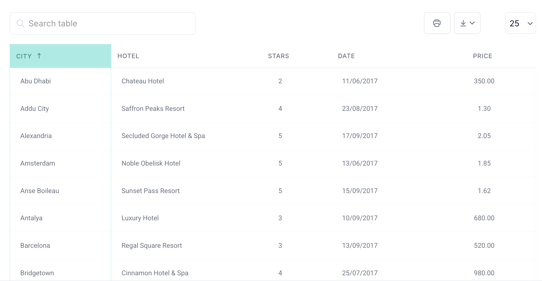
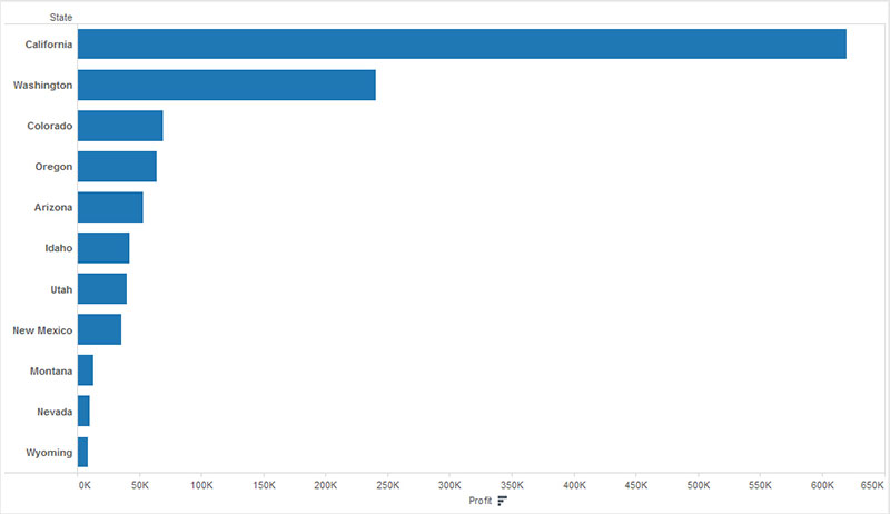
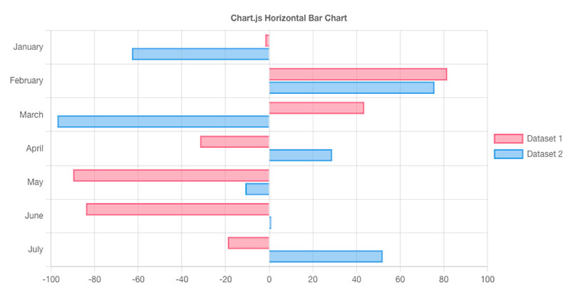
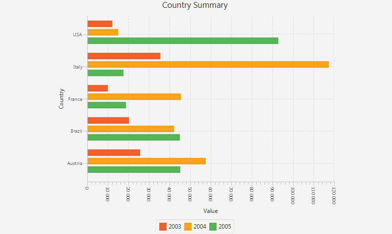
Chart created with wpDataTables
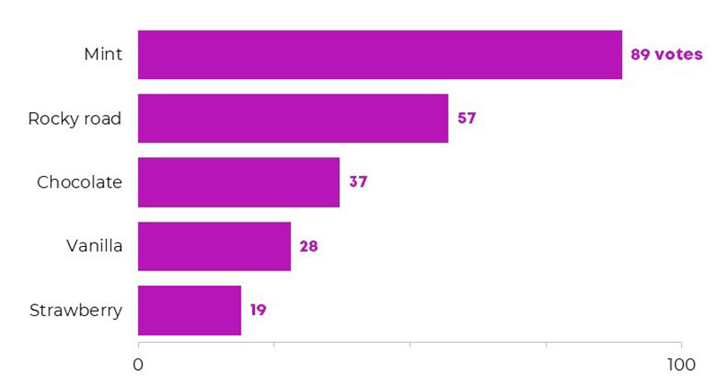
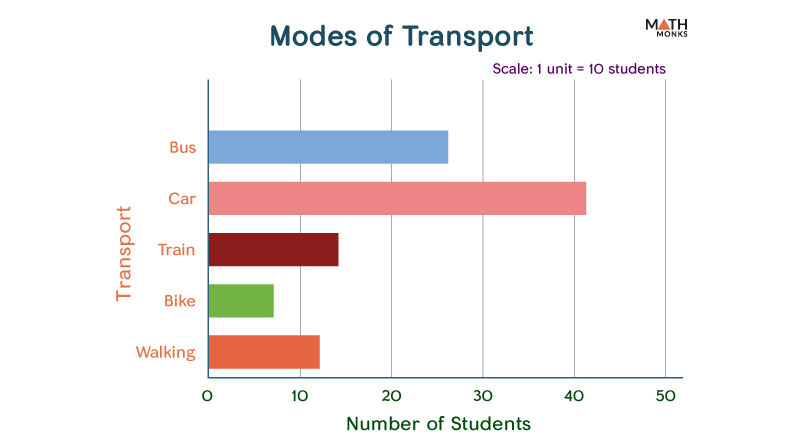
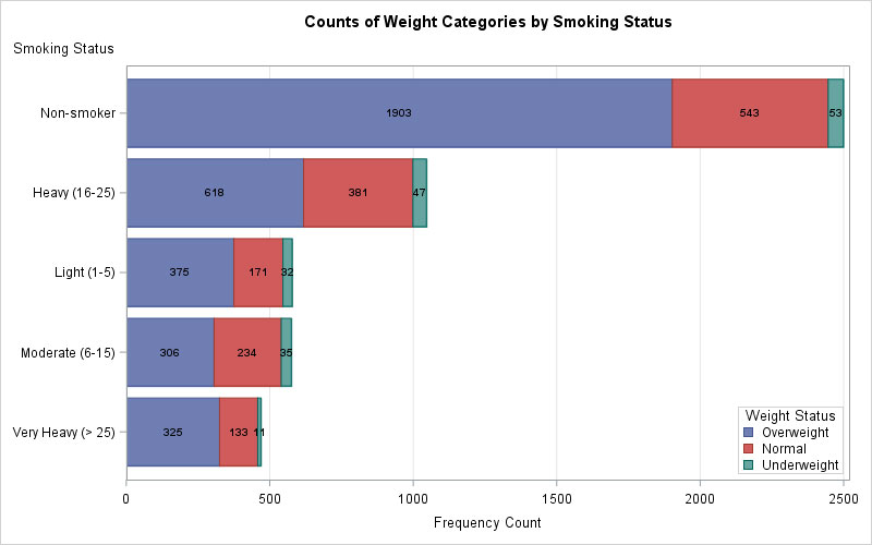
Chart created with wpDataTables
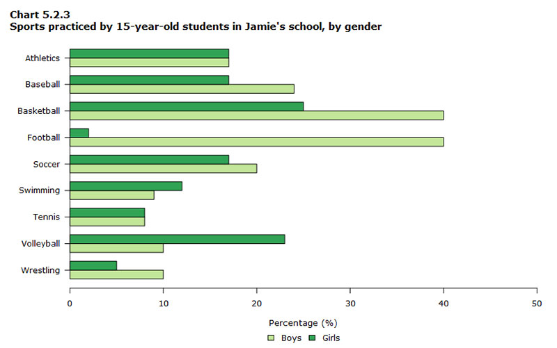
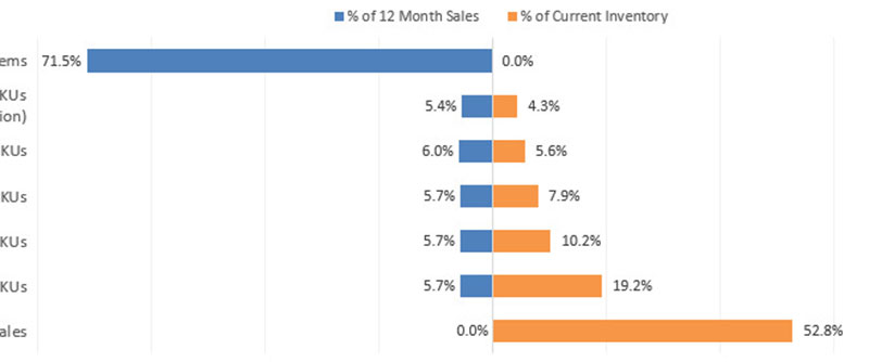
Chart created with wpDataTables
Your beautiful data deserves to be online
wpDataTables can make it that way. There’s a good reason why it’s the #1 WordPress plugin for creating responsive tables and charts.

And it’s really easy to do something like this:
- You provide the table data
- Configure and customize it
- Publish it in a post or page
And it’s not just pretty, but also practical. You can make large tables with up to millions of rows, or you can use advanced filters and search, or you can go wild and make it editable.
“Yeah, but I just like Excel too much and there’s nothing like that on websites”. Yeah, there is. You can use conditional formatting like in Excel or Google Sheets.
Did I tell you you can create charts too with your data? And that’s only a small part. There are lots of other features for you.
FAQ On Horizontal Bar Charts
What is a horizontal bar chart used for?
A horizontal bar chart is used for data visualization, specifically to compare different categories or groups.
With bars extending horizontally, it allows a side-by-side visual comparison, making it easier to read and interpret categorical data quickly. Ideal for business analytics and market research.
How do I create a horizontal bar chart in Excel?
To create a horizontal bar chart in Excel, select your data, navigate to the Insert tab, choose ‘Bar Chart,’ and pick ‘Horizontal Bar Chart.’
Customize by adding labels and adjusting colors. This provides a graphical representation useful for statistical analysis and quantitative analysis.
What are the advantages of using a horizontal bar chart?
Horizontal bar charts offer clarity in comparing lengthy category names. They make data insights easier to understand at a glance, especially when dealing with a large set of categories.
They’re great for visual comparison, making performance metrics clear and concise.
How can I customize a horizontal bar chart in Tableau?
In Tableau, create a horizontal bar chart by dragging your dimensions to the Rows shelf and measures to the Columns shelf.
Customize using the Marks card to adjust colors, labels, and sorting. This flexibility is ideal for reporting tools and business intelligence.
Can horizontal bar charts handle negative values?
Horizontal bar charts accommodate negative values efficiently. Negative bars extend to the left of the axis, visually differentiating between positive and negative values. This feature is essential for comprehensive financial reporting and quantitative analysis.
What types of data are best displayed with a horizontal bar chart?
Categorical data is best visualized using horizontal bar charts. Whether comparing survey results, employee performance, or sales performance, this chart type excels in presenting clear and easily interpretable comparative data and performance metrics.
How do I add labels to bars in a horizontal bar chart?
In most charting tools like Excel or Tableau, you can add labels by selecting the bar chart and enabling “Data Labels” from the chart options. Labels enhance data presentation, providing explicit values on bars and improving data comparison.
What is the difference between a horizontal and vertical bar chart?
The primary difference lies in orientation. Horizontal bar charts have categories along the Y-axis and values along the X-axis, making them better for longer category names. This orientation is effective for survey results and other detailed data metrics.
When should I use a horizontal bar chart over other chart types?
Use horizontal bar charts when comparing multiple categories with long names or when data needs to be displayed side-by-side for clarity.
They’re suited for operational metrics, resource allocation, and in contexts requiring a straightforward visual comparison.
Conclusion
Horizontal bar charts serve as a vital tool for clear, effective data visualization. By facilitating straightforward comparative analysis, they suit a variety of business analytics, market research, and financial reporting tasks.
Leveraging tools like Excel, Tableau, and Power BI, you can effortlessly create and customize these charts to match your specific statistical analysis needs. From employee performance tracking to survey results, horizontal bar charts offer unparalleled clarity and detail.
By understanding how to use and customize these charts, you enhance your ability to communicate complex data insights efficiently. The ability to compare categorical data side-by-side helps in performance metrics visualization, ensuring a comprehensive grasp of the information.
Horizontal bar charts are essential for effective data presentation, reporting tools, and dashboard visuals. Their integration into business intelligence and operational metrics efforts provides indispensable value.
Unlock their potential for your data needs, ensuring clarity and actionable insights.