Most websites handle data badly. Raw numbers dumped into paragraphs, spreadsheets screenshotted and uploaded as images, a chart shoved in where a plain table would have done the job quicker.
Good data tables show what structured data looks like when it’s working: scannable, precise, built around the decision the user came to make.
What follows runs across the full range of table types you’ll find on the web, from basic static reference tables to interactive, filterable, responsive ones, with real use cases pulled from finance, healthcare, e-commerce, and sports. There’s practical guidance on structure and styling threaded through, plus the question that quietly decides everything: when to reach for a table instead of a chart.
Table of Contents
What Are Data Tables and Why Do They Matter
A data table sorts information into rows and columns so people can scan, compare, and pull a specific value without wading through paragraphs of text.
You see them everywhere. Product spec pages, financial dashboards, pricing plans, sports standings, medical records, HR reports. The structure looks deceptively simple, but done right, a table communicates faster than almost any other format going.
Written information is 70% more effective when paired with visuals, per Robert Horn’s research at Stanford. Tables sit right on the line between “visual” and “structured text,” which is exactly why they handle comparative data so well.
The Data Visualization Society’s 2024 industry report found Excel still ranking among the top tools data professionals reach for, with Tableau usage up 8% year over year. Both are built around tabular data first and charts second, and that order is the whole point.
Picking the right table type for your content is the first real decision you’ll make. Get it wrong and no amount of perfect styling will dig you out.
Basic Data Table Examples
The most common table is also the one people underrate the most. A basic data table has headers, rows, and data. Nothing else. No sorting, no filters, no interactivity.
But basic doesn’t mean dull or weak. A well-structured basic table carries a surprising amount of weight.
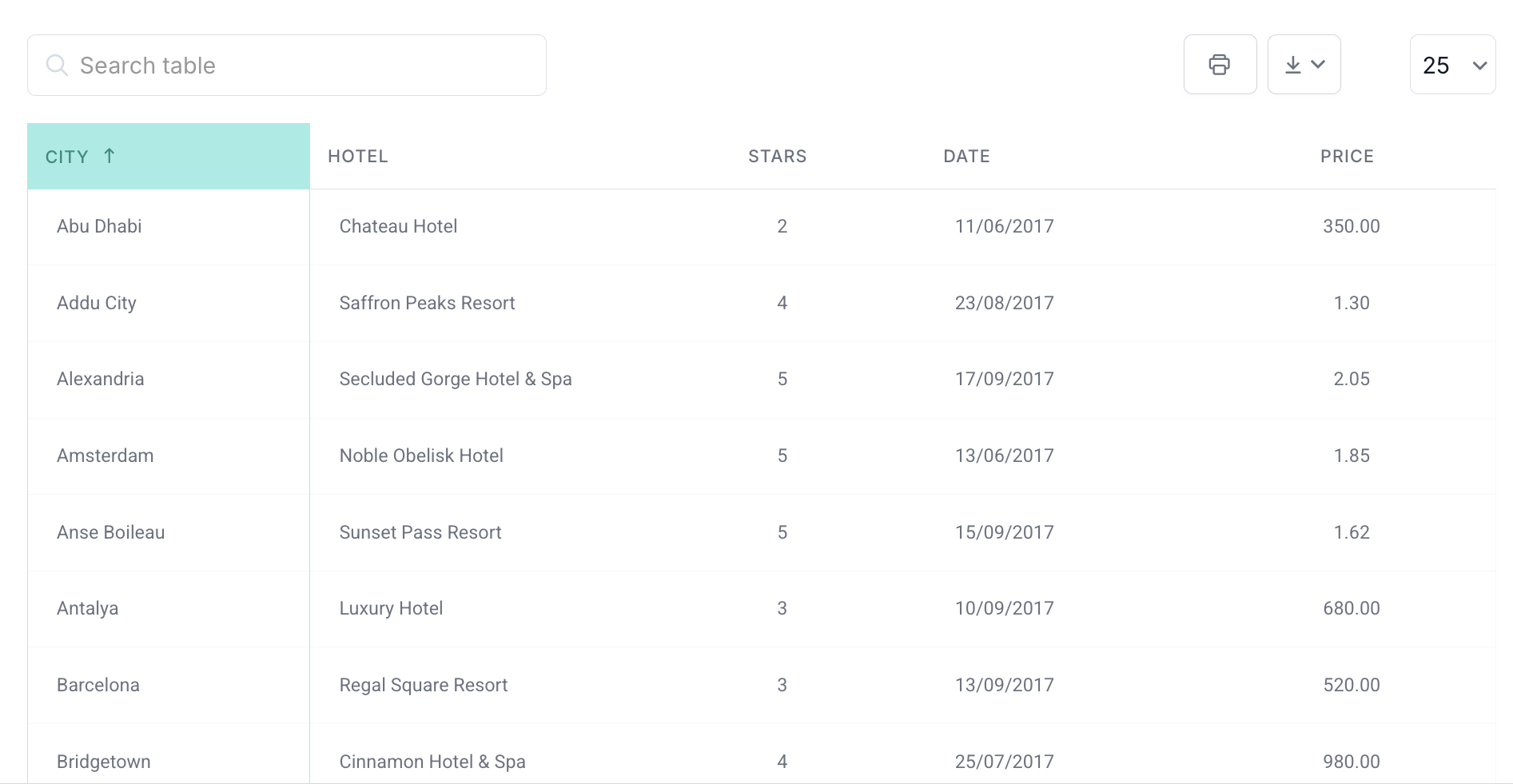
Static Reference Tables
See the Pen
Static Reference Table – SaaS UI Component by Bogdan Sandu (@bogdansandu)
on CodePen.
These are the workhorses for documentation, specs, schedules, and any dataset a user reads rather than manipulates.
Government sites lean on them constantly. Tax brackets, postal rate charts, national holiday calendars. The data rarely changes and people just need to find one row and read across it.
A good static reference table keeps its column headers clear and short, holds one data type per column (don’t mix text and numbers in the same one), and uses alternating row colors or enough whitespace to lead the eye down the page.
Striping the rows sounds like a trivial touch. IEEE VIS 2024 research found that zebra striping genuinely improves accuracy on complex comparison tasks, even though color and inline bars help people spot maximum values faster.
Comparison Tables
This is arguably the most-used table type on the web right now. SaaS products, hosting plans, insurance policies, laptops, smartphones, all of it lives in comparison tables.
The job here is different from a reference table. You’re not helping someone find a value. You’re helping them make a decision.
| Use case | Key feature | Common mistake |
|---|---|---|
| Pricing plans | Highlight recommended plan | Too many features listed per row |
| Product specs | Group specs by category | Missing units (GB, ms, kg) |
| Software features | Use checkmarks for yes / no | Ambiguous check vs. partial support |
Stripe’s pricing page is the example everyone points to. Three columns, a highlighted center column for the recommended plan, checkmarks for feature inclusion. Plain as anything, and it converts.
If you’re putting one together, comparison charts are worth a look for layout ideas that go past the standard three-tier grid.
Schedule and Calendar Tables
See the Pen
Weekly Schedule & Calendar UI by Bogdan Sandu (@bogdansandu)
on CodePen.
People often forget these count as a table “type,” but they run on the same logic. Days across the top, times down the side (or the reverse), data filling the cells.
Sports schedules, class timetables, event lineups all land here. The structure isn’t the hard part. The hard part is handling empty cells gracefully and keeping the thing readable once it gets wide.
A fixed header with a scrollable body solves most of that. If you’ve never built one, the approach for an HTML table with a fixed header and scrollable body is worth getting your head around before you start.
Interactive Data Table Examples
Static tables are fine as far as they go. Add sorting, filtering, or pagination, though, and you change how people work with the data entirely.
Frontiers research (a 2025 systematic review) found that interactivity like hover-over detail and clickable elements measurably improves both the effectiveness and the efficiency of user decisions on complex data. Which surprises nobody who’s watched someone hunt for a single row in a 500-row static table.
Sortable Tables
See the Pen
Sortable Table – Typed vs. String Sort Bug Demo by Bogdan Sandu (@bogdansandu)
on CodePen.
Sortable tables let people reorder rows by clicking a column header. That one feature turns a table from “I have to scroll until I find it” into “I can find the top five in two seconds.”
Amazon’s product listings, GitHub’s repository lists, Google Analytics reports, all sortable, because users show up with different priorities. One wants the cheapest option first. The next wants the highest rated.
There’s more under the hood than swapping an arrow icon, though. JavaScript sorting needs care around mixed data types (numbers stored as strings sort wrong), null values, and whether the sort state survives once a filter is applied.
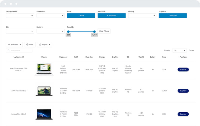
Filterable Tables
See the Pen
Filterable Table – Live Filter Chips & Row Counter Demo by Bogdan Sandu (@bogdansandu)
on CodePen.
Filtering isn’t the same as sorting. Sorting reorganizes. Filtering removes.
A filterable table hides the rows that don’t match what the user’s after. Real estate listings, job boards, e-commerce catalogs. The dataset is too big to scroll through, so people narrow it down first.
When you filter a table with JavaScript, the real UX call is where the controls go. Above the table, in the column headers, off in a sidebar? It depends on how many filter dimensions you have. One or two work inline. Six or more usually want a dedicated sidebar.
Tables with Pagination
See the Pen
Paginated Table – Sort State Persistence Demo by Bogdan Sandu (@bogdansandu)
on CodePen.
Loading 10,000 rows into the DOM is a bad idea, every time.
Pagination chops a big dataset into manageable pages, usually 10, 25, or 50 rows at a stretch. The user picks the page, and only that page loads in the browser.
Done well, table pagination keeps the interface fast and dodges the cognitive overload of infinite-scrolling through tabular data. The “show 25 results per page” pattern is familiar enough that people rarely need to be told how it works.
Where most implementations slip is forgetting to hold sort and filter state across page navigation. If someone sorts by price descending, jumps to page 2, then comes back to page 1, that sort should still be there.
Tables with Collapsible Rows
See the Pen
Collapsible Table Rows – Income Statement Demo by Bogdan Sandu (@bogdansandu)
on CodePen.
Sometimes the data is hierarchical. Parent rows with child rows tucked underneath. Grouping it this way gives people the high-level view first, then the detail on demand.
Financial statements work like this. An income statement might show revenue as a top-level row, with the product lines collapsible beneath it. A table with collapsible rows handles that tree structure without permanently hiding anything.
Took me a while to appreciate how much cleaner this is than nested subtables. Collapsible rows keep the column structure consistent, which nested tables just can’t pull off reliably.
Financial and Business Data Table Examples
Finance is where tables get serious, because the errors have consequences. A misread row or a misaligned column in a budget table isn’t an annoyance, it’s a problem.
Dataversity’s 2024 survey found active data modeling jumping from 51% to 64% of organizations in a single year, and a lot of that modeling ends up in financial tables eventually.
Budget and Expense Tables
See the Pen
Budget & Expense Tables – Financial SaaS UI by Bogdan Sandu (@bogdansandu)
on CodePen.
The most common financial table. Rows for expense categories, columns for months or quarters, totals along the bottom.
A few rules earn their place here. Right-align every numeric column, because people scan columns of numbers faster when they’re right-aligned. Keep the decimal places consistent, either always show two or never show two. Bold the totals row and set it apart visually. And put the aggregated figures in a table footer rather than burying them mid-table.
Google Sheets and Excel right-align numbers by default, and that default exists for a reason. If you’re hand-coding a financial table in HTML, match it.
Pricing Tables
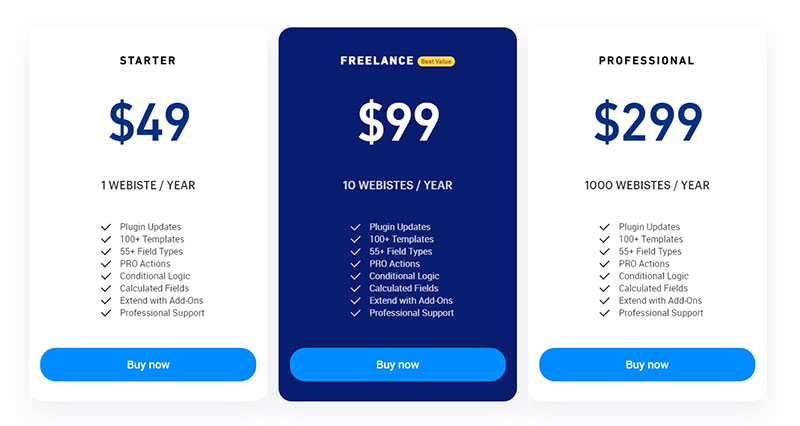
A pricing table is technically a comparison table, but it earns its own mention because the stakes are different. This is a conversion element, not just a reference tool.
The visual hierarchy in pricing tables that convert tends to follow the same shape. The recommended plan sits center, lifted out visually with a different background or border, and the CTA button rides higher than you’d expect, above the feature list.
Decision fatigue is real. Pricing tables with more than four plans usually hurt conversions rather than help them, because the mental work of comparing five columns is just too much.
Statistical and Research Tables
See the Pen
Statistical & Research Table – Academic Publication UI by Bogdan Sandu (@bogdansandu)
on CodePen.
Academic papers, government reports, and scientific publications lean on tables to lay out raw findings. These put precision ahead of aesthetics.
A research table usually carries column headers with units, footnotes for methodology, and precise decimal formatting. There’s a lot to learn from how statistical tables handle footnotes and source attribution, especially when the table has to stand alone with no surrounding text to lean on.
| Table type | Primary goal | Formatting priority |
|---|---|---|
| Budget / Expense | Track spending accuracy | Right-aligned numbers Bold totals |
| Pricing | Drive plan selection | Visual hierarchy Highlighted plan |
| Statistical | Present research findings | Precision Footnotes Units |
Sports and Standings Table Examples
Sports tables are interesting because the audience already knows how to read them. Nobody needs a league standings table explained to them. That shared familiarity means you get to focus on visual execution instead of usability basics.
League Standings Tables
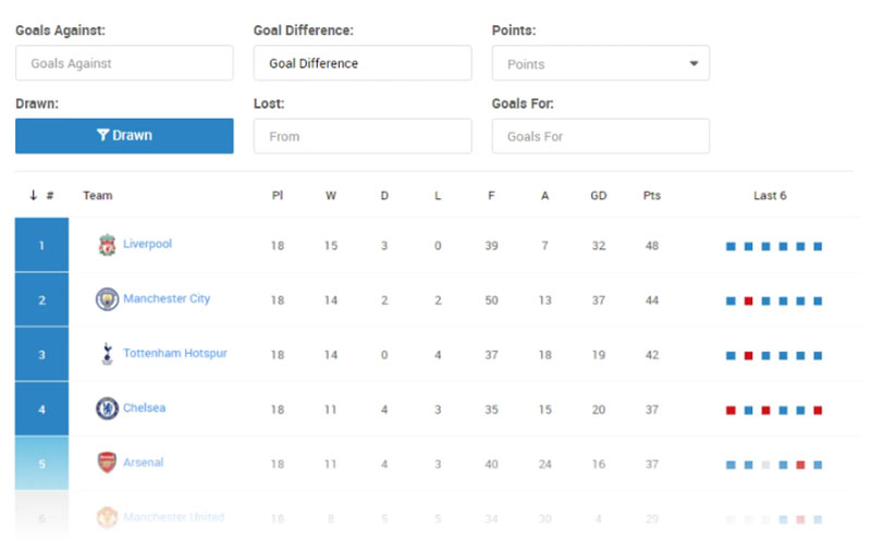
Points, wins, losses, goal difference. Those are the columns people expect, and straying from the convention just confuses fans.
The Premier League table format is a solid reference for what data belongs where, and for how the promotion and relegation zones get marked with row background colors.
Color-coded rows do real work here. Green for Champions League qualification, red for relegation. Fans scan for their team’s row first, then read the columns, so the row color tells them the story before they’ve taken in a single number.
If you build sports data visualization regularly, standings tables are only the opening act. Play-by-play stats, player performance grids, head-to-head records all follow the same tabular logic with a different set of column priorities.
Olympics Medal Tables
| Athlete | Nation | Sport | Gold | Silver | Bronze | Total |
|---|---|---|---|---|---|---|
| Michael Phelps |
|
Swimming | 8 | 0 | 0 | 8 |
| Chris Hoy |
|
Cycling | 3 | 0 | 0 | 3 |
| Zou Kai |
|
Gymnastics | 3 | 0 | 0 | 3 |
| Stephanie Rice |
|
Swimming | 3 | 0 | 0 | 3 |
| Libby Trickett |
|
Swimming | 2 | 1 | 1 | 4 |
| Ryan Lochte |
|
Swimming | 2 | 0 | 2 | 4 |
| Nastia Liukin |
|
Gymnastics | 1 | 3 | 1 | 5 |
| Kirsty Coventry |
|
Swimming | 1 | 3 | 0 | 4 |
| Shawn Johnson |
|
Gymnastics | 1 | 3 | 0 | 4 |
| Natalie Coughlin |
|
Swimming | 1 | 2 | 3 | 6 |
This simple table was created with wpDataTables. Check out yourself how easy it is to create a table.
Medal tables sort by gold count first, not total medals. Most people assume it’s total medals. It isn’t, and that one difference shifts the ranking significantly.
The all-time Olympic medal table is a clean example of handling multi-level sorting (gold, then silver, then bronze as tiebreakers) in a table people want to re-sort their own way.
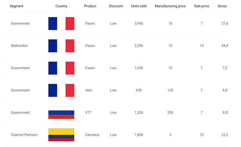
Country flags in the first column are a good use of HTML tables with images. Keep the image sizes small and consistent inside a fixed-width column and they won’t disrupt the layout, while adding instant visual context.
HTML and Web-Based Data Table Examples
Knowing what a table should do and actually building one that holds up on every screen are two separate problems. The web piles on constraints a printed table never had to deal with.
Responsive Tables
See the Pen
Responsive Table – Priority Columns at Breakpoints by Bogdan Sandu (@bogdansandu)
on CodePen.
Wide tables on small screens. This is the problem that refuses to go away.
WebAIM’s 2024 Screen Reader User Survey found 91.3% of screen reader users accessing content on mobile devices. That number alone should end any debate about whether responsive tables matter.
There’s no one right answer. Horizontal scroll with a fixed first column suits some tables. Card-style layouts, one record per card on mobile, suit others. The right call comes down to how many columns you have and which ones people genuinely need on a phone.
A properly built responsive table doesn’t just shrink visually. It restructures the data relationships so screen readers still know which header belongs to which cell.
Accessible Tables
See the Pen
Table Accessibility – Simulated Screen Reader Demo by Bogdan Sandu (@bogdansandu)
on CodePen.
The U.S. Department of Justice published a final rule in April 2024 requiring all state and local government web content to meet WCAG 2.1 Level AA. Data tables are explicitly covered.
The core requirements aren’t complicated. Use <th> elements for headers rather than styled <td> cells. Add scope="col" or scope="row" so screen readers know which direction a header applies. And include a <caption> when there’s more than one table on a page.
Deque’s 2024 research found that 57% of accessibility issues get caught through automated testing, while the other 43% need manual testing. For tables, the manual part is almost always about focus management and header-cell relationships on the complex layouts.
Building accessible tables from the start is far less work than retrofitting them after the fact.
Tables with Nested Data
A nested table in HTML is a table inside a table cell. Use them rarely. Actually, think twice before using them at all.
They made sense in the early 2000s for page layout. These days, if you catch yourself nesting a table, there’s usually a better structure on offer. Grouped rows with a collapsible pattern, or a two-level header, solves most of the same problems without the accessibility headaches nested tables drag in.
When you genuinely do need nested structure, say a complex HR org chart shown as tabular data, at least give each inner table its own complete header structure. Screen readers treat nested tables as fully separate tables.
Data Table Design and Styling Examples
Good data presentation and good styling aren’t separate calls. How a table looks feeds directly into how fast people find what they’re after.
HTML Table Styling Approaches
See the Pen
SaaS Pricing Comparison Table – Pure CSS & HTML by Bogdan Sandu (@bogdansandu)
on CodePen.
A handful of baseline choices carry most of the weight. Border or no border, since dense data tables often read better with minimal borders and generous cell padding. Alternating row colors once a table runs past eight to ten rows. A sticky header row for anything that scrolls vertically. And monospace fonts on numeric columns, which sharpen the alignment when you’re scanning.
Styling HTML tables with CSS hands you full control over all of it. The tricky part is keeping it consistent across browsers, particularly with border-collapse behavior and sticky positioning in Safari.
For the wider HTML table design picture, including the layout decisions you make before any CSS gets applied, the same principles hold whether you’re hand-coding or using a plugin.
Table Color and Background Choices
See the Pen
Modern Project Dashboard Table by Bogdan Sandu (@bogdansandu)
on CodePen.
Color in a table has one job: to guide the eye. Not to decorate.
Use a table’s background color to signal meaning. Green for positive values, red for negative, yellow for a warning. Just don’t lean on color as the only signal. Color-blind users, roughly 8% of men, need an alternative cue like a symbol or a label.
A heatmap table is the most deliberate use of background color there is. The cell color intensity maps to the value magnitude, so people read the distribution at a glance before they read a single number.
Table UI Design Principles
There’s a gap between “it works” and “it works well.” Most tables work. Fewer are genuinely easy to use.
| Design element | Common mistake | Better approach |
|---|---|---|
| Column headers | Vague labels (“Value”, “Item”) | Specific labels with units (“Revenue (USD)”, “SKU”) |
| Row height | Too tight, hard to click targets | Min 44px for touch targets |
| Font choice | Proportional font for numbers | Tabular numerals or monospace for numeric columns |
| Empty cells | Just blank | Dash or “N/A” with title attribute explanation |
Good table UI pays attention to what happens at the edges. Empty states, long text that wraps awkwardly, numbers that overflow the column width. Those edge cases are where most tables quietly come apart.
The best fonts for tables are another detail people skip. Lining numerals, where every digit sits on the same baseline and takes up equal horizontal space, make a real difference in how fast people scan a column of numbers.
Make your data tables work harder with wpDataTables
Organize complex data on your site without touching a line of code. wpDataTables creates tables that are clear, interactive, and easy to manage, and your visitors will actually want to use them.
Industry-Specific Data Table Examples
Different industries want different things from a table. A healthcare table needs precision and auditability. A retail product table needs fast visual scanning and action buttons.
Get this wrong and you build a table that technically works but nobody actually uses.
Healthcare Data Tables
See the Pen
Healthcare ICU Patient Outcomes Table by Bogdan Sandu (@bogdansandu)
on CodePen.
The stakes shift here. A misread value in a patient record or a clinical outcomes table carries real consequences, which is why healthcare tables lean harder on precision formatting than on looks.
The U.S. health care industry employed over 17 million people in 2023, according to the Health Resources and Services Administration. At that scale, structured data tables are the backbone of HR dashboards, staffing reports, patient outcome summaries, and compliance tracking.
Well-built healthcare data visualization almost always leans on locked column headers for long patient record tables, clear unit labels on every numeric column, and color-coded threshold flags (normal, warning, critical) paired with a non-color indicator.
HR and Workforce Tables
See the Pen
HR & Workforce Dashboard Table by Bogdan Sandu (@bogdansandu)
on CodePen.
Headcount, turnover rate, time-to-hire, compensation bands. HR tables carry a lot of columns, and a lot of decisions ride on them.
40% of healthcare administrative tasks can currently be automated with existing HR technologies, per industry research, and that automation feeds straight into tabular dashboards HR teams scan daily.
The HR tables that work tend to handle tenure segmentation, grouping employees by years of service rather than listing them flat. They show variance columns, the delta between the current and previous period sitting next to the raw figure. And they support drill-down rows, where department-level data expands to individual role data on a click.
Financial Reporting Tables
You can’t audit a bar chart. Financial tables exist for one reason, the exact values that can be cross-referenced, verified, and signed off on.
Domo’s research backs this up directly: when auditors and analysts need to cross-reference figures against source documents, tabular format is the only viable option. Charts don’t serve that need.
The strongest financial implementations pair a summary chart up top with a full data table beneath it. Executives scan the chart. Analysts work the table.
Survey Data Tables
Survey results are one of the most common reasons people reach for a table when a chart would serve better, and the reverse happens just as often.
A survey table earns its place when respondents need to compare their answers across several questions at once, or when the audience needs exact percentages rather than the approximate shapes a chart gives.
| Data type | Table works well | Chart works better |
|---|---|---|
| Survey results | Cross-tab comparisons by demographic | Single-question distribution |
| Financial data | Line-item budgets Audit trails |
Revenue trend over time |
| HR metrics | Headcount by department and role | Turnover rate trend |
Data Tables Combined with Charts
Tables and charts aren’t competing formats. They answer different questions about the same data.
According to Nielsen Norman Group research, good table design should support four core user tasks: finding specific records, comparing data, viewing or editing individual rows, and taking action on records. Charts handle none of those well. Tables handle all four.
When to Use a Chart Instead of a Table
Google chart created with wpDataTables
Charts win when the shape of the data matters more than the individual values.
A line chart of 24 months of revenue says “growth is slowing” in under two seconds. A table with 24 rows makes people work out the rate of change in their heads, which is slow, and most won’t bother.
Reach for a chart when you need to show a trend rather than a value, when your audience needs pattern recognition over precision, or when comparing across many items beats reading exact figures. The full breakdown of charts versus tables leans heavily on who your audience is and what decision they’re trying to make.
Pairing Tables with Bar Charts
See the Pen
Table + Bar Chart Dashboard – SaaS Analytics UI by Bogdan Sandu (@bogdansandu)
on CodePen.
Bar charts summarize. Tables verify. Put both in the same view and you’re serving two different audiences at once.
You see the pattern all over business dashboards. A bar chart up top showing category totals, a detailed breakdown table underneath. Executives read the chart, analysts scroll to the table, same data in two reading modes.
Bar charts shown next to their source tables also build credibility. People trust the visual more when they can verify the exact numbers sitting behind it.
Tables That Feed into Line Charts
See the Pen
Revenue Intelligence Dashboard by Bogdan Sandu (@bogdansandu)
on CodePen.
A time-series table is usually the raw input for a line chart. Monthly sales, daily active users, weekly support ticket volume.
The table holds the precision, the line chart holds the narrative. Showing both on one page gives analysts the detail they need without making executives squint at a spreadsheet.
This is especially handy with financial charts and graphs, where regulatory or compliance rules sometimes require the underlying data table to stay visible alongside any chart.
WordPress Data Table Examples
Building tables in WordPress used to mean hand-coding HTML or settling for whatever a basic Gutenberg block could manage. The plugin ecosystem changed that in a big way.
WooCommerce held a 39% share of the global e-commerce software market in 2023, according to Shoptrial research. A huge chunk of those stores need product tables, comparison tables, and pricing grids that reach well past what native WordPress can do.
WordPress Table Plugins
The plugin you pick matters more than most people realize. The basic ones are fine for static content. Anything dynamic, live database connections, real-time filtering, large datasets, needs something purpose-built.
For interactive tables with sorting and filtering, wpDataTables fits, and it also supports Google Charts and Chart.js across 23 chart types. For form-generated data, Formidable Forms with its table display add-on does the job. The full breakdown of WordPress table plugins shows meaningful differences in how each one handles large datasets, responsiveness, and database connectivity.
WooCommerce Product Tables
A standard WooCommerce shop page shows products as cards. That’s fine for 20 items. It falls apart at 500.
The average WooCommerce store conversion rate sat around 2.5% in 2024, per WooCommerce data. Product tables that let people filter by spec, sort by price, and add to cart without navigating away can push that number up meaningfully.
A WooCommerce product table swaps the card grid for a scannable row layout, much closer to how B2B buyers actually want to shop: filter fast, compare specs, order without friction.
WordPress Charts Alongside Tables
Chart created with wpDataTables
WordPress-native charting used to mean embedding an image of a chart. Now the plugins connect straight to table data sources and render charts dynamically.
Chart.js sits at roughly 60,000 GitHub stars and around 2.4 million weekly npm downloads, which makes it the most widely used open-source charting library out there. WordPress plugins running Chart.js under the hood inherit that stability and community support.
WordPress charts built from the same data source as an adjacent table stay in sync automatically when the underlying data updates. That sync wipes out a whole class of manual errors that come from maintaining a chart and a table as two separate things.
How to Choose the Right Table Structure
Most table problems aren’t styling problems. They’re structure problems. The wrong table type makes even clean data hard to read.
Match the Table Type to the User Task
Nielsen Norman Group identifies four main tasks people perform on data tables, and each one points to a different structural priority.
| User task | Table feature needed | Common mistake |
|---|---|---|
| Find a specific record | Search box Row filtering |
No search, alphabetical-only |
| Compare values | Aligned columns Fixed headers |
Inconsistent column widths |
| Edit a single row | Inline editing Clear affordances |
Edit only via separate page |
| Take bulk action | Row checkboxes Action toolbar |
Single-row action menus only |
Understanding how to present data visually starts with working out which of these tasks your users actually do, then designing the table around that one task.
Tables vs Charts: Making the Call
The honest answer is that most data works better in one format than the other, and forcing it into the wrong one is where most presentations go off the rails.
Use a table when people need to look up exact values, compare several attributes per item, or take action on individual rows. Use a chart when they need to see a trend, understand a distribution, or compare magnitudes quickly without exact precision.
Learning how to choose the right chart for your data is really just a piece of the bigger skill: knowing when not to use a chart at all.
Think About Column Count First
Too many columns is the most common table design error. Well, that and too few.
A 15-column table usually means someone exported a spreadsheet and called it done. A 2-column table probably should have been a list. The practical range for most web tables is three to eight columns, with mobile pushing that lower still.
Before you build, audit the columns. Does every one support a decision or an action? Can any two merge without losing meaning? Which ones are only needed after a user drills into a row?
Lollypop’s 2026 UX research notes that tables running into the hundreds of rows demand deliberate decisions about what shows by default versus what stays secondary. Column count is part of that same decision.
Data Table Tools and Builders
You don’t always need to code a table from scratch. The right tool depends on where the table lives, who maintains it, and how the data source works.
JavaScript Table Libraries
Covers AG Grid Community v33, TanStack Table v8, and Tabulator v6.
Chart.js pulls almost 2 million downloads a week on npm, and D3.js is still the most flexible option for complex custom visualizations, even with its famously steep learning curve.
For tables specifically, not charts, the landscape looks different. Most developers reach for DataTables or AG Grid when they want feature-complete sortable, filterable, paginated tables. Both have free tiers that cover most common cases.
The wider ecosystem of JavaScript chart libraries and JavaScript table libraries overlaps more than you’d expect. Plenty of chart libraries bundle table components and vice versa, so it’s worth checking before you add a second dependency.
Chart Libraries That Work with Tables
Three names come up over and over when developers need charts wired to live table data. Chart.js is the easiest entry point, canvas-based, and excellent for the standard chart types. Google Charts is free, well-documented, and renders cleanly straight from Google Sheets data. Highcharts needs a commercial license for business use but offers the deepest feature set of the three.
ApexCharts is worth a mention as a more recent arrival. Free, open source, with wrappers for React, Vue, and Angular, which has made it the default for a lot of framework-based projects right now.
Building Tables Without Code
No-code table builders have gotten genuinely good. Not just for simple static content, but for tables with live data connections, conditional formatting, and role-based visibility.
The WordPress table generator approach works well when it’s content editors, not developers, managing the data. You build the structure and styling once, and editors update the rows through a familiar spreadsheet-like interface.
For teams already living in Excel, knowing how to publish an Excel spreadsheet on the web is often faster than rebuilding the table in a new tool.
Common Data Table Mistakes to Avoid
The mistakes that kill usability in data tables are painfully predictable. And they keep showing up because they’re fast to build and slow to notice.
Overloading Columns and Rows
More data isn’t more useful. This is maybe the single most important thing to internalize about table design.
A 20-column table forces people to scroll horizontally, which breaks the mental model of scanning across a row. They lose their place. They stop trusting the table. Then they stop using it.
The practical limits run roughly like this. On desktop, up to eight columns before horizontal scroll gets genuinely painful. On mobile, three to four columns max before a card layout is the better call. And on rows, paginating at 25 to 50 keeps both load times and cognitive load in check.
Missing or Vague Headers
Headers carry the entire interpretive burden of a table. A column labeled “Value” or “Count” with no context is useless.
Spell out the dimension being measured, the unit if it’s numeric, and the time period if it’s time-bound.
Well-written HTML table headers do more than label a column. They tell people what question that column answers. “Revenue (USD, Q3 2024)” is a header. “Revenue” is a guess.
Ignoring Empty and Error States
A filtered table that returns zero results into a blank white space is a broken experience. An empty table with no explanation just looks like a bug.
An empty state needs three things to feel intentional: a clear message explaining why nothing’s showing, guidance on what to do next (clear the filter, widen the date range), and a visual that doesn’t read like a load error.
The same logic runs to cells with missing data. A blank cell could mean zero, not applicable, not yet measured, or a genuine data error. Only one of those is fine on its own. The rest need a label.
No Mobile Consideration
WebAIM’s 2024 survey found 91.3% of screen reader users accessing content on mobile. But the mobile problem isn’t only about accessibility. A six-column table on a 375px screen is unusable for everyone.
Horizontal scrolling with a fixed first column is one way out. Showing priority columns only on mobile, hiding the lower-priority ones by default, is another. A card-view toggle that switches the table to a stacked format at small breakpoints is a third.
Honestly, the right answer comes down to which columns people actually need on mobile, not which ones exist in the desktop version. It’s usually fewer than you’d think. Mobile-friendly tables are about deciding what to cut, not just how to shrink.
FAQ on Data Tables
What is a data table?
A data table sorts information into rows and columns so people can scan, compare, and look up specific values quickly. Unlike charts, tables show the exact figures rather than visual approximations, which makes them the right choice when precision matters more than pattern recognition.
What are common examples of data tables on websites?
The most common types are pricing tables, product comparison tables, sports standings, financial reports, schedule tables, and HR dashboards. Each serves a different purpose, but they all share the same core structure: labeled columns, consistent rows, and data people need to compare or look up.
When should I use a table instead of a chart?
Use a table when people need exact values, need to compare several attributes per item, or need to act on individual rows. Charts work better for showing trends or distributions. If someone has to audit the numbers, a table is the only option.
What makes a data table easy to read?
Short, specific column headers with units, right-aligned numeric columns, alternating row colors on tall tables, and enough cell padding to separate the values visually. Zebra striping consistently improves accuracy on complex comparison tasks, per IEEE VIS 2024 research.
How do I make a data table responsive on mobile?
The main routes are horizontal scrolling with a fixed first column, hiding lower-priority columns at small breakpoints, or switching to a stacked card layout on mobile. The right one depends on which columns people actually need on a small screen, which is usually fewer than the desktop version shows.
What is an interactive data table?
An interactive data table lets people sort columns, filter rows, search for specific records, or paginate through large datasets without reloading the page. Sorting and filtering turn a table from a static reference into a tool people can actively work with to find what they need.
How do I build an accessible data table?
Use proper <th> elements with scope attributes for headers, add a <caption> when multiple tables appear on one page, and never use color as the only signal for meaning. The U.S. Department of Justice’s April 2024 ruling requires all state and local government web content to meet WCAG 2.1 Level AA, which explicitly covers data tables.
What is the difference between a data table and a comparison table?
A data table presents structured information for lookup or reference. A comparison table is a specific type built to help people choose between options by setting competing attributes side by side. Pricing tables, product spec grids, and feature matrices are all comparison tables.
Which tools can I use to create data tables in WordPress?
TablePress handles basic static tables well and free. For interactive tables with sorting, filtering, and chart integration, wpDataTables connects to live data sources including Excel, CSV, and MySQL. The right plugin depends on whether your table content is static or pulled from a dynamic source.
How many columns should a data table have?
On desktop, up to eight columns is manageable before horizontal scrolling hurts usability. On mobile, three to four is the practical limit before a card layout becomes the better choice. Every column should answer a specific question or support a decision. If it does neither, cut it.
Conclusion
This conclusion is for an article presenting the full range of data table types used across the web, from static reference tables to interactive, filterable, and accessible designs.
The right table structure depends on your users’ tasks, not your data volume.
Sortable columns, responsive layouts, and proper semantic markup are not optional extras. They are the baseline for any table that people will actually use.
Whether you are building a product comparison table, a financial report, a sports standings grid, or an HR dashboard, the principles stay consistent: match the structure to the decision, keep column count honest, and test on mobile.
A well-built data table does not need to be complex. It needs to be clear.