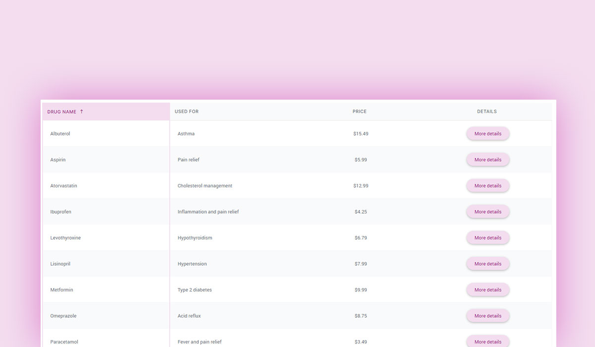
Tables are a crucial part of web development when it comes to displaying organized data effectively. However, default HTML tables often look plain and lack the polish users expect in modern websites. That’s where CSS comes in. By styling a table with CSS, you can customize them to make them visually appealing, readable, and responsive.
In this complete guide, we’ll walk you through all the techniques you need to master styling a table with CSS. We’ll also focus on practical methods to control table column width with CSS, one of the most common challenges developers face. By the end of this blog, you’ll be able fine-tune spacing, add hover effects, and make tables mobile-friendly.
Plus, you’ll find actionable examples and tips. What’s there not to like?
Table of Contents
Why CSS is Essential for Table Styling
HTML provides a basic structure for tables, but it doesn’t offer much when it comes to aesthetics or functionality. By default, HTML tables appear plain and lack responsiveness, which can make them difficult to read on modern websites or mobile devices.
Here’s why CSS is essential for table styling:
- Customization: CSS allows you to fully customize the appearance of your table – adjusting widths, colors, borders, padding, and more.
- Readability: With CSS, you can improve spacing, highlight headers, and alternate row colors to make data more scannable.
- Responsiveness: CSS techniques, like media queries and overflow settings, make tables adaptable to different screen sizes.
- Enhanced user experience: Adding hover effects, borders, or styling specific cells makes the table more interactive and professional.
Without CSS, tables are outdated and hard to use, especially when displaying large datasets.
Understanding the Basics of Table Elements in HTML
Before diving into table styling, it’s important to understand the basic HTML structure of a table. A table is created using a combination of specific elements, each serving a unique purpose:
- <table>: Defines the table itself.
- <tr>: Stands for “table row” and is used to create rows within the table.
- <th>: Represents “table header” cells, typically used for column or row labels.
- <td>: Represents “table data” cells, where actual data resides.
- <col>: Used for applying styles to entire columns.
Here’s a simple HTML table to demonstrate:
How it looks without CSS
By default, this table will appear unstyled – plain and lacking visual appeal.
| Product | Price | Quantity |
|---|---|---|
| Apples | $1.50 | 4 |
| Bananas | $0.99 | 6 |
In the following sections, we’ll use CSS to transform this basic table into something more polished, starting with controlling table column width using CSS.
Setting Table Column Width with CSS
One of the most common tasks in table styling is controlling the width of table columns. By default, column widths adjust automatically based on the content inside each cell. This behavior can lead to inconsistent and messy tables. Fortunately, CSS provides multiple ways to set and control table column widths for better alignment and readability.
Using fixed pixel values to set table column width with CSS
You can use the width property to set a fixed width for table columns. Applying this directly to <th> or <td> elements ensures the columns maintain consistent widths.
| Product | Price | Quantity |
|---|---|---|
| Apples | $1.50 | 4 |
How it works:
- The style=”width: Xpx;” ensures each column has a fixed width regardless of the content size.
- This approach works well for tables where you know the approximate size of the content.
Using percentage-based widths
For responsive tables, percentage-based widths are a better option. Instead of using fixed pixel values, you can distribute column widths relative to the table’s total width.
| Product | Price | Quantity |
|---|---|---|
| Apples | $1.50 | 4 |
How it works:
- The total width of the table is set to 100% of its container.
- Each column is assigned a percentage of that total width (e.g., 50%, 25%, etc.).
- This approach makes tables responsive and adaptable to different screen sizes.
Using table-layout:fixed for consistency
The table-layout property in CSS gives you greater control over column widths. By setting table-layout: fixed, the browser calculates column widths based on the specified width values rather than the content inside.
| Product | Price | Quantity |
|---|---|---|
| Apples | $1.50 | 4 |
- table-layout: fixed ensures the browser strictly adheres to the widths defined in CSS, ignoring the content size.
- This is especially useful when you want columns to be equal or have a uniform layout.
Comparing methods
| Method | Best for | Drawback |
| Fixed pixel values | Tables with fixed content | Not responsive on small screens |
| Percentage-based widths | Responsive tables | May not work for complex layouts |
| table-layout: fixed | Consistent column widths | Content may be cut off |
By combining these methods, you can fine-tune table column width with CSS to match your design requirements and improve the user experience.
Pro tip: If you’re on your laptop or PC, play with screen size in your browser and you’ll see these slight variations in methods.
Why wpDataTables is the Perfect Solution for Non-Coders: A Powerful Tool for Both Complex and Simple Tables
Creating well-styled tables that look professional and are easy to read can be a time-consuming and often technical process, especially for those who aren’t familiar with coding. That’s where wpDataTables shines as the perfect solution. Whether you’re dealing with complex datasets or simple content display, wpDataTables allows you to build fully-responsive, highly customizable tables without writing a single line of code.
Why choose wpDataTables?
wpDataTables is a versatile WordPress table plugin that lets you create and manage tables with ease. It’s particularly helpful for users who want to create customized tables, but without diving into HTML or CSS. Whether you’re showcasing a simple list or working with complex data, wpDataTables streamlines the table creation process with its intuitive drag-and-drop interface and powerful features.
Handling complex data tables with ease
For those dealing with large datasets – such as sales reports, product catalogs, or financial data – wpDataTables offers unparalleled power. The plugin allows you to manage dynamic tables that can be easily updated, filtered, and sorted. But it doesn’t just stop there. wpDataTables also lets you style these tables, making them look attractive and accessible on all screen sizes.
Simple tables, big impact
Even if your needs are more basic, wpDataTables excels in helping you create simple tables that fit seamlessly into any website design. Without the need for complicated coding, you can adjust everything from column widths to font colors, ensuring that your tables are visually appealing and easy to read.
Styling your tables without coding
When it comes to customizing table appearance, wpDataTables has you covered with built-in features that let you tweak every aspect of the table without writing CSS. Here are some of the key styling aspects covered by the plugin, based on our earlier sections on table styling:
1. Adding borders to your table
Creating tables with borders can make them stand out and improve their readability. With wpDataTables, you don’t need to worry about applying border styles manually. The plugin allows you to easily add borders to entire tables or individual cells using its visual editor. Whether you prefer solid, dashed, or dotted borders, wpDataTables gives you control over every side of your table cells without needing any CSS.

Use case: Imagine you have a product comparison table where each product needs clear separation. wpDataTables lets you set borders with just a few clicks in the interface.
2. Hover effects
Hover effects on table rows or cells make your tables interactive, giving them a modern feel and enhancing the user experience. With wpDataTables, you can effortlessly enable hover effects for rows or individual cells. You don’t have to manually set :hover pseudo-classes—wpDataTables does it all for you.

Use Case: A service comparison table could benefit from a hover effect that highlights the row a user is currently viewing. With wpDataTables, adding this effect is just a click away, improving the interactivity of your table.
3. Adding colors
Color plays a major role in making tables visually engaging and readable. wpDataTables lets you easily add background colors, text colors, and gradient effects to table headers, rows, and individual cells. No need to fiddle with background-color or color properties; simply select your desired colors from the plugin’s options.
Use Case: You could have a sales report table where the header needs to stand out in blue, while the even and odd rows have alternating colors for easy reading. wpDataTables lets you apply these colors in seconds with no coding required.
4. Background images
Want to add a creative flair to your table? wpDataTables allows you to set background images or textures to tables and individual cells. You can either upload an image or use a solid color gradient to create a visually rich table background. The plugin automatically adjusts these backgrounds for mobile responsiveness, ensuring that your design looks good on all devices.
Use Case: If you’re running a restaurant website, you might want to have a menu table with a background image of your signature dishes. wpDataTables will let you add this background without coding and ensure the table looks good on mobile too.
5. Text wrapping and alignment
Ensuring text is wrapped correctly and aligned properly is crucial for readability, especially when dealing with long text or varying content lengths. wpDataTables gives you complete control over text wrapping and cell alignment. You can easily adjust alignment to the left, center, or right for any column, and text will automatically wrap when it exceeds the cell width.
Use Case: Suppose you’re showcasing product descriptions in a table. By using wpDataTables, you can set the text in the description column to wrap automatically, ensuring that it doesn’t overflow or break the table layout. Plus, you can align the price column to the right for a neat, organized appearance.
6. Responsive tables
Tables need to be accessible on every device and wpDataTables has built-in features for responsive tables, meaning that if the table is too wide for smaller screens, it automatically becomes scrollable horizontally. Additionally, you can customize how your tables adapt to different screen sizes without having to code media queries.
Use Case: If you’re presenting a large table on a mobile-friendly site, wpDataTables ensures that users can scroll horizontally to view the full table without sacrificing readability or design.
Save time, eliminate code
For example, we’ve created this pricing table example, or this table from Excel without writing a line of code and for considerably less time than you would spend on setting up and styling yours using CSS and HTML.
Pricing table
STARTER
1 Webiste / YEAR
|
FREELANCE
10 Webistes / YEAR
|
PROFESSIONAL
1000 Webistes / YEAR
|
All Countries
The beauty of wpDataTables is that you can achieve all of this powerful styling and customization without needing to touch any code. Whether you’re adjusting borders, adding hover effects, or inserting background images, wpDataTables streamlines the process so you can focus on content creation and user experience, not on coding. Its visual editor provides all the tools you need to create professional, interactive tables with a few clicks.
| Explore wpDataTables Plans |
Styling Table Borders with CSS
Adding and customizing borders can significantly enhance the appearance of a table. CSS allows you to control the border style, thickness, and color for the entire table, rows, or individual cells.
Adding basic borders
The border property is used to apply borders to a table and its cells. To create clean, consistent borders, combine it with border-collapse.
| Product | Price | Quantity |
|---|---|---|
| Apples | $1.50 | 4 |
How it works:
- The border: 1px solid #333 creates a solid black border around the table, rows, and cells.
- The border-collapse: collapse property ensures borders of adjacent cells merge into a single border.
Customizing border style
CSS supports various border styles like solid, dotted, and dashed. You can apply different styles for more creative designs.
Example code:
th, td {
border: 2px dashed #007BFF; /* Blue dashed border */
}
Result:
The table will have blue dashed borders around each cell. You can mix styles for headers and data cells to highlight them visually.
| Product | Price | Quantity |
|---|---|---|
| Apples | $1.50 | 4 |
| Bananas | $0.50 | 10 |
Styling table rows and columns independently
Sometimes, you may want to apply borders to specific rows or columns. Use CSS classes or the nth-child selector for targeted styling.
Example code:
tr:nth-child(odd) td {
border-bottom: 2px solid #ddd; /* Bottom border for odd rows */
}
th {
border-right: 2px solid #000; /* Right border for table headers */
}
How it works:
- nth-child(odd) applies the style to odd-numbered rows.
Borders can be applied only to specific sides, like border-right or border-bottom, for cleaner designs.
| Product | Price | Quantity |
|---|---|---|
| Apples | $1.50 | 4 |
| Bananas | $0.50 | 10 |
Adding borders to specific cells
For custom designs, borders can be applied to individual cells using inline styles or specific classes.
Example code:
<td style=”border: 2px dotted red;”>Special Cell</td>
This applies a red dotted border only to the specific cell.
| Product | Price | Quantity |
|---|---|---|
| Apples | Special Cell | 4 |
| Bananas | $0.50 | 10 |
Styling Table Headers with CSS
Table headers play a key role in making your tables organized and easy to understand. By styling headers separately from the rest of the table, you can emphasize their importance and improve the overall design. CSS provides various ways to customize table headers to make them stand out.
Adding background colors
A simple yet effective way to differentiate table headers is by adding a background color.
Example code:
th {
background-color: #007BFF; /* Blue background */
color: #fff; /* White text */
padding: 10px; /* Adds space inside header cells */
text-align: left; /* Aligns text to the left */
}
How it works:
- Background-color sets the header background color.
- Color changes the text color to ensure readability.
- Padding provides spacing inside the header cells.
- Text-align ensures the text aligns as per your design (e.g., left, center, or right).
Result:
| Product | Price | Quantity |
|---|---|---|
| Apples | $1.50 | 4 |
| Bananas | $0.50 | 10 |
Adding hover effects to headers
To make your table headers interactive, you can use hover effects that change styles when the user hovers over them.
Example code:
th {
background-color: #007BFF;
color: #fff;
padding: 10px;
transition: background-color 0.3s ease; /* Smooth transition */
}
th:hover {
background-color: #0056b3; /* Darker blue on hover */
}
How it works:
- transition ensures the background color changes smoothly.
- :hover allows you to define the style when the user hovers over the header.
| Product | Price | Quantity |
|---|---|---|
| Apples | $1.50 | 4 |
| Bananas | $0.50 | 10 |
Centering table headers
If you want table headers to appear centered, you can use text-align and vertical-align properties.
Example code:
th {
text-align: center;
vertical-align: middle; /* Aligns text vertically in the cell */
}
Responsive Tables with CSS
Responsive tables ensure that your data remains accessible and readable across different devices, from desktops to smartphones. By using CSS, you can make tables adapt seamlessly to smaller screens.
Adding horizontal scrolling with overflow: auto
One of the simplest ways to make tables responsive is to allow horizontal scrolling when the table exceeds the screen width.
How it works:
- Wrapping the table in a container with overflow-x: auto allows horizontal scrolling when the table exceeds the screen width.
- This method preserves the table structure while ensuring all data remains visible on smaller devices.
Result:
Users can swipe horizontally to view the table content on smaller screens.
| Product | Price | Quantity | Description | Category | Supplier | Rating | Discount |
|---|---|---|---|---|---|---|---|
| Apples | $1.50 | 4 | Fresh red apples | Fruit | Farm Fresh | 4.5 | 10% |
| Bananas | $0.50 | 10 | Ripe yellow bananas | Fruit | Tropical Co. | 4.2 | 5% |
| Carrots | $0.75 | 7 | Fresh orange carrots | Vegetable | Veggies Galore | 4.8 | 15% |
| Milk | $2.00 | 1 | Whole milk, 1 gallon | Dairy | DairyCo | 4.6 | 20% |
| Bread | $1.25 | 2 | Whole wheat bread | Bakery | Baker’s Delight | 4.3 | 5% |
Using media queries to adjust column widths
Media queries let you tailor table styles for different screen sizes. You can reduce padding, hide less important columns, or stack table content for smaller screens.
Example code:
/* Default table styles for larger screens */
table {
width: 100%;
border-collapse: collapse;
}
th, td {
padding: 10px;
border: 1px solid #ddd;
text-align: left;
}
/* Media query for small screens */
@media (max-width: 600px) {
th, td {
padding: 5px; /* Reduce padding */
font-size: 12px; /* Adjust font size */
}
table, th, td {
display: block; /* Stack table rows */
}
th {
background-color: #f2f2f2; /* Highlight headers */
}
}
How it works:
- The @media rule targets devices with a screen width of 600px or smaller.
- Reducing padding and font size ensures the table fits better on smaller screens.
- By changing table, th, and td to display: block, the table content stacks vertically, making it easier to read on narrow devices.
Result:
- On larger screens: The table displays as usual.
- On smaller screens: The table content stacks, with headers highlighted for clarity.
| Responsive Tables Without Code |
Combining techniques for optimal results
For the best results, you can combine both horizontal scrolling and media queries. This ensures your table remains usable on all devices.
Example approach:
- Use overflow-x: auto for wide tables.
- Add media queries to adjust styles (e.g., padding, font size, or hiding columns) for small screens.
Advanced Table Styling with CSS
In this section, we’ll explore advanced techniques to take your table designs to the next level. By combining different CSS properties, you can create tables that are not only functional but also visually appealing. These methods include adding gradients, shadows, and background images to enhance your table’s look.
Adding gradients to table headers
A gradient background can give your table headers a sleek, modern look. By using the background-image property, you can create a smooth gradient effect.
How it works:
- background-image: linear-gradient(to right, #007BFF, #0056b3) creates a gradient that goes from light to dark blue, making the header stand out.
- color: white ensures the text remains readable against the gradient.
| Product | Price | Quantity |
|---|---|---|
| Apples | $1.50 | 4 |
Table overlays and background images
For a more creative approach, you can overlay images or add background textures to your tables. This can make the table more visually engaging.
How it works:
- background-image: url(‘table-background.jpg’) adds an image behind the table content.
- background-size: cover makes sure the image covers the entire table area.
- rgba(255, 255, 255, 0.8) ensures the content remains readable by applying a semi-transparent background to the table cells.
| Product | Price | Quantity |
|---|---|---|
| Apples | $1.50 | 4 |
| Style Your Tables Without Code |
Common Issues with Table Styling and How to Fix Them
While styling tables with CSS can yield beautiful results, there are a few common issues you might encounter. In this section, we’ll discuss some of the most frequent problems with table styling and provide solutions to help you overcome them.
Columns not aligning properly
A common issue when styling tables is that the columns may not align correctly, especially when data in the cells varies in length. This can lead to a messy table layout.
Solution: Use table-layout: fixed;
One of the easiest ways to fix alignment issues is by using the table-layout: fixed property, which forces the table to follow a predefined column width rather than adjusting based on the content.
table-layout: fixed forces the browser to set the column width based on the first row’s content, instead of adjusting it dynamically.
This helps keep the columns aligned, even when the data in cells differs in length.
Fixing inconsistent spacing or widths
Another issue that may arise is inconsistent spacing or widths between columns. This often happens when you don’t specify the column width explicitly.
Solution: Set column widths using width
To ensure consistent column widths, set a fixed width for your table columns using the width property.
By using the nth-child selector, you can target specific columns and set their width. This ensures that each column maintains the desired size, regardless of the content.
Solutions for table overflow on small screens
When tables are too wide for smaller screens, content can overflow, causing horizontal scrolling or content clipping.
The best solution for handling overflow on small screens is to wrap the table in a container with overflow: auto; and use media queries to adjust table layouts.
Wrapping the table in a container with overflow-x: auto allows users to scroll horizontally when the table exceeds the available width.
The media query reduces padding and font size for smaller screens, ensuring the table remains readable.
FAQs: Styling a Table with CSS
How do you set table column width with CSS?
To set table column widths, use the width property on th or td elements or set table-layout: fixed; for uniform column width across the table.
How do you use CSS to style a table?
You can style a table by targeting its table, th, td, and tr elements with CSS properties such as border, padding, background-color, and text-align.
How to make a nice table in CSS?
To create an attractive table in CSS, combine basic styles like borders, alternating row colors, and hover effects. Add padding and font styling to ensure readability and a modern design.
How to apply CSS to a particular table?
To apply CSS to a specific table, use classes or IDs to target that table individually, ensuring that the styles only affect the intended table.
What is the best way to style a table for responsiveness?
The best way to style a table for responsiveness is by using overflow: auto; to enable horizontal scrolling and media queries to adjust the table’s layout and font size on smaller screens.
How can I add alternating row colors to my table?
To add alternating row colors, use the :nth-child pseudo-class to target even or odd rows and apply different background colors for each.
Can you use CSS to style a table?
Yes, CSS can be used to style a table by targeting elements like table, th, td, and tr to control their appearance, including borders, spacing, fonts, and colors.
How do you wrap a table in CSS?
To wrap a table in CSS, you can use a container element like a div around the table and apply the overflow: auto; property to enable horizontal scrolling for larger tables.


