Tables are everywhere in modern web applications. In CRMs, admin panels, analytics dashboards, websites. But designing a table with great UI goes beyond rows and columns.
Poorly designed table UI overwhemls users, hides important info and often break on mobile. But we’ll show you how to achieve the opposite – clean, effective and scalable UI tables for various use cases.
By the end of this read, you’ll be equipped with actionable insights into creating tables that are responsive, accessible, and downright beautiful.
Table of Contents
What makes a good table UI?
Data tables have a purpose and should be free from clutter or distractions. When formatting the table, it is essential to prioritize readability.
How to choose the ideal colors in table UI design
Never use too many colors in table UI design. Having too many can distract from the table’s real purpose.
They help viewers to learn about the products, services, or packages available.
Use colors only for a specific reason.
For example, color can focus attention on the header. Or use it to highlight the negative and positive details in comparison.
One thing to remember is to never use a dark color. Darker shades can cover the message or make the details unclear.
For a darker shade without these risks, use dark gray for the fonts and light gray for borders.
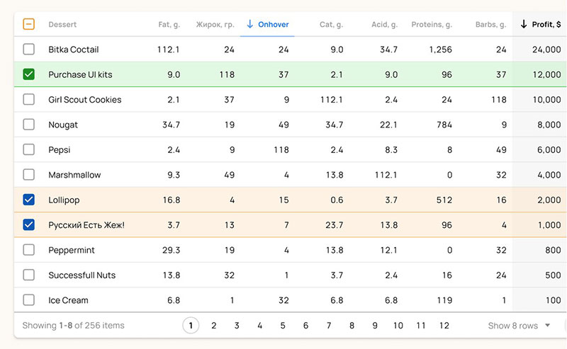
Zebra striping is a popular strategy in table UI design. When employing this strategy, designers only use light shades and colors.
Colors should not be too dark or too bright, so it’s best to stick to lighter shades.
How to choose the right size for the table UI design
To present the table well, designers must choose the best font and table size for the amount of information.
When the information is extensive, it can be challenging to fit the texts into the table. In this case, the designer can use smaller fonts and row heights.
If there is a lot of information but few items or rows, then make sure to set up generous row heights.
The table UI design should be easy to read and intuitive. Decreasing the row height also increases the items and number above the fold.
To make it shorter, follow the standard sizing:
Row Heights
- Condensed: 40px
- Regular: 48px
- Relaxed: 56px
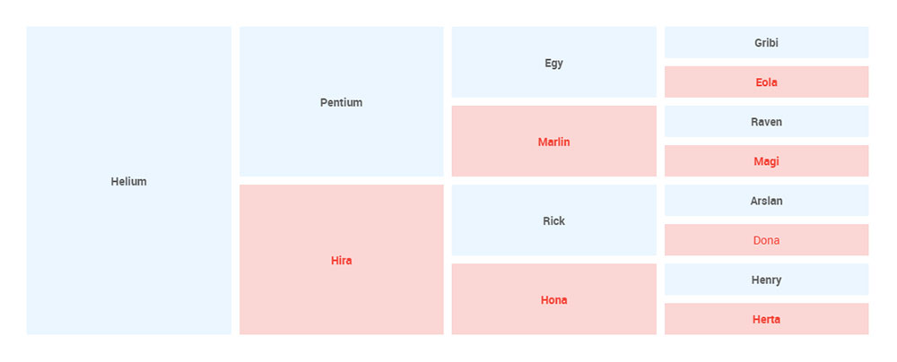
How to choose the ideal row style for table UI design
Customizing the row style enhances readability and scannability. This allows readers to view the data in a convenient way.
There are several row styles to choose from to set up a table.
Free form
This promotes a minimalist display of tables. It removes all the dividers to reduce the visual noise and other unnecessary clutter.
Zebra stripes
With the right shades of colors, readers can keep their place while reading. Each row has different background colors.
Horizontal lines
This row style only shows the horizontal lines. This reduces the visual noise and unnecessary clutter of a grid.
Grid
This combines both horizontal and vertical lines. It is the typical table structure seen on many websites created by top Chicago web design companies.
This row style provides separation between data points. The only disadvantage is that it can be distracting if it has too many details.
Tabular numbers
When optimizing the table UI design, all the digits must have a balance or the same amount of space. That is called “tabular numbers.”
They are easy to compare, which makes them ideal for any type of website’s data table.
Ensure to format the date or digit to the same length. For example, use the dd/mm/yyyy instead of dd/m/yyyy.
Check that the values stay left-aligned by default. They should always display this way.
However, remember that the Percentage, Amount, and Date should be right-aligned.
Dividers
Dividers are essential to add extra clarity but are not always necessary.
If there are lots of columns or the details are getting too close to one another, use dividers. They will keep the data table clutter-free and clean.
To leave out the dividers, it’s possible to have smaller and less dynamic tables. A designer may choose to use them to make the table more attractive.
Typography
Choosing the right typography can make or break the data table UI design. Although it is not the main priority, the visual presentation can attract more visitors.
It’s not necessary to use super fancy typography to create an ideal data table. But there are specific rules that can help to make them decent-looking.
Still, matching the table graphics with the overall website graphics will ensure that it won’t pop up like an eye-sore, maintaining a consistent and pleasant look. Graphic design software can be of assistance.
- Only use simple fonts.
- Don’t italicize or bold the texts.
- Don’t use Serif fonts.
- All caps are hard to read. Avoid using caps lock when writing your text.
Fill the blank spaces with a marker
One thing to keep in mind is that there should not be blank spaces. If the data doesn’t apply to a particular cell, use a marker, like an icon, cross, or dashes.
Set a fixed row height, but make sure columns are resizable
Fixed row height enables readers to view the data with ease. They don’t have to scroll up and down to find the missing information.
It’s also important to make the columns resizable. Nobody wants to create a new table because they need to add a few details or information.
The solution for this is to make the columns resizable.
The table UI design would look weird if it had too many rows and columns in different sizes. It would also look messy and disorganized.
Structured information allows readers to grasp what the website is all about.
Even with resizable columns, don’t put all the details in a single column. It only adds to the reader’s confusion.
Regardless of the content, all rows should have the same height. It helps to make the details more obvious and improves the overall aesthetic.
Table functionality best practices
Data tables should be intuitive. This allows visitors to scan, analyze, understand, and compare the data of each item, package, or product. Using automated integration testing
can further ensure that all components of your data tables work seamlessly. Ensuring that your data table functions as intended and provides a user-friendly experience relies on a comprehensive integration testing strategy.
The following section will explain how to make this possible.
Use table sections
Consider using table sections or table grouping to group related rows. These sections are necessary if putting all similar data together.
They must share the same set of columns. It would be natural to group rows when listing countries or regions.
Ensure that the table sections are collapsible or expandable. Don’t forget to show summarized data when readers need it.
Design patterns and common interactions
Users and web visitors have pattern-seeking tendencies. UX designers use this to create patterns with reusable solutions for usability problems.
These patterns also come in useful when one needs to create a table quickly. people don’t have the time to invent or create a new data table UI design, they can use these patterns as the sole solution for that.
Create moveable columns
Users want a customizable table, allowing for easier adjustments in the future. This has several benefits, especially if they’re going to move it to other pages or other page sections.
It also allows them to remove or add new columns.
As a UX designer, it is crucial to give users the ability to move or reorder the cells and content. It’s possible to order the table columns according to the data’s importance, date, or alphabet.
Make the table customizable to add or edit data
If the goal is for users to add or edit several data, ensure that the table can edit or add new data. However, if editing or customizing a data table is not the priority task, they can simply use an edit action per row.
While handling errors, try using both color and icons to help with accessibility. It would also be helpful to show the rows with errors by putting a ‘Count on the Table’ header and the on-click filter.
Make the header labels clickable
Making clickable header labels enables users to sort and filter the tables.
It is essential to mark the sorted table column by placing an arrow next to the column name. This shows the order of the sorted column, whether it is ascending or descending.
On the other hand, users need filtering when dealing with a large amount of data. This is possible by using a dropdown, radio buttons, or checkboxes.
It is possible to prioritize the filters based on urgency and frequency while leaving other tasks under the filter menu.
By making the header clickable, users can customize the filters they want to keep. They also have complete control over the actions for the data table.
Freeze the first few columns or rows
This step is crucial, especially if there are too many columns in the data table. It will maintain the whole table context, while the rest of the table gets a scroll bar.
Fixed columns
For horizontal scrolling, often the first column contains the identifying information. It is advisable to fix this first column in place.
That keeps the row identifier visible to viewers and provides the needed context.
Fixed headers
Keep the column labels visible all the time. As users scroll vertically, the fixed headersfixed headers show the identifying information.
Need a fast, flexible table UI?
Designing clean, responsive, feature-rich tables for your WordPress site can get overwhelming – fast. If you’re dealing with large datasets, it’s even messier. You want to add interactivity – but not overhwhelm the users. You want to optimize performance of your table – but keep the beauty of it.
wpDataTables helps you achieve that, and more! It’s the best table plugin, built to tacke the issues with table UI design.
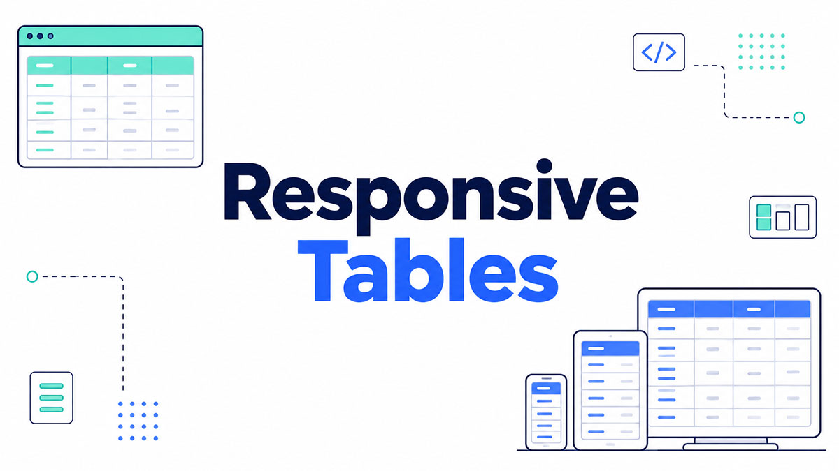
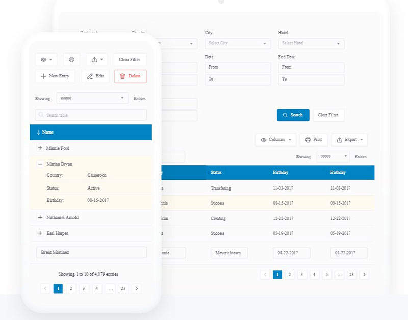
Do your tables break on mobile?
wpDataTables automatically creates responsive table UIs using column stacking, scrollable containers, and other tactics to ensure responsiveness. You can see the preview before publishing and make sure nothing breaks when you do.
wpDataTables also has powerful filtering and sorting options with AJAX loading. And it’s especially built to handle large datasets – just like Excel but on WordPress.
With master-detail addon, expandable rows, nested tables and conditional formatting, you can create complex tables without writing a line of code. You can import data from CSV, Excel, Google Sheets, MySQL and other data sources and visualize it on your website in minutes.
If you need to create beautiful table UI that fits your branding quickly, without sacrificing quality – wpDataTables is up for the job. Explore pricing plans and create tables faster and better than ever before.
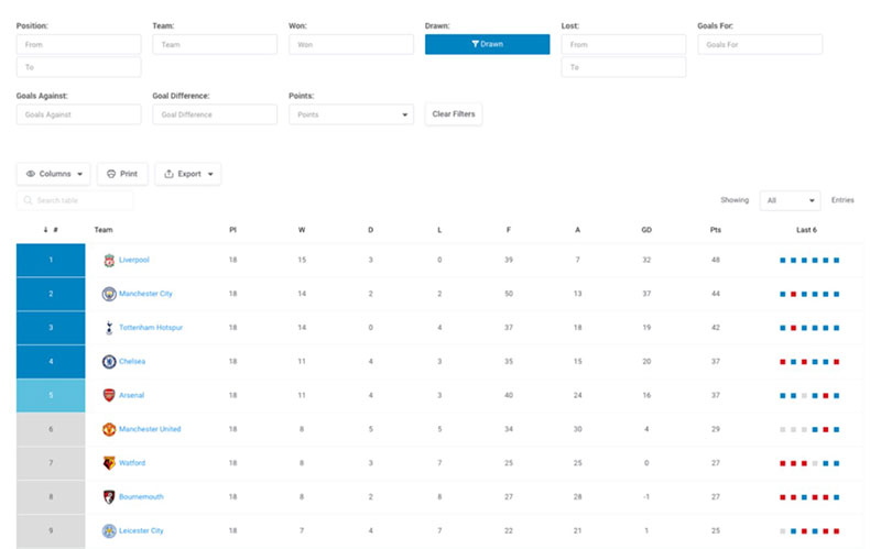
wpDataTables Table UI design examples
Simple table UI design
From Keywords to Content Map: Build with Intent
| Funnel Stage | Topic Cluster | Keyword Example | Content Type |
| TOFU | WordPress booking | "best WordPress booking plugins" | Blog post, Listicle |
| MOFU | Booking tools | "Amelia vs. Bookly" | Comparison page |
| BOFU | Amelia features | "WP booking plugin with payment gateways' | Landing page |
| *Retention | Feature How-Tos | "how to add Stripe" | Tutorial, Help Doc |
Movies (Table with Custom Field Columns)
Benefits of plugins with built-in optimization features for large tables
| wdt_ID | wdt_created_by | wdt_created_at | wdt_last_edited_by | wdt_last_edited_at | Optimization Feature | What It Is | How It Helps | Example | Best Practices |
|---|---|---|---|---|---|---|---|---|---|
| 1 | Tamara | 21/11/2024 12:29 PM | Tamara | 21/11/2024 12:29 PM | Data Caching | Caches frequently accessed data to reduce the need for repetitive database queries. | - Speeds up load times by serving cached data. - Reduces server load and improves scalability. | Using wpDataTables to cache product data, so users can view it instantly without waiting for a reload. | - Enable caching for static or frequently used data. - Ensure caching is regularly updated to reflect changes. |
| 2 | Tamara | 21/11/2024 12:29 PM | Tamara | 21/11/2024 12:29 PM | AJAX Loading | Loads only relevant data when needed, without reloading the entire table. | - Reduces load times by fetching only the necessary data. - Keeps the table responsive. | Filtering a customer list table via AJAX so that only relevant records load without page refresh. | - Implement AJAX for large tables with complex interactions. - Combine AJAX with pagination for optimal results. |
| 3 | Tamara | 21/11/2024 12:29 PM | Tamara | 21/11/2024 12:29 PM | Server-Side Processing | Handles sorting, filtering, and pagination actions on the server rather than the client. | - Reduces browser load by processing large data on the server. - Speeds up table interaction. | Implementing server-side processing in wpDataTables for a financial data table with thousands of rows. | - Use server-side processing for large datasets. - Limit data fetched based on user interaction to speed up actions. |
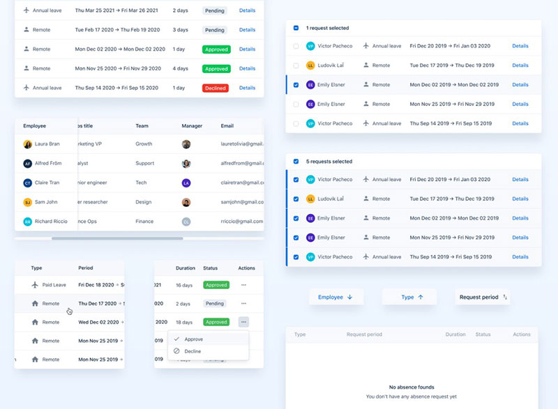
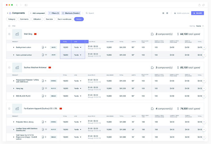
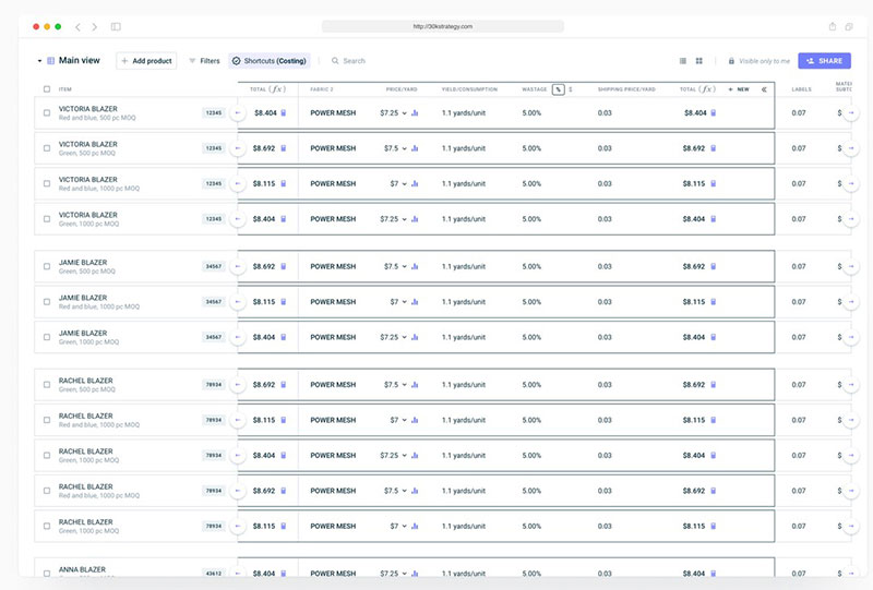
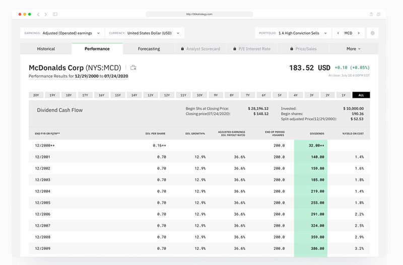
More table UI design examples
Catalog of Drivers
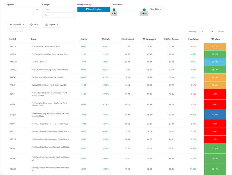
Top Mutual Funds
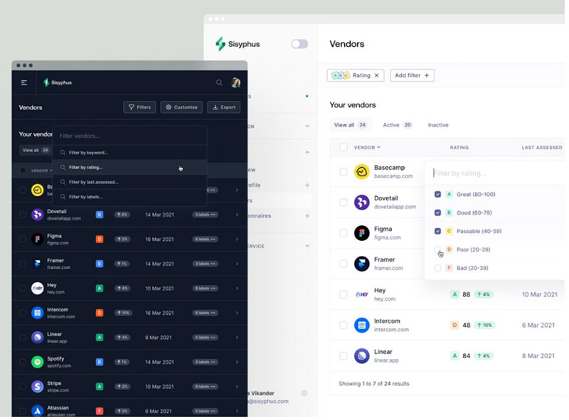
Sisyphus™ — dashboard table filtering

Table’s Filters Component – Backmarket Back Office

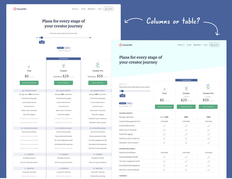
Column or table view for pricing page

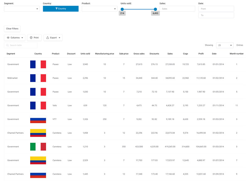
Financial Report By Segments
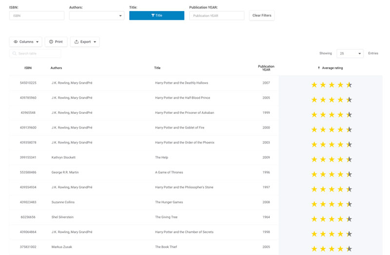
Catalog Of Books
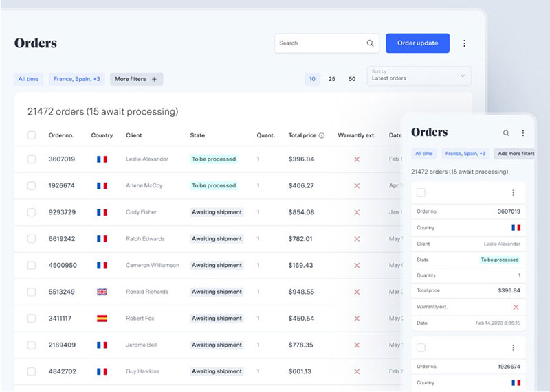
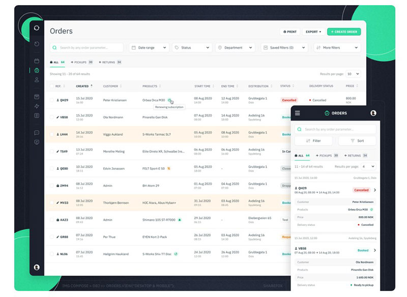
Sharefox | Orders Page • Desktop & Mobile

Dark Mode Table

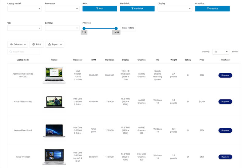
Laptop Online Catalog
Do you have WooCommerce store? Explore wpDataTables – the best WooCommerce product table plugin
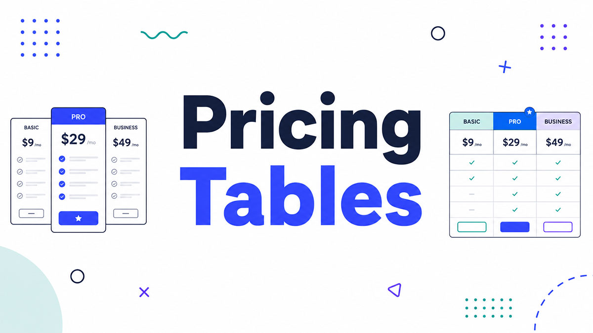
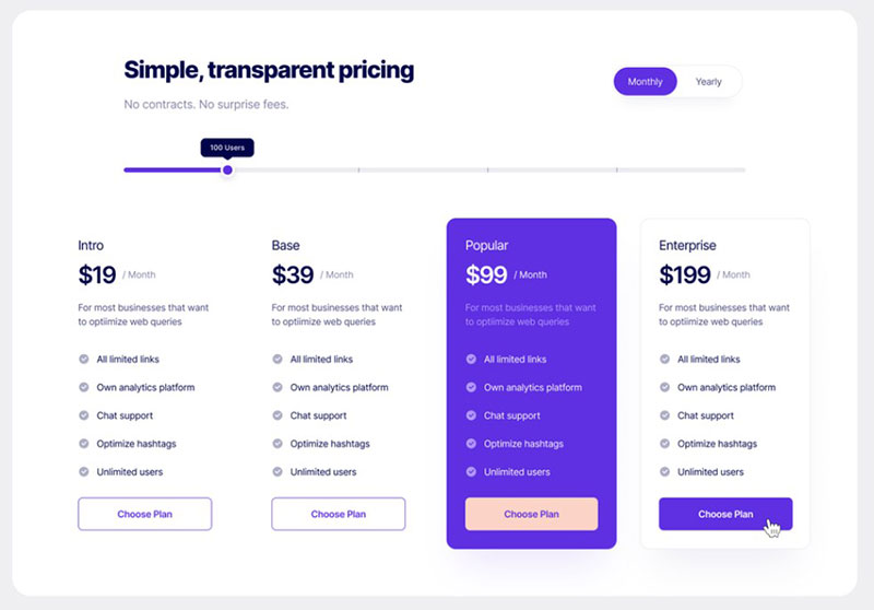
Pricing Section
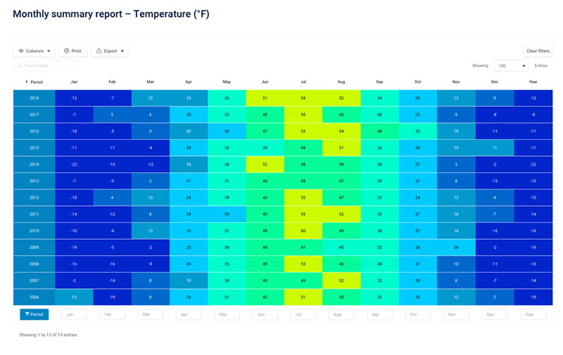
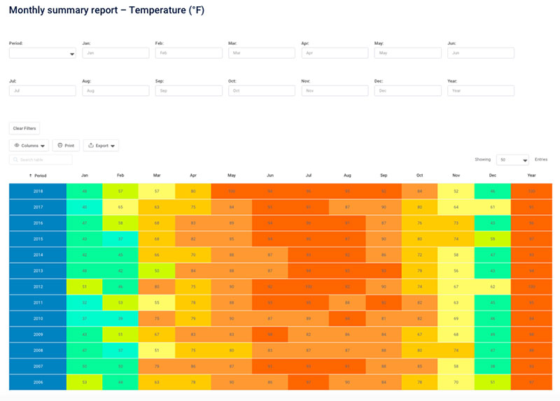
Temperature Report – Maximums
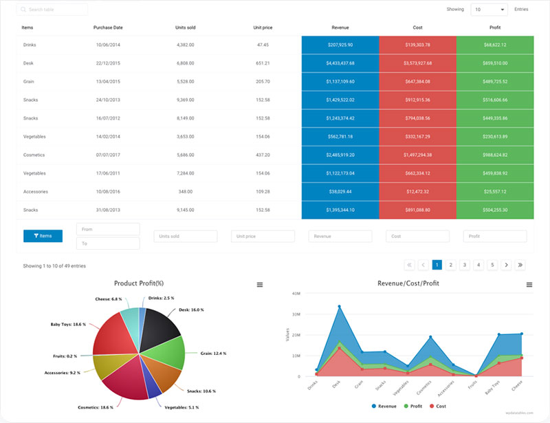
Statistics Table With Charts
Payfit – Table component (Midnight Design system)
Employees Table
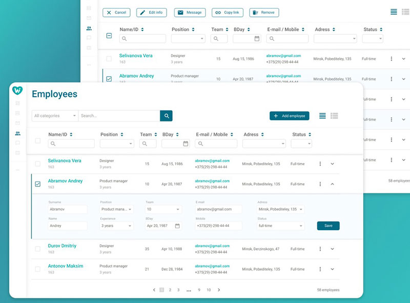
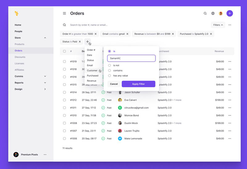
Table Filters
Impower menu

Pricing – Light and Dark mode
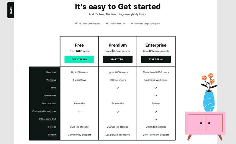
Check out more pricing table examples
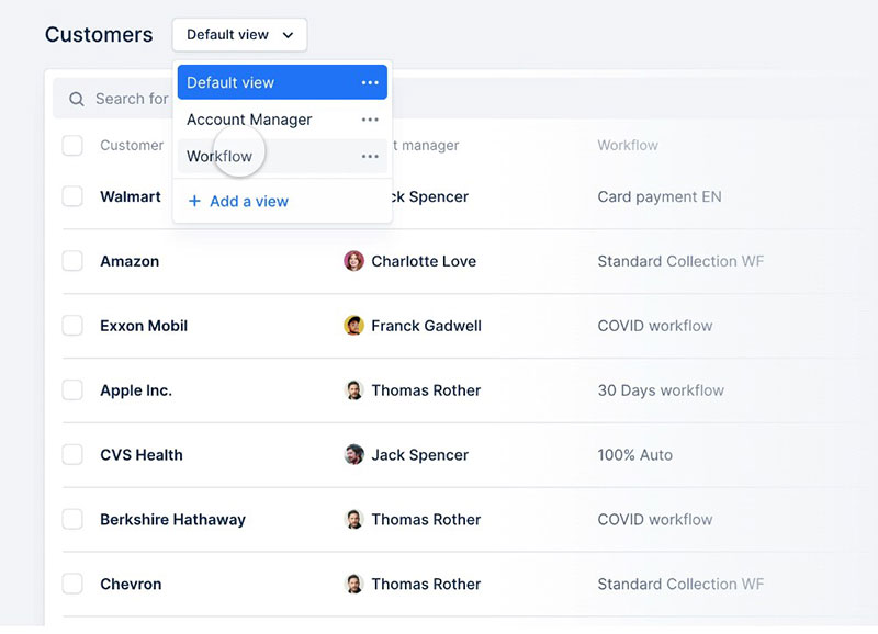
Saved Views

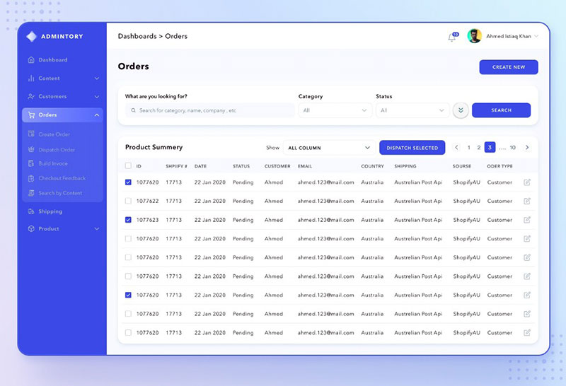
Admintory Order Details

Data grid expanded – Figma Material X design system

Components allocation by supplier (Retail planning SaaS web app)
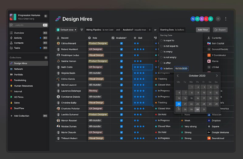
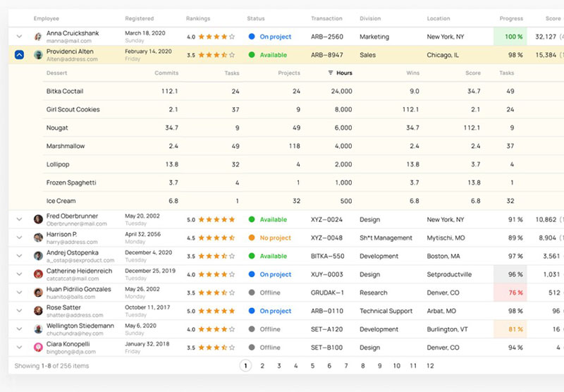
Data table for HR
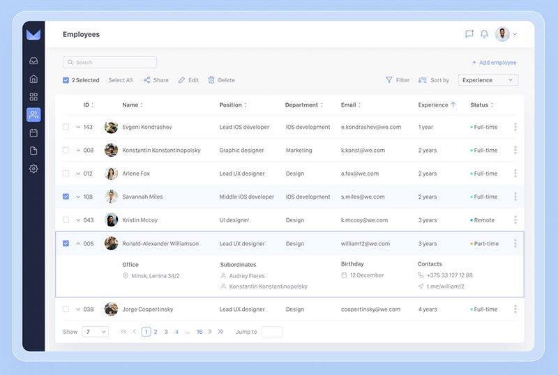

Table UI template for Material X design system

Tables – Product planning (SaaS web app)

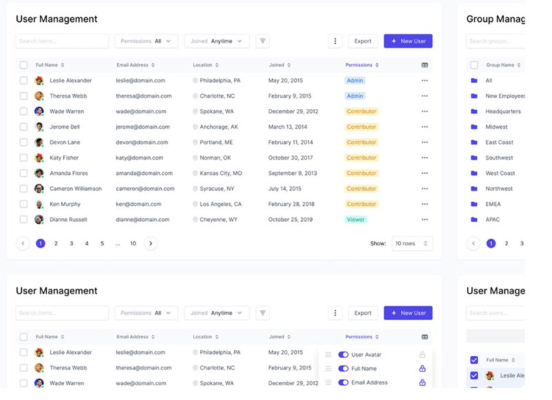
User & Group Management

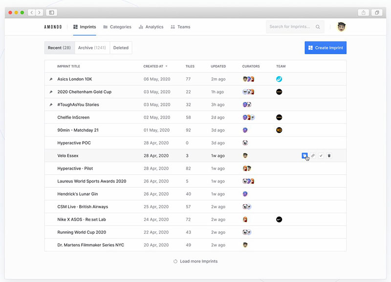
Amondo — Curation Dashboard 4.0
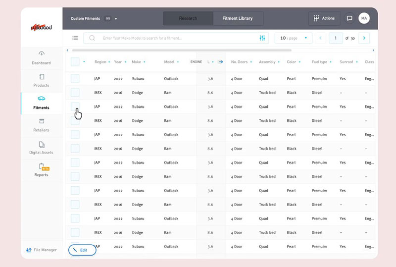
PartsHub Contextual Table Design

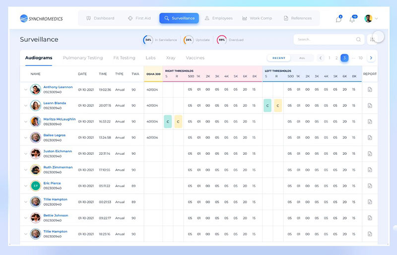
Sychromedics Surveillance

Company Performance – Stock Analysis (Web app)
FAQ about table UI design
How can I make my table UI design more user-friendly?
Use clear headings, consistent alignment, hover effects, and ample spacing to make your table UI easy to read and navigate.
What are some responsive table design strategies for mobile devices?
Use scrollable containers, card-based views, or stacked cell layouts to ensure your responsive table UI remains readable on smaller screens.
How important are accessibility features in table UI design?
Accessibility is crucial – use proper HTML structure, ARIA labels, and sufficient contrast to make your data table UI usable for all users, including those with assistive technologies.
What’s the role of visual hierarchy in table UI design?
Visual hierarchy helps users scan and prioritize content quickly – highlight headers, highlight rows, freeze top rows, and use bold or color-coded elements to improve table UI design clarity.
How do I integrate interactive elements in my table UI?
Interactive elements? Add sortable columns, filter inputs, expandable rows, and in-line editing to make your interactive table UI more dynamic and functional. Leverage UX design tools to streamline the process. Make sure the clicks lead to insights, not just… clicks.
What are the trends in UI/UX design for tables?
Modern data table UI design trends include dark mode support, minimalism, fixed headers, real-time updates, and adaptive layouts for better UX.
How can I ensure my table UI design is consistent with my brand?
Use your brand’s color palette, typography, and button styles across your table dashboard UI design to maintain visual consistency.
What are the best practices for pagination in table UI design?
Use numbered pages for table pagination, “load more” buttons, or infinite scroll, depending on the use case—always indicate total results and allow users to change page size.
How do I handle large datasets in table UI design without overwhelming the user?
Use lazy loading, column filtering, and collapsible rows to manage large datasets in a web table design without sacrificing performance or usability.
Conclusion
You don’t want to make a table UI that’s pretty. You want to make one that’s both pretty and usable. Users will love you for it because they can find what they need faster, the table will reduce cognitive load and improve overall engagement.
To recap, keep this principles in mind:
- Prioritize scannability and responsivenes
- Use interactive elements (sorting, filtering, inline actions) only when they add value
- Make sure your UI table design adapts to all screen sizes
- Avoid clutter – whitespace is a part of the design, not the lack of it
Hungry for more knowledge?
- Learn how to publish an Excel spreadsheet on the web.
- Explore examples of data tables,
- Learn how to make a data table,
- Get inspired with pricing table examples, and
- Fall in love with statistical tables.
If you want more use cases, we’ve compiled the best: