
The Best Data Visualization Tools To Use




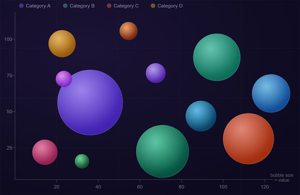
Most charts show two variables. Bubble charts show three, and that changes what you can actually learn from your data. A bubble chart plots data points as circles across X and Y axes, with bubble size encoding a third quantitative…
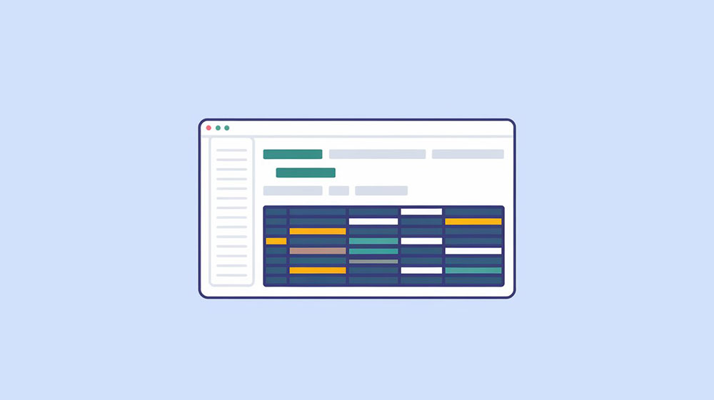
Every developer eventually stares at a raw JSON array and thinks: this needs to be a table. Whether you’re displaying API response data in a dashboard or rendering database results on a page, knowing how to convert JSON to an…
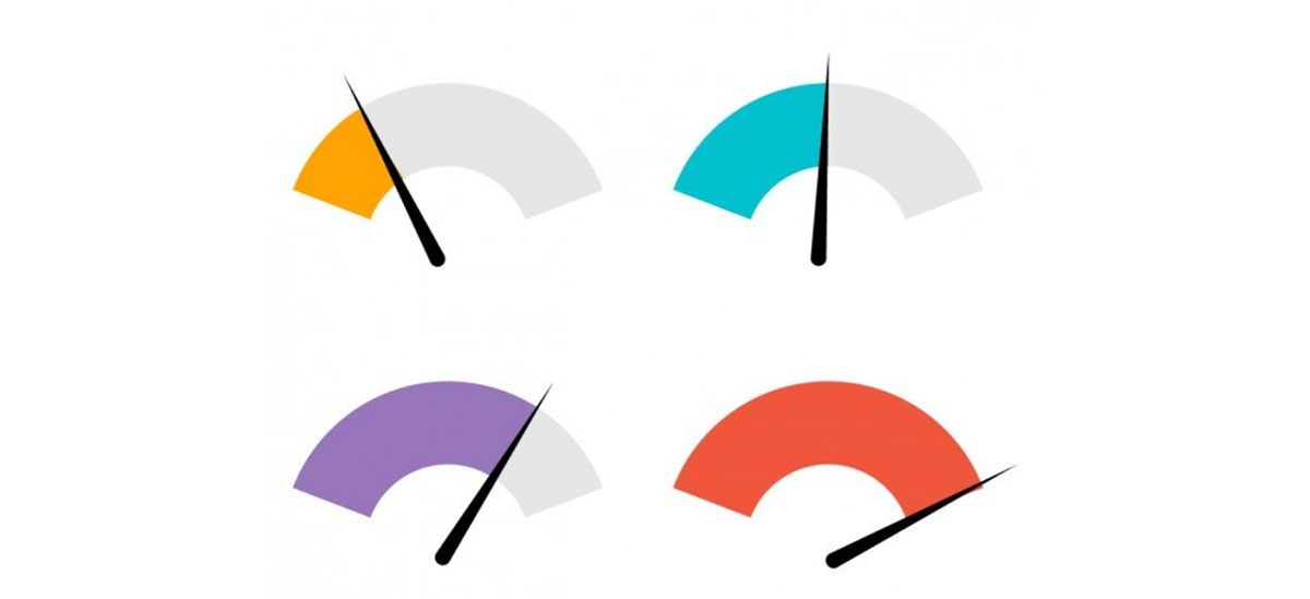
One number. One range. One instant decision. That’s the entire job of a gauge chart, and it does that job better than almost any other visualization type. From KPI dashboards in Power BI to real-time monitoring panels in Grafana, the…
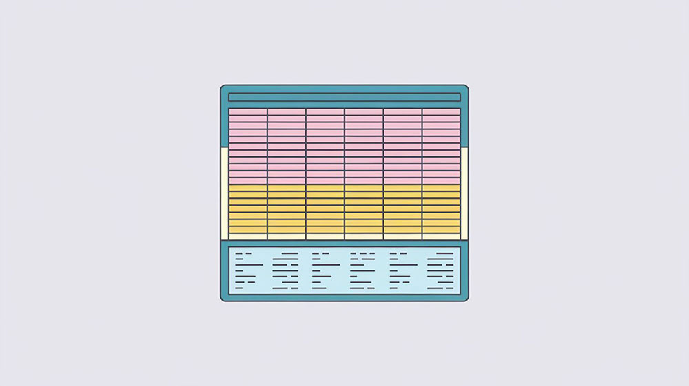
When creating HTML tables, knowing when to use table footers can significantly enhance data presentation and usability. Table footers, denoted by the <tfoot> element, aren’t just decorative—they serve practical purposes that improve how data is interpreted and interacted with. Understanding the strategic…