One number. One range. One instant decision.
That’s the entire job of a gauge chart, and it does that job better than almost any other visualization type.
From KPI dashboards in Power BI to real-time monitoring panels in Grafana, the dial chart (or speedometer chart, as many call it) shows up wherever teams need a fast, no-ambiguity status check on a single metric.
This guide covers everything you need to know:
- How gauge charts work and when to use them
- The main types, including solid gauge and radial variants
- Design best practices for color zones and scale calibration
- Which JavaScript libraries and BI tools support them
- Accessibility limitations worth knowing before you build
Table of Contents
What is a Gauge Chart
Chart created with wpDataTables
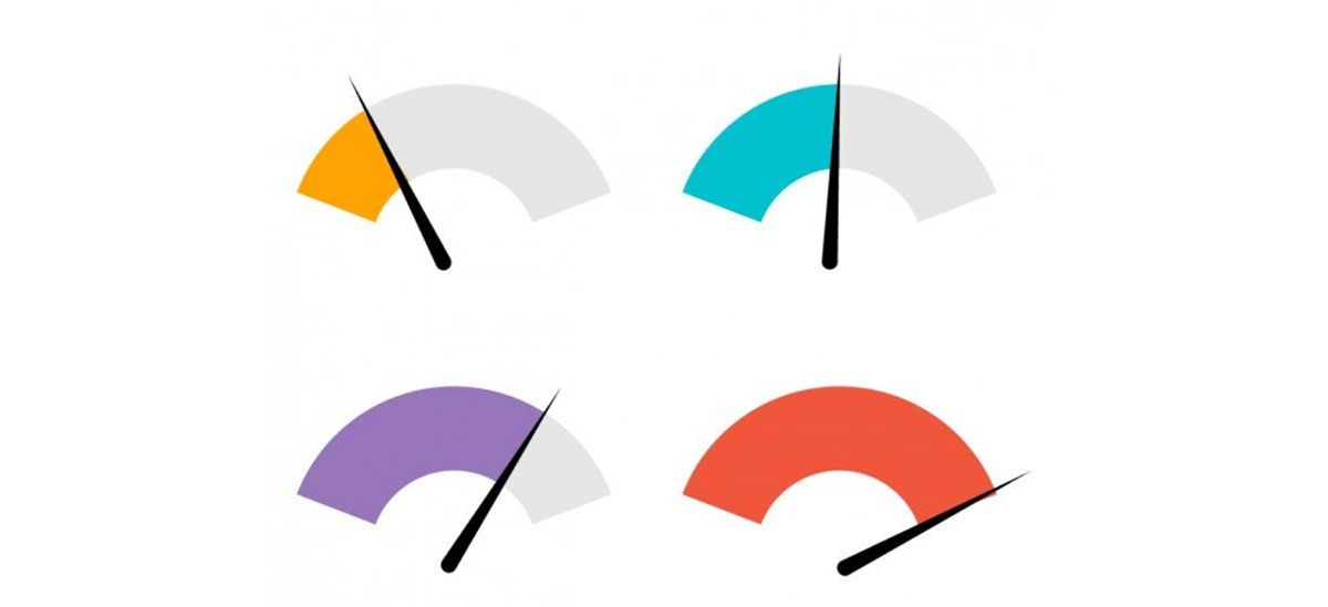
A gauge chart is a data visualization that displays a single value within a defined range. It works exactly like a speedometer: a curved arc spans from a minimum to a maximum value, and a needle or filled segment shows where the measured value sits.
Also called a dial chart or speedometer chart, it gives viewers an instant read on whether a metric is on track, falling short, or exceeding a target.
According to the Data Visualization Society, gauge charts can improve metric comprehension by up to 25% compared to plain numeric displays. That familiarity matters. People already understand speedometers, so there’s no learning curve when they land on a dashboard.
The core components of any gauge chart are straightforward:
- Arc or dial: the curved scale that runs from min to max
- Needle or fill: shows the current value’s position
- Color zones: segments (typically red, yellow, green) marking performance thresholds
- Numeric readout: the actual value displayed alongside the visual
- Target marker: an optional line indicating the goal value
The gauge chart sits in a specific spot in the broader chart family. It doesn’t show trends over time like line charts do, and it doesn’t compare categories the way bar charts do. Its job is narrower: show one number in context, right now.
How a Gauge Chart Works
Three numbers drive every gauge chart: a minimum value, a maximum value, and the current value. Everything visual flows from those three inputs.
The arc represents the full possible range. The needle or filled arc segment maps the current value proportionally within that range. If your scale runs 0 to 100 and the value is 75, the needle sits three-quarters of the way around.
The Role of Thresholds and Color Zones
Color zones are where gauge charts earn their keep. Most implementations divide the arc into two to four segments, each assigned a color based on what that range means for your metric.
Common zone conventions:
- Red: below acceptable range (poor performance or critical alert)
- Yellow or orange: caution zone (needs attention)
- Green: on target or above target (healthy)
Some gauges flip this logic. A CPU temperature gauge might use green for low values and red for high ones. The color meaning depends entirely on your data context, not a universal rule.
One thing to keep in mind: color alone should never be the only signal. Labels, numeric values, and clear zone boundaries all help readers understand the chart even without relying on color coding.
Needle vs. Arc Fill: Two Display Approaches
The needle gauge uses a pointer that rotates from the minimum position toward the maximum. Clean and precise. Works well when users need to read an exact position on the scale.
The solid gauge (arc fill) replaces the needle with a filled arc that grows from the minimum end. Visually simpler, often used in mobile dashboards or tight UI layouts where a needle would be hard to read at small sizes.
Both communicate the same underlying data. The choice usually comes down to design context and screen real estate.
Tick Marks, Labels, and the Target Line
Tick marks and value labels along the arc help readers identify exact positions without guessing. A target indicator, usually a short line or arrow overlaid on the arc, shows where the goal sits so the viewer can instantly compare current value against the target.
Remove tick marks if they clutter the visual. Add them back if precision matters for your audience.
How To Create a Gauge Chart With wpDataTables
Gauge charts in wpDataTables are available through the Google Charts rendering engine. Before you start, make sure you have a wpDataTables table already created with the data you want to visualize. The gauge type needs at least one string or date column (used to name each gauge) and one or more numerical columns.
Keep the row count low. Google Charts gauge doesn’t handle lots of rows gracefully.
Prepare Your Data Table
Your table structure matters here. You need:
- One string or date column (this becomes the gauge label)
- One or more numerical columns (these become the gauge values)
If you don’t have a table yet, go to wpDataTables > Create a Table first and set one up.
Open the Chart Creation Wizard
Go to your WordPress admin panel and navigate to wpDataTables > Create a Chart.
The wizard opens. You’ll see two fields right away:
- Chart name – give it something you’ll recognize later
- Rendering engine – this is where you select Google Charts
Once you pick Google Charts, the list of available chart types updates. Select Gauge Chart from the list, then click Next.
Select the Data Source
On the next step, you pick which wpDataTable will power this chart.
A simple dropdown lists all your existing tables. Select the one with your gauge data. Click Next.
Define the Data Range
This step is where most people slow down a bit.
You’ll see a Column range picker – check the columns you want to include. At minimum: your label column and one numeric value column.
You also have the option to set a Row range. By default it uses all rows, but you can limit it if needed. If you select “All rows,” you’ll also see a Follow table filtering checkbox – turning that on means the gauge updates dynamically when someone filters the linked table on the front end.
There’s also a Group chart checkbox. If your data has repeated labels, ticking this sums those rows into a single gauge per label.
Click Next when the range looks right.
Format and Preview
Here’s where you configure how the gauge actually looks.
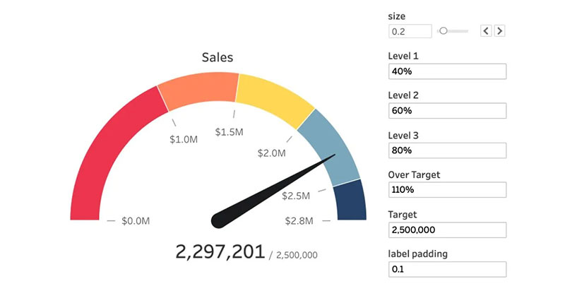
Options available for the Google Charts gauge type:
- Chart title and title styling
- Background color
- Border width, color, and radius
- Min and max values for the gauge range
- Color zones (green/yellow/red ranges, similar to a speedometer)
The live preview on the right updates as you adjust settings. If something looks off, go back and tweak the data range or column selection before continuing.
A Note on Color Zones
Google Charts lets you define three color bands:
- Green zone – the “good” range
- Yellow zone – the warning range
- Red zone – the critical range
These are defined by numerical thresholds. Set them to match whatever your data represents (percentages, scores, temperatures, etc.).
Save and Insert the Chart
Once the preview looks right, click Save.
wpDataTables generates a shortcode for your gauge chart. It looks something like this:
Copy that shortcode and paste it into any WordPress post, page, or widget area. You can also use the wpDataTables Gutenberg block or the Elementor/Divi widget if you’re working inside a page builder.
Editing the Chart Later
If you need to change anything after saving, go to wpDataTables > All Charts, find your gauge, and click Edit. The same wizard opens with all your previous settings intact.
Types of Gauge Charts
Not all gauge charts look the same. The right type depends on your data, your dashboard layout, and what you actually need to communicate.
| Type | Shape | Best For |
|---|---|---|
| Half-circle gauge | 180-degree arc | Standard KPI dashboards, wide layouts |
| Full-circle gauge | 360-degree arc | Percentage metrics, completion tracking |
| Solid gauge | Filled arc (no needle) | Mobile dashboards, compact spaces |
| Bullet chart | Linear bar | When space is limited, multi-metric comparisons |
| Multi-needle gauge | Half or full arc, 2–3 needles | Comparing target vs. actual on one dial |
Half-Circle vs. Full-Circle Gauge
The half-circle gauge is the most common variant. It takes up less vertical space and maps well to the left-to-right reading pattern most users expect.
Full-circle gauges work better for metrics expressed as percentages (0 to 100%) where you want to visually show the whole “pie” of possibility. Think completion rates, budget used, or storage capacity.
Bullet Chart as a Gauge Alternative
The bullet chart is the lean alternative when you need more information in less space. It displays the current value as a bar, a comparative reference line (like last year’s result), and qualitative range bands, all in a compact horizontal layout.
Data visualization researcher Stephen Few designed bullet charts specifically as a response to the space inefficiency of dial gauges. If you’re showing five or more metrics side by side, bullet charts almost always outperform traditional gauge charts for readability.
When to Use a Gauge Chart
Gauge charts shine in one scenario: a single metric needs a fast, no-ambiguity status check.
That’s a narrower use case than most people realize. Here’s where they work well and where they fall flat.
Good Use Cases
According to Databox’s 2024 data visualization survey, 44% of practitioners struggle with choosing the right chart type for their data. Gauge charts are commonly misapplied, but the right scenarios are clear:
- NPS score against a quarterly target
- Server uptime percentage relative to an SLA threshold
- Sales attainment as a percentage of monthly quota
- Budget spent vs. planned budget for the current period
- Patient satisfaction score in a healthcare dashboard
All of these share the same pattern: one value, one target, one range. The gauge chart makes sense when that’s all you need to communicate.
When to Use Something Else
The gauge falls apart fast outside its use case. Avoid it when:
You need to show change over time. A gauge has no time axis. A line chart handles this far better.
You’re comparing multiple metrics. Stacking five gauges side by side creates clutter and makes comparison harder, not easier. A horizontal bar chart or a table does this more clearly.
Your data has no defined target or threshold. Without a reference point, the needle position is meaningless. Readers won’t know if 65 is good or bad without context.
You’re working with distribution data. If you’re showing how values spread across a range, use a histogram or scatter chart instead.
Gauge Chart Design Best Practices
A poorly designed gauge chart is worse than no chart at all. It takes up space, confuses readers, and communicates nothing useful.
These decisions separate clean gauge charts from noisy ones.
Color Zone Guidelines
Color is the first thing readers process. Get it wrong and the whole chart misleads.
Standard zone setup: red for below threshold, yellow for caution, green for on-target or above. This matches the mental model most people carry from traffic lights and status indicators.
But color blindness affects roughly 8% of men and 0.5% of women (NIH data). Red-green combinations are the most commonly problematic. Options that work better:
- Add text labels directly inside or near each zone
- Use blue-orange instead of red-green when possible
- Pair color with a numeric readout so color is never the sole data carrier
WCAG accessibility guidelines require chart graphics to maintain at least a 3:1 contrast ratio with their background. Most default color schemes in major tools don’t meet this without adjustment.
Scale and Range Calibration
Setting the wrong min/max range is one of the most common gauge chart mistakes. A scale that starts at 80 instead of 0 can make a 90% result look like it’s barely in the middle. That misleads readers.
Rules that hold up in practice:
- Start the scale at a meaningful zero or logical floor, not an arbitrary number
- Set the maximum at a realistic ceiling, not an aspirational stretch goal
- Keep the number of zones to three or four maximum
- Always show the numeric value alongside the needle position
One gauge per metric. The temptation to cram two needles into one dial is real, but it almost always creates confusion. When you need to compare actual vs. target, a target marker line on a single-needle gauge is cleaner.
Gauge Charts in Dashboard Tools
Most major BI platforms include gauge chart support out of the box. The implementation quality varies quite a bit between tools, though.
Organizations using Power BI report a 70% reduction in report generation time when moving from Excel-based reporting to dashboard tools (SR Analytics, 2024). Gauge charts are a standard component in that shift.
Gauge Charts in Power BI
Power BI’s built-in gauge visual covers the basics: minimum value, maximum value, target value, and current value. Configuration is drag-and-drop.
The default gauge in Power BI uses a half-circle arc. For more control, the AppSource marketplace has several third-party gauge visuals including the Speedometer KPI visual, which adds smooth needle animation, custom fonts, gradient color modes, and adjustable gauge thickness from 10 to 100 pixels.
Worth knowing: Power BI’s native gauge doesn’t support dynamic color zones based on conditional logic without workarounds. If your thresholds change based on the selected time period, you’ll need a custom visual or DAX measures to handle it.
Gauge Charts in Looker Studio
Looker Studio (formerly Google Data Studio) includes a native gauge chart component. It connects directly to Google Sheets data and other Google data sources with minimal setup.
The configuration options are more limited than Power BI, but for teams already working inside the Google ecosystem, the tight integration makes up for that. You can set color ranges and display a target line, though the styling options are fairly basic compared to dedicated chart libraries.
Gauge Charts in Grafana
Grafana is where gauge charts get serious. It’s the go-to platform for real-time data visualization in infrastructure monitoring and IoT dashboards.
Grafana offers two distinct panel types that serve gauge-like purposes:
- Gauge panel: traditional radial gauge with color thresholds and a numeric display
- Stat panel: shows the current value as a large number with background color coding, no arc
The gauge panel in Grafana supports auto-scaling thresholds, multiple value mappings, and live data refresh at sub-second intervals. For DevOps teams tracking server CPU usage or API response times, this is the most practical gauge implementation available.
Tableau also supports gauge chart creation, though it requires building the chart from a donut chart workaround rather than a native gauge type. The same is true for Excel and Google Sheets. Neither has a dedicated gauge chart type natively, so most implementations use a combination of doughnut and bar chart layers stacked to simulate the dial visual.
Gauge Chart Libraries for Web Development
If you need a gauge chart in a web app, you have more options than you probably need. The right pick depends on three things: how much control you want over the output, how complex your data is, and whether you can live with a commercial license.
Chart.js sees nearly 2 million npm downloads per week, making it the most widely used JavaScript charting library by a wide margin (npm, 2024). That said, it has no native gauge chart type.
| Library | Native Gauge? | License | Best For |
|---|---|---|---|
| D3.js | No (fully custom) | BSD (free) | Complex, bespoke gauge designs |
| Highcharts | Yes (solid gauge + angular) | Commercial for production | Enterprise dashboards, WCAG compliance |
| ApexCharts | Yes (radial bar) | MIT (free) | Quick setup, modern UI |
| ECharts | Yes (gauge series) | Apache 2.0 (free) | Large datasets, customizable zones |
| Chart.js | No (doughnut workaround) | MIT (free) | Simple, lightweight dashboards |
D3.js
Maximum control, maximum effort. D3.js gives you complete freedom over every pixel of the gauge output. There’s no built-in gauge type, so you build it from scratch using SVG arc paths and a scale function.
The current stable release is D3.js v7, which uses a modular structure so you import only what you need. That keeps bundle sizes down. The trade-off is time: a production-ready animated gauge in D3 typically takes significantly more development time than in ApexCharts or ECharts. Our full Chart.js guide covers how simpler libraries compare for everyday dashboard work.
Highcharts
Highcharts ships with two gauge-specific modules: a solid gauge (filled arc) and an angular gauge (needle and dial). Both are production-ready out of the box.
The main catch: commercial projects require a paid license. For enterprise teams building internal BI dashboards, that cost is usually justified. Highcharts is also one of the few libraries with documented WCAG accessibility compliance built into its core, which matters for regulated industries. More detail in our Highcharts guide.
ApexCharts
ApexCharts launched in 2018 and grew fast. It gets more weekly downloads than established tools like FusionCharts and older D3-based libraries, according to npm data from 2024.
The radial bar chart in ApexCharts doubles as a clean gauge visualization. Setup is minimal. You pass a percentage value, set your colors and labels, and it renders. Our ApexCharts guide walks through configuration options in detail.
ECharts and Chart.js
ECharts has a dedicated gauge series with needle support, color zone configuration, tick marks, and smooth animation. It handles large datasets better than most alternatives and is completely free under Apache 2.0.
Chart.js has no native gauge type. The common workaround is a doughnut chart with half the arc hidden. It works, but it requires extra configuration and loses some gauge-specific features like a needle. For teams already using Chart.js plugins on a project, this workaround is usually good enough for simple status indicators.
Gauge Chart Accessibility and Limitations
Gauge charts look great on a widescreen monitor. They’re a different story on mobile, in a low-contrast environment, or for anyone using a screen reader.
Knowing these limitations upfront saves time later.
Screen Reader Support Gaps
A 2023 CHI Conference study found that most data visualizations are incompatible with screen readers, and gauge charts are among the worst offenders. The circular SVG structure of a gauge gives screen readers almost nothing to work with unless the developer adds explicit ARIA attributes and a text alternative.
Practical fixes:
- Add an
aria-labelto the SVG element with the current value and context - Include a visually hidden text element (using a screen-reader-only CSS class) that states the metric, value, and threshold status
- Provide a data table as a fallback for screen reader users
The U.S. Web Design System guidance (USWDS) recommends pairing every chart with a plain-text summary of what it communicates, not just a label of what it shows.
Color Blindness and Contrast
The red-green-yellow zone convention used in most gauge charts is a direct problem for the roughly 8% of men who have some form of color vision deficiency (NIH data).
WCAG 2.2 requires a minimum 3:1 contrast ratio between chart elements and their background. Most default gauge color palettes in Power BI, Grafana, and chart libraries don’t meet this without manual adjustment.
Two changes that fix most issues:
- Replace red-green with blue-orange, or add text labels inside each zone
- Always display the numeric value alongside the needle, so color is never the sole signal
Low Data Density and Space Cost
One number. That’s all a gauge chart ever shows.
Dashboard space is limited, and a gauge occupies a lot of it relative to the information it conveys. Data visualization researcher Stephen Few documented this problem extensively, arguing that bullet charts provide the same status signal while also showing comparative benchmarks and qualitative ranges in a fraction of the space.
The honest question to ask before adding a gauge: would a large number with a colored background communicate the same thing faster? For many KPI dashboard scenarios, a stat card or a well-structured comparison chart does the job with less real estate.
Mobile Readability
Gauge charts shrink badly. At small sizes, tick marks become unreadable, the needle becomes hard to distinguish from the arc, and zone colors start bleeding into each other.
At widths below roughly 200px, switch to a solid gauge (filled arc) or a stat panel instead. Both communicate the same information and remain readable at mobile sizes. Grafana’s stat panel is a good reference point: it shows the current value as a bold number with a color-coded background, no arc needed.
Teams building cross-device dashboards often use gauge charts on desktop views and swap them for compact stat tiles on mobile breakpoints. That approach handles the readability problem without removing the information entirely. Our broader guide on data visualization best practices covers responsive chart design across all chart types.
FAQ on Gauge Charts
What is a gauge chart?
A gauge chart is a data visualization that displays a single value within a defined range using a needle, arc, or filled segment. It works like a speedometer, showing whether a metric is below, on, or above a target threshold.
When should you use a gauge chart?
Use a gauge chart when you need an instant status read on one metric against a defined target. It works well for KPI dashboards, SLA compliance tracking, sales quota attainment, and NPS scores.
What is the difference between a gauge chart and a bullet chart?
A bullet chart is a compact, linear alternative to the dial chart. It shows the current value, a comparative benchmark, and qualitative ranges in far less space. For multi-metric dashboards, bullet charts almost always win on readability.
What are the main types of gauge charts?
The main types are the half-circle gauge, full-circle gauge, solid gauge (filled arc), multi-needle gauge, and the linear bullet chart variant. Choice depends on available space and how many data points you need to show.
Can gauge charts show multiple values?
Yes, but with limits. A multi-needle gauge can compare two or three values on one dial. Beyond that, the visual gets cluttered fast. For comparing more than three metrics, a bar chart or table is cleaner.
What JavaScript libraries support gauge charts?
Highcharts and ApexCharts both offer native gauge chart types. ECharts supports a dedicated gauge series with needle and color zones. D3.js requires building one from scratch. Chart.js uses a doughnut chart workaround.
Are gauge charts accessible?
Not by default. Most gauge charts render as SVG with no screen reader support unless you add ARIA labels and a text alternative. The WCAG 2.2 minimum contrast ratio of 3:1 also requires manual adjustment in most tools.
What are the biggest limitations of gauge charts?
Low data density is the main one. A gauge shows one number and nothing else. It can’t display trends, comparisons, or distributions. It also takes up more dashboard space than the information it provides typically justifies.
How do you set the right scale for a gauge chart?
Start the scale at a meaningful floor, usually zero, and set the maximum at a realistic ceiling. Avoid compressing the range to make results look more dramatic. Always display the numeric value alongside the needle position.
What tools support gauge charts in BI dashboards?
Power BI, Grafana, Tableau, and Google Looker Studio all support gauge chart visuals. Grafana’s gauge panel is especially strong for real-time data visualization with live threshold alerts and sub-second refresh rates.
Conclusion
This conclusion is for an article presenting gauge charts as a focused, single-metric visualization tool for performance monitoring and KPI dashboards.
Used correctly, the dial chart delivers instant clarity. Used carelessly, it wastes space and misleads readers through poor scale calibration or inaccessible color zones.
The key takeaways are straightforward. Match the chart type to the data. Set honest min and max ranges. Always include a numeric readout alongside the needle indicator.
For web projects, libraries like ECharts and Highcharts handle the radial gauge and solid gauge types well, each with different trade-offs on licensing and customization depth.
Accessibility is not optional. Add ARIA labels, check contrast ratios, and always provide a text alternative for screen reader users.
Pick the right tool, design with clarity in mind, and the speedometer chart earns its place on any dashboard.


