
Raw data does not make decisions. People do, and they need to see it first.
Data visualization tools turn spreadsheets and databases into charts, dashboards, and interactive reports that actually communicate something.
The market has grown fast. There are now dozens of options, from no-code platforms like Tableau and Google Looker Studio to code-based libraries like D3.js and Chart.js, and choosing the wrong one wastes time and budget.
This guide covers what these tools are, which ones lead the market, and how to match the right platform to your specific use case, team skills, and budget.
Table of Contents
What Are Data Visualization Tools
Data visualization tools are software applications that convert raw datasets into visual formats. Charts, graphs, maps, dashboards, and interactive displays. The goal is simple: make data readable by humans, not just machines.
These tools sit at the intersection of data analysis and communication. A spreadsheet full of numbers tells you nothing at a glance. A well-built dashboard tells you everything in seconds.
There’s a wide spectrum here. On one end, you have drag-and-drop BI platforms like Tableau or Microsoft Power BI built for business teams. On the other, you have code-based JavaScript visualization libraries built for developers who want pixel-level control. In between, there are spreadsheet tools, no-code builders, and specialized platforms for journalism, science, and real-time monitoring.
Who actually uses these tools? A broader range of people than most expect.
- Data analysts and business intelligence teams building KPI dashboards
- Developers embedding interactive charts into web applications
- Data scientists creating exploratory visual analytics in Python or R
- Journalists and researchers producing publication-ready data stories
- Marketing and ops teams tracking real-time metrics
The market reflects this demand. According to Mordor Intelligence, the global data visualization market was valued at $10.92 billion in 2025 and is projected to reach $18.36 billion by 2030. That growth is coming from every direction: larger enterprises replacing static reports with cloud-native dashboards, and smaller teams gaining affordable access through subscription pricing.
Cloud deployments now account for 63.45% of the market (Mordor Intelligence 2024). The shift away from on-premises reporting stacks is real and it is accelerating.
Types of Data Visualization Tools
Not all visualization tools do the same job. Grouping them by category makes the choice process a lot less confusing.
BI and Dashboard Platforms
Who they’re for: Business teams, executives, and analysts who need to track KPIs and build interactive reports without writing code.
Tableau, Microsoft Power BI, Google Looker Studio, Qlik Sense, and Domo are the main players here. These platforms connect to dozens of data sources, offer drag-and-drop chart builders, and support real-time dashboard updates.
More than 83% of organizations now rely on dashboards for decision-making, and over 68% had integrated visualization tools into their BI strategies by 2024 (Market Growth Reports). BI platforms are the reason those numbers are that high.
Code-Based Visualization Libraries
These are for developers. You write the code, you control everything.
- D3.js: SVG-based, maximum flexibility, steep learning curve
- Chart.js: Simple API, near 2 million npm downloads per week, great for standard chart types
- <strong>ApexCharts</strong>: Interactive SVG charts, MIT-licensed, solid React and Vue support
- Plotly: High-level interactivity, supports Python, R, and JavaScript
Companies like Uber, Netflix, and LinkedIn use D3.js for custom data-driven visuals. The New York Times uses it for editorial data journalism. Shopify and Slack use Chart.js for internal analytics dashboards.
Spreadsheet-Native Tools
Most teams start here, and honestly, many never need to leave.
Excel and Google Sheets handle a surprising amount of visualization work. They cover standard chart types, pivot-based summaries, and basic dashboards. The limit shows up when data gets large, dynamic, or needs to be shared with a wider audience.
Specialized and No-Code Tools
Datawrapper and Flourish serve journalism and editorial teams that need clean, embed-ready charts fast. RAWGraphs handles uncommon chart types in a browser with no login required. These tools are not trying to compete with Tableau. They solve a different problem.
No-code tools are also expanding into the enterprise space, driven by data democratization. 48% of companies now give non-technical teams direct access to visualization platforms (Market Growth Reports 2024).
Best Data Visualization Tools Compared
Here are the tools that actually matter. Broken down by what they do well, who they’re for, and where they fall short.
Recommended: wpDataTables
wpDataTables can make it that way. There’s a good reason why it’s the #1 WordPress plugin for creating responsive tables and charts.

And it’s really easy to do something like this:
- You provide the table data
- Configure and customize it
- Publish it in a post or page
And it’s not just pretty, but also practical. You can make large tables with up to millions of rows, or you can use advanced filters and search, or you can go wild and make it editable.
“Yeah, but I just like Excel too much and there’s nothing like that on websites”. Yeah, there is. You can use conditional formatting like in Excel or Google Sheets.
Did I tell you you can create charts too with your data? And that’s only a small part. There are lots of other features for you.
Tableau
Tableau is still the benchmark for visual analytics. Salesforce acquired it in 2019 for $15.7 billion, which tells you something about its position in the market.
Strengths: Drag-and-drop dashboard building, deep data blending across multiple sources, strong support for custom calculations and R/Python scripts. In 2024, Tableau launched AI-powered “Pulse” dashboards, reporting 47.3% better responsiveness and a 31.8% increase in usage across finance and healthcare (Global Growth Insights).
Best for: Analytics teams that need sophisticated, high-quality visual reports and are willing to invest in licensing and training.
Pricing: Viewer plans start at $15/user/month. Creator plans run $75/user/month.
Honest limitation: The learning curve is real. And if you’re outside the Salesforce ecosystem, some integrations feel clunky.
Microsoft Power BI
Power BI wins on value. For teams already inside the Microsoft stack, it’s hard to argue against it.
In November 2024, Microsoft added AI integration with Copilot features that automate insight generation and predictive analytics inside dashboards. The “Quick Measure Suggestions” feature, introduced in 2023, boosted adoption by 26.9% among non-technical users (Global Growth Insights).
- Connects natively to Excel, Azure, SharePoint, and hundreds of other sources
- Pro plan starts at $10/user/month, well below Tableau’s pricing
- AI Q&A visual lets users ask data questions in plain language
- Free version has limited data refresh rates
Key difference from Tableau: Power BI is stronger for Microsoft-native environments and self-service reporting. Tableau leads when visualization complexity or aesthetic quality matters more.
Google Looker Studio
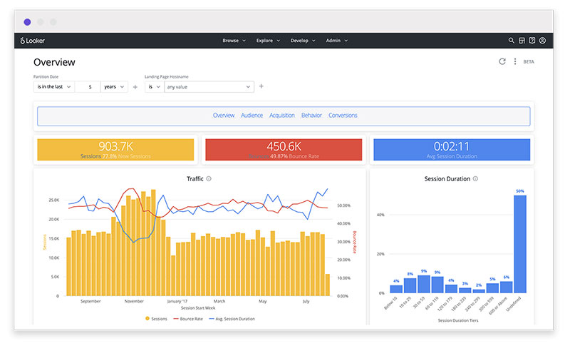
Free, cloud-based, and deeply connected to Google’s ecosystem. That’s the pitch, and it mostly holds up.
Looker Studio connects directly to Google Analytics, Google Ads, BigQuery, and Google Sheets with no additional setup. For digital marketing teams, it often replaces paid BI tools entirely. In 2024, Looker upgraded its embedded analytics interface and reported 29.6% growth in client integrations across education and healthcare (Global Growth Insights).
Where it struggles: Large datasets slow it down noticeably. Advanced analytics features are limited compared to Power BI or Tableau. If your data lives outside Google’s ecosystem, you’ll need paid partner connectors.
D3.js
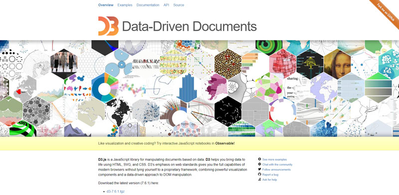
D3 is not a tool for everyone. That’s fine. It’s a tool for developers who need complete control over every pixel of their visualization.
It’s SVG-based, which means it handles large datasets differently than Canvas-based libraries. Chart.js, Highcharts, and Plotly start struggling above 10,000 data points. D3 scales better for complex, data-dense visuals because it manipulates the DOM directly.
Companies that use D3 in production: Uber (driver location mapping), The New York Times (editorial graphics), Google Maps (custom geographic overlays). These are not beginner use cases.
Well, actually it depends on your setup. If you want plug-and-play interactive charts, D3 will frustrate you. If you want to build something nobody else has built, it’s the right tool.
Flourish
Best in category for data storytelling. No code required.
Free public plan available. Upload a spreadsheet, pick a template, publish an embed. The output looks genuinely polished, not like a default chart from a BI tool.
Flourish works for newsrooms, marketing teams, and anyone who needs publication-ready visuals without writing code. It does not scale to enterprise BI. That’s not what it’s trying to do.
Datawrapper
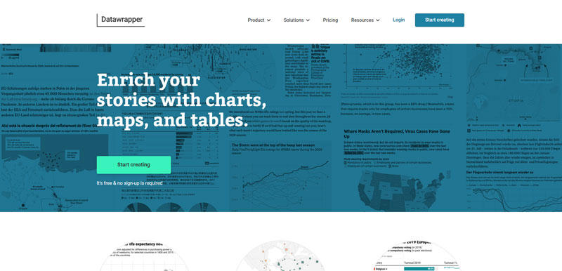
Datawrapper is the tool journalists reach for. Publications like Reuters, The Guardian, and Der Spiegel use it to produce embeddable charts at speed.
- Free for public charts with Datawrapper branding
- Clean defaults that look good without customization
- Supports scatter charts, maps, tables, and most standard chart types
- Not designed for large-scale dashboard work or complex data pipelines
Plotly
Plotly occupies a useful middle ground. More interactive than Chart.js, less complex than D3.
It supports JavaScript, Python, and R, which makes it popular with data scientists who want to take Python-based analysis and turn it into interactive web visuals. The Dash framework, built on Plotly, lets developers build full analytical web applications without leaving Python.
Airbnb uses Plotly to visualize property distribution and user engagement across regions. That’s a good example of what it does well: complex, multi-dimensional data made interactive without requiring heavy front-end development.
Performance note: Plotly can get slow with very large datasets. Above 100,000 data points, Canvas-based renderers like Plotly and Chart.js start to break down. For big data visualization at that scale, WebGL-based tools become necessary.
How to Choose the Right Data Visualization Tool
This is where most people spend too much time overthinking it. A few direct questions usually get you to the right answer fast.
Team Skills and Technical Capacity
Non-technical team? Stick to Looker Studio, Power BI, or Tableau. All three have drag-and-drop interfaces that don’t require coding knowledge.
Developer-led team? Code-based libraries give you flexibility that no BI platform can match. Chart.js for quick, clean charts. D3 for custom or complex visualizations. HighCharts for production-grade, interactive charts with enterprise support.
Took me a while to figure this out, but the biggest source of tool regret I’ve seen is teams choosing D3 when they actually needed Power BI. The reverse happens too.
Data Source and Volume
| Scenario | Recommended Tool |
|---|---|
| Google Analytics + Ads data | Looker Studio |
| Microsoft/Azure data stack | Power BI |
| Multiple mixed sources, enterprise scale | Tableau or Qlik |
| Python/R data science workflows | Plotly or Matplotlib |
| Custom web app, complex visuals | D3.js |
| Spreadsheet data, quick charts | Chart.js or Google Charts |
Output Format Requirements
This matters more than people think upfront.
- Embeds in articles or web pages: Datawrapper, Flourish, or code-based libraries
- Live business dashboards: Tableau, Power BI, Looker Studio, Domo
- PDF reports: Most BI platforms support export, but quality varies
- Custom web applications: D3, Plotly, Chart.js, or React chart libraries
- Real-time operational displays: Grafana, Domo, or Kibana
Budget
Free options that are actually useful: Looker Studio, RAWGraphs, Flourish (public plan), Chart.js, D3.js, Plotly (open source), Google Charts.
Paid tools start earning their price when your team needs real-time data refresh, enterprise-level access controls, or managed infrastructure. Platform subscription costs increased by 18% between 2023 and 2025 (Market Growth Reports), so the free-vs-paid calculation is shifting.
Data Visualization Tools for Specific Use Cases
The right tool shifts depending on what you’re actually trying to show. Here’s how tool choice maps to common real-world scenarios.
Business Reporting and KPI Dashboards
Power BI and Tableau dominate here. Both connect to CRM systems, ERP data, and cloud databases, and both support scheduled data refreshes so dashboards stay current without manual updates.
For teams already inside the Microsoft stack, Power BI is usually the faster path. Tableau Creator plans are worth the higher cost when dashboard complexity and visual quality are non-negotiable.
According to Market Growth Reports, 51% of companies report faster decision-making after adopting visualization platforms. KPI dashboards are where that impact shows up most directly.
Scientific and Academic Research
Matplotlib and Seaborn handle most academic visualization needs in Python. For statistical charts, publication-quality output, and integration with research data pipelines, they’re the standard.
Plotly adds interactivity when research needs to be shared beyond PDFs. Jupyter Notebooks pair well with both, letting researchers document analysis and visualizations in one place. For more on this, see our deep dive into scientific data visualization.
Journalism and Public Data Storytelling
Datawrapper and Flourish were built for this. Speed matters in editorial work, and both tools produce clean, embed-ready charts without requiring technical staff.
D3.js handles the more ambitious editorial graphics. The New York Times graphics team is probably the most cited example of D3 used at the editorial level, though their work involves significant developer resources that most newsrooms can’t match.
For anyone getting started with data journalism, Datawrapper is the practical first tool.
HR and Healthcare Visualization
HR dashboards are one of the fastest-growing segments. Mordor Intelligence shows HR dashboards growing at an 11.45% CAGR through 2030, faster than most other department categories. Power BI and Workday integrations drive most of this.
Healthcare is similar. Healthcare and life sciences visualization is advancing at an 11.67% CAGR (Mordor Intelligence), driven by patient data monitoring, clinical reporting, and compliance dashboards. See more on healthcare data visualization use cases and approaches.
Real-Time Operational Monitoring
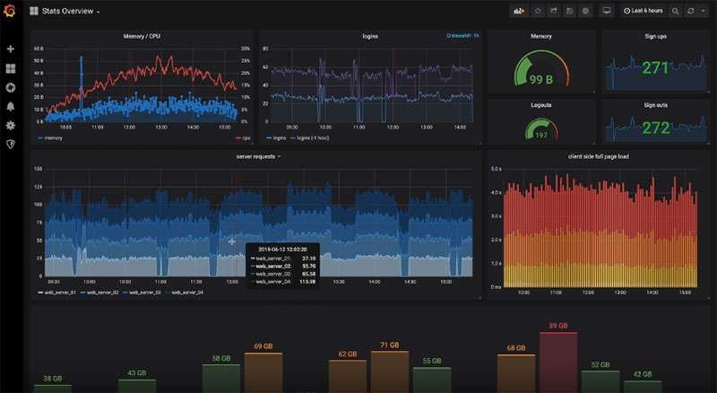
Grafana is the go-to for infrastructure and DevOps teams. Kibana handles log data and search analytics inside the Elastic stack. Domo supports real-time streaming dashboards across business operations.
These tools handle real-time data visualization at scale. Standard BI platforms like Tableau or Power BI can do real-time with the right connectors, but Grafana and Kibana are purpose-built for it.
Financial Data Visualization
Finance teams need specific chart types: candlestick charts for price data, waterfall charts for variance analysis, and time-series line charts for performance trends.
Tableau, Power BI, and Plotly all handle these well. For more specialized financial data visualization, dedicated platforms like Bloomberg Terminal or custom D3 builds cover edge cases that general BI tools can’t.
Key Features to Look for in Data Visualization Tools
Most tools check some of these boxes. The best ones check all of them. Knowing which features matter for your use case cuts evaluation time significantly.
Data Connectivity
The range of data connectors is often the deciding factor. A tool that can’t reach your data sources is useless regardless of how good its charts look.
Check for native connections to SQL databases, cloud data warehouses (Snowflake, BigQuery, Redshift), spreadsheets, REST APIs, and the SaaS platforms your team already uses. Power BI supports hundreds of connectors natively. Looker Studio covers Google’s ecosystem well but relies on paid partner connectors for everything else.
API-based customizations appeared in 41% of enterprise software integrations in 2024 (Market Growth Reports), which signals how much teams are now building custom data pipelines rather than relying on out-of-the-box connectors alone.
Chart Type Library
Standard chart types everyone offers: bar, line, pie, scatter, area, bubble. The differentiation shows up in edge cases.
Look for support for histograms, box plots, funnel charts, gauge charts, treemaps, and heat maps if your data needs them. Not every tool covers all of these.
Highcharts, Plotly, and Tableau have among the widest chart type libraries. Chart.js is intentionally lighter, which is fine if you only need common chart types.
Interactivity and Filtering
Static charts answer questions. Interactive charts let users ask their own.
Filtering, drill-downs, tooltips on hover, and cross-chart highlighting are what separate a live dashboard from a screenshot. Interactive dashboards account for 72% of user engagement across visualization platforms (Market Growth Reports 2024).
Plotly and Highcharts include interactivity by default. D3 requires you to build it yourself. Tableau and Power BI offer it through point-and-click configuration.
Collaboration and Access Controls
Becomes important fast once more than one person is involved.
- Can multiple users edit the same dashboard simultaneously?
- Are there role-based permissions to control who sees what data?
- Does the tool support version history or change tracking?
Looker (the enterprise version, not Looker Studio) is known for its LookML governance model, which enforces consistent metric definitions across every dashboard. Useful for large teams where “revenue” needs to mean the same thing everywhere.
Export and Embedding
Some tools produce great dashboards but make it tricky to get that content out to other places.
For embedding charts in websites or apps, code-based libraries like Chart.js are the natural fit. You can also embed a chart from Datawrapper or Flourish with a simple iframe. Tableau and Power BI support embedding, but it usually requires additional licensing.
Performance at Scale
This is where tools diverge sharply. Canvas-based renderers (Chart.js, Plotly, Highcharts) handle up to around 10,000 data points well. Above that, performance degrades. Above 100,000 points, they can become unusable.
D3.js scales better for dense visualizations due to direct DOM manipulation. For truly large-scale data, WebGL-based tools are necessary. More than 22,000 enterprises globally now run data pipelines exceeding 1 petabyte per month (Market Growth Reports), and big data visualization at that scale is a distinct technical challenge from standard dashboard building.
Free Data Visualization Tools Worth Using
Free does not mean limited. Several of the most widely used visualization tools in the world cost nothing, and a few are good enough that teams never need to upgrade.
Nearly 65% of organizations have adopted or are actively investigating AI and analytics technologies (Coherent Solutions 2025), which is pushing more teams toward accessible, low-barrier tools before committing to enterprise platforms.
Google Looker Studio
Best no-cost option for Google-connected teams. Fully free, cloud-based, no installation required.
It pulls live data from Google Analytics, Google Ads, BigQuery, and Google Sheets automatically. For marketing teams or small businesses already inside Google’s ecosystem, it often covers 100% of their dashboard needs without a paid subscription.
The ceiling shows up fast if your data lives outside Google. Large datasets slow it down, and advanced analytics features are thinner than what Power BI or Tableau offer. But for the price, there’s nothing that competes directly with it.
Datawrapper
Unlimited charts, maps, and tables on the free plan. No account required to start.
Major newsrooms including The New York Times, Bloomberg, and NPR use it for editorial graphics. That alone tells you the output quality is serious. Charts are automatically mobile-responsive, and the design defaults are clean enough to publish without additional customization.
The free plan adds a “Created with Datawrapper” line to outputs. Paid team plans jump to $599/month, with not much in between. Fine for individuals; tricky for mid-size agencies. Supports scatter plots, maps, bar charts, and tables, but the overall chart library is narrower than Flourish.
Flourish
Acquired by Canva in 2022. Still the best free tool for animated, narrative-driven visualizations.
Free public plan: Full access to templates, no coding required, shareable embeds.
The chart variety goes beyond what Datawrapper covers. Bubble charts, timeline animations, scrollytelling stories, racing bar charts. Useful when you need something that will actually get read and shared, not just embedded. Private plan runs $69/month for anyone who needs their data kept off the public internet.
Qrvey
Qrvey is one of the top embedded analytics tools for SaaS companies that want to place dashboards, reports, alerts, and self-service analytics directly inside their own products. Its multi-tenant architecture helps product teams keep customer data separated while controlling branding, permissions, and the user experience.
Unlike standalone visualization software, Qrvey combines data collection, transformation, analytics, automation, and embedded delivery in one platform. This makes it a strong option for teams comparing embedded analytics solutions that need more than charts alone, especially when customer-facing workflows, white-labeling, and tenant-level governance are part of the product.
Best for: SaaS product and engineering teams looking for embedded analytics platforms with native multi-tenancy, flexible customization, and workflow automation.
Pricing: Qrvey uses flat-rate annual pricing rather than per-user licensing. Exact pricing is available from the company.
Honest limitation: Qrvey is built for deeper embedded analytics use cases. Teams that only need a few standalone charts or simple public visualizations may find a lighter tool quicker to adopt.
RAWGraphs
Open source, browser-based, and your data never leaves your machine. That last point matters more than people expect in regulated industries.
It covers uncommon chart types that standard tools skip entirely: Sankey diagrams, alluvial charts, bump charts, circular dendrograms. Outputs as SVG files, which means a designer can take the export into Figma or Illustrator and refine it further. You can also self-host the entire thing if you need that level of control.
Not for beginners. The interface assumes you understand your data and know what chart type you want. That said, researchers and data visualization practitioners who work with unusual datasets reach for it constantly.
Chart.js and D3.js
Both open source. Both free. Completely different in what they ask of you.
| Library | Skill Needed | Best For | Chart Range |
|---|---|---|---|
| Chart.js | Basic JavaScript | Standard charts, quick setup | Common chart types only |
| D3.js | Advanced JavaScript + SVG | Custom, complex visuals | Unlimited (fully customizable) |
Chart.js pulls nearly 2 million npm downloads per week. Shopify, IBM, Slack, and Amazon all use it for dashboard and analytics work. It stays lightweight and handles most common chart types well without needing the full power of D3.
D3.js is for when you need something nobody else has built. Free, but the development time cost is real.
Plotly (Open Source)
The open source version of Plotly gives you a full JavaScript charting library at no cost. Supports Python, R, and JavaScript. Interactive charts by default, no extra configuration needed.
The Dash framework built on top of Plotly lets developers build analytical web applications entirely in Python. Airbnb uses Plotly for visualizing property and engagement data across locations. For data scientists who want to share Python-based analysis as interactive web dashboards without hiring a front-end developer, Plotly is the practical answer.
Data Visualization Tools and AI Features
AI is being added to almost every major visualization platform right now. Some of it genuinely changes the workflow. Some of it is just a chat box bolted onto a dashboard.
According to Market Growth Reports, 47% of visualization tools had incorporated AI-based features by 2025, up sharply from earlier years.
One example is comparing AI models when teams need to evaluate which model produces more reliable summaries, recommendations, or chart-related explanations from the same dataset. That kind of side-by-side testing is useful before adding AI features to reporting workflows.
The gap between what AI can do in BI tools versus what most users actually use is still wide.
What AI Actually Does in These Tools
Natural language queries: Ask a question in plain English, get a chart back. Power BI Copilot, Tableau Agent (formerly Einstein Copilot), and ThoughtSpot Spotter all do this.
Automated insight detection: The tool scans your data and flags anomalies, trends, or outliers without you asking. Tableau Pulse does this specifically for KPI monitoring, delivering summaries via Slack and email with the underlying stats.
McKinsey data shows 78% of organizations now use AI in at least one business function (up from 55% in 2023). That’s the macro force driving BI vendors to add these features fast.
Power BI Copilot
Microsoft’s generative AI integration for Power BI. Runs on Azure OpenAI. Generates DAX queries, report summaries, and visuals from plain language prompts.
The honest limitation: Copilot requires Fabric or Premium licensing. You’re paying more to unlock AI features inside a tool you’re already paying for. For teams already in the Microsoft stack and on Premium, it’s useful. For everyone else, it’s locked behind a pricing tier that’s hard to justify.
- Generates visuals from text prompts
- Writes DAX formulas from descriptions
- Produces narrative summaries of dashboards
- Requires Premium or Fabric license for full access
Tableau Agent and Pulse
Tableau Agent (the rename of Einstein Copilot) is integrated across Tableau’s full product suite, from data prep to publishing.
Ask it to show trends over time, drill into dimensions, filter by region. It adjusts the visualization automatically based on follow-up questions, which is genuinely faster than building filters manually.
Tableau Pulse is a separate product sitting on top of a Metrics Layer. It monitors defined KPIs, generates statistical insight summaries in natural language, and delivers them into Slack or email. For executives who want to stay on top of key numbers without opening a dashboard, it’s a different interaction model entirely.
AI-Generated Chart Suggestions
Several tools now recommend chart types based on your data structure. This is useful for beginners and for analysts moving fast who don’t want to think about whether a bar chart or histogram fits a particular dataset better.
Qlik expanded its multi-cloud architecture in 2024 with AI capabilities that helped drive a 38.7% rise in cross-platform deployment (Global Growth Insights). Databricks launched AI/BI in June 2024, combining natural language queries with visualization inside its data platform.
Where AI Still Falls Short
Natural language queries work well for standard analytical questions. They struggle with multi-step, complex logic, or anything that requires understanding business context the tool hasn’t been trained on.
Auto-generated charts are often technically correct but visually wrong. An AI picking a line chart vs. bar chart doesn’t always pick the one that communicates the data point most clearly to a specific audience.
The bigger issue: AI features in most BI tools require the underlying data to be clean, modeled, and governed correctly first. The AI layer doesn’t fix bad data. It just makes the bad data faster to query. PwC implemented advanced visualization tools in 2024 specifically to support real-time financial reporting for clients, and the value came from the data infrastructure underneath, not the AI features on top.
AI Tools vs. Traditional Dashboards: A Quick Comparison
| Capability | Traditional Dashboards | AI-Assisted Tools |
|---|---|---|
| Query method | Pre-built filters and drilldowns | Natural language input |
| Insight generation | Manual interpretation | Automated anomaly detection |
| Chart creation | Drag-and-drop or code | Prompt-to-visual generation |
| Dependency | Data literacy required | Clean semantic layer required |
The tools that do AI well (Tableau, ThoughtSpot, Holistics) build it into the core query and governance layer. The ones that do it poorly just add a chat interface on top of dashboards that were never designed for it.
For more on how these tools fit into broader interactive data visualization strategies and what to expect as the AI layer matures, data visualization trends research tracks the gap between feature announcements and real-world adoption closely.
FAQ on Data Visualization Tools
What are data visualization tools?
Data visualization tools are software platforms that convert raw datasets into visual formats like charts, graphs, and dashboards.
They range from no-code BI platforms like Tableau and Power BI to code-based libraries like D3.js and Chart.js.
What is the best data visualization tool?
It depends on your team. Tableau leads for visual analytics. Power BI wins on value inside the Microsoft ecosystem. Looker Studio is the strongest free option. D3.js is best when you need complete custom control.
Which free data visualization tools are worth using?
Google Looker Studio, Datawrapper, Flourish (public plan), RAWGraphs, Chart.js, and Plotly are all free and genuinely useful.
Most teams start with Looker Studio or Datawrapper and upgrade only when their needs outgrow the free tier.
What is the difference between Tableau and Power BI?
Tableau leads in visual quality and flexibility. Power BI is cheaper and integrates tightly with Microsoft tools like Excel and Azure. Both handle interactive dashboards well. Power BI starts at $10/user per month. Tableau starts at $15.
What are the most common types of charts used in data visualization?
Bar charts, line charts, pie charts, scatter plots, and histograms cover most use cases.
More advanced types include waterfall charts, funnel charts, bubble charts, heatmaps, and candlestick charts for financial data.
Can non-technical users use data visualization tools?
Yes. Looker Studio, Flourish, and Datawrapper require no coding. Power BI and Tableau have drag-and-drop interfaces accessible to most business users.
Code-based libraries like D3.js are the exception. Those require JavaScript knowledge.
What data visualization tools do developers use?
D3.js, Chart.js, Plotly, Highcharts, and ApexCharts are the most common choices.
Chart.js pulls nearly 2 million npm downloads per week. D3.js is used in production by Uber, Netflix, and The New York Times.
How do AI features work in data visualization tools?
AI features in tools like Power BI Copilot and Tableau Pulse allow users to query data in plain language and receive auto-generated charts and insight summaries.
They work best when the underlying data is already clean and well-structured.
What data visualization tools are used in data journalism?
Datawrapper and Flourish are the standard tools. Publications like The Guardian, Bloomberg, and NPR use Datawrapper for fast, embed-ready charts.
D3.js powers more complex editorial graphics at outlets like The New York Times.
How do I choose the right data visualization tool for my team?
Start with three questions: What is your team’s technical skill level? Where does your data live? What format does the output need to be in?
Match those answers to a tool category before comparing specific platforms and pricing.
Conclusion
This conclusion is for an article presenting data visualization tools across every category, from enterprise BI platforms to open source libraries and no-code storytelling tools.
The right choice depends on your data sources, team skills, and what the output actually needs to do.
Power BI fits Microsoft-heavy environments. Tableau handles complex visual analytics. Looker Studio, Datawrapper, and Flourish cover most needs at zero cost.
For developers, Chart.js, Plotly, and D3.js give you control that no drag-and-drop platform can match.
AI features are real but still early. Clean data and a clear question matter more than any Copilot feature.
Pick the tool that fits your workflow, not the one with the biggest marketing budget.


