Most charts show two variables. Bubble charts show three, and that changes what you can actually learn from your data.
A bubble chart plots data points as circles across X and Y axes, with bubble size encoding a third quantitative variable. Population, revenue, volume, risk score. Whatever matters most in your dataset gets a dimension that a scatter plot simply can’t give you.
This guide covers everything: how bubble charts work, when to use them, how to build one in Excel, Tableau, Power BI, and Chart.js, and the design rules that keep your chart readable rather than cluttered.
Table of Contents
What is a Bubble Chart
A bubble chart is a data visualization method that plots three numeric variables at once. Two variables map to the X and Y axes, while the third is encoded as the physical size of each data point, which is why those points are called “bubbles.”
That third variable is what separates a bubble chart from a standard scatter plot. A scatter plot uses uniform dots to show the relationship between two variables. A bubble chart replaces those dots with circles of varying sizes, adding a layer of information without adding another axis.
Color works as a fourth dimension. Assign distinct hues to different categories, and a single chart can show four variables at once. Done right, this is useful. Done carelessly, it turns into noise.
The Three Core Data Dimensions
Position and size drive the whole structure:
- X-axis: First quantitative variable (income, marketing spend, risk score)
- Y-axis: Second quantitative variable (life expectancy, revenue, return rate)
- Bubble size: Third quantitative variable, always encoded by area, not diameter
That last point matters more than most people realize. Encoding by diameter instead of area means a bubble with twice the value looks four times as large visually. That distorts the data. Every charting tool should scale bubbles by area.
Color as a Fourth Variable
Color encoding works in two ways. For categorical data, each category gets a distinct hue. For numeric data, a continuous color gradient (light to dark) maps to value ranges.
Using both size and color together adds density fast. Keep it manageable. More than 20-25 bubbles with both size and color encoding active tends to produce overlap and confusion rather than insight.
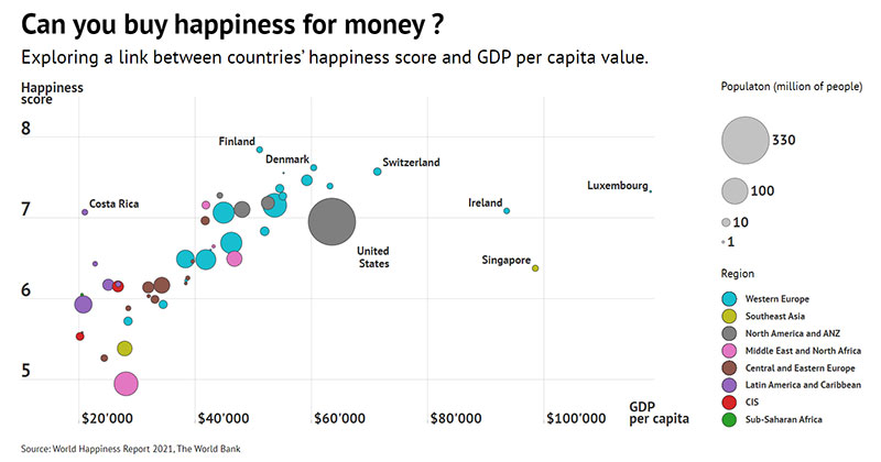
Hans Rosling’s Gapminder tool is still the clearest real-world example of this done well. It maps GDP per capita on the X-axis, life expectancy on the Y-axis, population as bubble size, and world region as color, across 182 countries, and it reads cleanly.
Free Chart Type Picker
How Bubble Charts Work
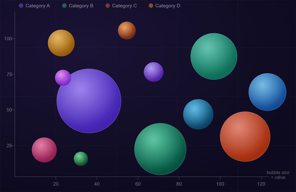
Chart created with wpDataTables
Reading a bubble chart takes a few seconds more than reading a bar chart. That’s expected. Three variables are active at once.
Each bubble represents one entity: a country, a product, a company, a region. Its horizontal position shows one value. Its vertical position shows a second. Its size tells you a third. When you see a cluster of large bubbles in the upper-right corner, that means high values across all three dimensions for that group of entities.
| Visual Element | What It Encodes | Variable Type |
|---|---|---|
| Horizontal position | X-axis variable | Quantitative |
| Vertical position | Y-axis variable | Quantitative |
| Bubble size | Third variable | Quantitative |
| Bubble color | Fourth variable (optional) | Categorical or quantitative |
Bubble Size Encoding
Area, not radius. This is the most common technical mistake in bubble chart design.
If you map the radius of a bubble to a data value, the visual area grows as the square of that value. A company with $200M revenue will have a bubble that looks four times larger than one with $100M, not twice as large. That misrepresents the data.
Correct size encoding sets area proportional to value. Most modern tools (Tableau, Power BI, D3.js) do this by default, but it’s worth verifying. In Excel, you have to select “area” explicitly when setting up the bubble series.
Color as a Fourth Dimension
Color adds a second categorical or quantitative layer without touching the axes.
- Categorical data: one distinct color per category (continent, product line, region)
- Quantitative data: continuous gradient, where darker or more saturated means higher value
- Accessibility check: always test color choices against color blindness simulators
The Gapminder chart uses color for world regions. That one design choice turns a three-variable chart into a four-variable chart without making it harder to read. Worth studying if you’re building something similar.
When to Use a Bubble Chart
The global data visualization tools market was valued at around $9.22 billion in 2022 and is projected to reach $22.12 billion by 2030 (Grand View Research). More organizations are tracking multi-variable data than ever, which is exactly where bubble charts earn their place.
A bubble chart is the right choice when you have three numeric variables that are all meaningfully related, and you need to show those relationships across multiple entities at once.
Data Conditions That Fit
Three signals that a bubble chart makes sense:
- You have at least three quantitative columns per data row
- The size variable has a real magnitude that matters to the story (population, revenue, volume)
- You’re comparing 5-30 entities, not hundreds
Business use cases that map well to this format include comparing marketing channels by spend (X), conversion rate (Y), and total customers reached (bubble size). Or comparing products by development cost (X), profit margin (Y), and sales volume (bubble size).
Where It Outperforms a Scatter Plot
A scatter chart handles two variables cleanly. But if that third variable is the whole point of your analysis, the bubble encoding makes it visible without building a second chart.
Concrete example: You want to show whether cities with higher public transit investment have lower car ownership rates, while also communicating each city’s total population. That third variable (population) adds context without a second chart. A bubble chart handles all three in one view.
Three scatter plots would theoretically cover the same comparisons, but the three-way relationship becomes obvious in a single bubble chart in a way it never does across separate charts.
When Not to Use a Bubble Chart
Bubble charts get misused fairly often. The format looks visually impressive, so people reach for it when simpler chart types would work better.
Situations Where a Bubble Chart Fails
Only two variables exist. Use a scatter plot. The bubble size encoding has nothing real to represent, so bubbles become arbitrary and misleading.
Precision matters. Human eyes are bad at comparing areas. We read bar lengths accurately. We estimate bubble sizes loosely. If your audience needs to extract exact values, consider a bar chart or a data table instead.
- Too many data points: 50+ bubbles overlap badly and patterns disappear
- Negative values in the size variable: bubble size can’t represent negative numbers intuitively
- Categorical-only data: bubble charts require numeric variables on both axes
- Time-series comparisons: line charts show change over time far more clearly
The Overplotting Problem
Overlapping bubbles are tricky. When large bubbles cover smaller ones, data points disappear. This is one of the most common complaints about bubble charts in production dashboards.
Partial transparency (around 60-70% opacity) helps, but it doesn’t fully solve the problem. If your dataset is dense, a histogram or heatmap might communicate the distribution more honestly.
I’ve seen reports where bubble charts had so much overlap that the only readable insight was “there are a lot of bubbles here.” That’s not a visualization. That’s noise.
Bubble Chart vs. Other Chart Types
Choosing the wrong chart type for multi-variable data is one of the more common data visualization challenges teams run into. The comparison below covers the most common decision points.
Bubble Chart vs. Scatter Plot
This one is straightforward. Variable count is the deciding factor.
| Factor | Scatter Plot | Bubble Chart |
|---|---|---|
| Variables | 2 (X and Y) | 3–4 (X, Y, size, optional color) |
| Readability | Higher, less visual load | Moderate, requires a legend |
| Trend lines | Supported natively | Tricky with bubbles of varying sizes |
| Best for | Correlation analysis between two variables | Multi-dimensional entity comparison |
If you only have two numeric variables and want to show correlation, a scatter plot wins. The bubble size adds nothing when there’s no meaningful third variable to encode.
For more on line charts vs scatter plots and where each applies, that comparison gets into correlation vs. trend trade-offs that come up often in practice.
Bubble Chart vs. Bar Chart
A bar chart wins when your audience needs to read exact values or rank items clearly. Bubble charts are better for showing relationships between three variables simultaneously.
Bar chart strengths:
- Precise comparison of single-dimension values
- Familiar to non-technical audiences
- Clean category-to-value reading
Bubble chart strengths:
- Shows three-variable relationships in one view
- Reveals clusters and outliers across dimensions
- Better for portfolio and competitive comparisons
A good rule: if someone will need to say “the exact value of X is Y,” use a bar chart. If someone needs to say “these entities cluster together across three dimensions,” use a bubble chart.
Bubble Chart vs. Treemap
Both encode value through area. The difference is context.
Treemaps show part-to-whole relationships. They’re excellent for showing how segments contribute to a total. Bubble charts show relationships between independent numeric variables. There’s no “whole” implied. Each bubble stands on its own across two axes and a size dimension.
Use a treemap when hierarchy and proportion are the story. Use a bubble chart when position and magnitude across three dimensions is the story.
Types of Bubble Charts
The standard format (X axis, Y axis, bubble size) covers most use cases. But there are a few variations worth knowing, each suited to a different data structure or audience.
Standard Bubble Chart
Three quantitative variables. No color category. Clean and fast to build in any tool.
Best for: internal analysis, early-stage data exploration, audiences comfortable with quantitative charts. When the pattern in the data is strong, color isn’t needed. Adding it just for aesthetics usually muddies the chart.
Colored Bubble Chart
Four variables at once: X position, Y position, bubble size, and color category.
This is the Gapminder model. It works when your categories are few (under 8 or so) and clearly distinct. More than that and the color legend becomes a lookup table rather than an at-a-glance aid.
Motion / Animated Bubble Chart
Adds a time dimension by animating bubbles across frames. Hans Rosling’s BBC presentation of global development data from 1800 to 2015 is the defining example of this format. Each frame is one year. The bubbles move as countries develop.
These work well in presentations and interactive dashboards. Tools like Chart.js, Highcharts, and Flourish all support animated bubble charts with relatively little setup.
For non-interactive contexts (PDFs, printed reports), animation obviously doesn’t work. A static snapshot with a callout showing key frames tends to be the practical substitute.
Packed Bubble Chart
No axes. Bubbles sized by a single variable and packed together in a circle layout.
What it shows: Relative magnitude across categories
What it loses: All positional meaning (X and Y are just layout, not data)
Best for: Showing proportional comparisons where the audience only needs to grasp “big vs. small” across a set of categories
Packed bubble charts are visually striking, which is why they show up often in journalism and executive decks. They’re not great for analytical depth. You can get an impression, but not precise comparison. For that, a bar chart is more honest.
Geographic Bubble Chart
Bubbles overlaid on a map. Position is determined by latitude and longitude instead of data-driven axes. Bubble size still encodes a quantitative variable.
Common uses: regional sales volumes, population-weighted metrics, city-level comparisons. The New York Times and Financial Times use this format regularly in their data journalism work. The geographic context does something a plain bubble chart can’t: it anchors each bubble to a physical location that readers already understand.
How to Make a Bubble Chart
More than 68% of businesses integrated data visualization tools into their BI strategies in 2024, according to Market Growth Reports. Most of them are building charts in tools they already have.
Before touching any tool, get the data structure right. You need a minimum of three numeric columns per row and one label column. If your size variable has no real scale, stop and pick a different chart type.
Data Preparation
Required columns:
- Label column (country, product, campaign name)
- X-axis value (numeric)
- Y-axis value (numeric)
- Size value (numeric, positive only)
- Optional: category column for color encoding
Clean the size column first. Negative values break area encoding. Values that are too close together (say, all between 98 and 102) will produce bubbles that look nearly identical. That kills the visual story the third variable is supposed to tell.
In Excel and Google Sheets
Excel has native bubble chart support. Microsoft describes it as a variation of the scatter chart where the Z values determine bubble size.
Steps in Excel:
- Select your three data columns (X, Y, size)
- Insert > Chart > Bubble
- Under “Format Data Series,” set bubble scale to Area, not width
- Add axis titles and a size legend manually
Google Sheets follows the same logic. Use Insert > Chart, select Bubble chart from the dropdown, then map your columns to X, Y, Size, and optionally Color.
Took me a while to find the area vs. width toggle in Excel the first time. It’s buried in the Format Data Series panel, not in the main chart options.
In Tableau and Power BI
Tableau automatically sizes bubbles by area when you drop a measure onto the Size shelf. Power BI supports bubble charts through the scatter visual, with bubble size mapped to the “Size” field well.
Both tools allow up to 10,000 data points in a scatter/bubble visual (Microsoft Learn), though readability drops well before that threshold.
Tableau workflow: Drag X measure to Columns, Y measure to Rows, size measure to Size on the Marks card, category to Color.
Power BI workflow: Add a Scatter chart visual, map X Axis, Y Axis, Size, and optionally Legend fields in the Fields pane.
In D3.js and Chart.js
D3.js gives you complete control. You define the scale function, map radius to the square root of your size value (to preserve area encoding), and handle all rendering logic yourself. Steep learning curve. Worth it when you need custom interactivity or non-standard layouts.
Chart.js is the faster option for standard bubble charts. It supports bubble charts natively, requires minimal setup, and runs on HTML5 Canvas. The bundle size is around 60kb, which makes it a practical choice for web projects where load time matters.
If you’re extending Chart.js behavior, the available Chart.js plugins cover tooltip customization, annotation layers, and zoom/pan, which are all useful additions for interactive bubble charts.
Bubble Chart Best Practices
Design standards for bubble charts are well established. The Urban Institute’s data visualization style guide is explicit: size by area, not diameter, and consider color only for a fourth variable. Most errors in production bubble charts come from ignoring one of those two rules.
Size and Scale Rules
Sizing by radius instead of area is the most common mistake. A bubble with twice the value will have four times the visual area if you scale by radius. That misrepresents the data significantly.
Key rule: Map bubble size to the square root of the value, or use a tool that does this automatically. Verify the setting in whichever tool you’re using.
Keep bubble count between 5 and 25 for a clean, readable chart. Beyond 30, overlap becomes a real problem, especially if size ranges are wide.
Labeling and Legends
Interactive charts can use tooltips. Static charts need direct labels on key bubbles.
A size legend is non-negotiable. Without one, readers have no reference for what bubble area represents in actual data units. Show two or three reference bubble sizes in the legend with their corresponding values.
- Label only the 3-5 most significant bubbles directly
- Use tooltips for the rest in interactive contexts
- Keep axis labels concise, with units included
Color and Accessibility
70% opacity on bubbles is a practical default. It reduces overplotting without making individual bubbles hard to read.
Color palettes need to pass contrast checks. Following WCAG 2.1 AA guidelines (a minimum contrast ratio of 4.5:1 for normal text) is a reliable standard for accessible charts, according to DataTeams AI. This matters more for bubble charts than for bar charts, since small bubbles are harder to distinguish.
Avoid 3D bubble effects entirely. They distort size perception and add no information. They just look tricky to read and usually are.
What to Skip
No 3D. No gradient fills on bubbles unless the gradient itself encodes data. No decorative background imagery.
Edward Tufte’s concept of “chart junk” applies here directly: every pixel that doesn’t communicate data reduces signal-to-noise ratio. A plain white background with minimal gridlines outperforms decorative designs consistently in comprehension tests.
Real-World Examples of Bubble Charts
Bubble charts appear across industries wherever three numeric variables need simultaneous comparison. The format is especially strong in financial data visualization, global development analysis, and product portfolio reviews.
Gapminder: The Definitive Example
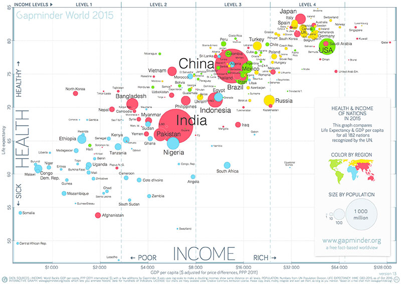
Hans Rosling’s Gapminder tool remains the benchmark for what a bubble chart can do. It maps GDP per capita (X axis) against life expectancy (Y axis), with population size as the bubble size and world region as color, across 182 countries.
The chart runs from 1800 to 2021. Each year is a frame in the animation. It shows two centuries of global development in a format that a general audience can follow without any statistical background. That’s rare in data visualization.
The New York Times Visualization Lab has also used bubble charts for complex data storytelling, including economic and political datasets where multiple variables interact.
Business and Finance
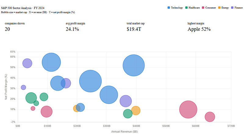
Portfolio analysis is where bubble charts show up most often in corporate settings. The classic format: risk (X) vs. return (Y) vs. portfolio size (bubble) across investment categories or business units.
Common business applications:
- Marketing: spend vs. conversion rate vs. total reach per channel
- Product: development cost vs. profit margin vs. sales volume
- Sales: deal count vs. total revenue vs. average deal size per rep
- Finance: budget vs. return vs. division size
Finviz uses bubble charts in their stock market visualization tool to show market cap, performance, and sector relationships across hundreds of tickers simultaneously.
Healthcare and Scientific Data
Healthcare systems reported a 41% improvement in patient data visibility using integrated visualizations (Market Growth Reports, 2024). Bubble charts contribute to this specifically in comparative outcome studies and resource allocation analysis.
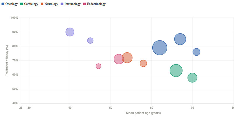
A typical healthcare data visualization use case: treatment cost (X) vs. effectiveness rate (Y) vs. patient volume (bubble size) across treatment protocols.
That three-variable view shows which treatments are both cost-effective and widely used. A scatter plot alone can’t communicate patient volume without adding another chart.
Sports Analytics
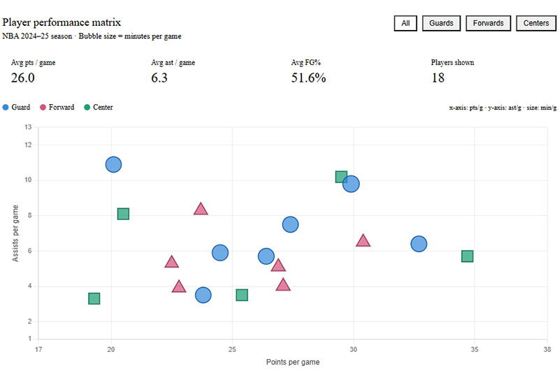
In sports data visualization, bubble charts map player or team performance across multiple metrics. Points scored vs. points allowed vs. win count is a straightforward NBA example. The format also appears in player scouting: speed vs. accuracy vs. games played.
These charts are useful precisely because the three-variable comparison is the point. You’re not looking for a single ranking. You’re looking for the cluster of players who perform well across all three dimensions simultaneously.
Tools and Software for Bubble Charts
Over 92% of Fortune 500 companies use advanced data visualization tools as of 2024 (Market Growth Reports). Bubble chart support is standard across most of them, but capability varies significantly.
| Tool | Best for | Bubble chart support | Cost |
|---|---|---|---|
| wpDataTables | WordPress sites, embedded tables & charts | Via Chart.js / Highcharts integration | Paid plugin |
| Excel / Google Sheets | Quick analysis, small datasets | Native, manual setup required | Free Microsoft 365 |
| Tableau | Business BI, interactive dashboards | Full support, packed and standard | Paid |
| Power BI | Microsoft ecosystem, enterprise | Via scatter visual, ~10k data points | Freemium |
| D3.js | Custom web visualizations | Full control, manual encoding | Open source |
| Flourish / Datawrapper | No-code, publication-ready | Built-in templates | Freemium |
Excel and Google Sheets
Good starting point. Both tools support native bubble charts with minimal configuration. The main limitation is interactivity. Neither gives you hover tooltips or animated playback without significant extra work.
Limitation to know: Excel’s default bubble sizing uses width, not area. Changing this is a one-step fix, but you have to know it exists.
Tableau and Power BI
Tableau introduced enhanced data collaboration features in October 2024, allowing users to share and interact with visualizations across teams in real time. That’s directly useful for shared bubble chart dashboards in team settings.
Power BI added AI-driven predictive features in November 2024 (Microsoft). For bubble charts specifically, this means trend overlays and automated insight suggestions can sit alongside your standard three-variable view.
Both tools handle interactive charts well and are the standard choice for most enterprise analytics teams.
Chart.js, Highcharts, and Google Charts
These three cover most developer-facing needs for web-embedded bubble charts.
Chart.js: Open source, 60kb, built-in bubble type, Canvas-based rendering. Best for web projects where size matters and interactivity is simple.
Highcharts: SVG-based, commercially licensed for production use, strong accessibility module, used by IBM, Facebook, and MasterCard. More polished defaults than Chart.js, better cross-browser consistency.
Google Charts: Free, browser-based, no installation required. Bubble chart is one of its built-in types. Good for embedding in web pages quickly without a build pipeline.
Flourish and Datawrapper
Both are no-code tools built for journalists, analysts, and anyone who wants publication-quality charts without writing code.
Flourish’s animated bubble chart builder is one of its most popular features. You upload your data, map your columns, and get a Gapminder-style animated chart with a few clicks. The output is embeddable via iframe.
Datawrapper is more conservative in style, which suits editorial contexts. The charts export cleanly to PNG or SVG and meet accessibility standards out of the box.
For teams doing a lot of chart work across chart types, comparing a range of types of charts and their tool support is a practical first step before committing to a platform. And if you’re working across multiple visualization formats, reviewing broader data visualization best practices helps set consistent standards across your whole output.
FAQ on Bubble Charts
What is a bubble chart?
A bubble chart is a data visualization that plots three numeric variables at once. Two map to the X and Y axes. The third is encoded as bubble size. Color can optionally represent a fourth variable, usually a category.
What is the difference between a bubble chart and a scatter plot?
A scatter plot shows two variables using uniform dots. A bubble chart adds a third variable through bubble size. If your data only has two numeric dimensions, a scatter plot is the cleaner choice.
When should you use a bubble chart?
Use one when you have three related numeric variables and need to compare multiple entities at once. Good fits include portfolio analysis, marketing channel comparison, and population-weighted data. Avoid it when precision matters more than pattern recognition.
How do you read a bubble chart?
Check horizontal position for the X variable, vertical position for the Y variable, and bubble size for the third. Larger bubbles mean higher values. A legend showing reference bubble sizes helps readers estimate values without guessing.
What are the most common mistakes in bubble chart design?
The biggest one is sizing bubbles by diameter instead of area, which visually inflates larger values. Other frequent issues include too many bubbles, missing size legends, and using 3D effects that distort size perception entirely.
How many data points can a bubble chart handle?
Practically, 5 to 25 bubbles is the readable range for most audiences. Tools like Power BI support up to 10,000 data points technically, but readability collapses well before that. Heavy overlap signals it’s time for a different chart type.
What tools can you use to make a bubble chart?
Excel and Google Sheets work for quick analysis. Tableau and Power BI suit business dashboards. For web use, Chart.js and ApexCharts are solid developer options. Flourish and Datawrapper handle no-code, publication-ready output.
Can a bubble chart show negative values?
Not directly through bubble size. A shape can’t have negative area, so negative values in the size variable break the encoding. You can use color or annotation to flag negative values separately, but the core size dimension stays positive.
What is a packed bubble chart?
A packed bubble chart drops the X and Y axes entirely. Bubbles are sized by a single variable and packed together in a circular layout. It shows relative magnitude across categories but loses all positional data meaning. Good for presentations, weak for analysis.
How is a bubble chart different from a treemap?
Both encode value through area, but the purpose differs. A treemap shows part-to-whole hierarchy. A bubble chart shows relationships between independent numeric variables across two axes. Use a treemap for proportions, a bubble chart for multi-variable comparisons.
Conclusion
This conclusion is for an article presenting bubble charts as one of the more capable chart types for multi-variable data analysis.
When your dataset has three quantitative dimensions that interact, no other chart type shows those relationships as clearly in a single view.
Size encoding, axis positioning, and optional color assignment give you a format that handles comparative analysis across entities without requiring multiple separate charts.
The rules are straightforward: scale by area, keep bubble count manageable, always include a size legend, and choose your tool based on whether you need static output or interactive data visualization.
Get those basics right and the chart reads cleanly. Get them wrong and the data story disappears into overlap and distortion.


