
In a world driven by data, the power of visual presentation is unparalleled. When you encounter examples of good graphs and charts, not only do they capture attention, but they also transform complex data into comprehensible insights.
Data visualization isn’t merely about throwing numbers into a graph; it’s about storytelling. Whether you’re crafting a business report or preparing for an important presentation, the right visual aids—such as bar charts, line graphs, and pie charts—can make your data speak volumes.
Today, I’ll dive into the art and science behind effective graph design. You’ll discover the best chart types tailored for various data sets, learn visualization techniques, and explore professional charts that stand out in any analytical setting.
By the end of this article, you’ll have a comprehensive toolkit to elevate your communication skills through impactful graphs and charts, turning raw data into stories that resonate. Let’s transform your data into powerful visuals that not just inform, but also inspire.
Table of Contents
What Makes A Good Graph?
A good graph clearly presents data with a concise caption, labeled axes and scales, distinct symbols, and a well-defined data field. It includes a descriptive legend and, if applicable, a source line. The graph type should suit the data, avoiding clutter and ensuring readability and accuracy.
Essential Elements of a Good Graph
When designing a graph, several key elements ensure its clarity and effectiveness. A well-constructed graph should always include the following components:
- Caption: Provides a brief description of what the graph is about. It should be clear, concise, and help the viewer understand the context of the data at a glance.
- Axes and Scales: Graphs must feature clearly labeled vertical (Y axis) and horizontal (X axis) axes. These labels often describe the dependent and independent variables, respectively. Scales should be consistent and accurately represent the data range.
- Symbols: Distinct and legible symbols are essential for differentiating various data points or lines. These symbols should provide good contrast with the graph’s background to ensure visibility.
- Data Field: This is the area where data points or graphical elements such as bars or lines are plotted. It must be precise and depict the data accurately.
- Legends: A descriptive legend explains the meaning of various symbols, lines, or colors used within the graph. This helps in identifying different data categories or series.
- Title: Even though a caption is necessary, a succinct title at the top of the graph often helps in quickly conveying the main topic or finding.
- Source Line: If the data is sourced from another work, include a credit or source line. This ensures credibility and allows viewers to reference the original data.
Moreover, while creating a graph, it’s crucial to select the appropriate type based on the data:
- Line Graphs: Ideal for showing trends over time.
- Bar Graphs: Best suited for comparing quantities across different groups.
- Scattergrams: Useful for illustrating relationships between two numeric variables.
- Pie Charts: Effective for showing proportions within a whole.
Avoid common errors such as cluttered legends, inappropriate graph types, mislabeled axes, or scales that exaggerate the data. Ensure that your symbols and lines are distinct, and refrain from including unnecessary elements that do not contribute to the viewer’s understanding of the data.
Data Visualization Examples by Type of Chart
Bar Charts
OECD – Better Life Index
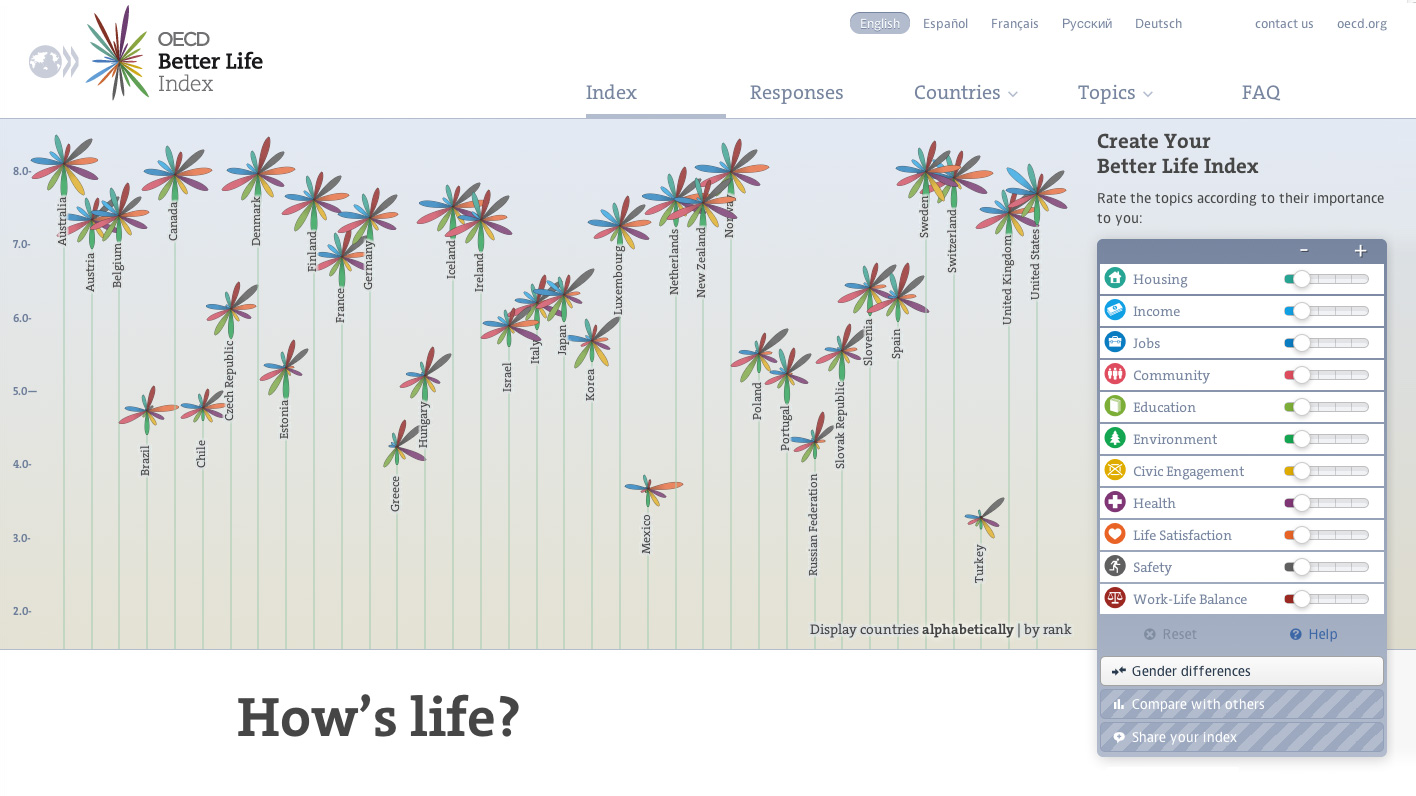
The Organisation for Economic Co-operation and Development (OECD) fosters policies that improve lives. They assess the well-being of the population in different countries with a worldwide impact.
Their Better Life Index presents a unique column chart scoring 41 countries according to 11 key metrics. These parameters are combined to form the index values on the vertical axis.
This data visualization uses a flower to indicate the rank of each country. Flower size and height vary according to the results.
This example shows how column charts can be fully interactive and flexible to your subject and data. The same chart allows users to see gender differences or personalize their index.
The Pudding – Film Dialogue (Broken Down by Gender)

The Pudding set out to present data regarding men-dominated movie roles by studying over 2000 screenplays. Here, you will find five main charts and graphs.
They start examining dialogue by gender in Disney movies with the charts above. They present a bullet graph for male, balanced, and female-dominated dialogues.
Afterward, they introduce a dot plot of all scripts divided by gender in which the data points represent movies. They use bar graphs to analyze high-grossing films that reached the top 2500 at US Box Office.
A gradient stacked bar chart breaks down dialogues by gender. When you click on it, it shows a simple bar graph of the movie’s top five characters.
Additionally, a diverging bar chart reveals female and male lines by the minute. Then, two bar graphs split the percentage of dialogue by gender and age.
To sum up, they present a Marimekko chart of all films by cast member and gender. The use of data visualization in this study fosters transparency, despite the intricacy of the data set content.
Real-life Bar Chart

This unique column chart includes three beer mugs, a handwritten label, and a $5 bill. Despite not being digital, this basic bar chart is one of the best examples of good graphs.
It shows that you can create charts and graphs out of anything. Column charts are easy to build and help compare and visualize data at a glance.
The Next America
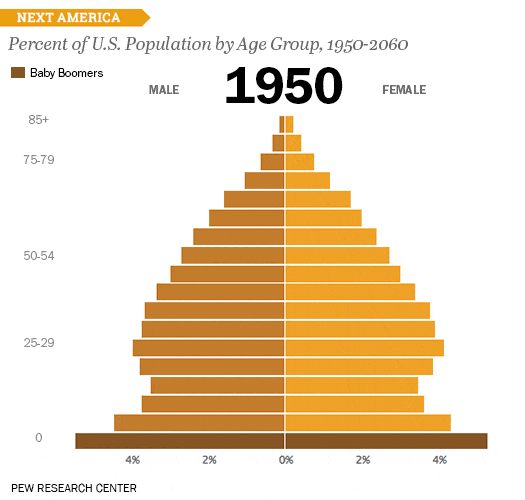
Next, the Pew Research Center presents population pyramids. This type of bar graph depicts the distribution of a population by age group and gender.
The x-axis represents the size of that population, while the y-axis defines its age. Hence, the bar chart allows you to analyze past numbers and enables solid predictions.
The Next America is a look into the trends and changes that will shape the future of the country’s population. Besides the example above, it has numerous other charts and graphs.
In this case, they joined several bar charts to create a moving graphic instead of presenting a single data visualization. In them, you can learn the percentages of the American population between 1950 and 2060.
For example, you can notice the impact of better healthcare on the elderly population rates.
Bar chart created with wpDataTables
Discover the most populous nations in the world using our bar chart made with wpDataTables. Compare and evaluate population statistics for various nations quickly. With this useful visualization, you can find out which nations rank highest and learn about changes in the world’s population.
Bubble charts
Information is Beautiful – Data Breaches and Hacks
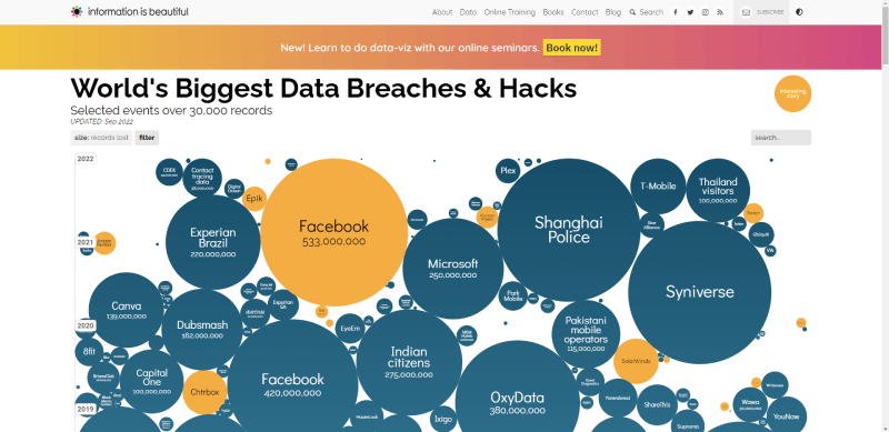
Information is Beautiful presents a bubble chart of the most significant data breaches and hacks. This data visualization is interactive and allows access to its raw data.
The bubble chart is similar to a scatter graph but introduces an additional numeric variable. Bubble size varies according to the scale of the breach or attack.
Here, users can get an overview of events from 2004 onwards. Placing the cursor on top of the data points will open a summary of the occurrence, and clicking on it will lead to its detailed story.
There is also a selection of filters available that enclose different categories, such as method and sector. This way, users can choose to analyze data in detail, with more precision.
It will help them see logical relationships between data changes and possible corrective actions. Beneath this graphic are other bubble charts of data breaches according to data sensitivity.
Your beautiful data deserves to be online
wpDataTables can make it that way. There’s a good reason why it’s the #1 WordPress plugin for creating responsive tables and charts.

And it’s really easy to do something like this:
- You provide the table data
- Configure and customize it
- Publish it in a post or page
And it’s not just pretty, but also practical. You can make large tables with up to millions of rows, or you can use advanced filters and search, or you can go wild and make it editable.
“Yeah, but I just like Excel too much and there’s nothing like that on websites”. Yeah, there is. You can use conditional formatting like in Excel or Google Sheets.
Did I tell you you can create charts too with your data? And that’s only a small part. There are lots of other features for you.
Four Ways to Slice Obama’s 2013 Budget Proposal
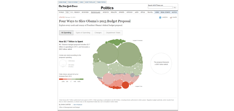
This unique circular graph is a bubble chart of President Obama’s 2013 Budget Proposal. There are four main ways to explore it, each with its own data visualization.
Users can view all spending or divide expenses by type of spending. They can also see the changes in discretionary spending or check department totals.
They can get more details by placing the cursor over the data points in each bubble chart. Thus, users might understand the spending estimation of $3.8 trillion with a $901 billion deficit.
The chart shows budget cuts or increases through a variation in bubble colors. As to their size, it changes according to the proposed spending value.
Interactive Chart of Good Government
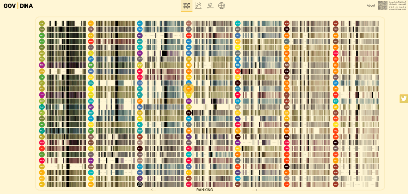
Interactive features tend to make charts and graphs more complex. Thus, it is usually best to avoid them for clear and precise data visualization.
Still, not all charts need to be static. Depending on your theme and audience, interactivity can increase engagement and boost data impact.
That is why Gov | DNA is one of the best examples of good graphs on this list. This website allows users to explore the DNA of a good government through various graphics.
They use scatter plots for several significant indexes. They simplify understanding by using bubbles to represent countries in each scatter diagram.
Besides, each country also has an individual mekko chart detailing its progress and metrics results.
Circular Network Chart
Popular Programming Languages in 300 CRAN Packages

Learning data visualization techniques will help you create unique charts and graphs. As you become more skilled, you will no longer have to settle with a type of chart design.
For example, network diagrams are valuable in ascertaining logical connections between data. At the same time, pie charts have a more comprehensive layout.
Plus, a bubble chart allows you to easily represent different values without a limit of categories. When you become proficient in chart design, you can create a single data visualization with features from these three. That is what the above chart shows.
It analyzes popular programming languages in 300 CRAN (Comprehensive R Archive Network) packages. Despite the complexity of its data set, this data visualization is engaging and easy to understand.
Its creator, Torsten Sprenger, even shared the data and code on his GitHub profile.
Line Graphs
COVID-19 Hospitalization Rates
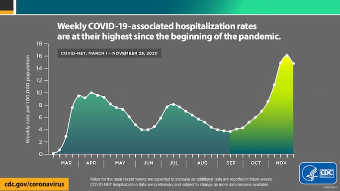
This line chart portrays the weekly hospitalization rates associated with COVID-19. The Centers for Disease Control and Prevention (CDC) compiled the data between March and November 2020.
Line graphs compare two variables, which makes them an excellent choice for general information. The labels and different color shades make this data visualization easy to read and accessible for most people.
Global Surface Temperature
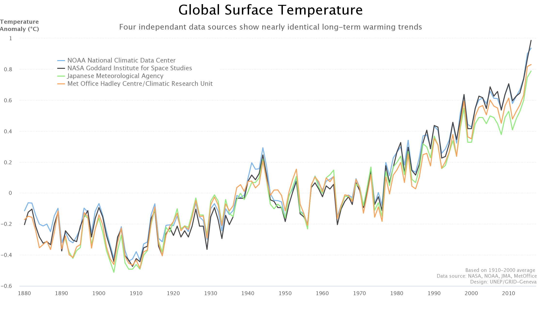
Clarity is the most crucial feature in charts and graphs. This list of examples of good graphs includes several simple maps representing complex data.
Accordingly, the line graph is one of the best data visualization methods to maintain clear presentations. It is excellent to depict time series data with two or more variables.
The line chart above displays temperature anomalies between 1880 and 2010. The y-axis registers changes in degrees celsius, while the x-axis represents the timeline.
Additionally, this line graph compiles information from four data sources within the same period. They all reach the same distressing conclusion that temperatures have been rising alarmingly.
You can see how the straightforward chart design and the irrefutable sources highlight its data set. Despite transmitting public knowledge information, the line graph is still impactful.
Pie Chart
Most Popular Food Delivery Items in America

Pie charts are an excellent way to portray qualitative data in numeric variables when there are not too many categories. In this example, Eater analyzes the most popular delivery items in America.
The pie chart shows eight varieties of commonly available food for delivery. It also includes a legend with the different values that concern each option.
3D pie chart created in WordPress
Experience your data in a new dimension with our 3D bar chart created using WPDataTables and Highcharts library. Stunning, interactive visualizations made easy.
Streamgraph
Immigration to The United States

The last example of a good graph is an area chart. This type of chart is beautiful as well as informative.
Area charts are data visualization methods that provide a clear outline of the information depicted. On the downside, they are not the best choice for detailed analysis.
In this example, the area chart is a streamgraph portraying immigration to the United States between 1829 and 2013. With colorful data labels, it examines the number of immigrants, prior country of residence, and year of moving.
Users can see the changes in immigration flows and origins and relate them to historical events or trends. For example, during and sometime after the Second World War, there was a significant slowdown in immigration.
Frequently asked questions about graphs
What makes a graph or chart effective?
An effective graph or chart simplifies complex data, providing clarity. It combines visual data representation with appropriate chart types like line graphs or scatter plots, ensuring readability. Key performance indicators (KPIs) are highlighted, maintaining the focus on vital metrics.
Which chart type should I use for my data?
Choosing the right chart type depends on your data. Use bar charts for comparison, line graphs for trends over time, and pie charts for proportions. Histograms work best for frequency distributions, while bubble charts excel in displaying variable relationships.
How do I avoid clutter in my graphs?
Less is more. Graph design should prioritize essential data points, removing unnecessary elements. Use clear labels and consistent colors. Avoid 3D effects unless absolutely necessary. Ensure your graphs for presentations are straightforward and to the point.
Why is color choice important in charts?
Color communicates. For data-driven graphs, use contrasting colors to distinguish data series. Stick to a consistent color scheme: blues for professional charts, brighter hues for infographic charts. Visual aids should be accessible, avoiding colors that may be difficult for color-blind people.
Conclusion
Transforming raw data into clear and compelling visual stories is both an art and a science. Examples of good graphs and charts shine by distilling complexity into clarity, employing optimal visualization techniques that resonate with the audience.
As we’ve seen, choosing the right chart types—whether bar charts, line graphs, or scatter plots—can turn mundane numbers into insightful narratives. Using effective graph design, the right colors, and clear labels can elevate your visual data representation, captivating your viewers and driving your point home with precision.
By leveraging data storytelling principles, your graphs for presentations become more than just visuals; they become powerful tools that facilitate understanding and decision-making. Whether it’s in business reports, dashboards, or infographic charts, mastering these elements ensures your data is both informative and engaging.
Incorporate these practices, and you’ll not just show data—you’ll convey meaning, inspire action, and narrate stories that truly make an impact. The key lies in transforming data insights into professional charts that speak for themselves.
If you liked this article about examples of good graphs, you should check out this article about financial charts and graphs.
There are also similar articles discussing interactive charts, creating interactive charts, comparison chart makers, and comparison charts.
And let’s not forget about articles on React chart libraries, JavaScript chart libraries, chart generators, and animated charts.


