How wpDataTables Turns Raw Data Into Actionable Insights
Data should answer questions, not create more of them.
Data should answer questions, not create more of them.

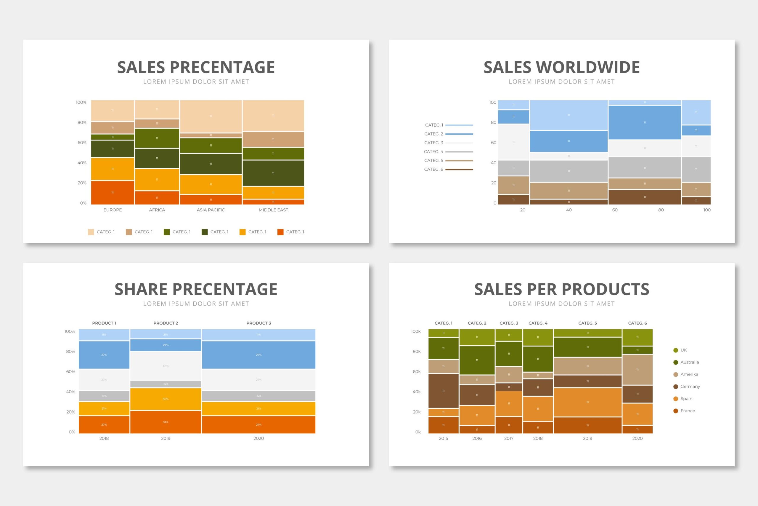
Raw data does not make decisions. People do, and they need to see it first. Data visualization tools turn spreadsheets and databases into charts, dashboards, and interactive reports that actually communicate something. The market has grown fast. There are now…

Tables are one of those elements most WordPress users don’t think much about—until they actually need one. And when you’re comparing products, displaying pricing plans, or organizing large amounts of information, a simple paragraph just won’t cut it.

Looking back on 2025, it feels like we’ve been on quite a journey together. For our team, this year was full of challenges, experiments, and small victories that reminded us why we love building wpDataTables.
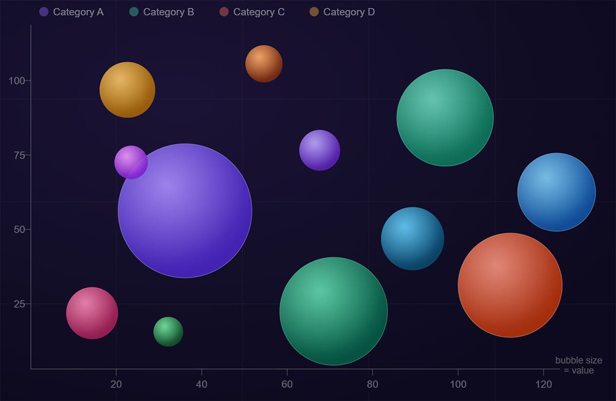
Most charts show two variables. Bubble charts show three, and that changes what you can actually learn from your data. A bubble chart plots data points as circles across X and Y axes, with bubble size encoding a third quantitative…

If you ever tried to make even a single table in WordPress, you know how slow and frustrating it can be. Native tables are limited, editing often means jumping between screens, and even small updates can turn into time-consuming tasks.…

Every developer eventually stares at a raw JSON array and thinks: this needs to be a table. Whether you’re displaying API response data in a dashboard or rendering database results on a page, knowing how to convert JSON to an…
Merging cells in HTML and WordPress can be a game-changer for enhancing your web design and ensuring your tables look sleek and professional. Whether you’re working with HTML to craft the perfect table on your website or using WordPress plugins to simplify…

Every December, something special happens across the WordPress ecosystem. The pace slows just enough for us to look beyond launches, dashboards, and deadlines, so we can focus on something bigger.
Turning raw data into something people actually understand isn’t always easy. A bunch of numbers on their own don’t say much—but put them into the right chart, and suddenly the story becomes clear. That’s where Chart.js comes in. This guide…
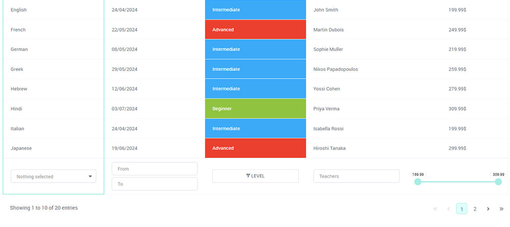
Ever felt frustrated trying to find something on a website, scrolling endlessly or clicking around without a clue where to go? That’s exactly the problem table pagination solves. It takes a big, messy chunk of data and breaks it into…

Data tables might not get the spotlight, but they’re the unsung heroes of any website full of information. They take a jumble of numbers, text, and stats and turn it into something you can actually make sense of – quickly…