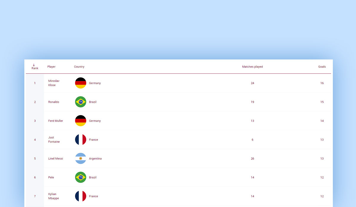
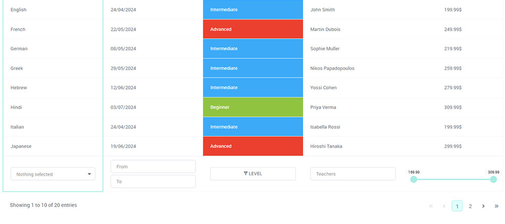
In the realm of web design, a plain HTML table can sometimes feel like a relic from a bygone era. But what if I told you there’s a way to breathe life into these tables, transforming them into visually appealing and highly functional components of your website?
The secret lies in leveraging the <img> tag and enhancing your HTML tables with images.
Imagine this: a sleek table format showcasing not just textual data but vivid images that capture the eye and communicate more information at a glance.
From interactive data visualizations to elegant product showcases, adding images to your HTML tables can significantly amplify their effectiveness and aesthetic appeal.
Why should you care? With the rise of responsive design and the ever-increasing focus on user experience (UX), learning to improve your HTML tables with images can set your website apart, making it more engaging and informative.
Through this guide, you’ll discover practical techniques and best practices, from CSS styling tips to optimizing images for web use.
By the end of this article, you’ll be able to integrate compelling visuals into your tables seamlessly, ensuring your site not only looks professional but also communicates effectively.
Table of Contents
The Basics of HTML Tables
A gentle dive into the world of HTML tables reveals the basic building blocks, the tags. These tags are the foundation upon which everything else sits.
Essential HTML Table Tags
<table> – Main container for the table
The <table> tag is your primary canvas, holding everything together. Without this sturdy container, your table would be just a jumble of unorganized elements.
<tr> – Defines a table row
The <tr> tag represents each row in your table. Think of it as the rows in a spreadsheet, each one housing various cells to organize your data logically.
<th> – Defines a table header
For the headings in your table, the <th> tag steps in. It bolds and centers text by default, making it clear what each column represents. These headers serve as signposts, guiding the reader through the table’s contents.
<td> – Defines a table cell
Last but certainly not least, the <td> tag defines each cell within your rows. These are the individual data points that make up your table’s content, creating columns and filling each row with context.
HTML Table Syntax
Understanding the syntax of an HTML table is crucial. It’s like learning the grammar of a new language.
The basic structure of an HTML table
A basic HTML table is structured with nested tags. You start with the <table>, add rows with <tr>, and fill those rows with headers (<th>) and data cells (<td>).
<table>
  <tr>
    <th>Header 1</th>
    <th>Header 2</th>
  </tr>
  <tr>
    <td>Data 1</td>
    <td>Data 2</td>
  </tr>
</table>
This simplicity, however, masks the table’s potential for housing complex data and interactive elements, enhancing user experience and design aesthetics.
Example of a simple HTML table with rows and columns
Consider the following example that puts the above structure into practice:
<table>
  <tr>
    <th>Product</th>
    <th>Price</th>
  </tr>
  <tr>
    <td>Apples</td>
    <td>$1.00</td>
  </tr>
  <tr>
    <td>Oranges</td>
    <td>$0.80</td>
  </tr>
</table>
In this straightforward table, we have a list of products and their prices. The <th> tags clearly mark the headers, while the <td> tags fill in the corresponding details. The magic lies in how these simple tags bring clarity and structure to data, making it digestible at a glance.
By getting comfortable with these essential tags and their syntax, you set the stage to improve your HTML table with images and advanced styling techniques.
Adding Content to HTML Tables
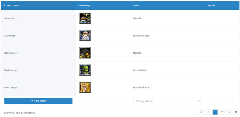
Within the dynamic world of HTML, it’s crucial to understand how to infuse tables with life, making them both functional and visually appealing.
Table Headings
Headings are the cornerstone of a well-structured table. Without clear headings, your data can feel like a labyrinth.
Using <th> tags for table headings
The <th> tag is your go-to for table headers. This tag not only bolds the text but also centers it by default, making the column definitions stand out.
<table>
  <tr>
    <th>Name</th>
    <th>Age</th>
  </tr>
</table>
This setup draws the eye, helping users quickly understand what each column represents.
Example of a table with headings
Let’s sprinkle some magic to create a table that shines with clarity.
<table>
  <tr>
    <th>Product</th>
    <th>Price</th>
  </tr>
  <tr>
    <td>Bananas</td>
    <td>$0.50</td>
  </tr>
  <tr>
    <td>Grapes</td>
    <td>$2.00</td>
  </tr>
</table>
It’s simple yet effective. The headings scream “clarity”, while the data lies neatly below, giving structure to chaos.
Adding Images to Tables
See the Pen
Bootstrap 4 Table with Images by cristina (@cristinaconacel)
on CodePen.
Images within tables add a layer of visualization that mere text often cannot. Here’s how to wield this power.
Using <img> tags within table cells
The <img> tag integrates seamlessly into table cells, transforming a data table into a visual feast. Consider it the sprinkle of glitter on a plain table.
<table>
  <tr>
    <th>Product</th>
    <th>Image</th>
  </tr>
  <tr>
    <td>Bananas</td>
    <td><img src="banana.jpg" alt="Banana" width="50" height="50"/></td>
  </tr>
  <tr>
    <td>Grapes</td>
    <td><img src="grapes.jpg" alt="Grapes" width="50" height="50"/></td>
  </tr>
</table>
Complement your text data with relevant images to enhance user interaction and accessibility.
Example and code snippets for adding images to a table
Let’s dive deeper with another example that combines technical accuracy with visual elements.
<table>
  <tr>
    <th>Item</th>
    <th>Picture</th>
  </tr>
  <tr>
    <td>Apple</td>
    <td><img src="apple.jpg" alt="Apple" width="60" height="60"></td>
  </tr>
  <tr>
    <td>Orange</td>
    <td><img src="orange.jpg" alt="Orange" width="60" height="60"></td>
  </tr>
</table>
These visual gems help to improve your HTML table with images, enhancing the overall experience.
Explanation of attributes like src, alt, width, and height
Understanding the attributes of the <img> tag is pivotal for crafting impeccable tables.
src: Directs to the image file. This is the path your table follows to pull in the image.alt: Provides alternative text if the image doesn’t load. Vital for accessibility.widthandheight: Define the dimensions. Keeping your visuals crisp and proportionate.
By mastering these facets, you unlock the true potential of your HTML creations. Images seamlessly flow into tables, enriching the content and making the data both informative and aesthetically pleasing.
Your beautiful data deserves to be online
wpDataTables can make it that way. There’s a good reason why it’s the #1 WordPress plugin for creating responsive tables and charts.
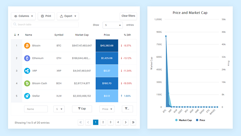
And it’s really easy to do something like this:
- You provide the table data
- Configure and customize it
- Publish it in a post or page
And it’s not just pretty, but also practical. You can make large tables with up to millions of rows, or you can use advanced filters and search, or you can go wild and make it editable.
“Yeah, but I just like Excel too much and there’s nothing like that on websites”. Yeah, there is. You can use conditional formatting like in Excel or Google Sheets.
Did I tell you you can create charts too with your data? And that’s only a small part. There are lots of other features for you.
Advanced Table Features
Using Captions in Tables
Captions—think of them like the title of a movie, giving the audience an instant grasp of the plot.
<caption> tag for adding table captions
The <caption> tag sits at the top of your table, screaming, “Notice me!” This tag is as essential as a good headline in an article.
<table>
  <caption>Top Selling Fruits</caption>
  <tr>
    <th>Fruit</th>
    <th>Quantity</th>
  </tr>
</table>
Simple yet powerful, this tag provides immediate context, setting the stage for what follows.
Example and benefits of using table captions
Consider this table, which becomes immediately clearer with a caption:
<table>
  <caption>Annual Sales Report</caption>
  <tr>
    <th>Product</th>
    <th>Sales</th>
  </tr>
  <tr>
    <td>Bananas</td>
    <td>1500</td>
  </tr>
  <tr>
    <td>Apples</td>
    <td>2000</td>
  </tr>
</table>
A caption tells viewers precisely what the data represents—crisp, clear communication. It’s like a fine wine label that makes you want to pour a glass.
Implementing Scope Attribute
Scope—let it resonate; it’s the silent superhero of accessibility, ensuring every user is accounted for.
Scope attribute for defining header cell scope
Using the scope attribute enhances table headers by defining their reach, ensuring screen readers grasp the context effortlessly.
<th scope="col">Product</th>
<th scope="row">Quantity</th>
This small addition makes a big impact, especially for users navigating through assistive technologies.
Example and importance for accessibility
Here’s our table, now accessible:
<table>
  <tr>
    <th scope="col">Fruit</th>
    <th scope="col">Quantity</th>
  </tr>
  <tr>
    <td>Bananas</td>
    <td>1500</td>
  </tr>
  <tr>
    <td>Apples</td>
    <td>2000</td>
  </tr>
</table>
The scope=”col” and scope=”row” attributes ensure headers are associated properly—it’s like having Braille for the web. Accessibility isn’t just a feature; it’s a commitment.
Cell Spanning
Dive deeper into the artistry with cell spanning, where cells unite or stretch like yoga masters.
Using colspan and rowspan for spanning cells
Meet colspan and rowspan, the dynamic duo that merges cells either horizontally or vertically.
<td colspan="2">Merged Cell</td>
<td rowspan="2">Also Merged Cell</td>
These attributes create fluid, flexible layouts. Imagine rows blending and columns stretching, to fit the exact narrative you desire.
Examples of horizontal and vertical spanning
Horizontal span—like knocking down a wall to create an open concept living room:
<table>
  <tr>
    <td colspan="2">Wide Cell</td>
  </tr>
  <tr>
    <td>Data 1</td>
    <td>Data 2</td>
  </tr>
</table>
Vertical span—think of it as adding a mezzanine:
<table>
  <tr>
    <td rowspan="2">Tall Cell</td>
    <td>Data 1</td>
  </tr>
  <tr>
    <td>Data 2</td>
  </tr>
</table>
These techniques make your tables not just functional but visually engaging.
They improve your HTML table with images or other elements, adding layers of sophistication to your data presentation. Advanced features like these aren’t just about aesthetics; they deliver clarity and coherence.
Styling HTML Tables
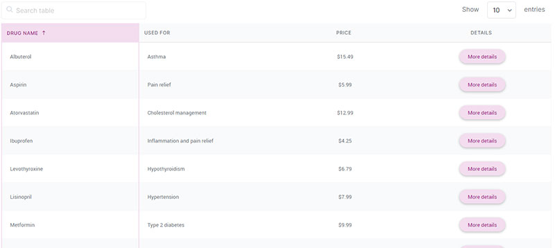
Visual appeal, folks. How your table looks can be as crucial as what it says. Let’s jazz it up with some CSS magic.
Adding Borders
Borders are to tables what frames are to pictures. They bring structure and clarity.
Using CSS to add borders to tables, rows, and cells
Want your table to pop? Borders are your best friend. CSS gives you fine control, whether you’re outlining the whole table, each row, or just individual cells.
table, th, td {
  border: 1px solid black;
}
With this simple CSS rule, you can make everything neatly boxed and defined. Sharp and precise, just the way data should be.
Example of CSS rules for table borders
Let’s break it down further with an example that highlights the visual impact.
table {
  border-collapse: collapse;
}
th, td {
  border: 1px solid #dddddd;
}
Your table now feels more integrated, every cell snug against its neighbors, thanks to border-collapse: collapse;. Perfect for those who like their data tight and tidy.
Padding and Spacing
Padding is the cushion that makes your table’s text comfortable to read.
Adding padding to table cells for better readability
Cluttered data? Padding is the antidote.
th, td {
  padding: 15px;
}
Generous padding allows your text to breathe, easing the reader’s eye and making your information digestible.
Example of CSS rules for padding
Padding transforms your table into a thing of beauty and function.
table {
  border-collapse: collapse;
}
th, td {
  padding: 10px;
  border: 1px solid #dddddd;
}
It’s like putting cushions on every chair at your dinner table. Suddenly, it’s not just data; it’s a conversation.
Background Colors and Font Sizes
Colors and fonts—the paintbrushes of your digital canvas.
Applying background colors to headers and cells
What’s a little flair without color? Headers stand out when they’re bathed in a different hue.
th {
  background-color: #f2f2f2;
}
Subtle, yet it makes a world of difference.
Adjusting font sizes for better distinction
Clarity through contrast. Font size adjustments tell the reader, “Hey, look at this!”
th {
  font-size: 1.2em;
}
td {
  font-size: 1em;
}
Headers get a touch larger, more prominent. Data remains clear, cohesive.
Examples of CSS rules for background colors and font sizes
Bring it all together. A symphony of style.
table {
  border-collapse: collapse;
  width: 100%;
}
th, td {
  padding: 8px;
  border: 1px solid #dddddd;
  text-align: left;
}
th {
  background-color: #f2f2f2;
  font-size: 1.2em;
}
td {
  font-size: 1em;
}
Blend these elements to not just show your data but to tell a story, to improve your HTML table with images and beyond. It’s not just coding; it’s craftsmanship.
Layout and Alignment
The elegance of a well-laid table can make or break a user experience. Let’s sculpt that elegance with precision and flair.
Column Width Adjustment
Ever seen a table where one column hogs all the space while others suffocate? We’re fixing that.
Using <colgroup> and <col> tags for setting column widths
The <colgroup> and <col> tags are your artisans, chiseling away to set the perfect widths for your columns.
<colgroup>
  <col style="width: 50%;">
  <col style="width: 30%;">
  <col style="width: 20%;">
</colgroup>
With these, you dictate the real estate each column commands. No more egregiously wide or cramped columns—every element in its right place.
Example of CSS rules for column widths
Let’s dive into some CSS wizardry that fine-tunes column widths.
col:nth-child(1) {
  width: 50%;
}
col:nth-child(2) {
  width: 30%;
}
col:nth-child(3) {
  width: 20%;
}
Apply these styles, and watch the columns dance to your tune, each taking up just the space it needs, nothing more, nothing less.
Interlacing <colgroup> and col settings with CSS rules makes your tables responsive, adaptable, and visually harmonious—each column a cog in the well-oiled machine of your layout.
Centering Tables
Centering a table is like putting a spotlight on it, showcasing its significance. Let’s make it the star.
Centering tables using CSS margin properties
CSS margin properties are like stagehands, subtly positioning your table center stage, where it belongs.
table {
  margin: 0 auto;
}
This simple line is your mantra. “Margin: 0 auto;” whispers to the browser, and behold—centering perfection. The table stands proud in the middle of the screen, balanced and bold.
Example of CSS rules for centering tables
Here’s the full ensemble in action.
table {
  width: 60%;
  margin: 0 auto;
  border-collapse: collapse;
}
th, td {
  border: 1px solid #dddddd;
  text-align: left;
  padding: 8px;
}
With width: 60%; and margin: 0 auto;, your table commands presence without overwhelming the surrounding content.
It’s a perfect blend of form and function, ready to highlight essential data or even improve your HTML table with images.
Nested Tables
Let’s dive into the rabbit hole of nested tables, where tables live inside other tables. Meta, right?
Creating Nested Tables
Nested tables are like a table within a table, inception-style.
Definition and use cases for nested tables
Imagine a situation where you need to show detailed data within a larger dataset. Nesting a table makes it feasible.
- Sales reports within departments
- Product features within categories
- Specifications within device listings
These instances demand multi-layered data display. Nesting shines here, providing a structured way to dive from broad to detailed views.
Example of a table within a table
Here’s how you unpack this layering:
<table>
  <tr>
    <th>Project</th>
    <th>Details</th>
  </tr>
  <tr>
    <td>Website Redesign</td>
    <td>
      <table>
        <tr>
          <th>Task</th>
          <th>Status</th>
        </tr>
        <tr>
          <td>Mockups</td>
          <td>Completed</td>
        </tr>
        <tr>
          <td>Development</td>
          <td>In Progress</td>
        </tr>
      </table>
    </td>
  </tr>
</table>
The outer table gives the overarching structure, the inner table dives into specifics. A neat encapsulation of detailed data right within reach.
Styling Nested Tables
Styles can be tricky when you’re dealing with tables within tables. Think of it as dressing up a doll that’s inside another doll.
Specific CSS rules for nested tables
Target nested tables with specificity. Use descendant selectors:
table {
  width: 100%;
  border-collapse: collapse;
}

table table {
  width: 90%;
  margin: 10px;
  border: 1px solid #ddd;
}

th, td {
  border: 1px solid #ddd;
  padding: 8px;
}
Notice how table table targets only the nested ones. It’s like saying, “Hey table, but not just any table, only the ones inside another table.”
Example of styling nested tables for clarity
Let’s add flavor to make nested tables not just functional but fabulous.
table {
  width: 100%;
  border-collapse: collapse;
  margin-bottom: 20px;
}

table table {
  width: 90%;
  margin: 10px;
  border: 1px solid #aaa;
  background-color: #f9f9f9;
}

th, td {
  border: 1px solid #ddd;
  padding: 8px;
}

table th {
  background-color: #f2f2f2;
  font-size: 1.2em;
}
With the right CSS, nested tables don’t clash with their parent. Instead, they harmonize, keeping clarity intact while making data crisp.
Incorporating these nested elements can drastically improve your HTML table with images or any other detailed information display, making it both hierarchical and visually coherent.
Best Practices for Using HTML Tables
When to Use HTML Tables
Tables, oh tables. They’re not just grids; they’re the backbone of data organization—structure in its purest form.
Situations where tables are most effective
Tables shine when you’re faced with:
- Tabular Data: Rows and columns making sense of the chaos.
- Comparisons: Products, features, specifications—side-by-side clarity.
- Schedules: Timelines, itineraries—order emerges from disorder.
You know the times. When your data screams for structure, a table answers.
Examples of practical uses of HTML tables
Practicality meets elegance in these examples:
<table>
  <tr>
    <th>Country</th>
    <th>Capital</th>
    <th>Population</th>
  </tr>
  <tr>
    <td>France</td>
    <td>Paris</td>
    <td>67 million</td>
  </tr>
  <tr>
    <td>Japan</td>
    <td>Tokyo</td>
    <td>126 million</td>
  </tr>
</table>
A clean display—countries, capitals, populations. Notice how the data falls into place, each row a chapter of a story well-told.
Avoiding Misuse of HTML Tables
A table’s role is sacred. Misuse it, and you’re playing with fire.
Explanation of why tables should not be used for page layouts
Once upon a time, tables were used for layouts. A dark age, indeed.
- Rigid Structure: Tables don’t adapt. Fluid layouts? Forget it.
- Accessibility Nightmare: Assistive technologies falter, page semantics suffer.
- Maintenance Hell: Updating a table layout? Painful. Lines of
tr,td—a tangled web.
Your layout’s backbone should flex, breathe. Tables are not the skeleton of modern web design.
Alternatives to tables for layout purposes like CSS Grid and Flexbox
There’s light at the end of the tunnel. Meet CSS Grid and Flexbox—modern knights in shining armor.
CSS Grid brings a new era:
.grid-container {
  display: grid;
  grid-template-columns: auto auto auto;
  gap: 10px;
}

.grid-item {
  background-color: #f2f2f2;
  padding: 10px;
  text-align: center;
}
A recipe for layout nirvana. Rows, columns—dynamic, powerful, responsive.
Flexbox—the nimble, flexible friend:
.flex-container {
  display: flex;
  justify-content: space-between;
}

.flex-item {
  background-color: #f9f9f9;
  padding: 10px;
}
Effortless alignment, fluid layouts. Your nightmare of tables for layouts fades into a distant memory.
FAQ On Improve Your HTML Table With Images
How do you add an image to an HTML table cell?
To add an image to a table cell, simply use the <img> tag within the <td> tags. For instance:
<td><img src="image.jpg" alt="Description"></td>
This places the image directly within the table cell, enhancing the visual aspect of your table.
Can you style images within HTML tables using CSS?
Absolutely! Use CSS to style images within HTML tables. Apply styles directly or through a class. For example:
img {
  width: 100px;
  border: 1px solid #ccc;
}
This snippet will make your table images uniform and aesthetically pleasing.
How do you create a responsive HTML table with images?
To create a responsive HTML table, utilize CSS media queries and ensure images resize proportionally.
table {
  width: 100%;
}
img {
  max-width: 100%;
  height: auto;
}
This ensures the table adapts to various screen sizes, keeping images intact.
What is the role of the alt attribute in images within tables?
The alt attribute provides alternative text for an image, improving accessibility and SEO. Always include a descriptive alt attribute:
<img src="chart.png" alt="Sales Chart">
This text is crucial for screen readers and in cases where the image fails to load.
How can you align images within table cells?
Align images within table cells using CSS. For example, you can vertical-align and center an image with:
td {
  text-align: center;
  vertical-align: middle;
}
This ensures your images are well-positioned and appealing within the table layout.
How do you handle large images in HTML tables?
To manage large images, use CSS to control their size:
img {
  max-width: 100px;
  height: auto;
}
This approach keeps images within reasonable dimensions, maintaining the table’s structure and usability.
Can you use images for table headers?
Yes, you can use images within <th> elements for table headers:
<th><img src="icon.png" alt="Icon"></th>
This adds a visual identity to your headers, making tables more interactive and visually engaging for users.
What are best practices for optimizing images in HTML tables?
Optimize images by compressing them for faster load times. Tools like TinyPNG or ImageOptim work well. Additionally, leverage modern image formats like WebP for improved efficiency.
How can you add captions to images in tables?
Use the <figcaption> element within a <figure> if needed:
<td>
  <figure>
    <img src="photo.jpg" alt="Photo">
    <figcaption>Image Description</figcaption>
  </figure>
</td>
Captions enhance context, making your table data more informative.
What are common pitfalls when adding images to HTML tables?
Avoid using excessively large images, as they can disrupt table layout and slow down page load times. Also, ensure you include appropriate alt attributes for accessibility and SEO purposes. Be mindful of the visual balance and alignment within your table cells.
Conclusion
Creating a compelling, user-friendly web experience often hinges on the subtle details. When you improve your HTML table with images, you transcend mere functionality, offering an engaging and visually rich presentation.
Integrating well-placed images within <table>, <tr>, and <td> tags isn’t just about aesthetics; it’s about clarity and enhanced user engagement.
Think of your tables as a canvas—every <img> tag you introduce within them should serve a purpose, be it clarification or attraction. Through CSS styling, you can align, resize, and polish these images, ensuring they contribute seamlessly to the table’s narrative.
By adhering to best practices—like optimizing image size and providing alt attributes—you’ll not only boost accessibility but also enhance your site’s SEO footprint.
Incorporate responsive design principles with media queries to cater to diverse devices and screens. This guide equips you with the tools to craft HTML tables that aren’t just rows and columns but vibrant, interactive sections of your website. Elevate your design game and transform those tables from mundane to magnificent.
