Picture a world awash in data, a landscape where every number tells a story. In the spotlight are two stellar showrunners: the line chart and the bar chart. They’re not just tools in a designer’s kit; they’re the narrators of trends and tales told through statistics and figures.
In this theatre of digits, choosing the right chart is akin to selecting the perfect lens to view a masterpiece. It’s essential, the pivot on which clarity and insight balance.
Navigate this world with ease and come away with the know-how to make data dance to your tune.
By the article’s end, expect to effortlessly distinguish these charts, wielding them to spotlight patterns or highlight data comparisons with finesse.
From dissecting time-sensitive trends to categorizing information, we delve into the nitty-gritty of visualization tools like a maestro guiding an orchestra.
The result? You, too, will orchestrate the raw numbers into meaningful infographics with aplomb.
Table of Contents
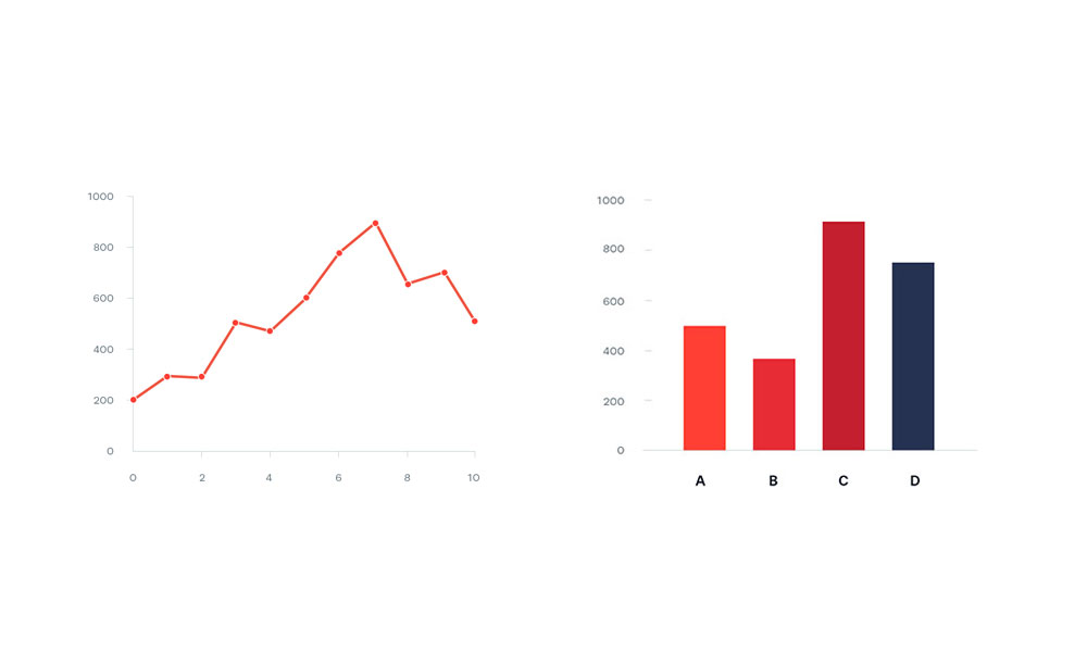
Understanding Line Charts
Chart created with wpDataTables
Imagine you’ve got a story to tell, not with words, but with numbers. You’ve collected information over time, and you want to show others the journey those numbers took.
That’s where a line chart steps in, like a visual storyteller. It’s not just about plotting dots on a graph; it’s about connecting those dots with straight lines to show a continuous journey.
This isn’t just about seeing where things stand but spotting where they’re headed.
The beauty of a line chart comes from its simplicity and focus. It’s like a roadmap of your data, where each point on the graph is a landmark, and the lines between are the routes taken.
You can quickly see peaks and valleys, noticing how things have changed and predicting where they might go.
And when it comes to time or sequences, like months of the year or stages in a process, line charts are unmatched in showing evolution or regression.
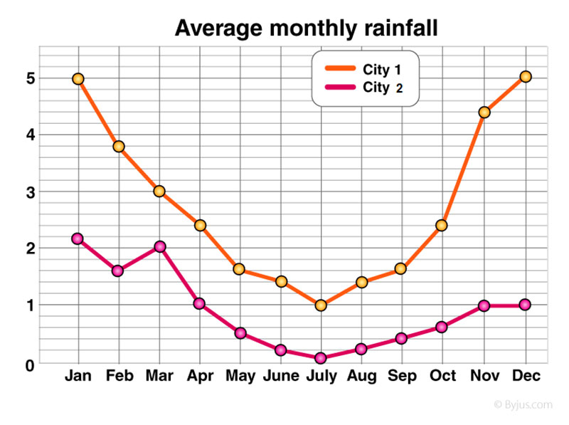
When to Use Line Charts
Multiple line chart created with wpDataTables
When I sit down to decide whether a line chart is the right choice, some things just make sense.
If I want to tell a story of change, such as how my website’s traffic fluctuated during different marketing campaigns, a line chart is like a time machine. It captures the ups and downs, each point a beat in the story of growth or decline.
And it’s not just about solitary data. Sometimes, you’ve got a bunch of narratives to tell side-by-side, like comparing the performance of different products over time.
A line chart lets them share the stage, making it a snap to see how they relate. You can spot if one product consistently outshines the others or if they all ride the same waves of change.
Advantages of Line Charts
Area line chart created with wpDataTables
The magic of a line chart is all in its ability to show movement. You’ve got your data—maybe it’s something like sales figures—and you want to see exactly how they’ve grown or shrank.
A line chart doesn’t just deliver that info; it highlights the pace of change. It’s that sense of motion, showing not just where things have been, but how quickly they got there.
And when you’re juggling multiple threads of data, a line chart is like a skilled juggler.
It can handle a bunch of trends, all darting across the same stage, and still make it easy to follow each one’s trajectory. That’s crucial when you’re comparing, say, social media platforms to figure out which one’s driving the most traffic to your site.
Limitations and Considerations
However, even a helpful tool like a line chart has its quirks. Imagine a busy intersection in a bustling city—lines crossing and weaving, a tangle of directions.
That’s what a line chart can look like if you’ve got too many overlapping trends. It’s easy for your audience to get lost in the mess, mistaking one journey for another.
And for those instances when you’re not tracing a journey over time, but rather sizing up distinct items—think flavors of ice cream or types of services—a line chart might not be your best pal.
It’s built for motion, not snapshots. Different beasts altogether, and the trick is to match the data to the chart that’ll show it off best.
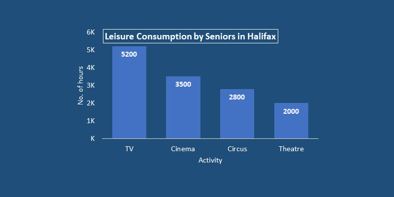
Understanding Bar Charts
Chart created with wpDataTables
Sometimes, you need a no-nonsense way to present your data. Imagine the blocks in a city skyline, each with its own height, its own significance. Bar charts take the essence of that image and turn it into a straightforward, direct way to communicate your data.
Rectangular bars rise from the ground of the graph, each a monument to a different category of information.
What stands out with bar charts is their straight-up approach.
Visualize those rectangular bars – they’re like pillars, sturdy and well-defined, planted firmly to represent different groups or ideas. Some reach for the skies, some are more modest, but each gives a clear picture of quantity and lets you draw comparisons at a glance.
Picture these bars lined up, side by side, or stacked like building blocks. Horizontal or vertical, they both have their charm.
It all depends on how you want your audience to walk through the data – a stroll down the graph from left to right, or an adventure upward, scaling each bar as they go.
When to Use Bar Charts
Diving into the toolkit of visuals, bar charts shine when differentiation is the name of the game. Say you’re looking at a bunch of different things – types of cookies baked in a shop, or the array of services you offer on a website.
A bar chart breaks it down, makes it clear just how chocolate chip compares to oatmeal raisin, or how the demand for logo design measures up against web design.
If it’s about frequency, how often something happens, bar charts are perfect for setting out the nature of that frequency visually.
Picture the times you visit your favorite coffee place each week. On some days, it’s just once, but maybe on Monday, it’s three times. Each day gets its bar, telling a story of coffee dependence without a word.
For magnifying differences, line chart vs bar chart debates come to rest on bar charts when it’s critical to spell out how things stand apart.
Categories get the spotlight with bar charts, boldly declaring, “Look here, see the difference!” This is fantastic when pointing out the unique features of something that’s varied and distinct.
Advantages of Bar Charts
Chart created with wpDataTables
Let’s have a peek at the strength of bar charts. They’re versatile characters, equally at home with the essentials – the numbers and the names – yet they can also play dress-up with more complex outfits, like percentages or frequencies.
That flexibility matters, because whether it’s survey results or a tally of inbound customer queries, a bar chart steps up, ready to showcase the differences.
The clarity that comes with bar charts is sharp. You can tell at a glance which is the tallest, which stretches furthest, and it’s seeing that difference that often counts the most.
This is especially clear when the quest is to compare and contrast – to lay down the gauntlet and see which category wears the crown.
Limitations and Considerations
Great tools, like great stories, have their twists. With bar charts, too much of a good thing can lead to a complex, crowded experience.
Imagine a party where everyone’s trying to get through the door at once – it’s that sort of clutter you want to avoid. Too many bars, too many categories, and suddenly it’s a jigsaw puzzle, not a clear picture.
The directness of bar charts can be double-edged when the scales are tampered with. What if one chart is zoomed in, making minor differences look like mountains, and another uses a full scale, where the same difference is barely a bump in the road?
It’s in these moments that the power of bar charts to inform can slip, and instead, they can mislead, even if it’s not the intention.
This is critical to wrap your head around, as trust in the story you tell with your data hinges on that honest portrayal. The chart must mirror reality, like a reflection in still water – clear, undistorted, and true.
Your beautiful data deserves to be online
wpDataTables can make it that way. There’s a good reason why it’s the #1 WordPress plugin for creating responsive tables and charts.

And it’s really easy to do something like this:
- You provide the table data
- Configure and customize it
- Publish it in a post or page
And it’s not just pretty, but also practical. You can make large tables with up to millions of rows, or you can use advanced filters and search, or you can go wild and make it editable.
“Yeah, but I just like Excel too much and there’s nothing like that on websites”. Yeah, there is. You can use conditional formatting like in Excel or Google Sheets.
Did I tell you you can create charts too with your data? And that’s only a small part. There are lots of other features for you.
Comparative Analysis of Line and Bar Charts
Appropriate Contexts for Usage
Let’s mull over two friends in the world of figures and facts: line chart vs bar chart. They’re like compasses for different terrains.
For mapping adventures across the rivers of time, a line chart is your steadfast guide. It’s the one who knows the lay of temporal lands, who sees the flow of months, of years, of hours and shows you the path things took.
Now, flip the coin, and there’s the bar chart: the friend who’s all about now. It’s the storyteller of here, the one that points not to journeys but to standing stones, the monoliths of data that mark different spots in a categorical landscape.
It thrives on the pieces, each with its own space, its own story in the overall tale of comparison.
Visual Representation and Reader Interpretation
A line chart, it’s got to sway, to flow—it’s all about direction and journey, leading eyes along a path that weaves through time-spun stories.
Bar charts? They clash cymbals for attention—each bar a beat, a stamp, a distinctive sound in the space of ‘which is which,’ ‘how much,’ ‘how many.’
They draw the crowd in with bold differences, inviting comparison, daring anyone to miss the unique offering each pillar brings to the table.
Risks and Misinterpretations
Tread carefully though, for the road of visual storytelling is fraught with pitfalls. A misstep in the line chart vs bar chart gambit can twist the narrative, bend the facts until they’re pretzels of their former selves.
It’s not about deception—no, but in the eagerness to showcase data, one might lead the parade down a path where meaning becomes as murky as a foggy night.
In the bustling market of graphs and charts, clarity is currency. Opt for the wrong visual and watch as the message, the heart of what you’re trying to convey, gets lost, tossed around by an audience unsure of what they’re glimpsing.
And it’s not just about the risk of scattering attention. No, the responsibility goes deeper; it’s about ensuring that what you unveil is the truth, without shades or filters that can skew perception.
One chart might make a molehill out of a mountain, another a mountain from a molehill, all depending on how you frame it, how you set the stage.
So keep a watchful eye on the alignment of your data story. Ensure the line chart vs bar chart choice is a decision steeped in the nature of the narrative of figures you’re charged with telling. The goal? Truth, clarity, and a message that reaches its audience as pure as the intention with which it was sent.
FAQ On Line Chart Vs Bar Chart
When should I use a line chart instead of a bar chart?
Opt for a line chart to depict changes over time. This visualization shines when illustrating trends, growth patterns, or declines within a continuous data set.
It’s like watching a timeline unfurl; each point connected reveals the journey of your data, especially effective with time series analysis.
What’s the main difference between line charts and bar charts?
Line charts join data points with lines, emphasizing movement and flow, ideal for viewing data patterns over periods.
Bar charts, contrastingly, use horizontal or vertical bars to compare discrete variables or categorical data across groups—think snapshots of data at a standstill.
Can I show multiple data series in a line chart?
Absolutely. Picture several threads woven into a single narrative. Line charts handle multiple data series adeptly, offering a clear, comparative view of different datasets over the same timeline. It’s a harmonious way to contrast and track several trends simultaneously.
Are bar charts suitable for representing complex data?
Bar charts excel at presenting straightforward datasets. They’re the go-to when your aim is comparative analysis of distinct categories or groups.
While not ideal for intricate data interpretation, they can be augmented with stacked or grouped formats for more complex insights.
How do the axes work in line and bar charts?
The axes are the stage where the data performs. In line charts, the vertical axis often represents the measured value, while the horizontal illustrates time progression.
Bar charts flip the script, with the vertical axis showing categories and the horizontal detailing the measurements. They both orchestrate a dance of quantitative information.
Is it possible to combine a line chart with a bar chart?
Combine them? Think of it as a duet where each brings its strengths to the stage. A combo chart overlays a line chart onto a bar chart to mix trend analysis with categorical comparisons, providing a two-pronged perspective on the data interplay.
How do I choose the right chart for my data?
Imagine you’re a detective examining clues. The nature of your data is the leading hint. Use bar charts for data comparisons among categories.
Line charts? They’re perfect when you’re tracking a sequence, like sales trends. Let your data’s story dictate the chart—it’s a creative yet calculated decision.
Do line charts or bar charts work better for presentations?
That hangs on your narrative. Line charts convey journeys, perfect when you’re guiding an audience through a story of evolution or patterns.
Bar charts bring contrast in comparisons, making them the star when you need a clear display of differing values or categories.
How can I make my line or bar chart more informative?
Annotate. Illuminate those data points with labels, provide context with a legend, maybe toss in some gridlines for precision.
The more intuitive your chart, the more insightful it becomes. Consider accessibility in visualizations so that your audience clicks with the data, no head-scratching involved.
What are some common mistakes to avoid with line charts and bar charts?
Overcrowding is the top party foul. Too many lines in a chart, and it’s a tangle no one can decipher. For bar charts, the faux pas is bars too thick or too thin—aim for that ‘just right’ feel. And color choice? Make it simple, not a color theory experiment gone wild.
Conclusion
So, we’ve come full circle. In the grand scheme of things, when line chart vs bar chart dances through the conversation, we’re not just talking mere graph types; we’re mulling over the master storytellers of the data visualization realm.
- Line charts? They’re the long-distance runners, moving gracefully with the ebb and flow of time, unfolding stories that take us on a journey through peaks and valleys.
- Bar charts? Think of them as the keyframes, capturing the essence of disparate elements, shoulder to shoulder, painting a picture you can grasp at a glance.
Whether gauging the pulse of a quarterly report or illuminating the rise and fall of market trends, picking the right chart is akin to choosing the verse for your visual poetry. Each conversation with numbers weaves its own narrative, and with the tricks up your sleeve now, you hold the power to translate data into compelling tales. Remember, let the context be your compass and the content, your north star. Keep dancing.


