
Imagine unearthing patterns hidden within seas of data with a simple, yet powerful tool – scatter plots. Picture this: each dot representing a story, a clue that, when combined, reveals trends, connections, and insights that could revolutionize your understanding of complex data sets.
Scatter plots, those nifty graphs showing how two variables interact, are more than just a staple in data visualization; they are pivotal in data analytics and interpretation.
By diving into this article, you embark on a journey to master the art of crafting and interpreting scatter plots. Whether you’re wrangling data in Python using matplotlib, pinpointing outliers, or decoding the correlation coefficient for your next big project, you’ll learn the nuts and bolts here.
We’ll navigate through quantitative variables, explore the significance of trend analysis, and harness statistical graphs to propel your data storytelling skills.
From the nuanced dance of correlation vs. causation to the precision of plotting on Cartesian coordinates, each paragraph zooms in on crucial techniques and practical applications. Get ready to elevate your data game.
Table of Contents
- What Is A Scatter Plot?
- Scatter Plot Example
- When To Use A Scatter Plot
- How To Read A Scatter Plot
- Types Of Scatter Plots
- How To Make A Scatter Plot In WordPress
- How To Make A Scatter Plot In Excel
- How To Make A Scatter Plot In Google Sheets
Table of Contents
What Is A Scatter Plot?
A scatter plot is a type of data visualization that displays values from two variables as points on a two-dimensional graph. Each point represents an observation’s values, pinpointing where they intersect on the axes. This graph is helpful for observing relationships, trends, and potential correlations between the variables.
Scatter Plot Example
Chart created with wpDataTables
When To Use A Scatter Plot
Think of those moments when you’re staring at columns of paired numbers, data points flirting with the edges of comprehension. That’s your cue! Bring out a scatter plot.
Whenever you need to spy on how two quantitative variables play together—do they move in sync, or is it a solo act? That’s prime time for this visual tool.
You’re delving into a sea of data, fishing for patterns or maybe chasing the ghost of a trend. Plot these points, and suddenly, stories emerge, ready for the telling. It’s not just about looking good; it’s about decoding the silent language spoken by your dataset, loud and clear.
How To Read A Scatter Plot
Chart created with wpDataTables
Dive into the scatter plot, eyes locked on the crisscrossing axes.
Each dot? That’s a story, a frozen moment where two variables shook hands. Start with the axes: one glance and you’ve got their names and units. Now, the plot itself – a congregation of points either huddled together in a trend or flung wide in disparity.
Don’t just skim; really look. Is there a uphill path forming? Could be positive correlation. More of a downhill slide? That’s negative. Or are these dots rebels without a cause, scattered like confetti? No trend in sight.
It’s the whispers of data we’re after, the subdued relationships, and the loud, unmistakable ones. That’s reading a scatter plot, like translating a dialect of dots into your native tongue.
Types Of Scatter Plots
You’ve got your basic scatter plot—it’s your straight-up, no-nonsense grid with dots plotting the tango between two variables. It’s classic.
Then, there’s the grouped scatter plot. Here, we’re breaking norms. Dots get colors or symbols because they belong to different groups, like different genres in a playlist.
Enter the 3D scatter plot—it’s not just x and y anymore; we’re adding a z. Imagine a dance floor from above, but this time, with people jumping.
We can’t forget the bubble scatter plot: size does matter. Dots inflate based on another variable’s value—think of them as whispers or shouts in the data conversation.
Lastly, the scatter plot matrix—imagine a party where plots meet and greet, mingling in a grid, each pair shaking hands. That’s how we roll, showcasing relationships across multiple variables all at once.
How To Make A Scatter Plot In WordPress
Here’s the approach for creating a scatter plot in WordPress with wpDataTables:
- Open the Chart Creation Wizard:
- Navigate to your WordPress admin panel, go to wpDataTables -> Create a Chart.
- Assign a name to your chart for easy identification and choose a rendering engine (Google Charts, Highcharts, Chart.js, or ApexCharts might be available options, depending on the plugin’s updates).
- Define the Data Source:
- Select the table that will serve as the data source for your new chart. This is typically done through a simple selection box within the wizard.
- Set the Data Range:
- Specify which parts of your data table you want to include in the scatter plot. This involves selecting the columns that contain the data points for both the x-axis and y-axis of your scatter plot.
- Formatting and Preview:
- Customize the appearance and settings of your chart. While scatter plots might have specific options, you generally have the ability to adjust aspects like chart titles, colors, and the display of data points.
- Use the live preview feature to review the chart’s appearance. If it’s not exactly as you want, you can go back and adjust the settings as needed.
- Finalize and Insert the Chart:
- Once you’re satisfied with the chart, save your work. The plugin will generate a shortcode for your new scatter plot.
- Use this shortcode to insert the scatter plot into your WordPress posts or pages.
How To Make A Scatter Plot In Excel
To create a scatter plot in Excel, follow these steps:
- Prepare Your Data: Arrange your data in two columns on a worksheet. One column for the x-values and the other for the y-values of each point in the scatter plot.
- Select the Data: Highlight the range of data you want to include in your scatter plot. This includes both the x-values and y-values.
- Insert Scatter Chart:
- Go to the
Inserttab on the Excel ribbon. - Click on
Insert Scatter (X, Y) or Bubble Chart. - Choose
Scatter.
- Go to the
- Customize Your Chart:
- Once the chart is created, you can customize it to your liking. Click on the chart to display the
DesignandFormattabs. - Use the
Designtab to change the chart style or switch chart type. - Add chart elements like chart title, axis titles, and data labels by clicking on
Add Chart Elementin theDesigntab. - To change the chart title, click on it and type your desired text.
- Once the chart is created, you can customize it to your liking. Click on the chart to display the
- Adjust Axis Titles:
- To add titles to the axes, go to the
Designtab, clickAdd Chart Element, chooseAxis Titles, and then selectPrimary Horizontalfor the x-axis title andPrimary Verticalfor the y-axis title. - Click each title to edit and type the text you want.
- To add titles to the axes, go to the
- Format the Chart:
- You can further format your chart for a better visual appearance. Right-click on elements of the chart (like the plot area or data series) to access formatting options.
- Use the
Formattab to apply styles, effects, or to adjust the size and shape of chart elements.
- Apply Theme Colors (Optional):
- If you wish to change the theme colors, go to the
Page Layouttab, clickThemes, and select the theme you want to use.
- If you wish to change the theme colors, go to the
This process will help you create a scatter plot in Excel, which is useful for showing the relationship between two variables.
How To Make A Scatter Plot In Google Sheets
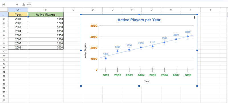
To create a scatter plot in Google Sheets, follow these steps:
- Select Your Data: Highlight the range of data you want to use for your scatter plot. This includes both the x-values and y-values.
- Insert Chart:
- Go to the
Inserttab on the menu. - Choose
Chartfrom the options.
- Go to the
- Choose Chart Type:
- Once the Chart Editor sidebar appears, click on the
Chart Typedropdown menu. - Select
Scatter Chartfrom the list. You can also check theAggregatebox if you want to aggregate the data points.
- Once the Chart Editor sidebar appears, click on the
- Customize Your Scatter Chart:
- To further customize your scatter chart, click on the
Edit Chartoption in the chart’s menu. - In the
Customizetab of the Chart Editor sidebar, you can adjust various settings:- Series or Data Series: Here, you can add error bars, data labels, and a trendline.
- Horizontal and Vertical Axis: Customize the axis titles, label font size, format, and text color.
- Gridlines: Adjust the appearance of gridlines for both the vertical and horizontal axes.
- To further customize your scatter chart, click on the
- Customize Chart and Axis Titles:
- In the
Customizetab, navigate toChart & Axis Titles. Here, you can rename the chart title and change its format. - To customize the titles for the horizontal and vertical axes, follow the same steps.
- In the
By following these steps, you’ll have a customized scatter plot chart in Google Sheets.
FAQ About Scatter Plots
How do you interpret a scatter plot?
Interpreting a scatter plot is like being a detective. You scrutinize the dots’ arrangement – a downward or upward trend hints at negative or positive correlation. A messy splatter? No clear relationship. The closer these points hug an imaginary line, the stronger their dance of correlation. It’s visual storytelling with data.
What’s the difference between a scatter plot and a line graph?
Let’s set the record straight – a scatter plot displays individual data points, specifically to spot how two variables relate. Meanwhile, a line graph connects the dots, typically over time, to track changes and trends. They’re cousins in the chart family; similar yet used for uniquely different tales.
Can scatter plots show causation?
Oh, the classic mix-up! Scatter plots hint at potential relationships, but they don’t play the blame game. Just because two variables seem in sync on your plot, doesn’t mean one causes the other. Causation is a deeper dive, requiring more than just a visual cue to substantiate.
What types of data are best visualized with scatter plots?
Scatter plots shine when you’ve got pairs of quantitative variables. Think of them as the go-to for numerical show-and-tell. Want to see how sales numbers perform against marketing spend? Or maybe compare website traffic with conversion rates? Scatter plots are your visual aid for uncovering these quantitative dialogues.
How do you add a line of best fit to a scatter plot?
Adding a line of best fit to a scatter plot is like laying down a runway amidst a field of points. Software like Excel or programming libraries like ggplot2 and matplotlib do the heavy lifting. They calculate the line that cruises as close as possible to all those data points.
What do outliers in a scatter plot indicate?
Outliers – think of them as the rebels of the scatter plot world. They defy the trend, lounging far from the crowd. Now, they’re not just there to look pretty; they could be signaling a mistake, an exceptional case, or a need for further investigation. They’re red flags that beg a closer look.
Can scatter plots display more than two variables?
Sure thing! Scatter plots’ basic form is a two-variable party, but they’re versatile. Add color, size, or shape variations to points, and boom – you’re juggling multiple variables. It’s like a data layer cake. Each new attribute seasons your plot with richer, more complex insights.
Why is it important to label axes on a scatter plot?
Axes labels are your map legends; they guide you through the data terrain. Without labels, you’re just looking at dots in no-man’s-land. What’s being measured? Labels tell the story, clarifying what each axis represents – crucial for anyone hoping to navigate and decipher the plot’s underlying message.
How do scatter plots help in the field of data analytics?
In the vast data analytics universe, scatter plots are like navigational stars. They help analysts and data scientists uncover relationships, predict trends, and even fuel machine learning algorithms. Those clusters and patterns you spot? They’re insights that can drive strategies, inform decisions, and sprinkle a little foresight into business moves.
Conclusion
We’ve danced through the dots, charting a course in the rich lands of scatter plots. In the folds of this article, you found yourself tracing the subtle whisper of relationships between variables, unlocking stories told in the language of data points. From recognizing trend analysis with the eye of an outlier detective to painting data clusters with shades of meaning—you’ve seen it all.
Through this journey, scatter plots have become more than marks on a Cartesian coordinate system; they’re lenses focusing on the heartbeats of bivariate data analysis. You’ve got the power now, the know-how to harness these statistical graphs as a tool—a data visualization technique to forge narratives, influencing decisions that make ripples across the canvases of industries.
Go on, take this wisdom, and let your insights scatter like stars across the night sky, telling tales of numbers and nurturing informed decisions in a world that thrives on data-driven strategies.
If you liked this article about scatter plots, you should check out this article about line charts vs candlesticks.
There are also similar articles discussing box plots, funnel charts, pie charts vs bar charts, and pie charts vs donut charts.
And let’s not forget about articles on scatter charts, gauge charts, histograms, and how to choose the right chart for your data.


