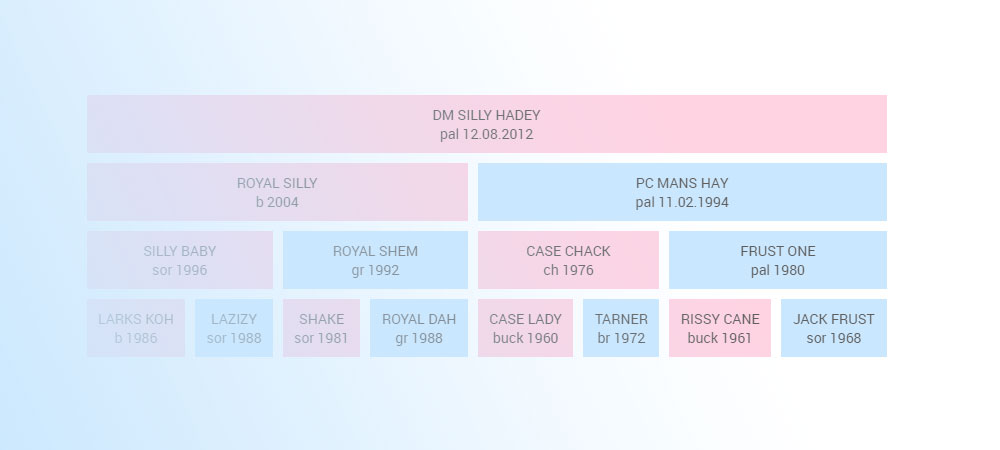
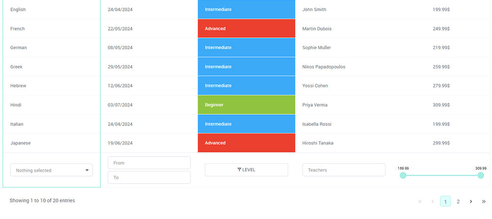
Picture a set of boxes, each tucked inside another—the smaller ones holding treasures, essential elements that form a cohesive whole.
This is the essence of a nested table in html, a concept that smartly organizes content for both the orderly and the intricate minds.
In a digital era where information is king and clarity is the gatekeeper, mastering such structures is critical.
In the next few scrolls, you’ll unravel the secrets of elegant table nesting, a skill that refines data presentation and enhances user experience.
Explore the steps to create versatile, multi-layered tables and learn how to style them for visual impact without compromising on performance.
From accessibility insights ensuring your data reaches everyone to tips on keeping your tables robust and responsive across devices, you’ll gain knowledge that could reshape the way you structure information.
By the end of this journey, you’ll not only grasp the intricacies of nested tables but also be equipped to deploy them in crafting beautiful, functional web designs.
Table of Contents
Creating Nested Tables
Basic Concepts

Dive into the universe of tables, such a vital part of web design! Picture a traditional dinner setting – plates within plates, a smaller one for the salad nested inside the larger one for the main course.
This imagery translates well into how we layer tables in HTML documents. Let’s peel back the layers to better understand this foundational concept.
HTML table syntax review
Before we start stacking tables within each other, it’s crucial to grasp the basics. Think of an HTML table as a grid – columns and rows holding data snug like eggs in a carton.
The <table> tag kicks off this grid, followed by <tr> for each new row. As if molding clay, we shape our columns with <td> elements tucked inside rows.
It’s a simple and beautiful hierarchy – elements nestled within elements crafting the body of our table.
Understanding outer and inner tables
Now, for the intriguing bit – the inception of tables, a table within a table! Our outer table serves as the grand stage – it’s the primary stage upon which we will build complexity.
Within this expanse, we place our inner tables, much like placing a cup of hot cocoa on a saucer.
Each inner table lives cozily within the confines of a <td> element from the outer table.
Step-by-Step Guide to Creating Nested Tables
Embarking on this crafting journey requires patience and attention to detail.
But fear not, for the process can be as enjoyable as watching a garden you’ve planted begin to blossom!
Defining the outer table structure
First, we gather our tools – tags for tables, rows, and table cells. We etch out our ground table, setting the stage with <table> and then branching out into rows using <tr>.
Imagine setting up an empty stage, considering the backdrop and props before the actors take their places.
Inserting an inner table within an outer table cell
Here’s where the magic unfolds – placing a new, small stage inside the grand one. We choose a cell in our outer table, designated by <td>, and within it, we start crafting a new <table>.
This bundle of joy sits right there – a fresh table within the familiar embrace of the outer one.
Adding multiple levels of nesting
As architects of complexity, we dare to delve deeper. Multiple levels of nesting are like crafting Russian matryoshka dolls, each smaller one sitting perfectly inside its larger counterpart.
With each <td> of an inner table, we have an opportunity – a new opportunity to introduce an even more diminutive table, layer upon layer, crafting intricate webs of information spaces.
Detailed Examples of Nested Tables
Example Implementations
Simple nested table design
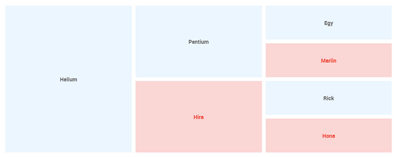
Imagine a cozy breakfast nook, a single teacup on a matching saucer. That’s your basic nested table – no frills, just the essentials.
It starts with a solid <table> tag, like laying out your tablecloth. Then, you sprout a <tr>, a row to place our dish upon. Within the arms of a <td>, like a saucer waiting for its cup, is where a smaller <table> takes its nest.
It’s a straightforward affair: a schedule within a calendar, a photo within a profile. The beauty lies in its simplicity, and for many situations, it’s just what you need. But sometimes the story calls for a bit more flair, more layers to the narrative.
Complex nested table structures for advanced layouts
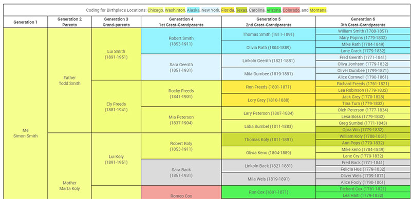
Let’s put on our architect’s hat and jazz things up. We aren’t just making a simple cup of tea; we’re setting up for a banquet.
A complex HTML table setup can be like a grand dining table spread out with an ensemble of dishes, cutlery, and decorations.
A <table> wears a cloak of multiple <tr> rows, each row bejeweled with a <td> where a new <table> can lay nestled. Rows are woven with columns, background colors, and an intricate dance of padding and margins. It’s a multi-level matrix, a structural ballet dance within the confines of cells.
Styling and Customization
CSS for Nested Tables
Dressing up a table in HTML is like picking outfits for a party – you want every cell and row looking sharp.
But when it’s time to style up those nested tables, it’s more like dressing a Russian doll. You’ve got to think about each layer and how they’ll look together.
Basic styling options for border, padding, and background
Starting with our base layer, let’s talk about the borders. Just like a picture frame, they define the edges of our tables.
With a sprinkle of CSS, we can make them as thin, thick, solid, or fancy as the situation desires.
Padding is next, and it’s like the cushion on a chair – it gives your content room to breathe inside each cell.
No one likes a cramped space, so we ensure there’s ample padding to keep things comfy.
The background is our canvas, and here we paint with colors and gradients. Perhaps a subtle shade for the outer table and a splash of contrast for the inner ones? It sets the stage, creates the mood, and helps guide the eye through the layers of data.
Advanced CSS techniques for nested table aesthetics
See the Pen
Nested table solution by Jonno Witts (@jonnowitts)
on CodePen.
Once our basic outfit is sorted, it’s time for the accessories – the little details that can make or break the look.
Ever played with box shadows? They add depth, like a subtle echo of each table, making them pop off the page.
Rounded corners can soften the edges, giving it a modern, friendly feel.
Transitions are the dance moves of the web. They choreograph the way styles change with a hover or a click.
They can guide users through the nested structures, with each hover unveiling a new layer, a smooth reveal of information.
Responsive Design Considerations
See the Pen
Responsive Nested Table by Dodds-Donnelly (@DoddsDonnelly)
on CodePen.
Not everyone’s at the big screens; some are on tiny ones, squinting at pixels. So, how do we ensure our nested tables play nice with different devices?
Making nested tables responsive for different devices
Flexibility is key. Just like yoga for the web, we use fluid widths and scalable elements. Tables that can stretch and shrink while still holding onto their content, that’s the goal.
Sometimes, we employ the magic of media queries, dictating unique styles for mobile, tablet, and desktop views.
Challenges and best practices in responsive nested table design
But as we all know, great power comes with great challenges. The dance can get tricky with nested tables. We need to maintain readability.
Fonts need to shrink, columns might need to hide, and layouts can change entirely, swapping from horizontal spreads to vertical stacks like cards.
The best practice is always planning ahead. Think content first – what’s essential and what can be tucked away for smaller screens?
Simplify. Maybe that inner table doesn’t need to be a table on mobile. Could it be a list instead?
And testing – oh, the testing. On emulators, on real devices, squishing browsers, and flipping orientations.
Accessibility and Usability
Accessibility Features for Nested Tables
When laying out a spread of data on a webpage, imagine setting the table not just for the eyes but for the ears too.
Using caption, thead, tbody, and tfoot for screen readers
We start with the caption, a polite introduction of the table, like a title plaque in a gallery. It’s there to whisper gently to the screen readers about what masterpiece of data they are about to encounter.
Thead stands tall like a headline on a newspaper, giving those who can’t see but hear an anchor, a starting point.
Tbody is the body, the meat of the table where all the juicy information lives. And tfoot, well it’s the conclusory note, tying up the information like neatly wrapping a present with a bow.
Implementing scope attributes for accessibility
Scope, it’s like the North Star, guiding screen readers through the columns and rows, telling them where they are in the nested table in html.
Without it, it would be like wandering in a city without street signs. It marks the headers, clarifying the relationship between header and data cells.
Best Practices for Usability
It’s all about ease now, letting users navigate your masterpiece without getting lost.
Ensuring ease of navigation and data interpretation
Think about it like trail signs in a forest. Clear and bold, guiding the hikers to their destination without confusion.
Links should be obvious, headings need to stand out, and the flow should be intuitive, leading from one point to the next with gentle prompts.
Avoiding common pitfalls in nested table usage
Steer clear of the rabbit holes – those common traps that catch the unwary. Overloading tables with too much data, like packing a suitcase until the latches groan, it’s just going to weigh down the user. Keep it light, keep it relevant.
And then, there’s the urge to get fancy with styling at the cost of clarity. Resist it.
Decoration should never drown out the message. Balance aesthetics with clear communication, and your tables will not only be a pleasure to look at but also a breeze to navigate.
Your beautiful data deserves to be online
wpDataTables can make it that way. There’s a good reason why it’s the #1 WordPress plugin for creating responsive tables and charts.
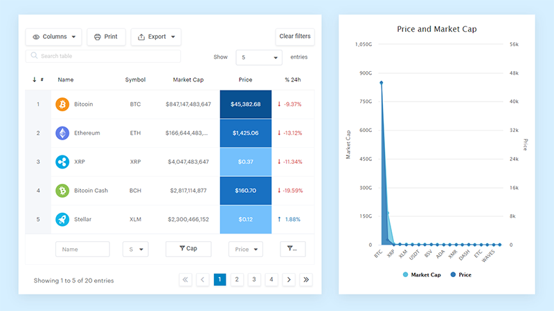
And it’s really easy to do something like this:
- You provide the table data
- Configure and customize it
- Publish it in a post or page
And it’s not just pretty, but also practical. You can make large tables with up to millions of rows, or you can use advanced filters and search, or you can go wild and make it editable.
“Yeah, but I just like Excel too much and there’s nothing like that on websites”. Yeah, there is. You can use conditional formatting like in Excel or Google Sheets.
Did I tell you you can create charts too with your data? And that’s only a small part. There are lots of other features for you.
Technical Considerations and Performance
Loading Time and Efficiency
Crafting a webpage, think of it like baking. Every ingredient affects the bake time and taste.
Nested tables, if overdone, can be like tossing in too many nuts; they slow down the mix and the page load.
Impact of nested tables on page loading speed
Picture a busy kitchen, cooks and bakers hustling. Now, imagine if they had to stop and ask for every tiny detail.
That’s what happens when a browser meets a poorly made nested table in html. It’s stopping, asking, loading – a constant back and forth that drags down the speed.
The more complex the table, the more the kitchen – I mean, the browser – slows down.
Optimizing nested tables for better performance
To keep things zipping along, tighten up those tables. Streamline the code like you’d tidy up a countertop.
Combine styles, minimize the use of inline CSS, and serve up those stylesheets like a well-planned menu. Efficiency is the name of the game.
HTML Validation and Standards
When laying bricks for a house, you follow a blueprint, right? The same goes for crafting web pages. The blueprint here is the standards set by the folks who know the web best.
Ensuring code validity and compliance with HTML standards
Start using a good HTML validator. It will go through your code to check if it is error-free and according to the latest standards. If any issues are found, the tool will highlight them for easy fixing.
Remember, a page that sticks to HTML standards is like a well-built house; it stands strong and welcomes everyone.
Testing and validating nested table code
Roll up your sleeves; it’s testing time. Look at your tables through different lenses – browsers, devices, and settings. It’s the trial before the grand opening. Spot the missteps, the wobbly legs, the uneven edges, and smooth them out.
With every refresh and every test, you’re inching closer to that gold standard. A webpage that not only looks good but holds strong under any and all conditions. It’s the craft, the mastery of balancing beauty with brains in the web world.
FAQ On Nested Table In HTML
Why use nested tables in HTML?
Nested tables offer a way to organize complex information in a clear, hierarchical structure that can be crucial for data presentation and user interfaces that require a detailed layout, akin to the layers seen in advanced web design and development.
Can nested tables affect website performance?
Yes, without careful optimization, nested tables can increase page loading times due to their complex structure that requires more HTML and CSS processing, similar to how detailed CSS for nested tables requires more resources.
How do you create nested tables in HTML?
Creating nested tables involves placing a <table> element within a <td> of another table. It’s like assembling a puzzle within a puzzle, where each piece fits within the framework of the outer table’s cells, calling for a meticulous approach to web design.
Are nested tables good for mobile responsiveness?
Out of the box, not really. They can become unwieldy on small screens, leading to a suboptimal mobile user experience. Responsive web design principles must be applied to ensure they adapt gracefully across devices.
How can nested tables be made accessible?
You can enhance accessibility by using semantic tags like <caption>, <th>, and attributes like scope to define relationships between headers and data, ensuring a screen reader can navigate the table effectively, aligning with best practices and web standards for accessibility.
What are the alternatives to nested tables?
CSS Flexbox and Grid provide modern, layout-specific alternatives that often result in cleaner, more maintainable code, showing the evolution from older design patterns to front-end development techniques that prioritize performance and maintainability.
How can you style nested tables with CSS?
Use CSS to apply styles for border, padding, background, and more, to nested tables. Advanced techniques like pseudo-classes, hover effects, and animations can also be applied to improve their visual appeal and usability in web content.
What is the right way to code nested tables for SEO?
Coding nested tables with SEO in mind includes using semantically correct tags and ensuring content is organized in a way that makes sense for search engines and users alike, steering clear from practices that could be mistaken for keyword stuffing.
How to prevent nested tables from breaking layout on different browsers?
Cross-browser compatibility testing is key, as is following W3C standards. Employ universal styles, consider CSS resets, and use proven web development frameworks to mitigate inconsistencies across different web browsers.
What to do if nested tables aren’t displaying correctly?
Troubleshoot by validating your HTML code, checking your CSS for errors, and ensuring you’re not missing closing tags. Look at how the DOM is structured, use developer tools to inspect elements, and debug step by step, line by line.
Conclusion
We’ve journeyed together through the nuances of a nested table in HTML, a tool with the finesse to compartmentalize and present intricate data, turning a simple web page into a bastion of organization. Like a skillfully played symphony, we’ve learned how to align these structures for harmony.
In wrapping up, remember that the power of tables wields the double-edged sword of structure and complexity.
Whether you’re crafting a multi-level masterpiece or styling for accessibility and usability, attention to detail paired with a vigilant eye on performance and standards is paramount.
The true artistry lies in balancing the visual with the functional, ensuring that your tables not only hold data but also tell a story, guiding viewers through the layers with ease.
So, take these insights, and infuse them into your creations, letting nested tables emerge not just as a skeletal framework but as an integral, living part of your web design endeavors.
