Ever felt frustrated trying to find something on a website, scrolling endlessly or clicking around without a clue where to go? That’s exactly the problem table pagination solves. It takes a big, messy chunk of data and breaks it into manageable, easy-to-navigate pieces – so users can find what they need without getting lost.
In this article, we’ll explore how to use pagination to make tables more user-friendly, responsive, and even visually appealing. We’ll focus on design, usability, or SEO, and you’ll find practical tips and examples to make your tables work better for your visitors. By the end, you’ll have a clear understanding of how smart pagination can turn overwhelming data into a smooth, enjoyable experience.
Table of Contents
Table Pagination 101
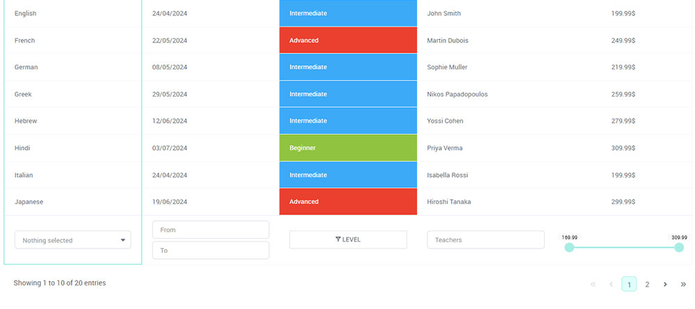
When tables get big, scrolling through dozens – or even hundreds – of rows can quickly become frustrating for users. That’s where table pagination comes in. It breaks your data into bite-sized chunks, making it easier to navigate, faster to load, and much more user-friendly.
Elements of a Standard Pagination System
A standard pagination bar is like the plate in our analogy – it’s the base. It holds together the navigational elements that allow users to move through different pages of information efficiently. Most commonly, this includes:
- Page Numbers: Think of these as individual dishes on that buffet. Users can click on a number to jump straight to a page.
- Next and Previous Buttons: Like the “next” or “previous” course, these help diners – I mean, users – move sequentially through the content.
- First and Last Buttons: For when you want to skip right back to the salad or jump ahead to the dessert, these take users to the very start or end.
Navigation Buttons and Their Functionalities
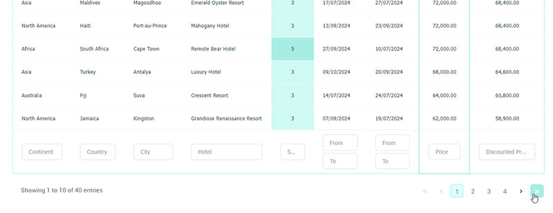
The magic in the flow of your buffet visit is largely down to these buttons.
The Previous one gently takes you back a step – perhaps you missed something on the last table. The Next button encourages you to explore ahead. Without these, users might just get lost in the array of data, or worse, feel overwhelmed and leave.
For larger datasets like a database query limit that could stretch across many pages, First and Last navigation buttons avoid the tedium of clicking through endless courses.
You’re transported to the very edges of data tables without scrolling through every single page.
Icon Usage and Symbolic Representation
When it comes to icons, less is more. A clear arrow for going forward or back, universally understood, transcends language barriers, making your navigation cross-culturally delicious.
Icons work like visual seasoning, enhancing the user experience without overwhelming the main content—your site’s delectable offerings. By incorporating simple arrows, magnifying glasses for search, or even stylized numbers, icons guide visitors through pagination with intuition rather than instruction.
Active and Disabled States in Pagination Links
In our buffet, you can’t choose a dish that’s not yet ready. Similarly, in pagination, a link that you can’t click on — a page you can’t visit yet — is “disabled.” It’s visually distinct, often grayed out, subtly telling users it’s off the table momentarily.
On the flip side, the “active” state is the plate you’re currently enjoying: the page you’re on. Highlights, bolds, or distinctive colors can signify this, ensuring users always know where they stand in their journey through content.
Icons, along with the changing states of links, create a dynamic experience.
Whether it’s a load more button for a sequential feast or a pagination bar signposting the way, every element is a subtle invitation to explore further. With pagination, we invite users into a story, serving up content one satisfying page at a time.
How to Implement Table Pagination?
Table pagination is the simplest way to make large datasets manageable. Instead of overwhelming users with endless rows, it splits the information into clear, navigable pages.
Here, we’ll show you how to set it up effectively so your tables stay organized, fast, and easy to explore, no matter which platform you’re using.
Dive into any web project and soon enough you’ll hit a stage where you’ve got more data than can fit on a single screen.
That’s your cue for table pagination—a neat technique that lets you break down and navigate through lists or tables of data like a champ.
Each development platform winks at you with its tools and quirks, and understanding these is key. Let’s say you’re juggling multiple balls – JavaScript pagination, or maybe server-side pagination in PHP or Python.
Each requires a different approach. With JavaScript, you’re dealing with data already on the user’s plate, so you shuffle and resort without a constant back-and-forth with the kitchen. But with server-side, each click is like sending a waiter back to the kitchen – it requires a fresh data query.
Now, picture running a bistro that’s got its own character—like React or Bootstrap. They’ve got their local flavor and you’ve got to cook accordingly.
Client-Side Pagination (JavaScript)
Client-side pagination works with data that’s already loaded in the browser. This means the entire dataset is available to JavaScript, which then slices it into pages for the user to navigate.
- When to use: Ideal for smaller datasets where loading all rows at once won’t impact performance. For example, tables with a few hundred rows or less.
- Tools & Libraries: Popular choices include DataTables or other JavaScript table libraries that come with built-in pagination support.
- How it works: The browser holds all the data in memory. When a user clicks a page number, the script hides the current rows and shows the relevant ones, without communicating with the server.
Actionable Steps:
- Include a JavaScript table library like DataTables in your project.
- Initialize your table with the pagination option enabled.
- Define how many rows should appear per page (e.g., 10, 25, 50).
- Optionally, allow users to adjust the number of rows per page.
Benefits: Fast page switching and smooth interaction since no server requests are needed.
Server-Side Pagination (PHP, Python, Node.js, etc.)
Server-side pagination is best for large datasets that would be too heavy to load all at once. Instead of sending all data to the browser, only the rows needed for the current page are fetched from the server.
- When to use: Large databases, tables with thousands or millions of rows, or when you need to reduce memory usage in the browser.
- How it works: Each page click triggers a request to the server. The server queries the database for just the rows required and sends them back to the client.
Actionable Steps:
- Modify your database query to include parameters like
LIMITandOFFSET(orpage number). - When a user clicks a pagination button, send the current page info to the server.
- The server returns only the requested rows, which are rendered in the table.
- Optionally, combine with search or filtering features to make navigation more efficient.
Benefits: Handles massive datasets without overloading the client, keeps load times reasonable, and allows dynamic querying.
Framework-Specific Pagination
Many modern frameworks provide their own way to handle pagination. Here’s a breakdown:
React
- How it works: Use React state to track the current page. Slice the dataset based on the state and render only the visible rows. Update state when the user clicks “Next” or “Previous.”
- Actionable Steps:
-
- Store the current page number in a state variable.
- Calculate which rows to show based on the page size.
- Render navigation buttons that update the state when clicked.
- Optionally, add features like jump-to-page or dynamic page sizes.
Bootstrap
- How it works: Bootstrap provides pre-styled pagination components. You can combine these with JavaScript or server-side logic to handle page changes.
- Actionable Steps:
-
- Add Bootstrap pagination classes to your navigation.
- Link buttons to functions that change which rows are visible.
- Combine with client-side or server-side pagination logic depending on dataset size.
Custom Data Applications (Dashboards, CMS, etc.)
- How it works: In applications with large or dynamic datasets, pagination is part of a larger strategy to optimize performance and usability.
- Actionable Steps:
-
- Decide how many rows should display per page.
- Load data in batches to reduce memory and server strain.
- Include filters, sorting, and search alongside pagination.
- Ensure responsive layout so pagination works across devices.
Benefits: Keeps complex dashboards or CMS tables usable, ensures fast loading times, and improves overall user experience.
How to Customize Table Pagination?
Default pagination works fine, but sometimes you want it to fit your site’s style, improve usability, or highlight important data. Customizing table pagination lets you control everything from button design and layout to how many rows appear per page.
Sizing Options for Different Design Needs
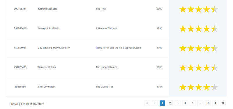
When you’re sizing up your pagination controls, it’s a bit like tailoring a suit—you want a perfect fit for your content’s style.
It’s not just about whether it works. Does it look good? Does it feel right in the grand scheme of the page design?
You’re going to want options.
In a responsive layout, that means your pagination components might need to be chunkier on mobile—big, easy-to-tap buttons—compared to the more refined, compact version that desktop users see.
Custom CSS gives you this versatility; you can design thoughtful pagination patterns that scale and adapt. Yes, like stretchy pants for your UI, scaling up or down as needed.
Aligning Pagination Components Within the Layout
Now, let’s talk about getting your pagination to play nice with the rest of the page. Alignment is key.
Whether you’re going for centered, to the left, maybe the right, the flow of the content should lead naturally to your pagination controls.
A flawless outfit isn’t just about the clothes, right? It’s about how they’re worn together. Same thing here.
Think about how these components interact with other elements—like filters or table sorting controls.
It’s about creating a visual harmony that guides the user’s eyes down the buffet line. You want them reaching for the page numbers like the next spoonful from a favorite dish.
Providing Large Hit Areas for Better Interaction
Let’s crack the code on those tiny little buttons that make us all fumble—literally.
The hit area, the clickable space around your pagination links, should be generous. Nothing turns a meal sour faster than struggling to get at the next course because the spoon’s handle is too thin.
Just like creating a spacious dining area, you need to offer up large enough clickables for hassle-free navigation.
No squinting, no miss-clicks. Just smooth sailing or, well, clicking. It’s about being as click-friendly as sporks at a picnic—everyone finds them easy to use.
Utilizing Aria-Labels for Accessibility and Navigation
Last morsel—accessibility. It’s not an afterthought, it’s a crucial ingredient. For screen readers to gobble up your site as easily as sighted users, they need clear, descriptive aria-labels.
Think of these like signposts or menu descriptions that help everyone relish the experience, regardless of how they interact with your page.
Labels like “Go to page two” or “Next page” give context. It’s like having someone describe the taste of a dish with their eyes closed—a screen reader conveys the essence so no one misses out.
Essential for those using assistive technology; they’re counting on you to narrate the journey from one plate—ahem, page—to the next.
Practical Table Pagination Examples and Code Snippets
Seeing pagination in action makes it much easier to understand and implement. In this section, we’ve put together practical examples and ready-to-use code snippets that show how table pagination works in real scenarios.
Examples of Simple and Full Pagination Controls in Bootstrap
See the Pen
bootstrap table 4 with responsive and search bar and pagination by shubham jaiswal (@shubham829)
on CodePen.
On to Bootstrap, where style meets function with a dash of class. Add the ‘pagination’ class to an unordered list, sprinkle in some ‘page-item’ and ‘page-link’ classes on list items and anchors, and you’ve got the bare essentials.
But what if your tastes are more eclectic? What if you want next and previous buttons?
Bootstrap says, “No problem!” Add a little more spice with additional list items, some ‘disabled’ for that first-course charm, and ‘active’ for the dish you’re currently devouring. Bootstrap serves your users a visually tasty buffet of navigational choices that stack beautifully on all devices.
Advanced Table Pagination Features
Once you’ve mastered the basics of table pagination, there’s a lot more you can do to make your tables smarter, faster, and more user-friendly. Advanced pagination features go beyond simple Previous/Next buttons, helping users navigate large datasets effortlessly and interact with your tables in a more dynamic way.
Customizing Page Size and Translation Options
Now, let’s kick it up a notch. Your users are picky eaters—they want control over their portion sizes or need to understand the menu in their native tongue.
This is where customization shines. Most pagination frameworks, including the ones we’ve been cooking with, allow you to tweak how much data shows up on one plate—er, page.
Burrowing into settings, you can define ‘page length’ options—for the small, medium, or large appetites. Throw in a translation file or some inline definitions, and the pagination tool speaks whatever language your users crave.
Integrating Icons and Managing States in Bootstrap
Lastly, let’s garnish with icons. Bootstrap icons are like the final sprinkle of parsley—they make your paginations pop. Want to replace that bland ‘Next’ text with a snazzy arrow? Bootstrap’s got an icon for that.
But remember, a beautiful dish is more than just garnish. Those icons need to react. They need to know when they’re the centerpiece and when to step back.
Managing states takes care of this. With Bootstrap, an icon in an ‘active’ state is highlighted, basking in the limelight.
When ‘disabled’, it fades into the background, unclickable, telling users it’s taking a break until it’s their turn again. It’s visual feedback, a silent conversation with the user as they feast upon page after glorious page.
Techniques for Managing Extensive Datasets with Pagination
Think of a library. Rows upon rows of books, each a container of stories, just like a database holds data.
Now, imagine wanting to find one particular story. Where to start? This is where table pagination comes in, like a librarian guiding you to the right aisle.
Chunk it down. Break the data into volumes that are manageable, each page of pagination is a summary, an index of content.
Lazy loading is a trick here—it’s the sneak-peek concept. Show only what’s needed, and fetch more as the user asks. They turn the page, you fetch the next set of data.
Remember also the concept of caching, kind of like having a notepad to jot down where you spotted a book you might want to come back to. It saves time. Just like caching can speed up the retrieving process by keeping a handy note of recently used data.
Impact of Pagination on Performance and Data Retrieval
Performance—it’s needing a book and having it fly into your hands, rather than taking a leisurely stroll down each aisle. When pagination is on point, it’s like the best librarian ever, zippy, efficient, no dilly-dallying.
But it’s a delicate dance. Poorly implemented pagination can be like having to wait for every individual book to be pulled off the shelf, one at a time, even when you know you want the whole series.
Server-side pagination requires a round trip to the database for each page change. It can slow things down if not done thoughtfully.
On the other hand, pulling everything out at once, like client-side pagination may do, can make the initial wait a drag. Striking that balance by implementing performance best practices, like proper indexing and minimizing the payload, is the key.
Different Table Pagination Types and Their Uses
Like tools in a shed, there are different types of pagination. Infinite scroll is like a hose that just keeps going, pouring out content continuously until you say stop. Think social media—bottomless.
Then there’s the classic table pagination, like a well-organized toolbox. Neat sections, clear labels; you pick what you need with precision. Essential for data-dense tables.
There are animated page flips, which, let’s admit it, are fun. They’re the wind chimes that serve little purpose but delight anyway. And don’t forget the ‘Load More’ button, not quite infinite, more controlled—a tap to release more content, another tap for even more.
In large-scale applications like the LinkedIn database, pagination ensures efficient data retrieval and user-friendly navigation through vast amounts of information.
Configuring Pagination Controls to Suit User Needs
Finally, it’s about the right fit. Customized pagination lets the user say, “I want to see 10 records per page, no more.” You nod, you configure. Or they say, “Make it so I can jump to the page I want.” Again, you make it happen.
It’s like ordering à la carte—users choose their settings. Performance optimization and user-friendly design dance together here. Tailored pagination controls are the consideration that says, “I see you, I know what you need, and I got you.”
Organize Large Tables Easily with wpDataTables
Handling big tables on your website can get overwhelming fast. wpDataTables is a WordPress table plugin that makes creating, managing, and displaying tables simple – even if you have hundreds or thousands of rows of data.
What you’ll get:
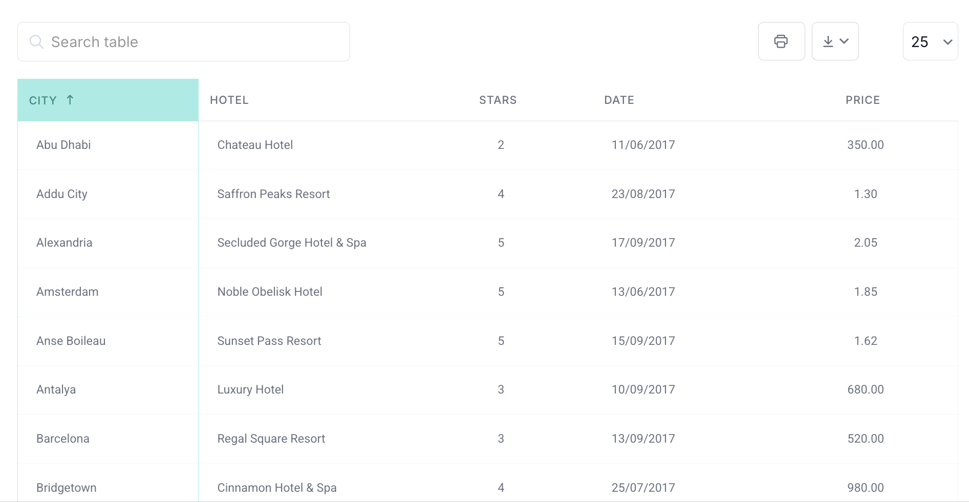
- Pagination: Automatically splits long tables into manageable pages. You can choose how many rows show per page, and combine pagination with filters or search boxes for a smooth user experience.
- Sorting & Filtering: Users can sort columns alphabetically, numerically, or by date, and filter data instantly without reloading the page.
- Responsive Design: Tables adapt to any screen size, making them readable and functional on mobile, tablet, and desktop.
- Server-Side Processing: For large datasets, wpDataTables can load only the rows needed per page, keeping performance fast and reducing browser load.
- Customizable Columns: Control column visibility, widths, and formatting to match your design or highlight important data.
- Searchable Tables: Add a search bar to help users find specific data quickly, even in large tables.
How to Use wpDataTables for Pagination
- Create a Table: Import data from Excel, CSV, Google Sheets, or connect directly to your database.
- Enable Pagination: Turn on pagination in the table settings and define how many rows to show per page.
- Add Sorting and Filtering: Make your table interactive by enabling column sorting and filters.
- Publish Your Table: Insert your table anywhere on your WordPress site using the shortcode.
With wpDataTables, large datasets are no longer a headache. You can create organized, responsive, and interactive tables quickly, improving usability for your visitors and keeping your site professional and easy to navigate.
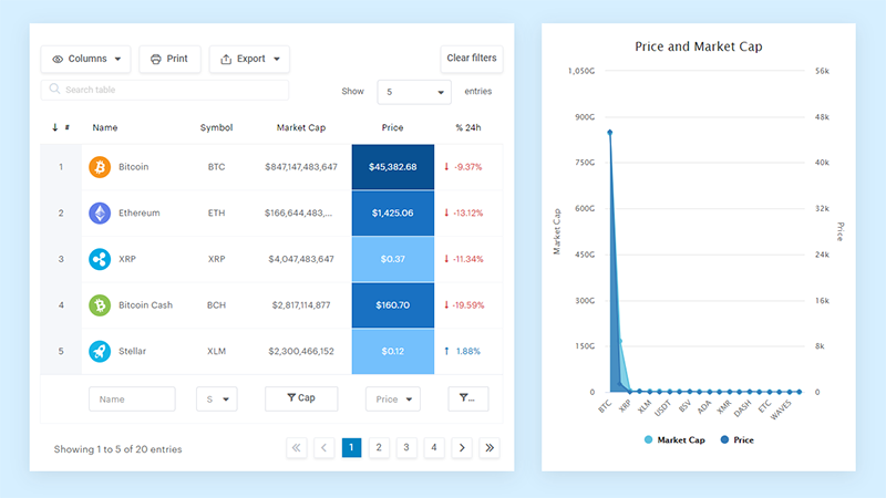
And it’s not just pretty, but also practical. You can make large tables with up to millions of rows, or you can use advanced filters and search, or you can go wild and make it editable.
“Yeah, but I just like Excel too much and there’s nothing like that on websites”. Yeah, there is. You can use conditional formatting like in Excel or Google Sheets.
Did I tell you you can create charts too with your data? And that’s only a small part. There are lots of other features for you.
FAQ On Table Pagination
Why is Pagination Important in Web Design?
It’s the great organizer. Pagination tames data overload, offering a more digestible user experience. Imagine turning the chaos of shopping on Black Friday into the calm of a Sunday market stroll—that’s pagination’s gift to web design.
How Does Pagination Improve User Experience?
By breaking up content, pagination decreases load time and avoids user fatigue. It’s akin to providing a map in a large museum, letting visitors explore exhibits without overwhelming them. This ensures they find what they seek with ease and speed.
Can Pagination Affect the SEO of a Website?
Absolutely, pagination can impact SEO. It molds how content is indexed and can influence the crawlability of a website. Proper implementation ensures search engines and users find content more efficiently, no page left unturned.
What’s Better: Infinite Scrolling or Pagination?
It’s a matter of context. Pagination suits data-heavy sites, think spreadsheets, where precision navigation is key. Infinite scrolling plays well with continuous content, like social media feeds, for a more casual browsing experience.
Is Table Pagination Difficult to Implement?
Not exactly the Gordian knot. With modern web development frameworks and libraries providing built-in pagination components, it can be quite straightforward. A dash of coding knowledge, coupled with some documentation, makes implementation manageable.
How Do You Customize Pagination?
Customizing pagination is like painting your living room. It requires a solid understanding of CSS and JavaScript to tweak the look and behavior, matching it to the vibe you want your site to give off.
What is the Role of Ajax in Pagination?
Ajax in pagination is the behind-the-scenes ninja. It allows new content to load without a full page refresh, creating a smoother and faster navigation experience, like slipping through crowds without bumping into anyone.
How Many Items Should Be Displayed Per Page?
The golden number varies. Consider the content type, screen size, and load time. It’s a balancing act between providing enough data points to be useful and not so many that performance takes a hit.
How Should Pagination Be Tested?
Testing pagination involves checking functionality across browsers, ensuring accessibility, and verifying that the SEO structure is intact. Also, a hearty stress test under heavy data load ensures it doesn’t crumble when the digital dining room is full.
