Most HTML tables on the web are a mess. Broken markup, no mobile thought whatsoever, headers that don’t even use <th>. I’ve seen production dashboards where the whole thing was built with nested divs trying to fake table behavior. Worse than just using a table.
Tabular data shows up everywhere: dashboards, pricing pages, financial reports, scheduling grids. Getting it wrong in those contexts isn’t just a code quality issue, it’s a UX problem that real people run into daily.
Table of Contents
What HTML Table Design Actually Means
Structuring, styling, and organizing tabular data with HTML and CSS so it’s readable, accessible, and makes sense to browsers. That’s it.
Not every grid on a page is a table, though. This is where a lot of developers trip up.
Data tables show relational information where rows and columns carry actual meaning. You need to know that row 3, column 2 means something specific. Layout tables were a pre-CSS Grid hack. Using <table> for layout in 2025 is just… don’t. Assistive technologies expect table markup to mean something, and when it doesn’t, screen readers produce garbage output.
The core elements you need: <table>, <thead>, <tbody>, <tfoot>, <th>, <td>, and <caption>. Each one has a semantic role. Skip them and you’re basically lying to the browser.
Where tables make sense
- Pricing comparisons
- Sports standings
- Financial reports
- Scheduling grids
- Any data where the row/column relationship matters
Where they absolutely don’t belong
- Page layout (use Grid)
- Navigation (use
<nav>) - Image galleries (use Grid or Flexbox)
The tricky part isn’t styling. It’s knowing upfront whether your data actually needs a table, or whether you’re just reaching for one because it feels organized. Figure that out first, then write the CSS.
HTML Table Design Examples
Modern Project Dashboard Table
See the Pen
Modern Project Dashboard Table by Bogdan Sandu (@bogdansandu)
on CodePen.
Simple Responsive HTML Table with Overflow
See the Pen
Simple Responsive Table With Overflow by Envato Tuts+ (@tutsplus)
on CodePen.
HTML Table Design Example
See the Pen
HTML Table Design by Asma Zahra (@asma-zahra)
on CodePen.
Multiplication HTML Table
See the Pen
Multiplication table for kids by Max Konoval (@frontendmax)
on CodePen.
HTML + CSS Table with Expandable Rows
See the Pen
CSS Expanadle Table Rows by Vincent Van Goggles (@Gogh)
on CodePen.
Responsive Fujita Scale Table Example
See the Pen
Responsive Fujita Scale <table> by Eat. Sleep. Design (@Eat_Sleep_Design)
on CodePen.
Take Your Tables to the Next Level with wpDataTables
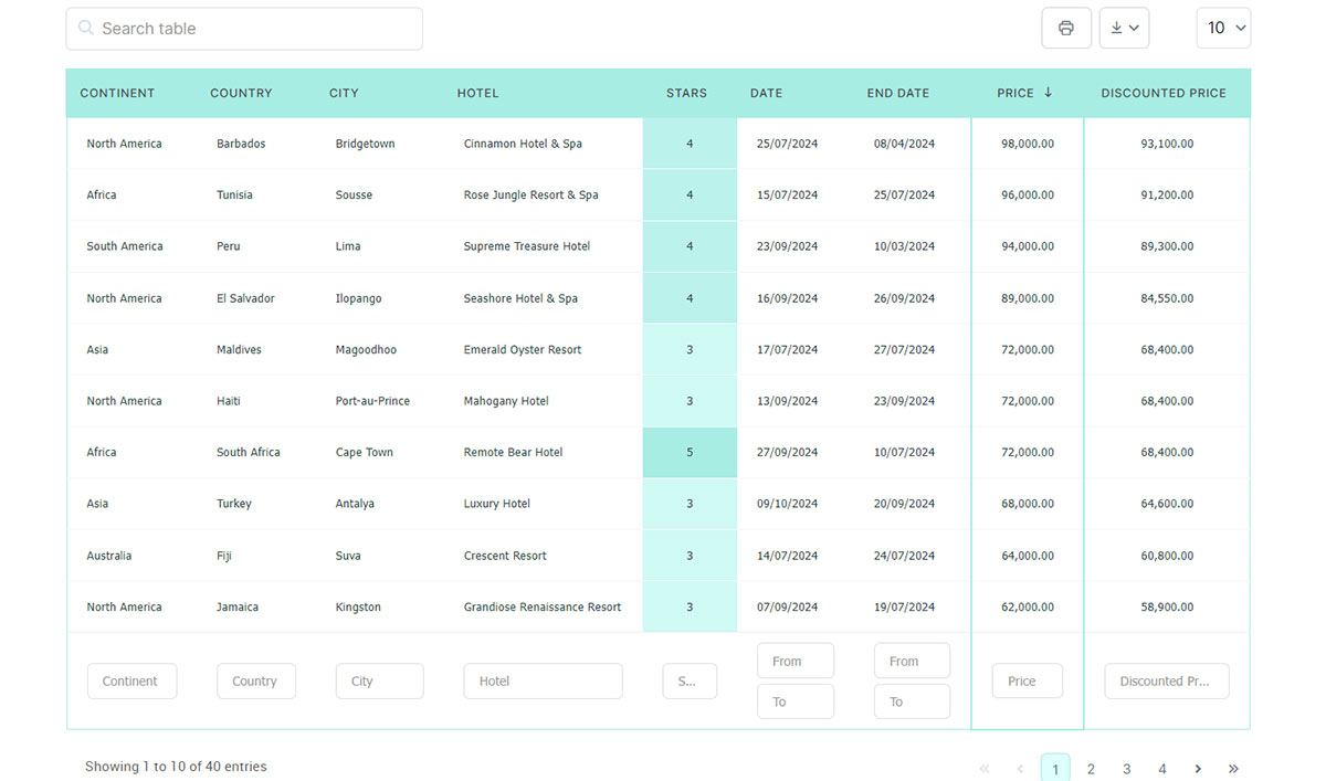
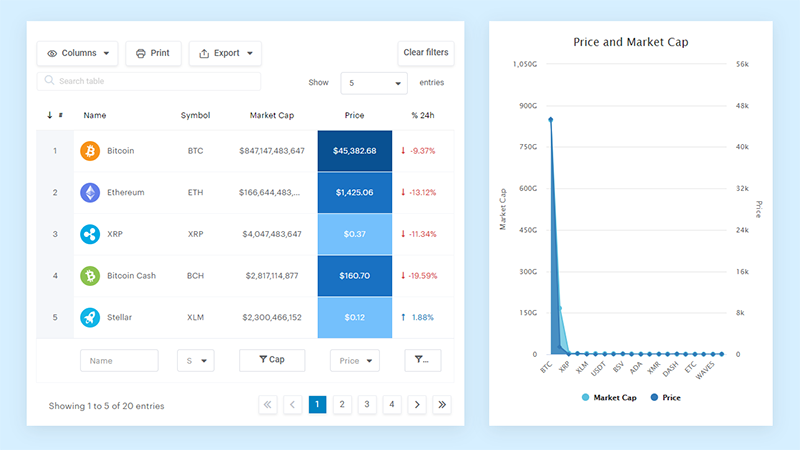
Creating professional, interactive tables doesn’t have to be complicated or time-consuming. wpDataTables turns raw data into clean, responsive, and fully functional tables that users can read, search, and interact with instantly.
No matter if your data involves pricing, products, finances, or massive datasets, wpDataTables ensures your tables communicate clearly and professionally.
Key Features and Benefits:
- Drag-and-drop table builder: Customize tables visually with no coding.
- Responsive and mobile-friendly: Tables adapt to any screen size, looking great on desktop, tablet, or mobile.
- Searchable and sortable tables: Users find information quickly, even in large datasets.
- Excel, CSV, and Google Sheets integration: Import data directly from spreadsheets and keep it accurate.
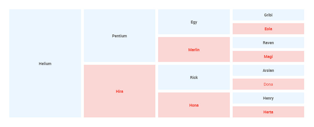
- Conditional formatting: Highlight important values, trends, or alerts with custom colors and styles.
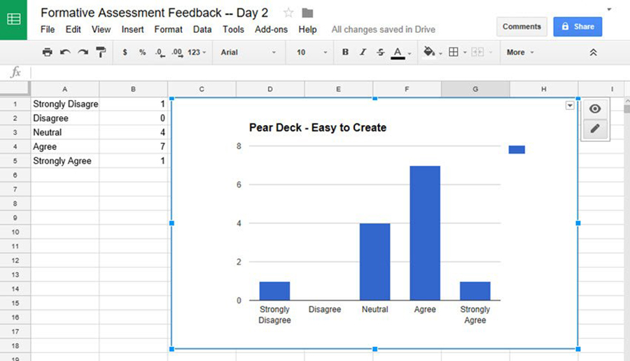
- Charts and graphs: Turn tables into visual charts to make data more impactful.
Use Cases:
- Display pricing plans or service comparisons
- Publish financial reports or KPI dashboards
- Organize product tables for e-commerce
- Manage large datasets with clarity and precision
Save hours on formatting while delivering a professional, user-friendly experience that keeps visitors engaged and informed.
We’ve got advanced filters and search, or you can go wild and make it editable.
“Yeah, but I just like Excel too much and there’s nothing like that on websites”. Yeah, there is. You can use conditional formatting like in Excel or Google Sheets.
Did I tell you you can create charts too with your data? And that’s only a small part. There are lots of other features for you.
HTML Table Example with Fixed Header
See the Pen
Fixed table header by Nikhil Krishnan (@nikhil8krishnan)
on CodePen.
Responsive HTML Table
See the Pen
A responsive table by Joke Gysen (@keukenrolletje)
on CodePen.
Angular Material Table
See the Pen
Angular Material Table by Mickael B. (@jbltx)
on CodePen.
HTML & CSS Table Example
See the Pen
HTML Table & CSS Table by Ahmad Awais ⚡️ (@ahmadawais)
on CodePen.
HTML5 Table
See the Pen
David Kern HTML5 Table by David Kern (@DavidKern)
on CodePen.
Placeholder HTML Table Design
See the Pen
Untitled by Renato Atilio (@renatoat)
on CodePen.
Dynamic Background Table Design
See the Pen
Dynamic background tiles by Andrea Mignolo (@pnts)
on CodePen.
University Timetable in HTML
See the Pen
Flat University Timetable by Mark Murray (@markmurray)
on CodePen.
Responsive HTML Table Design
See the Pen
Responsive Table by Geoff Yuen (@geoffyuen)
on CodePen.
Simple HTML Table Design
See the Pen
Untitled by Phelipe M Peres (@phemestre)
on CodePen.
Responsive CSS & HTML Table Design
See the Pen
Responsive Table HTML and CSS Only by Flor Antara (@florantara)
on CodePen.
CSS Grid Table
See the Pen
Responsive Table | CSS Grid by Developer Zahid (@DeveloperZahid)
on CodePen.
Comparison Table in HTML
See the Pen
Version comparison ns by Steven (@gxnzkaiy-the-bold)
on CodePen.
HTML Pricing Table Design
See the Pen
Responsive Pricing Table, Table Rows in Desktop, Slider in Mobile by Nguyen Anh Tuan (@nguyenanhtuan)
on CodePen.
Vue.js + Tailwind Table
See the Pen
Vue.js + Tailwind Responsive Table by Shadow Smith (@heyshadowsmith)
on CodePen.
What Are the Core HTML Table Elements and Their Roles?
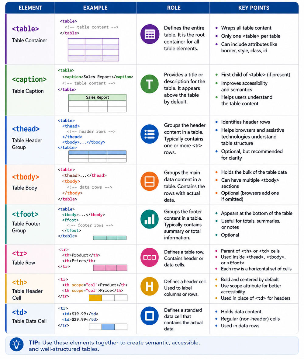
Every well-structured data table is built from the same 7 core elements. Skip any of them and the table becomes harder to read, style, and parse by assistive technologies.
Structural Elements Every Table Needs
caption: The table’s accessible title. Screen readers announce it first. Required for any table where context is not obvious from surrounding text.
thead: Groups header rows. Browsers repeat this section when a table spans multiple printed pages.
tbody: Contains the data rows. Multiple <tbody> elements can group related rows into logical sections.
tfoot: Holds summary or total rows. The browser renders it after tbody but allows it to appear at the bottom visually. For detailed guidance on how to use this element correctly, see this breakdown of table footer behavior and styling.
Cell-Level Elements and Attributes
th vs td: <th> is a header cell. <td> is a data cell. Never style a <td> to look like a header. The semantic difference affects how screen readers read the table.
colspan and rowspan: Merge cells horizontally or vertically. Use sparingly. Every merged cell increases complexity for assistive technologies.
colgroup and col: Apply column-level styling without repeating CSS on every <td>. Useful for setting consistent column widths across a large dataset.
| Element | Role | Accessibility Impact |
|---|---|---|
caption |
Table title | Announced by screen readers first |
thead |
Header group | Repeats on print, defines column scope |
tbody |
Data rows | Main content grouping |
tfoot |
Summary rows | Totals, averages, aggregate data |
th |
Header cell | Linked to data cells via scope |
colgroup |
Column styling | No direct impact, structural |
What Makes an HTML Table Accessible?
See the Pen
Modern Accessible Data Table with Sticky Headers, Pagination & Filtering by Bogdan Sandu (@bogdansandu)
on CodePen.
Accessibility failures in HTML tables are common. The WebAIM Million 2025 report found that 94.8% of homepages still had detectable WCAG failures, and missing or incorrect table markup contributes to that number directly.
The fix is not complicated. It requires 3 specific attributes and a consistent structure.
Simple Tables vs. Complex Tables: Accessibility Differences
Simple Tables
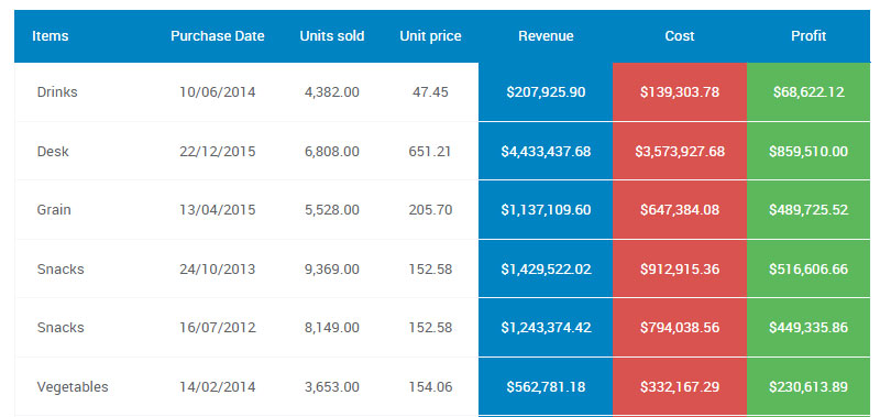
A simple table is the easy case: one header row, one header column, nothing merged. If that’s what you’ve got, the association work is almost trivial.
Drop scope="col" onto every <th> in that top row, and scope="row" onto every <th> running down the first column. That’s it. A screen reader now knows which header belongs to which cell, and you’re done.
Complex Tables

The moment you bring in colspan, rowspan, or stacked multi-level headers, scope stops being enough. It just can’t describe those relationships anymore.
This is where you switch to id attributes on the header cells and headers attributes on the data cells, spelling out the links by hand. Every single <td> has to list the id of every <th> it answers to. Tedious? Yeah. But there’s no shortcut once the layout gets gnarly.
The Non-Negotiable Accessibility Rules
- Every data table gets a
<caption>. Need it hidden visually? Do it with CSS (clipplusposition: absolute), neverdisplay: none, which yanks it from screen readers too. aria-labelcan stand in for<caption>on dynamically generated tables, but honestly, reach for<caption>first whenever you can.- WCAG 2.1 Success Criterion 1.3.1 (Info and Relationships) is the one that bites here: whatever structure you convey visually has to be conveyed programmatically too. A table that looks like it has headers but uses
<td>where it should use<th>flat-out fails it. - When you’re building accessible tables, test with an actual screen reader. Not just the automated checker. Those tools only catch around 30% of issues (WebAIM, 2025), so the other 70% is on you to hear for yourself.
If you want proof this stuff bites at scale: GOV.UK tore down and rebuilt their whole table pattern in 2022, specifically to pass NVDA and VoiceOver, after audits turned up missing scope attributes spread across hundreds of pages.
What CSS Properties Control HTML Table Layout and Spacing?
Before any visual design decision, 4 CSS properties determine how a table renders. Getting these wrong causes column width chaos, border doubling, and overflow failures on small screens.
table-layout: The Performance Switch
According to MDN Web Docs and CSS-Tricks, table-layout: fixed renders an entire table after parsing only the first row, which is significantly faster than the default auto value that must scan all cell content before calculating widths.
Use fixed when column widths are set explicitly. Use auto only for small tables where content-driven width calculation is acceptable.
border-collapse and Cell Spacing
border-collapse: collapse merges adjacent cell borders into a single line. This is what most table designs need.
border-collapse: separate keeps borders distinct and allows border-spacing to add gaps between cells. Rarely used in modern CSS tables but valid for certain grid-style designs.
Overflow and Responsive Containment
Wrap every table in a <div> with overflow-x: auto. Do this by default, not as an afterthought. Mobile traffic accounted for over 54% of global web traffic in 2023 (Research.com), meaning more than half of your table’s visitors are on a screen where horizontal overflow breaks the layout.
Column Width Strategy
| Method | Where Set | When to Use |
|---|---|---|
width on col |
colgroup |
Consistent widths across all rows |
width on th |
Header cell | When headers define column size |
width on td |
Data cell | Avoid – inconsistent across rows |
| Percentage widths | Any of the above | Fluid layouts with table-layout: fixed |
What Are the Best Practices for HTML Table Design?
Most bad tables share the same 5 problems: missing semantic markup, incorrect alignment, overloaded columns, no caption, and layout misuse.
Column Alignment Rules for Numeric and Text Data
Right-align every numeric column. Left-align every text column. Center-align only icons or status indicators.
This is not a style preference. Right-alignment lets users scan numbers vertically by decimal position. Left-aligned numbers break that scan pattern and slow comprehension.
Apply alignment at the column level using text-align on <col> elements inside <colgroup>. This avoids repeating the declaration on every <td>.
When to Use Zebra Striping vs. Row Borders
Zebra striping works best for wide tables with many columns. The alternating background (implemented with :nth-child(even)) helps the eye track across a row without losing position.
Row borders only work best for narrow tables with fewer than 5 columns. They reduce visual noise when columns are close together.
Never use both simultaneously. Combining zebra striping with visible row borders creates visual overload. Pick one and stay consistent.
The Rules That Prevent the Most Mistakes
- Use
<th scope="col">for every header. Never style a<td>to look like a header. - Add
<caption>to every data table, even if it is visually hidden. - Limit columns to the data required for the decision the table supports. Extra columns are friction, not completeness.
- Never use
<table>for page layout. That is a job for CSS Grid. - Set a minimum cell padding of 8px top/bottom and 12px left/right. Less than that and cells feel cramped on any screen size.
Look at any well-designed examples of data tables from financial or government sources: they all share these same structural decisions, even if their visual styles differ.
How Do You Make HTML Tables Responsive?
73.1% of web designers say non-responsive design is the main reason visitors leave a website (DiviFlash, 2024). Tables are one of the hardest elements to make responsive because their structure is inherently two-dimensional.
There are 3 methods. Each suits a different table type.
Horizontal Scroll Method
See the Pen
Responsive HTML Table – SaaS Docs Style by Bogdan Sandu (@bogdansandu)
on CodePen.
The simplest approach. Wrap the table in a <div> with overflow-x: auto. The table keeps its full structure; users scroll sideways on small screens.
Best for: Dense data tables where all columns are necessary and cannot be removed at small breakpoints.
Tradeoff: Users must scroll to see data. Works fine for reference tables. Poor for tables where users compare values across rows.
Pair this with an HTML table with fixed header and scrollable body when rows exceed the viewport height. This keeps column labels visible as users scroll down.
Card Layout Transformation for Mobile
See the Pen
Responsive HTML Table – Card Layout Transformation by Bogdan Sandu (@bogdansandu)
on CodePen.
At a defined breakpoint (typically 640px), use CSS to change the table’s rendering entirely.
Set display: block on <table>, <tbody>, <tr>, and <td>. Hide <thead>. Add data-label attributes to each <td> that mirror the column headers. Use the CSS ::before pseudo-element to display those labels inline.
Best for: Contact lists, product listings, and comparison tables with fewer than 6 columns where each row represents a distinct item.
For a complete walkthrough of patterns that actually work in production, the guide on mobile friendly tables covers each method with real code.
Priority Columns at Breakpoints
See the Pen
Responsive Table – Priority Columns at Breakpoints by Bogdan Sandu (@bogdansandu)
on CodePen.
A third option: hide lower-priority columns at small screens using CSS display: none on specific <col> or <td> groups.
Requires planning upfront. Every column needs a priority ranking before the table is built. Columns marked low-priority get hidden below 768px. This approach works well when a table has 8 or more columns and only 3 or 4 of them are critical for mobile decisions.
What Are the HTML Table Design Best Practices for Styling?
Visual design decisions in tables are narrower than most designers expect. Most of the work is about contrast, spacing, and hierarchy. Not decoration.
Header Row Styling
The header row needs 3 things to establish visual hierarchy:
- A distinct background color that separates it from data rows
font-weight: 600or700on the text- Slightly more padding than body rows (typically 4px more top and bottom)
Do not use a background color without checking the contrast ratio. WCAG 2.1 requires a minimum contrast ratio of 4.5:1 for normal text against its background. Most light gray header backgrounds with medium gray text fail this test.
Row Hover and Zebra Striping
Hover states use tr:hover with a subtle background shift. The shift should be visible but not jarring, typically a 5-8% lightness change from the row’s base color.
Critical rule: Never use color alone to convey the hover state. Users with color vision deficiencies will not perceive a background color shift. Add a left border or a slight opacity change as a secondary indicator.
Zebra striping is implemented with tbody tr:nth-child(even). The even-row background should be no more than 3-5% darker than white. If the stripe is visible from across the room, it is too strong.
Border Strategies
3 common table border patterns, each suited to a different context:
Full borders: Every cell has a border on all sides. Appropriate for dense reference tables, spreadsheet-style displays, and financial data where cell boundaries help users scan accurately.
Horizontal borders only: Row separators with no vertical lines. Cleaner visually. Works best for tables with few columns where column separation is obvious from content alignment.
Borderless: No borders at all. Relies entirely on padding and zebra striping for separation. Best for minimal-style UI tables with 3 or fewer columns.
For a deeper look at how border choices affect table readability, the reference on table border in HTML covers the CSS syntax for each approach. Also, styling HTML tables is worth reviewing for more comprehensive CSS examples across different design systems.
Font and Size Consistency
Table font size should not drop below 14px for body cells. Header cells can go down to 12px if they use uppercase with letter-spacing, but only for short column labels.
Monospace fonts work well for numeric columns. They align decimal points vertically without extra CSS. Particularly useful for financial tables where users scan columns of dollar amounts or percentages.
For a curated list of typefaces that work reliably across table sizes and data densities, the guide on best fonts for tables is a useful reference.
How Do You Sort and Filter HTML Tables?
Sorting and filtering are the 2 interaction patterns users expect most from data-heavy tables. Both require accessible state management, not just visual changes.
Native JavaScript Sorting
Client-side sorting works well for datasets under 500 rows. Beyond that, the sort operation blocks the main thread long enough that users notice the delay.
Implementation steps:
- Add
data-valueattributes to<td>elements for numeric or date columns (stores the raw value, not the formatted string) - Attach a click listener to each sortable
<th> - On click, read the
data-valueattributes from the column, sort the rows array, and re-insert rows into<tbody> - Update
aria-sorton the active<th>and remove it from all other headers
Per MDN Web Docs and the WAI-ARIA specification, aria-sort should only appear on 1 header at a time. It communicates sort state to screen readers. Without it, keyboard-only users have no feedback that sorting occurred.
JavaScript Libraries for Table Interaction
DataTables.js remains the most widely used jQuery-based solution for adding table pagination, sorting, and search to existing HTML tables. It works by wrapping a standard <table> with minimal configuration.
| Library | Size | jQuery Required | Best For |
|---|---|---|---|
| DataTables.js | ~80kb | Yes | Legacy projects, quick setup |
| Tabulator | ~180kb | No | Complex data grids, frameworks |
| Grid.js | ~30kb | No | Lightweight modern projects |
| TanStack Table | Headless | No | React/Vue with custom UI |
For projects that need filtering without a full library, a separate implementation pattern is available in the guide on how to filter a table with JavaScript.
Server-Side vs. Client-Side Sorting
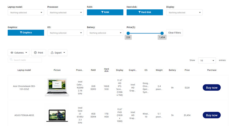
Client-side sorting loads all data upfront and sorts in the browser. Fast interaction after load. Breaks above roughly 500 rows due to DOM manipulation cost.
Server-side sorting sends the sort parameter to the backend and returns a new page of results. Slower per interaction but handles unlimited dataset sizes. Required for any paginated dataset where not all rows are loaded in the DOM.
The rule: if pagination exists because the dataset is too large to show all at once, sorting must also be server-side. Client-side sorting on a paginated table only sorts the visible page, which is wrong behavior.
How Do You Style HTML Tables with CSS Frameworks?
Bootstrap is used on 17.5% of all websites globally as of 2025 (W3Techs). That makes it the most common source of default table styling in production, and understanding its defaults matters more than understanding Tailwind or Bulma for most projects.
Bootstrap 5 Table Classes
See the Pen
Bootstrap 5 Table Classes by Bogdan Sandu (@bogdansandu)
on CodePen.
Bootstrap 5 ships 8 table modifier classes. The base .table class adds consistent padding and a bottom border on each row. Every other class is additive.
- .table-striped: Adds zebra striping via
nth-child - .table-hover: Adds a row hover background
- .table-bordered: Adds borders on all cells and the outer table edge
- .table-borderless: Removes all borders
- .table-sm: Halves cell padding for compact display
- .table-responsive: Wraps the table in an
overflow-x: autocontainer
For a full reference with rendered examples, the Bootstrap tables guide covers every class with code samples and edge cases.
Tailwind CSS Table Styling
See the Pen
Tailwind CSS Table by Bogdan Sandu (@bogdansandu)
on CodePen.
Tailwind has no pre-built table component. Every style is applied with utility classes directly on <table>, <th>, and <td> elements.
Common pattern for a clean Tailwind table:
w-full border-collapseon<table>text-left px-4 py-2 bg-gray-100 font-semiboldon<th>px-4 py-2 border-b border-gray-200on<td>
The tradeoff is verbosity. A Tailwind table requires 3-4x more class attributes than a Bootstrap table. The benefit is zero specificity conflicts and no framework CSS to override.
When Framework Defaults Are Not Enough
Framework table styles handle padding, borders, and basic hover states. They do not handle 4 common production needs.
Fixed column widths: Framework classes use table-layout: auto by default. Override with table-layout: fixed and explicit widths on <col> elements.
Sticky headers: Bootstrap and Tailwind do not include position-sticky header behavior. Add position: sticky; top: 0; z-index: 1; on <thead> manually.
Column alignment: Frameworks default all columns to left-aligned. Numeric columns need right-alignment added explicitly.
Print styles: Neither Bootstrap nor Tailwind includes print-specific table styling. Add a @media print block that removes hover states, resets backgrounds, and forces black text.
What Are Common HTML Table Design Mistakes?
WebAIM’s 2025 Million report recorded 50.7 detectable accessibility errors per homepage on average. A significant portion of those errors are in table markup. The same 5 mistakes appear repeatedly.
Missing Semantic Markup
The Web Almanac found that <caption> elements are used on a very small fraction of tables in production (Web Almanac, 2022). Missing captions mean screen reader users hear “table with 6 rows and 4 columns” with no context about what the table contains.
Equally common: using <td> elements styled to look like headers. Visually correct, semantically broken. Screen readers announce those cells as data, not as column or row labels.
Hardcoded Pixel Widths on Cells
Setting width: 200px directly on <td> elements is a layout trap. It creates 3 problems.
- The widths conflict across rows when content lengths vary
- The table overflows its container on small screens
- It overrides any
<col>widths set in<colgroup>, creating inconsistencies
Set widths on <col> elements instead. Use percentages with table-layout: fixed for predictable column sizing.
Too Many Columns
73.1% of web designers cite non-responsive design as the primary reason visitors leave (DiviFlash, 2024). Overloaded tables are a major cause. A table with 12 columns forces horizontal scrolling on desktop, not just mobile.
The fix is not always responsive CSS. Sometimes the fix is removing columns that do not support the decision the table exists to help users make. Every column needs justification.
Using Tables for Page Layout
Still common in email HTML and legacy CMS templates. A layout table forces screen readers to announce it as a data structure. The content inside becomes disjointed and out of reading order.
If a layout table is unavoidable (in email, for Outlook compatibility), add role="presentation" to signal that it carries no data semantics. This suppresses the “table” announcement in screen readers.
Inconsistent Cell Padding
Mixing padding values across <th> and <td> cells, or setting padding on some rows but not others, creates visual noise that slows scanning.
Set padding globally on td, th { padding: 12px 16px; } and override only where genuinely needed. Consistency in spacing reduces cognitive load faster than any color or typography choice.
How Do HTML Tables Affect Page Performance?
Table rendering is one of the few cases where the HTML element itself, not just the CSS or JavaScript around it, directly affects browser performance.
The table-layout Algorithm Cost
With table-layout: auto (the default), the browser must parse every cell in every row before it can calculate column widths and paint the table. For a table with 1,000 rows and 10 columns, that means processing 10,000 cells before a single pixel renders.
table-layout: fixed solves this. The browser reads the first row only, then renders immediately. Per CSS-Tricks and the W3C specification, this is explicitly described as the “fast” layout algorithm. The tradeoff: cells with longer content than the defined column width will overflow unless overflow: hidden and text-overflow: ellipsis are set.
Large DOM Tables and Virtual Scrolling
Rendering 50,000+ DOM nodes for a table with thousands of rows causes significant reflow and memory consumption. Basedash documented a 500% performance improvement after switching from full DOM rendering to virtual scrolling in their data table component.
Virtual scrolling renders only the rows currently visible in the viewport, typically 20-30 rows, plus a small buffer above and below. As users scroll, rows are recycled rather than created and destroyed.
Libraries for virtual scrolling in tables:
- TanStack Virtual (framework-agnostic, most popular as of November 2024)
- Clusterize.js (lightweight, works with existing HTML tables)
- AG Grid (includes virtualization built in, suited for enterprise data grids)
CSS Containment for Table Wrappers
Adding contain: layout to the table wrapper <div> tells the browser that layout changes inside the container do not affect elements outside it.
This reduces the scope of reflow calculations when table content updates (sorting, filtering, pagination). Useful for tables that update frequently without a full page reload. Supported in all major browsers as of 2023.
How Do HTML Tables Work in Email Design?
See the Pen
Email HTML Tables by Bogdan Sandu (@bogdansandu)
on CodePen.
Email HTML follows different rules from web HTML. Apple Mail holds 57% of email client market share, followed by Gmail at 30% and Outlook at 4% (Litmus, 2025). Despite Outlook’s small global share, it dominates enterprise B2B inboxes, which is exactly where table-heavy emails land.
Why Tables Are Still Required in Email
Outlook for Windows uses Microsoft Word’s rendering engine, not a browser. It does not support display: flex, display: grid, or most modern CSS layout properties.
Table-based layout is the only reliable way to create multi-column email layouts that render correctly in Outlook. This is not a legacy concern. It applies to every Outlook version from 2016 through 2021, and Microsoft only began migrating enterprise accounts to the new Chromium-based Outlook in January 2025.
HTML Attributes That Still Matter in Email
CSS applied via <style> blocks is stripped by Gmail. All styles must be inline on every element.
Attributes that replace CSS in email tables:
- cellpadding=”0″ cellspacing=”0″: Remove default browser spacing that CSS
padding: 0does not reliably reset in Outlook - border=”0″: Removes default table borders in older clients
- align=”center”: Centers the outer table when CSS
margin: autois unsupported - width=”600″: Set as an HTML attribute on the outer table, not just in CSS
Email Table Width and Max-Width
The standard outer table width for email is 600px. This fits within the preview pane of Outlook on a 1024px screen and renders full-width on most mobile clients.
Set width="600" as an HTML attribute and max-width: 600px; width: 100%; as inline CSS. The attribute handles Outlook. The CSS handles every other client.
MJML and Foundation for Emails abstract this complexity by compiling cleaner source HTML into table-based email code. MJML in particular is widely used for transactional email templates because it handles Outlook conditional comments automatically.
For additional context on how nested tables work in email and in standard web layouts, the breakdown of nested tables in HTML covers the structural rules and when nesting is appropriate vs. problematic.
FAQ on HTML Table Design
What is the correct HTML structure for a data table?
A well-structured data table uses <table>, <thead>, <tbody>, <tfoot>, <th>, <td>, and <caption>. Every header cell needs a scope attribute. Skipping these elements breaks both accessibility and browser rendering consistency.
Should I use tables for page layout?
No. Tables are for tabular data only. Use CSS Grid or Flexbox for page layout. The one exception is HTML email, where Outlook’s Word-based rendering engine still requires table-based layouts for consistent results.
How do I make an HTML table accessible?
Add scope="col" or scope="row" to every <th> element. Include a <caption> on every data table. For complex tables with merged cells, use explicit id and headers attributes to associate each data cell with its headers.
What CSS property makes tables render faster?
table-layout: fixed is significantly faster than the default auto value. The browser reads only the first row to calculate column widths, then renders immediately. Use it with explicit column widths set on <col> elements.
How do I make an HTML table responsive?
3 methods work: wrap the table in a <div> with overflow-x: auto for horizontal scrolling, transform rows into card layouts at mobile breakpoints using display: block, or hide lower-priority columns with CSS breakpoints.
When should I use zebra striping vs. row borders?
Use zebra striping on wide tables with many columns where users need help tracking rows horizontally. Use horizontal-only row borders on narrow tables with fewer than 5 columns. Never combine both in the same table.
How should I align data in table columns?
Right-align all numeric columns so decimal points stack vertically. Left-align all text columns. Center only icons or status indicators. Apply alignment via text-align on <col> elements inside <colgroup> to avoid repeating it on every individual cell.
What is the aria-sort attribute and when do I need it?
aria-sort communicates the current sort direction to screen readers. Set it to "ascending" or "descending" on the active sorted <th>. Only one header carries this attribute at a time. Without it, keyboard users receive no feedback that sorting occurred.
What are the most common HTML table design mistakes?
The 5 most frequent mistakes are: missing <caption> and scope attributes, using <td> styled as headers, hardcoded pixel widths on cells, too many columns for the viewport, and using layout tables without role="presentation".
How do I handle large datasets in an HTML table?
Use virtual scrolling to render only visible rows, keeping DOM nodes at 20-30 at any time. Libraries like TanStack Virtual or Clusterize.js handle this efficiently. For datasets over 500 rows, move sorting and filtering to the server side.
Conclusion
This conclusion is for an article presenting the full scope of HTML table design, from semantic markup and CSS table layout to responsive patterns, accessibility compliance, and email rendering.
Good table design is not decoration. It is structure, and structure determines whether your data is usable or not.
Get the <thead>, <tbody>, and scope attributes right first. Then handle column alignment, border-collapse, and cell padding. Responsiveness and sorting come after the foundation is solid.
Every pattern covered here, from zebra striping to virtual scrolling to WCAG 2.1 compliance, serves one goal: making tabular data easy to read and act on.
Build tables for users, not browsers.