Visualizing data can be the difference between understanding your audience and missing the mark, and ApexCharts sits at the cutting edge of this transformation.
When our digital lives are dictated by numbers and trends, having a powerful chart library becomes essential. ApexCharts.js, a versatile and open-source tool, has turned creating interactive charts and data visualizations into an art form accessible to anyone with a passion for clarity and functionality.
This isn’t just another JavaScript library. It’s your gateway to crafting dynamic web applications and elevating user interfaces with a suite of options like responsive design and real-time data analytics integration.
Whether you’re a seasoned developer or setting foot in the world of front-end development, you’ll learn how to harness ApexCharts’ potential in creating compelling dashboards and transforming data into a visual story.
By diving into the details of setup, customization, and practical applications, you’ll be ready to revolutionize how you present data.
Table of Contents
What is ApexCharts?
ApexCharts is a modern JavaScript charting library designed for developers, offering a variety of chart types and customization options. It supports responsive and interactive charts, making it ideal for creating dynamic visualizations in web applications. It’s easy to integrate with front-end frameworks like React, Angular, and Vue.
Getting Started with ApexCharts
How to install ApexCharts
Let’s dive into the exhilarating world of charting, where data visualization meets design flair.
The very first step on this journey is getting your toolkit in place, and that starts with the installation of ApexCharts.
You have a few paths you can take; each one a gateway to layered depths of interactive graphs and storytelling visuals.
Installing via npm
For those huddling in the shelter of Node.js, npm is your trusty steed.
With a single line of command, you’re thrust into a realm where arrays and objects magically transform into bar charts and pie charts. It’s as simple as:
npm install apexcharts
This command pulls in the essence of JavaScript libraries, aligning with your data-driven goals.
It’s like a painter picking up a brush; everything else is just a canvas waiting to be painted.
Direct <script> Include
Now, there’s a time and place where simplicity rules. Perhaps serving raw HTML files on a static webpage, eschewing all things npm.
Here, you opt for the old-school direct <script> include. It’s as tactile as feeling the grain of paper between your fingers or the click of a vintage typewriter under your hands:
<script src="path/to/apexcharts.min.js"></script>
With this, ApexCharts stands ready in its distilled form, accessible in an instant, poised to burst forth as responsive charts on your display.
Using CDN Links
If speed is your calling card, then the tempo of CDNs will hum a tune you know well.
Grabbing ApexCharts through a CDN is akin to breezily flipping through JavaScript charts at your disposal, as nimble as a dancer on a polished floor:
<script src="https://cdn.jsdelivr.net/npm/apexcharts"></script>
The charting tools ripple through the interwebs like a brisk wind, embracing front-end development with open arms.
For the jackrabbit in all of us, agility meets efficiency, making it the choice de jour for those keen on rapid integration.
Setting Up the Environment
Now that the tools are in your grasp, let’s set up the stage where this encore of data analytics will unfold.
It’s all about creating a harmonious dance of code and visuals in an environment ripe for exploration.
Creating a Basic HTML Structure
The bones of your project lie in a basic HTML structure, the scaffold upon which every interactive graph will hang.
Think of it as laying the foundation to an elaborate castle where each tag plays a role in framing the turrets, keeps, and halls of web development.
<!DOCTYPE html>
<html lang="en">
<head>
    <meta charset="UTF-8">
    <meta name="viewport" content="width=device-width, initial-scale=1.0">
    <title>Chart Example</title>
</head>
<body>
    <div id="chart"></div>
</body>
</html>
This might seem humble, but within its bounds lies the potential for real-time data storytelling and chart customization. The stage is set for a digital canvas of SVG graphics, ready to captivate through color and movement.
Integrating ApexCharts into the Project
And thus, the crescendo—the integration of ApexCharts into your burgeoning project. It’s here where everything snaps into focus, where the magic of web development comes alive:
var options = {
  chart: {
    type: 'line'
  },
  series: [{
    name: 'Sample Series',
    data: [10, 41, 35, 51, 49, 62, 69, 91, 148]
  }],
  xaxis: {
    categories: ['Jan', 'Feb', 'Mar', 'Apr', 'May', 'Jun', 'Jul', 'Aug', 'Sep']
  }
}

var chart = new ApexCharts(document.querySelector("#chart"), options);
chart.render();
Among the symphony of data visualization trends, a line chart emerges, a testament to the potential of the JavaScript API documentation. As axes and series define its elegance, the chart stands as an emblem of streamlined design and intricate storytelling, weaving data patterns into a holistic narrative.
How to install ApexCharts for Angular
Install via npm
npm install apexcharts ng-apexcharts --save
Update angular.json:
Add the following line under the scripts section:
"scripts": [
"node_modules/apexcharts/dist/apexcharts.min.js"
]
Import the module:
In your Angular module (e.g., app.module.ts), import NgApexchartsModule:
import { NgApexchartsModule } from "ng-apexcharts";

@NgModule({
imports: [
BrowserModule,
FormsModule,
ReactiveFormsModule,
NgApexchartsModule,
// other imports...
],
// ...
})
export class AppModule { }
Create a chart component:
In your component (e.g., app.component.ts):
import { Component, ViewChild } from "@angular/core";
import { ChartComponent, ApexAxisChartSeries, ApexChart, ApexXAxis, ApexTitleSubtitle } from "ng-apexcharts";

export type ChartOptions = {
series: ApexAxisChartSeries;
chart: ApexChart;
xaxis: ApexXAxis;
title: ApexTitleSubtitle;
};

@Component({
selector: "app-root",
templateUrl: "./app.component.html",
styleUrls: ["./app.component.css"]
})
export class AppComponent {
@ViewChild("chart") chart: ChartComponent;
public chartOptions: Partial<ChartOptions>;

constructor() {
this.chartOptions = {
series: [{
name: "My-series",
data: [10, 41, 35, 51, 49, 62, 69, 91, 148]
}],
chart: {
height: 350,
type: "bar"
},
title: {
text: "My First Angular Chart"
},
xaxis: {
categories: ["Jan", "Feb", "Mar", "Apr", "May", "Jun", "Jul", "Aug", "Sep"]
}
};
}
}
Add the chart in HTML:
In your component template (e.g., app.component.html):
<div style="text-align:center">
<apx-chart
[series]="chartOptions.series"
[chart]="chartOptions.chart"
[xaxis]="chartOptions.xaxis"
[title]="chartOptions.title"
></apx-chart>
</div>
Understanding ApexCharts Components
| Chart Type | Description | Use Cases | Key Features | Interactivity | Data Type |
|---|---|---|---|---|---|
| Line Chart | Represents data points connected by a line. | Trends over time, Stock data | Smooth and stepped lines, Multiple series support | High | Numeric, Time |
| Bar Chart | Displays data with rectangular bars. | Category comparison | Horizontal and vertical bars, Stacked bars | High | Categorical |
| Area Chart | Similar to line charts but filled with color. | Cumulative data trends | Gradient fill, Stacked areas | High | Numeric, Time |
| Pie Chart | Circular chart divided into sectors. | Proportional data | Donut option, Labels inside/outside sectors | Medium | Numeric |
| Scatter Chart | Plots data points as dots on the graph. | Correlation analysis | Multiple series, Data clustering | Medium | Numeric |
| Heatmap Chart | Represents data in matrix format with colors. | Performance metrics | Color gradients, Custom color scales | Medium | Numeric |
| Radar Chart | Displays multivariate data in a circular graph. | Skill comparison, Surveys | Multiple series, Customizable axes | Medium | Numeric, Categorical |
| Bubble Chart | Similar to scatter chart but with varying sizes. | Data distribution, Outliers | Bubble sizes based on value, Multiple series | High | Numeric |
| Candlestick Chart | Used for stock price movements. | Financial data | OHLC data, Custom time intervals | High | Financial, Time |
| Radial Bar Chart | Circular progress bars. | Progress tracking | Multiple levels, Gradient fills | High | Numeric |
| Mixed Chart | Combines multiple chart types in one. | Complex data visualization | Line + Bar combinations, Syncing between charts | High | Multiple |
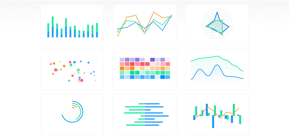
Chart Types
In the land of data visualization, there’s a rich tapestry of chart types waiting to weave their tale.
Each type tells a story distinct from the others, painting pictures with lines, bars, and hues.
Line Charts
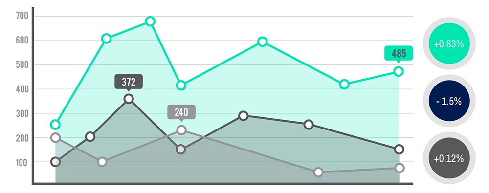
Chart created with wpDataTables
Imagine tracing the trajectory of a soaring bird. Line charts do just that, mapping data points into a journey across the screen.
Highly intuitive, they’re the storytellers of trends in time, converting static numbers into flowing narratives.
Area Charts
Chart created with wpDataTables
Blend the precision of line charts with the depth of shadows, and you get area charts.
They’re the canvases where subtlety and boldness meet, filling spaces under lines to provide context and volume to the visuals.
Bar Charts
Chunky and assertive, bar charts lay it all out. They stack the bricks of comparison vertically or horizontally, providing visibility into differences at a glance.
It’s a go-to for categorical distinctions, straightforward and timeless.
Column Charts
Chart created with wpDataTables
Flip the axis, and you land in the territory of column charts.
Tall and poised, they lift data into the spotlight. Ideal for showing change over time, they stand as pillars in the architectural wonders of dashboards.
Pie and Donut Charts
Chart created with wpDataTables
A wheelhouse of segmentation, these charts break information into bites, or should I say, slices?
Their circular beauty is captivating, delivering insights with a glance. Pies are for purists; donuts offer a twist of modern flair.
Mixed Charts
In a world that resists monotony, mixed charts dance with diversity.
A fusion of forms, they bring together the rigidity of bars and the fluidity of lines. Here, hybrid vigor thrives, and the combination is often greater than the sum of its parts.
Candlestick Charts
Venture into the evocative realm of financial markets, where candlestick charts come alive.
They’re more than just graphs; they’re the pulse of stock trading, where bodies, shadows, and wicks tell stories of open and close, high and low.
Heatmaps
Intensity maps deconstructed, heatmaps splash color across grids.
They visualize gradients of data, representing density and magnitude in a vibrant dance of color where heat turns the invisible visible.
Gauges
Stretching the bow of anticipation, gauges measure and display.
Their circular ease is inviting and familiar, quickly relaying quantitative data as needles race across the face.
Sparklines
Tiny yet powerful, sparklines whisper insights between the lines.
Minimalistic, they’re the distillation of trend and movement, fitting neatly into margins like annotations in a book.
Core Elements
Behind every chart lies a framework of elements, the unseen hands guiding the dance of data.
Series
The soul of the chart, the series reflects the narrative arc of the data. It’s the spine along which numbers skip, hop, and dance, forming the backbone of every visualization.
Axes
These are the coordinates of understanding. Axes lay down the grids of comprehension, anchoring data with precision. They bring the order to what might otherwise be chaotic storytelling.
Legends
Every visual tells a tale, and legends offer clarity. They’re the guides that help decode the enigma of colors and patterns, like translators whispering secrets to the untrained eye.
Tooltips
Hover and pause; tooltips are the springboards to deeper insight. Unobtrusive yet vital, they offer context on demand, bringing details to the surface with a slight move of the cursor.
Annotations
In the margins of understanding lie annotations, marking points of significance. These are the footnotes to your charts, emphasizing moments that defy the ordinary, underscoring insights in the lexicon of visualization.
Your beautiful data deserves to be online
wpDataTables can make it that way. There’s a good reason why it’s the #1 WordPress plugin for creating responsive tables and charts.

And it’s really easy to do something like this:
- You provide the table data
- Configure and customize it
- Publish it in a post or page
But it’s not just about looks—it’s highly functional too. Whether you need to create large tables with up to millions of rows, utilize advanced filters and search, or even make your tables editable, wpDataTables has you covered.
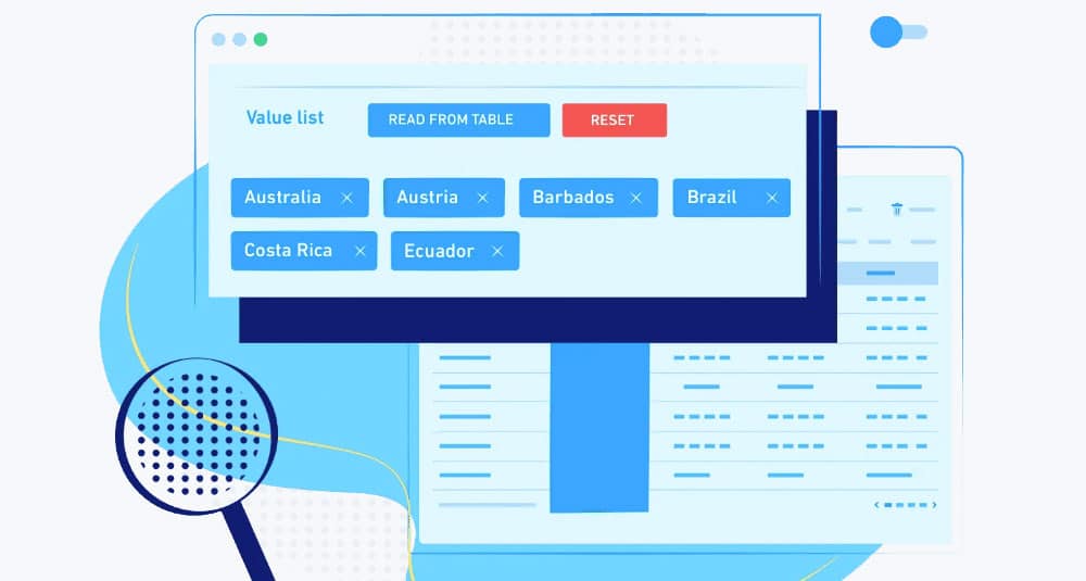
And for those who love working with data visualization, wpDataTables supports the powerful ApexCharts library. You don’t need to know a single line of code to add ApexCharts to your website. Just use the intuitive wpDataTables interface to create and customize your charts.
Creating and Customizing Charts
Basic Chart Creation
Crafting charts is akin to painting, where the brushstrokes are numbers and categories, and the canvas is a screen glowing with potential.
It’s a dance between data and design, a tango that demands both precision and creativity.
Defining Data Series
Dive into the heart of your story with the data series. It’s here that raw numbers transform into the harmonious threads of a visual narrative.
At its core, a data series is the backbone of any chart, laying down the sequence that guides your eyes and mind:
series: [{
  name: 'Revenue',
  data: [45000, 47000, 42000, 50000, 55000, 61000, 73000]
}]
The sequence unfolds like notes in a melody, inviting the viewer to interpret the rhythm and rise of the numbers as they march along their plotted path.
Setting Chart Options
The options lie in wait, silent yet powerful, much like ingredients waiting for the chef’s touch. Choices abound, as customization opens the floodgates to shape and personalize:
var options = {
  chart: {
    type: 'bar'
  },
  xaxis: {
    categories: ['Jan', 'Feb', 'Mar', 'Apr', 'May', 'Jun', 'Jul']
  }
};
With a flick of a proverbial wrist, categories become targets for your bar graphs, and the flavor of your data tale begins to emerge.
Advanced Customizations
Once the basics whisper their song, turn up the volume with bold customization.
This is where charts go from informative to unforgettable, with flair that would make even the D3.js aficionados take a second glance.
Styling and Themes
Do colors sing in your work, or do they whisper subtly in structured harmony?
With styles and themes, paint the canvas of your visualization with hues that speak to your brand’s soul or the viewer’s emotions:
- Light and Dark themes: Switch between moods as easily as a poet changes stanzas.
- Custom palette: Infuse every chart with your signature, making series colors reflect intentions beyond mere aesthetics.
Responsive Design Considerations
In a fluid world, flexibility is key. Responsive design ensures that wherever your data may be viewed, it resizes like magic, making the display as seamless on a desktop monitor as it is on a mobile screen.
Consider it the art of being everything, everywhere, all at once—when pixels gracefully adapt without compromise.
Interactivity Features
Interactivity is where charts wink at you, acknowledging your curiosity with a nod and a smile.
- Zooming and Panning: Let viewers plunge into the granularity of their interest, zooming into the heart of data or panning across vast collections with a deft swipe or click.
- Dynamic Data Updates: Make the static move, as real-time updates inject vitality. The breath of life in a chart, responding dynamically to data streams like a dance floor alive with the energy of a thousand feet.
Integrating with Frameworks
Marrying the power of JavaScript with the elegance of frameworks builds bridges to vast seas of possibilities.
Charting libraries don’t stand alone—they have allies in frameworks like React, Vue.js, Angular, and Stencil, each a lighthouses guiding the flow of data to shore.
React
A match made in the dynamic skies—React and visualization.
The component-based architecture cradles chart components seamlessly, as updates flow, making interfacing a light dance between states and rendering.
Vue.js
When simplicity meets sophistication, Vue.js charts come alive.
The ease of integration feels like a second skin, adhering smoothly to the contours of reactive data-driven applications, as if whispering a gentle promise of harmony to front-end developers.
Angular
Angular’s structured approach to data binding and component modularity finds its reflection in charts that respond optimally to changes, converting layers of logic into visual poetry without missing a beat.
Working with Data
Data Formats and Sources
Chart created with wpDataTables
The world of data is a boundless sea. It ebbs and flows, waving tales in every kilobyte.
Yet the key to unlocking these secrets lies in understanding formats, those magical containers that carry the whispers of insights yet to bloom.
JSON Data Integration
JSON, the lingua franca of web data, speaks in curly braces and colons. It’s a structured dialogue, exchanging information fluidly between server and client. With ApexCharts at your command, you unfold JSON onto the canvas, calling forth data points that arrange and display with clarity bordering on magic.
The structure feels familiar, like arranging flowers in a vase, making JSON the friendly messenger of structured data.
var chartData = {
  categories: ['Sun', 'Mon', 'Tue'],
  series: [350, 420, 500]
};
Such simplicity, yet underpinning it is an entire conversation of data waiting to animate and narrate.
Real-time Data Streaming
Streams are the lifeblood of dynamic applications.
In a world that never pauses, where data flows as smoothly as a river bends and curves, real-time streaming delivers the freshest of stories, whether pulsing stock tickers or live user activities.
Hooking into these streams is an exercise in presence, where past data is no longer your only witness.
Here, every moment refreshes the narrative, guiding ApexCharts to breathe life into static visuals, making them flutter with vibrant actuality.
Data Processing and Manipulation
Before data sleeps in static displays, it dances in chaos—it needs a hand, a gentle nudge, to align and reveal its finer truths.
Aggregating Data
Sometimes, more is indeed more. Aggregation lets you gather multitudes, merging scattered data into one coherent song.
It combines, sums, averages, unveiling the larger picture from the tune of individual notes. The technique is like weaving together loose threads into a tapestry that speaks of patterns unseen by individual strands.
Filtering and Sorting Techniques
In the tangled jungle of information, clarity emerges from distinction—enter filtering and sorting.
Filtering cuts through noise, focusing the view like a camera lens sharpening its subject, dismissing distractions to spotlight the essence.
Sorting, on the other hand, orders the domain, imposing structure on chaos.
Be it ascending acclaim or descending merits, sorting is your wand to arrange data, crafting order as natural as the cadence of a sonnet.
Enhancing User Experience
Animations and Transitions
There’s magic in motion. With every flicker and glide, animations and transitions breathe life into static numbers.
They don’t just change; they unfold. A bar stretching skyward, a pie chart swirling to reveal its segments—all these movements tantalize the senses and guide the eye.
Images dance and graphs transform, adding layers of meaning with a rhythm that captures attention before gently letting it go.
Here, it’s all about the journey as much as the destination.
Accessibility Features
Inclusive design is not an option; it’s a necessity. ApexCharts understands this need and equips each visualization with powerful accessibility features that open the doors wide for every visitor.
ARIA Labels
In the canvas of life, ARIA labels are the whispers that describe the unseen.
As silent narrators, ARIA provides a voice for your charts, ensuring screen readers articulate the intricate patterns and designs unfolding on screen. They translate visuals into an audible symphony, bridging the gap between form and function.
Keyboard Navigation
Let’s not forget those who navigate the world with a keyboard as their guide. Keyboard navigation introduces an elegant dance where each keystroke uncovers new layers, granting access everywhere the mouse may lead.
A seamless crossroad between utility and accessibility, where every inch of interactivity becomes reachable with a tap or a touch.
Exporting and Sharing Charts
Visuals are not mere decorations—they’re storytellers, yet stories need to spread.
Sharing extends the narrative beyond the confines of the browser, opening new vistas for exploration and understanding.
Exporting as Images or PDFs
Transforming interactive charts into static keepsakes—this is where exporting steps in.
Be it images or PDFs, exporting captures the essence of a chart’s journey, preserving it like a snapshot frozen in time. It’s the art of taking an experience and making it a tangible artifact, ready to share, scrutinize, and celebrate.
Embedding Charts in Web Pages
The world of the web is vast, and charts need not remain tethered to their creators. Embedding charts extends their reach, embedding portals to insights wherever eyes may wander.
Each embed, a lighthouse guiding users through the foggy realms of data, illuminating the way with clarity and precision—seamlessly woven into the tapestry of the web, waiting to be discovered and explored.
Performance Optimization
Handling Large Datasets
In the vast ocean of analytics, data ebbs and flows with a volume that’s sky-high. And therein lies the challenge—how to tame these behemoths?
Picture a symphony, where each note must be heard, yet the orchestra is immense. Efficiency is the baton guiding complexity to harmony.
Imagine using ApexCharts to process large data sets. You can do it without knowing lots of code with wpDataTables. It’s about picking the perfect brush to paint a picture on this cosmic canvas.
Techniques such as data aggregation become allies, distilling mountains into molehills without losing the grandeur. Balancing load with precision, ensuring every pixel pulses with purpose.
Lazy Loading Techniques
1. Dynamic Module Loading in Angular
One common approach is to utilize Angular‘s lazy loading feature. This allows you to load the ApexCharts module only when it is needed, rather than including it in the initial bundle. You can achieve this by:
- Creating a separate module for your charts.
- Using Angular’s
loadChildrenproperty in your routing configuration to dynamically load the module when the user navigates to the route that requires the chart.
For example:
const routes: Routes = [
{
path: 'chart',
loadChildren: () => import('./chart/chart.module').then(m => m.ChartModule)
}
];
This way, the ApexCharts library is only loaded when the user accesses the chart route, reducing the initial load time of your application.
2. Using CDN for ApexCharts
Another method to reduce the bundle size is to load ApexCharts from a CDN. This can be particularly useful if you want to avoid bundling the library with your application. You can include the CDN link in your HTML file and access the charts directly in your components:
Then, you can initialize your charts in the component without importing the library, which helps keep your bundle size smaller.
3. Component-based Lazy Loading
You can create a wrapper component that loads the ApexCharts component only when it is needed. For instance, you can use a button to trigger the loading of the chart component:
<button (click)="loadChart()">Load Chart</button>
<div *ngIf="isChartLoaded">
<app-my-chart></app-my-chart>
</div>
In your component’s TypeScript file:
isChartLoaded = false;

loadChart() {
this.isChartLoaded = true;
}
This approach ensures that the chart is only instantiated when the user interacts with the button, minimizing the initial load.
4. Tree Shaking Unused Code
If you are using modern JavaScript bundlers like Webpack, ensure that you are taking advantage of tree shaking. This involves importing only the specific chart types or functions you need from ApexCharts rather than the entire library. For example:
import { Chart } from 'apexcharts';
This can significantly reduce the bundle size by excluding unused parts of the library from the final build.
5. Scroll-based Lazy Loading
For scenarios where charts are not immediately visible, consider implementing scroll-based lazy loading. This means initializing charts only when they come into the viewport. You can use libraries like Intersection Observer to achieve this:
const observer = new IntersectionObserver((entries) => {
entries.forEach(entry => {
if (entry.isIntersecting) {
// Initialize your chart here
const chart = new ApexCharts(document.querySelector("#chart"), options);
chart.render();
observer.unobserve(entry.target);
}
});
});

observer.observe(document.querySelector("#chart"));
This method ensures that charts are only rendered when they are visible to the user, improving performance on pages with multiple charts.
Minimizing Resource Consumption
Our era demands elegance and consciousness, digital footprints as light as air. Resource consumption—whittling down the excess, economizing every byte.
Therein lies the heart of a responsible creator: ensuring the web’s vast expanse remains nimble and swift.
Optimizations ripple through the fibers of backend and frontend development. Images compressed like tightly wound clocks, scripts minified to ethereal lines.
Each action, each line of code, carefully honed to perfection as if carved by a master craftsman from a block of marble.
Troubleshooting and Best Practices
Common Issues and Solutions
Every coder knows the pulse of crisis—blood pounding in the ears, fingers tracing the familiar paths of their keyboard to unravel the arcane mysteries of bugs. Troubleshooting is a rite, a path to enlightenment through debugging labyrinths.
First, the ghost of error messages—they lurk in the darkened console corners, whispering secrets in their cryptic tongue. Listening is key. Decode them as ancient runes; they often point the way, illuminating the path to resolution.
Then comes the specter of incompatibility. JavaScript libraries like Chart.js or ApexCharts fluctuate in their versions, evolving like languages sans Rosetta Stone. Check compatibility, a dance of packages in harmony—a symphony, or a cacophony if left unchecked.
And of course, the errant paths of data formats. JSON speaks clear and structured, but woe betide the extra comma, the mismatched brace. Mind the syntax; treat each symbol as a treasure chest of meaning.
Tips for Effective Data Visualization with ApexCharts
In the kingdom of data visualization, design wears the crown. Here’s the art: to unravel numbers into narratives, giving voice to data’s silent song.
Begin with clarity as your compass. A chart should speak without words—the axes, legends, every annotation playing its part in a seamless tale. Strip away the superfluous—it’s the minimalist’s mantra, beauty in simplicity.
Then, focus the lens on interactivity. Just as life’s rich pageant captivates, so should your charts invite curiosity, allowing users to delve, to explore. Use zooming and panning like a maestro wields a baton, guiding the audience through crescendos and diminuendos of insight.
Also, color carefully—palette as the storyteller’s brush. Respect the power of hues, language without words; colors should sing harmoniously, a verdant landscape, an azure sky. Accessibility should lead the dance—contrast and clarity lighting the stage.
FAQ On ApexCharts
How do I integrate ApexCharts with React?
Integrating ApexCharts with React is straightforward. You use the apexcharts package along with react-apexcharts for easy integration.
Import the components, pass your configurations, and leverage React’s component-based architecture to render dynamic data visualizations, ensuring seamless chart updates and changes in your web applications.
Can I use ApexCharts with Angular?
Absolutely, ApexCharts fits elegantly into the Angular framework. Use the ng-apexcharts package, enabling you to incorporate charts directly into Angular components.
Define your chart options, feed your data, and enjoy the flexibility of data-binding, all while maintaining the clean structure Angular is praised for.
What types of charts can I create with ApexCharts?
ApexCharts offers a versatile array of charts, including bar, line, pie, radar, and time-series.
The emphasis on chart customization allows for unique visual styles and dynamic data presentations, meeting diverse needs across data visualization projects—be it for dashboard development or analytics.
How can ApexCharts be customized?
Customization is one of ApexCharts’ strengths. Modify colors, fonts, legends, tooltips, and animations through straightforward JavaScript configurations.
With chart plugins and responsive design options, you can fine-tune every visual aspect, resulting in tailored data experiences that captivate and inform your audience.
Is ApexCharts suitable for real-time data visualizations?
Yes, ApexCharts excels at handling dynamic data through real-time updates. Its efficient architecture supports high-frequency data streams, making it ideal for use cases like monitoring applications or financial dashboards. The ability to visualize time-series data dynamically is a notable feature.
Can ApexCharts be used in mobile applications?
Designed with responsive design in mind, ApexCharts adapts to various screen sizes, making it suitable for mobile applications.
It provides consistent visuals whether on desktops, tablets, or smartphones, offering developers a reliable option for cross-platform data visualization needs.
How do I install ApexCharts?
To install ApexCharts, use npm or yarn: npm install apexcharts. Depending on your project, you may also install framework-specific packages like react-apexcharts or ng-apexcharts.
This straightforward installation approach ensures your development environment is quickly configured to start creating beautiful charts.
What are the performance considerations for using ApexCharts?
ApexCharts is engineered for performance optimization. However, large datasets can impact rendering times.
To mitigate this, utilize CSV streaming for large volumes and pre-process data when possible. Leverage options like lazy loading to maintain speedy and efficient user experiences.
Where can I find resources or community support?
The GitHub repository is a treasure trove of documentation, alongside user-contributed insights. Engage with a thriving developer community for tips and enhancements.
Forums and the ApexCharts website offer support, where fellow developers share best practices, ensuring you stay informed and effective.
Conclusion
Harnessing the power of ApexCharts, we transform mundane numbers into living, breathing stories on the web. This isn’t just about charts; it’s about intuitive data visualization and empowering decisions. Whether you’re weaving bar charts, crafting intricate line graphs, or diving into the ocean of radar charts, ApexCharts.js equips us with robust tools.
As this article unveiled the library’s potential, remember that customization is at your fingertips. From real-time updates to seamless framework integration with React and Angular, navigating dynamic datasets becomes effortless. ApexCharts champions the art of simplicity in a complex digital canvas, embracing the essence of open-source for both novices and adept developers alike.
When the question of how to communicate your data visually arises, rest assured—ApexCharts is the answer, offering a harmonious blend of aesthetics and functionality. With the knowledge gained here, you’re now poised to craft compelling dashboards, enrich web applications, and elevate user experiences with precision and flair.