There are more JavaScript chart libraries than any team needs, and in a demo they all look roughly the same. The differences surface later, usually on the day your dataset gets big or your framework starts fighting the wrapper.
JavaScript chart libraries exist so you don’t hand-code canvas or SVG from scratch every time. Chart.js, D3.js, Apache ECharts, Highcharts, and Recharts all do that, and all solve different problems underneath.
Pick wrong and it costs you a sprint. The ten below are ranked on real adoption and how safely each one scales.
Table of Contents
JavaScript Chart Libraries
Picking a charting tool used to mean vanilla canvas code and a lost weekend. Not anymore.
The field is crowded and mature. By npm downloads, D3 and Chart.js sit at the top of the deliberate-adoption pile, with Apache ECharts close behind, according to ApexCharts’ 2026 charting report.
| Library | Rendering | License | Best For |
|---|---|---|---|
| Chart.js | Canvas |
MIT (free) | Standard charts, fast setup |
| D3.js | SVG |
ISC (free) | Custom bespoke visuals |
| Apache ECharts | Canvas / WebGL |
Apache 2.0 (free) | Big dashboards, huge datasets |
| Recharts | SVG |
MIT (free) | React apps |
| Highcharts | SVG |
Commercial | Regulated enterprise |
| ApexCharts | SVG |
MIT core | Polished dashboards |
| Plotly.js | WebGL |
MIT (free) | Scientific and 3D |
| FusionCharts | SVG |
Commercial | Chart and map variety |
| Victory | SVG |
MIT (free) | React Native cross-platform |
| Google Charts | SVG |
Free | Legacy and throwaway |
Chart.js – Best for teams shipping standard charts fast
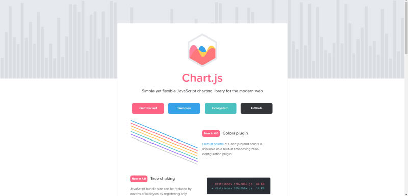
Chart.js is the default pick for production codebases that want reliable charts without a steep learning curve. Canvas-based, MIT-licensed, built for line, bar, pie, and scatter work.
Best for product teams needing standard chart output on a tight performance budget. It also carries the widest plugin ecosystem of any free chart library.
What you get:
- 10 built-in chart types, canvas rendering
- Automatic responsive resize and animation
- Deep plugin support via add-ons for zoom, decimation, and annotations
- Framework wrappers for React, Vue, and Angular
Pricing: Free, open source (MIT), as of 2026.
Where it wins:
- Around 92 kB gzipped core
- Largest community of any web chart tool
- Near-zero config for common charts
Where it falls short:
- Canvas limits fine-grained styling
- Deep customization gets awkward past the basics
In our testing, standard datasets rendered with almost no config. npm currently shows roughly 12 million weekly downloads for chart.js, which matches how often it turned up as the safe default.
It’s also one of the three engines bundled inside wpDataTables, alongside Google Charts and HighCharts. If you’re on WordPress, that means you get Chart.js output from your table data through a wizard instead of writing the init code yourself.
Most guides praise the setup speed and skip the trade-off. Once you need custom hit-testing or non-standard interactions, you end up fighting the canvas. Worth knowing before you commit. There’s a full setup and configuration walkthrough and some practical build examples if you go this route.
D3.js – Best for fully custom, bespoke visualizations
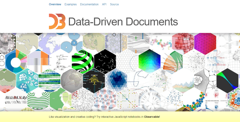
D3.js is a low-level data transformation toolkit, not a plug-and-play chart library. That distinction matters more than anything else about it.
It’s the strongest choice when your design deviates from standard chart types and you need total control over every pixel. Nothing else here comes close on flexibility.
What you get:
- Direct SVG manipulation and data binding
- Force-directed graphs, geographic mapping, custom scales
- Modular imports (d3-scale, d3-shape, and so on)
Pricing: Free, open source (ISC), as of 2026.
Where it wins:
- Roughly 13 to 15 million weekly npm downloads and about 113,000 GitHub stars, the highest star count here
- Powers custom dashboards nothing else can
- Huge example gallery from Mike Bostock and the Observable community
Where it falls short:
- Brutal learning curve
- Weaker TypeScript support than JS
- v7 shipped ESM-only, which breaks older Webpack 4 monorepos
Prototyping a standard bar chart in D3 took far longer than in Chart.js. The payoff only shows up on non-standard work. For anything ordinary, it’s over-engineering.
That ESM-only migration in v7 is a real production trap. Older bundlers throw build errors, and most “best of” pages never mention it. Pin to v6 or upgrade your bundler first.
Apache ECharts – Best for enterprise dashboards and massive datasets
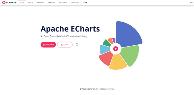
ECharts renders 100k to millions of data points without choking. Canvas-first with optional WebGL, and the top pick for long-running dashboards and real-time analytics at scale.
Best for enterprise monitoring platforms handling dense, high-volume time series data. The standout is built-in LTTB downsampling, which keeps memory stable over long sessions.
What you get:
- Canvas by default, WebGL via echarts-gl
- Exotic types: sankey, treemap, sunburst, calendar heatmap, geo maps
- Tree-shakeable to roughly 100 kB gzipped when you import only what you use
Pricing: Free, open source (Apache 2.0), as of 2026.
Where it wins:
- Comfortable with 100k+ points per chart
- Roughly 3.4 million weekly downloads and 66,800 GitHub stars
- Mobile-friendly with enormous chart variety out of the box
Where it falls short:
- Styling runs through its own theme system, not CSS
- You must call resize methods manually
Baidu originally built it and the Apache Software Foundation now stewards it, with large Chinese tech firms running it in production commerce dashboards. Strapi’s 2026 roundup confirms it holds up rendering 100k to 10M+ points where SVG libraries fall over.
Teams pick it for chart variety, then discover the real win is memory stability on dashboards that stay open for hours. That endurance angle rarely gets covered.
Recharts – Best for React-native projects
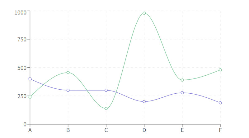
Recharts wraps D3 scales in idiomatic React components. It’s the cleanest match to React’s mental model and the default for teams that live inside JSX.
Best for React developers who want composable chart components rather than imperative setup.
What you get:
- Built on D3 scales plus SVG rendering
- Composable elements (XAxis, Tooltip, Legend as JSX)
- Responsive containers and animation baked in
Pricing: Free, open source (MIT), as of 2026.
Where it wins:
- Around 49 million weekly npm downloads, the highest raw count of any chart package
- Minimal boilerplate
- Strong docs
Where it falls short:
- SVG rendering struggles past a few thousand points
- Less control than raw D3
- That download figure is inflated by Recharts arriving as a transitive dependency inside many React UI kits, so it overstates deliberate adoption relative to Chart.js
Dropping charts into an existing React tree felt native. No wrapper wrestling. It reads like normal component code, which is the whole point.
It’s the go-to across the broader React charting ecosystem, but the SVG ceiling on large datasets is real. For dense data inside React, wrap Chart.js or ECharts instead.
Highcharts – Best for regulated enterprise and finance
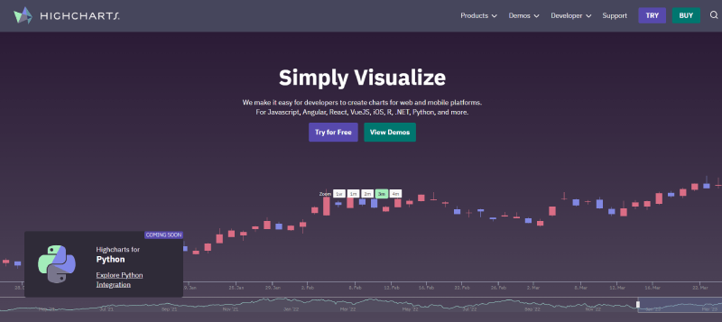
Highcharts is the standard for finance, healthcare, and other regulated teams that need production-grade output and vendor support. Polished, SVG-based, commercial, with accessibility and support maturity free tools don’t match.
Best for enterprise teams building financial charts and graphs under compliance requirements.
What you get:
- 20+ chart types, responsive design, WCAG accessibility
- Stock and financial modules (candlestick, OHLC)
- Framework integration across React, Vue, Angular
Pricing: Free for non-commercial use. Commercial licensing is per developer and varies widely by deployment type. Reseller listings start Highcharts Core around $416 per developer, while contract data from Vendr puts a single-developer internal license nearer $1,500 to $3,000 per year, with most companies landing between $1,000 and $5,000 annually. SaaS and OEM licenses cost more. Get a quote for your specific use case rather than budgeting off a headline figure.
Where it wins:
- Used by 80+ of the world’s 100 largest companies
- Deep docs
- Reliable paid support
Where it falls short:
- Per-developer licensing gets expensive fast
- Annual renewal increases are common
Highsoft, the maker, serves 80+ Fortune 100 firms, which lines up with the polish we saw. The financial chart modules worked out of the box where free libraries needed plugins.
It’s also one of the three engines bundled inside wpDataTables, alongside Chart.js and Google Charts. On WordPress that means Highcharts output built from your table data through a wizard, without writing the configuration by hand.
The sticker price isn’t the trap. The per-seat model on a growing team is, and published “starting from” figures understate what teams actually pay. Budget for headcount and deployment type, not just the first license. There are free options if the licensing worries you, covered in this rundown of Highcharts substitutes, and the complete Highcharts guide has the full details.
ApexCharts – Best for polished dashboards with minimal config
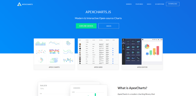
ApexCharts ships good-looking charts with almost no styling work. It’s the fastest path to a clean interactive dashboard when you don’t need SSR or extreme customization.
Best for dashboards that need attractive interactive charts out of the box. The zoom, brush, and annotation interactivity is best-in-class and you don’t write any of it yourself.
What you get:
- 20+ chart types, SVG rendering, modern defaults
- Recent releases added modular imports and better TypeScript typings
- Official React, Vue, and Angular wrappers
Pricing: The core library is free and open source under MIT. Check the current terms on apexcharts.com if you need commercial support or an extended license.
Where it wins:
- Polished visuals with near-zero config
- Around 15,000 GitHub stars
- Excellent built-in interactivity and a clean API
Where it falls short:
- SSR is problematic. It touches window on import, so Next.js needs dynamic imports
- Treemap and heatmap have quirks
The zoom and brush controls worked without a single line of extra code. That interactivity is why it keeps showing up on shortlists.
Everyone praises the defaults. Few warn that the window-on-import issue will break your first Next.js build. Wrap it in a dynamic import and move on. The ApexCharts setup guide covers the details.
Plotly.js – Best for scientific and statistical work
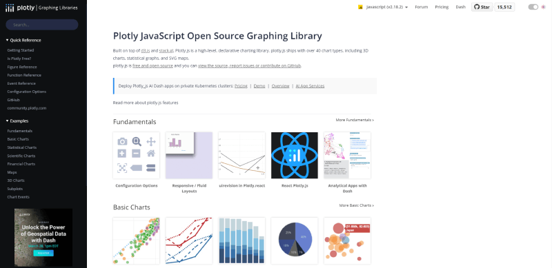
Plotly.js is the pick when your charts are statistical rather than decorative. MIT-licensed, WebGL-accelerated, with native 3D that most libraries lack entirely.
Best for data science teams needing 3D visualization and statistical chart types.
What you get:
- WebGL rendering for dense scatter plots
- 3D surfaces, contour, box plots, statistical charts
- Python and R bindings for backend workflows
Pricing: Free, open source (MIT), as of 2026.
Where it wins:
- Strong for analytical dashboards
- Huge chart variety
- Ties cleanly into Python data pipelines
Where it falls short:
- Heavier bundle than Chart.js
- Overkill for simple bar or pie chart needs
The 3D and statistical types worked without add-ons, which saved real time on analytical work. For a basic column chart, though, it’s far more library than you need.
Most roundups file it under “general purpose.” It isn’t. Its real edge is scientific and statistical output, and forcing it onto simple dashboards just bloats your bundle.
FusionCharts – Best for maximum chart and map variety
FusionCharts has the widest catalog on this list: 100+ chart types and 2,000+ maps. It suits enterprise teams that need every visualization type imaginable in one paid package.
Best for large organizations wanting one commercial tool covering every chart and map need.
What you get:
- 100+ chart types, 2,000+ geographic maps
- Responsive design across desktop, tablet, mobile
- Framework integrations and rich documentation
Pricing: Commercial license (paid). Free trial available with a watermark, as of 2026.
Where it wins:
- Largest chart and map catalog
- Strong support and docs
- Highly customizable visuals
Where it falls short:
- Full build runs around 680 kB, the heaviest here
- Paid license for commercial use
The map coverage was the clear differentiator. For niche chart types we didn’t need a single plugin. The bundle weight, though, is hard to ignore on a lean project.
It’s easy to dismiss as expensive and heavy. The honest angle: if map variety is a hard requirement, it saves weeks versus stitching together free tools. That’s a real trade, not marketing.
Victory – Best for React Native cross-platform charts
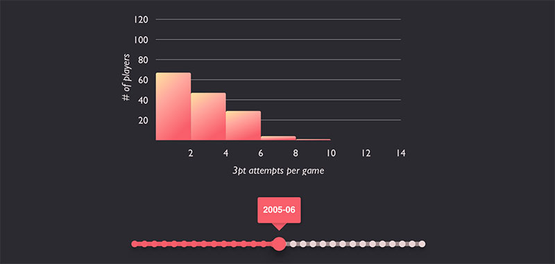
Victory runs the same chart code on both web and React Native. That portability is rare, and it’s the entire reason to pick it.
Best for teams shipping charts to both React web and React Native from one codebase.
What you get:
- Composable, modular React components
- Shared API across React and React Native
- Custom theming and animation
Pricing: Free, open source (MIT), as of 2026.
Where it wins:
- One chart API for web and mobile
- Clean composition model
- Solid defaults
Where it falls short:
- Smaller community than Recharts
- Fewer chart types than the enterprise tools
- Development pace is steadier than fast-moving
Reusing chart components between a web build and a React Native app worked with minimal changes.
Web-only roundups skip it because they miss the point. Its value is cross-platform. If you’re not touching React Native, pick Recharts instead.
Google Charts – Best for legacy and quick throwaway charts
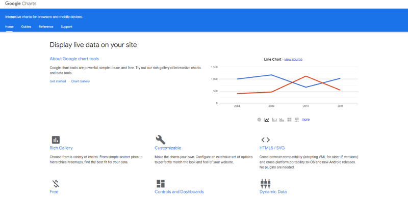
Google Charts works for quick internal or legacy pages, and its effectively frozen development makes it a weak bet for anything new. Free, hosted, minimal code.
Best for fast, disposable charts on internal tools where longevity doesn’t matter.
What you get:
- Standard chart types via a hosted script
- Simple JSON-style configuration
- Free with no licensing
Pricing: Free, as of 2026.
Where it wins:
- Trivial to drop in
- No build step
- Familiar Google ecosystem
Where it falls short:
- Effectively in maintenance mode, with little meaningful feature development for years
- Not recommended for new production projects
It rendered basic charts instantly, exactly as expected. DataBrain’s 2026 guide flags the same red line we hit: the lack of active development makes it a liability for anything long-lived.
It’s one of the three engines bundled inside wpDataTables, alongside Chart.js and HighCharts, so WordPress users can build Google Charts output from table data through a wizard. If you’re starting something new, the Chart.js or HighCharts engines in the same plugin are the safer default.
It still appears on outdated “best of” pages, so it earns a spot here mainly as a warning. Use it for a throwaway page, not a product. The Google Charts guide covers what it can and can’t do.
Different projects, different winners. If you’re still weighing the chart types themselves before the library, sort that first. And if your real goal is building interactive charts without touching much code, a no-code option may beat all ten.
What is a JavaScript chart library and how do rendering engines differ
Strip out the specifics and it’s a prebuilt tool that turns raw data into interactive charts, so you don’t write low-level canvas or SVG by hand.
Every option above does that same core job. The split that matters is the rendering engine underneath, and that single choice decides your performance ceiling, styling control, and mobile behavior.
| Engine | Point Capacity | Strength |
|---|---|---|
| SVG | ~1,000–5,000 | Per-element styling, CSS control |
| Canvas | 100,000+ | Dense data, low memory |
| WebGL | Millions+ | 3D, extreme point counts |
Canvas vs SVG vs WebGL rendering
SVG stores every point as a DOM node, so you get native CSS styling and easy event handling. It slows down as elements pile up, though. Published benchmarks put its practical ceiling around 5,000 points before the DOM starts to choke.
Canvas paints pixels to a bitmap instead. OpenReplay testing shows it renders 10,000 points in under 100ms, where SVG can take several seconds.
WebGL pushes rendering onto the GPU for 3D and million-point scatter work, which is why Plotly.js leans on it for heavy analytical charts.
How do you choose the right JavaScript chart library
It comes down to how much data, which framework, how custom, and what license. Standard line, bar, and pie work is well served by Chart.js, Recharts, or Apache ECharts. Reaching for D3.js on a plain bar chart is over-engineering.
Chart type steers the pick too, since some libraries specialize:
- Financial and stock work: Highcharts and ECharts ship candlestick and OHLC modules built in, which matters for candlestick chart rendering without add-ons
- Geographic and network data: ECharts covers sankey, treemap, and geo maps natively
- Dense scatter plots: canvas-based tools handle the point density that would freeze an SVG build, a real concern when plotting large scatter plot datasets
Prototype with your actual data before committing. A library that looks fine in a demo can fall apart on production volume.
For a wider view of the field, this roundup of data visualization libraries in JavaScript maps the trade-offs side by side.
Which libraries handle large datasets and real-time data best
This is where the rankings actually diverge. Most libraries do fine at 500 points and fall over at 500,000.
Apache ECharts and Chart.js lead here, both canvas-based. Large-scale production deployments at major tech firms are a fair stress test.
Performance thresholds by point count
The break points are well documented.
- Under 5,000 points: SVG is fine (Highcharts, ApexCharts, Recharts)
- 5,000 to 100,000: switch to canvas (Chart.js, ECharts)
- 1M+: WebGL or upstream aggregation
ECharts uses LTTB downsampling to stay responsive above 100k points, per Strapi’s 2026 comparison.
Chart.js hits similar scale with the chartjs-plugin-decimation add-on. Good options exist for rendering very large data sets without a browser freeze.
Real-time and streaming data updates
Canvas beats SVG for frequent redraws. Every SVG update touches the DOM, which gets expensive fast on a live feed.
LogRocket’s 2026 review names ECharts and react-chartjs-2 as the strongest picks for real-time data, both better suited to constant updates than SVG-only tools.
For dashboards refreshing every second, canvas keeps a stable frame rate where SVG stutters. That gap defines most real-time data visualization builds.
How JavaScript chart libraries integrate with React, Vue, and Angular
Framework fit is the practical blocker. The best library on paper is useless if it fights your stack.
React dominates that stack. State of JavaScript 2025 puts React at 83.6% usage, and on npm it pulls tens of millions of weekly downloads against low single-digit millions for Vue and Angular.
| Framework | Native Pick | Wrapper Option |
|---|---|---|
| React | Recharts | react-chartjs-2 |
| Vue | vue-echarts | vue-chartjs |
| Angular | ng2-charts | ngx-echarts |
Recharts is the React-native default, with around 49 million weekly downloads, the highest raw count of any chart package.
Watch the SSR trap. ApexCharts touches window on import, so Next.js (used by 59% of developers in the 2025 survey) needs dynamic imports or the build breaks.
Victory covers teams sharing code across React and React Native. Wrappers make migration feasible across the wider React charting ecosystem.
What do JavaScript chart libraries cost and how does licensing work
The split is clean. Most are free, a few are commercial, and the license terms aren’t uniform.
Chart.js, D3.js, Apache ECharts, Recharts, and Plotly.js are unconditionally free under MIT, ISC, or Apache 2.0. Check the terms anyway, because “free” has conditions on some tools.
| Library | License | Cost |
|---|---|---|
| Chart.js / D3 / ECharts | MIT / ISC / Apache 2.0 | Free |
| Highcharts | Commercial | Quote-based from ~$416/dev |
| FusionCharts | Commercial | Paid trial watermark |
| ApexCharts | MIT core | Free |
Highcharts is free for non-commercial use. Commercial pricing is per developer and quote-driven: reseller listings start around $416 per developer for Highcharts Core, while real contract data puts single-developer internal licenses closer to $1,500 to $3,000 per year and most companies between $1,000 and $5,000 annually. SaaS and OEM deployments cost more again.
Highsoft, the maker, serves 80+ of the world’s 100 largest companies, so the per-seat model scales with headcount, not usage.
Two other license quirks worth catching before you build:
- amCharts 5 is free only with an attribution link
- FusionCharts stays paid for commercial use, and its full build runs around 680 kB, the heaviest on the list
Budget for team size on the commercial tools. A five-developer license costs five times a single seat, which changes the math against a free MIT alternative fast.
FAQ on JavaScript Chart Libraries
What is a JavaScript chart library?
It is a prebuilt tool that renders interactive charts from your data. Instead of hand-coding canvas or SVG, you pass a dataset and config, and the library draws the line, bar, or pie chart.
Which JavaScript chart library is the best?
There is no single winner. Chart.js suits standard charts, ECharts handles large datasets, D3.js gives full custom control, and Recharts fits React. The right pick depends on your data volume, framework, and budget.
Is Chart.js free to use?
Yes. Chart.js is fully open source under the MIT license, free for commercial and personal projects. It pulls around 12 million weekly npm downloads, making it one of the most-used free options available in 2026.
What is the best chart library for React?
Recharts is the React-native default, built on D3 scales with a clean component model. It leads React charting at roughly 49 million weekly downloads. For canvas performance, react-chartjs-2 wraps Chart.js well.
Canvas or SVG: which rendering is better?
Depends on data size. SVG gives per-element styling but slows past 5,000 points. Canvas paints pixels, handling 100,000+ points smoothly. Below 1,000 points, the performance difference is negligible either way.
Which library handles large datasets best?
Apache ECharts leads. Its canvas rendering plus LTTB downsampling stays stable above 100,000 points, and it runs in production at major tech firms. Chart.js with the decimation plugin is the next-best option.
Which chart library is best for financial charts?
Highcharts ships candlestick and OHLC modules built in, which is why finance teams favor it. Apache ECharts is a strong free alternative for stock and time series visualization without the per-developer license cost.
Do I need to pay for a chart library?
Usually no. Chart.js, D3.js, ECharts, Recharts, and Plotly.js are free. Highcharts and FusionCharts charge for commercial use, with Highcharts quoted per developer and typically running well into four figures annually for a commercial deployment.
What is D3.js used for?
D3.js is a low-level data transformation toolkit for fully custom, bespoke visualizations. It manipulates SVG directly and offers unlimited flexibility. The trade-off is a steep learning curve, so it is overkill for standard charts.
Can chart libraries work with real-time data?
Yes. Canvas-based libraries like ECharts and Chart.js handle frequent updates best, since SVG redraws get expensive on live feeds. They keep a stable frame rate for dashboards refreshing every second.
Conclusion
No single tool wins the JavaScript chart libraries race. The right choice tracks your data, your framework, and your budget.
Need standard graphs fast? Chart.js. Building custom, bespoke visuals? D3.js.
For enterprise dashboards pushing huge datasets, Apache ECharts holds up where others stall. React teams lean on Recharts, and regulated finance work still favors Highcharts.
The rendering engine drives most of it. Canvas wins on dense data and real-time updates, SVG on styling control, WebGL on 3D and million-point scatter plots.
Match the library to the job, not to a popularity ranking.
Prototype with your own data before you commit. A tool that shines in a demo can buckle on production volume.
Pick deliberately, and your charts stay fast, readable, and worth building.