Bar charts are essential tools in data visualization that transform raw data into an easily digestible visual format. Whether you’re working with business intelligence tools like Tableau or Power BI, or simple Excel charts, bar charts allow for clear comparative analysis and effective performance tracking.
These visual tools provide a snapshot of data trends, making them invaluable in business analytics and reporting tools.
As we delve into this article, you’ll gain insights into different types of bar charts, from horizontal to stacked formats, how they can be used for interactive charts, and best practices for visual representation of data.
By the end, you’ll be equipped with the knowledge to leverage bar charts effectively, utilizing elements like axis labels, data labels, and color coding to convey information succinctly.
We’ll also explore chart customization and charting tools that’ll enhance your data presentation efforts. Whether it’s integrating into dashboard visualization or crafting compelling corporate presentations, bar charts are an indispensable part of your data analysis toolkit.
Table of contents
- Bar Chart Example
- When To Use A Bar Chart
- How To Read A Bar Chart
- Types Of Bar Charts
- How To Make A Bar Chart In WordPress
- How To Make A Bar Chart In Excel
- How To Make A Bar Chart In Google Sheets
Table of Contents
What Is A Bar Chart?
A bar chart is a graphical representation of data where individual bars represent different categories or groups. The length or height of each bar is proportional to the value or frequency of the category it represents.
Bar Chart Example
Chart created with wpDataTables
When To Use A Bar Chart
Simplicity’s the key here. When you have categorical data, like your favorite coffee shop’s best-selling drinks or the monthly traffic on your blog, it’s bar chart o’clock.
Pinpoint the scenario where you need to compare these distinct categories or show some trends over time and bam, bar charts are your go-to.
It clicks when you’re presenting data and clarity’s the goal. Think about the audience too.
If they need quick, clean insights without the frills, bar charts deliver. It’s all about taking those figures and making them stick with minimal fuss.
How To Read A Bar Chart
- Identify the categories on the x-axis.
- Look at the y-axis for the scale or values.
- Observe the length or height of each bar.
- Compare the bars to understand the differences in values or frequencies between categories.
Types Of Bar Charts
Vertical Bar Chart
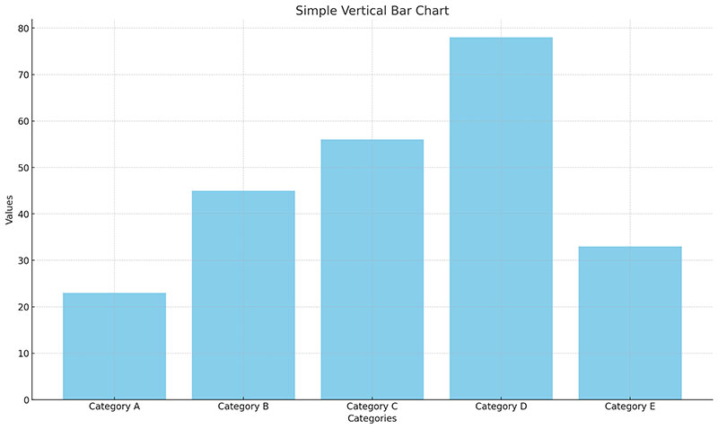
Traditional format with bars extending vertically from the x-axis. Good for comparing frequency or amount across categories.
Horizontal Bar Chart
Chart created with wpDataTables
Bars extend horizontally from the y-axis. Useful when category names are lengthy or there are many categories.
Stacked Bar Chart
Chart created with wpDataTables
Shows the total amount for each category and subdivides each bar to display the contribution of individual components to the whole.
Grouped Bar Chart (Clustered Bar Chart)
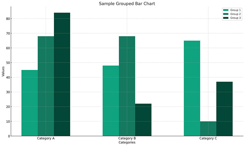
Places bars for different categories next to each other for easy comparison. Useful for comparing multiple sub-categories within each main category.
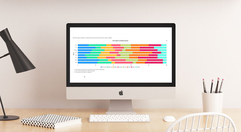
100% Stacked Bar Chart
Chart created with wpDataTables
Similar to the stacked bar chart but scaled so that each bar represents a percentage (100%), making it easier to compare the proportion of sub-categories within each main category.
Range Bar Chart
Chart created with wpDataTables
Displays variation within the data, showing the start and end point of each bar.
Waterfall Bar Chart
Chart created with wpDataTables
A waterfall chart is useful for understanding the cumulative effect of sequentially introduced positive or negative values.
How To Make A Bar Chart In WordPress
Creating a bar chart in WordPress is easier when doing it with wpDataTables. How easy is it, though? Check out these quick steps:
- Open Chart Creation Wizard: Go to wpDataTables -> Create a Chart in your WordPress admin panel.
- Define Chart Name and Type: Choose a chart name for identification and select a render engine (e.g., Google Charts, Highcharts, Chart.js, ApexCharts). Then, pick a chart type from the list provided by the chosen engine.
- Select Data Source: Choose a wpDataTable as the data source for your chart.
- Set Data Range: Define the columns and rows from the table to be used in the chart. You can select specific columns and rows or ranges.
- Formatting and Preview: Customize the chart’s appearance (size, color, axis options, etc.) and preview it in real-time.
- Finalize and Save: Once satisfied, save the chart. A shortcode will be generated for embedding the chart in posts or pages.
How To Make A Bar Chart In Excel
First things first, pick the data you wanna show off in your chart. Head over to the Insert tab, find the Charts group, and click on your chosen bar chart type.
If you’re rolling with just one column of numbers, your bar graph will show a single data series. Got more columns? Expect a color-coded party with each series in a different shade.
Now, Excel’s got a bunch of bar chart types. Clustered bar charts are great for comparing values across categories. Stacked bar charts? They’re all about showing how individual items stack up to the whole. And if you’re into percentages, 100% stacked bar charts have got your back.
Feeling artsy? Play around with the chart’s layout and style on the Design tab. Quick Layout and Chart Styles are your go-to buttons for this.
But wait, there’s more! Excel lets you tweak the bar width and spacing. Right-click a bar, hit Format Data Series, and adjust the Gap Width slider. Want your bars to overlap or have some space between them? The Series Overlap slider’s there for you.
Got negative values? No sweat. Excel handles them like a champ. You might want to move the vertical axis labels to the left and play with different colors for negative bars to make them pop.
And if your data’s looking a bit topsy-turvy, simply reverse the order of data categories or sort your bar graph without messing with your data.
How To Make A Bar Chart In Google Sheets
Creating a bar graph in Google Sheets? Piece of cake! Here’s the lowdown:
- Select Your Data: Grab the cells with the info you wanna show off.
- Hit the Chart Icon: It’s chilling in the Google Sheets toolbar.
- Customize Your Chart: Dive into the chart editor to make it your own.
Now, let’s jazz it up a bit. Want to label your bars? Click the three dots on your graph and hit “Edit chart.” You can add labels for clarity. And if you’re feeling fancy, customize those labels – change the font, size, color, you name it.
But wait, there’s more! Google Sheets lets you tweak your bar graph to the max. Play around with the chart style, axis titles, and series colors. You can even adjust the axis labels and gridlines.
Got a bunch of data? Stack it up with a stacked bar chart. Just choose your dataset, including headers, and select ‘Stacked Bar Chart’ in the chart editor. Want to show percentages? Go for a 100% stacked bar chart.
FAQ About Bar Charts
Why use bar charts?
Bar charts provide an intuitive way to compare data sets in a clear, concise manner. They are ideal for performance tracking, statistical analysis, and business analytics. These charts make it easier to identify variations between different categories quickly, aiding better decision-making.
How to create a bar chart?
To create a bar chart, start by selecting your data. Use charting tools like Excel, Google Sheets, or Power BI. Ensure you label your axes and choose the appropriate color coding for clarity. Customize with data labels and chart legends for a more descriptive presentation.
What are different types of bar charts?
Bar charts come in various forms: horizontal, vertical, and stacked are the most common. Each type has unique advantages depending on the context. Horizontal bars are useful for long category names, while stacked bars show sub-category totals within a single bar.
Can a Bar Chart Show Continuous Data?
Eh, it’s not their prime gig. Bar charts are champs with categorical stuff – think “types of fruit” or “different brands.”
If you’re wrangling continuous data, like, say, heights or weights, you’d be better off with a histogram. It’s similar but built precisely for that kind of data.
What Should Be Considered When Creating a Bar Chart?
You’ll want to tune into things like the axis labels, bar colors, and spacing. Keep it clean and focused. Oh, and make sure your scale interval makes sense so your message doesn’t get lost in translation.
How Do I Choose the Right Software for Bar Charts?
No sweat here – it’s about what you need. Need something user-friendly? wpDataTables, Excel and Google Sheets are your buddies. Looking for more horsepower? Go for Tableau or Power BI. Fancy jazzing up your design? Adobe Illustrator‘s got your back. Just align your choice with your mission.
Are Bar Charts Effective for Large Data Sets?
They can be, but only if you’re not cramming a ton of bars into one congested space. It’s all about the clarity.
Big data? Consider breaking it down into smaller chunks or pivoting to another chart type. Keep it clean, or your story gets muddy quick.
How to customize a bar chart?
Customization involves adjusting axis labels, chart titles, color palettes, and bar lengths. Most chart software like Tableau or Excel offers extensive customization options. Adding data labels and chart legends can further enhance your data visualization efforts.
What is the difference between a bar and a histogram?
While both use bars to represent data, bar charts compare different categories, and histograms display the frequency distribution of a dataset. Histograms are ideal for statistical representation, while bar charts are better suited for comparative analysis across different variables.
What software can create bar charts?
Several data visualization software tools can create bar charts, including Excel, Google Sheets, Tableau, and Power BI. These tools offer various features for data presentation, including interactive charts and dashboard visualization. They’re crucial for transforming data into actionable insights.
How to interpret a bar chart?
Interpreting a bar chart involves analyzing the length of the bars and their arrangement against the X-axis and Y-axis. This helps identify data points, data trends, and comparative analysis of different categories, making it easier to draw meaningful conclusions from the visualized data.
What are common mistakes in bar charts?
Common mistakes include not labeling axis labels properly, using inappropriate color coding, and overcrowding the chart with too much data. These errors can hinder data interpretation and make the chart difficult to read. Always ensure clarity and simplicity for better data visualization.
Conclusion
Bar charts are indispensable tools for visualizing data. They offer clear and concise comparative analysis across different categories, making them essential for business intelligence tools like wpDataTables, Tableau and Power BI. By interpreting data trends and performance metrics through these charts, one can easily derive actionable insights.
Using bar charts, whether in Excel, Google Sheets, or dedicated data visualization software, enhances your data presentation. Customize your charts with meaningful axis labels, color coding, and data labels to improve clarity and effectiveness.
When designed correctly, utilizing chart software tailored to your needs, bar charts elevate data analysis to a new level. They are critical for presenting information in corporate presentations, interactive charts, and dashboard visualizations.
Key Takeaways:
- Master the functionality and customization of bar charts.
- Use them to clarify complex data with horizontal, vertical, or stacked bars.
- Implement best practices to avoid common pitfalls and ensure your data visualization is efficient and insightful.
If you liked this article about bar charts, you should check out this article about pie charts.
There are also similar articles discussing candlestick charts, line charts, bubble charts, and waterfall charts.
And let’s not forget about articles on stacked bar charts, area charts, column charts, and donut charts.


