Ever stumbled upon a graph so interactive it felt like a chat with data itself? Bingo. That’s where the magic of interactive charts comes alive—turning static numbers into engaging stories. Imagine slicing through layers of insights with a mere mouse-hover or tap, unveiling trends and patterns as you navigate.
Here, we’re plunging into the dynamic world where data visualization software transforms into a playground for the curious minds. We’ll sail through the nitty-gritty of crafting dynamic graphing tools that not only illustrate data points but invite conversation.
By article’s end, you’ll be armed with an arsenal of examples—each exemplifying the finesse of user-driven data exploration. We’ll check out responsive chart designs that leave viewers awestruck.
Structured to impress, this piece spans the broad spectrum from JavaScript charting tutorials to JavaScript Events, critical in animating data tales. Strap in; we’re about to sketch life into numbers.
Table of Contents
Impressive Interactive Chart Examples
Here are some outstanding interactive charts you can explore:
2018 FIFA World Cup Ratings
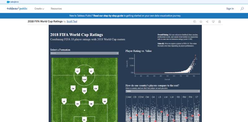
Directed toward soccer fans, this Tableau merges FIFA 18-player ratings with 2018 World Cup rosters. You will find a representation of player positions on the field and a scatter plot representative of their rating and value.
There is also a heatmap to compare the players in each country to the rest. This type of map is common in sports analytics. This visualization set by Scott Teal shows how to portray complex data in an understandable format.
Four Ways to Slice Obama’s 2013 Budget Proposal
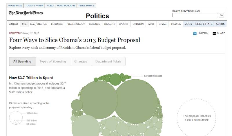
In this example, a responsive bubble chart by Shan Carter with The New York Times represents Obama’s 2013 Budget Proposal.
It has hovering-responsive tooltips, tags, and colors to indicate changes in fund allocation. The bubble size varies with the amount of proposed expenses. Thus, the largest value will correspond to the biggest bubble.
How State Populations Have Shifted
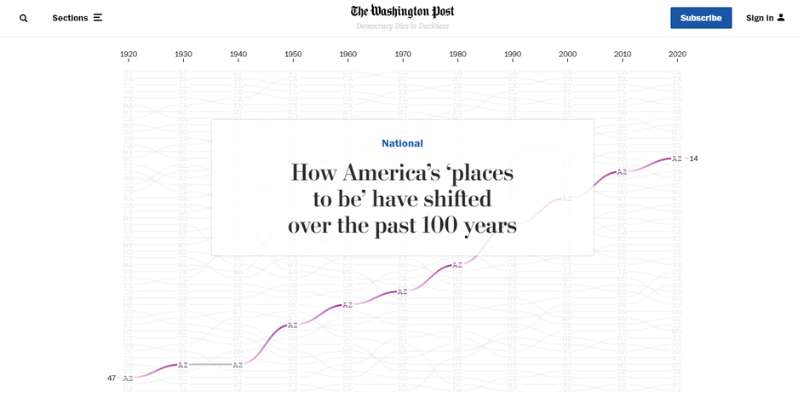
This article by The Washington Post focuses on the evolution of US state populations in the last one hundred years. It has animations activated upon scrolling and timely notes explaining the changes depicted.
The map highlights each state’s position in 1920 and highlights its growth or decline through colored lines. This way, you can isolate and understand their trajectory.
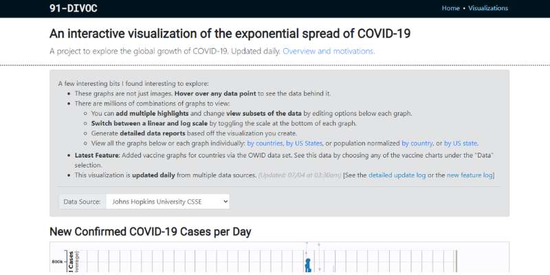
Interactive Visualization Of The Exponential Spread Of COVID-19

Here, you will find four interactive charts that depict the global spread of COVID-19. The project emphasizes reliable data. Its sources are the Johns Hopkins University, Oxford University, or The Atlantic (COVID Tracking Project).
You can pick between a log or linear scale, filter data by country or US state, and create detailed reports. The maps are also responsive. You can hover over any point to discover more information, add extra highlights, or include additional data.
The graphics are downloadable, and users can animate them to see the development of its data appear naturally. This way, users can understand the evolution of COVID-19’s spread despite the large number of figures and records available.
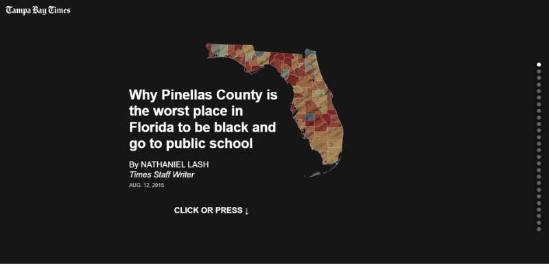
Pinellas County’s Public School Inequalities For Black Students

Here is a powerful presentation by Tampa Bay Times staff writer Nathaniel Lash. It explores the effects of segregation in Pinellas County’s public schools. As such, the charts emphasize student and school results in several states and other Florida counties.
As a user, you can understand the impact of each graphic and its information. The straightforward descriptions pass on a clear and precise message.
The animations and transitions trigger upon clicking or scrolling. They might reveal the following chart or extra details. This feature is practical for viewing on mobile devices. Besides, it is already familiar to most users because of its applications in social media.
Supporting scrolling is an excellent form of ensuring readers stay engaged for longer. They also capture information better, as the charts and data become their principal focus.
The Sustainability Advantage
This example is an interactive report by Workflow. It centers on how Environmental, Social, and Corporate Governance (ESG) links with business strategy. You will discover insightful charts that portray supporting data and track crucial metrics.
It highlights the advantages of companies adopting environmental best practices. Then, it also points out the disadvantages of not doing so. The presentation divides into three sections to approach trust, leadership, and measurement.
It has many scroll-triggered transitions and animations, including fading and parallax effects. Despite having more text than other visualizations, this example features backing testimonials. It also provides context for users to understand the current situation and trends.
The Tobacco Atlas
The Tobacco Atlas helps raise awareness of the danger of tobacco usage and addiction. Despite the decline in consumption, this problem continues to impact millions worldwide. The visualization is impactful.
It employs charts, illustrations, and effects to highlight the data and conclusions. Developing along a vertical layout, users must click on specific points to access more information.
There are many opportunities for user interaction, with a horizontal slide gallery and an interactive world map. This is one of those interactive websites that knows what it’s doing.
The Largest Vocabulary in Hip Hop
In this visualization, The Pudding presents rappers ranked by the number of unique words used in their lyrics. The first graph is responsive and gathers artists along a single line to define the variety of their vocabulary.
The following chart divides rappers by two variables: their era and a specific unique word interval. And the last one compares the lyrical diversity of rap with other music genres. This way, the presentation provides valuable information and context.
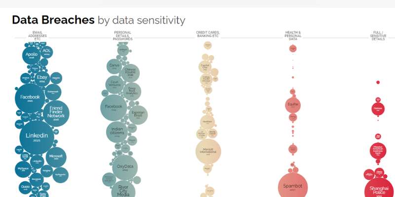
World’s Biggest Data Breaches and Hacks
Information is Beautiful is a data visualization reference. This example shows how picking the proper chart helps structure and emphasize relevant facts. This bubble chart highlights the most significant data breaches and hacks that happened all over the world since 2004.
The size of the bubbles varies according to the impact of the attack. Besides, all bubbles are hovering responsive. They link to external pages that provide further details about each situation.
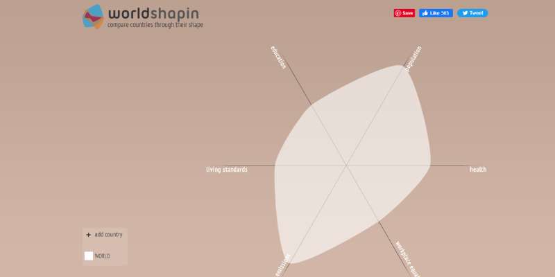
Worldshapin

Worldshapin is an informative chart that relates human development to sustainability. It collects data about the population, education, living standards, CO2 emissions, workplace equality, and health.
Its information comes from the Human Development Report 2011 and relies on the Human Development Index (HDI). Then, it forms a unique shape that depicts the situation of the world and each country.
This method facilitates comparisons and evaluations. If you select a specific country, another chart appears to specify its values on the criteria.
Create Interactive Charts with wpDataTables
Boom! Charts. They’re everywhere. Pie charts. Bar charts. Fancy line graphs with all those squiggly lines.
We love ’em, we hate ’em. But let’s be real here – we need ’em.
Why? Because without charts, all those juicy numbers and data are just, well, numbers. But with charts? Magic happens. Patterns emerge. Complex information transforms into bite-sized, understandable pieces.
You’ve got a website. It’s sleek, it’s shiny. But it’s missing that magic touch – interactive charts. You want your audience to engage. You want them to explore the data. You want to show them you’re not just a pretty face, but a brainy bunch, too.
And you’ve been hunting high and low, scanning the web’s far corners for a tool that can nail this for you.
Enter wpDataTables.
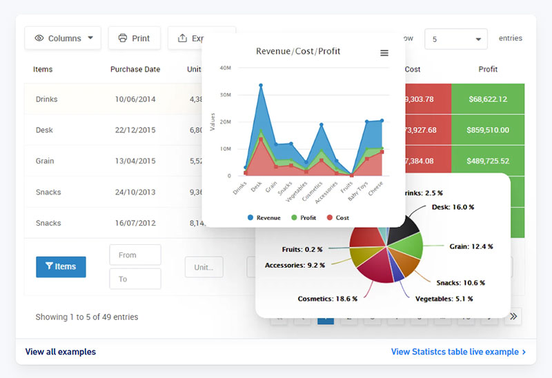
With wpDataTables, you’re not just adding charts. You’re adding interactive charts. Fancy, modern, swipe-left-or-right kinda charts. A chart for every occasion, every type of data, and – the cherry on top – it’s so easy to use.
So why wait? Join the wpDataTables revolution now and take your website from blah to blazing. Give your audience the interactive chart experience they didn’t know they needed.
9 Steps to Build Interactive Visualizations Using wpDataTables
Follow these steps to create your interactive visualizations with wpDataTables:
- The first step is to install wpDataTables and start it on your WordPress website.
- On the plugin, click Create a Chart, write a title for your chart, and select your preferred rendering engine. It can be Google Charts, Highcharts, Chart.js, or ApexCharts.js.
- Choose your desired format from a selection of chart-type options. This selection varies according to your choice of rendering engine.
- Pick a data source. You can use a table you already created or build a new one. In this case, upload data from other sources, like Excel, CSV, JSON files, Google Sheets, or MySQL.
- Select which data will feature in your graph. You can specify the rows and columns you wish to feature in the final visualization. wpDataTables also has filtering and grouping options to facilitate the process.
- After defining the data range for your chart, click Next to move on to Formatting and Preview. In this step, you can see your chart rendered on the right side of your screen. Additionally, whatever changes you make are instantly visible.
- Move from each category to the next to make the needed customizations to your chart. There are numerous tailoring options. With the live preview feature, you can see the final look of your chart and change it according to your needs.
- Once the chart meets your requirements and personalization preferences, you can click Save. Afterward, wpDataTables saves your visualization on your WordPress database. It also emits a shortcode for it.
- All you have to do now is select Copy to copy the shortcode to your clipboard.
Techniques to Improve Interactive Data Visualization
Now that you have a better understanding of interactive graphs, look at the top techniques for creating engaging charts. Use them according to your visualization goals and needs and your audience’s preferences.
Upgrade Your Static Charts
Animated Charts
You can animate your standard pie charts, line charts, or bar charts to improve engagement. Adding animated elements, regardless of the chart type, is essential for a better user experience. Here are two example possibilities:
- Interactive Decision Tree: You have probably worked with flowcharts before. They help break up complex processes into stages. Decision Trees serve the same purpose, adding interactiveness.
You can create Interactive Decision Trees to fit various situations and projects. For example, add one to your website to facilitate visitor navigation. - Sankey Chart: Sankey Charts or diagrams enable you to portray flows between sets of values through arrows. You can create a chart for each variable or have a single map to display all the different options within the main topic.
The lowest values make for thinner arrows, while more significant flows create wider ones. These indicators then direct away or cross paths according to the situation and your chosen format.
Add Tools For Viewers
Data-Points
You can identify a data point in any chart via shapes or objects placed within it. These points respond to mouse movements or clicks by expanding to reveal extra information.
For example, a line chart might include dots to mark its main points. On the contrary, each column might make up for a data point in a column chart. Either way, these markers allow users to dig deeper into the values depicted.
Drill-Down and Hierarchical Navigation
Drill-down is a technique to include different layers of information in a chart. Thus, the user analyzes data values at various levels of complexity, starting at the outline and moving into further detail.
Hierarchical navigation is another way to structure your chart. You can use them for geographic or managerial maps.
Filtering and Selection Options
Filtering and selection are some of the most basic visualization add-ons. With them, users can focus on different types of information according to their search needs. You can incorporate a menu or sidebar checklist to enable a customized image.
Hovering-triggered Tooltips
After creating a data point on your graph, you can make it hovering-responsive. Then, attach an insightful tooltip to provide extra information. These tooltips can comprise detailed descriptions or tags or show precise values.
Animations
Animations triggered by scrolling or any other user action make the user experience more engaging. They can help reveal more data or highlight a line or point in your visualization.
On a different type of animation, animation makers can be used to create a variety of animated content, including explainer videos, product demos, and marketing videos. They can even be used when streaming live videos, just make sure to optimize your Twitch bitrate and adapt your video to the platform you’ll be streming it on.
Zoom and Pan
All visualizations should enable zooming. This way, users can click on the image to enlarge it, which accounts for a better understanding of the data.
They should also get to change their perspective throughout the analysis or pan the visualization. Still, you can only allow panning in axis graphs, like a box plot or a bar chart.
FAQ on Interactive Charts
What are interactive charts exactly?
They’re like your data’s personal storytellers. Interactive charts let you dive into the what and why behind the numbers. By hovering, clicking, or touching, more details are revealed, so trends and insights unfold in real-time, making them a go-to for engaging data presentation.
How do interactive charts enhance user experience?
Think of them as a dialogue with data. They enrich the user journey by transforming passive viewing into an interactive exploration. Sleek and responsive, they respond to users’ actions, providing deeper insights and keeping viewers hooked, leading to better data-driven decision making.
Can you create interactive charts without coding knowledge?
Absolutely! A bevy of tools like Tableau or Google Charts cater to non-coders. They demystify the process with intuitive interfaces, letting you whip up charts that talk back — no coding degree required. Just drag, drop, and witness your data come alive.
What types of data are best for interactive charts?
Think broad. Any data set that’s ripe for user-driven exploration fits the bill. Sales trends, demographics, site analytics — you name it. The more layers and dimensions, the richer the interactive narrative, giving that enticing depth through animated charting features.
Which tools are best for creating interactive charts?
Ah, the heavyweights! Data visualization software like Tableau, Sisense, or Plotly stand out. They flex powerful capabilities, from crafting API for live data charts to intricate animated charting features. And for the coding savvy, libraries like D3.js or Highcharts are gold mines.
Are interactive charts mobile-friendly?
Nowadays, they’d better be. With most digital footprints being mobile, responsive chart designs are non-negotiable. Many platforms ensure their charts play nice with smartphones and tablets, maintaining touch-screen friendly finesse and adjusting sleekly to smaller screens.
How can interactive charts be shared or published?
It’s a breeze. Many platforms offer embed codes, or you can export as images or interactive files. Post on social media, embed in web pages, or slot into presentations. Charts are ready to mingle and amp up your data storytelling game.
What’s the role of JavaScript in interactive charts?
JavaScript’s not just a piece of the puzzle; it’s the linchpin! It’s the engine behind client-side chart rendering, making your charts respond to users in real-time. Wrapped up in libraries like Chart.js or via JavaScript Events mastery, it’s the maestro conducting the interactivity symphony.
How do you ensure interactive charts are accessible to all users?
No exclusions in the chart party! Adhering to accessibility standards like WCAG, ensure your nifty visuals can be deciphered by everyone. Adding textual descriptions, keyboard navigation, and screen-reader compatibility makes your charts not just interactive, but inclusive.
How can interactive charts influence business decisions?
By turning abstract numbers into clear visual narratives, interactive charts serve up real-time analytics display that businesses crave. They’re like x-ray vision for data, revealing pivotal insights that underpin strategic moves, financial planning, and market analysis — ah, the gist for data-driven decision making.
Conclusion
With those clickable, hoverable pieces of art, data’s never looked so dapper.
So, we’ve unboxed secrets behind those dynamic graphing tools and peeked into how they make even the driest data dance. You’ve seen the power of visual analytics tools, tailor-fit for this touch-and-go era where dashboards become responsive chart designs ready for any screen.
- Agile and animated.
- Boldly visual.
- Interactive stories woven straight from raw figures.
That’s the environment you want for your data. It’s where insights spark connections, turning the ordinary into conversations.
Take these insights, tools, and strategies; let them fuel your next creation. Remember, every number has a story, and with interactive charts, you’re the storyteller. Fuse JavaScript charting tutorials with SVG chart animations, and watch the narrative unfold. Your audience awaits.
If you liked this article about interactive charts, you should check out this article about financial charts and graphs.
There are also similar articles discussing creating interactive charts, comparison chart maker, comparison charts, and React chart libraries.
And let’s not forget about articles on javascript chart libraries, chart generator, examples of good graphs, and animated charts.


