Imagine your data could sing. What color would its voice be? A well-crafted data visualization color palette orchestrates a visual symphony, turning numbers into narratives that pop off the page and stick in the mind.
The right blend of hues transitions your charts from silent datasets to storytellers with punch. It’s a high-wire act, balancing aesthetic appeal with the crystal clear delivery of complex information. Want to walk the tightrope? I’ve got your back.
Dive in, and we’ll traverse the color spectrum together—from the psychology driving your choices to the nitty-gritty of contrast and accessibility. Along the way, we’re decoding color schemes and tapping into dashboard color themes that resonate with all viewers.
By article’s end, you’re not just selecting colors; you’re wielding a powerful tool that elevates your visual data representation to new heights. Ready to color your audience impressed?
Table of Contents
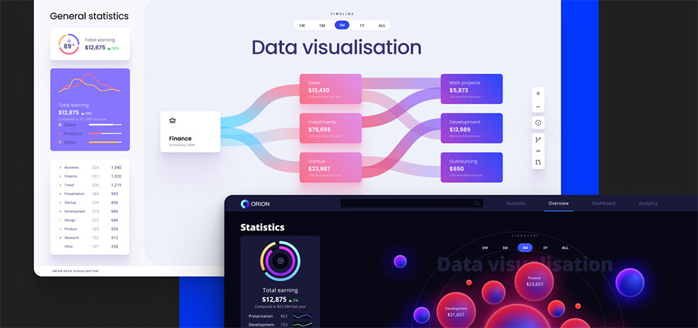
Data Visualization Color Palettes
Chart created with wpDataTables
The colors used for data visualization can be classified into three palettes: categorical colors, sequential colors, and diverging colors.
Categorical colors
When you want to present categories that are not correlated, go for a categorical color palette. This will make your categories perfectly distinguishable from each other.
Categorical colors must be displayed in sequence and contrast with one another. The maximum amount of colors is 10 and they must have different hues and saturation levels.
If you use more than 10 colors, the information will be hard to comprehend. Likewise, the closer colors are in hue and saturation, the harder it is to distinguish them.
Here are some examples that you can use:
Retro Metro
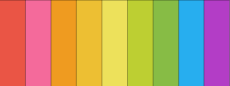
[“#ea5545”, “#f46a9b”, “#ef9b20”, “#edbf33”, “#ede15b”, “#bdcf32”, “#87bc45”, “#27aeef”, “#b33dc6”]
Dutch Field

[#e60049″, “#0bb4ff”, “#50e991”, “#e6d800”, “#9b19f5”, “#ffa300”, “#dc0ab4”, “#b3d4ff”, “#00bfa0”]
River Nights
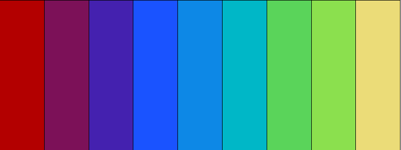
[“#b30000”, “#7c1158”, “#4421af”, “#1a53ff”, “#0d88e6”, “#00b7c7”, “#5ad45a”, “#8be04e”, “#ebdc78”]
Spring Pastels

[“#fd7f6f”, “#7eb0d5”, “#b2e061”, “#bd7ebe”, “#ffb55a”, “#ffee65”, “#beb9db”, “#fdcce5”, “#8bd3c7”]
Sequential palettes
Use a sequential color palette for graphics with sequentially ordered values. Thus, sequential colors are displayed in a continuous pattern based on hue, lightness, or both. Each sequential color will be assigned to data values with higher values having lighter or darker shades.
Being the ideal option for trend charts, sequential palettes will help you highlight the evolution of a certain parameter. In a dark theme, the lighter colors represent the highest values. If you are working with a light theme, the darker colors will represent the highest values. Thus, with the second example, you have a light to dark palette.
Such an approach will help you draw the reader’s attention to the larger values.
Here are some excellent sequential color palette examples you can use:
Blue to Yellow
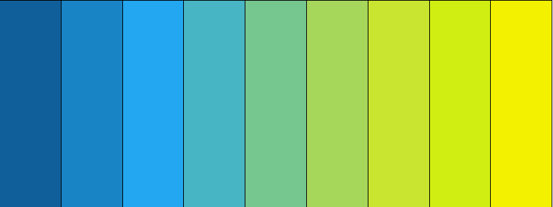
[“#115f9a”, “#1984c5”, “#22a7f0”, “#48b5c4”, “#76c68f”, “#a6d75b”, “#c9e52f”, “#d0ee11”, “#f4f100”]
Grey to Red
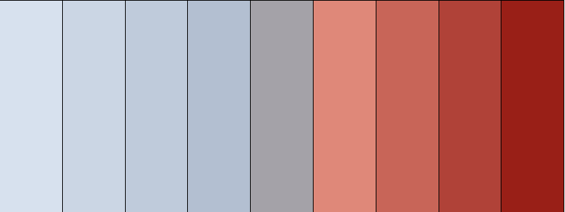
[“#d7e1ee”, “#cbd6e4”, “#bfcbdb”, “#b3bfd1”, “#a4a2a8”, “#df8879”, “#c86558”, “#b04238”, “#991f17”]
Black to Pink

[“#2e2b28”, “#3b3734”, “#474440”, “#54504c”, “#6b506b”, “#ab3da9”, “#de25da”, “#eb44e8”, “#ff80ff”]
Blues
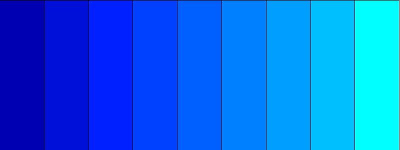
[“#0000b3”, “#0010d9”, “#0020ff”, “#0040ff”, “#0060ff”, “#0080ff”, “#009fff”, “#00bfff”, “#00ffff”]
Your beautiful data deserves to be online
wpDataTables can make it that way. There’s a good reason why it’s the #1 WordPress plugin for creating responsive tables and charts.

And it’s really easy to do something like this:
- You provide the table data
- Configure and customize it
- Publish it in a post or page
And it’s not just pretty, but also practical. You can make large tables with up to millions of rows, or you can use advanced filters and search, or you can go wild and make it editable.
“Yeah, but I just like Excel too much and there’s nothing like that on websites”. Yeah, there is. You can use conditional formatting like in Excel or Google Sheets.
Did I tell you you can create charts too with your data? And that’s only a small part. There are lots of other features for you.
Diverging palettes
If your data visualization chart has a central value (let’s say ‘0’), diverging palettes will be useful.
This is a combination of two sequential palettes that share the same endpoint. As a result, readers will easily distinguish different values falling from different sides of the endpoint.
In the center of the graphic, it’s recommended to use a neutral color. Thus, your higher values will be properly highlighted towards the chart’s edges.
Here are some examples of how to use diverging colors:
Blue to Red
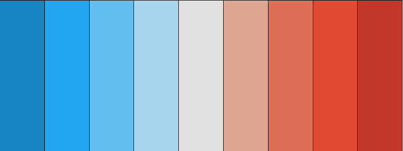
[“#1984c5”, “#22a7f0”, “#63bff0”, “#a7d5ed”, “#e2e2e2”, “#e1a692”, “#de6e56”, “#e14b31”, “#c23728”]
Orange to Purple
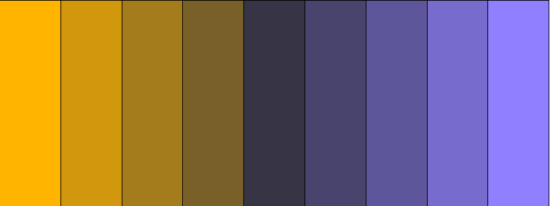
[“#ffb400”, “#d2980d”, “#a57c1b”, “#786028”, “#363445”, “#48446e”, “#5e569b”, “#776bcd”, “#9080ff”]
Pink Foam

[“#54bebe”, “#76c8c8”, “#98d1d1”, “#badbdb”, “#dedad2”, “#e4bcad”, “#df979e”, “#d7658b”, “#c80064”]
Salmon to Aqua

[“#e27c7c”, “#a86464”, “#6d4b4b”, “#503f3f”, “#333333”, “#3c4e4b”, “#466964”, “#599e94”, “#6cd4c5”]
Color Palette Generators
Now, what happens when you are working on large projects? In this case, it’s vital that your data visualization color palettes are consistent across all graphics, reports, documents, etc.
Luckily, there are color codes to reproduce the exact color with the right hue, saturation, and luminance.
For scientific publications, HEX color codes are very popular. These codes consist of 6 digits and can be used across websites, Google Slides, Excel, Adobe Illustrator, PowerPoint, and Prism. Other graphic design tools or platforms may use codes like CMYK, HSL, or RGB.
If you want to find different codes, the following tools will be of great help:
Toptal Color Platte
Use it to download HEX codes for a variety of color palettes including analogic, monochromatic, and custom palettes.
Design Your Way’s Color Scheme Generator
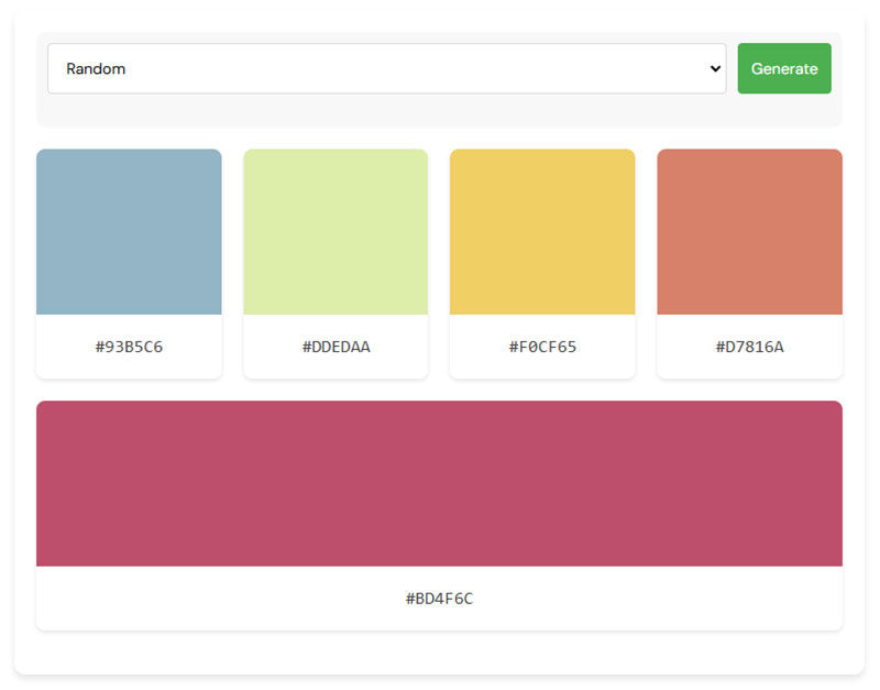
Transform your creative projects with Design Your Way’s color palette generator. Perfect for crafting cohesive color schemes, this tool is ideal for web design, branding, and digital art. Utilizing color theory, it produces harmonious palettes, simplifying your design process and boosting productivity.
Google Color Picker
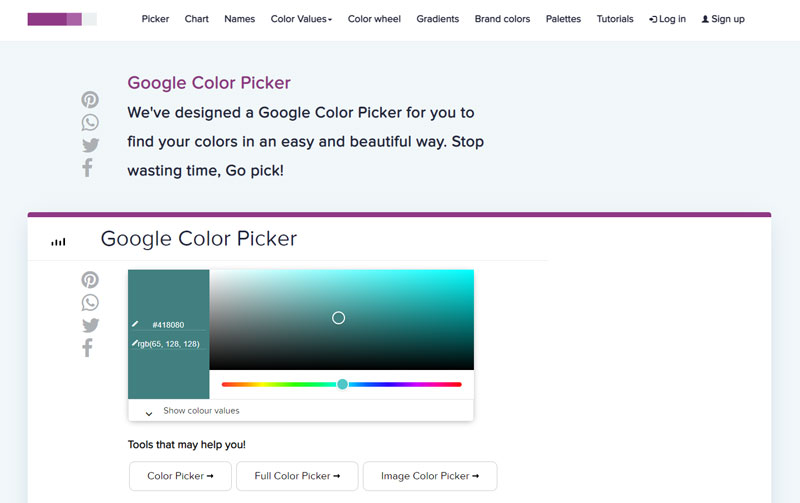
With this great tool you can use a slide to find the right codes. These can be of any kind (HEX, HSL, CMYK, or RGB).
Image Color Picker
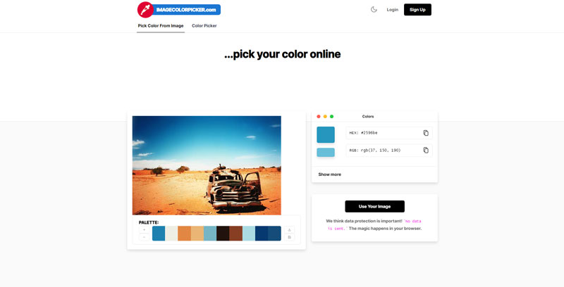
Thanks to Image Color Picker you can pick colors from an uploaded picture or a URL. It allows you to extract HSL, HEX, and RGB codes.
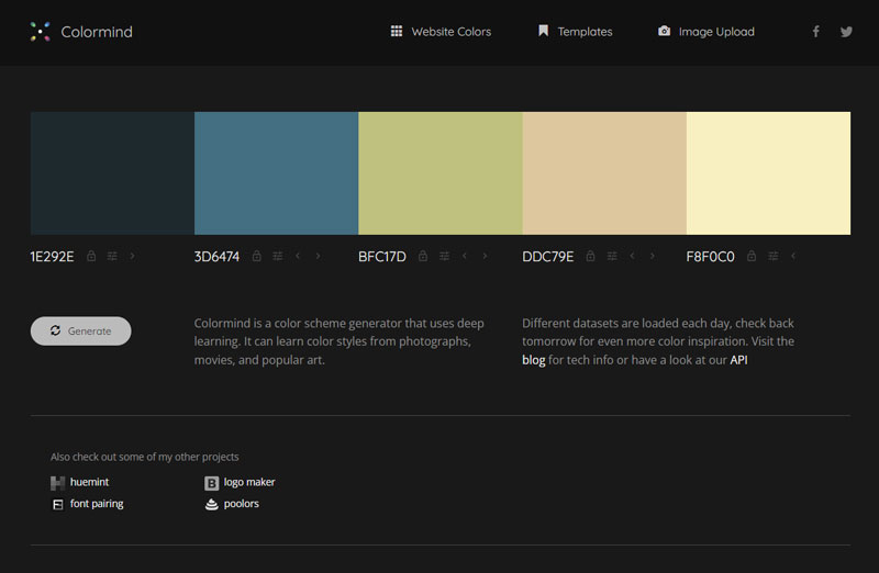
Colormind
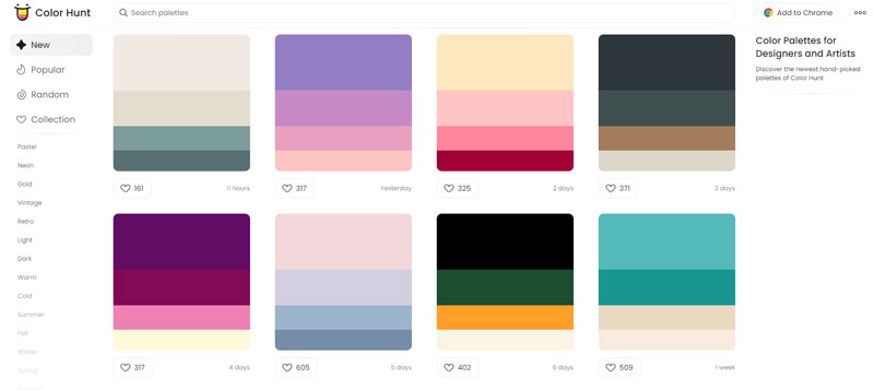
Color Hunt
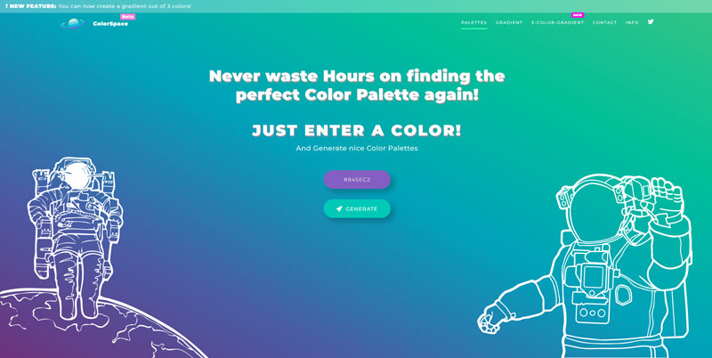
Color Space
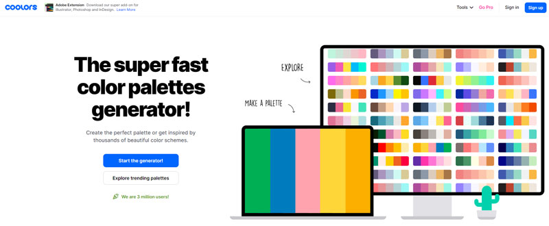
Coolors
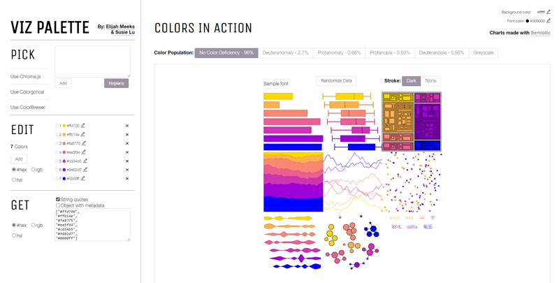
Viz Palette
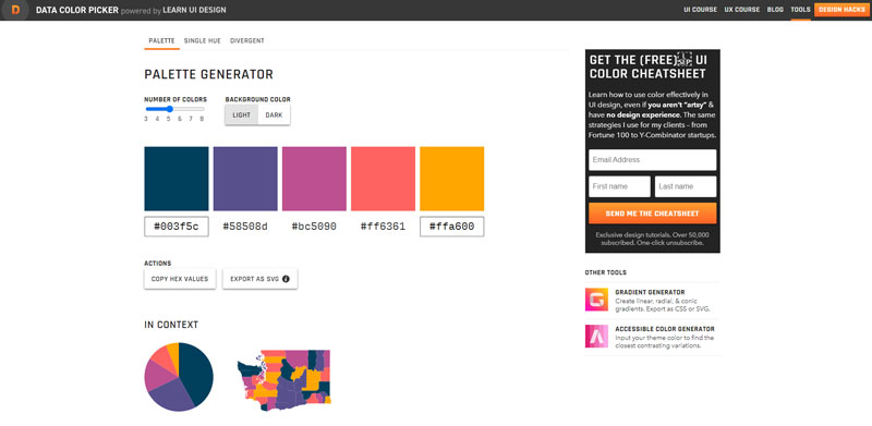
Data Color Picker
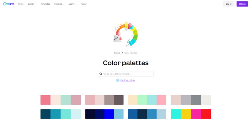
Canva Color palettes
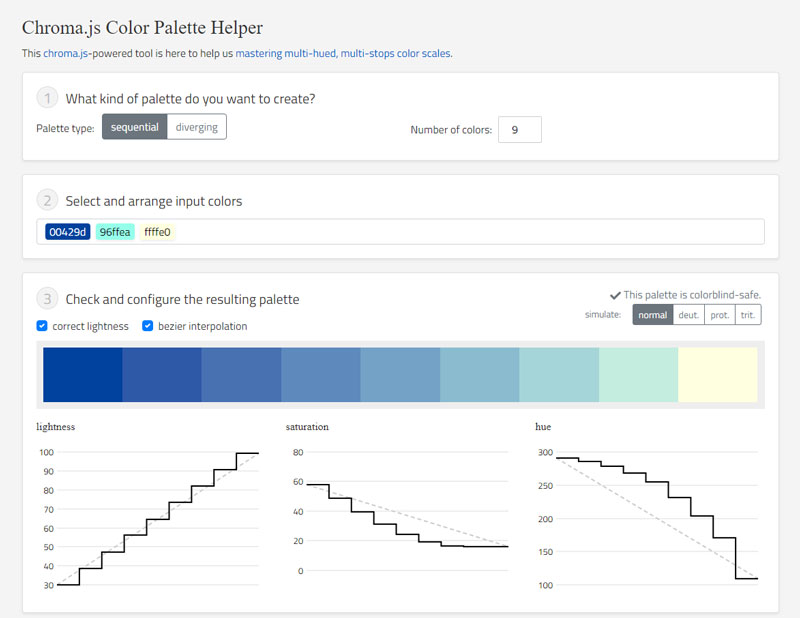
Color Palette Helper
FAQ on Data Visualization Color Palettes
Why is choosing the right color palette important in data visualization?
Your palette can make or break the story your data tells. Like a maestro controlling an orchestra’s mood, colors in your charts guide viewers to feel and understand trends and outliers. Get it right, and your visual data representation sings; get it wrong, and the message may fall flat.
How does color affect the readability and interpretation of data visualizations?
Color differences can highlight key info or muddy the waters. A stark contrast in hues will draw eyes to crucial points, boosting interpretability. However, a jarring palette could distract, confuse, and tire eyes. Strive for a balance where your color combinations for graphs are both eye-catching and informative.
What are the best practices for selecting a color palette for various types of data?
Start by understanding your data type—is it categorical, sequential, or diverging? Categorical colors distinguish distinct groups while sequential hues work best for ranking. Diverging palettes? Ideal for contrasting data. Remember, the goal is aiding comprehension; hence your color scheme must align with your data’s story.
How can I create a color palette that is accessible to all audiences?
Accessibility rocks, and it’s vital. Think color blindness, ensuring colorblind-friendly palettes through tools or simulation tests. Use sufficient contrast for those with visual impairments. A tip? Black text on white for high readability. Inclusive design ensures no one’s left scratching their heads.
What tools can help me build an effective data visualization color palette?
Palette generators are your best pals. Adobe Color CC, COLOURlovers, or Paletton, to name a few, make scheme creation smoother than a latte. They provide pre-made palettes or customizable options based on color theory. Choose one—they’re lifesavers when you’re dancing on the tightrope of choice and balance.
Which colors should be avoided in data visualizations?
Broad strokes? Garish neons and overly saturated shades—they scream louder than a carnival barker and can overwhelm data points. Aim for a harmonious ensemble where no color goes diva, stealing the spotlight without cause. Let your data’s significance dictate the tonal direction.
How can I ensure my color palette conveys the correct emotional response?
Ah, color psychology—like a secret handshake, it influences mood. Corporate blue instills trust, fiery red screams urgency. Pick up cues from your data’s pulse. Want calm analysis? Go for cool blues. Urging action? Hello, reds and oranges. Aim for hues reflecting the heart of your data’s rhythm.
Can the same color palette be used for all my data visualizations?
Imagine only owning one outfit. Bland, right? While consistency has its charm, variety speaks volumes. Tailor your color palette to the graph’s context, type, and the story it’s dying to spill. A single palette won’t flatter every dataset. Change it up, keep it fresh, and relevant.
What role do cultural differences play in the perception of color in data visualizations?
Buckle up—colors carry cultural baggage. While green spells ‘go’ in many places, it can signify death in others. Red for prosperity? Sure, if you’re in China. So before slapping a color onto global data, peek into the cultural lens. Avoid unwittingly offending or miscommunicating with an international audience.
How frequently should I update the color palette of my data visualization?
Think seasons—change when the context does. Unveiling new data? The visual design may need a spring cleaning. Trends shift too; what was hot yesterday might be icy today. Stay alert, and be ready to tweak your palette when your data morphs or when audience feedback nudges you towards a refresh.
Conclusion
So, we’ve painted our way through the vibrant world of data visualization color palettes. To wrap it up, remember, the colors you choose aren’t just about making pretty patterns. They’re like the secret sauce, elevating your data story from mundane to memorable.
- Your colors need to mesh well, like a band hitting the right notes, to lead your audience through the data tunes clearly.
- Accessibility isn’t just nice; it’s a must. Include everyone in your data narrative with smart color choices.
- Tools? They’re your trusty sidekicks. Whether it’s Adobe Color CC or a simple palette generator, they’re there to keep you from color chaos.
- And hey, change is as good as a vacation. Don’t be afraid to switch up your palette when your data sings a different song.
Embrace these pointers, keep your audience and data at the heart of your visual design, and watch your visual stories captivate and inform a crowd that’s hungry for clarity wrapped in beauty.
If you liked this article about data visualization color palettes, you should check out this article about open source data visualization.
There are also similar articles discussing data visualization javascript libraries, WordPress data visualization, interactive data visualization, and misleading data visualization examples.
And let’s not forget about articles on data visualization tools, data visualization best practices, data visualization examples, and weather data visualization.


