Despite having the same purpose, infographics and data visualizations have several differences, as well as diverse applications and benefits.
With so much information available, how can you distinguish the option that will best fit your purpose?
This article explains infographics and data visualization in detail. You will understand the disparities between them and know when to apply them.
Plus, you will learn how to determine the best choice for your business. But first, read below about each of these visual representation methods.
Table of Contents
What Is Data Visualization?
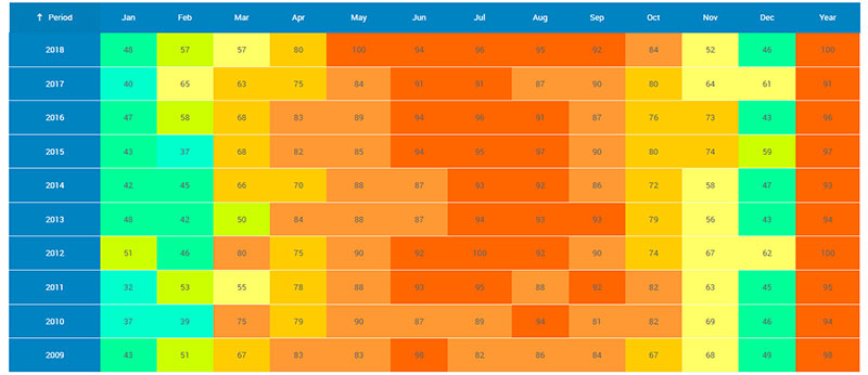
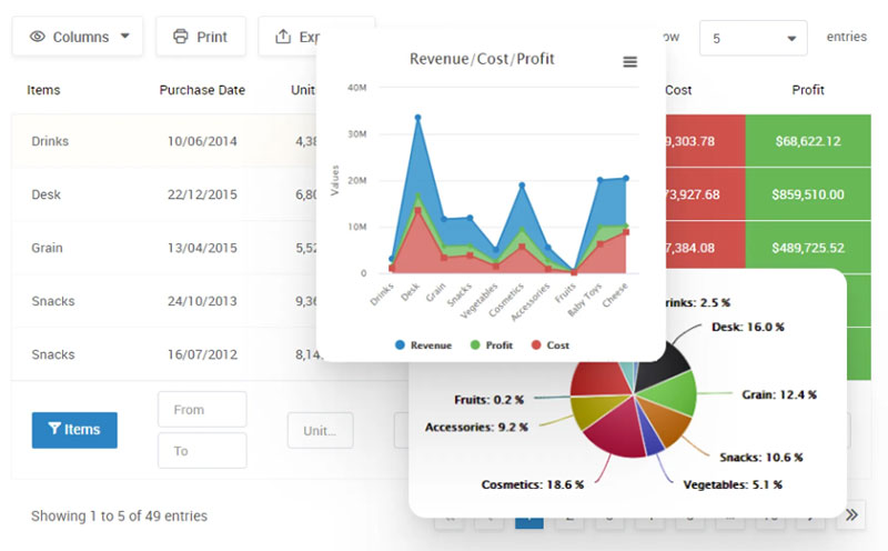
Data visualization is a visual way of presenting different types of information. It uses graphics, charts, illustrations, and other images. Its goal is to help viewers understand the knowledge presented in the least amount of time possible.
They use visual elements to gather and portray numerical data. This conversion can be automatic by using suitable software to create each visualization.
No matter how complex the information compiled, it can be intelligible through good data visualization. Hence, learning becomes much less complicated than if it was just written text.
This understanding leads to better and more efficient communication. Which, in turn, will ease assessment and management.
Viewers can then make reasonable and logical conclusions based on reliable data. The decision process also becomes more straightforward and precise.
Data visualizations are more than simple charts. They have evolved into valuable tools for means of communication in general.
Where Should You Use Data Visualization?
Data visualizations are especially valuable for businesses. They summarize complex data and extensive information. So it becomes easier to assess and decide on subjects like fund distribution.
Plus, with a statistical overview, you can make internal knowledge of all operations more accessible. Here are 5 common examples of its applications:
Dashboards
Using data visualizations on business dashboards promotes transparency.
Users get easy access to their product, transaction, and data stories. No matter the platform, graphs will deliver essential information with clarity and accuracy.
Reports
Business operations rely heavily on objective reporting to make informed decisions.
This information also serves to update staff members on progress and accomplishments. You can use different charts or maps with statistics to share a summary of key insights.
White papers
Good data visualization offers credibility to your white papers.
Any person reading will have a better understanding of your research and ideas. Plus, they will feel more motivated to make decisions following your point of view.
Newsletters
Newsletters are a fantastic way to boost both employee and customer engagement.
You can use them to inform readers about different topics. Use data visualization to create an aesthetically pleasing message for your target audience.
Editorials
Editorials benefit much from including data visualizations. Apart from discussing a specific idea, these articles should remain balanced.
Including statistical graphics brings objectivity and helps explain the story.
Your beautiful data deserves to be online
wpDataTables can make it that way. There’s a good reason why it’s the #1 WordPress plugin for creating responsive tables and charts.

And it’s really easy to do something like this:
- You provide the table data
- Configure and customize it
- Publish it in a post or page
And it’s not just pretty, but also practical. You can make large tables with up to millions of rows, or you can use advanced filters and search, or you can go wild and make it editable.
“Yeah, but I just like Excel too much and there’s nothing like that on websites”. Yeah, there is. You can use conditional formatting like in Excel or Google Sheets.
Did I tell you you can create charts too with your data? And that’s only a small part. There are lots of other features for you.
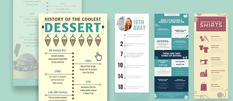
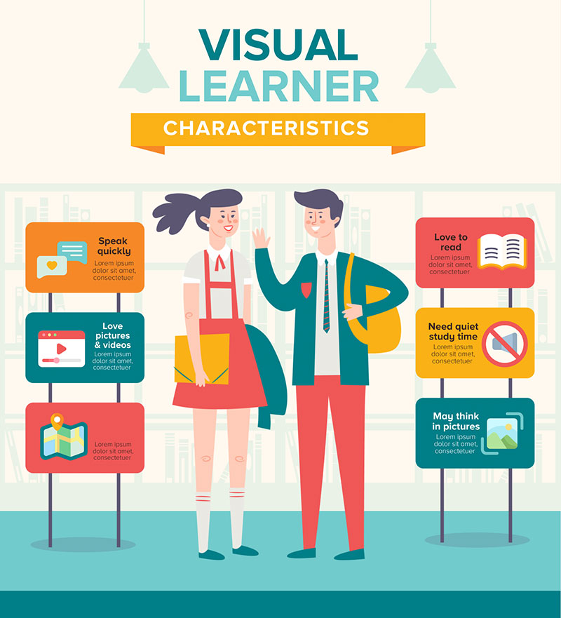
What Is an Infographic?
Infographics are a type of graphic data representation. They pair visual and informative content and ease comprehension and analysis.
Generally, they display information in a graphic format along with some short explanatory text. This written content might include labels, comments, or simple descriptions.
Also known as information graphics, they enable multiple data visualizations. Thus, they simplify the interpretation of a large amount of information at once.
They might not always offer direct conclusions, but they can help forecast future events. They are helpful for tasks like monitoring and decision-making.
By simplifying understanding, they support the human capability of identifying patterns. Most people can quickly understand a subject and make reasonable deductions using these maps.
In recent years, infographics have become widespread in general communication.
They are also used by mentors, as it is easier for them to explain concepts, processes, and relationships to their students. Besides, once they create the infographics, they can add them to the knowledge base of the mentoring software they use so that mentees can access and review the information at their own pace.
Where Should You Use Infographics?
Infographics can be adapted to the information and the style of presentation you prefer. Hence, you can employ them for any subject and idea.
If you have a complex matter to explain, you can use infographics. It is a way to turn elaborate issues into fairly simple concepts so viewers can understand your point.
Besides, they also serve as outstanding illustrations related to the theme you are exploring. You can use them as tools to add more information or make an example.
Infographics are great to use as a way to compare situations, products, or services. You can create a map to display trends or a pie chart to portray statistical data.
Plus, you can use them to raise awareness of certain types of more sensitive information. Here are 5 specific ways you can apply them:
Blogs
Visuals are critical for making blog articles engaging. You can create an infographic as an example to highlight data that supports your point.
Whether you opt for a pie chart or some other map, your website will be more compelling to users.
Marketing content
An infographic is an excellent addition to marketing because it simplifies understanding. It is advised to keep the text short and clear.
Whether in the form of a bar graph or a map, it will also catch attention and make your content more appealing.
Social Media Posts
Like a website, social media runs on engagement, but you must deliver suitable content. An infographic tells a story, so it makes for a terrific post.
If you manage Instagram accounts, Facebook pages, and other social accounts for your business, a simple infographic can be shared on all those platforms using a scheduling tool and bring even more results, such as gaining more Instagram followers.
Some of the more popular scheduling tools are SocialPilot and its alternatives.
You can use them to teach your audience about current trends or concepts. They are also fit as examples to verify any information you might share.
Furthermore, you can use the best QR code generator to embed QR codes into your infographics and link viewers to deeper insights, external resources, or interactive content, making your data even more engaging and accessible.
Case Studies
Case studies often support the decision-making process. You want them to be enlightening rather than dull or hard to interpret.
You can use infographics to represent sales results and other numbers effectively. These will make your case study more trustworthy to readers.
Resumes
Including them in your resume can distinguish you from other candidates.
Visuals will make your resume unique and tell your story with creativity. To make the process easier, consider using some of the best resume builders to design a visually appealing and professional resume.
The Key Differences
You have already learned about both infographics and data visualization. But what are the main differences between them?
Data Portrayal and Complexity
A single infographic can include and merge several data visualizations. They usually contain some explanatory text. Whether in the form of captions or labels, these elements add crucial information.
On the contrary, data visualizations are individual depictions. They also demand a different kind of map.
As such, an infographic tends to be more appealing and insightful. You can build on it by using vector graphics software. Programs such as Adobe Illustrator enable you to develop all styles of graphs and charts.
Design and Aesthetics
Data visualizations are simple. Their goal is to represent data in a way that eases understanding.
It differs from an infographic, in which development already has a precise point in mind. Despite facilitating analysis, its design is thought out for viewers to make a fixed judgment.
Automatically Generated vs. Manually Created
Generally, you use appropriate software to create a data visualization. You have many options as to the form of the visualization. But, in most cases, this procedure is fully automated.
As mentioned above, you also have available software to create an infographic. Yet, this is not an automatic operation. You must organize all the elements created.
Raw values vs. Storytelling
Infographics and data visualizations have distinct focuses. A data visualization concentrates on raw values and presents data as is.
With an infographic, there is a story behind the data. It is what makes it so compelling to most viewers.
Type of Data Presented
Data visualizations are adaptable. They deliver precise quantitative information. Nevertheless, the maps are editable and can vary as often as necessary.
An infographic can present qualitative data. Yet, regardless of the kind of data, a chart can’t change. It uses fixed values and it is not flexible.
Interactiveness
Interactiveness is vital for engagement, and data visualizations can include highly interactive features. Plus, as the software develops, they have grown even more interactive.
In contrast, infographics are motionless. However, both can be transformed into “data stories” when paired with a specific context.
The Best Data Visual Representation Option for You
As you have seen, there are advantages and disadvantages tied to each type of visualization. They offer distinct possibilities and have particular features.
If you want to tell a compelling story and help viewers reach a specific conclusion, then an infographic is the best choice. Most people in the world will understand a viewpoint better when its presentation has context and related images.
And by using AI to generate art, you can provide context even in times when you don’t have the perfect image.
You can also use an infographic to compare different units, products, or results. For instance, consider creating pie charts to illustrate sales results. Again, with a pre-defined result already in mind.
Yet, you want to follow a timeline or be able to update your maps. In that case, you should opt for data visualization. Line charts, for example, are perfect for tracking progress over time.
You can use them to educate the viewers. It will ease understanding, encourage them to analyze the chart, and make individual conclusions.
The choice between infographics and data visualization will depend on your end goals. You must consider both and understand which will be more beneficial for each matter.
Conclusions on the Difference Between Infographics and Data Visualization
This article has considered infographics and data visualization in depth. You have gotten to know the details about these graphic representation methods. You now understand what differentiates them from one another.
Besides that, you learned how to choose the best option according to your goals. Now you are ready to use these tools in the most beneficial way for your business.
The information above is vital, even if you are not the one creating a visualization. As a viewer, you should be able to understand a chart, its data, and its aim and make reasonable conclusions.
Still, prepare to work with suited software to create successful presentations. And use these tools to deliver a simple yet impactful message.
If you liked this article about infographics and data visualization, you should check out this article about dynamic data visualization.
There are also similar articles discussing text data visualization, table data visualization, survey data visualization, and effective data visualization.
And let’s not forget about articles on visualizing Google Sheets data, misleading statistics, data visualization skills, and what data visualization to use.


