Unlocking the power behind sports data visualization can revolutionize your understanding of the game. Imagine transforming complex game statistics and performance metrics into stunning interactive charts and heat maps.
Whether you’re an NBA analyst tracking LeBron James’s moves or a general fan curious about team analytics for Manchester United, the right visual tools bring data insights to life. Sports statistics software and data visualization tools like Tableau and Power BI make even the most intricate details accessible.
By the end of this article, you’ll grasp how integrating predictive analytics in sports and real-time statistics can elevate your approach to match analysis and player performance.
Through visual storytelling, we’ll explore practical examples—from statistical charts in Sabermetrics to KPI dashboards in the Olympics—that exemplify the crucial role of visual data representation in modern sports.
Get ready to dive deep into the world where algorithms meet the athletic arena.
Table of Contents
Sports Data Visualization Examples
Responsive and sortable Premier League table
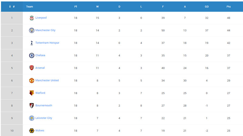
Premier League table created with wpDataTables
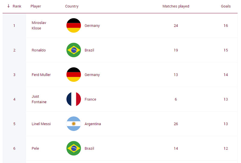
World Cup Scorers Table
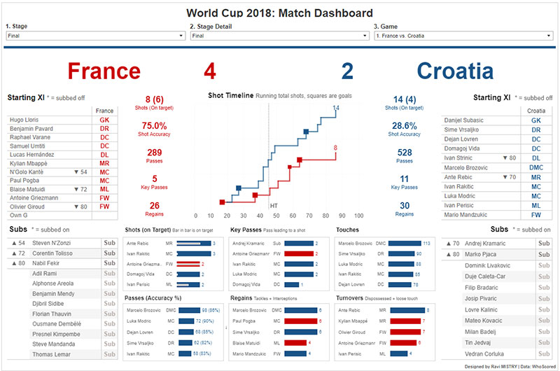
World Cup 2018: Match Dashboard
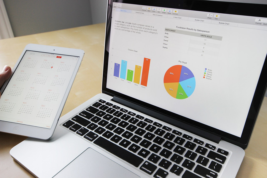
Your beautiful data deserves to be online
wpDataTables can make it that way. There’s a good reason why it’s the #1 WordPress plugin for creating responsive tables and charts.

And it’s really easy to do something like this:
- You provide the table data
- Configure and customize it
- Publish it in a post or page
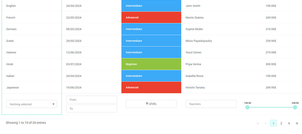
And it’s not just pretty, but also practical. You can make large tables with up to millions of rows, or you can use advanced filters and search, or you can go wild and make it editable.
“Yeah, but I just like Excel too much and there’s nothing like that on websites”. Yeah, there is. You can use conditional formatting like in Excel or Google Sheets.
Did I tell you you can create charts too with your data? And that’s only a small part. There are lots of other features for you.
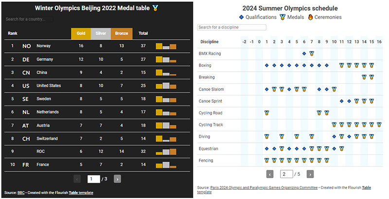
Olympics
Ice Hockey Shot Data

Image source: The Information Interfaces Group
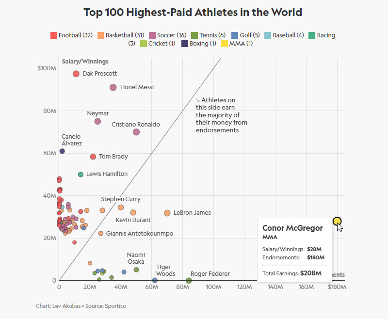
The World’s 100 Highest-Paid Athletes
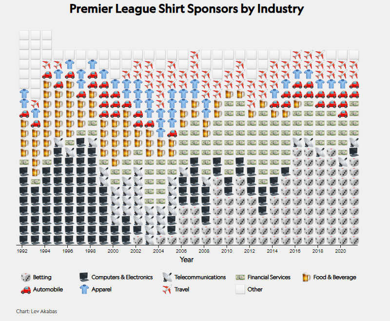
Premier League shirt sponsors
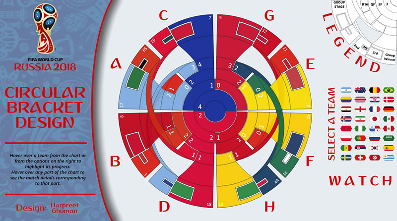
FIFA 2018 Circular Bracket
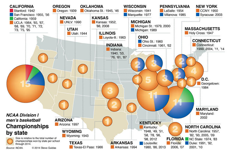
Championships by state
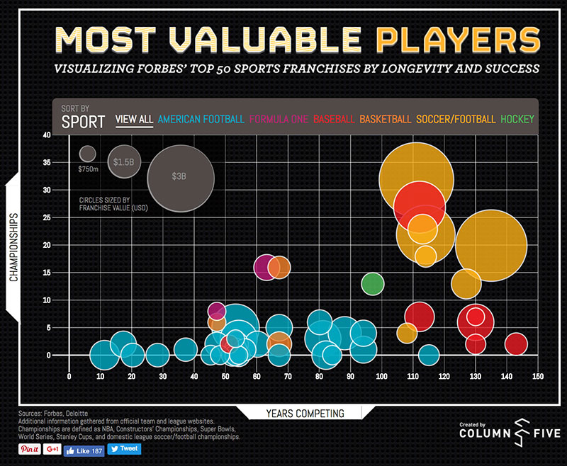
Most Valuable Sports Franchises
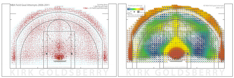
NBA field goal attempts
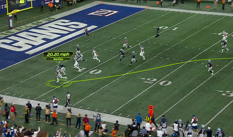
AR data-visualization example
FAQ On Sports Data Visualization
What is Sports Data Visualization?
Sports data visualization transforms complex sports analytics into comprehensible visual formats like graphs, dashboards, and infographics that illustrate the patterns and insights drawn from sports-related data.
Why Use Data Visualization in Sports?
Visualizing data in sports aids in the easy interpretation and analysis of player performances, game statistics, and other critical metrics, enhancing decision-making for coaches, players, and sports analysts.
What Tools Are Best for Creating Sports Data Visualizations?
Popular tools such as Tableau, Power BI, and even specialized sports analytics software provide robust platforms for creating dynamic and insightful sports data visualizations.
Can Visualization Influence Player Performance?
Yes, effective data visualizations can highlight areas needing improvement and track progress, offering players and coaches concrete data to base training and strategies upon.
How to Design an Effective Sports Data Visualization?
Start by clearly defining the objective, choose the right type of chart or graphic, and ensure the visualization presents the data in an intuitive, easily digestible way that highlights the key insights.
What are Common Challenges in Sports Data Visualization?
Challenges include managing large volumes of data, ensuring the accuracy of data sources, and designing visuals that accurately reflect the complexity of sports data without oversimplifying important details.
How Has Sports Data Visualization Impacted the Sports Industry?
Data visualization in sports has revolutionized how strategies are formed, performances are analyzed, and fans engage with sports, providing a deeper understanding of the intricate details of sports dynamics.
What are the Future Trends in Sports Data Visualization?
Emerging trends include the integration of AI and machine learning for more predictive analytics, real-time data visualization during live events, and greater personalization in how data is presented to different users.
How Can Teams Implement Data Visualization Effectively?
Teams can start by integrating comprehensive data collection methods, investing in training for analytical tools, and fostering a culture that values data-driven decision making.
What’s the Impact of Real-Time Data Visualization in Sports?
Real-time visualization provides immediate insights during games, enhancing tactical decisions and fan engagement by offering up-to-the-minute analysis directly linked to the unfolding action.
Conclusion
Exploring sports data visualization examples has opened a fascinating window into the intricate weave of numbers and narratives in sports. These visual tools aren’t just charts—they’re gateways to deeper insights and refined strategies, transforming raw data into compelling stories that resonate with coaches, players, and fans alike.
- Empowerment through Clarity: Visualizations demystify the complex interplay of stats, spotlighting opportunities for peak performance.
- Strategic Edge: The analytics provide tactical advantages, turning data into a cornerstone of sports intelligence.
- Engagement: Every graph and infographic invites greater fan interaction, making the data not only accessible but also genuinely engaging.
As we step forward, the blend of sports analytics and visualization technology will only become more sophisticated, integrating AI and real-time insights to push boundaries further. This journey into visual analytics has just begun, promising revolutionary shifts in how sports stories are told and understood.