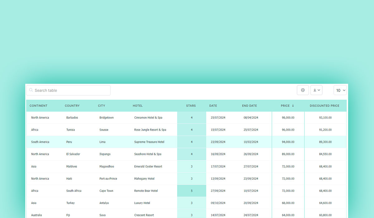
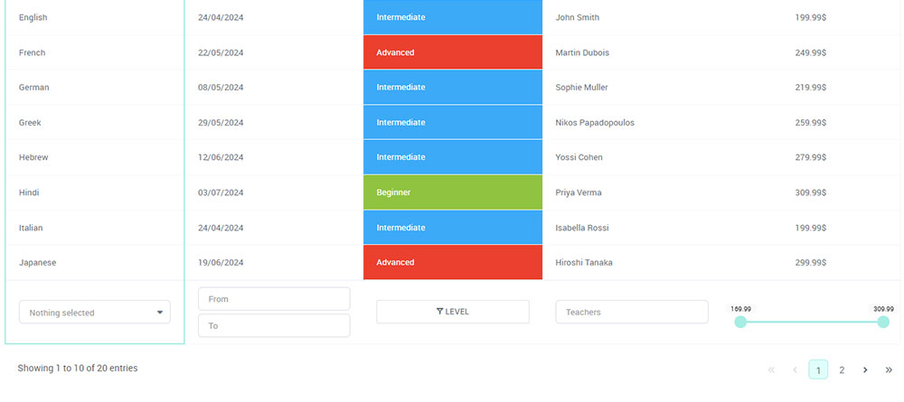
Styling HTML tables can transform a mundane grid of data into an aesthetically pleasing and highly functional part of your web design.
You’ve probably encountered countless unstyled tables that look straight out of the 90s. That’s where CSS comes into play. With cascading style sheets, you can breathe new life into your HTML table elements.
Understanding the intricacies of CSS selectors and properties like border, background-color, and hover effects is crucial.
From adjusting cell padding to creating newspaper-like “zebra stripes,” I’ll guide you through making your HTML tables not just functional but visually appealing.
By the end of this article, you’ll know how to:
- Apply responsive web design principles so your tables look great on any device.
- Leverage CSS frameworks like Bootstrap for quick styling.
- Ensure cross-browser compatibility and web accessibility for a wider audience.
Table of Contents
Setting Up the HTML Table
Basic HTML Table Structure
When diving into the world of web design, understanding the foundational elements of an HTML table is crucial. We kick off with the essential tags that form the skeleton of our table: <table>, <tr>, <td>, and <th>. It’s these building blocks that lay the groundwork for any table layout.
So let’s conjure up a basic HTML table:
<table>
  <tr>
    <th>Header 1</th>
    <th>Header 2</th>
  </tr>
  <tr>
    <td>Data 1</td>
    <td>Data 2</td>
  </tr>
  <tr>
    <td>Data 3</td>
    <td>Data 4</td>
  </tr>
</table>
That’s your bread and butter right there. A clean, unfussy table waiting to be elevated.
Adding Table Headings and Captions
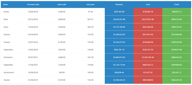
Moving forward, we elevate our humble table by injecting some structure through table headings and descriptive captions.
The <th> tag steps up here, transforming mundane cells into prominent headings. Adding a <caption> breathes life into the table, giving it context in a single stroke.
Here’s how it shapes up:
<table>
  <caption>Monthly Sales Data</caption>
  <tr>
    <th>Product</th>
    <th>Sales</th>
  </tr>
  <tr>
    <td>Widget A</td>
    <td>200</td>
  </tr>
  <tr>
    <td>Widget B</td>
    <td>150</td>
  </tr>
</table>
That <caption> tag doesn’t just describe the table; it tells a story, setting the scene.
Organizing Table Content
For a more complex table, organization is king. We carve up the table’s body, header, and footer with the tags <thead>, <tbody>, and <tfoot>.
These elements give structure and neatly segregate the table’s sections—each serving a unique purpose.
An example for clarity:
<table>
  <caption>Quarterly Financial Report</caption>
  <thead>
    <tr>
      <th>Quarter</th>
      <th>Revenue</th>
      <th>Expenses</th>
    </tr>
  </thead>
  <tbody>
    <tr>
      <td>Q1</td>
      <td>$10,000</td>
      <td>$4,000</td>
    </tr>
    <tr>
      <td>Q2</td>
      <td>$12,000</td>
      <td>$5,000</td>
    </tr>
  </tbody>
  <tfoot>
    <tr>
      <td>Total</td>
      <td>$22,000</td>
      <td>$9,000</td>
    </tr>
  </tfoot>
</table>
With <thead>, the header stays distinct. <tbody> wraps our core data in a tidy package. And <tfoot> is the grand finale, neatly summing up the totals. This is the essence of data presentation, making it digestible and logical for any viewer.
Styling the Table Layout
Understanding Browser Defaults
When crafting the perfect table, it’s essential to grasp how browsers default to styling them.
The raw, unaltered look—courtesy of browser default styles—tends to lack flair. Browsers apply their own padding, margins, and borders, giving every table that generic look.
To counter this, resetting these default styles becomes crucial. Think of it as starting with a blank canvas, free from any unwanted blemishes.
table {
  border-collapse: collapse;
  width: 100%;
}
th, td {
  padding: 8px;
  text-align: left;
  border: 1px solid #ddd;
}
Here, border-collapse and width properties flatten the table’s surface and stretch it to fit, laying the groundwork for some serious CSS magic.
Applying Basic CSS Styles
Time to design. Let’s paint with broader strokes first—setting the width and defining layout properties. A table that breathes, feels expansive and uncluttered.
table {
  table-layout: fixed;
  width: 100%;
}
With table-layout: fixed;, we anchor our proportions, making each column even and predictable. Now, let’s embrace borders because a well-defined boundary can do wonders.
th, td {
  border: 1px solid #333;
  border-collapse: collapse;
}
A solid line, forming the skeletal structure. Borders shouldn’t just be lines; they should mark territory.
Spacing and Layout Adjustments
Whitespace—it’s not just a buffer, it’s a breathing space. Adjusting padding and spacing within cells ensures content doesn’t feel crammed. Imagine a lofty room with ample legroom—now, transpose that onto your table.
th, td {
  padding: 10px 15px;
}
Consider the elegance of properly spaced text. It invites the eye, rather than overwhelming it. As you tweak the padding, see how the table morphs from a flat, rigid structure to a lively, engaging tableau.
To wrap it up, here’s our masterpiece blending all together:
table {
  width: 100%;
  border-collapse: collapse;
}

th, td {
  padding: 12px;
  border: 1px solid #ddd;
  text-align: left;
}
This seamless flow, draped in CSS, brings out the essence of Styling HTML Tables. It’s about more than just data presentation; it’s web aesthetics, making information visually compelling.
Your beautiful data deserves to be online
wpDataTables can make it that way. There’s a good reason why it’s the #1 WordPress plugin for creating responsive tables and charts.

And it’s really easy to do something like this:
- You provide the table data
- Configure and customize it
- Publish it in a post or page
And it’s not just pretty, but also practical. You can make large tables with up to millions of rows, or you can use advanced filters and search, or you can go wild and make it editable.
“Yeah, but I just like Excel too much and there’s nothing like that on websites”. Yeah, there is. You can use conditional formatting like in Excel or Google Sheets.
Did I tell you you can create charts too with your data? And that’s only a small part. There are lots of other features for you.
Typography and Text Styling
Choosing Fonts and Text Styles
Fonts are like the attire of your text. For tables, the font choice can make or break readability. Imagine a financial report dressed in Comic Sans—absolute chaos. Selecting appropriate fonts ensures that the content doesn’t just sit there but speaks.
When picking fonts, go for clarity. Sans-serif fonts like Arial, Helvetica, or even Google Fonts such as Open Sans and Roboto work like magic. They are clean, no frills, and easy on the eyes.
Apply global font styles to keep the table cohesive. What you do to one cell, you do to all.
table {
  font-family: 'Open Sans', sans-serif;
  font-size: 14px;
}
That line alone declutters the table, making the data sing in harmony. It’s not just about the type; it’s about the melody your table sings.
Enhancing Readability with Text Styling
Text alignment is a game of balance. Left-aligned for text, right-aligned for numbers—like a well-rehearsed dance.
th, td {
  text-align: left;
}
td.numeric {
  text-align: right;
}
Adding class="numeric" to your numerical data gives it a home, snugly tucked to the right.
But wait, adjust the letter spacing for a breath of fresh air. Crowded characters? No, thank you.
th, td {
  letter-spacing: 0.05em;
}
Your table breathes easier now. Each character sits comfortably next to its neighbor, untouched yet together.
Text transformation adds a flair without overwhelming the senses.
th {
  text-transform: uppercase;
  font-weight: bold;
}
Uppercase headers—like grand signposts guiding through rows and columns with authority and ease.
Visual Enhancements and Graphics
Adding Background Colors and Images
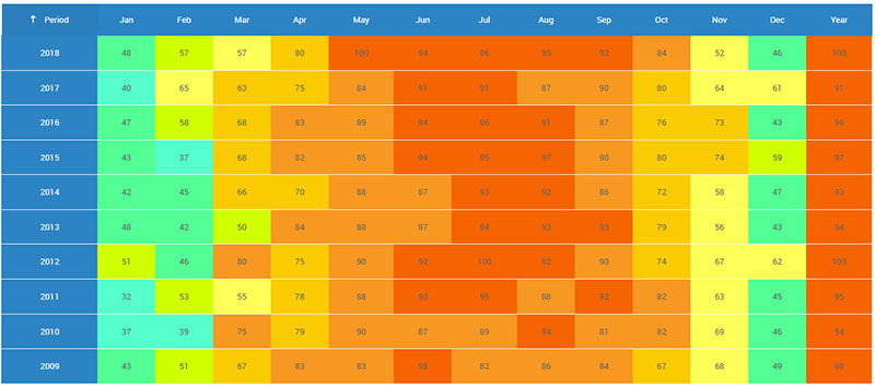
Tables need life. They shouldn’t just present data—they should also tell a story.
Applying background colors to headers and rows is like adding brushstrokes to a blank canvas. It organizes, highlights, and engages. A splash of color at the top can signal, ‘Hey, this is important!’.
thead {
  background-color: #333;
  color: #fff;
}
tr:nth-child(even) {
  background-color: #f2f2f2;
}
Here, contrasting colors—the dark header and light rows—bring clarity and break the monotony.
Consider background images if plain colors aren’t your thing. It’s like wallpaper for your data. But tread lightly; subtlety is key.
table {
  background-image: url('background.png');
  background-size: cover;
}
Use an image sparingly to enhance, not to overwhelm. Think web aesthetics—perfect balance, not chaos.
Implementing Zebra Striping
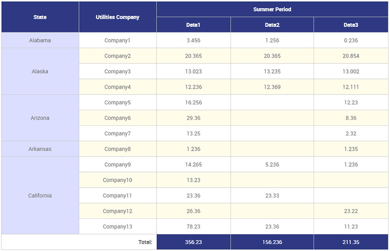
Zebra striping is the unsung hero of table design. Alternating row colors guide the eye through the data effortlessly, much like the lines on a ledger.
tr:nth-child(odd) {
  background-color: #fafafa;
}
tr:nth-child(even) {
  background-color: #eaeaea;
}
Rows of alternating shades provide a rhythm, a cadence. It’s data presentation at its finest, making lengthy tables digestible at a glance.
Bonus: Learn how to merge cells with HTML
Customizing Table Borders
Borders define boundaries. They frame the information, providing structure where chaos might reign. But there’s an art to it. Different border styles cater to different needs.
th, td {
  border: 1px solid #ddd;
  border-collapse: collapse;
}
A subtle, light border is unobtrusive yet effective. It says, ‘Here’s where one cell ends and another begins.’
For a cohesive look, border-collapse is your ally. It merges borders, giving the table a seamless, unified appearance.
table {
  border-collapse: collapse;
}
Styling HTML Tables isn’t just about making them look good. It’s about making them make sense. Each border, each color, each stripe has a purpose. When executed well, they transform simple data into visual narratives that captivate and inform.
Advanced Styling Techniques
Using Pseudo-Classes for Styling
Ah, the magic of pseudo-classes. These CSS selectors are like secret handshakes, granting you access to specific parts of your table without touching the HTML. Target rows, columns, even individual cells with precision.
Targeting specific rows and columns crafts a symphony out of your data. Imagine highlighting every third column, painting patterns where there were none.
tr:nth-child(even) {
  background-color: #f9f9f9;
}

td:nth-child(3) {
  background-color: #ffeb3b;
}
Here, nth-child is the wizard’s wand. Even rows get a subtle shade, while every third column shines in yellow. The table breathes, making data dance before your very eyes.
Let’s push boundaries further. Alternating row styles? Easy.
tr:nth-child(odd) {
  background-color: #e0f7fa;
}
tr:nth-child(even) {
  background-color: #b2ebf2;
}
Rows now oscillate, grabbing attention and guiding focus.
Highlighting Specific Cells
But we’re not done. Sometimes, a single cell cries out for attention. It holds the golden nugget, the crucial piece. With custom classes, you flag these VIP sections of your table.
<td class="highlight">Critical Data</td>
And then, unleash the CSS magic:
.highlight {
  background-color: #ff5722;
  font-weight: bold;
  color: #ffffff;
}
There you have it. A cell that practically shouts, “Look at me!” without uttering a word. Background-color, font-weight, and text color all come together to elevate that single piece of data.
Enhancing Table Accessibility
Importance of Semantic HTML
Tables aren’t just about data presentation. They’re the bridge to information, especially for those relying on screen readers. Enter semantic HTML, our unsung hero.
Using appropriate HTML elements is like laying down smooth, accessible pathways. The <caption> tag, for instance, doesn’t just sit pretty; it gives context. Efficient and essential.
<table>
  <caption>Yearly Expenditure</caption>
  <tr>
    <th>Category</th>
    <th>Amount</th>
  </tr>
  <!-- Rows of data -->
</table>
Notice how <caption> introduces the table? It’s not merely decoration. It sets the stage, providing meaningful context.
And then there’s <th>. Ah, the grand marshal, the guiding beacon. Every <th> tag within a table header helps anchor the data, making each cell’s content clear and concise.
<tr>
  <th scope="col">Quarter</th>
  <th scope="col">Revenue</th>
</tr>
With semantic HTML, we’re not just coding. We’re sculpting accessible, user-friendly experiences.
Implementing ARIA Roles and Properties
Now, take a step further into accessibility with ARIA—Accessible Rich Internet Applications. Think of ARIA roles as the backstage crew that ensures the show runs smoothly for everyone, especially those needing extra help.
Adding ARIA roles enhances table navigation, ensuring every voice is heard when users interact with your table.
<table role="table">
  <thead>
    <tr role="row">
      <th role="columnheader">Product</th>
      <th role="columnheader">Sales</th>
    </tr>
  </thead>
  <tbody>
    <tr role="row">
      <td role="cell">Gadgets</td>
      <td role="cell">1500</td>
    </tr>
  </tbody>
</table>
ARIA properties tag along, providing clarity. Each role="table", role="row", role="columnheader", and role="cell" guides assistive technologies, ensuring no one is left behind.
FAQ On Styling HTML Tables
How do I use CSS to style HTML tables?
Begin by targeting your HTML Table Element with CSS selectors. Apply properties like border, padding, and background-color to customize the table’s look.
Don’t forget to style Table Data Cells and Table Headers with th and td selectors. Use CSS classes for reusable styles.
How can I add borders to my HTML table?
Adding borders is simple. Use CSS and the border property. For example: table, th, td { border: 1px solid black; }. This will apply a solid border to the entire table, headers, and data cells. Experiment with border-collapse for a seamless look.
What’s the best way to make HTML tables responsive?
Responsive design is key. Utilize media queries to adjust table styles based on the viewport size. You can also leverage CSS frameworks like Bootstrap table styling that offer built-in responsive table features.
Consider using display: block and overflow-x: auto for improving responsiveness.
How do I style table headers separately from data cells?
To differentiate headers from data cells, use the th selector for Table Header styling and the td selector for Table Data Cell styling. Apply distinct CSS properties, such as font-weight: bold for headers, and different background-color settings to enhance readability.
Can I use external CSS for styling HTML tables?
Absolutely. An External Stylesheet keeps your HTML clean and your styles organized. Link your CSS file with the <link> tag in the HTML head. Define your table styles in this file to maintain a coherent design across multiple pages.
How do I create zebra stripes on rows in HTML tables?
Zebra stripes enhance readability. Use the nth-child pseudo-class to style alternate rows. For example: tr:nth-child(even) { background-color: #f2f2f2; }. This CSS rule will apply a light gray background to every second row, creating that “zebra stripe” effect.
What are some common pitfalls to avoid while styling HTML tables?
Avoiding pitfalls is essential. Don’t forget about web accessibility—ensure tables are readable with proper contrast.
Overusing inline styles can make your HTML cluttered, so prefer External Stylesheets. Lastly, test your tables for cross-browser compatibility to ensure they appear correctly on all platforms.
How can I make my HTML tables cross-browser compatible?
Ensuring cross-browser compatibility involves testing your tables in various browsers. Use standard CSS and avoid browser-specific properties.
Tools like BrowserStack can help you check compatibility. Ensure your HTML5 Doctype and CSS syntax are clean and validated to minimize rendering issues.
How do I style nested HTML tables?
Nested tables can complicate styling. Use specific class names for nested HTML tables to avoid conflicts. For example, .nested-table th { background-color: #ddd; }.
This targets only the headers of nested tables, preventing unwanted styles from affecting parent tables.
How do I change the background color of an HTML table row based on hover?
To change row background color on hover, use the :hover pseudo-class. For example: tr:hover { background-color: #f5f5f5; }. This CSS rule highlights the row the user’s cursor is over, enhancing interactivity and user experience in your web design.
Conclusion
Styling HTML tables isn’t just about making your data look good—it’s about creating an engaging user experience. By applying a blend of CSS properties, selectors, and pseudo-classes, you can make tables both visually appealing and highly functional.
Throughout this guide, you’ve learned essential techniques to customize table borders, add cell padding, create responsive HTML tables, and enhance readability with zebra stripes.
You’ve also seen how leveraging CSS frameworks like Bootstrap and ensuring cross-browser compatibility can streamline your process. The details matter—from Table Header styles to row hover effects, these small tweaks can make a significant impact.
In your web design projects, integrating these methods will transform mundane data grids into professional, user-friendly tables. By understanding the art and science behind styling HTML tables, you elevate both the aesthetics and functionality of your web elements.
Now, go ahead and create tables that not only serve their purpose but also impress your audience.
