We have to admit that today we live in a mobile world. Even Google has switched to a mobile-first index, which means that Google is going to rank your website based on your mobile content relevance and UX.
Your mobile navigation needs to be on point no matter what kind of website or app you are working on. Yet creating a responsive menu for mobile devices is a tricky task —it’s really a juggling act between both functionality and proportions. A CSS mobile menu needs to be tight, easy to tap, and work across many varying screen sizes.
According to Localytics, 21% of users will abandon a mobile app after using it only once. There are many reasons for this, but frustration with poor navigation is high on the list. People prefer easy things; they don’t want complicated interfaces.
A simple, well-designed CSS mobile menu is necessary if you want to build a navigation experience that users can easily interact with, no matter where they are and regardless of the device they are using.
This article created by our team at wpDataTables will show you some great examples of different CSS mobile menu ideas that you can try on your own website or app. Read on for the list!
Table of Contents
Examples of CSS Mobile Menus
You don’t have to reinvent the wheel, or possess special knowledge, to get a responsive menu design. But what you need to understand is that the user experience takes priority overlooks.
Looking good is, of course, important, but when it comes to menus, you have to first ensure that they are practical and that the navigation structure makes sense.
Does it make sense to have 100’s of menu links to every page on your site? No. Does it make sense to make your menu items so small that they can’t be tapped except by people with small fingers? No. These are necessary considerations, though luckily they’re not rocket science.
Below you will find a list of examples that show how to create responsive mobile menus that work well for all types of mobile users. Each one is a CSS mobile menu that ensures proper responsive design for many different device types.
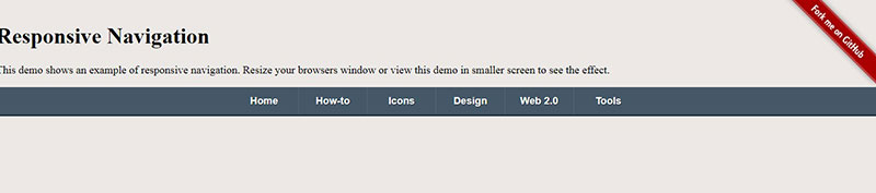
Mobile Menu – CSS

When you are moving elements from a big screen to a small one you need to make a few compromises. Most of the time, designers want to avoid these compromises and they try to get a universal design that can be used easily in all screen sizes.
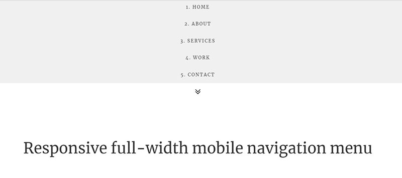
Having a full-screen menu like this one can be awesome since it looks and feels the same on computers, phones, and tablets as well.
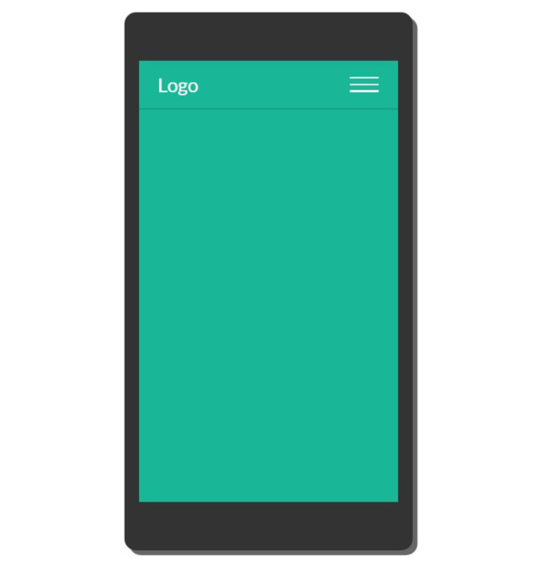
Basic Responsive “Three Line” Menu (CSS & jQuery)
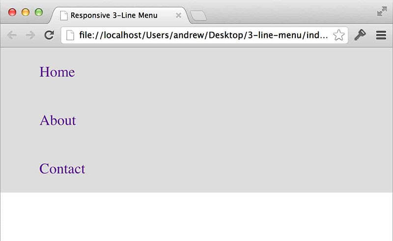
In this tutorial, you will discover how you can quickly code a CSS mobile menu that is responsive. You will also need to use jQuery but don’t get discouraged; it’s a very small section of code.
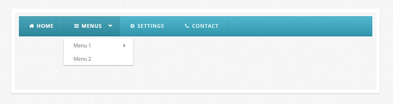
CSS-Only Dark Menu
If you want to get a very simple navigation menu you should consider trying this guide. The bar is horizontal and has the classic dropdowns until the window gets small enough.
After this responsive break point, the navigation will become a full-screen mobile menu that looks great.
Animated Accessible Navigation

This one showcases a circular navigation menu icon that becomes delightfully animated when it is clicked.
Responsive Button Nav
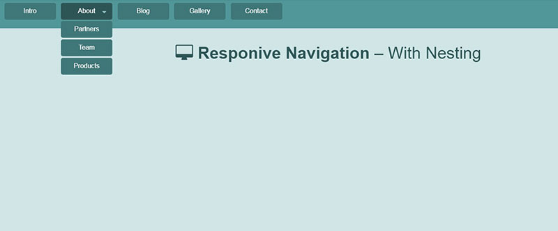
This CSS mobile menu supports nesting with different button styles. It has different web page transitions and it can be easily added into any layout.
Morphing Mobile Hamburger Navigation With JavaScript And CSS3

Check out this mobile navigation concept if you want a menu that is easy to use and familiar to users.
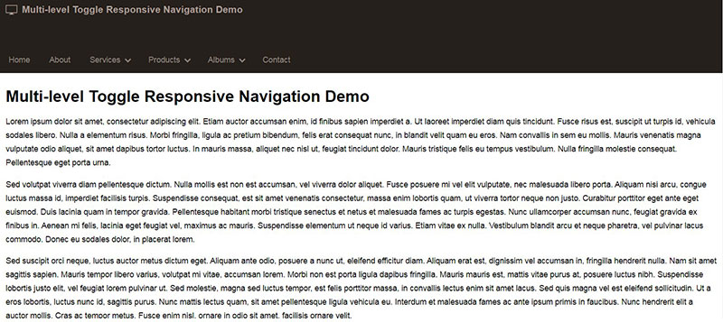
Multi-level Responsive Menu
The tutorial here focuses on jQuery and CSS in order to create a3-Levels-Deep Drop Down menu. What is cool about it is that the menu is entirely responsive and it can shrink to fit any kind of device.
3D Responsive Mobile Menu Bar
If you were searching for a CSS mobile menu that works great on desktop too, this is a great choice. At desktop size, it features a horizontal list of menu items with 3D effects, and at mobile size, it becomes a solid responsive mobile menu.
Smooth Responsive Dropdown Menu – Top Drawer
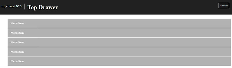
In this tutorial, you will learn how to create a smoother reveal mobile menu that uses CSS3 and is not animated in JavaScript. Once you click the menu icon it will bring a drop-down style that looks nice and can work well for any kind of device you have in mind.
Smooth Fade

Fading navigation menus are popular and are really easy to create. They work by using CSS classes to transform the menu into a full-page interface especially suitable for small screens.
Mobile Menu Animation

In this mobile menu design, you get a great animation effect that makes it look special. The hamburger menu icon is purposefully placed in the center to accommodate both right- and left-handed users.
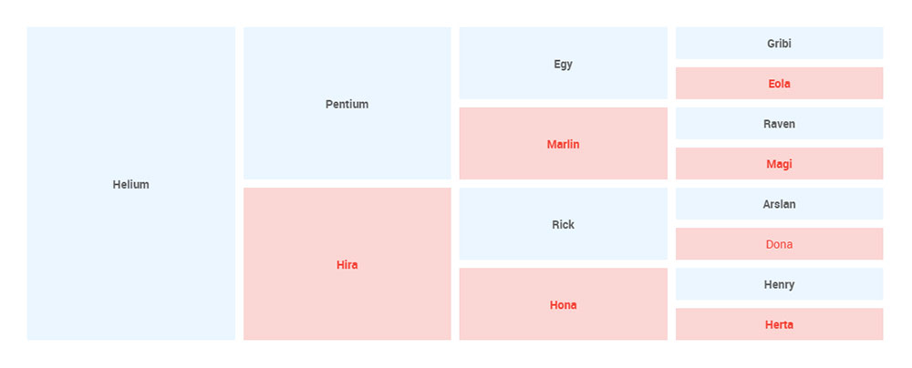
Hey, did you know data can be beautiful too?
wpDataTables can make it that way. There’s a good reason why it’s the #1 WordPress plugin for creating responsive tables and charts.
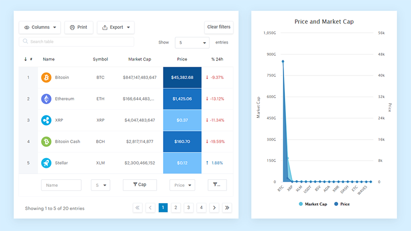
And it’s really easy to do something like this:
- You provide the table data
- Configure and customize it
- Publish it in a post or page
And it’s not just pretty, but also practical. You can make large tables with up to millions of rows, or you can use advanced filters and search, or you can go wild and make it editable.
“Yeah, but I just like Excel too much and there’s nothing like that on websites”. Yeah, there is. You can use conditional formatting like in Excel or Google Sheets.
Did I tell you you can create charts too with your data? And that’s only a small part. There are lots of other features for you.
Bootstrap Nav bar

This mobile menu design is influenced by Bootstrap, the popular front-end component library. What makes it stand out is that it uses no JavaScript — only HTML and CSS.
Responsive CSS Only Header Navigation – Luxbar
Luxbar is a CSS library that is used for creating responsive, mobile-friendly header navigation that is fully customizable using different CSS classes. With just a few tweaks, it can help you get the CSS mobile menu that you want.
Menu With Scroll Effects
This is a mobile menu with some amazing scroll and hover effects. It’s great for adding improving the user experience on an interactive website.
Responsive Flat Menu
A responsive flat menu that has two sub-menus is what you will get here. It’s perfect for organizing extensive categories.
Simple Responsive Navigation
With this tutorial, you will get a very simple approach that helps you build a responsive menu from zero by using CSS3. It’s a good start for learning how to design your menu for smaller mobile screens.
Mobile Menu Design 3
This CSS mobile menu has different animation effects that make the menu look cool. The effects are quick so users don’t get impatient. Together with the navigation menu, you can even add different action buttons.
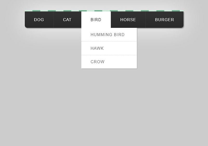
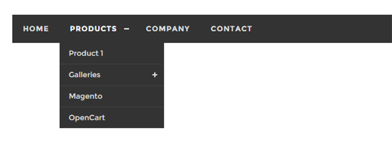
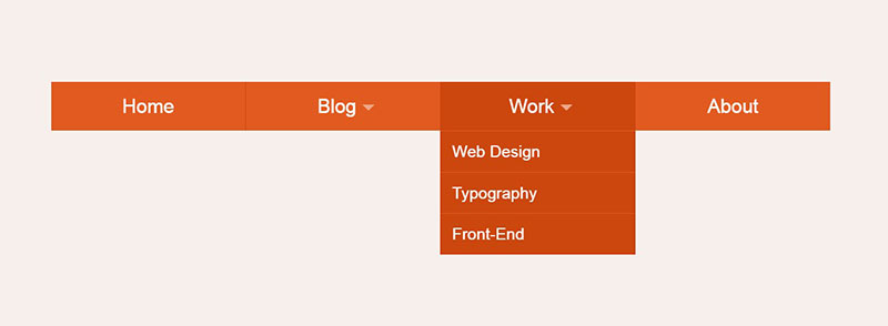
Pure CSS Mega Menu

Online magazine themes often use mega-menus to get articles in their menus. These CSS mobile menu types look great and work very well in certain situations.
Textured Responsive Mobile Drop Down Menu
This is a textured responsive drop-down menu that can take an existing multi-level menu and transform it into a cool dropdown for smartphones.
Clean Dropdown Toggle
Mobile navigation needs to be simple for all users. If this is what you want to achieve then try this dropdown menu that is made using CSS only.
Responsive Navigation Mobile Menu Toggle
This navigation menu is quite a popular one for mobile app. The well-known hamburger menu icon is used together with a simple design. Give it a try and see if this is what you need.
Multi-level Toggle Responsive Navigation Menu using Pure CSS
This is a neat CSS mobile menu that has user-friendly navigation and it fits all mobile screen devices.
Apple Style Mobile Menu
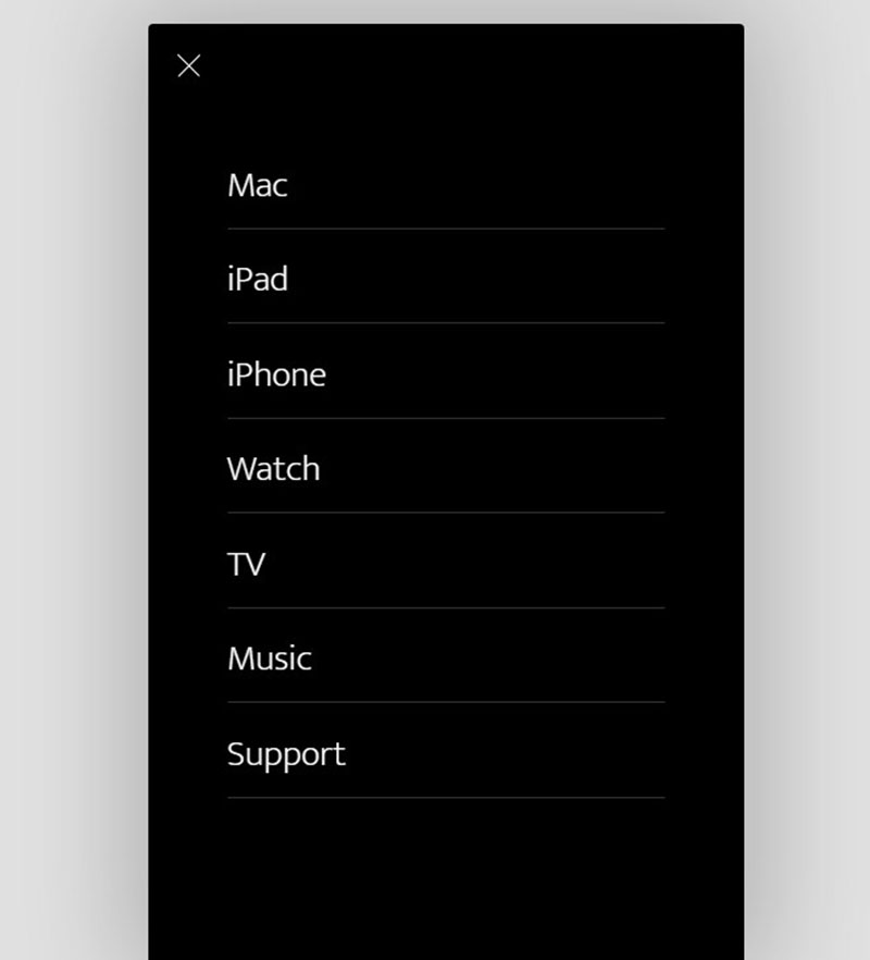
This mobile menu is inspired by the one made by Apple and it’s both stylish and functional.
Basic Responsive Menu
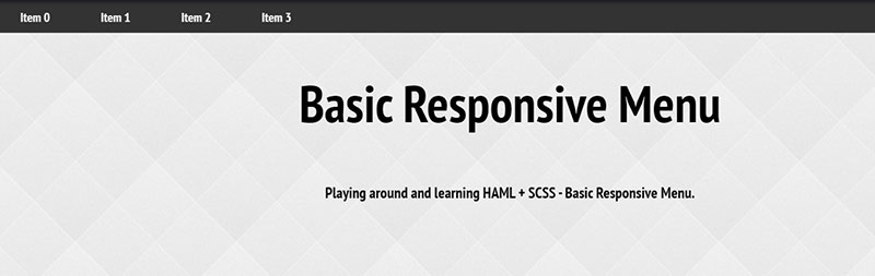
This is a generic navigational menu that drops down from the top. It was made with HAML and SCSS with a bit of JavaScript.
Pure CSS Mobile-compatible Responsive Dropdown Menu
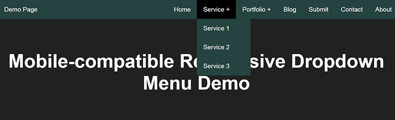
Check out this CSS mobile menu that changes easily to a toggleable dropdown menu after a certain breakpoint. It’s neat, simple, and effective.
FAQ about CSS mobile menus
How do I create a mobile menu using CSS?
Man, you’re in luck! First, you’ll want to design the HTML structure of your menu. Use <nav> and <ul> elements to create a basic list of menu items. Then, dive into the CSS! Apply styles to your menu, like hiding it by default and showing it when you click a button. Use media queries to target specific screen sizes and adjust your menu’s appearance as needed. Don’t forget to experiment with animations and transitions for a smooth user experience!
Why isn’t my CSS mobile menu working?
Oh, that’s frustrating! There are several reasons your menu might not be working. Check if your HTML structure is correct, and make sure the CSS classes and IDs match. Inspect your styles in the browser to see if there are any conflicts or overrides. Finally, check your JavaScript or jQuery code (if you’re using it) to ensure it’s working properly. If you’re still having trouble, take a deep breath, and consider seeking help on forums like Stack Overflow.
How can I make my CSS mobile menu responsive?
Responsive design is all about flexibility! You’ll want to use media queries to target different screen sizes and adjust your menu accordingly. For instance, you can change the menu’s layout, font size, or spacing based on the screen width. Also, consider using relative units like percentages, ems, or rems for your sizes and measurements. This will help your menu adapt to various screen resolutions, making it more user-friendly.
Can I create a CSS mobile menu without JavaScript?
Absolutely, my friend! You can create a CSS-only mobile menu using the :checked pseudo-class and the <input> element with a type of “checkbox.” Wrap your menu and the checkbox input inside a label, then use the :checked pseudo-class to show and hide the menu when the checkbox is toggled. It’s a neat trick that lets you create a functioning mobile menu without the need for JavaScript.
What are some popular CSS mobile menu designs?
There’s a whole world of design inspiration out there! Some popular mobile menu styles include:
- Hamburger icon with a slide-out or dropdown menu
- Full-screen overlay menu
- Horizontal scroll menu
- Accordion-style menu
- Tab-based menu
Don’t be afraid to explore different options and find a style that suits your website’s aesthetic and user experience.
How can I animate my CSS mobile menu?
Oh, animations can really elevate your menu! To animate your mobile menu, use CSS transitions or keyframe animations. You can apply these to properties like opacity, transform, or height to create smooth, engaging effects. Remember to experiment with easing functions and durations to find the perfect animation style for your menu.
How do I optimize my CSS mobile menu for touch devices?
Great question! Touch devices require special consideration. Make sure your menu items have a large enough touch target area, typically at least 44×44 pixels. Use padding and spacing to prevent accidental clicks, and avoid hover effects, as they don’t work well on touchscreens. You might also consider using the :active pseudo-class to provide visual feedback when users tap a menu item.
Can I create a CSS mobile menu with submenus?
You bet! To create a mobile menu with submenus, nest additional <ul> elements inside your main menu list items. Then, use CSS to style and position the submenus, typically hiding them by default. You can use JavaScript or CSS :hover and :focus pseudo-classes (for non-touch devices) to show and hide the submenus when users interact with the parent menu item.
What are some best practices for CSS mobile menu accessibility?
Accessibility is crucial! To make your CSS mobile menu accessible, follow these best practices:
- Use proper HTML semantics, like
<nav>elements, to help screen readers understand the menu structure. - Add
ariaattributes and roles to provide additional context for assistive technologies. - Ensure your menu has sufficient color contrast, making it easier to read for visually impaired users.
- Include keyboard navigation support, allowing users to navigate the menu with the Tab and Enter keys.
- Test your menu with various accessibility tools and screen readers to identify and fix any issues.
How do I add icons or images to my CSS mobile menu?
Adding some visual flair to your menu? Nice! To add icons or images, you can use several methods:
- Add an
<img>element inside your menu items, styling it with CSS as needed. - Use an icon font, like Font Awesome or Google Material Icons, and include the appropriate classes in your menu items.
- Opt for an SVG icon, which can be inserted directly into your HTML or used as a background image in your CSS.
Remember to keep your icons or images lightweight and optimized for the web to ensure your menu loads quickly and looks great on all devices.
Wrapping up These CSS Mobile Menu Examples
In conclusion, finding a CSS mobile menu that works for your website or app is an activity that you can’t skip. The menu is one of the first items that a user interacts with and you want them to enjoy it.
Besides creating a good first impression, a properly implemented mobile menu ensures enduring usability and keeps users from abandoning ship out of frustration.
If you enjoyed reading this article on CSS mobile menu examples, you should check out this one about CSS text glow effects.
We also wrote about a few related subjects like HTML search box, CSS image gallery, CSS editor, CSS page transitions and CSS image hover effects.