Stepping into the world of data visualization doesn’t have to be daunting—it can be an exhilarating journey of transforming data into compelling stories.
HighCharts emerges as the go-to JavaScript charting library for crafting dynamic and interactive charts, crucial in making sense of complex datasets.
With a robust API, ease of use, and a plethora of customization options, it empowers designers to dream up tables that speak volumes.
In this article, you’ll uncover how to leverage HighCharts to transform raw data into visuals that don’t just stand out, but captivate.
Whether it’s the line chart, bar chart, or pie chart in your next project, you’ll master not just the chart framework, but the art of seamless integration into your workflow.
Ready to level up your data-driven storytelling? Let’s dive into code integration, real-time updates, and performance optimization—everything you need to make data both beautiful and intelligible.
Table of Contents
What is HighCharts?
Highcharts is a robust JavaScript charting library that enables developers to create interactive and customizable charts for web applications. It supports a wide range of chart types and is known for its high performance and ease of use. Highcharts is compatible with several frameworks and widely used for data visualization needs.
Getting Started with HighCharts
Installation and Setup
Installing HighCharts via npm
To install Highcharts using npm, follow these steps:
1. Install Highcharts as a dependency in your project by running:
npm install highcharts --save
This will add Highcharts to your project’s package.json file under the dependencies section.
2. Import Highcharts in your JavaScript file:
import * as Highcharts from 'highcharts';
3. Create a container element in your HTML where the chart will be rendered:
<div id="container"></div>
4. Generate the chart using the Highcharts.chart() function:
Highcharts.chart('container', {
chart: {
type: 'line'
},
title: {
text: 'My Chart'
},
series: [{
data: [1, 2, 3]
}]
});
Loading Highcharts Stock, Maps, or Gantt
Highcharts Stock, Maps, and Gantt are also available as npm packages. To load them:
// Load Highcharts Stock
import Highcharts from 'highcharts/highstock';

// Load Highcharts Maps
import Highcharts from 'highcharts/highmaps';

// Load Highcharts Gantt
import Highcharts from 'highcharts/highcharts-gantt';
Note that these packages include Highcharts core, so you don’t need to load both.
Using the HighCharts CDN
Alternatively, there’s a simplicity and peace in using the HighCharts CDN.
Here’s how to use the Highcharts CDN:
Including Highcharts from the CDN
To include Highcharts from the CDN, add the following script tag in the <head> section of your HTML page:
<script src="https://code.highcharts.com/highcharts.js"></script>
This will load the latest version of Highcharts Core from the CDN.
Specifying a Version
To load a specific version of Highcharts, append the version number to the URL:
<script src="https://code.highcharts.com/10/highcharts.js"></script>
This will load Highcharts v10.x.x from the CDN.
Loading Modules
Highcharts Stock, Maps and Gantt are available as separate modules. To load them, include the corresponding module script after the core Highcharts script:
<script src="https://code.highcharts.com/highcharts.js"></script>
<script src="https://code.highcharts.com/modules/stock.js"></script>
This will load Highcharts Core and the Stock module.
Using the Latest Patch Version
To load the latest patch version of a minor release, truncate the version number:
<script src="https://code.highcharts.com/10.1/highcharts.js"></script>
This will load the latest patch version of Highcharts 10.1.x.
Styled Mode
Highcharts supports styled mode, which allows styling charts via CSS. To use it, include the highcharts.css file:
<link href="https://code.highcharts.com/css/highcharts.css" rel="stylesheet" />
<script src="https://code.highcharts.com/highcharts.js"></script>
ES6 Modules
Highcharts can be loaded as ES6 modules from the CDN:
<script type="module">
import Highcharts from 'https://code.highcharts.com/es-modules/masters/highcharts.src.js';
Highcharts.chart('container', { ... });
</script>
Basic setup for a new project
Setting up a new project is an adventure, a spark. Start with an HTML skeleton, whether bare-bones or with a colorful front-end framework.
Nest your JavaScript within, secure a chart container, and let your creativity flow. The journey starts with a div, moves to JavaScript configurations, and breathes in life as your first chart animates into view.
Understanding the HighCharts Architecture
Core components and modules
Imagine HighCharts as an intricate puzzle of modules and components, each a crucial piece to a divine visualization.
It’s modularity in full display—core components that house basic functionalities alongside modules that extend capabilities like exporting charts or accommodating diverse chart types like maps through Highmaps or stock market visualizations via Highstock.
How HighCharts integrates with other frameworks (e.g., React, Angular)
Frameworks like React and Angular rewrite the rules of web interaction.
HighCharts dances gracefully, integrating seamlessly.
Utilize libraries such as react-highcharts or angular-highcharts to bind components and state together, serving not just visuals, but an interactive data-driven dialogue between user and data.
This integration unleashes a power where dynamic charts coexist elegantly within sophisticated single-page applications.
Overview of HighCharts API and documentation
Embark on a voyage through the HighCharts API and find yourself in a realm where possibilities stretch infinitely.
The documentation—a curated masterpiece—is your map, guiding you through a labyrinth of options, hooks, and settings.
Gain proficiency with API references, dashed with examples and clear blueprints that articulate the assemblage of compelling visual narratives.
It’s the architectural brain behind the stunning façades of interactive charts, a treasure trove awaiting exploration.
Creating Basic Charts
Introduction to Chart Types
Line Charts
Chart created with wpDataTables
Definitely one of my favorites—a classic. Line charts tell stories, painting a flow across axes, connecting dots in a symphony of visualization.
This chart type tracks journeys over time, like a visual biography of data, charting trends with the grace of a pen gliding on paper. It’s like crafting an elegant narrative in pixels and data points.
Bar and Column Charts
Chart created with wpDataTables
Visual staccato, bar and column charts are robust characters on the data visualization stage.
They’re bold, definitive, and deliver an impactful punch, succinctly contrasting categories and values. Picture bars stretching skyward or columns stacked in neat arrangements, delivering clear, unmistakable visual messages.
It’s data made tangible, almost touchable.
Pie Charts
Chart created with wpDataTables
Slice a pie, what do you get? Visual taste buds delight in the rich simplicity of pie charts, even as they polarize opinions in data viz circles.
They offer a concise slice-of-life view into proportions and parts-whole relationships. Each wedge a story—colorful, proportional, and compelling, a reminder of data’s delicious diversity.
Scatter and Bubble Charts
Chart created with wpDataTables
Enter the realm of scatter and bubble charts.
They’re like the impressionist artists of the charting world, visualizing relationships between pairs of variables, patterns in the chaos, stories in the data confetti.
Add a third dimension with bubble charts—size translated into importance—offering an extra layer of interpretative depth, turning scatter plots into serious data dialogue.
Configuring Your First Chart
Setting up the chart container
Where does a chart live? In a container—a blank canvas eagerly awaiting its masterpiece. It starts with a simple HTML div, a digital stage on which data dramas unfold.
This container, devoid of content, is but an empty shell, ready to be filled with static data or real-time updates, transforming voids into vibrant visualization.
Defining chart data and categories
Data is the muse. Define it well, and it sings. Categories are the scaffolding; data, the bricks.
Craft the structure wisely. Line up your categories as axes; place your data like precious gems, fitting seamlessly into this framework. It’s a delicate ballet of XML, JSON, CSV dancing into position—and boom, your narrative begins.
Customizing chart appearance (colors, labels, legends)
Paint with data. Let colors, labels, and legends be your palette, giving life to data’s dance on the screen.
Tweak the hues to highlight insights, tailor the labels for clarity’s sake, and let legends guide the observer through the chart’s tale.
Customizing the appearance is an art, a voodoo of code and creativity. It’s where form meets function, and interaction becomes an experience.
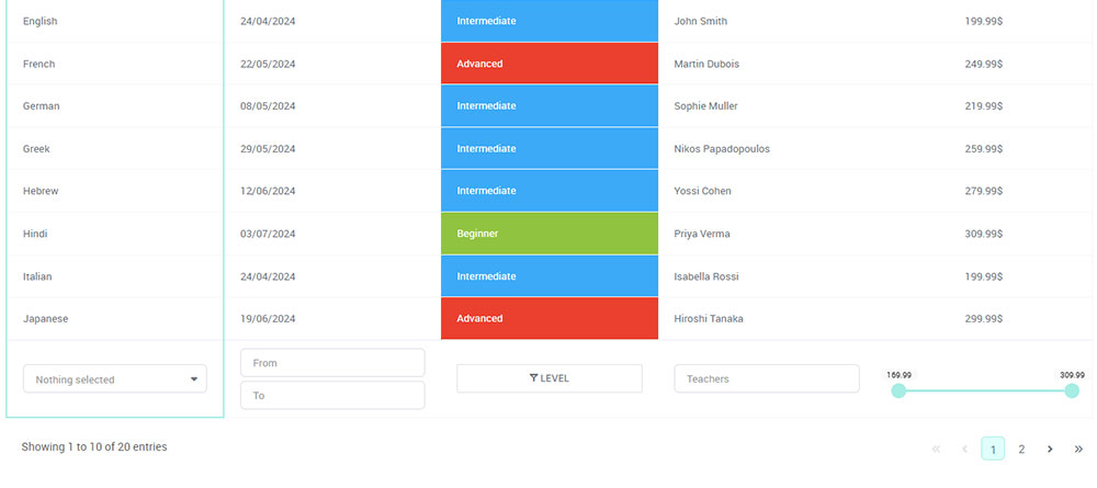
Your beautiful data deserves to be online
wpDataTables can make it that way. There’s a good reason why it’s the #1 WordPress plugin for creating responsive tables and charts.

And it’s really easy to do something like this:
- You provide the table data
- Configure and customize it
- Publish it in a post or page
But it’s not just about looks—it’s highly functional too. Whether you need to create large tables with up to millions of rows, utilize advanced filters and search, or even make your tables editable, wpDataTables has you covered.
And for those who love working with data visualization, wpDataTables supports the powerful HighCharts library. You don’t need to know a single line of code to add HighCharts to your website. Just use the intuitive wpDataTables interface to create and customize your charts.
Advanced Chart Customization
Interactive Features
Adding tooltips and data labels
See the Pen
Highcharts Scatter3D by Prashant Sail (@psail4444)
on CodePen.
The devil is in the details—or perhaps the delight. Tooltips, like whispers in the dark, reveal hidden truths hovering over data points.
They flutter open, sharing secrets in a neat pop-up. Data labels? Ah, they’re the storytellers etched in place, announcing their presence bravely atop data peaks and valleys.
Integrate them both and watch the user engagement soar as you guide them through your crafted narrative.
Implementing zooming and panning
Expand the horizons. Zooming and panning are the binoculars and compass of chart interactivity. Transcend static views, allowing users to delve deep, lost in data discovery.
Zoom into intricacies; pan across timelines and spaces—a fluid journey where every detail waits to be uncovered. With HighCharts, offer users the power to navigate with ease.
Utilizing drilldown capabilities
Push boundaries with drilldowns. From the macro to the micro, dive deeper into data layers, peeling them back like an onion.
A click here, a world unlocked there. Drilldowns transform surface insights into enriched explorations—every click a portal into more detailed contextual realms, charting the unseen territories. It’s a multispectral journey through the data landscape.
Theming and Styling
Applying predefined themes
Aesthetic dreams come alive with themes. Swap them like clothing, sift through styles like a wardrobe curated for occasions.
Predefined themes are the haute couture of chart fashion, compelling yet flexible. Choose elegance for a finance dashboard or vibrant colors for a tech showcase—whatever suits your decorative narrative best.
Custom CSS for HighCharts
To add custom CSS to Highcharts, you can utilize the styled mode introduced in Highcharts version 5, which allows you to style charts using standard CSS. Here’s a step-by-step guide on how to implement custom CSS for your Highcharts:
1. Enable Styled Mode
First, ensure that you’re using styled mode by including the Highcharts CSS file in your project. You can do this by adding the following line in your HTML or CSS file:
@import url('https://code.highcharts.com/css/highcharts.css');
2. Create Your Custom CSS File
Create a separate CSS file (e.g., yourtheme.css) where you will define your custom styles. You can override existing styles or create new ones. Here’s a basic structure:
/* Import default styles */
@import url('https://code.highcharts.com/css/highcharts.css');

/* Custom styles */
:root {
--highcharts-color-0: #f45b5b; /* Change the first color */
}

.highcharts-title {
fill: black; /* Change the title color */
font-size: 26px; /* Change the title font size */
}

.highcharts-axis-labels {
fill: var(--highcharts-neutral-color-100); /* Change axis labels color */
}

/* Style for data points */
.highcharts-point {
stroke: #000; /* Change the border color of data points */
stroke-width: 2px; /* Change the border width */
}
3. Apply Your Custom Theme
To apply your custom theme, include your CSS file in your HTML:
<link rel="stylesheet" type="text/css" href="yourtheme.css">
4. Use Custom Classes
Highcharts elements have specific class names that you can target in your CSS. For example:
.highcharts-data-labelfor data labels.highcharts-pointfor each data point.highcharts-axis-labelsfor axis labels
You can inspect the elements in your browser to find the appropriate classes to style.
5. Example of Custom Styling
Here’s an example of how you might define a custom theme:
/* Custom theme example */
.highcharts-title {
fill: #2b908f; /* Title color */
}

.highcharts-series .highcharts-point {
fill: #ff0066; /* Data point color */
}

.highcharts-axis-labels {
font-size: 14px; /* Axis label font size */
color: #333; /* Axis label color */
}
6. Responsive Design
Highcharts also supports responsive design. You can define media queries in your CSS to adjust styles based on screen size. For example:
@media (max-width: 600px) {
.highcharts-title {
font-size: 18px; /* Smaller font size on small screens */
}
}
Handling Large Datasets
Optimizing performance for large datasets
Size matters—so does speed. Large datasets can be cumbersome, slowing down the performance of even the sleekest systems.
Optimize with precision, whether it’s through debouncing data loads or utilizing efficient rendering techniques. Here, performance isn’t just a feature; it’s an ethos.
Data grouping and sampling techniques
Clarity in data mountains arises with grouping and sampling. Think of it as artful pruning, selectively showcasing what’s essential without losing the essence.
It’s data curation, a curated gallery over an unending timeline, making sense of chaos, finding patterns in the noise.
Implementing lazy loading and pagination
Lazy loading, pagination—two allies against overload. Together, they ensure that your data’s gravitational pull doesn’t overwhelm the viewer.
Lazy loading fetches data as needed, while pagination offers a structured journey, chunk by chunk. Both orchestrate a balanced performance; neither sacrificing exploration, nor drowning the audience in data tidal waves.
Integrating HighCharts with Data Sources
Connecting to Static Data
Loading data from local files (CSV, JSON, XML)
Highcharts provides several options for loading data from local files like CSV, JSON, and XML. Here are the key steps:
CSV Files
- Store the CSV file in the same directory as your HTML file or in a subdirectory.
- Use the
$.get()function from jQuery to load the CSV file asynchronously:
$.get('data.csv', function(data) {
// Process the CSV data
// ...
});
- Split the CSV data by newlines to get individual rows, then split each row by commas to get the values.
- Use the row and column indices to populate the
xAxis.categoriesandseries.dataproperties in the Highcharts options. - Create the chart using
new Highcharts.Chart(options).
JSON Files
- Store the JSON file in the same directory structure as the HTML file.
- Use
$.getJSON()to load the JSON data asynchronously:
$.getJSON('data.json', function(data) {
// Use the JSON data directly in the Highcharts options
var options = {
// ...
series: data.series
};
new Highcharts.Chart(options);
});
- Structure the JSON data to match the expected format in the Highcharts options, such as
series,xAxis.categories, etc.
XML Files
- Store the XML file in the same directory structure.
- Use
$.ajax()to load the XML data:
$.ajax({
dataType: "xml",
url: 'data.xml',
success: function(xmlDoc) {
// Process the XML data
// ...
}
});
- Use jQuery to traverse the XML document and extract the relevant data for the chart options.
- Populate the Highcharts options with the extracted data and create the chart.
Key Points
- Ensure the files are accessible from the web server, as loading from the local file system may not work due to security restrictions.
- Use relative paths for the data files, such as
'data.csv'or'subdir/data.json'. - Refer to the Highcharts documentation for the expected data format in the options, such as
series,xAxis.categories, etc.
Structuring data for compatibility with HighCharts
Data needs its polished edges before it can shine. Structure is everything—categories to axis, and values rewoven into a tapestry HighCharts can paint with precision.
Think arrays and objects, snippets of logical beauty, orchestrated to sync with API’s needs.
It’s about aligning raw data to the format HighCharts understands, as if translating between two languages, ensuring every detail is in harmonious balance.
Real-time Data Integration
Fetching live data from APIs
Welcome to the real-time carnival. APIs, those doorways to dynamic information, bring live data directly into the heart of your chart.
They’re little messengers, fetching fresh content hour by hour, minute by minute. Connect and command, then dance the syncopation of incoming flows with ease, letting HighCharts keep pace with the pulse of the now.
Implementing WebSocket for real-time updates
WebSockets—they’re the secret tunnels of the web, whispering continuous data streams without the noisy commotion of requests.
They provide seamless pathways for real-time updates, turning static visuals into living organisms. Implement WebSocket and watch your charts breathe with life, updating instantaneously with every new data pulse.
Best practices for managing real-time data streams
Real-time is a demanding maestro. Timing is synchronous symphony, each piece in concert with the next.
Buffers and throttling guide the flow, managing the river of data that cascades into your charts. Let not the overwhelm consume; employ strategies to control, to organize the chaotic dance of countless bits flowing onward.
Using HighCharts with Databases
Connecting to SQL databases
To connect Highcharts to SQL databases, you typically need to follow these steps, which involve using a server-side language (like PHP, Node.js, etc.) to fetch data from your SQL database and then pass that data to Highcharts for visualization.
Steps to Connect Highcharts to SQL Databases
1. Set Up Your Database Connection
First, you need to establish a connection to your SQL database. Depending on the server-side language you are using, the connection method will vary. For example, in Node.js, you might use a library like tedious for SQL Server:
var Connection = require('tedious').Connection;

var config = {
userName: 'yourUsername',
password: 'yourPassword',
server: 'yourServer',
options: {
encrypt: true,
database: 'yourDatabase'
}
};

var connection = new Connection(config);
2. Fetch Data from the Database
Once connected, you can execute a SQL query to retrieve the data you need. For example, if you want to get sales data grouped by vendor, your SQL query might look like this:
SELECT vendor, date, SUM(amount) AS total_amount
FROM your_table
GROUP BY vendor, date;
3. Format the Data for Highcharts
After fetching the data, you need to format it into a structure that Highcharts can understand. Highcharts typically expects data in an array format. You can convert your SQL query results into a suitable format. For instance, if you are using PHP, you could do:
$data = [];
while ($row = mysql_fetch_array($result)) {
$data[] = [$row['date'] * 1000, $row['total_amount']]; // Convert date to JavaScript timestamp
}
4. Pass the Data to Highcharts
Using AJAX, you can dynamically load this data into your Highcharts configuration. Here’s an example using jQuery:
$.ajax({
url: 'path/to/your/server-side/script.php',
method: 'GET',
success: function(data) {
var chart = new Highcharts.Chart({
chart: {
renderTo: 'container'
},
series: [{
name: 'Vendor Data',
data: data // This should be the formatted data from your SQL query
}]
});
}
});
5. Render the Chart
Finally, ensure that Highcharts is properly set up to render the chart in your HTML. You will need a container element in your HTML where the chart will be displayed:
<div id="container"></div>
By following these steps, you can effectively connect Highcharts to SQL databases. The key is to handle the data fetching and formatting on the server side and then pass that data to Highcharts on the client side using AJAX. This method allows you to create dynamic and interactive charts based on your SQL data.
Extending HighCharts Functionality
Custom Modules and Plugins
Overview of available plugins
Plugins are like the secret spices in a gourmet dish, intensifying and enhancing the flavors—umami for the senses.
Here is a list of popular Highcharts plugins that extend the functionality of Highcharts:
- Exporting Module:
- Allows exporting charts to images (PNG, JPEG, SVG, PDF).
- Offers options to print charts directly.
- Offline Exporting:
- Enables exporting charts without server dependencies.
- Adds the ability to save charts as images locally.
- Annotations:
- Adds tools for drawing shapes, labels, and arrows directly on the chart.
- Useful for marking specific points or areas on the chart.
- Boost Module:
- Optimizes chart rendering for large datasets.
- Increases performance by using WebGL for rendering.
- Drilldown:
- Allows creating interactive charts with the ability to drill down into detailed data.
- Makes charts more dynamic and engaging.
- Heatmap:
- Adds the ability to create heatmap charts, which are great for representing data density.
- Supports color variations based on data intensity.
- Accessibility Module:
- Enhances chart accessibility for screen readers.
- Provides keyboard navigation and better focus management.
- No Data to Display:
- Displays a message when a chart has no data to show.
- Useful for better UX when dealing with dynamic data sources.
- Word Cloud:
- Generates word clouds based on the frequency of words.
- Useful for text analysis and visualization.
- Pattern Fill:
- Enables the use of patterns in chart series and fills.
- Allows custom pattern designs to be used as backgrounds.
- Custom Events:
- Extends the standard event-handling functionality.
- Adds the ability to handle custom events within Highcharts.
- Highcharts Gantt:
- Extends Highcharts with Gantt chart functionality.
- Useful for project management and scheduling.
- Timeline:
- Adds support for creating timeline charts, which are great for representing events over time.
- Supports both linear and logarithmic scales.
- Treemap:
- Allows the creation of treemaps to visualize hierarchical data.
- Useful for displaying data distribution across categories.
- 3D Charts:
- Adds support for 3D charting.
- Allows rotation, perspective, and depth adjustment.
- Windbarb:
- Provides a specialized chart type for wind barbs.
- Useful for meteorological data visualization.
- Bullet Chart:
- Enables the creation of bullet charts, which are ideal for performance tracking.
- Displays multiple measurements within a single chart.
These plugins and modules can be used to significantly enhance the capabilities of Highcharts, making it easier to create more interactive, complex, and visually appealing charts.
Creating and integrating custom modules
Roll up the sleeves. Fancy a feature HighCharts doesn’t yet sing about? Code your own tune with custom modules.
This personal touch—like composing a sonnet—brings specialized functionality to life. Integrating these creations is akin to fitting a new piece into a dynamic jigsaw puzzle, creating harmony where once was silence.
Sharing and reusing plugins across projects
Pass it on. Share your ingenious creations with the community or reuse them for future projects. The beauty of plugins is their flexibility, the ability to transcend the original project boundary, offering enduring value. Think of them as rooted seedlings that, when shared, blossom across different gardens.
Exporting and Sharing Charts
1. Include the exporting module
To enable exporting, you need to include the exporting module after including highcharts.js or highstock.js. You can download the module from https://code.highcharts.com/ or include it directly:
<script src="https://code.highcharts.com/modules/exporting.js"></script>
<script src="https://code.highcharts.com/modules/offline-exporting.js"></script>
2. Enable the exporting button
When the exporting module is included, a context button with a menu appears in the top right corner of the chart. You can customize the position and styling of the button using the navigation.buttonOptions and exporting.buttons.contextButton options.
3. Customize the exported image size
The size of the exported image is determined by a few rules:
- If
exporting.sourceWidthandexporting.sourceHeightoptions are set, they take precedence. - If not, and
chart.widthandchart.heightoptions are set, those are used. - If a size hasn’t been found yet, and the containing div has an explicit pixel width or height, that width or height is used.
- If a size still hasn’t been found, it defaults to 600 by 400 pixels.
The actual image resolution is determined by exporting.scale which defaults to 2, meaning a 600×400 chart will return an 1200×800 pixel image.
4. Export to PDF
Exporting to PDF is supported, but there are some limitations and potential issues:
- The PDF export may not work on some servers due to package dependencies.
- The colors in the exported PDF may differ from the actual chart.
- Exporting multiple charts side-by-side in a single PDF is not straightforward.
To export to PDF, you can use the Chart.exportChart() method with the type parameter set to 'application/pdf'.
5. Export to PNG, JPEG, SVG
Exporting to PNG, JPEG, and SVG formats is supported and generally works well. You can use the Chart.exportChart() method with the type parameter set to 'image/png', 'image/jpeg', or 'image/svg+xml' respectively.In summary, HighCharts provides a built-in exporting module that allows you to export charts to various formats like PNG, JPEG, PDF, and SVG. You can customize the exported image size and enable the exporting button in the chart. However, exporting to PDF may have some limitations and potential issues.
Embedding charts in websites and applications
Your canvas awaits its frame. Embed charts within websites and applications, giving them a permanent home.
See them enveloped in HTML, snug within the confines of dynamic digital environments. It’s akin to mounting artwork in a gallery—properly framed, perfectly lit, ready for the eyes of the world.
Sharing interactive charts via social media
Shareability in the age of viral connectivity. Social media needs visuals that speak, and interactive charts draw engagement like moths to a flame.
HighCharts transforms static data into a captivating performance that can ripple through social networks—a story told through lines, colors, and interactions.
HighCharts and Accessibility
Ensuring charts are accessible to all users
Accessibility in charts ensures no one is left out of the conversation.
Broaden the visual horizon with features designed to be inclusive, enhancing usability for all. It’s the democratization of data, where everyone partakes in the feast.
Best practices for screen reader compatibility
Eyes closed, senses awake. Best practices for screen readers involve carefully articulated tags, detailed descriptions, and thoughtful structural choices.
It’s about translating visual cues into audible experiences, ensuring those without sight don’t miss the beauty of the data story.
HighCharts’ accessibility features
HighCharts embraces accessibility with open arms, ensuring support for those with disabilities.
Embed ARIA attributes, and define keyboard navigation paths. These features transform complexity into simplicity, ensuring everyone can navigate, explore, and appreciate the vast world data visualizations reveal.
FAQ On Highcharts
How do I integrate HighCharts into my project?
Integrating HighCharts is straightforward. Include the HighCharts JavaScript file in your project, then set up the chart container in your HTML.
By leveraging the extensive API, you can easily configure chart types, data series, and interactivity, allowing for seamless frontend development.
Can HighCharts handle real-time data?
Absolutely. HighCharts excels at dynamic rendering, making it perfect for real-time data applications.
By simply updating the data series and utilizing JavaScript functions, you can refresh charts instantaneously—ideal for dashboards needing continuous updates with real-time analytics.
Are there any licensing requirements for HighCharts?
Yes, HighCharts offers both commercial and non-commercial licensing. While personal and open-source projects can use it for free, commercial usage requires purchasing a license from Highsoft.
This ensures compliance and support, crucial for professional and large-scale applications.
How customizable are the charts in HighCharts?
HighCharts provides extensive customization options—including colors, labels, and animations.
Using CSS, you can style the chart elements to match your branding, while JavaScript allows deep control over plot options. It’s easy to create a chart that perfectly fits your design aspirations.
Does HighCharts support exporting charts?
Indeed, HighCharts supports exporting to widely used formats like PNG, JPEG, and PDF.
The Export module integrates seamlessly, empowering users to save their current chart view with a simple button click. This feature is invaluable for presentations and sharing visual data insights.
What is the performance like with large datasets?
HighCharts handles large datasets efficiently by rendering them in SVG, which is optimized for performance in most modern browsers.
For extremely large datasets, techniques like data sampling and progressive loading ensure smooth interaction and visualization without compromising user experience.
Is HighCharts compatible with all browsers?
HighCharts promises robust cross-platform support, functioning smoothly across major browsers, including Chrome, Firefox, and even IE11.
It leverages HTML5 and CSS3 technologies, ensuring broad compatibility while utilizing fallback mechanisms for older browser versions, making it suitable for diverse web environments.
Can I use HighCharts with frameworks like Angular or React?
Yes, HighCharts can be seamlessly integrated into frameworks like Angular and React. HighCharts offers official wrappers that facilitate this process, enabling developers to utilize its full capabilities within modern JavaScript frameworks, thus enhancing data visualization in these environments.
Are there alternatives to HighCharts?
While HighCharts is a leading choice, other libraries like Chart.js and D3.js offer similar functionality.
These alternatives support different visualization tools and features, catering to various needs and preferences, and can be considered depending on specific project requirements and constraints.
Conclusion
HighCharts stands as a beacon for creating insightful, interactive charts. As we’ve journeyed through its dynamic capabilities, it’s clear that this JavaScript charting library isn’t just a tool—it’s a passport to crafting meaningful stories from raw numbers.
From customizing chart types to leveraging real-time data integration, HighCharts empowers designers to transcend mere data presentation.
With its versatile API and seamless cross-platform support, HighCharts offers not just immense flexibility, but an opportunity to enhance data-driven storytelling across diverse applications. Whether embedding charts in web pages or preparing detailed dashboards, the potential for compelling visual storytelling is vast.
Embark on this path where technology meets creativity, and harness HighCharts to animate your data analytics. The journey to understanding your data better, to deriving insights, and making informed decisions, often begins with choosing the right visualization path—HighCharts is yours to explore.