
Pie charts are an integral tool for data visualization, providing clear, at-a-glance insights into data distribution. Used extensively in business intelligence, marketing analysis, and presentations, these circular graphs represent data segments within a whole. By the end of this article, you’ll master how to create, customize, and utilize pie charts to enhance your reports and presentations.
We’ll go into the components of pie charts, explore tools like wpDataTables, Microsoft Excel, PowerPoint, and Google Sheets, and discuss their role in visual analytics.
You’ll learn how to apply these visualization tools in your marketing analysis, improving your data presentation and making survey results more accessible and engaging.
Expect insights into best practices for chart customization, legend placement, and effective use of color coding. Enhance your ability to present data with precision and clarity, ensuring your audience grasps the data insights swiftly. Ready to elevate your data visualization game? Let’s dive in.
Table of Contents
- What Is A Pie Chart?
- Pie Chart Example
- When To Use A Pie Chart
- How To Read A Pie Chart
- Types Of Pie Charts
- How To Make A Pie Chart In WordPress
- How To Make A Pie Chart In Excel
- How To Make A Pie Chart In Google Sheets
Table of Contents
What Is A Pie Chart?
A pie chart is a circular statistical graphic that divides a circle into slices to illustrate numerical proportions. Each slice represents a category’s contribution to the whole, typically displayed as a percentage or fraction of the total.
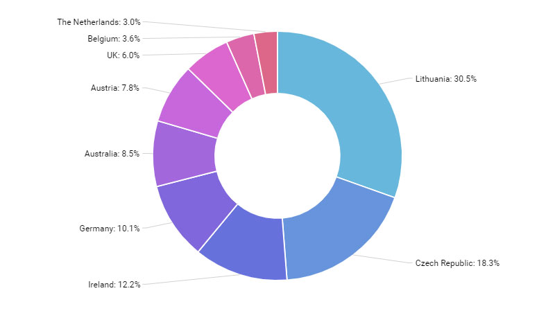
Pie Chart Example
Chart created with wpDataTables
When To Use A Pie Chart
The pie chart’s your go-to when you want to show how individual pieces measure up to the whole.
You’ve got a few categories? You’re in pie chart territory. Say you’re breaking down how time’s spent on a project, illustrating different slices for each task. If these tasks make up the entire project time, you’ve got yourself a pie chart situation. It’s about showing the relationship, like how much of the pie goes to meetings versus actual work.
Now, when you have a lot of categories or the differences between slices are kinda subtle, maybe think twice. Too many slivers of pie, and nobody knows what they’re looking at anymore.
So, use a pie chart when:
- You have a small number of categories.
- The focus is on relative proportions.
- You want to emphasize data as parts of a whole.
Just remember the golden slice: Pie charts are best served simple, with clarity as the main ingredient.
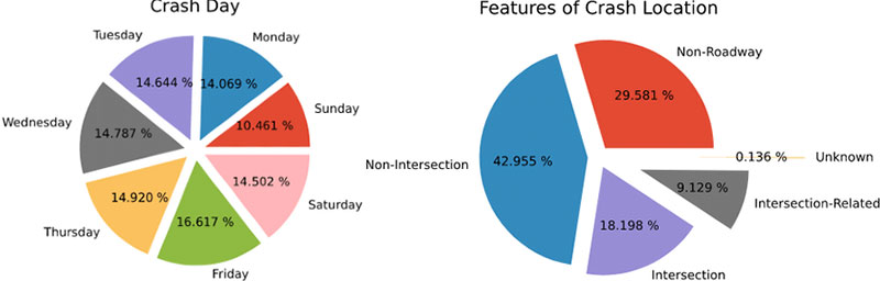
How To Read A Pie Chart
Chart created with wpDataTables
Picture this: a pie chart’s like a wheel, each wedge a different flavor of info.
First stuff first, check out the title. It hooks you up with what you’re eyeing – a chart about, say, favorite ice cream flavors. Without it, you’re a lost cookie in a creamery.
Now, on to the legend – it’s your flavor guide, matching colors on the pie to what they stand for. Cherry red for cherry, chocolate brown for, well, chocolate; you get the drift.
Here comes the main act, those tasty wedges. Bigger slice, bigger deal. It’s all about proportions here.
- Size up the slices: Eyeball which piece dominates – is it mint choco chip towering over the others?
- Colors and labels: They’re there for a reason. Match ’em up – which hue speaks for which stats?
- Savvy up on specifics: Some pie charts get fancy, throwing in numbers or percentages on the slices.
And hey, some charts like showboating with exploded segments to highlight the Big Kahuna.
Now, let’s not leave yet. Glance for any fine print or sources – gotta make sure you’re biting into fresh data pie, not last week’s leftovers.
Types Of Pie Charts
Standard Pie Chart
Chart created with wpDataTables
This is the most basic form, where different segments of a circle represent different categories. The size of each segment is proportional to the quantity it represents.
Doughnut Chart
Similar to a standard pie chart but with a hole in the middle, giving it a doughnut shape. It’s useful for comparing parts of a whole and can sometimes include multiple series of data.
Exploded Pie Chart
In this type, some or all of the slices are separated from the main pie. This is useful for emphasizing certain segments.
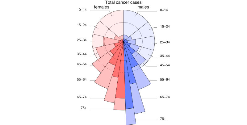
Polar Area Diagram (Coxcomb Chart)
Resembles a pie chart, but each segment has an equal angle, and the radius varies according to the value being represented. It’s useful for displaying cyclic data.
3D Pie Chart
Chart created with wpDataTables
A pie chart with a three-dimensional aspect. While visually appealing, it can sometimes distort data representation.
Pie of Pie or Bar of Pie Chart
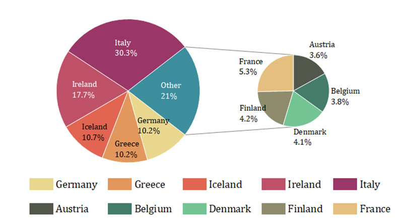
This involves a second pie or bar chart emerging from a slice of the main pie chart. It’s used to highlight and give more detail to smaller slices.
Spie Chart
This is a variant of the pie chart with an additional variable represented by the radius of each slice.
Multi-level Pie Chart
A pie chart with multiple levels or concentric circles, each representing a different hierarchy or grouping of data.
How To Make A Pie Chart In WordPress
To create a pie chart in WordPress using wpDataTables, follow these steps:
- Open the Chart Creation Wizard in your WordPress admin panel by navigating to wpDataTables -> Create a Chart.
- Choose a chart name and select a rendering engine (Google Charts, Highcharts, Chart.js, or ApexCharts).
- Pick a chart type from the list provided by the selected rendering engine.
- Define the data source by selecting a wpDataTable.
- Specify the data range for the chart, selecting columns and rows from the table.
- Customize the chart’s appearance and settings, including dimensions, colors, and other format options.
- Save the chart, which will generate a shortcode.
- Use the shortcode to insert the pie chart into your WordPress post or page.
How To Make A Pie Chart In Excel
To create a pie chart in Excel, follow these steps:
- Prepare the source data for the pie chart in a single column or row.
- Insert a pie chart by selecting your data, going to the ‘Insert’ tab, and choosing your desired pie chart type.
- Customize the chart by selecting various chart styles and options for formatting, labeling, and rotating the pie chart.
How To Make A Pie Chart In Google Sheets
To create a pie chart in Google Sheets, follow these six steps:
- Open Google Sheets and input your data, ensuring it’s organized with clear labels for each category and their corresponding values.
- Highlight the data you want to include in the pie chart.
- Go to the ‘Insert’ menu and select ‘Chart’.
- Set up your pie chart by choosing the ‘Pie Chart’ option in the Chart Editor.
- Customize your pie chart using the Chart Editor, where you can edit chart elements, modify colors, add titles, adjust the legend, and more.
- Finalize and insert the pie chart into your Google Sheets document by clicking the ‘Insert’ button in the Chart Editor.
FAQ About Pie Charts
How do you create a pie chart in Excel?
To create a pie chart in Microsoft Excel, enter your data in a table, select the range, and then go to the “Insert” tab. Choose “Pie Chart” from the chart options. Customize it using Excel’s chart editor for aesthetics and clarity.
When should you use a pie chart?
Pie charts are best used when you need to represent parts of a whole. They are useful in survey results, market research, and when presenting simple percentage distributions. They should not be used for complex data or when comparing multiple datasets.
What are the limitations of pie charts?
Pie charts can be misleading if there are too many segments or if the segments are very similar in size. They don’t show exact values well and can be challenging to interpret without proper chart legends and data labels.
How do you add labels to a pie chart?
In most visualization tools like Excel, PowerPoint, or Google Sheets, you can add labels by selecting the chart and using the “Chart Elements” or “Format Data Labels” options. Labels improve the readability and clarity of the data presentation.
What are the best practices for designing a pie chart?
Ensure the slices are in a logical order, typically from largest to smallest. Use contrasting colors for different segments. Always include a legend or labels for clear identification. Avoid clutter by limiting the number of slices for better visual analytics.
How do you customize a pie chart in Google Sheets?
After creating your pie chart in Google Sheets, click on the chart to access the chart editor. Here, you can customize colors, labels, and other elements. Using interactive charts helps in making chart customization more intuitive and user-friendly.
What is the difference between a pie chart and a donut chart?
Both charts show parts of a whole, but a donut chart features a hole in the center, allowing for additional labeling or data representation. The choice between them often depends on the specific data reporting needs and the desired visual impact.
How can pie charts enhance business presentations?
Pie charts simplify complex data, making it accessible and easy to understand. They highlight key data insights and data metrics, improving engagement and comprehension in PowerPoint presentations or business reports. Their visual appeal can make an impactful statement in data comparison.
What tools are best for creating pie charts?
Leading tools include wpDataTables, Microsoft Excel, Google Sheets, Tableau, and various visualization software. Each offers unique features for creating and customizing pie charts. Choosing the right tool depends on your specific needs for data visualization and the complexity of your data analysis.
Conclusion
Pie charts provide instant visual clarity for data distribution, making them essential for data visualization and business presentations. By now, you should be proficient in creating, customizing, and applying pie charts using tools like Microsoft Excel, Google Sheets, and Tableau.
Their effectiveness lies in their simplicity, aiding in data analysis and enhancing user engagement. From showcasing survey results to market research findings, pie charts break down complex data into digestible segments, ensuring your audience grasps essential data insights swiftly.
Remember key practices: logical slice order, clear labels, contrasting colors, and avoiding clutter. Utilize these charts in visual analytics to bolster your business intelligence strategies. Mastering pie charts will undoubtedly improve your data reporting and presentation skills.
Leverage the power of pie charts to present data with precision, enhancing both comprehension and impact. Equipped with this knowledge, you’re ready to underscore your data’s story clearly and effectively.
If you liked this article about pie charts, you should check out this article about bar charts.
There are also similar articles discussing candlestick charts, line charts, bubble charts, and waterfall charts.
And let’s not forget about articles on stacked bar charts, area charts, column charts, and donut charts.


