
You know when you’re scrolling through Instagram, and you come across this super cool infographic, and it just clicks? That’s the power of data storytelling. At its heart, it’s about taking numbers and stats and turning them into a tale that resonates with everyone – yeah, even folks who hated math in school.
Okay, so imagine you’ve got a ton of data, right? Numbers, charts, graphs – the whole shebang. But when you just throw that at someone, it’s like chucking a novel in their face and saying, “Read it, quick!” Not fun.
Data storytelling is like turning that novel into a blockbuster movie. It’s all about painting a picture with your data so that anyone can get the gist in a heartbeat. Think of it as the art of communicating data insights through narratives and visuals.
Nowadays, everything’s online. I mean, my grandma’s cat has its own Instagram account. With this insane flood of info, how do you stand out? How do you make sure people pay attention to what you have to say?
That’s where data storytelling comes in clutch. It doesn’t just throw facts at you. It shows you the story behind the numbers, making it way easier to understand and remember. And given how much data is out there, having some legit data storytelling examples in your toolkit is a game-changer.
Table of Contents
Data Storytelling Examples
The Entire History of Kickstarter Projects
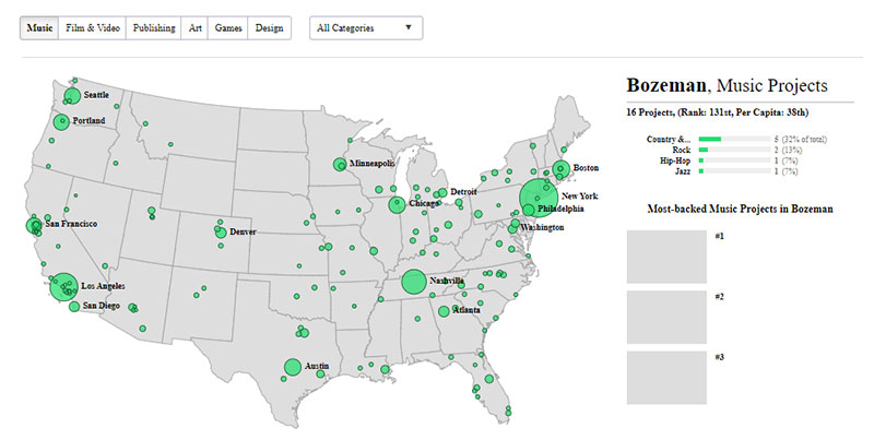
Polygraph presents an interactive visualization of every Kickstarter project. It offers insights into the most funded categories, success rates, and other intriguing data points.
BetterUp 2021 Insight Report
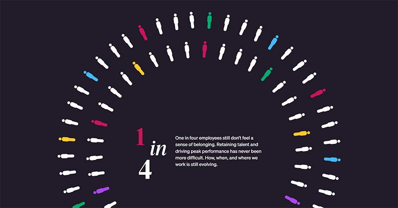
BetterUp’s 2021 Insight Report emphasizes the importance of diversity and inclusivity.
The report is filled with visuals and colors that humanize the company and showcase their commitment to inclusivity.
Film Dialogue
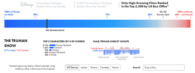
This data visualization from The Pudding breaks down thousands of film scripts to analyze the distribution of lines between male and female actors.
It provides a clear picture of gender disparity in Hollywood.
How Pop Music Got Less Wordy
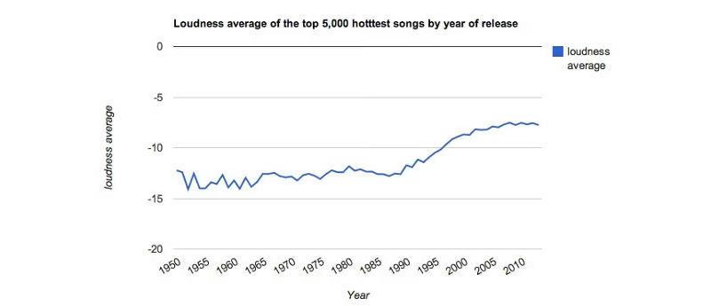
The Guardian uses data to showcase the evolution of pop music lyrics over the decades.
The visualization reveals a trend towards simpler, more repetitive lyrics in recent years.
A Day in the Life of Americans
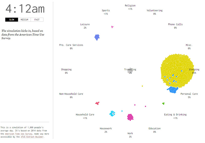
Nathan Yau visualizes the daily routines of Americans in this mesmerizing simulation. It offers a glimpse into the patterns and rhythms of daily life.
Facebook 2020 Environmental Sustainability Report
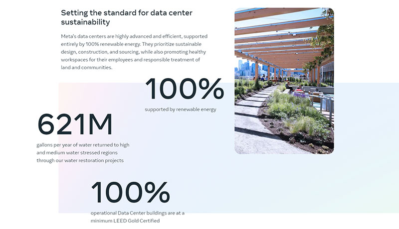
Facebook’s 2020 Environmental Sustainability Report highlights the company’s efforts towards sustainability.
With simple illustrations and concise text, the report presents Facebook’s commitment to the environment in a straightforward manner.
Nordgold Ten Year Anniversary of Gold
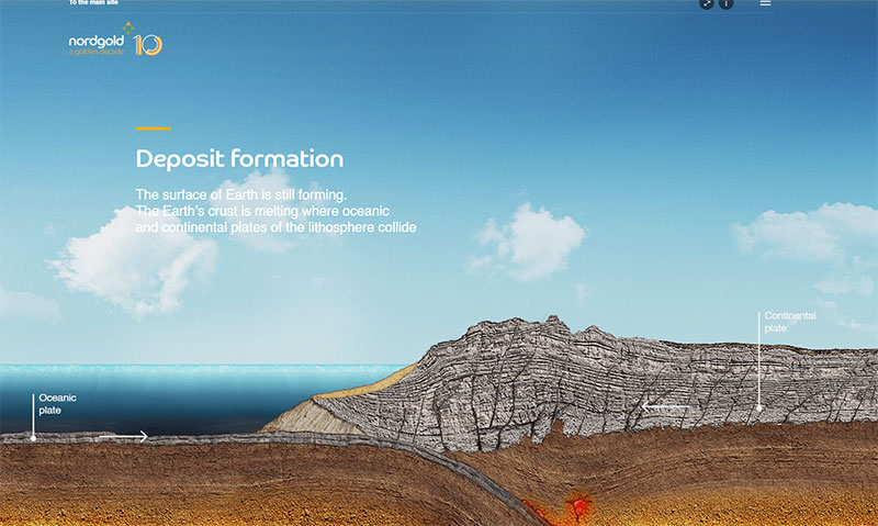
Norgold’s ten-year anniversary presentation on the history of gold is a visual treat.
It offers an immersive journey into the formation and significance of gold, enriched with three-dimensional graphics, scroll-triggered animations, and unique visuals.
Police Shootings
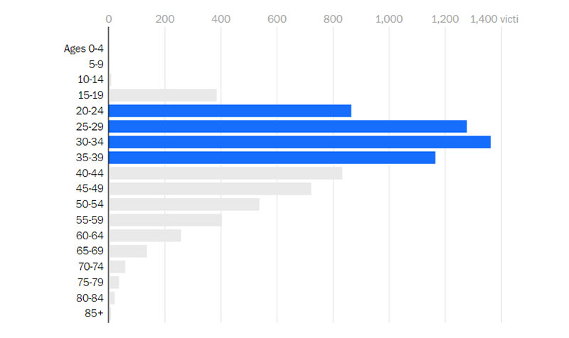
The Washington Post tracks every fatal shooting by an on-duty police officer in the U.S. The data is presented in a comprehensive and searchable database, shedding light on a critical issue.
Chit Chart
Chit Chart is a fun collection of data charts ranging from science to food.
It celebrates the imaginative ways data can be visualized, offering both unique and amusing displays of information.
U.S. Gun Deaths
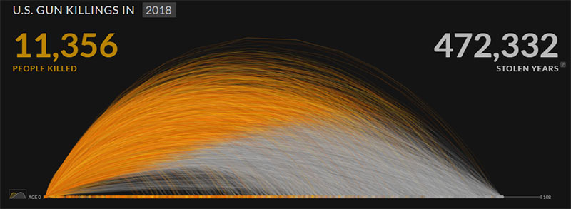
Periscopic offers a haunting visualization of gun deaths in the U.S. It not only presents the data but also humanizes it by showing the potential years of life lost.
Years You Have Left to Live, Probably
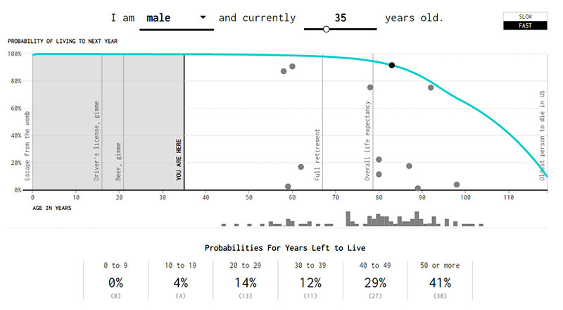
FlowingData’s interactive visualization provides a probabilistic view of how many years a person has left to live based on their current age. It’s a unique take on life expectancy data.
Your beautiful data deserves to be online
wpDataTables can make it that way. There’s a good reason why it’s the #1 WordPress plugin for creating responsive tables and charts.

And it’s really easy to do something like this:
- You provide the table data
- Configure and customize it
- Publish it in a post or page
And it’s not just pretty, but also practical. You can make large tables with up to millions of rows, or you can use advanced filters and search, or you can go wild and make it editable.
“Yeah, but I just like Excel too much and there’s nothing like that on websites”. Yeah, there is. You can use conditional formatting like in Excel or Google Sheets.
Did I tell you you can create charts too with your data? And that’s only a small part. There are lots of other features for you.
The Evolution of Data Storytelling
Ain’t nothing new, folks. Data storytelling’s been around the block, but it sure has changed its shoes along the way.
Historical Context
Early forms of visual storytelling
Way before our digital age, people have been using visuals to tell tales. Think cave paintings, hieroglyphs, and even those medieval tapestries (shoutout to all the history buffs!). These were all precursors to our modern-day infographics and charts.
These early visuals were humanity’s first attempt at recording events, beliefs, and – yep, you guessed it – data. They gave folks a snapshot of life back then. And, honestly, they were the OG data storytelling examples.
The rise of digital data visualization
Fast forward a bit, and computers enter the scene. Suddenly, we’ve got more data than we know what to do with. Enter digital data visualization. This was about making sense of all that info, using tools and software to craft visuals that made complex data digestible.
I mean, remember the first time you saw a digital pie chart? Mind. Blown. It was a revolutionary way to showcase data storytelling examples in a form that the digital generation could vibe with.
Modern Applications
Business and marketing
Every time you see a company’s cool ad that shows how their product is “200% better” with snazzy graphics? That’s data storytelling working its magic.
Brands these days need more than just a catchy slogan. They need to show their worth, and what better way than with some killer data storytelling examples?
Journalism and media
News channels and papers aren’t just about the “who, what, when” anymore. They’re diving deep into the “why” and “how”.
When you see a map highlighting areas affected by a natural disaster or a bar graph showing election results, you’re seeing data storytelling in action.
Academic and research
Remember those yawn-inducing presentations back in college? Now, researchers are upping their game, using data storytelling to make their findings more accessible and engaging.
From climate change graphs to stats on social trends, data storytelling examples are making waves in academia.
Benefits of Data Storytelling
Okay, real talk – why’s everyone so hyped about data storytelling? Let’s dive into the juicy benefits that have everyone raving about data storytelling examples.
For Businesses
Enhancing marketing campaigns
Ever stumbled upon an ad that just spoke to you? Chances are, it had some sleek data storytelling woven in.
Marketers use data to tailor their campaigns, making them more relatable. And when there’s a visual representation of “Hey, 9 out of 10 people love this,” it kinda makes you want to jump on that bandwagon.
Informing decision-making
Behind the scenes, businesses are using data storytelling to make some big moves.
Deciding to launch a new product, targeting a new audience, or even changing their brand colors, these decisions aren’t just whims. They’re backed by data stories that offer insights and a clear path forward.
Building brand credibility
Let’s be real; no one’s gonna trust a brand that just talks the talk. By showcasing data storytelling examples, brands can walk the walk.
It’s like saying, “Don’t just take our word for it, look at these stats!” Instant credibility booster.
For Audiences
Simplifying complex information
Who’s got time to go through pages of data? I sure don’t. But give me a cool infographic or a catchy animation that summarizes it all?
I’m all ears.
Data storytelling breaks down the geeky stuff and turns it into snackable content.
Engaging and memorable content
Ever had a jingle stuck in your head for days? That’s the power of engaging content. And with visuals, data storytelling is no different.
It serves facts with a side of fun, making it stick in your mind for longer.
Encouraging informed actions
Every time you’ve switched brands or tried something new because of a compelling ad, that’s data storytelling working its charm. It not only informs but also nudges you in the right direction, helping you make better choices.
FAQ about Data Storytelling
What’s data storytelling anyway?
Well, in the simplest terms, data storytelling is about turning raw numbers into a compelling narrative.
Think of it as a bridge between hard stats and a story that resonates with people. Instead of just throwing graphs at you, data storytelling wraps it up in a tale that’s way more digestible.
Why is data storytelling such a big deal now?
It’s the digital age, my friend. We’re drowning in data. To stand out, you gotta speak human, not spreadsheet.
With so much info out there, data storytelling helps simplify complex data so the average Joe and Jane can get it.
Got any cool data storytelling examples?
Absolutely! Ever seen an infographic showing how coffee consumption varies around the world? Or maybe a heat map on a website that shows where users click the most?
Those are all examples of data storytelling – taking data and making it visual and relatable.
How do businesses use data storytelling?
Businesses are smart cookies. They use data storytelling to boost their marketing campaigns, make informed decisions, and build brand credibility.
Instead of saying “Our product is awesome,” they show you why with compelling visuals backed by data.
Is data storytelling just for techy folks?
Nah, not at all. While there’s tech involved, especially in creating the visuals, the essence of data storytelling is about communication.
What tools can I use for data storytelling?
There’s a buffet of tools out there. From Tableau for hardcore data enthusiasts to Canva for those who like it simple and snazzy.
Depending on what you’re comfy with and your goals, there’s probably a tool out there that fits just right.
How do I ensure my data storytelling is effective?
Great question! Firstly, know your audience. What works for millennials might not click with baby boomers. Then, keep it simple.
Avoid jargon and opt for visuals that convey the message clearly. And always, always stay true to the data.
Any pitfalls I should watch out for?
Oh, plenty. The biggest one? Misrepresenting data, even unintentionally. Always ensure your data is accurate and not manipulated.
Also, avoid overloading with too much info. Remember, the goal is clarity, not confusion.
Conclusion on Data Storytelling
Alright, wrapping things up here – data storytelling ain’t just a buzzword. It’s the real deal in the world of information overload.
Whether you’re a brand trying to stand out or just someone navigating the vast sea of the internet, recognizing the power of data storytelling examples can be a game-changer.
And hey, next time you come across a cool visual or an infographic, you’ll know the mad skills that went into crafting it. So here’s to more stories, more data, and a whole lot of epic content.
If you liked this article about data storytelling examples, you should check out this article about data visualization blogs.
There are also similar articles discussing scientific data visualization, data visualization challenges, data visualization for marketers, and data journalism examples.
And let’s not forget about articles on big data visualization, visualizing large data sets, financial data visualization tools, and data visualization trends.


