Imagine being able to watch a symphony of data unfold in real-time, helping you make smarter decisions instantly. That’s the power of IoT data visualization—a game-changer in our data-driven world.
In a landscape dominated by connected devices and sensor data, the need to interpret massive amounts of information efficiently is more critical than ever. IoT data visualization pulls key insights from the overwhelming noise, providing clear and actionable visuals.
By leveraging advanced visualization tools and embracing technologies like cloud computing, we unlock a treasure trove of data insights and predictive analytics.
Whether it’s for industrial IoT, smart cities, or predictive maintenance, mastering this skill offers an unparalleled advantage.
In this article, you’ll delve into the best methods for real-time data presentation, understand the frameworks that support this ecosystem, and discover top IoT platforms.
By the end, you’ll be equipped with the knowledge to transform complex data into intuitive, interactive dashboards and charts.
Table of Contents
What Is IoT Data Visualization?
IoT data visualization is the graphical representation of data from Internet of Things (IoT) devices, making it easier to interpret trends, patterns, and insights for better decision-making and monitoring.
Understanding IoT Data Visualization
The Concept of IoT Visualization
Data speaks volumes. Yet, raw data is often overwhelming. When it comes from IoT devices, we need an elegant translator—Enter IoT visualization.
Visuals transform the jumbled mess of zeros and ones into something comprehensible. Picture this: graphical representations like line charts, bar graphs, and immersive 3D models.
These elements simplify the complex, making it digestible.
Think pie charts showcasing the proportion of different devices in a network or a heatmap revealing the density of data points.
IoT isn’t just some flashy buzzword. It’s a revolution turning mere objects into smart entities, capable of churning out continuous streams of data. And this data? It doesn’t just sit there. It’s alive—demanding real-time monitoring and swift interpretation.
Role of IoT in Generating Data
Every smart device interconnected, chatting away, generating an avalanche of data.
This interconnectedness gives rise to invaluable insights. Imagine sensors monitoring temperature and humidity levels or smart meter water utilities in a smart agriculture system. Or think about a wearable health tracker constantly updating cloud storage with your vitals.
The role of IoT in data generation is paramount. We’re talking about continuous data generation and real-time streams from an ever-growing list of sources.
Appliances, vehicles, industrial machines—all these smart entities contribute to our pool of knowledge. This data isn’t static; it’s flowing, evolving, demanding visualization in real-time dashboards and other visual tools.
And that’s where IoT data visualization steps in—bridging the gap between complex data streams and actionable insights.
Here, visual elements help decode the maze of interconnected data, ensuring that no critical information is lost in translation.
Types of IoT Visualization
Real-time Dashboards
Imagine you’re looking at an interactive interface bursting with life. These real-time dashboards aren’t just colorful distractions—they’re the front lines of IoT data visualization.
Picture customizable layouts showcasing key performance indicators (KPIs), trends, and even sudden alerts.
Think of an industrial IoT setup, where machinery health stats flash in real time, empowering you with insights instantaneously.
This isn’t static imagery. It’s live, dynamic, and often the heartbeat of operations, allowing for immediate troubleshooting and nimble decision-making.
Graphs and Charts
Now, let’s get a bit more versatile. Line charts, tracking continuous data over time—ideal for monitoring variables like temperature or speed. Picture a steady rise or fall, guiding your next move. Bar charts step in for comparing discrete data points, visualizing, perhaps, the output of various sensors.
There’s elegance in simplicity—a pie chart for proportions, splitting the narrative of data distribution.
Scatter plots? They reveal relationships with intriguing patterns, be it IoT sensors in a smart home or devices in a vast industrial setup.
When density becomes paramount, we turn to heatmaps, portraying the data concentration like a vivid tapestry.
And don’t forget gauge charts for those crucial single-value representations—imagine fuel levels in a connected vehicle fleet.
3D Visualizations
Here’s where things get immersive. 3D visualizations transport data into another realm, often employing VR technologies.
Imagine exploring the spatial distribution of sensors in a smart city, or an industrial plant with machinery whirring in all directions. It’s not just data anymore; it’s an experience—a journey through a data-driven landscape.
Geospatial Visualizations
Step back and peer at the world through geospatial visualizations.
This is where maps and geography join forces with data—think GPS data streaming from connected devices across sprawling terrains. Visualize traffic patterns in a smart city, optimizing routes in real-time.
Popular Tools for IoT Data Visualization
Out of the Box Tools
When diving into IoT data visualization, having the right toolkit can make all the difference. Sometimes, you want solutions that are ready to go, right out of the box.
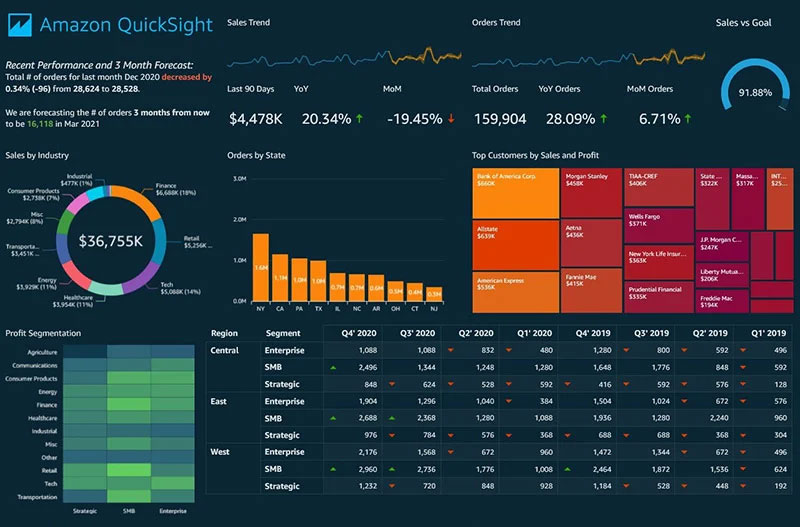
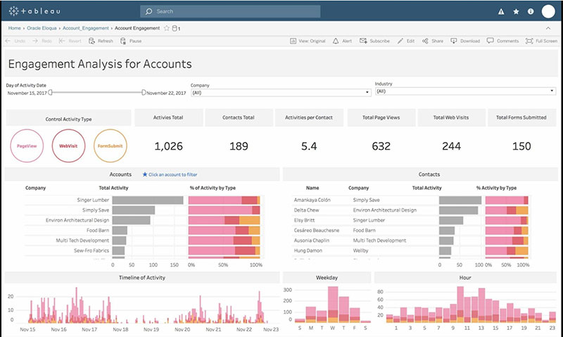
Picture Tableau, a powerhouse in the realm of data visualization. It’s got the chops for crafting interactive, insightful dashboards.
Whether it’s tracking sensor data from your smart home or analyzing industrial IoT metrics, Tableau can handle it.
Then there’s Power BI—another titan. Seamlessly integrates with your data sources and offers dynamic visuals. Think real-time analytics splayed out in vivid, customizable charts.
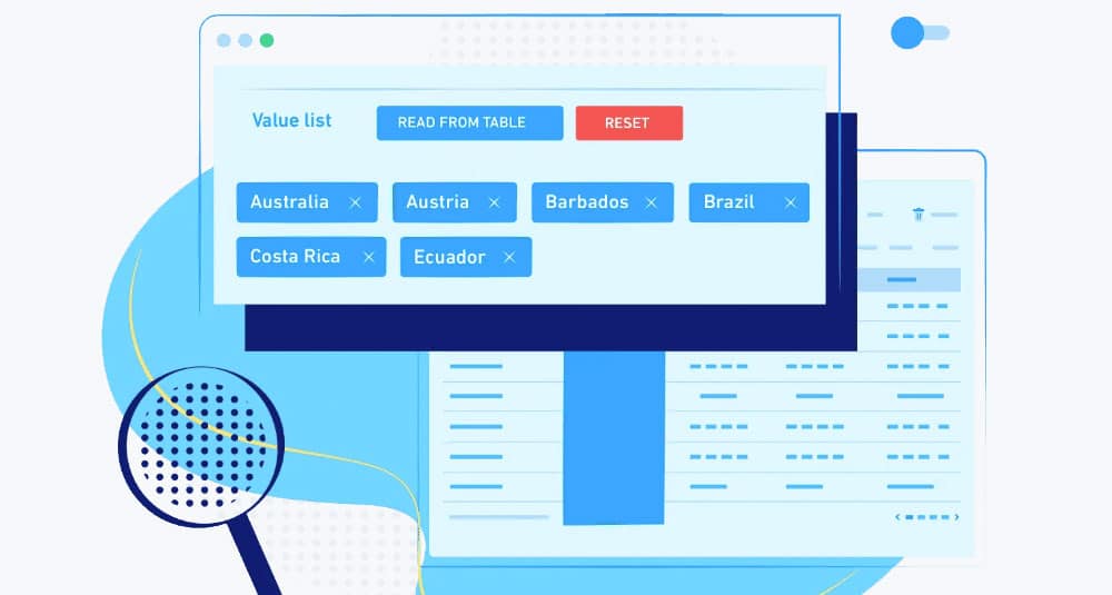
wpDataTables is another fantastic tool to consider. Known for its ease of use and versatility, it allows you to create responsive, feature-rich tables and charts from various data sources. Perfect for those who need quick, professional-grade visualizations without extensive setup.
And for those inclined toward a more technical setup, Grafana steps in. Perfect for building observability dashboards, it’s a go-to for monitoring data in real-time. Ideal for scenarios where instantaneous insights matter.
ThingSpeak is also worth a mention. It’s all about IoT. With its capabilities focused on quickly transforming raw data into visual insights, it’s a fitting choice for IoT enthusiasts and professionals alike.
Lastly, Ubidots—a robust platform letting you create visual representations of IoT data swiftly. From interactive maps to sophisticated charts, it’s got you covered.
Build Your Own Solutions
Maybe you crave something unique. Custom solutions where every detail is tailored. Enter the world of build-your-own tools.
D3.js—the darling of data visualization. It allows for intricate and custom visualizations, perfect for those who relish in coding and creativity. The sky’s the limit here.
Or perhaps Plotly, which brings the best of both worlds—complex, yet user-friendly. Interactive, web-ready graphs are its forte, making it a brilliant choice for those elaborate IoT visual projects.
For a balance between simplicity and functionality, there’s Chart.js. Easy to get started with for basic visualizations, yet powerful enough for more complicated displays.
Then, let’s talk Matplotlib. This staple of the Python community is a go-to for static, high-quality plots. Ideal for those deep into data science and analytics.
Bokeh offers interactive plots and dashboards directly in Python, making it a favorite for those who need real-time visual feedback.
And don’t forget Highcharts—robust and versatile, supporting a multitude of chart types. Capturing the essence of IoT data, it’s suitable for everything from simple line graphs to complex maps.
Benefits of IoT Visualization
Enhanced Understanding of Complex Data
Imagine swimming in a sea of raw information—sensor data, metrics from smart devices, bits and bytes coming at you like a relentless tidal wave.
IoT data visualization is your lifeboat. It transforms this chaotic flood into clearly comprehensible visuals. Think simplified graphs, intuitive charts, and interactive interfaces.
When you view intricate data sets through tools like real-time dashboards or geospatial visualizations, suddenly, everything snaps into focus.
It’s like pulling back the curtain to reveal patterns and insights that were always there, just hidden in the complexity.
Real-time Monitoring and Analysis
Welcome to the world of real-time. Your devices are continuously speaking, generating streams of data without a pause. The flow is constant, demanding immediate attention. Real-time monitoring transforms this stream into live visuals—interactive dashboards or live charts.
Imagine a city’s water system, monitored continuously through these interactive interfaces. Alerts pop up, trends emerge instantly, and you don’t just react—you adapt proactively, maintaining a pulse on every critical metric.
Improved Decision-making Processes
The boardroom isn’t just about high-backed chairs and solemn faces. It’s about decisions—swift and informed.
IoT visualization tools rally to empower decision-makers. How? They present clear, timely insights, cutting through the noise.
Empowerment means turning raw data into actionable intelligence. When critical insights are just a glance away on your dashboard, decision-making transcends guesswork and steps into the realm of strategic accuracy.
Identifying Patterns, Trends, and Anomalies
Numbers alone narrate a monotonous tale, but visual tools breathe life into them. Early detection of trends and anomalies becomes not just feasible but effortless.
Think heatmaps revealing data density or scatter plots mapping relationships between variables.
Patterns leap out, trends draw themselves, and anomalies blink like red warning signs.
Whether it’s in an industrial IoT setup or healthcare monitoring, these tools become the early warning systems—predicting the storm before it hits.
Predictive Insights and Forecasting
Look forward, not backwards. Predictive analytics is about using historical data to forecast the future, transforming reactive responses into proactive strategies.
Through comprehensive IoT data visualization, these predictive insights aren’t merely dry forecasts—they’re vibrant crystal balls.
Historical trends morph into future projections, empowering you to anticipate needs, preempt problems, and pivot strategies effectively.
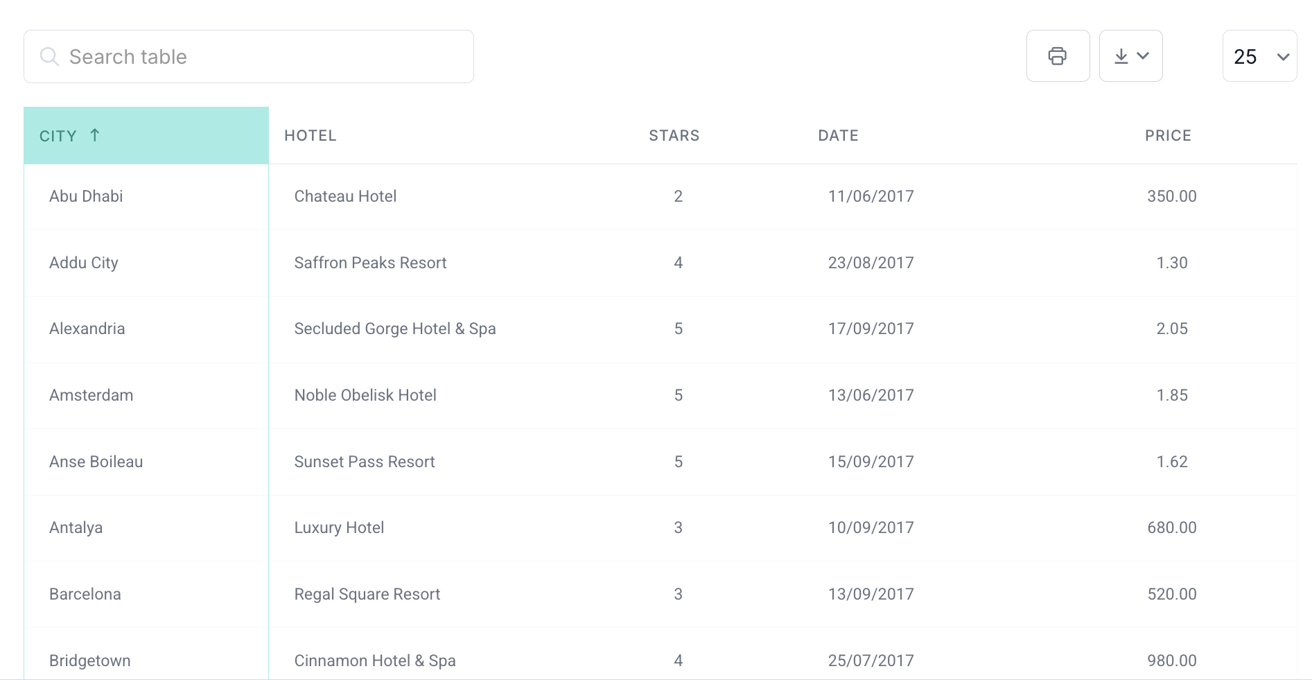
Your beautiful data deserves to be online
wpDataTables can make it that way. There’s a good reason why it’s the #1 WordPress plugin for creating responsive tables and charts.

And it’s really easy to do something like this:
- You provide the table data
- Configure and customize it
- Publish it in a post or page
And it’s not just pretty, but also practical. You can make large tables with up to millions of rows, or you can use advanced filters and search, or you can go wild and make it editable.
“Yeah, but I just like Excel too much and there’s nothing like that on websites”. Yeah, there is. You can use conditional formatting like in Excel or Google Sheets.
Did I tell you you can create charts too with your data? And that’s only a small part. There are lots of other features for you.
Best Practices for IoT Visualization
Defining Clear Objectives and KPIs
Before diving into the ocean of IoT data visualization, pause. What are your goals? Aligning visualization goals with your business objectives isn’t just smart; it’s essential.
Maybe you’re tracking predictive maintenance metrics for industrial equipment or monitoring air quality in smart cities. Pin down what success looks like—define your KPIs.
Is it uptime? Response time? Resource utilization? The clearer your objectives, the sharper your visuals.
Using Appropriate Visualization Techniques
Select the sword that suits your battle. Data varies, and so should your visualization techniques.
Use line charts for continuous streams of data; perfect if you’re monitoring temperature fluctuations over time. For comparing discrete data points, bar charts stand tall.
When talking proportions, pie charts slice through complexity effortlessly.
Scatter plots unveil relationships; think predicting wear-and-tear on machinery by plotting usage hours against breakage incidents.
Density worries? Heatmaps fire up the analysis, and gauge charts zero in on single data points—ideal for IoT metrics like battery levels.
Considering the Audience
Who’s your audience? A technical team scratching their heads over complex metrics or business execs needing quick insights? Tailoring visualizations isn’t just about aesthetics; it’s about understanding technical expertise.
For the data wizards, dive deep—use detailed graphs and scatter plots. For the strategists, simplicity wins—dashboards with clear and concise visuals. Tailor the depth and design to fit the user, ensuring that insights are not only accessible but actionable.
Ensuring Data Quality and Accuracy
Bad data? Bad decisions. It’s straightforward. Ensuring data quality and accuracy is the bedrock of meaningful visualization.
Data from connected devices must maintain integrity—no gaps, no inconsistencies.
Regular checks, rigorous cleaning, and real-time updates ensure that your visualizations don’t just look good but are dependable.
Quality data feeds trust and drives everything from predictive analytics to action plans.
Keeping Visualizations Simple and Intuitive
Less is more. Clutter? Complexity? They’re your enemies. Keep visualizations simple and intuitive.
Industrial IoT dashboards crammed with too much info? Nightmare. Users should glance at a chart or dashboard and instantly get the gist.
Use clear labels, intuitive color schemes, and straightforward layouts. Avoiding unnecessary flair sharpens comprehension.
After all, visualizations should light the path, not blind the traveler.
Applications of IoT Visualization
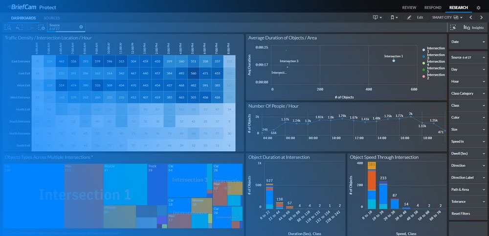
Smart Cities
Imagine a city that breathes. Not just buildings and roads, but a living, data-driven organism. IoT data visualization in smart cities optimizes everything:
Traffic flow—smooth and dynamic, managed in real-time. Signal adjustments, route suggestions, congestion predictions—all visualized on sleek dashboards.
Managing resources becomes artful. Energy, water, waste—not a drop wasted. See the entire city’s energy consumption laid out in heatmaps or bar charts, ready for tweaking and optimization.
Urban living, tailored. Illuminating streets when needed, regulating parking spaces, enhancing the urban experience. Smart cities are the future, visualized.
Industrial IoT
Enter the colossal world of Industrial IoT. Monitoring equipment health isn’t just a task; it’s essential.
Visual tools depict operational health, foreseeing failures before they happen.
Predictive maintenance—visual alerts pop before breakdowns. Illustrated timelines of wear and tear, scatter plots of usage vs. efficiency.
The factory floor, now a visual symphony of data-driven maintenance.
Healthcare
From remote patient monitoring to wearable health trackers, IoT visualization transforms healthcare.
Patient vitals streamed in real-time, graphed, and analyzed. Instant visual access to heart rates, glucose levels, activity—a lifeline for remote health monitoring.
Wearables don’t just count steps. They visualize holistic health, offering insights that drive real-time interventions.
Doctors see beyond numbers; they see health trajectories and anomalies—all in rich detail.
Agriculture
Drones zoom over fields, sensors in the soil—the modern farm, alive with data. Crop health visualized through heatmaps, weather data plotted over time, soil moisture levels charted meticulously.
It’s not farming; it’s precision agriculture. Decisions driven by visuals—when to irrigate, when to harvest. Sustainability meets technology in the fields, transformed by visual insights.
Retail
Step into a store where data shapes the experience. Retail IoT isn’t just about inventory; it’s about enhancing the customer journey. Visual dashboards show inventory levels in real-time, scattered plots for sales trends.
Customer experience? Personalized and optimal. Visuals map shopping behaviors, preferences, driving in-time stock adjustments and targeted promotions. Retail spaces, reimagined through visual data narratives.
Smart Homes
The humble abode, now smart. Visual tools monitor energy use, detect security breaches. Line graphs for energy consumption, heatmaps for security activity—a home that smartly reports itself.
Notifications spring to life on dashboards. Visibility into every corner, no intrusions unnoticed, no energy wasted. In a smart home, IoT visualization keeps everything under watch, ensuring comfort and security.
FAQ On IoT Data Visualization
Why is IoT Data Visualization Important?
Data visualization for IoT is crucial because it simplifies vast amounts of big data, enabling quicker decision-making. By converting raw data into visual formats, businesses can spot trends, detect anomalies, and enhance predictive maintenance.
Ultimately, it helps in making informed decisions swiftly by visualizing real-time data.
What Tools Are Used in IoT Data Visualization?
Several visualization tools like Tableau, Power BI, and Grafana are popular in IoT data visualization.
These tools integrate seamlessly with cloud computing and data analytics platforms, providing customizable and user-friendly interfaces to present data from smart sensors and networked systems effectively. To monitor usage, reduce unnecessary expenses, and make IoT deployments more efficient, these tools can be used alongside top cloud cost optimization tools.
How Does IoT Data Visualization Improve Decision-Making?
By translating complex data streams into visual formats, it aids in spotting key patterns and trends effortlessly. This immediate clarity supports informed decision-making, enabling swift responses to evolving situations.
IoT ecosystems benefit significantly, gaining actionable insights directly from interactive dashboards.
What Are Common Challenges in IoT Data Visualization?
Handling big data, ensuring real-time performance, and maintaining data accuracy are the main challenges. Visualizing continuous data streams from numerous connected devices demands robust infrastructure.
Additionally, creating intuitive and effective visualizations without overwhelming the users can be complex and demanding.
How Is Real-Time Data Visualization Achieved in IoT?
Real-time data visualization in IoT is made possible by using data aggregation platforms combined with edge computing. These systems process data quickly, allowing immediate updates.
Interactive dashboards and data monitoring tools are designed to display this real-time information effectively, ensuring seamless and up-to-date data presentations.
What Types of Data Can Be Visualized in IoT?
Virtually all types of sensor data can be visualized—temperature, humidity, motion, etc. Additionally, data metrics related to machine performance, environmental conditions, and energy usage are common.
IoT platforms ensure diverse data streams are processed and visualized, making them accessible for various applications.
What Is the Role of Machine Learning in IoT Data Visualization?
Machine learning enhances IoT data visualization by identifying patterns and predicting future trends. It aids in creating smart, adaptive visualizations that evolve based on data insights.
Integrating ML with visualization tools allows for more robust and predictive displays, enhancing the utility of IoT data.
How Can IoT Data Visualization Help in Predictive Maintenance?
By analyzing historical and real-time data trends, visualizations can predict potential failures.
Predictive maintenance relies on these insights to schedule timely interventions, thus reducing downtime and optimizing equipment lifespan. It transforms raw data into actionable information for maintaining operational efficiency.
How Does Data Security Affect IoT Data Visualization?
Data security is paramount. Ensuring that visualization platforms are secure safeguards sensitive information.
Utilizing encrypted data pipelines, secure cloud storage, and robust access controls helps in maintaining the integrity and confidentiality of visualized data, making it crucial in the IoT ecosystem.
Conclusion
IoT data visualization is not just a buzzword; it’s the cornerstone of transforming complex sensor data into actionable insights. By utilizing advanced visualization tools and integrating with cloud computing and edge computing, we’re able to craft real-time monitoring systems that are as intuitive as they are effective.
Key Points Wrapped Up:
- Unlocking valuable data insights.
- Enhancing predictive maintenance.
- Crafting interactive dashboards for seamless user experience.
The Internet of Things paired with powerful visualization techniques offers an unmatched opportunity to harness the full potential of big data. These technologies empower you to decode intricate data streams into clear, visual narratives that drive informed decision-making and operational efficiency.
In a world where data is the new gold, mastering IoT data visualization equips you with the tools to stay ahead—an imperative in today’s digital landscape. Remember, the future belongs to those who can make sense of it in real-time.