Imagine this: two chart contenders step into the data arena, each flaunting their strengths. In one corner, the steadfast bar chart; in the other, the towering column chart.
Ever found yourself in a data duel, deciding which visualization will best showcase your story? Well, chart a course to clarity, because you’re about to become an expert navigator in the world of comparative graphs.
Diving into the nitty-gritty of data visualization tools, we’ll unravel the mysteries of these chart types. With your trusty guide (that’s me), you’ll learn to wield these graphing gladiators with skill.
Whether you’re plotting categorical data or illustrating quantitative information, the insights you gain here will transform your dashboards from sufficient to spectacular.
By article’s end, you’ll not only discern when to use a bar chart over a column chart, but also why chart orientation and design could make or break your data presentation. Get ready to elevate your chart design and data storytelling skills to masterful heights!
Table of Contents
Differences Between Bar and Column Charts
Picture this: you’re staring at a juicy burger. The patty and the bun are the heart and soul of this classic meal. Similarly, in the realm of data visualization, the layout of a bar chart and a column chart is the meat and bun of our graphical feast.
Bar Chart: Horizontal layout and its implications
Imagine laying back in a hammock, looking at the stars – that’s how a bar chart stretches out, horizontally.
The key here isn’t just about its laid-back position; it’s how it caters to your eyes. With bars extending from left to right, one can easily fit longer data labels without a hitch.
Think about long, winding names or categories that just can’t seem to get enough of the alphabet. They unfold gracefully on a bar chart, no squinting or head-tilting required.
The horizontal bar graph whispers sweet nothings to comparisons. Oh, how it elegantly showcases differences between categories without making them jostle for your attention. And all this space has another perk: a spread-out display of data points that tells a story at a glance.
Column Chart: Vertical layout and its implications
Now, snap back to a skyscraper reaching for the clouds. That’s the vibe of a column chart – vertical and proud. The columns stand tall, side by side, like soldiers. It’s a format made for the hustle and bustle of time-sensitive data.
The rhythm of days, months, and years fits perfectly into the upward striving nature of column charts.
They’re like timelines that grow like beanstalks, each column a snapshot in time. This vertical dance is suited for when you’re tracking progress or highlighting growth.
It’s chronological data’s best friend, showing off trends while you tap your foot to the beat of time’s drum.
Optimal Use Cases
When you’re picking out shoes, you don’t just grab any pair, right? You choose the best fit for the occasion. Well, it’s the same deal with bar charts and column charts.
When to use Bar Charts: Detailed comparison and specific scenarios
Let’s tango with bar charts for a sec. They’re the champions when you have a bunch of items to compare – I’m talking a laundry list of categories.
It could be a librarian’s dream: comparing book genres across libraries or even a zookeeper’s diary, plotting animal food costs. When the details matter, when you need to get down to nitty-gritty comparisons, the bar chart is your trusty sidekick.
Plus, we’re not just talking plain Jane bars. Enter their cool cousins – stacked bar chart and grouped bar chart. Layered like a cake or grouped like a family photo, these variations add layers and depth to the way you compare the incomparable.
When to use Column Charts: Detailed comparison and specific scenarios
Switching gears, column charts strut in when time is central to your story.
They’re ideal for catching the ebb and flow of sales over the months or for tracking website visitors as the seasons change. Each column can play a part in a bigger picture, making it a cinch to spot trends or dips as time waltzes by.
And let’s jazz things up with a stacked column chart.
It’s like sorting your socks by color and pattern – everything in one place but neatly separated. When you’re showing how individual segments contribute to a total over time, it’s like hitting the jackpot with dazzling clarity.
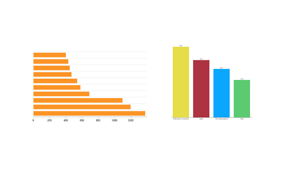
Deep Dive into Bar Charts
Chart created with wpDataTables
Components of a bar chart
It starts with a solid foundation: the axes. But in a horizontal bar graph, we flip the script.
The usual y-axis now holds what we want to compare, and the x-axis, well, it lays out the numbers, patiently stretching from zero to the star of the show, our data point.
Bars are like brushes in an artist’s hand. They paint the picture of differences or similarities across categories.
With careful shading through varying colors, we can highlight aspects that jump out and demand a “Hey, look at me!”
Then, there’s the scale – it’s the rhythm to which the bars dance.
Get it right, and you have a harmonious melody; mess it up, and you’ll hit a discordant note that could confuse anyone trying to understand the data melody.
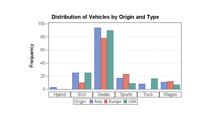
Variations: Stacked, grouped, and more
Chart created with wpDataTables
Variations in bar charts are the spice that can turn a bland dish into a gourmet meal. With a stacked bar chart, you stack up data like a totem pole of insights, one atop the other, forming a single bar that tells a layered story.
Grouped bar charts? They’re the chatter of a coffee shop, where conversations intermingle yet remain distinct.
Each category gets its cluster of bars, allowing multiple data sets to natter side by side.
Advantages of Using Bar Charts
Chart created with wpDataTables
Diving into the perks of a bar chart is like uncovering hidden gems that others might walk past.
Enhanced readability for long data labels
Long data labels that would usually trip and fall over themselves in a column chart find a welcoming stretch of beach to bask on a bar chart.
You can have labels like “Extravagantly expensive European sports cars” lying comfortably next to each of its bars, leaving no one squinting or getting a crick in the neck.
Effective comparison across a large number of categories
Imagine a fruit stand with every exotic fruit you can think of. How do you choose?
A bar chart lets each fruit – or in our case, category – show off without feeling cramped. More categories, more bars, more clarity. That’s our motto.
Limitations and Considerations
Even the best tools have their “handle with care” labels.
When bar charts may lead to misinterpretation
If the scale’s a mess or the bars are out of tune – say hello to confusion. Misinterpretation strolls in when the proportion between the bars isn’t just right.
Adjusting design to overcome limitations
It’s not about tossing the bar chart out with the bathwater, though. Tweak your design.
Play with the scale, shuffle the colors, and align the data labels. Make it a bar chart that speaks clearly, no misunderstandings, just pure, unadulterated insights.
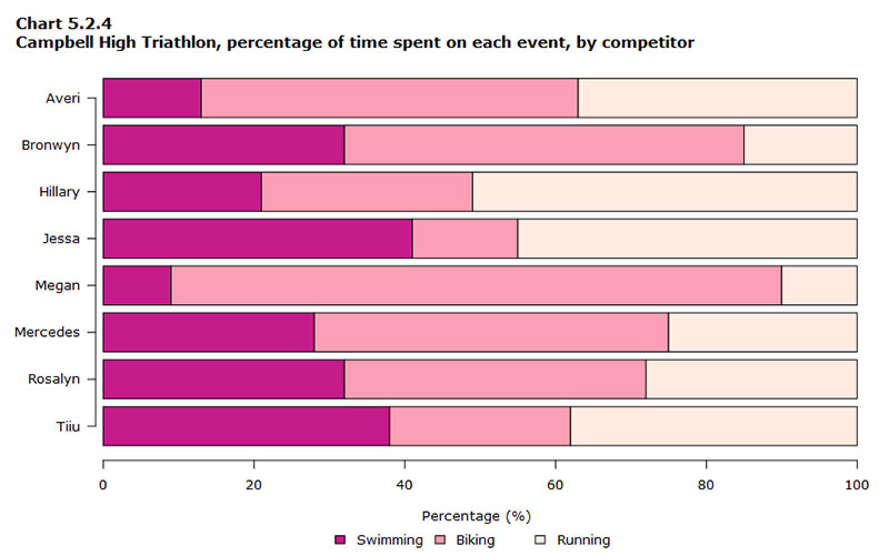
Comprehensive Analysis of Column Charts
Chart created with wpDataTables
Key components and layout
Every column chart starts with a solid ground—the x-axis, where the categories or time periods lay their claim.
Now look up, and there’s the y-axis, soaring with numbers that give height to the data. It’s like buildings where each floor counts the growth or drop, step by step.
Columns can be like pencils, drawing sharp lines upwards, each marking a different point in time.
The beauty in using a column chart comes from its ability to stand tall, showing off its data across the chart like a timeline you can walk through.
Variations: Stacked vs. clustered column charts
But why stop at simple? A column chart can get a glow-up with some stacking action.
Imagine stacking those building blocks, one category over another until you have a colorful column that breaks down the whole into distinct parts.
And then there’s the clustered column. It’s like watching a chorus line where every dancer has individual moves but together, they’re a single entity.
It’s perfect when different datasets need to shake hands and be compared side by side.
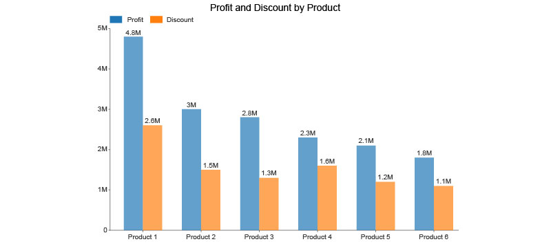
Benefits of Employing Column Charts
Chart created with wpDataTables
With column charts, it’s all about lifting data off the ground and giving it a stage to perform its narrative.
Ideal for showing trends over time
Think of the column chart as a time traveler, hopping from one year to the next. It’s fantastic for catching the waves in the sea of data.
A rise in sales, a dip in visitors, or a steady drumbeat of, say, rainfall amounts – it’s all there in the climbing steps of each column.
Clarity in representing chronological data
Chronological data is like a well-preserved diary, and the column chart transforms those words into pictures. It’s brilliant for organizing dates, times, or any sequence where order matters.
Watch data grow over the months or years, or compare holiday sales – each column a new chapter, clear and crisp as morning light.
Drawbacks and Strategies
Yet, every story of glory comes with its cautionary tales.
Challenges with a large number of datasets
Let’s not sugarcoat it. Cram too many columns into a chart, and it’ll look like a crowded party where everyone’s talking all at once.
With too much going on, it could become a jumble that might leave you scratching your head in confusion.
Mitigating clutter and enhancing interpretability
But hold on, don’t throw in the towel. Tidy it up. Narrow down the focus, maybe introduce a split series or break it down over multiple charts.
It’s about making the column chart accessible, readable, and as clear as day. No clutter, no squinting – just pure understanding, making bar chart vs column chart decisions a wee bit easier.
Advanced Techniques and Best Practices
Enhancing Chart Effectiveness
Dive into a sea of numbers, swim through the data waves, and emerge with a story crafted for the eyes.
That’s what it means to turn raw numbers into a tale through a chart. But not just any chart. I’m talking about the kind that sticks, the one that lingers in the mind long after the last click or page turn.
Selecting the right chart type based on data nature
It’s like this – each set of numbers carries its own personality, its quirks, its vibe.
One dataset might love the spotlight of a bar chart, sprawling itself out on a horizontal axis like a sunbather by the pool. Another might get a thrill from climbing the vertical ladder of a column chart, each step a notch higher in a skyscraper story.
And here’s the punchline: the showdown, the bar chart vs column chart battle, isn’t about winners or losers. It’s about matchmaking.
Pairing the right data with the right chart love story. Because when it’s a match, oh, how the insights sparkle!
Simplifying complex data for audience understanding
Now, imagine you’re telling a friend about the most incredible movie plot twist. You wouldn’t dive into the subtext and cinematography first, right?
Same goes here. Simplify. Use colors for emotion, labels for clarity, and spacing like it’s a breath of fresh air. It’s about giving the viewer a path, a simple yellow brick road to follow through the data.
Tailoring Charts to Audience Needs
The core of chart mastery? Knowing who’s going to be gazing at these graphical narratives.
Considerations for a data-savvy vs. a general audience
Witness a chart through the eyes of a data wizard vs. a casual observer. One devours complexity like a midnight snack, the other needs the juice without the squeeze.
Striking that sweet spot means tuning the chart’s complexity with the audience in mind, a frequency that resonates just right.
It might be a bar chart peppered with advanced analytics for the seasoned eye or a column chart that’s straight-up and storytelling for the everyday Joe.
The audience is the compass; they guide the ship.
Using annotations, labels, and colors for emphasis
Imagine a children’s book – vivid, popping with color, a story in every shade. It’s what annotations, labels, and colors are to charts.
They’re the highlighters, the underlines, the italics of the story. They say, “Look here, not there. This is the moment, the twist, the climax.”
Your beautiful data deserves to be online
wpDataTables can make it that way. There’s a good reason why it’s the #1 WordPress plugin for creating responsive tables and charts.

And it’s really easy to do something like this:
- You provide the table data
- Configure and customize it
- Publish it in a post or page
And it’s not just pretty, but also practical. You can make large tables with up to millions of rows, or you can use advanced filters and search, or you can go wild and make it editable.
“Yeah, but I just like Excel too much and there’s nothing like that on websites”. Yeah, there is. You can use conditional formatting like in Excel or Google Sheets.
Did I tell you you can create charts too with your data? And that’s only a small part. There are lots of other features for you.
FAQ On Bar Chart Vs Column Chart
When should I use a bar chart instead of a column chart?
Bar charts rock when you have long category names. They lay out horizontally, so there’s room for all that text without making a mess. Perfect when you’re dealing with a bunch of categories or when the differences in your data points are like night and day.
What’s the main visual difference between bar and column charts?
The vibe’s different, you know? Bar charts go horizontal. Think landscapes. They’re chill when the category text is lengthy. Column charts? They stand tall, vertical. Like city skylines. A solid pick when you’re comparing data over time, giving your audience that chronological flow.
Can a bar chart display continuous data?
Nah, bar charts are all about categories. Discrete stuff. They take your categorical data and give each its own spot in the limelight. If you’ve got continuous data humming in the background, that’s when you make a line graph your star.
Do column charts work better for time-series data?
Absolutely! Column charts have that vertical edge that aligns with how we think about time, you know? From the past at the left to the future at the right. Super intuitive for showcasing sales over quarters or website traffic across months.
Is it possible to compare multiple data sets with bar charts?
For sure! Stacked or grouped bar charts are your best buddies for this. Stack ’em up to show the total while breaking down the parts. Group ’em to compare individual sub-categories side by side. Either way, you’re delivering the full story in a single glance.
How do bar and column charts handle negative values?
They’re cool with it. Both charts will happily walk the line below zero to show losses, deficits, or anything dipping into the negatives. The bars or columns just extend in the opposite direction, making it a cinch to spot the ups and downs.
What are the best practices for labeling bar and column charts?
Keep it crystal clear. Use axis labels that spell out exactly what’s what. Legends? Only if you’re juggling multiple data series. And data labels? Sprinkle them on for instant clarity on actual values. But remember, overcrowding is a no-go; you want readable, not indecipherable chaos.
Can I show part-to-whole relationships with these charts?
Part-to-whole is pie chart territory. But hey, don’t write off bar charts just yet. Stacked bars can get the job done, illustrating how individual segments contribute to the total. Just know that pies and donuts will serve up that part-to-whole story with a cherry on top.
When it comes to trends, are bar or column charts a better fit?
If trends are what you’re after, column charts are your go-to. Lined up like dominos, they lay out changes over time—think stock price fluctuations or heart rate over a run. Bars are more about the snapshots, not the movie.
How do color and design choices affect bar and column charts?
Colors and designs are your secret sauce. Use them to guide the eyes, highlight key info, or even represent different data sets. But hey, don’t turn it into a rainbow mess. Stick to a theme, and let your data shine without a design battle.
Conclusion
So, we’ve jazzed up our data groove with the ins and outs of bar chart vs column chart showdown. You’ve seen how orientation slays that visual impact—horizontal for more text, vertical for the tick-tock of time. You’re now locked and loaded with the why’s for picking each chart style, armed to tailor your data’s tale.
Let’s not forget the little design notes that turn a mere graph into visual storytelling. Those colors, the spacing, the legends—they’re not just frills; they’re the GPS that guides your audience through your data’s landscape.
And the takeaway? It’s all about context, and choices, and the story you’re aching to tell. Whether it’s the calm, stretched-out bars or the march of the columns, your data’s got a voice. Now, you know how to let it sing. So go out there, and make those charts dance to your rhythm.


